
Surface Plot Overview
The Surface Plot platform is used to plot points and surfaces in three dimensions.
Surface plots are available as a separate platform (Graph > Surface Plot) and as options in many reports (known as the Surface Profiler). Its functionality is similar wherever it appears.
The plots can be of points or surfaces. When the surface plot is used as a separate platform (that is, not as a profiler), the points are linked to the data table. The points are clickable, respond to the brush tool, and reflect the colors and markers assigned in the data table. Surfaces can be defined by a mathematical equation, or through a set of points defining a polygonal surface. These surfaces can be displayed smoothly or as a mesh, with or without contour lines. Labels, axes, and lighting are fully customizable.
Surface Plot is built using the 3-D scene commands from the JMP Scripting Language (JSL). Complete documentation of the OpenGL-style scene commands is found in the Scripting Guide.
In this platform, you can:
• Use the mouse to drag the surface to a new position.
• Right-click the surface to change the background color or show the virtual ArcBall (which helps position the surface).
• Enable hardware acceleration, which can increase performance if it is supported on your system.
• Drag lights to different positions, assign them colors, and turn them on and off.
Launch the Surface Plot Platform
To launch the platform, select Surface Plot from the Graph menu. If there is a data table open, this displays the window in Figure 5.2. If you do not want to use a data table for drawing surfaces plots, click OK without specifying columns. If there is no data table open, you are presented with the default surface plot shown in Figure 5.3.
Figure 5.2 Surface Plot Launch Window
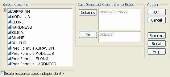
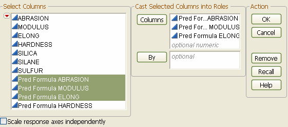
Specify the columns that you want to plot by putting them in the Columns role. Only numeric variables can be assigned to the Columns role. Variables in the By role produce a separate surface plot for each level of the By variable.
When selected, the Scale response axes independently option gives a separate scale to each response on the plot. When not selected, the axis scale for all responses is the same as the scale for the first item entered in the Columns role.
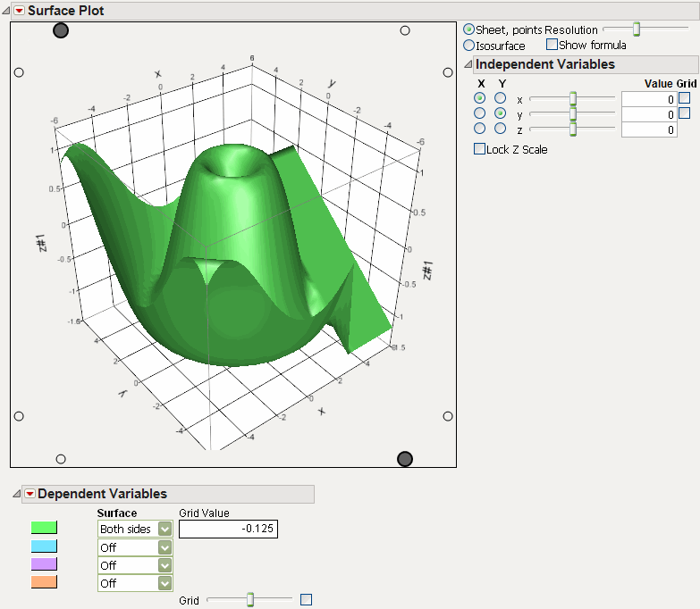
Plotting a Single Mathematical Function
To produce the graph of a mathematical function without any data points, do not fill in any of the roles on the launch window. Simply click OK to get a default plot, as shown in Figure 5.3.
Figure 5.3 Default Surface Plot
Select the Show Formula check box to show the formula space.
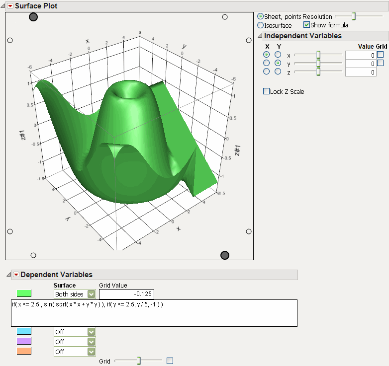
The default function shows in the box. To plot your own function, enter it in this box.
Plotting Points Only
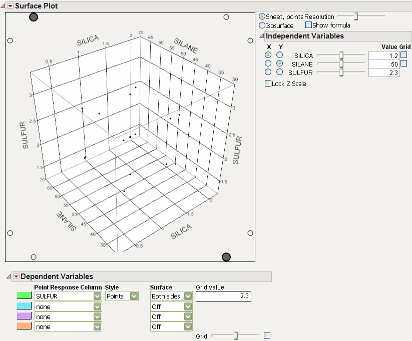
To produce a 3-D scatterplot of points, place the x-, y-, and z-columns in the Columns box. For example, using the Tiretread.jmp data, first select Rows > Clear Row States. Then select Graph > Surface Plot. Assign Silica, Silane, and Sulfur to the Columns role. Click OK.
Figure 5.4 3-D Scatterplot Launch and Results
Plotting a Formula from a Column
To plot a formula (that is, a formula from a column in the data table), place the column in the Columns box. For example, use the Tiretread.jmp data table and select Graph > Surface Plot. Assign Pred Formula ABRASION to the Columns role. Click OK. You do not have to specify the factors for the plot, because the platform automatically extracts them from the formula.
Figure 5.5 Formula Launch and Output
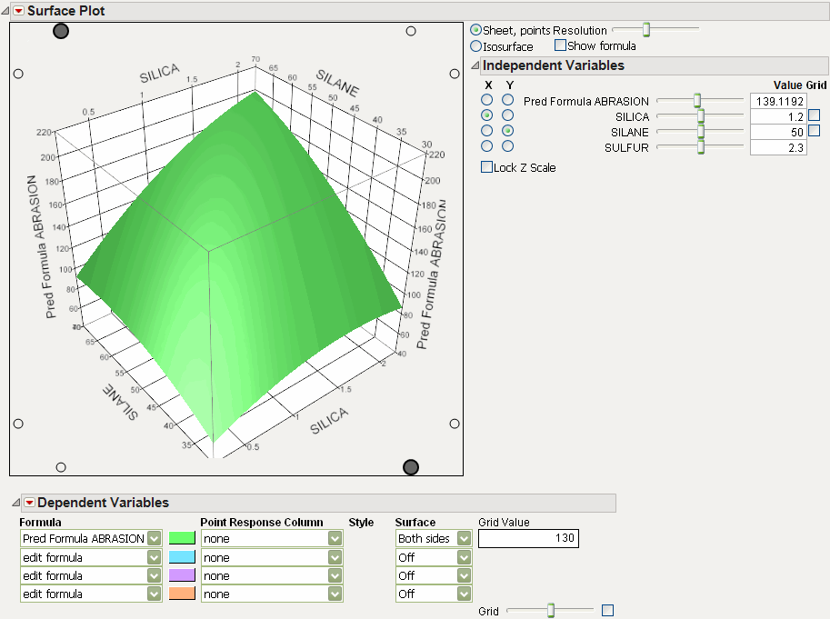
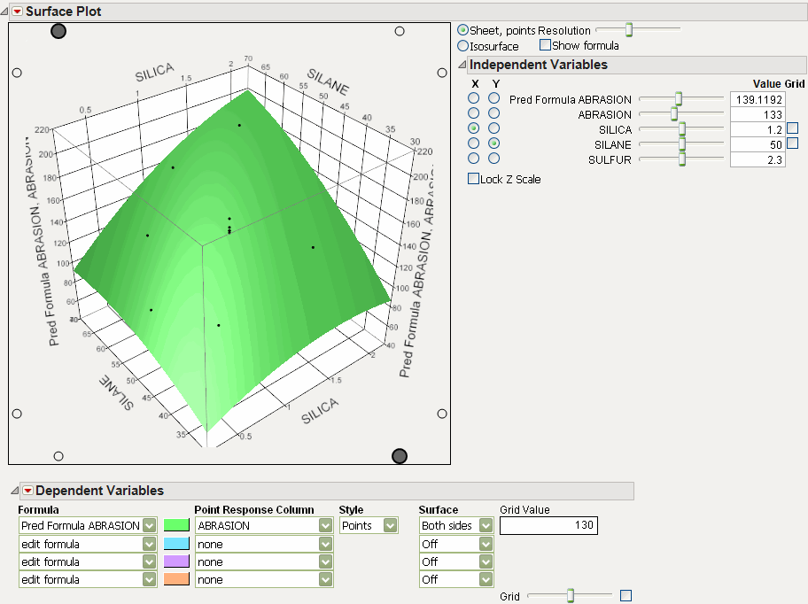
Note that this only plots the prediction surface. To plot the actual values in addition to the formula, assign the ABRASION and Pred Formula ABRASION to the Columns role. Figure 5.6 shows the completed results.
Figure 5.6 Formula and Data Points Launch and Output
Isosurfaces
Isosurfaces are the 3-D analogy to a 2-D contour plot. An isosurface requires a formula with three independent variables. The Resolution slider determines the n × n × n cube of points that the formula is evaluated over. The Value slider in the Dependent Variable section selects the isosurface (that is, the contour level) value.
For example, open the Tiretread.jmp data table and run the RSM for 4 Responses script. This produces a response surface model with dependent variables ABRASION, MODULUS, ELONG, and HARDNESS.
Now launch Surface Plot and designate the three prediction columns as those to be plotted.
When the report appears, select the Isosurface radio button. Under the Dependent Variables outline node, select Both Sides for all three variables.
Figure 5.7 Isosurface of Three Variables
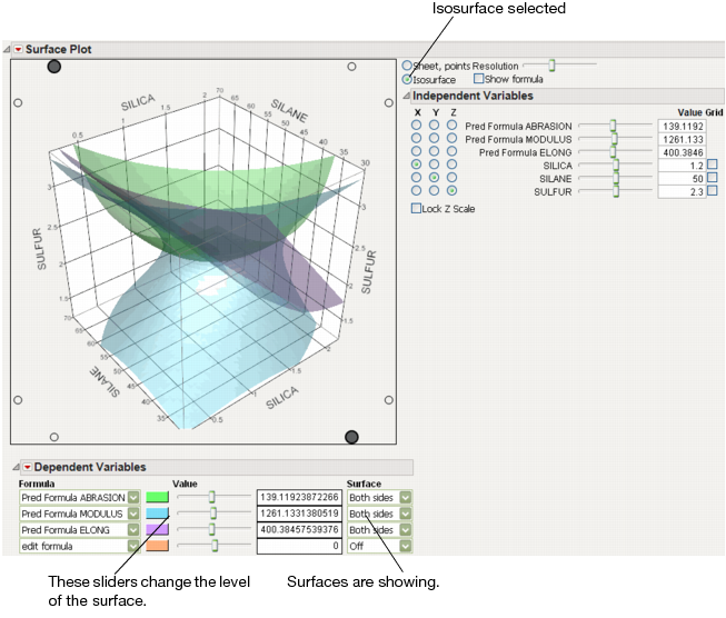
For the tire tread data, one might set the hardness at a fixed minimum setting and the elongation at a fixed maximum setting. Use the MODULUS slider to see which values of MODULUS are inside the limits set by the other two surfaces.
Surface Plot Platform Options
The red triangle menu in the main Surface Plot title bar has the following entries.
Control Panel
Shows or hides the Control Panel.
Scale response axes independently
Scales response axes independently. See explanation of Figure 5.2.
Script
Contains options that are available to all platforms. See the Using JMP book.
The Control Panel consists of the following groups of options.
Appearance Controls
The first set of controls enables you to specify the overall appearance of the surface plot.
Sheet, points
Is the setting for displaying sheets, points, and lines.
Isosurface
Changes the display to show isosurfaces, described in “Isosurfaces”.
Show formula
Shows the formula edit box, allowing you to enter a formula to be plotted.
The Resolution slider affects how many points are evaluated for a formula. Too coarse a resolution means a function with a sharp change might not be represented very well, but setting the resolution high makes evaluating and displaying the surface slower.
Surface Profiler Appearance Controls in Other Platforms
If you select the Surface Profiler from the Fit Model, Nonlinear, Gaussian Process, or Neural platforms, there is an additional option in the Appearance controls called data points are. Choose from the following:
Off
Turns the data points off.
Surface plus Residual
Shows the difference between the predicted value and actual value on the surface.
Actual
Shows the actual data points.
Residual
Shows the residual values (if they are not off the plot).
Independent Variables
The independent variables controls are displayed in Figure 5.8.
Figure 5.8 Variables Controls
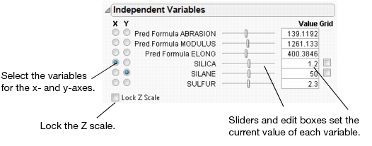
When there are more than two independent variables, you can select which two are displayed on the x- and y-axes using the radio buttons in this panel. The sliders and text boxes set the current values of each variable, which is most important for the variables that are not displayed on the axes. In essence, the plot shows the three-dimensional slice of the surface at the value shown in the text box. Move the slider to see different slices.
Lock Z Scale locks the z-axis to its current values. This is useful when moving the sliders that are not on an axis.
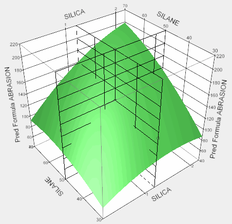
Grid check boxes activate a grid that is parallel to each axis. The sliders enable you to adjust the placement of each grid. The resolution of each grid can be controlled by adjusting axis settings. For example, Figure 5.9 shows a surface with the X and Y grids activated.
Figure 5.9 Activated X and Y Grids
Dependent Variables
The dependent variables controls change depending on whether you have selected Sheet, points or Isosurface in the Appearance Controls.
Controls for Sheet and Points
The Dependent Variables controls are shown in Figure 5.10 with its default menus.
Figure 5.10 Dependent Variable Controls
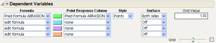
Formula
Lets you select the formula(s) to be displayed in the plot as surfaces.
Point Response Column
Lets you select the column that holds values to be plotted as points.
Style
Menus appear after you have selected a Point Response Column. The style menu lets you choose how those points are displayed, as Points, Needles, a Mesh, Surface, or Off (not at all). Points shows individual points, which change according to the color and marker settings of the row in the data table. Needles draws lines from the x-y plane to the points, or, if a surface is also plotted, connects the surface to the points. Mesh connects the points into a triangular mesh. Surface overlays a smooth, reflective surface on the points.
Surface
Enables you to show or hide the top or bottom of a surface. If Above only or Below only is selected, the opposite side of the surface is darkened.
Grid
Slider and check box activate a grid for the dependent variable. Use the slider to adjust the value where the grid is drawn, or enter the value into the Grid Value box above the slider.
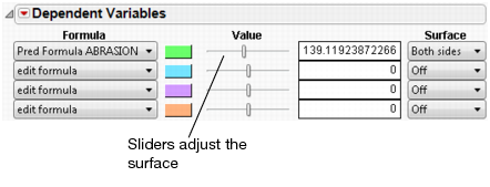
Controls for Isosurface
Most of the controls for Isosurface are identical to those of Sheet, points. Figure 5.11 shows the default controls, illustrating the slightly different presentation.
Figure 5.11 Dependent Variable Controls for Isosurfaces
Dependent Variable Options
There are several options for the Dependent Variable, accessed through the red triangle menu.
Formula
Reveals or hides the Formula drop-down list.
Surface
Reveals or hides the Surface drop-down list.
Points
Reveals or hides the Point Response Column drop-down list.
Response Grid
Reveals or hides the Grid controls.
Surface Plot Controls and Settings
Rotate
The plot can be rotated in any direction by dragging it. Drag the plot to rotate it.
Figure 5.12 Example of Cursor Position for Rotating Plot
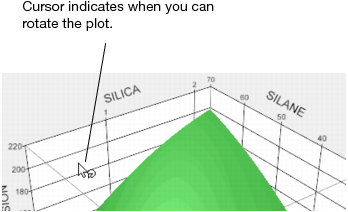
The Up, Down, Left, and Right arrow keys can also be used to rotate the plot.
Axis Settings
Double-click an axis to reveal the axis control window shown below. The window enables you to change the Minimum, Maximum, Increment, and tick mark label Format.
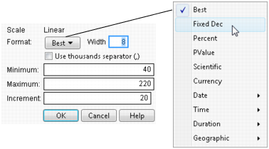
Like other JMP graphs, the axes can be adjusted, stretched, and compressed using the grabber tool. Place the cursor over an axis to change it to the grabber.
Figure 5.13 Grabber Tools

Lights
By default, the plot has lights shining on it. There are eight control knobs on the plot for changing the position and color of the lights. This is useful for highlighting different parts of a plot and creating contrast. Four of the eight knobs are shown below.
Figure 5.14 Control Knobs for Lights
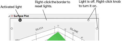
• Right-click a knob to turn that light on or off. More lights turned on brighten a plot, and fewer lights darken it.
• Drag a knob to change the position of a light.
• Change the color of a light by right-clicking on the knob. The default color is white.
Sheet or Surface Properties
If you are plotting a Sheet, points, right-click the sheet inside the plot and select Sheet Properties to reveal a window for changing the sheet properties.
Figure 5.15 Sheet Properties Window
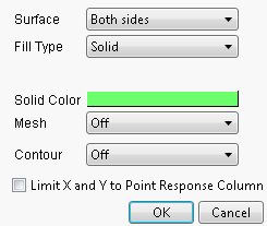
Surface
Enables you to show or hide the top or bottom of a surface. If Above only or Below only is selected, the opposite side of the surface is darkened.
Fill Type
Enables you to color the surface using a solid color, or continuous or discrete gradients. If a gradient is chosen, the Show Legend option appears when you right-click the surface.
Mesh
Enables you to turn on or off a surface mesh, for either the X or Y directions or both. If turned on, the Mesh Color option is revealed allowing you to change the color.
Contour
Enables you to turn on or off a contour grid, either above, below, or on the surface. If turned on, the Contour Color option is revealed allowing you to change the color.
Limit X and Y to Point Response Column
limits the range of the plot to the range of the data in the Point Response Column, if one is activated. If checked, this essentially restricts the plot from extrapolating outside the range of the data in the Point Response Column.
The equivalent JSL command for this option is Clip Sheet( Boolean ). You can send this message to a particular response column by appending the number of the response column. For example, Clip Sheet2( 1 ) limits the range of the plot to the range of the data of the second response column. See the Scripting Index in the JMP Help menu for an example.
If you are plotting an Isosurface, right-click the surface and select Surface Properties to reveal a similar window. You can modify the surface color, opacity, and toggle a mesh.
Other Properties and Commands
Right-click anywhere in the plot area to reveal the following options:
Show Legend
Shows a legend when the surface is colored using gradients.
Reset
Resets the plot to the original viewpoint. Changes in wall and background color are not affected.
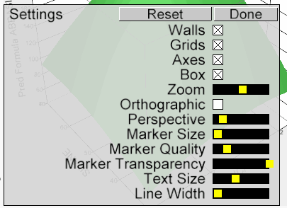
Settings
Opens a window for changing many plot settings.
Hide Lights Border
Shows or hides lighting controls.
Wall Color
Enables you to change the plot wall color.
Background Color
Enables you to change the plot background color.
Rows
Enables you to change row colors or markers, and also exclude, hide, and label points.
Use Hardware Acceleration
Provides for faster rendering of the display. For example, if the plot redraws slowly when rotating, this option can help it redraw faster.
Show ArcBall
Provides options for using the ArcBall. The ArcBall is a sphere drawn around the plot to help visualize the directions of rotation.
Keyboard Shortcuts
The following keyboard shortcuts can be used to manipulate the surface plot. To get the plot back to the original viewpoint, right-click the plot and select Reset.
|
Key
|
Function
|
|
left, right, up, and down arrows
|
spin
|
|
Home, End
|
diagonally spin
|
|
Enter (Return)
|
toggles ArcBall appearance
|
|
Delete
|
roll counterclockwise
|
|
Control
|
boost spin speed 10X
|
|
Shift
|
allows continual spinning
|
..................Content has been hidden....................
You can't read the all page of ebook, please click here login for view all page.