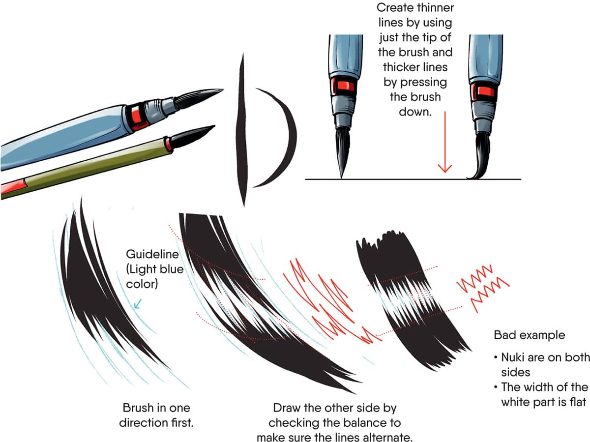
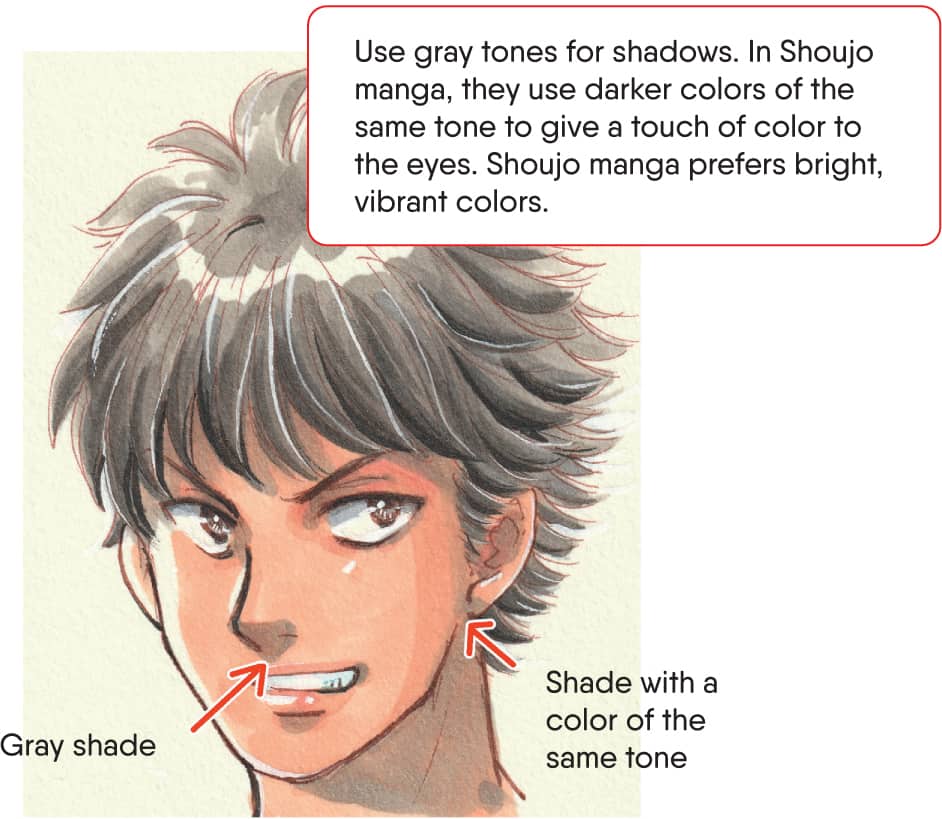
Atari: Rough sketches or guidelines to set the rough position, shapes, and balance of the composition. This includes characters, backgrounds, effect lines, and handwriting. Pen-ire/Pen Inking: To go over the pencil drawing in ink. Beta/Beta Inking: Solid black with brush pens or pens. Iri: The starting point of the stroke on Pen-ire or Beta. This is only for brush pens and dip pens. Don’t use this technique with carbon fiber pens or markers. Nuki: The end point of the stroke on Pen-ire or Beta. Draw it by pulling the tension away from the tip of the pen to make it look like it’s disappearing normally. Teri-Beta/Tsuya-Beta: An effect to make the part look shiny as if light shines on it by adjusting the Nuki and Iri. This technique is mainly used for black hair. Howaito (White): To erase wrong lines, ink smudges with white ink or correction fluid. It’s used for lights and highlights. Kakeami: Pen hatching; to express half tones with pens. Kakimoji (SFX): Onomatopoeia designed by hand drawing. It’s an important factor in manga to describe the atmosphere and situations as well as the sounds. Fukidashi: Conversation/word bubble. There are several sizes or shapes depending on the volume of the voice or the way it’s said. Manpu: Symbols or icons that help express emotions in manga such as sweat beads or lines. Kouka-Sen: Lines to show effects. There are several types: Tone/Screen Tone: Screen tones are a sheet of adhesive paper with different patterns. You can cut it with knife after applying. The surface can be scraped off with a knife and has different effects. Gray tones are called Ami and patterns, such as a checkered pattern, are called Gara. Due to printing costs and speed, manga manuscripts are generally black and white in Japan. Artists use tones with small dots to express gray areas in place of gray ink and pencils. Currently, technological advances allow the use of gray, but traditionally the color is expressed in tones.BASIC TERMS


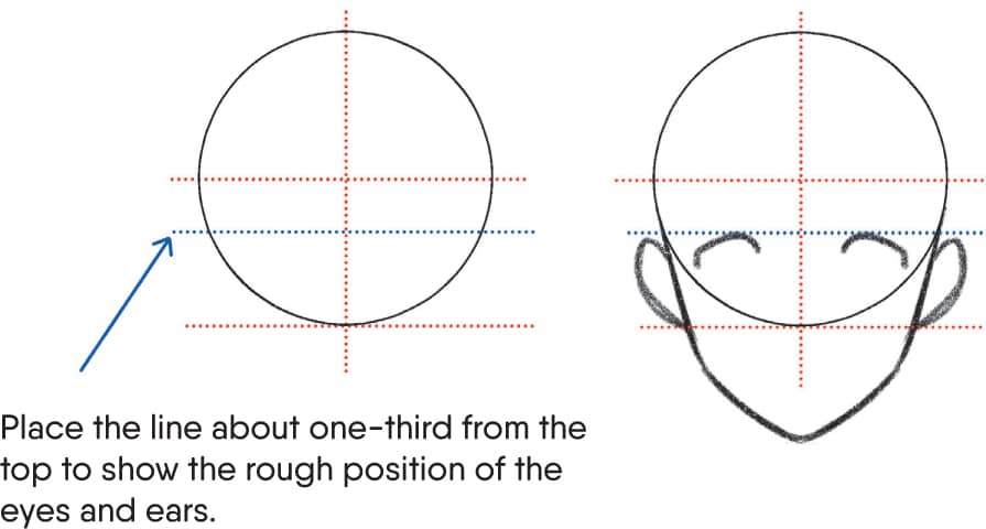
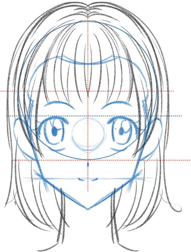
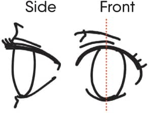
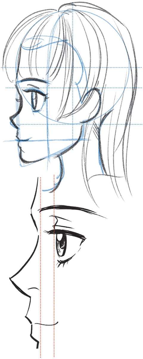
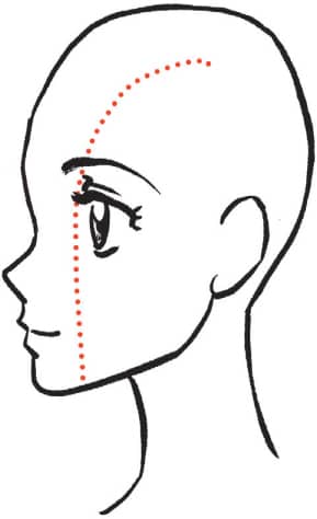
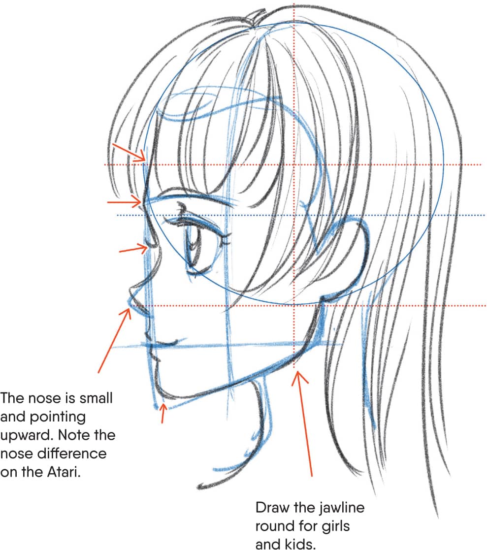
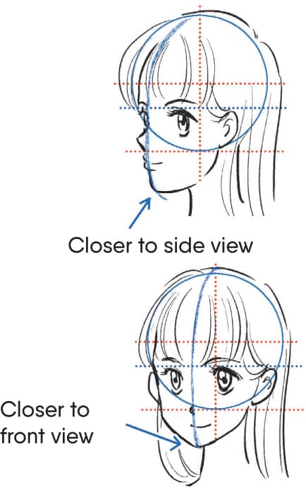
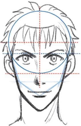
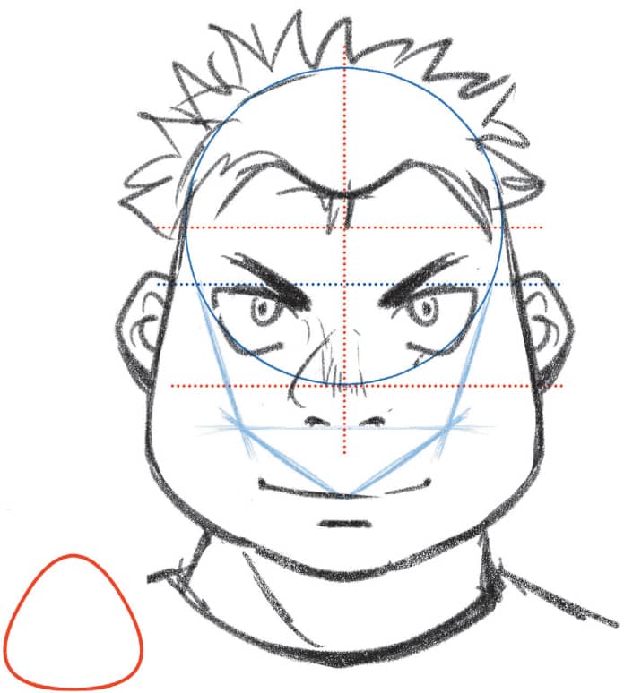
Basic Atari for Faces Cut a circle (a skull) in half both horizontally and vertically with a line on the bottom of the circle. The position of the mouth is the same height as the line of the jawbone. Determine the position of the nose by measuring from it. Draw the hair in consideration of the hairline direction and correct straight facial lines of the Atari to make it girlish, and it’s done. An eye looks like a triangle from the side. Notice that the eyes are in eye sockets and the eyebrows are above the brow bones. So from a side view, the eyes should be further right than the eyebrows. The eyes are attached to the front of the face. Make sure not to draw them on the side of the face. Facing left side. It might be easier for a left-handed person to start practicing from the one facing the right side. Draw a vertical line from A, the starting point of the face, to B, the position of the cheekbone, and connect it to the tip of the jaw to complete the Atari face line. Note the difference of the width, center line, and side part.DRAWING A FACE
Front View

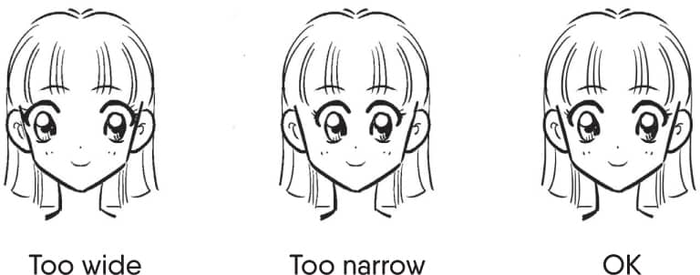
![]() Determine the contour of the face from the Atari. Since the face is oval, it narrows from the temple toward the jaw joint (gonial angle). Note that the face becomes sharper the narrower you make it.
Determine the contour of the face from the Atari. Since the face is oval, it narrows from the temple toward the jaw joint (gonial angle). Note that the face becomes sharper the narrower you make it.![]() Even with a hairstyle that covers the face, draw a hairline and check the size of the forehead and the position of the hairline.
Even with a hairstyle that covers the face, draw a hairline and check the size of the forehead and the position of the hairline.


Profile View
![]() Place the ears. Draw them closer to the center line and the center of the contour facing front. Some people draw them on the center line exactly.
Place the ears. Draw them closer to the center line and the center of the contour facing front. Some people draw them on the center line exactly.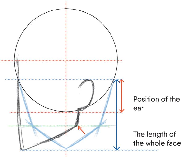
![]() Draw Atari on the front part of the face. Draw the line almost vertically downward and stop at the chin position.
Draw Atari on the front part of the face. Draw the line almost vertically downward and stop at the chin position.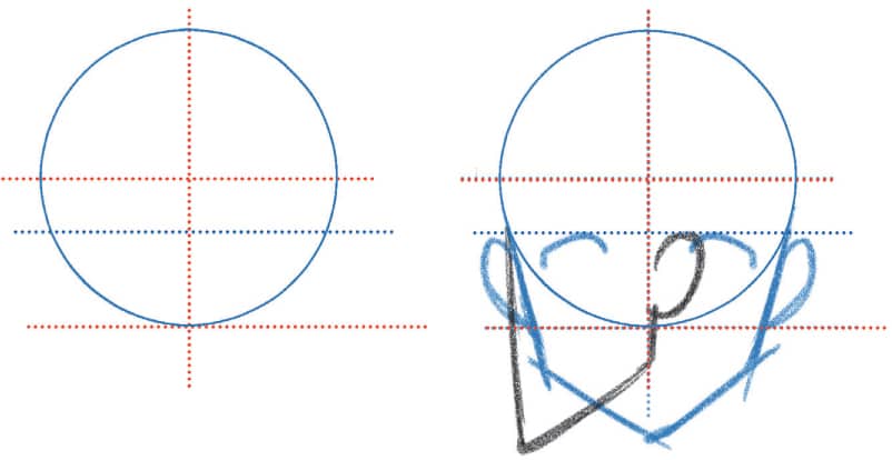
![]() Draw a line downward from under the ear, stop at the position of the jawbone, and then connect it with the tip of the jaw to complete the facial contour.
Draw a line downward from under the ear, stop at the position of the jawbone, and then connect it with the tip of the jaw to complete the facial contour.![]() Draw Atari at the position of the eyes, nose and mouth. If you feel it’s out of balance, correct it by checking the position when facing forward. Note that if the positions and sizes of the parts are different, they won’t look like the same character.
Draw Atari at the position of the eyes, nose and mouth. If you feel it’s out of balance, correct it by checking the position when facing forward. Note that if the positions and sizes of the parts are different, they won’t look like the same character.![]() Draw facial parts along the Atari and adjust the contour by paying attention to irregularities such as the forehead, between the eyes, and the chin.
Draw facial parts along the Atari and adjust the contour by paying attention to irregularities such as the forehead, between the eyes, and the chin.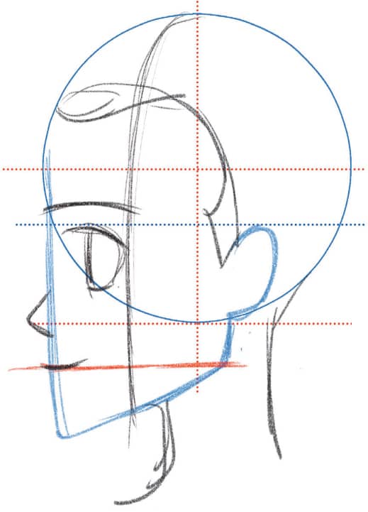
Three-Quarter View
![]() Decide the position of the ear based on the Atari. It’ll be between the ear on the face facing front and one with the face facing to the side. The position differs depending on the angle.
Decide the position of the ear based on the Atari. It’ll be between the ear on the face facing front and one with the face facing to the side. The position differs depending on the angle.
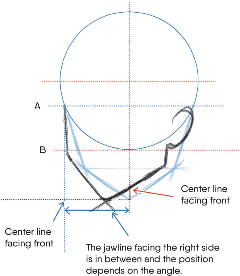
![]() Draw a vertical line from the bottom of the ear as you did for the side view and change the angle at the jawline to connect it to the line at the tip of the jaw. The position differs depending on the angle.
Draw a vertical line from the bottom of the ear as you did for the side view and change the angle at the jawline to connect it to the line at the tip of the jaw. The position differs depending on the angle.![]() Draw Atari for the center of the face from the tip of the jaw. Make sure to draw it straight, similar to the line at the cross-section of the face. Decide the position of the eyes, nose, and mouth. Make sure not to draw the eyes on the side of the face.
Draw Atari for the center of the face from the tip of the jaw. Make sure to draw it straight, similar to the line at the cross-section of the face. Decide the position of the eyes, nose, and mouth. Make sure not to draw the eyes on the side of the face.![]() Make the eye closer to you wider and the other one oval-shaped with a shorter width. Make sure that the ratio is the same as the difference of the width of the both sides of the face. The same goes for the mouth. Draw the part closer to you longer than the other side.
Make the eye closer to you wider and the other one oval-shaped with a shorter width. Make sure that the ratio is the same as the difference of the width of the both sides of the face. The same goes for the mouth. Draw the part closer to you longer than the other side.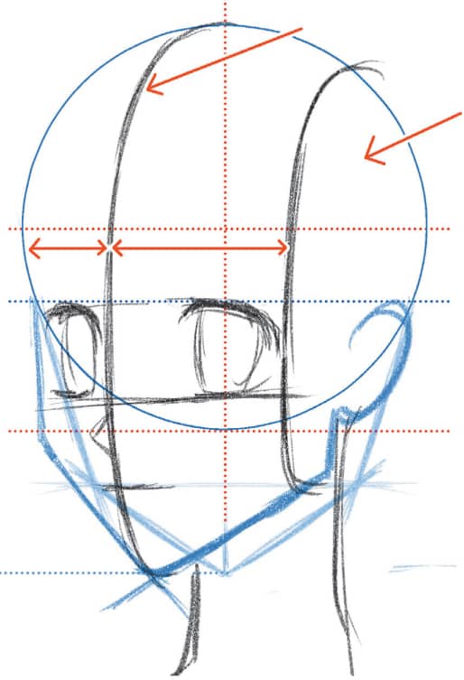
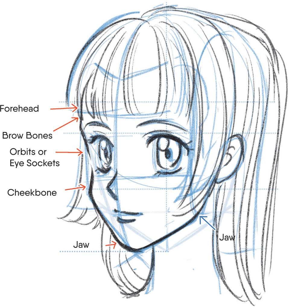
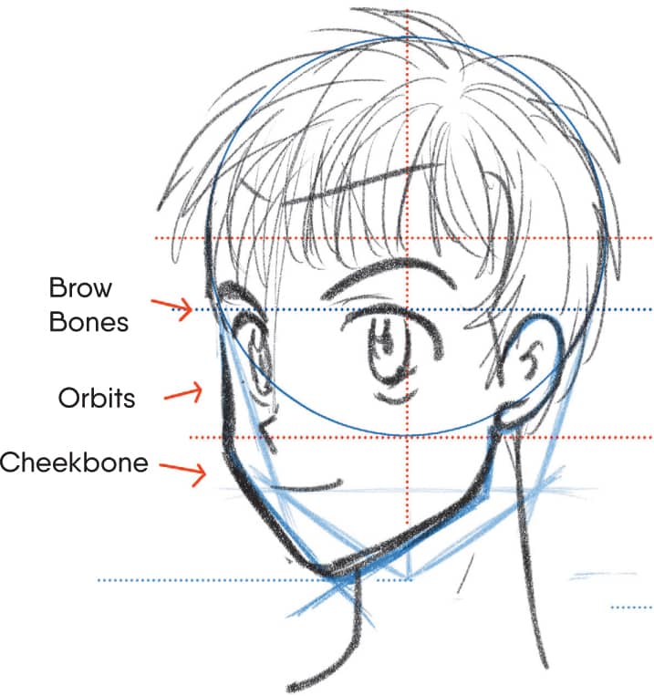
![]() Draw the parts of the face along the Atari in the same way as the side view and draw the face line considering the bone structure of the forehead, brow bones, eyeballs, cheekbones, and jaw.
Draw the parts of the face along the Atari in the same way as the side view and draw the face line considering the bone structure of the forehead, brow bones, eyeballs, cheekbones, and jaw.
There are different face shapes and proportions, depending on age and character type. Child. The face line is almost a circle because the facial features are underdeveloped and small. Rounder cheeks make the face cuter and more childish. The nose is small without a nose line. Teenager. The jaw becomes more defined, making the face longer. The forehead is flatter. The orbits and cheekbones are clearer. The nose should still be small even though the nose line is visible. Adult. The jaw is developed completely and the jawline is stronger. The cheekbones are clearer and the face line becomes straighter. The neck is thicker and the line on the back of the head is almost straight. The eyes become smaller and almond-shaped now that the face is fully developed. Oval Square. The contour of the face is straighter and the jawbone more square-shaped. It’s used for men with strong bodies or trained warriors. Inverted Triangle. This shape creates a long face with a small jaw, even though the length of the face is the same as the oval face shape. Use the inverted triangle for sensitive, thoughtful characters. Triangle. A rounded triangle face is shaped similarly to a rice ball. The bottom of the face is wider. While this face shape is similar to a child’s, the skull is smaller while the jaw is developed. It’s a face for a fat or thick man. Humorous, warm characters typically have this kind of face.FACE VARIATIONS
Age Differences


Shape Differences


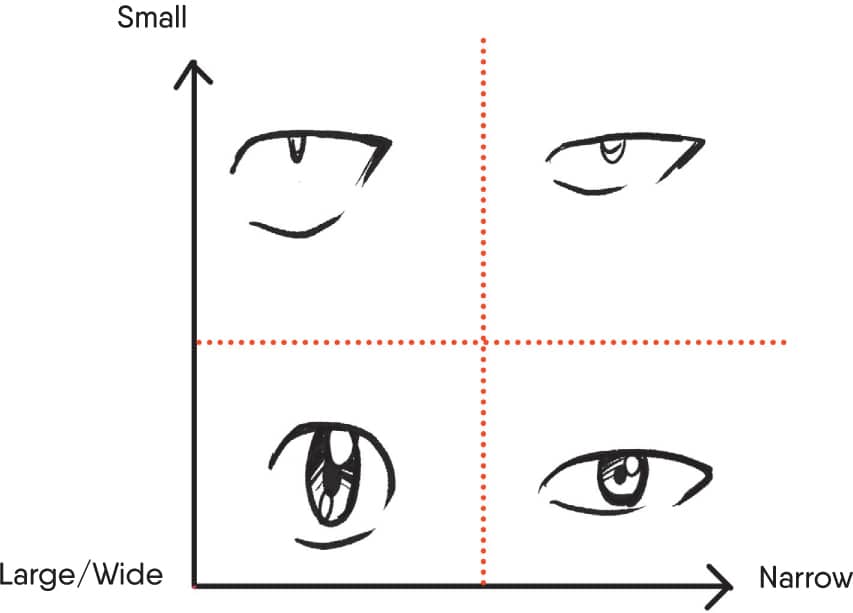
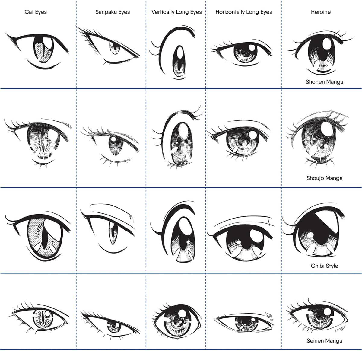
Eyes are a key facial feature when it comes to identifying manga genres or authors. Practice them by referring to your favorite style. I’ll introduce some variations with a more typical touch. Eyes with huge black irises and a small sclera (the white part of the eye) are normally used for the main character. This eye type conveys cuteness and purity. Enemies often have the opposite: small pupils and large sclera with white between the iris and lower eyelid, to depict their coldness or shrewdness. These are called sanpaku eyes.EYE VARIATIONS
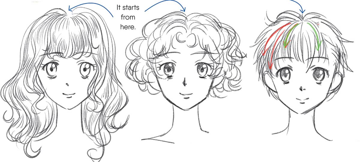
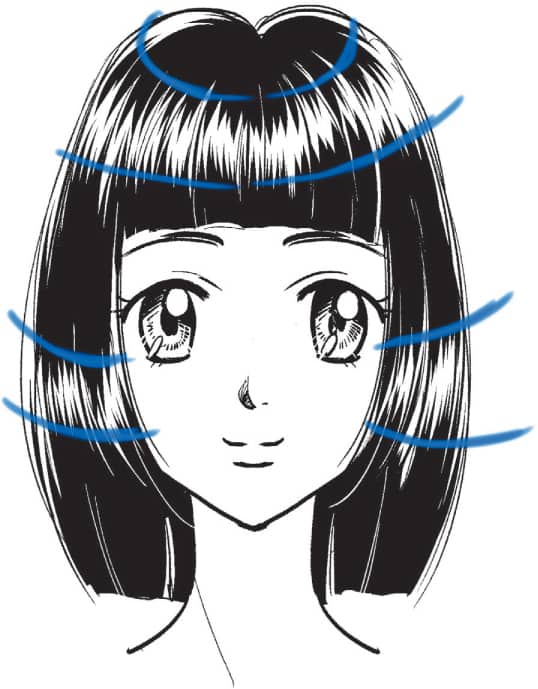
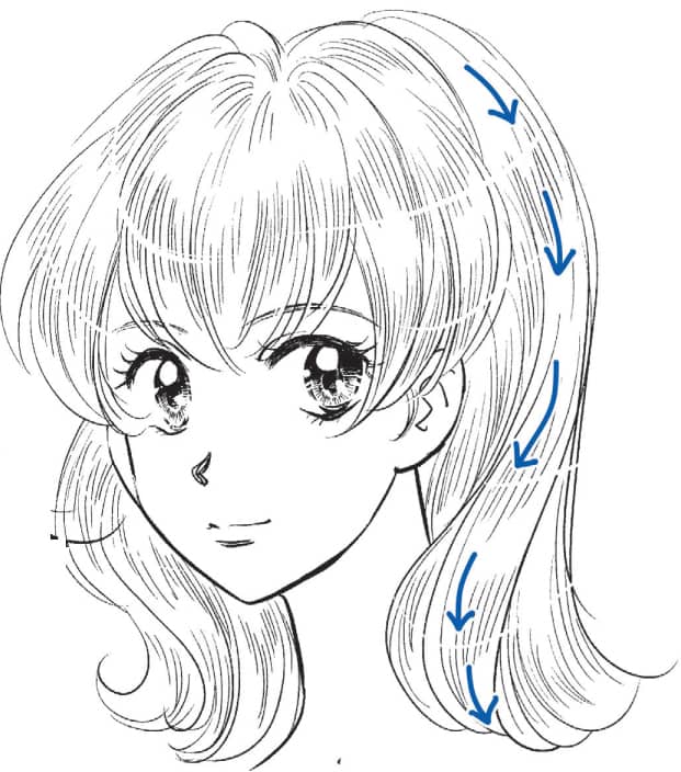
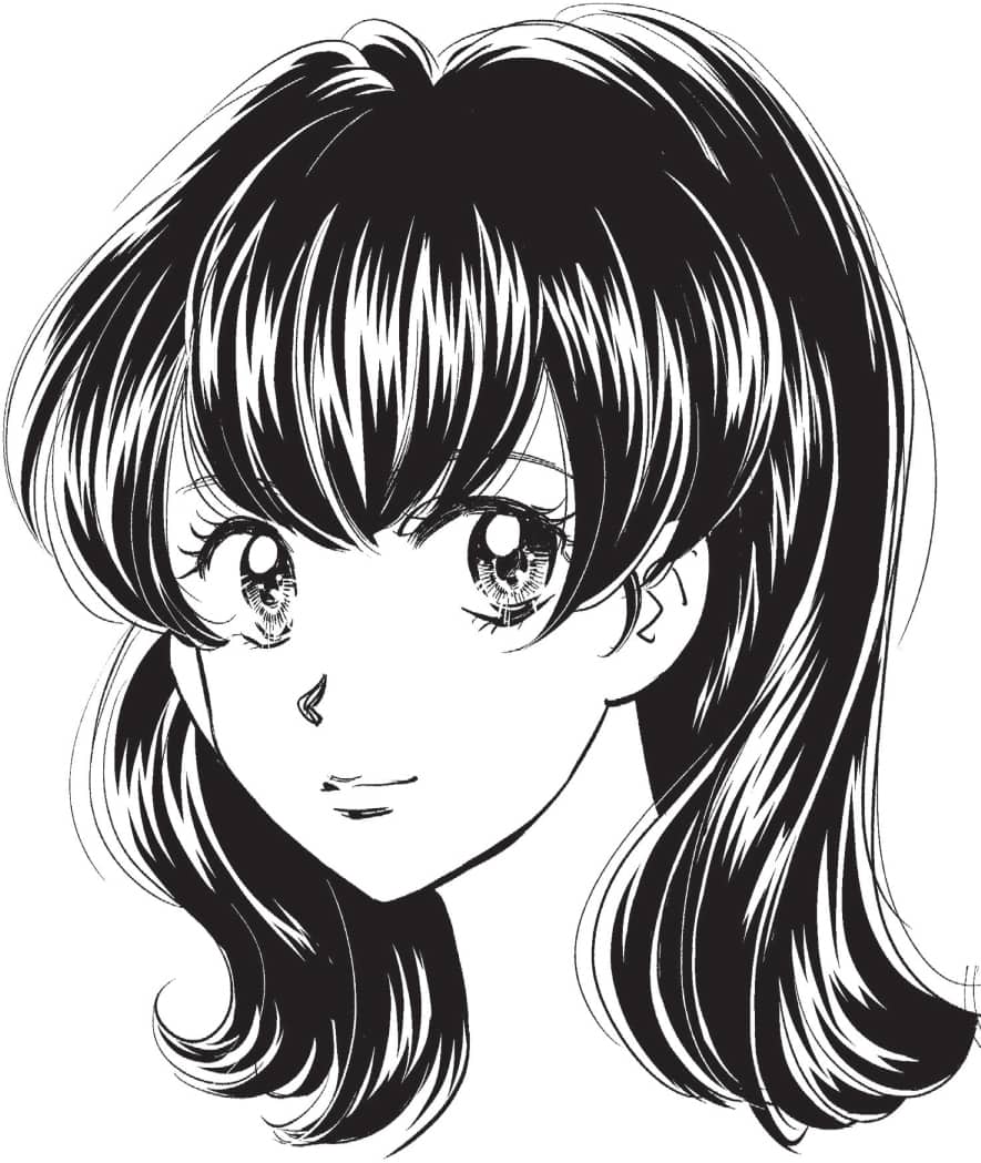
Make sure to consider each part of the front, side, and back hair for all hairstyles. The head shape is more visible with heavy, long hair because it’s weighed down. It flows straight down along the face. It’s the same for wavy hair, but it’s more spread out near the bottom because it weighs less. For short hair, it spreads out even more and is more voluminous because it’s lighter. Teri-Beta: An expression of black hair. It’s normally expressed with light reflections even though some draw the hair lines with white ink. It’s a technique to show the hair flow similar to the lines for blonde hair. Use this technique for wavy hair. The position of the light gathers in one spot for straight hair. Make sure to check the hair flow by drawing the Atari. Use a blue pencil lightly when you draw lines of hair or Teri-Beta. It looks like shiny blonde hair if you draw lines like this.HOW TO DRAW HAIR

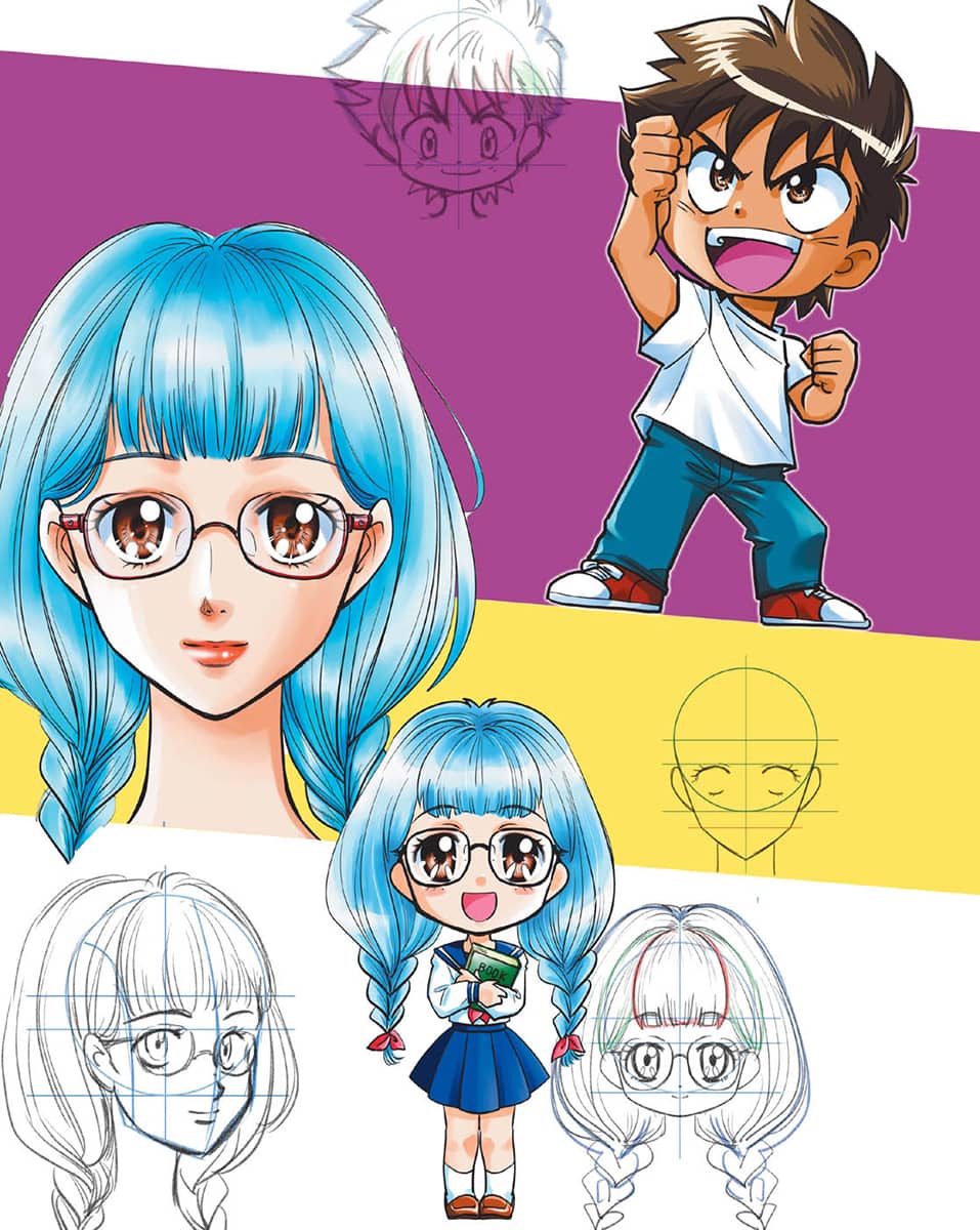
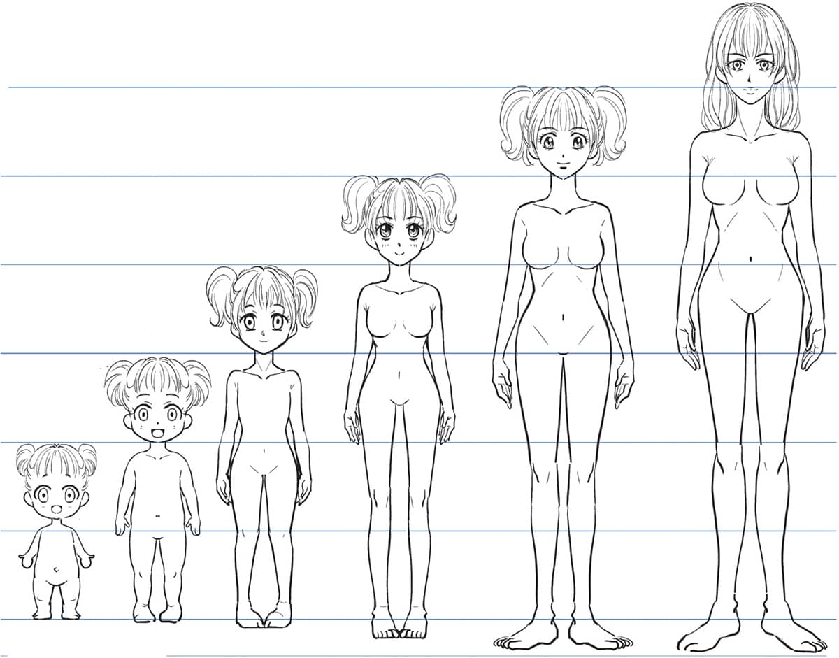
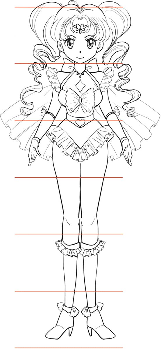
The proportions differ according to the style, but the ratio of the head to the body changes according to the age. The ratio is 2 to 6½ to 7, with 2 head lengths for babies and 7 for young adults. In the case of men, 7 or 7½ head lengths is the general adult body. Make sure to draw them differently according to the age. A child’s body shouldn’t have a waistline, and adults should have a waistline or developed hipbones. Ratio for Chibi Style is 2 to 3 heads. You’ll need 3 heads to a body ratio for feminine characters with big breasts. Decide your favorite proportion by checking the balance.PROPORTIONS FOR HEADS AND FIGURES

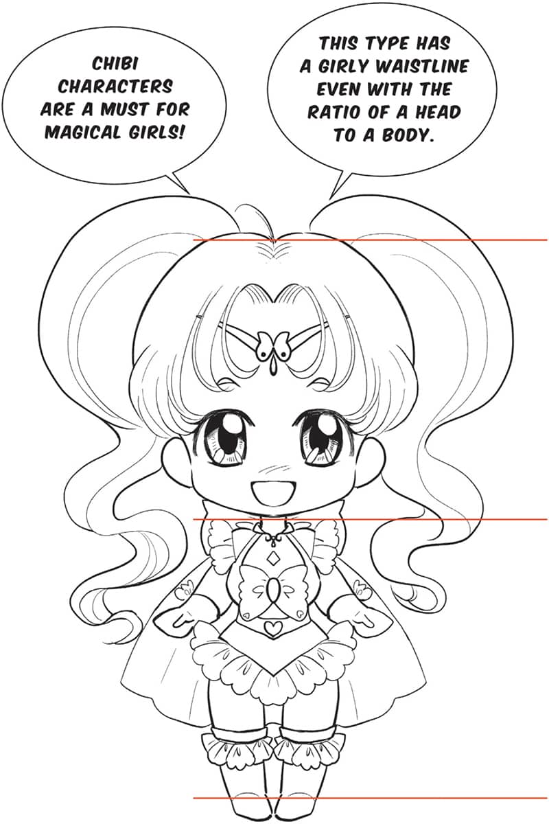
On these two pages we look at two very different characters—a Magical Girl (see here) and a Male Warrior (here)—to consider the guidelines and steps for creating a Chibi, a character’s smaller, cuter version. The hairstyle and the costume are butterfly inspired. 5½ heads to a body ratio It’s not difficult to make a Chibi out of a cute girl. Simplify the character design and change the eyes-to-nose ratio to 1 for babies. Make the hair fluffier and it’s done. The body is about the size of a head or two with the ratio of 2 to 3 heads to a body. In manga, legs are drawn longer than in real life. However, Chibi style has short legs. The ratio of body to legs is 1 to 1 at most. Head-to-body ratio. The hands and feet are small. The head is big. It will look like it can barely stand on its own. When drawing a warrior, consider where these soldiers or fighters serve, and the kinds of materials they would wear when you design their costumes and armor. 8 heads tall It might be hard to make Chibis out of serious characters, especially tough guys, but the method is the same: Draw the face bigger with fluffier hair and bigger eyes. The head-to-body ratio for a male Chibi is the same as for a female one—they’re both about 2 to 3 heads high—but the male Chibi’s shoulders and body are wider and thicker, so he’s consistent with the style of the original character. Also, a male Chibi’s hands and feet are usually larger than a female Chibi’s, though some artists draw their female Chibi’s hands and feet somewhat large. Ratio of 2½ heads to bodyCREATING A CHIBI
Magical Girl
Male Warrior
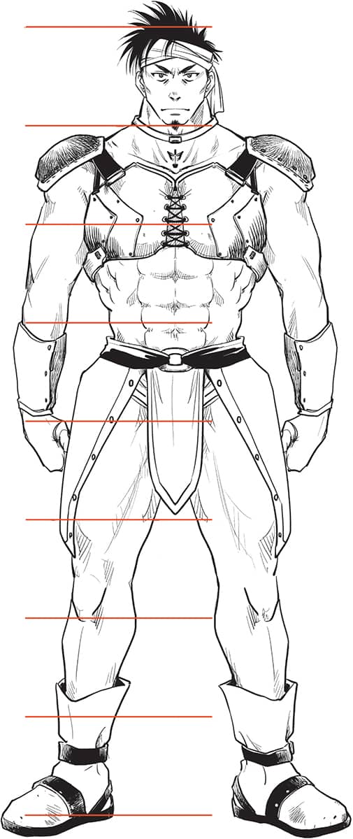
(head-to-body ratio: 8:1)
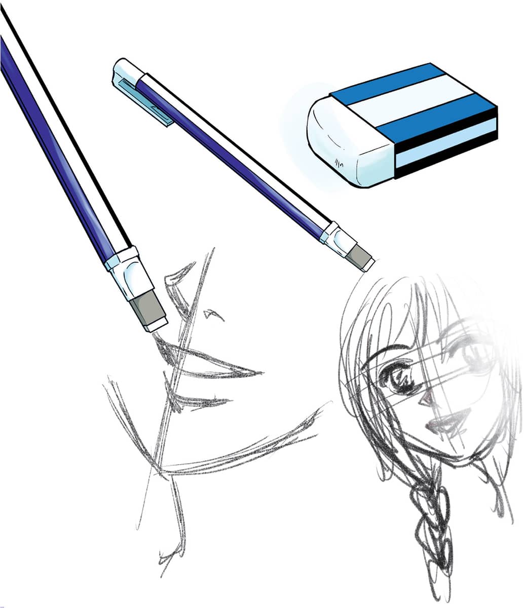
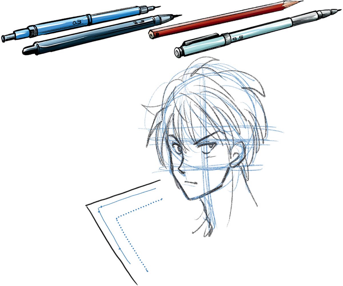
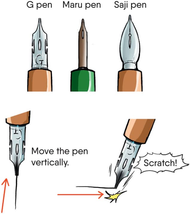
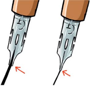
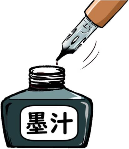
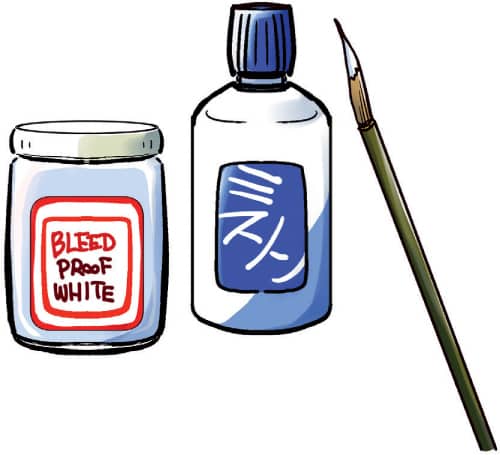
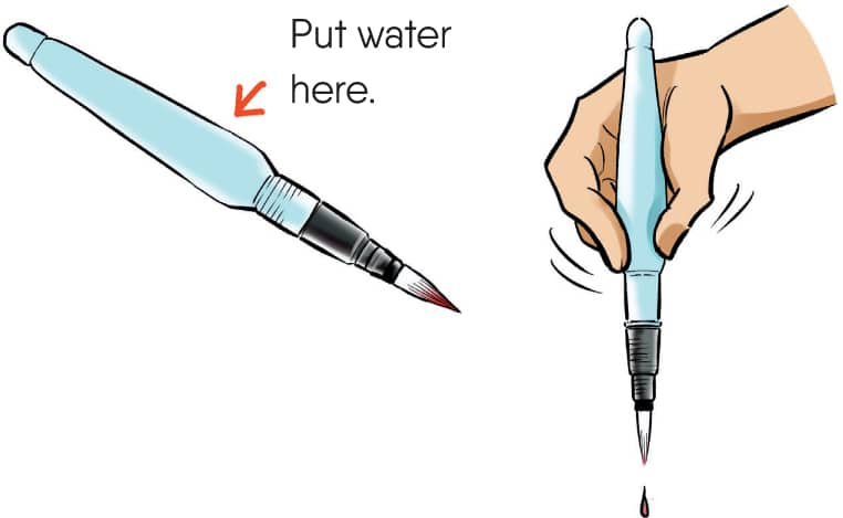
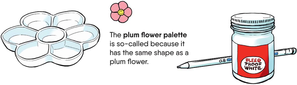
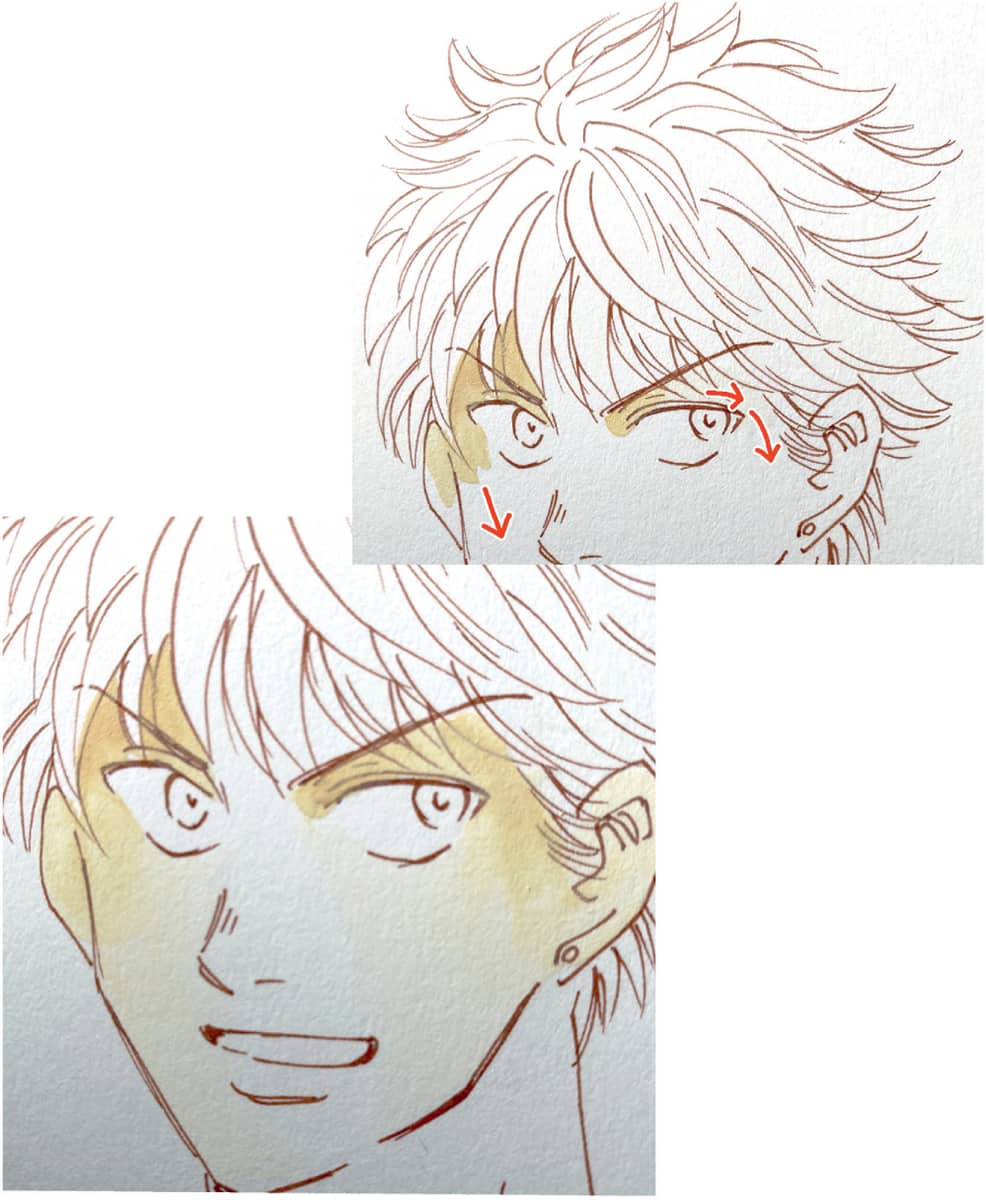
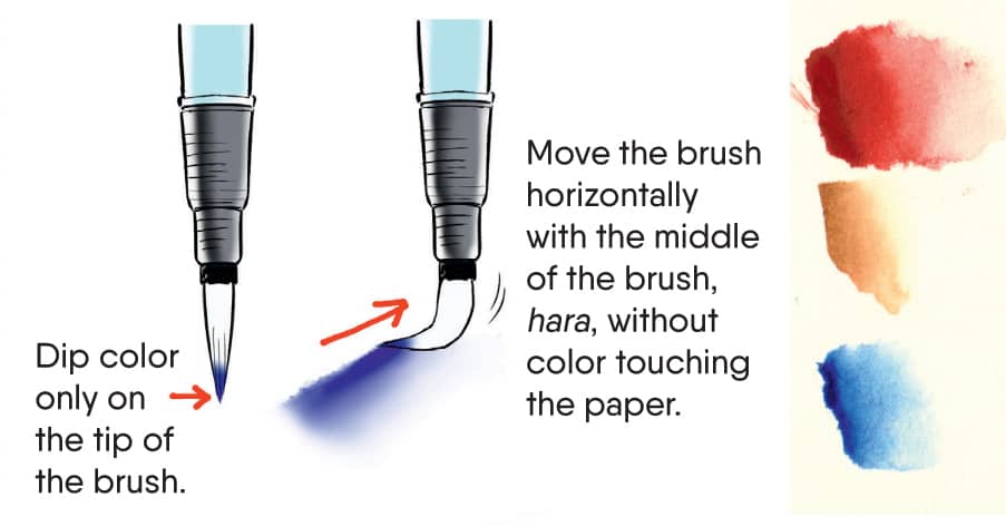
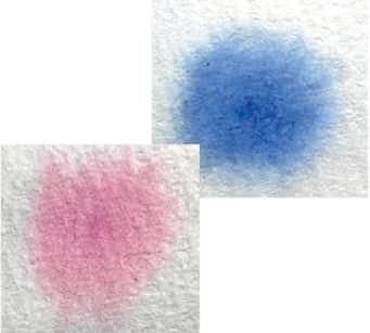
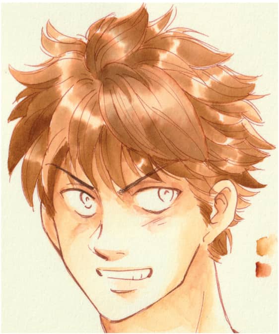
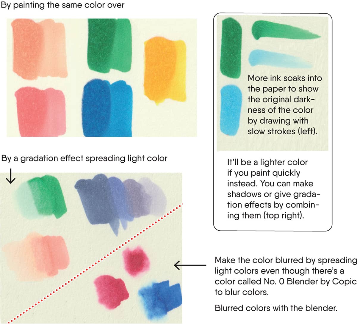
Use whatever tool you want. A normal pencil and an eraser will do the job. This section will introduce necessary and useful tools to complete a black and white manga manuscript with Pen-ire. Mechanical Pencil or Pencil. Soft pencils such as 2B or B work fine. Use artist-quality pencils. I use 0.5 and 1.3 mechanical pencil lead for characters. Pencils are recommended for people who draw hard or place a lot of weight on the pencil. Draw rough sketches lightly. For those who put more weight on pencils, draw lightly to avoid denting the paper, which will make it harder to do Pen-ire later! Light Blue Color Pencil (or Mechanical Pencil Lead). It will prevent the paper from getting dirty if you use them to draw the Atari. Draw clear lines with pencils after rough sketching. Make sure not to draw too strongly so that you can still erase it. Paper (for Pen-ire). Use paper with a hard and smooth surface. It’s better to use Bristol paper, but it can be expensive. It’s useful to have manuscript papers for manga. If you can buy them, I recommend them because they’re cheaper than Bristol paper. Normal manuscript papers for manga sometimes have useful light blue guidelines to help you! Eraser. Use plastic erasers. Plastic erasers let you erase pencil lines without damaging the surface of the paper. They even leave less eraser shavings. Search for your favorite brands to find an eraser perfect for you. Pencil Eraser. Choose plastic erasers for this kind as well. It’s useful when you want to erase detailed spots such as the edge of the mouth. Kneaded Eraser. This is a soft eraser that changes shape like clay. Pat the drawing with it when you want to clarify which line to use. It lightly erases the other lines without erasing them completely. You can do the same with plastic erasers. You might want to dedicate an eraser to this purpose because it’ll turn black over time from the lead. Ruler. You don’t need it for drawing faces, but it’s useful for drawing the Atari lines neatly. It also helps you check the position of the eyes and nose. The main pens used for manga are the three types listed below. However, there are many other kinds. They’re used with pen holders. These pens are necessary if you want to draw a smooth line with changes in thickness that are specific to manga. You will need to practice using it though. There’s also the danger of smudging or getting fingerprints on the paper! Milli Pen or Line Art Pen. Manga pens are typically used for main lines on characters, but some artists use milli pens. Use three types; SML, such as 0.1, 0.3, and 0.5 (0.8) for different uses. Use pigmented ink and avoid watercolor or oil color. Apply more pressure to the tip of the pen to draw thicker lines. Use light pressure to create thinner lines. Change the pen angle if the tip doesn’t open as seen in the picture. Ink. Ink is necessary to use manga pens. There are different types of ink or India ink. I recommend manga ink or manga-India ink, which you can find in art stores. Use drawing ink if you can’t find them. It’s black enough, fast-drying, and not erasable. Brush Pen. These are used for Beta inking. There are two common types: sponge and nylon. Nylon brush pens are widely used because it’s easier to move the tip and they’re good for Teri-Beta. Sponge brush pens are typically easier for beginners to use. Choose pigmented ink for this brush also. You can also draw Teri-Beta with these. White. White ink or white correcting fluid is used to correct mistakes or draw thin white lines. Choose ones you can draw with a brush or mix bleed-proof ones with water. Prepare a very thin brush. White gel ball point pens are useful also. Coloring with Watercolor. Use transparent watercolor to create different colors. Layer washes or paint strokes to create a variety of colors and hues. Some artists use vivid colored ink for Shoujo manga. Dr. Ph. Martin’s radiant colors are commonly used. Use it the same way as transparent watercolor. It’s a more vivid and clear color compared to the paint material type, but it fades more easily over time. Note that the quality of colored ink varies, depending on the company and type. Some are uneven. Start painting with just a few colors. It’s not bad to have a lot, but you can express various colors by layering washes on top of each other with transparent watercolor. Buy additional colors as needed. Don’t mix colors on a palette because the more you mix, the muddier and darker the color gets. Brush. I recommend a water brush. In the past, I used paint brushes for Japanese paintings, but now I use this one. You can buy it almost anywhere. It’s cheap and the tip is easy to use. The tip is made with nylon, the same kind as brush pens. It’s useful to buy three sizes; big, medium, and small. It’s used for sketching outdoors. It’s widely used because it’s easy. If possible, try out some different kinds because the tips are different depending on the brand. It’s very useful because water comes out when you squeeze it and cleans the tip! Palette. You’ll need one of these so you can adjust the intensity of a color by watering it down. White Ink/White Gel Ballpoint Pen. Use the same white ink as the one for black and white manuscripts. Make sure to use a bleedproof type. Prepare a line drawing. Use a manga pen with waterproof ink or a milli pen (line art pen) with pigment for water coloring. This paper is Japanese VifArt (fine). There are many kinds of watercolor paper, so try out some. When using a manga pen and waterproof ink, the paper must be fine with a smooth surface. But with a milli pen, don’t worry about the surface of the paper so much. Use your favorite type of paper because it won’t drastically affect the results. Lightly draw lines with pencils and use minimum erasers so that you don’t damage the surface of the paper when you’re drafting. Trace the draft to drawing papers using tracing papers or lightboxes. Express light and darkness by making shady spots by layering the same color, or a darker color of the same tone, on top of the base skin color. Start painting the skin. It’s standard to start with light colors and move to darker colors because you can’t correct it using transparent watercolor. Paint with a three-dimensional effect by spreading the paint after dropping the color that you get on the tip of the brush at the darker parts. Spread the paint to shaded parts such as shady parts of the hair, the eyes, or redder parts on the cheeks. Spread the color in one stroke to avoid uneven washes. The color will get darker and deeper by painting on top of it. Make natural gradation on the borders by painting different colors on top and spread it before the first one dries out. Ochre is used for skin here. Use brown for darker skin, red tone colors such as orange or magenta for white skin. Dip only the tip of the brush in color and make natural gradation by using the brush to spread the color on the paper. You can spread the color with water or dry it out by patting tissues on it when you put too much color. Prevent adding too much color by testing it on another piece of paper beforehand. There’s a way to paint with color by undercoating the part you color with water when you use thicker papers. It creates beautiful gradation when the color spreads naturally. Start painting hair once you finish the skin. Start coloring after checking that the skin has dried. Spread the colors on the paper after you’ve started coloring the darker parts. The tip is to paint it quickly so it spreads evenly. In this case, paint along the flow of the hair from the root and the tips. Leave the center lighter or white for highlights. Move the brush along the hairline to hide uneven parts. Turn the paper to make it easier to paint. Find the best direction for you as it’s different for everyone. The lighter parts look shiny from the reflection of the light by spreading the color toward them. Add color on darker parts little by little while checking the balance of the whole hair. Add the shades and flow of hair once the last part is dry. The base color of this hair is sepia. Draw the flow of hair on top of dark sepia. When you don’t draw the flow of hair, it’s better to show the difference between brighter parts and darker parts more clearly than in the image on the left. Paint the eyes while waiting for the hair to dry. Add some shadows in the sclera (white part of eyes) and the top of eyes. Light blue or light blue-black is normally used. Start painting the iris after the shadows have dried. Put dark color on the shaded part (in the top part) and spread it with a brush. Make sure not to spread the dark part all over the eyes. To make it darker, paint the same color over and over or use a darker color. Paint the iris with dark color and add a color on the pupil. Paint the same color or a darker color over them again to show the dimension. Dark brown is used here. Add the lines in the iris and reflection of light with white and it’s done. Correct mistakes with white such as the color of the eyes. Use the same color for the shadows in the white part of the eyes on the shadows inside the mouth and teeth. Use a bleed-proof white with a fine brush or a white gel ballpoint pen. Add highlights to the cheekbones, nose, lips, clavicles, Adam’s apple, and so on. The light source is above the character so the highlights should represent the direction of the light. Erase the part sticking out with white and finish. Use caution when painting as you can’t correct colors by painting over it like with acrylic or oil paints. The technique is to start with light colors and repeatedly layer paint over it. Spread the color quickly. Be careful before putting the color on the paper as it doesn’t spread nicely otherwise. Coloring with Markers. Alcohol markers are normally used for coloring manga. Copic markers are the most famous ones with good quality, but start with cheaper markers if you’re a beginner. Choose brush type pen nib. It’s easier than watercolor because you don’t need to wait for it to dry. However, with alcohol markers make sure to check the color before painting because the color changes after drying. Choose your favorite paper from typical watercolor paper to Bristol paper. The tone or evenness of the color changes a little depending on the paper. You can find papers for Copic also. It’s necessary to keep the surface of the paper as smooth as possible. Bristol paper has a smooth surface making it easy to draw lines with pens and it doesn’t get damaged easily when erasing. Prepare a line drawing. Draw the line drawing with alcohol-proof ink, a milli pen, and hard pencils such as 2H. Make sure that the lines don’t bleed with markers before starting to paint. There are some inks you can use with alcohol markers, even if they’re not labeled as alcohol proof. So if you already have some ink, you can try them out. You can also use printouts or photocopies of line art for painting because toner is strong against alcohol markers. Alcohol markers use the same technique as watercolor painting: Paint light base skin color. Paint quickly on the part where you want to put the color. This technique is similar to how we spread watercolor from darker parts (between eyes and cheeks). You won’t notice the unevenness as it’s a very light color. It helps to prevent unevenness of the color that comes on top of it also. Don’t cover the whole area, but leave some brighter parts to show the depth of the color and dimension by considering the light source. Make sure not to make it too dark.
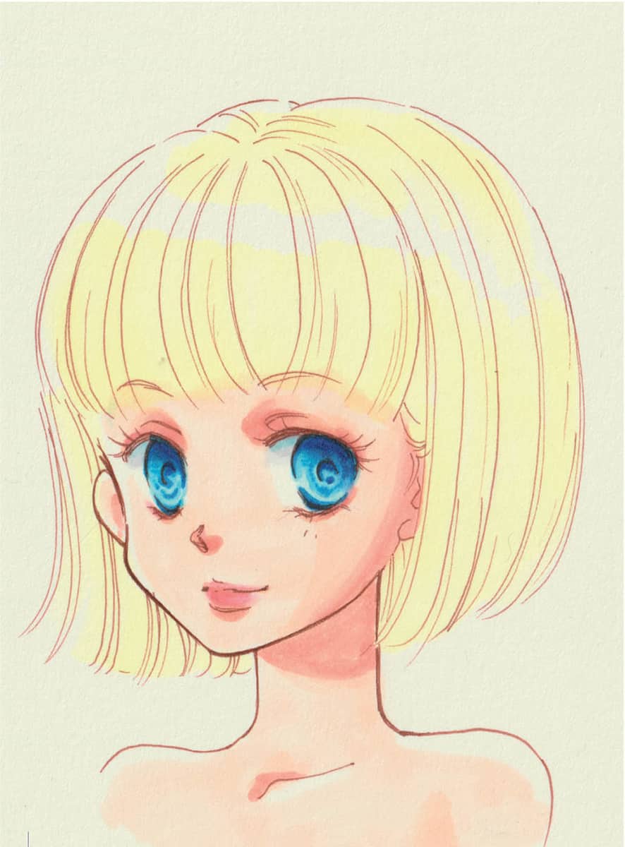
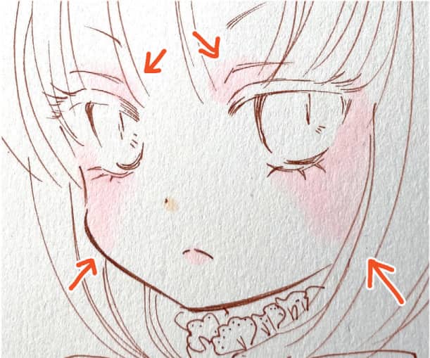
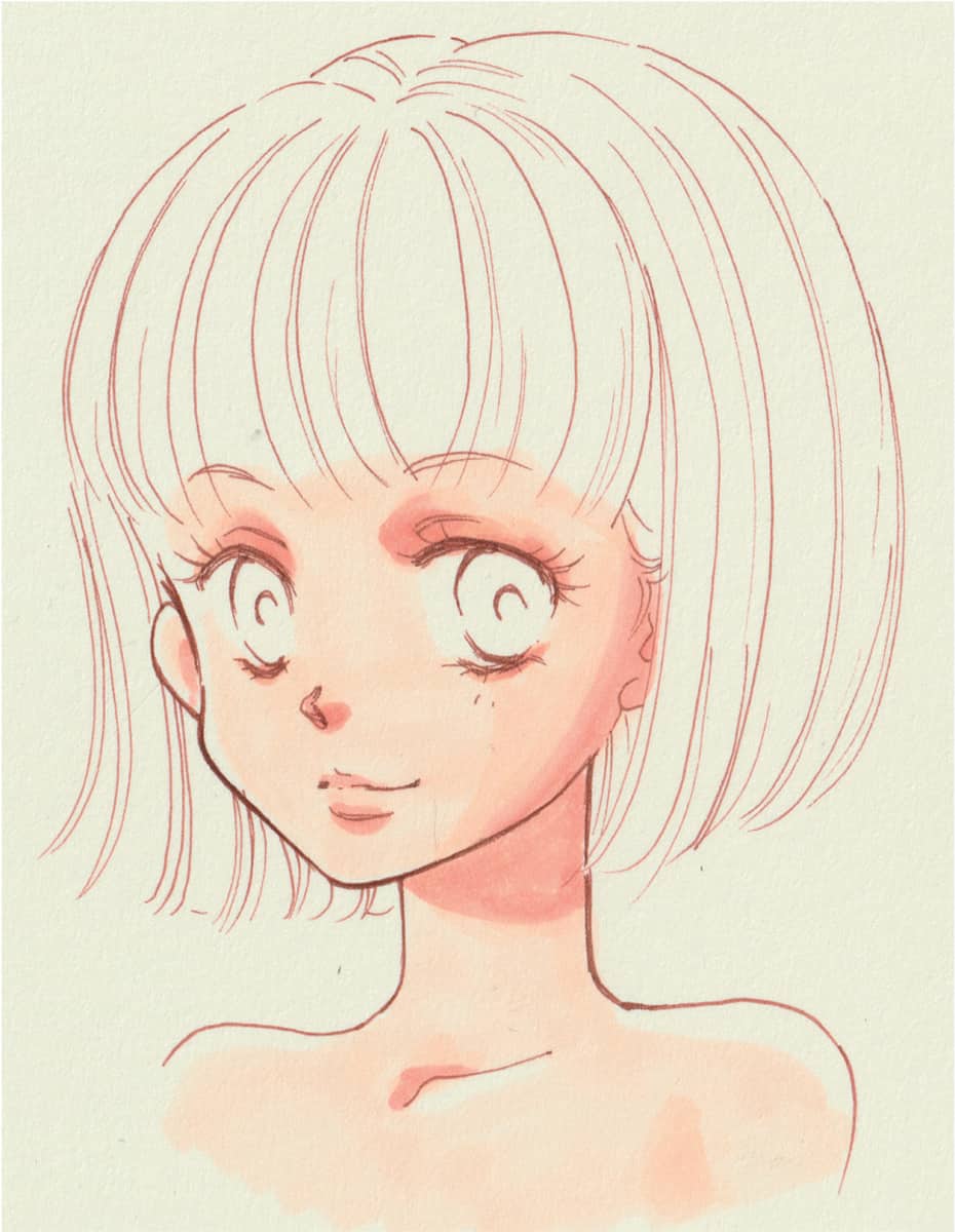
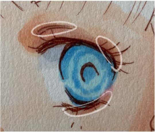
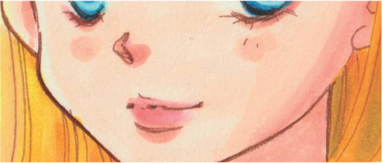
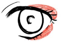
Shading with Copic Markers Light pink blurred with the blender (bottom). Paint the base skin color on top of it. Add the base skin color (basic color). Start with the shadows or darker areas to avoid unevenness. Make sure not to add too much color by checking the whole image. Only color the shadows to make white skin and leave lots of highlights or bright spots. When painting on top, make sure not to rub too much because unevenness is more visible when using dark colors. Accent the darker parts by layering the same tone of paint over them. Parts with darker colors on top of each other. Give some light pink color to the lips and cheeks. Blend it by painting a light color of the same tone or skin color on top of it when needed. Paint lips along the arrows in the picture. Accent the lip roundness by painting the middle of both lips a bright color and fade the color toward the edges of the mouth. Border around the eyelids like drawing eyeliner. It makes the eyes look clearer in the same way as eye makeup. Pink tones are normally used for girls or white-skinned characters, while brown tones are used for boys or dark-skinned characters. Painting the Eyes Paint the whole eyes with light base color. The top half (the part equal to the shades on the white parts) will be slightly darker as it has light shade. Paint the edge of the eyes with the color for shadows of the skin or bordered with a slightly darker color. Red tones are often used for girls and brown or gray tones for boys. There’s a way to draw the iris with dark blue lines, but it’s painted as a cluster here with some lines added with a white pen. To the right is an iris painted with dark blue lines Painting the Hair Paint the undercoat in the same way as the skin. Use a very light color of the same tone for the hair color. Leave the parts where the light shines on top in the same way as the skin. Paint it with yellow for blonde hair. Use yellow because it’s a color that shows less unevenness and is easy for beginners. However, this color makes it harder to show shadows and nuances. Paint the actual hair color on top of the undercoat. Unevenness doesn’t look unnatural if you paint along the hair lines. Spread the base color to blend it. Add shadows considering the light source. Add some shadows along the hair line using dark yellow and orange tones. The strongest highlight hits the top of the head, but since the roots of the hair are so dark, use a darker color and blend it. Use gray tones for shadows because it highlights the lights and darks of the hair color. Use a light brown tone if you have it. Add some highlights with white ink just like watercolor paintings. Add highlights easily with a white gel ballpoint pen, since the lines don’t need a sharp Iri and Nuki. Add highlights on the eyebrow line and in the eyes. It’s an important part as the impression changes completely depending on it. Add some highlights on the higher parts of the face such as cheekbones, the tip of the nose, and lips and finish it by correcting the mistakes. Correct the parts sticking out with white ink.
FROM SKETCH TO COLOR, STEP-BY-STEP
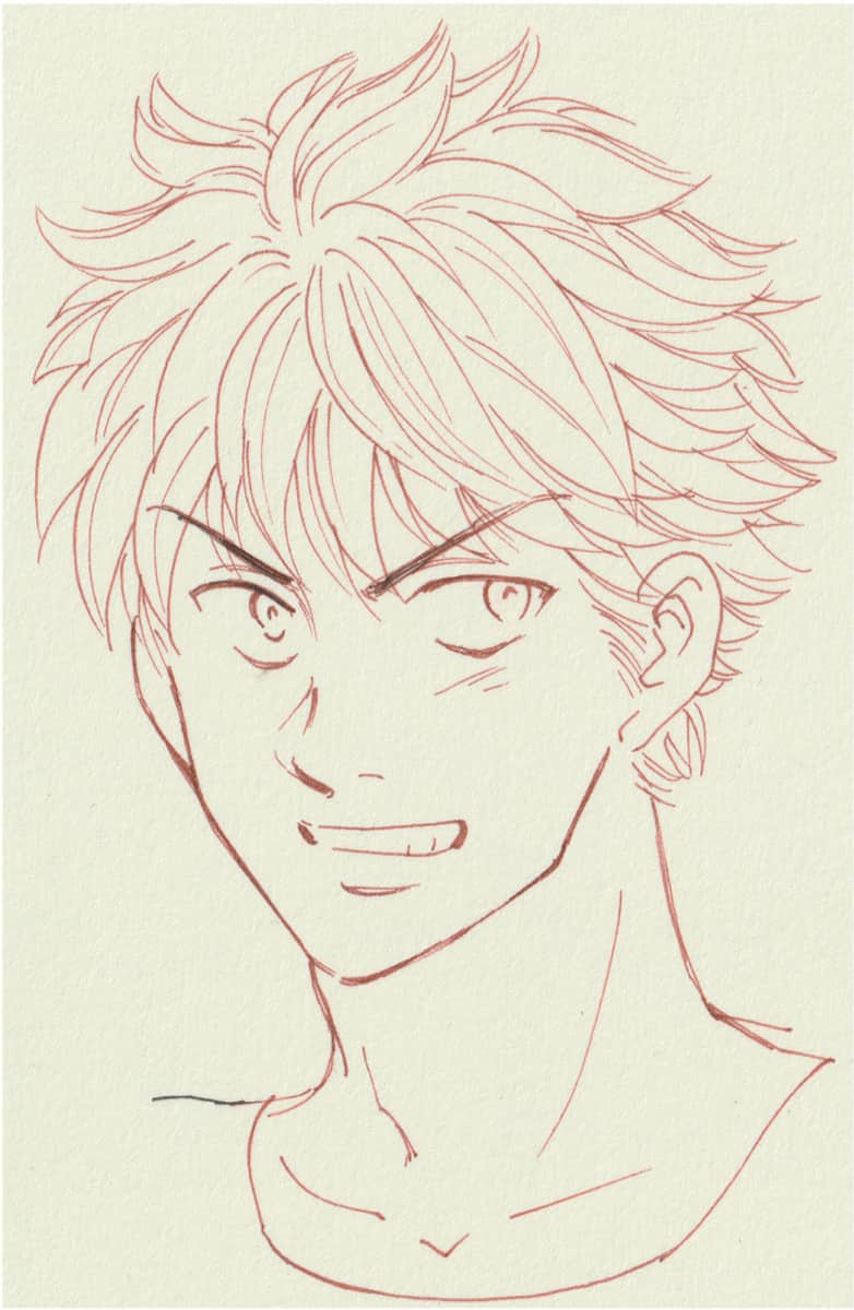
Atari (Rough Sketches)

Pen-ire
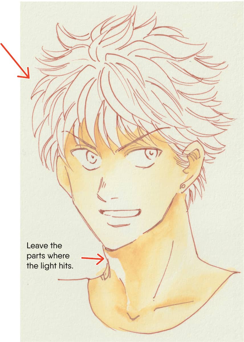
Coloring

Direction of Light

Hair

Eyes
Flow of Hair
![]() Once the base is dry, draw the flow of hair with a slightly darker color than the base. Start with a light color and slowly darken it by repeatedly painting on top of it. Note that you can’t make dark colors light again.
Once the base is dry, draw the flow of hair with a slightly darker color than the base. Start with a light color and slowly darken it by repeatedly painting on top of it. Note that you can’t make dark colors light again.![]() Add some accents with a dark color. Make weaker parts of the outlines clear with the darker brown such as face lines, eyes, or eyebrows. Substitute the dark brown for sepia or dark gray if you want.
Add some accents with a dark color. Make weaker parts of the outlines clear with the darker brown such as face lines, eyes, or eyebrows. Substitute the dark brown for sepia or dark gray if you want.![]() Add highlights on the hair. Add some lines only in the direction where the light shines on top. Imagine the lines clearly by drawing imaginary strokes before adding the highlights with white because you can’t undo them.
Add highlights on the hair. Add some lines only in the direction where the light shines on top. Imagine the lines clearly by drawing imaginary strokes before adding the highlights with white because you can’t undo them.
Finish and Correction


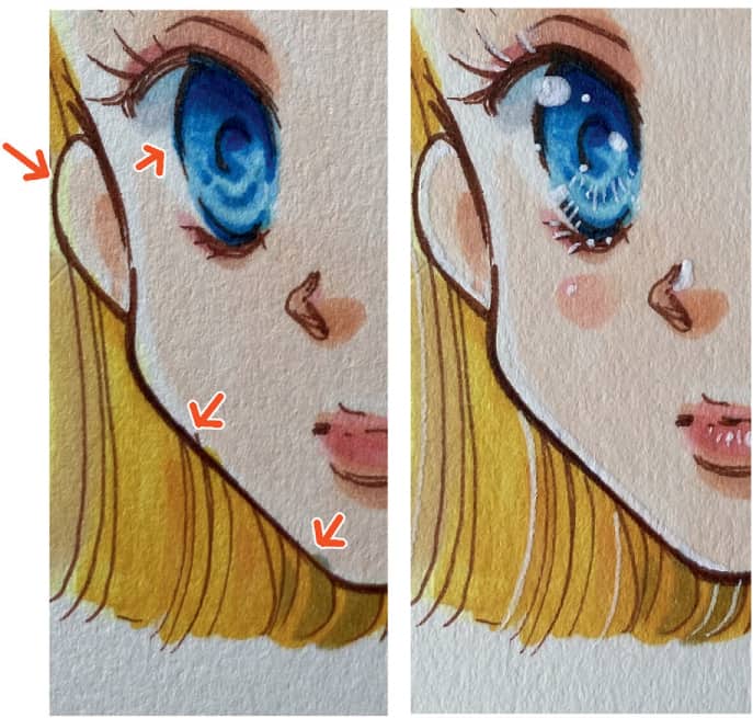
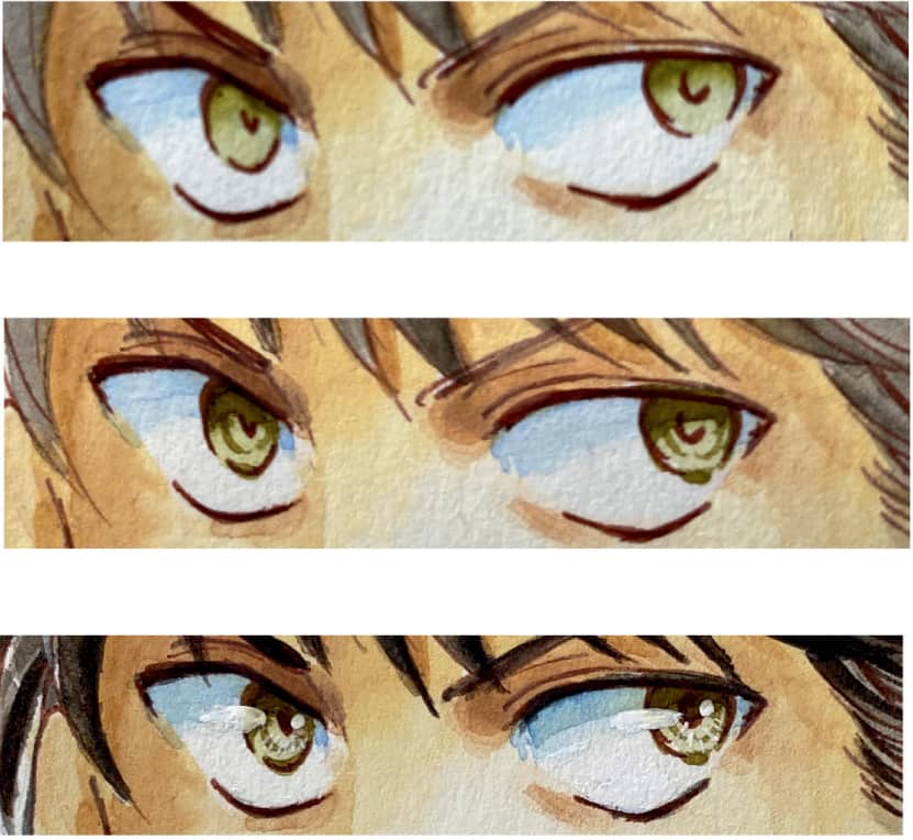
![]() Add light gray or blue on the top of the white part for shadows.
Add light gray or blue on the top of the white part for shadows.![]() Add the eye base color. Darken the color around the edges and leave the area from the center to the bottom lighter.
Add the eye base color. Darken the color around the edges and leave the area from the center to the bottom lighter.![]() Add some lines for the iris by painting the same color on top. Use the tip of the brush to leave parts with light color.
Add some lines for the iris by painting the same color on top. Use the tip of the brush to leave parts with light color.![]() Add dark blue for shadows. Put a dark color on the top and bottom of the pupil, leaving one area a light color. Then spread with light colors. The effect will be smoother by using a light color instead of a blender.
Add dark blue for shadows. Put a dark color on the top and bottom of the pupil, leaving one area a light color. Then spread with light colors. The effect will be smoother by using a light color instead of a blender.