COMPOSITION
A composition is a visual organization of forms into a unified, balanced, harmonious arrangement. Many artists and art instructors rely on intuitive skills to attain successful compositions, and this is fine. However, it is also a good idea to know and review some of the tenets of what really constitutes a successful composition.
Ask yourself: Is there balance in the forms or subject matter within the composition? Do your eyes move freely around the composition? Are there focal points to pull your interest to the composition or to individual objects? Is there a variety of shapes and forms for interest? These are just a few of the questions that will be discussed in this chapter to help you employ successful composition design.

Elements of Composition
The elements of composition are point, shape, mass, volume, texture, value, and color. Let’s talk about them one by one.
Point
A point is a single mark on a page without depth, height, or length. A group of points in a row or an arc can create a line—or at least imply a line. Points used closely together can suggest a three-dimensional object.
Line
Geometry defines a line as an infinite number of points. A line is the earliest tool that most children use intuitively to visualize and represent the world around them. A line represents the building-block foundation of most drawings. Lines can be bold, weak, varied, geometric, organic, energetic, or calm. We discussed gesture and contour line extensively in Chapter 1 (see here).
Line drawings are an integral foundation for all further exploration of drawing; they are the gateway to visual expression in other forms of art as well.
Shape
A shape can also be called a “form.” A shape is usually considered to be an area or object that is either: (a) completely enclosed by lines or (b) perceived as a separate entity through isolation of shape (through contrast of value or color). In the example of positive and negative space, the recognizable shape is the positive shape while the area around the form is the negative shape. This is also called the “figure and ground” relationship. Negative shapes can be just as interesting as positive shapes.

Also called the “figure/ground relationship,” the recognizable shape of the subject becomes the positive shape or form, and the space around it becomes the negative shape (A). Shape can be bold and dramatic, with the negative area around the shape becoming just as interesting as the positive shape (B).

Volume and Mass
While shape usually defines a flat form or area, “volume” or “mass” is the terminology used to describe a form with three-dimensional qualities. Architecture and sculpture are associated more with mass and volume than drawing or painting. However, mass and volume can be inferred on a flat, two-dimensional surface through strong contrasts in value—light and dark—within a drawn object.

The close cropping of the format, along with the high contrast across the form, gives this shell solidity and weight, or mass.
Texture
Texture refers to the tactile quality, actual or rendered, of an object. In a drawing, texture isn’t so much the surface on which we work, but rather the way the artist manipulates the drawing materials to evoke a textural feeling. We work to create a visual depiction of a texture. However, there are certain textural qualities inherent in various paper surfaces that can help facilitate a smooth surface, a mottled surface, a rough surface, or even a wet surface. This is part of the magic that an artist can bring to a drawing for the viewer.

Texture takes on many examples here, ranging from the rough quality of the fabric and the pebbly surface of orange skin to the slick, metallic quality of the vase and the wetness of the sliced orange.
Value
Value is the range of light from white to black, or very light to very dark. Values in a drawing help us determine the direction of the light source and the shapes and structure within a form. Value also helps explain and portray depth in a drawing; dark values appear to advance toward the viewer, while lighter values tend to recede into the background. Additionally, high-value contrast within a form can bring the object closer to the viewer, while low-value contrast makes the object move away from the viewer. This phenomenon is also known as “atmospheric perspective.”

This is an example of high-contrast value, with a range of values from very dark to very light.
Color
An entire book could be written just about color, and many have been! There are a few important basics to know about color. Color is all about light and the way it affects our perception of an object. In two-dimensional artwork, we attempt to portray the effects of light on a form or object through the color mixing of pigments and dyes.
Color has three important characteristics: hue, saturation, and value. Hue is the actual name or family of color, such as “blue,” “red,” or “green.” Saturation, or “intensity,” refers to the brightness or dullness of a color. A pure blue pigment has a much higher intensity, sometimes called “chroma,” than a blue that is mixed with its complement on the color wheel (orange). Value refers to the darkness or lightness of the color. Color is discussed more comprehensively here.
Principles of Composition
A pleasing composition appears balanced and harmonious, with the various elements working together to create an eye-catching scene. There are a variety of ways to achieve a good composition. Over the next couple of pages we’ll discuss several principles of composition and how to use them to achieve a well-balanced drawing.
Unity
Unity is the overarching dynamic that integrates and connects visual imagery into a cohesive and successful composition. The path to unity starts with understanding how different principles of design can help the artist attain unity in a composition. In good composition there should be a feeling of a plan, not a random arrangement of forms.

There is a structured feeling in this photograph due to the combination of flowers, which unify the composition with recognition; however, the variety of shapes, heights, and values add interest to the composition.
Variety
A composition that includes variety is typically more interesting than a rigid repetition of similar shapes. Different sizes, shapes, and values add variety to a composition.
Emphasis
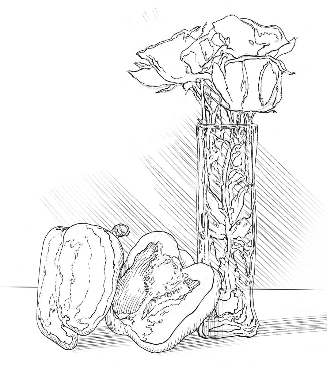
Emphasis in a composition will help lead the viewer’s eye to a focal point, or area of interest. This can be achieved through contrasting values, particularly high contrast (A). You can also achieve emphasis in a composition by using contrasting colors or a combination of hard and soft edges. The focal point of a composition is the best area to use a combination of hard edges, high value or color contrast, and lines or edges that direct toward the focal point. These diagonals or curves are called “directional forces” (B). Emphasis may also be achieved by isolating the focal point from the rest of the composition (C).


Harmony
Harmony is achieved through the orderly arrangement of elements that creates a unified composition. There are various ways to achieve harmony, including the repetition of shapes, values, or colors, which creates patterns for the eye to follow. The term “harmony” is more closely associated with music, but harmony and rhythm in a drawing composition bear similar characteristics: an orderly repetition of elements in a flowing and pleasing pattern.

Harmony in a composition can be achieved with the repetition of similar shapes throughout, such as the strawberries in this image, to tie different elements together into a unified design.

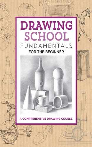
The pattern on the ground plane in this image is accentuated by the placement and repetition of similar shapes around the vase. Pattern can also add to the feeling of harmony in a composition.
Balance
Balance in a composition generates a feeling of equilibrium in the emphasis or weight of objects in relation to one another. Symmetrical compositions are the same on both sides, practically mirror images. Symmetrical balance is also called “formal balance.” In asymmetrical balance, the two sides appear to have the same visual weight, though the arrangement may consist of objects of unequal sizes or weights. Asymmetrical balance is also called “informal balance.”

SYMMETRY Symmetry is the same arrangement on both sides of a strong central form. This formal balance in a composition can sometimes be visually unexciting and seem static.

NEAR SYMMETRY This is a more pleasing arrangement of forms that is still very symmetrically balanced.
Proportion and Scale
In design, proportion refers to the relative size of objects to each other. Scale is another word for size. Scale and proportion are closely related to emphasis and focal point.

ASYMMETRY In general, asymmetry is achieved through equilibrium of objects that, even though they may be different in scale and proportion, are equal in weight.
The Golden Ratio
Also called the “golden rectangle,” this mathematical construction was developed by the ancient Greeks to represent the perfect ratios and proportions on which to base their architecture and design. These proportions have influenced art and design throughout the centuries ever since. The golden ratio is: width is to length as length is to length plus width.

The golden rectangle can be created by rotating the diagonal of the half square (blue).
A variation on this becomes the “true golden mean.” By adding a square to the long rectangle, another smaller—but proportional—rectangle is created. This process can be continued infinitely, if desired, and the resulting smaller perfect proportion will always be the same.

Many artists, designers, and architects believe that the convergence of increasingly smaller squares in this variation of the golden ratio creates the most desirable area of focus in a composition.
Rule of Thirds
A simplified and equally effective mathematical formula for locating focal points is called the “rule of thirds.” This rule divides the format into nine equal divisions with two equally spaced horizontal lines and two equally spaced vertical lines. The points at the convergence of these lines, as well as the lines themselves, are effective locations for guiding the eye successfully around the composition. Aligning a subject along these lines creates more interest, balance, and energy than simply centering the subject or randomly placing it in the composition.

Many artists and photographers use the rule of thirds, an effective and simplified formula for successful focal-point placement. The rule of thirds divides an image or subject into nine proportional segments. The points at which the lines converge are effective focal points.
YOUR HOMEWORK

Your homework for this chapter is to create a flower arrangement—using either real flowers or synthetic—and place them in a vase or hang them from a string or wire on the wall in front of your drawing board.
Start with an overall gesture drawing quickly executed with light line (preferably using an H or HB pencil).
Block in the entire still life in 15–20 minutes as you continually move around the gesture drawing, defining the forms with a line that is still lightly drawn, but a bit more refined.
Finish the drawing with a weighted contour line using a darker graphite pencil, such as a B or 2B, or both.
EXERCISES FOR PRACTICE

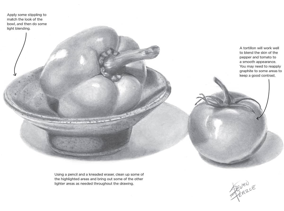
With very light lines, draw the simple shapes that make up the composition. The pepper is a slightly oval ellipse, and the tomato is round. Define the shapes of the pepper, bowl, and tomato, including the stems and some of the more prominent shadow and highlighted areas.

Identify and draw in the darkest-value areas of the composition using a 4B or 6B pencil.
Using a 2B pencil and an HB pencil, mostly with hatch strokes, follow the curvature of the stem of the pepper and the stem and leaves of the tomato.

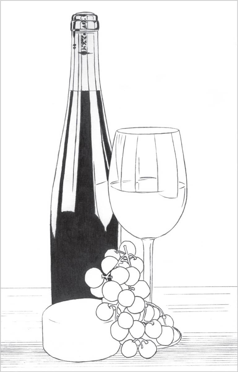
Wine & Cheese
This classic still life setup is great practice for drawing a variety of textures, including glass, wood, and the smooth skins of grapes and cheese. In this lesson, we’ll also learn how to bring out reflections and shade evenly.


STEP 1 Begin by drawing an outline. The drawings that follow have much darker lines for demonstration purposes; draw your outline very lightly. It is easier to darken the lines later in the drawing where needed than to erase to make them lighter.
STEP 2 Start on the wine bottle using a 4B pencil to establish the darkest values of the drawing. Use a circular motion and then burnish over it with a 2B, which gives a rich, dark tone. When drawing a large area like this, be very patient to create an even tone. You may need to reapply the 4B in some places.

STEP 3 Now work on a couple areas below the fill line of the bottle. On the far left edge, use a 2B pencil to create a slightly lighter tone, followed by light blending with a tortillon. The reflection just to the right is lighter, so use an HB followed by light blending with a tortillon. On the far right edge of the bottle, use an F and blend the same way. For the top of the bottle, above the fill line, use F and HB pencils for the darker and lighter tones, lightly blending with a tortillon. Leave the white of the paper for the highlighted area.

STEP 4 For the small reflection of the wine glass on the bottle, use a 2B and burnish with an HB. Above this area, use a 2H and blend lightly with a tortillon. For the two slightly darker vertical lines in the reflection, simply draw them using the graphite on the tortillon.

STEP 5 Use a 2B pencil on the wine glass because you want it to be slightly lighter in tone than the bottle. Then burnish using an HB. Use the 2B as well for the small dark areas where the stem connects to the glass.
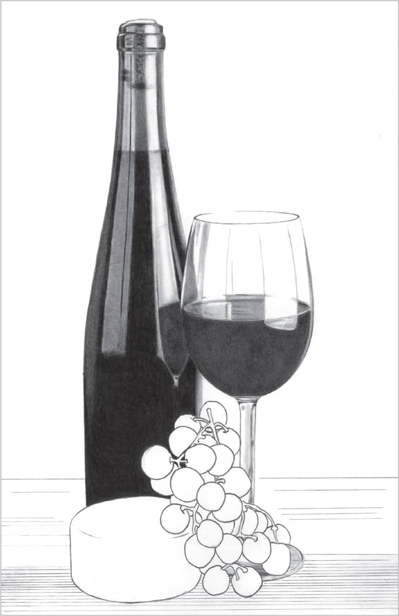
STEP 6 Use F and HB pencils for the lighter details of the upper glass, over the surface of the liquid in the glass, and on the stem. Then blend lightly with the tortillon.

STEP 7 For the grapes, use 2B and F pencils to create the light and dark areas on the fruit and stems. Use a circular motion, keeping it loose in areas where you see interesting texture. Lightly blend with a tortillon, trying to save some of the delicate texture on the grapes. Notice that a few of the grapes around and above the cheese show some slight reflected light from the cheese.

STEP 8 Darken and thicken the wood grain on the table with a 2B pencil and lightly blend with a tortillon. Use a pencil eraser to lighten areas in the wood grain and create the appearance of knife cuts in the wood. Also using the 2B, add shadows on the table from the cheese and grapes. Lightly shade the cheese with an F and blend with a stump in the shadow areas. You can also use a stump with graphite to achieve a similar result. For the background, use 2B, F, and 2H pencils to shade. Then use a stump and facial tissue to blend. Using my kneaded and pencil erasers, bring out a few subtle areas of reflection on the bottle and glass.
Onions
This simple setup against a clean, crisp background is perfect for beginning still life drawing. These onions are very basic in shape, and their smooth, subtly grained skin is ideal for practicing both hatching and blending.


STEP 1 First sketch an initial outline. When you’re happy with it, transfer the outline onto the drawing paper. Next establish the darkest areas on the two whole onions. Use a 2B pencil with the linear hatching technique, lifting the pencil at the end of each stroke and tapering toward the lighter areas. This will make for smooth transitions of hatch marks when using a harder pencil for the lighter areas. Follow the shape of the onion with your lines.

STEP 2 Again using hatch marks, use an HB pencil to go over the graphite you’ve already applied and move outward, creating slightly lighter areas of the skin and lifting the pencil at the end of each stroke. Use the same method with your F pencil for the lightest areas of the skin. With an HB or 2B, make small dots and irregular lines to create imperfections around the highlights and lightly shaded areas of both onions, as well as the root end of the onion on the right.

STEP 3 The skin on the cut onion appears much smoother and lighter in value. Use an F pencil and hatching strokes to follow the curves. For the slightly darker areas, use a light touch with an HB. Use the HB or 2B to work on the root end. Use a tortillon with a light, circular motion to blend the two back onions. Use the same light, circular motion to blend the skin of the cut onion. Pay close attention to the gradual transition of tone toward the highlighted areas or white of the paper. Use your kneaded eraser and the sharp edge of a cut pencil eraser to lighten these areas as needed.

STEP 4 Re-draw the rings of the cut onion using an HB pencil and lightly blend them with a tortillon. You can also use the graphite on the tortillon, or apply graphite to the tip, to create the light shading around the rings.

STEP 5 Create the light and dark areas on the parsley leaves using 2H and F pencils. Use the sharp edge of a cut pencil eraser to make the veins of the leaves. Then add the shadows with a 2B for the darkest areas, fading them out with my tortillon. You can also use the graphite on the tortillon to create the shadows around the leaves. Finish by cleaning up smudges around a drawing with a kneaded or block eraser.