INK LINE & TONE APPLICATION
This chapter will discuss techniques and tips that make the entire ink drawing experience a more pleasurable one—for both the beginning student and the seasoned professional artist. Drawing with ink does not have to be the dreadful experience that some believe it to be. With a few adjustments to the viscosity of the ink—and practice with a variety of pen nibs—ink can become as comfortable a drawing tool as graphite. Ink can create a bold statement of the highest contrast; yet it can just as easily generate the lightest, most delicate washes possible in a variety of gradations. Again, as always, practice in this medium is the key to consistent, successful drawings.

Ink
Aside from carving in stone, ink is probably the most permanent of art media. Permanent India ink lasts as long as the paper on which it is drawn. This permanence can be intimidating for artists of any skill level; however, it does not need to be.
Ink has been used as a communication medium for thousands of years, and its versatility in print and the world of art makes it a medium that any artist should attempt to be comfortable with. It takes patience and practice to work successfully with ink, but the results are well worth the effort.

Organic subjects like this collection of exotic dried flowers are ideal for the beginning student’s introduction to ink line drawing. Hard edges and straight lines can be avoided and replaced with long, flowing organic lines that offer the opportunity to gain confidence with the medium.
A common misconception about ink is that it is too heavy and black and difficult to draw with. Try diluting black India ink with a ratio of approximately 3 or 4 parts ink to 1 to 2 parts water. Part of an ice cube tray works well as an ink reservoir when using a diluted mixture, as the depth of the well allows most of the pen nib to be submerged into the ink.

Adding water to ink directly out of the bottle gives it more flow, but won’t dilute it enough to affect its velvety black appearance.
The smaller the pen nib, the finer the line will be. To achieve very light lines for gesture drawings, simply add more water to the mixture. Try using a larger nib, such as a B3, to sketch in gestural preliminary drawings; rounded nibs tend to flow across the paper, as opposed to fine-point nibs, which can be “scratchy” in a quick sketch. Save finer points for detail line work toward the end of the drawing.

Even a small selection of nib sizes and types can produce a variety of lines and mark-making.
Ink Line Mark-Making
It’s important to understand the different types, sizes, and uses of a variety of ink nibs and points, which can create a multitude of marks on paper. Using a variety of different line weights and line textures will make any drawing more interesting and compelling. In this student piece, notice the detail of line-weight variety and mark-making employed.

Student drawing by Christie Tseng.
Creating Tone with Dots
One way to create tonal variation in ink drawing is with a technique called “stippling.” To stipple means to create tone out of an accumulation of dots created with the point of a pen. To create a true dot, the pen nib should be held completely perpendicular to the paper, depositing the ink as a point without dragging it into a line.


Above is an ink stipple value scale. A variety of values can be accomplished by adding more dots of ink placed closer together or by changing the size of the nib to create larger, darker dots.
Creating Tone with Line
Creating tone with ink can also be accomplished with line, or linear mark-making. The line can be hatched (one direction), crosshatched (multiple directions), or scribbled to create tone.
Creating a value scale with linear marks is a vital way to understand how to add techniques to an artist’s “toolbox” and create interesting and complex drawings.
This type of tonal application can be employed for a variety of subjects, including still lifes, portraits, and architecture. The combination of crisp, clean ink marks with a variety of subtle-to-strong application techniques makes this linear mark-making a versatile way in which to build a successful value drawing.

This student’s architectural drawing incorporates line and value with ink nibs and brush. Time: 12–15 hours.

Create a line value scale using hatching and crosshatching with various ink nib sizes for value development from light to dark.
Creating Tone with Washes
Another way to create tone with ink is to dilute the ink in various shades of gray, from very light (lots of water) to very dark (less water), and apply the resulting washes with a brush.
The types of brushes most often used for this purpose are very soft and absorbent natural-hair brushes, such as squirrel or beaver. (The hair for these brushes is humanely harvested, and the brushes are inexpensive.)

An example of four washes used in an ink line drawing. Time: 1 hour.
Brush quality is important, as the chemical constituents in ink can be harsh on brush fibers. Avoid using expensive brushes with this technique. As is the case with any tonal technique, it is important to first create a value scale in order to get a feel for the appearance of the ink wash and its application.

Experiment with the water/ink ratio until you achieve four distinct values from light to dark. With four washes, plus the white of the paper and the straight black ink from the bottle, you will effectively have six different values to work with.
YOUR HOMEWORK
In this homework exercise, you’ll have the opportunity to practice all the elements that we discussed in this chapter. Gather two to three different types of flowers—real or artificial—and bundle them in a vase or hang them on a wall with fishing line. Use a single light source for illumination.

Create a light gesture sketch, followed by a contour line drawing. Add a tonal wash application of four distinct values, from very light to very dark, with a brush. This exercise should take 90 minutes to 2 hours to complete.
EXERCISES FOR PRACTICE

Giulio Campagnola first used stippling, or pointillism, in his engravings during the 16th century. Pointillism was recognized as a distinct technique during the 18th century, when Post-Impressionist painter Georges-Pierre Seurat popularized it.
Stippling involves applying black dots to a white surface to create a pattern that determines values’ tones and thus represents form. Dots can be used to represent textures through variations in light and temperature. With less intense dots, the shape of an object is made clearer.
How to Work with Stippling
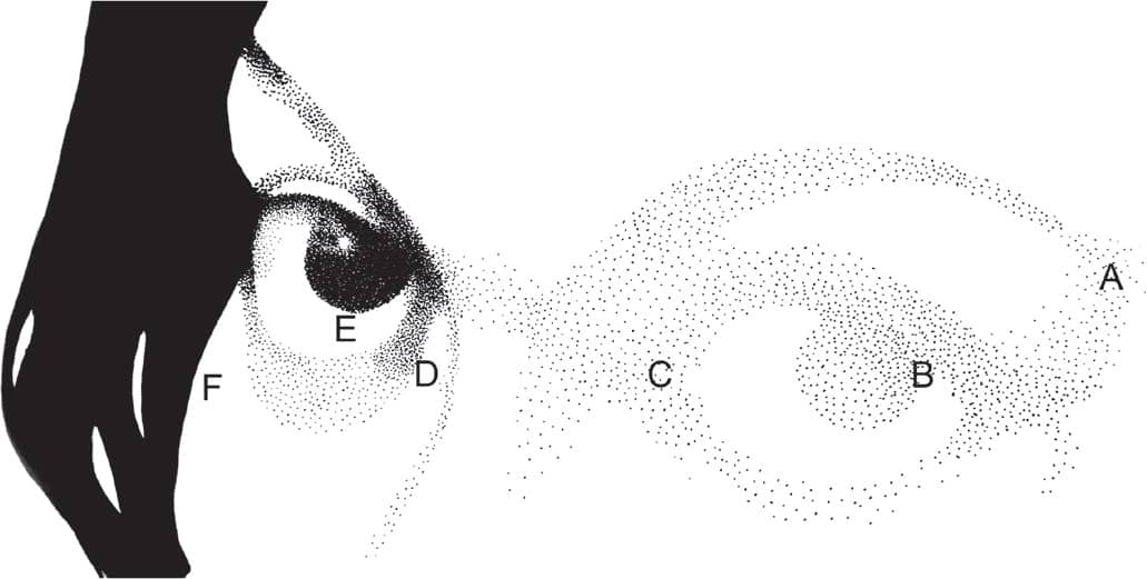
For your first exercise, create a grayscale drawing to use as a reference. Use a pencil to sketch it out, and then add dots with a pen. It might help you to use two reference photos: one with many variations in lighting and one with fewer. View the reference photo on a light table, and map out the grays with a soft pencil, such as a 2B. Place your reference photo near your drawing, and notice how the light falls on the object(s) in the photo. If we assume that the white paper is the high key (light tones with little contrast) and the black pen is the low key (darker tones that offer a great deal of contrast), then the dots’ closeness will be used to form a medium-gray color.
Start by drawing a pattern of gray, and then add more and more dots to create the darker areas. The idea is to fill the entire surface of the paper to create the shape of the object. Avoid placing dots too fast and without control. Stippling requires a great deal of concentration and discipline.
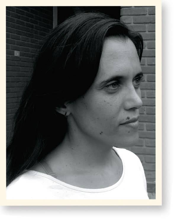
A Portrait of a Woman
This reference photo presents the subject from a three-quarter angle. She stands in a relaxed position, and she is naturally lit.

STEP 1 Sketching the piece first helps you isolate the light sources on the model’s face. A light table can make the sketch more accurate.

STEP 2 First, the dots are distributed all over. Study the gray values in the photo as well as its background, determining which spots are dark and light, and notice the negative space. Once the light source has been determined, add more dots to choose a counterpoint in the image, which is the center of the face in this case. You can reduce the light’s intensity by placing the dots closer together in darker areas.

STEP 3 Once you have chosen a counterpoint, draw the dots closer together in the background. The background should be darkened to highlight the woman’s face. Her hair is black, and it can be merged with the background. Draw the hair, and determine the light values in it.

STEP 4 Add more dots in the background and hair, and increase the light intensity in the model’s face. Then start building details like the eyes, nose, and mouth.

STEP 5 To form a counterpoint to the light areas on the subject’s face, more dots can be added to her chest, making her face the primary focus. The chest should be lighter than the background and not as detailed as the face.

STEP 6 Now draw the details on the face, making the eyes the main focus and the hair their counterpoint. The hair should be less detailed than the eyes so it doesn’t draw attention away from the face. Create the hair as a gray mass without drawing each strand of hair. There’s no need to add details to the hair. The viewer will know what it is, and the focus should stay on the woman’s face. To isolate the three key elements in the artwork (the subject’s eyes, the top of her head, and her hair), build a “frame” that will draw focus to the woman’s eyes. Add light below the eyes and to her jaw and neck, and give the hair more weight as a counterpoint to the light values in the face.

STEP 7 In the final drawing, you see the diagonal line going from the bottom left to the top right, dividing the weight of the drawing. The hair is on one side and the face is on the other, and the light values in the forehead direct the viewer’s eyes. The negative space of the subject’s shirt creates a balance between the upper and lower halves of the drawing.
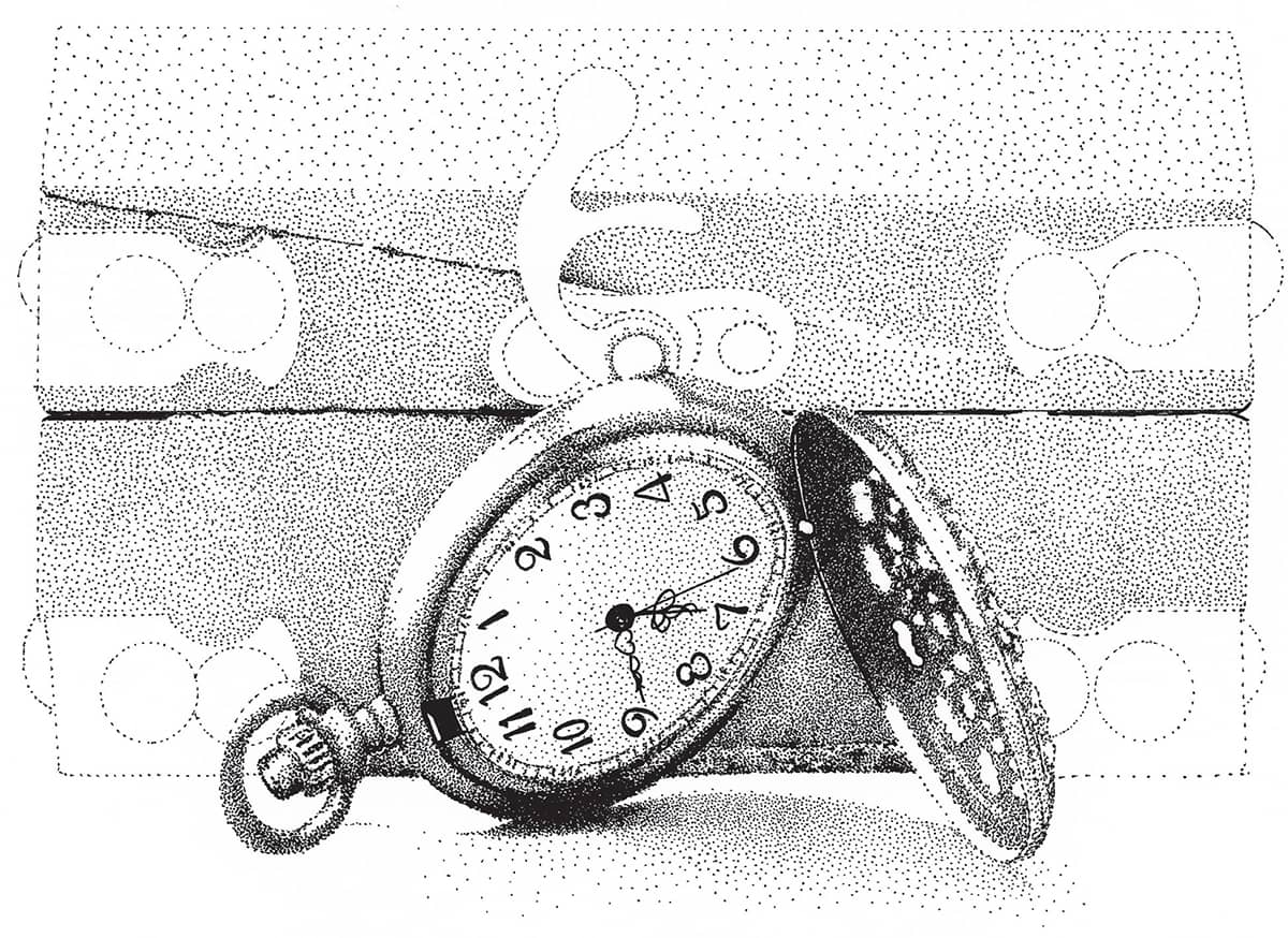
Still Life
This piece provides an excellent opportunity for studying the light and texture in various objects. First do just a quick sketch of all of the objects. The idea here is to play with the different textures in the scene.

STEP 1 Using a light table, outline the objects with dots. Mark the direction of the light and where its shadow lays. Adding numbers to the pocket watch makes it the focus of the piece.

STEP 2 Begin distributing dots throughout all of the objects without drawing the background. Notice the pocket watch’s light values and metallic texture.
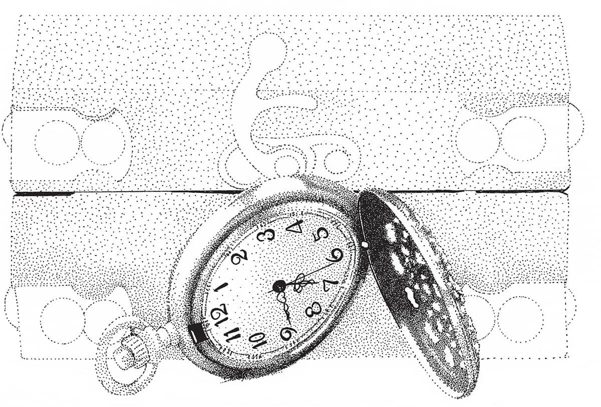
STEP 3 Now work the pocket watch into the foreground and distribute the dots to add volume and texture. The open cover serves as the light’s counterpoint and creates balance and shadows in the pocket watch.
STEP 4 Now turn your attention to the small chest, distributing dots throughout. The pocket watch should remain the focus of the piece, so work to create a balance between it and the chest.

STEP 5 Starting in the middle of the chest, work in its texture and light absorption values. Then add the same texture to the upper portion of the chest.

STEP 6 Two layers of dots are added to the chest: a shaded layer and a textured layer.

STEP 7 The top of the chest doesn’t need the same texture, and its lighting can be more diffused. The focus should remain on the clock; the chest needs fewer details.
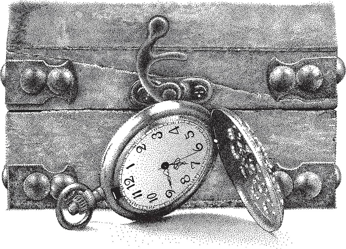
STEP 8 Add dots to work in the chest’s metal parts without drawing many details; just read the texture. More shadows are added to the clock and the surface beneath it to finish the piece.