Materials

I have drawn and painted on site for the last 30 years. In the early days, this was mostly in my sketchbook, but in the last decade, I have shifted to using an easel—this has made my work move in ways I never intended. It’s a whispered truth from one artist to another, typically starting with the phrase, “When I began to go outside...”
You don’t need a sports car to get from point A to point B. It may be quicker and more luxurious, but in the end you still arrive in the same spot taking a bus. That said, and the same is true with art, your materials should be the best you can afford. However, you should also be aware that just because something costs more, it does not mean it will perform better.
Of more importance is understanding what you need for your outing and how to leave things you will not use at home. Some painters use their cars as a mobile studio and, therefore, the need for caution on what to carry is less important, but if you are setting out on foot to explore, you will be carrying your materials all day. This is when planning and an understanding of just what you will need is essential. The following is a list of my personal must-have tools.
Brushes
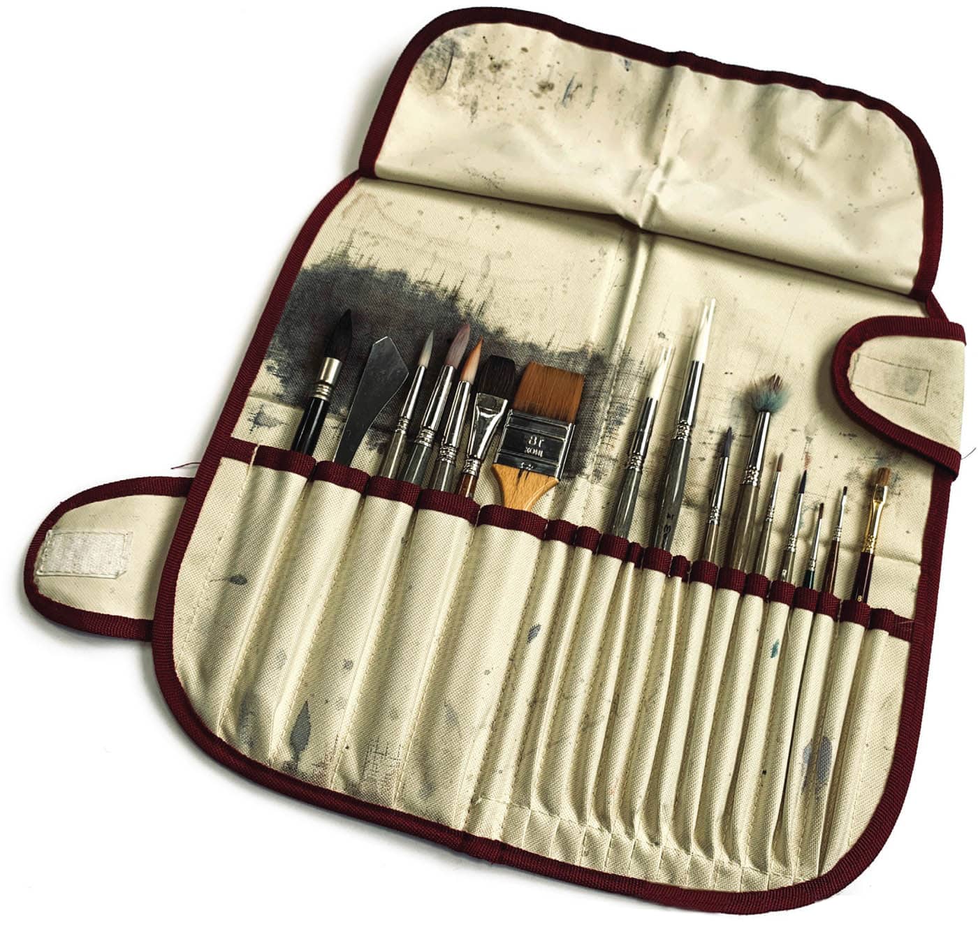
We all have certain favorite brushes that we find work well in different situations. I use synthetic fibers, as I have found over the last few years that their quality, durability, and cost have made them as effective as their natural counterparts. I am also extremely rough on my brushes, so I have to replace them every few months—this can get costly. I use an Escoda® Ultimo #14 mop to begin with, and then turn to smaller brushes as I move through the painting. These include Escoda® Perlas #14 and #10 rounds, which have very fine points that allow for more detailed work. I also use a few flats, a mottler, and a palette knife.
As you paint more regularly outside, make a note of the brushes you use and those that come back dry. If you go on three or four outings without using a particular brush, leave it at home next time. When working outside, I tend to paint on a quarter sheet or smaller; these small brushes are up to the task of that page size. If I go larger—so do the brushes.

Sketchbook
I use Stillman & Birn™ Alpha series hardbound sketchbooks in a few different sizes. There are many choices out there and I’ve given most of them a try, but I always find myself coming back to one particular book. Find what works for you and use it.
Paper
I typically use two or three different papers:
Saunders Waterford® 140 lb. — This paper is somewhat delicate, so scraping and lifting requires a subtle touch. It is my “go to” paper in most situations and is especially suited to more moody paintings.
Stillman & Birn™ — I purchase my sketchbook paper from the manufacturer. I find painting on the same surface to be quite freeing, as the transition from sketchbook to easel is more sympathetic.
Fabriano® Artistico 140 lb. Rough — Compared to Saunders, this paper has a very slick surface and can be used to make nice long brushstrokes. It works well wet-in-wet, and it can take multiple washes.
Paint

I highly recommend using artist-grade watercolors, if possible. The quality and intensity of pigment are far superior to student-grade paints, and the difference is quite noticeable. You will have to use much more student-grade paint to match the power of higher- quality pigments.
I typically use paints from Daniel Smith®, Winsor & Newton®, and Holbein®. There are other manufacturers out there, such as Schminke®, Sennelier®, and M. Graham® that also produce fine paints. Depending on where you live, certain brands will be less expensive. My advice here is to use what is readily available and cost-effective for you. My palette is fairly limited, as I find that I can mix most colors I need if I have a well-balanced selection, plus some hues nearing the primaries.
Key
DS = Daniel Smith
WN = Winsor & Newton
Cobalt Blue |
DS |
French Ultramarine |
DS |
Burnt Umber |
WN |
Neutral Tint |
DS |
Sodalite Genuine |
DS PrimaTek |
Burnt Sienna |
WN |
Light Red |
WN |
Imperial Purple |
DS |
Permanent Alizarin Crimson |
DS |
Cadmium Red Scarlet Hue |
DS |
Raw Sienna |
DS |
Cadmium Yellow Medium Hue |
DS |
Cadmium Orange |
DS |
New Gamboge |
DS |
Green Gold |
DS |
Undersea Green |
DS |
Ultramarine Turquoise |
DS |
Cobalt Teal Blue |
DS |
Specialty colors (not in palette) |
|
Naples Yellow |
DS |
Lavender |
DS |
Hookers Green |
WN |
Chinese White |
DS |
Quinacridone Rose |
DS |
Titanium White Gouache |
WN |
Naples Yellow Gouache |
WN |
Cadmium Red Gouache |
WN |
Palette
I used to have a nice Italian palette that I put custom wells in, but eventually it rusted. Today I use a Craig Young Paint Box. This is a brass palette and will not succumb to the same fate. I also use a Holbein steel palette in the studio, which transfers to a to-go palette well. For students, I suggest a lightweight Avlin® Heritage™ palette with gaskets. They work well and at under $20, they will not hurt your budget.
For many people, the question of palettes gets a little murky. A palette is like an old friend—it makes all the journeys with you. When I realized that my little Italian job was not going to make it anymore, I bought something I knew would last. Go with something like the Alvin and if you find it limiting, or you feel the need to upgrade, then do so.
I painted in my studio for almost 20 years using a porcelain plate with the colors spread like a color wheel around the rim. It worked extremely well until I decided to go outside. When I did that, I used the old Winsor & Newton steel palette my father bought me in Edinburgh when I was twelve. It still works.
It is essential that you prepare your palette prior to taking it outdoors. I fill my palette at least a day in advance and allow it to “set up” overnight so the wells are not full of semi-dry paint. Ideally you want to be able to hold your palette upside down and even shake it with no movement of the pigment. In reference to the “never clean your palette” clan, I will often go for a few days between real cleanings. The only time I clean mine extremely well is when I am going to use very light yellows or have used a lot of green. On a side note, learn that there can be some terrific grays hiding in the corners of a dirty palette!

Easel
There are many setups and differing opinions about what is most effective, but the best easel is the one that works well for you.
When working outside, for many years I balanced my sketchbook on my lap before graduating to a watercolor block. Several years ago, I decided to take the leap and buy an En Plein Air Pro easel and accompanying tripod (first generation). I still use it, but I’m always trying new things and playing with options.
The latest member of my easel family is the Marshall™ Field Gear painting box. It’s handmade by a good friend of mine. I especially like the sliding shelf that supports my palette and gear at the same level as the painting surface, so there’s no reaching down for water or mixing color, etc. This is more in tune with my studio setup making the jump to painting outside much easier.
You will need a proper easel setup to get outside. The trick is finding or creating the one that works best for you. The real question is always weight versus convenience. Remember: You have to carry these things around—sometimes for much longer than you expect!
Studio Setup Versus Plein Air Kit
I try to keep the transition from field painting and my studio as seamless as possible. That means that I buy three of any tool I use and keep them in each bag and one for the studio. The only things that move from spot to spot are my sketchbooks, field paintings, and palette. Everything else stays put. If you are on a budget, this can be difficult. But if you can replicate your working conditions both onsite and in the studio, it will allow you to focus just on painting.

Tripod
Find the best quality light tripod you can for your budget. Read reviews and see if it fits in your bag. Don’t be afraid to bring your entire painting kit with you and set up in the camera shop before buying one. I’ve had many interesting conversations doing just that.
Other Gear
Find a comfortable bag that neatly keeps all of your gear in one spot. This may require an awkward trip to your local camping supply shop (similar to the tripod situation), but it is a must. Your bag should be something you can carry comfortably for a long way. Consider weather and water resistance. If going for a messenger bag, see how it feels on both shoulders. I use a laptop messenger bag that has been all over the world with me.
Everyone has their own system. The more you paint outside, the more you will customize your equipment to suit your own needs. The following are my extras:
- a few specialty colors with me that won’t fit in my palette
- two Alvin collapsible water containers
- a small spray bottle
- lots of paper towels
- a sponge for drying my brush
- pencils of a few weights
- an eraser (only to be used in emergency)
- a pencil case
- six or seven quarter sheets of paper
- a stretching board
- drafting tape (1 inch)
- sunscreen and bug spray
- brimmed hat (a must)
I drink from the same bottle I use to fill my water containers and keep all of this in a convenient place. Did I mention resealable plastic bags? Anything that gets wet goes inside of one.
A piece of advice: put your kit on a diet. Choose a few brushes and carry only as much paper as you think you can reasonably use in a day. All those extra little things add up, and your back will conveniently let you know when it’s time to pare down. Listen to your spine. Leave the kitchen sink at home. I see so many people setting out as if they are on a Lewis and Clark-style expedition. This is not who you want to be!

Entering the Great Outdoors
Watching someone set up their gear says more about a painter than any introduction. Are they organized? How many times have they done this?
If the public nature of what you are doing makes you uncomfortable, consider that almost everyone watching you wishes they could be doing the same thing. My favorite city to paint en plein air is New York. I could paint wearing a tutu and bright red welly boots and no one would notice, let alone say anything.
Find your spot
I like to walk casually, waiting for something to catch my eye. Typically, I take pictures along the way so I know where certain subjects are should I choose to return. Also, the first rule of painting outside is knowing what the sun is going to do. A shadow on the ground cast from a vertical object will point directly at the sun. Think sundial here. Your light source and its intensity will affect everything in a scene. Colorful areas against a bright backdrop will turn neutral. Conversely, intense light on a surface will blanche color considerably.
My goal is to find the point at which the light and shadow cast on or near my subject tells the story of the scene. I use color against mixed grays to allow them to pop and move the viewer through the painting. When thinking about light and color, if we begin to understand each in terms of how they affect mood and atmosphere, then we are beginning to see through the artist’s eye. Don’t get confused by color versus value. They work the same way. As you paint, the mix will become thicker as you approach your real darks. Understanding the consistency of your pigment-to-water ratio is at the heart of learning value and color.
My procedure, once I have located a subject, is first to determine the location I should paint from. Look at pedestrian patterns if you’re in a city and, ideally, find a shady place where you can paint in peace. I do a lot of painting in Europe and I try to stay out of the way.

Two photographs of my palette: one in color and the other in grayscale. It’s of utmost importance that you do not “see” color as only a shift in hue. You need to understand that colors have value or tone, and you should use that to your advantage.
Also, look behind you. Quite often you will find that you may be setting up where a delivery van or something similar will require you to move. It happens, but with practice you get better at judging how a space is utilized.
Typically, a lighting effect or architectural element will catch my eye, and I will stand for a few moments taking pictures and looking at the surroundings for good spots to paint from. Once I’ve made my decision, I move quickly. I set up my tripod, easel, and gear. If in a city, I loop one of the handles of my bag around my leg to deter bandits. Then I’ll do a very quick value sketch or two to determine the best composition. This also allows me to begin the warm-up process.
Warming up is essential
Once I’ve settled on a design, I begin working quickly. However, I always take a photograph from my exact vantage point first. You never know how quickly light or weather will change.
Going at a sheet of watercolor paper without sketching is akin to running without stretching. Working when warmed up is essential.
Think about where your arm is moving from as you work. As I begin a layout drawing I hold my pencil (an F lead) overhand and work from my shoulder. This allows my full body to be engaged in the layout drawing.

At this point, I am looking for the big shapes/ gestures. I sketch them in lightly so that I will not be forced to crop the drawing. Once I have placed the major elements in the composition, I will give it another look. If I’m pleased, I move on. I then begin to refine the drawing, flipping the pencil to a more traditional grip and working from the elbow. I may switch pencils at this point to an HB. On watercolor paper, I do not use anything softer than HB. I try to keep my focus on the subject, being careful not to include elements that will compete against it. I have no problem moving trees, cars, or anything that gets in the way of how I want to convey my feeling of being in that particular place. I continue this movement from joint to pencil grasp as I progress through the drawing. Think about how much movement you have at each joint I mention: shoulder, elbow, wrist, fingers. If you work in this manner you will avoid becoming too detailed before you are ready. The same is true for brushwork.
Once the drawing is complete, I move immediately to the painting. I work understanding the environmental conditions I am in. If it is very hot, I have to work with more water, as well as faster, etc. The more you work outside, the better you will become at adapting to atmospheric conditions.
TIP
Painting and drawing on location takes time. The light is going to change and the weather can turn without warning. As a rule, I tend to draw in my shadow lines so that I remember where they were. It’s quite common to “chase shadows”—meaning you draw what you see when you see it, or worse, paint shadows that have moved.
Painting the light
In my work, I paint with the understanding that the light is there from the beginning. It is my goal not to lose it, so I work from light to dark as most watercolorists do. I do not worry about painting through a portion of the scene that will be covered by a darker wash later in the painting. This is the nature of watercolor. We move from light to dark.
My first task is to decide how to express the light and how to choose the proper color palette to best suit the scene. The decision is based on lighting conditions on site, and whether or not I wish to exaggerate or change the direction of the light to create a composition that I find more pleasing.
Using a weak to medium variegated wash, I move down the paper painting around only the areas that receive the most light. I try my best not to think I am painting a tree or a car—they are only shapes with value and color assigned to them. I typically work using three or four color mixes, making sure that I have enough paint to have some left over (Fig 1). This will help lend harmony to future washes. I do not start any wash unless I can see it in my mind’s eye first. In the early stages of a painting, this is crucial.

Fig 1
As I move to the next stages, I make decisions quickly, but the value sketch is done and my road map is clear. I paint at close to a 30-degree angle, which allows the paint to skim down the board and dry quickly at the top as I near the bottom. This way, I can step back and think about the next stage as I wait to begin the second wash. If I am going to do wet-in-wet, I am careful to judge when the shine is beginning to leave the upper portions of the painting and will mist it with my spray bottle if it’s drying too quickly.
When starting on the next phase, I remix the colors I need, paying close attention to how my palette complements the colors I have chosen, and if I am making the necessary value steps to bring depth into the painting. Again, I am not overly concerned with what I am painting. What is on my mind are the shapes and light and how I am making connections that begin to solidify my work. I will often use pops of pure color within a somewhat neutral wash to help engage the eye and balance the hues in the painting. Once I have completed two passes, I am usually ready to step back and reassess. Quite often I will put the painting down on the ground to dry in a safe spot (Fig 2).

Fig 2
Adding the glow
The third pass is usually where everything comes together—or falls apart. This is the realm of giving form to the shapes I have been talking about. Again, I mix more than enough paint to get through the next step and move ahead carving shadows, defining some details, and allowing colors to mingle on the paper. These can be the magic moments of a painting. Quite often, they are the ones that can ruin them as well!
To make a painting glow, you need your darks. If you are overprotective or afraid you will ruin your work, you most likely will. Paint in your darks with conviction. Use them to tie everything together and bring balance to your work. If you remember that watercolor dries much lighter than it looks wet, you must also understand that a good dark is going to look scary when it’s wet. If it looks “right” when it’s wet, it will dry too light. As a rule, you will lose a lot of value as your paint dries. If it’s too much, a little spritz from the spray bottle will weaken it, or you can flood the area with well water.
The final details
Now that you’ve done the hard work, the fun begins. Hold off on your final details until the end. You cannot judge how much punch a pass of color needs until it is seen with the adjacent values and hues. Nor can you determine how much power you need in some detailed areas. If you move ahead without understanding this, you can force yourself to go darker and darker as you get close to completing the painting. Remember, you should be able to see through to the initial wash in the completed painting (Fig 3).

Fig 3
Your work should be done in a manner that speaks to how you see light, color, distance, and atmosphere. Without that, your painting will appear flat and lifeless.
If you get tired, stop. That is a clear sign that you need a break. There are no rules about having to finish a painting all in one go. Let everything dry. Pack up, put your water containers in the plastic bags and your painting in a protective sleeve. When working outside, I never plan how many pieces I want to complete in a day. I just want to see where the day takes me. There’s always plenty of time back in the studio to put on the final touches.