Sketchbook
A sketch is a quick expression of where you are rather than a lengthy explanation.

I am often asked what advice I would give to someone wishing to improve their watercolors. My answer is invariably the same: Grab your sketchbook and go outside. Record the world around you. Don’t save it for trips to exotic locations. Take it to the places that you know well. From there you begin the journey of discovery of the places you may think mundane or underwhelming. I’ve done some of my favorite work in the alleys of the small railroad town I live in—places no one would consider beautiful or worthy of a second look. Training yourself to see and record those moments is at the heart of what I think is the beginning of every artist’s journey.
When used regularly, the sketchbook will further your understanding of the world that surrounds you. It is where you explore with the freedom of knowing that you are the only one who needs to view the work. Here are a few guidelines to help you let go of blank- paper anxiety.
1. When you start a new sketchbook, always skip to the second or third page. This is a simple solution to help you avoid seeing the first sketch you did in that book every time you open it. Yes, it does get old. Instead, use the first couple of pages to make notes or jot down ideas. One important thing: clearly write your name and a contact email address with “Reward if returned” prominently on the inside cover, so it has a chance of making it home if it’s lost.
2. Never tear a page out of your sketchbook—this will cause multiple problems. First off, if you don’t remove a page it means that particular image will never be anything more than a page in your sketchbook. No matter how good or bad it is, it will never be framed or judged on its merits. This allows you the freedom to make mistakes. I can’t stress this enough: to grow you must make mistakes. A well-used sketchbook collection becomes incredibly valuable to you as an artist. It allows you to revisit site work when in the studio and gives the joy of revisiting places and memories you have made while in the process of observing your world.
3. Set up a daily habit of sketching for at least 30 minutes. Choose subjects that interest you or that you have a hard time drawing. Practice is key. The results will speak for themselves.
4. The first few strokes you make upon opening your sketchbook will be rough. Doodle for a while or practice drawing straight lines to get warmed up.
TIP
When I sketch, I calm down. My breath becomes measured and my pulse slows. I am in my element, recording my life and where it takes me. There is an honesty in a sketch that I strive to recreate in my other work. It is often difficult, but the results can be astonishing. In all sincerity, sketching is not just about the result. It’s about being outside in the elements and “seeing” at a higher level.

Drawing
As I mentioned before, in order to communicate your ideas visually you have to be able to draw. There are many books written on this subject but my goal is to get you outside and working from life as quickly as possible. As we progress through this book, there will be drawing exercises in addition to painting ones. I will present them in a way that you should find easy to understand. They will build upon one another until you are working at an advanced level. This will require patience, but I believe the experience is worth the price of admission.
It is of utmost importance that you understand the principles we have discussed before moving on to more difficult subjects. The sketchbook is the perfect place to begin these exercises.

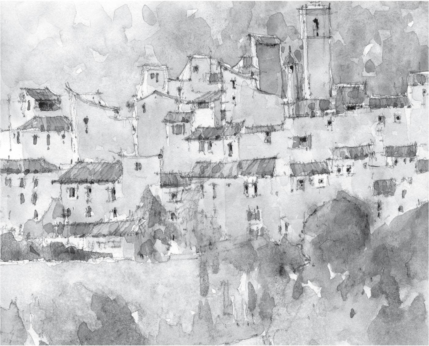
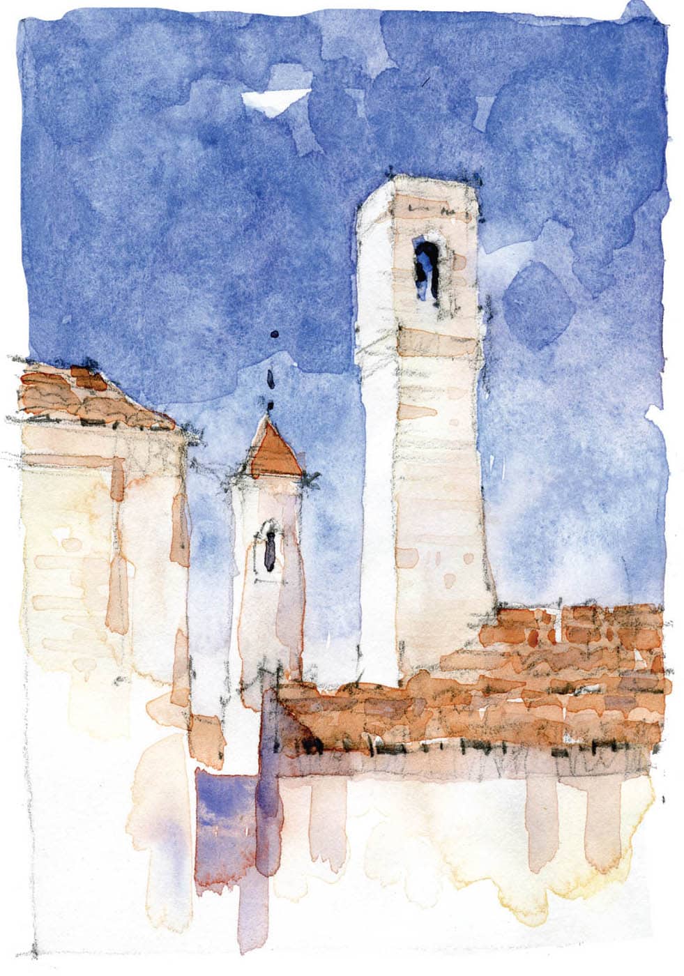
Painting in a sketchbook versus watercolor paper
Painting in your sketchbook is a very different exercise to working on watercolor paper. Typically, the sizing in your sketchbook will allow the color to stay on top of the paper, rather than be absorbed by a more traditional watercolor paper. Also, the bright white of the sketchbook paper is significantly lighter than the “white” of the watercolor papers I use.
You will find that your colors have more power. I enjoy forcing “blooms” and watching the way the paper changes, leaving peaks and valleys, which, in turn, shed or collect color. This can be used to your advantage depending on the type of scene you are trying to capture. If you have difficulty getting loose with your work, embrace these differences and let go of the idea that you are always in control.
Personally, I feel you should allow watercolor to behave the way it wishes. You can intervene, but in the end, the most pleasing passages in my paintings are when I allow the paint to react with the paper in surprising ways.
The important thing is to remember that this is your sketchbook—experimentation is what it is for.


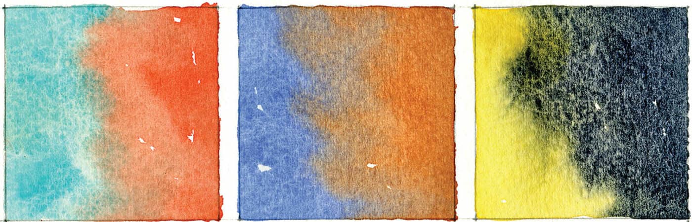
Wet-in-wet: Watercolor paper

Wet-in-wet: Sketchbook paper
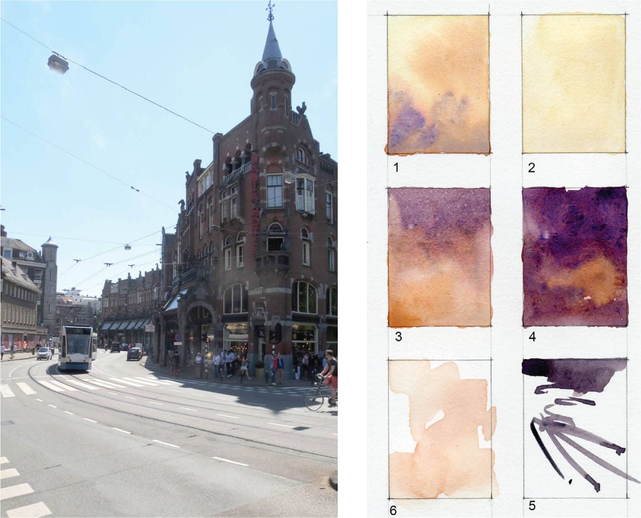
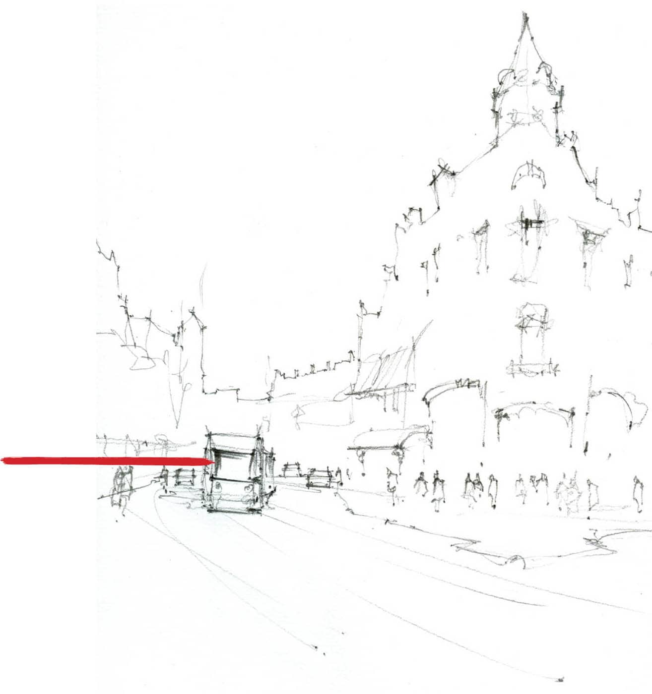
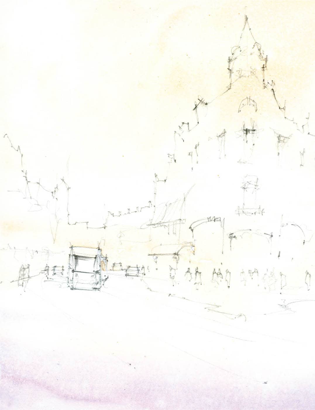
With a minimal palette and by using light and simplification to your advantage, you can paint a complex city scene. An Amsterdam street scene may seem an unlikely place to start the simplification process. It’s incredibly complex, full of people, and features unique architectural elements. Let go of the number of windows, cars, people, and buildings. Instead, focus on the larger idea. What is the sketch about? In this instance, it is stripping a scene down to its most basic elements and organizing them in a way that describes the feeling of being in a certain place. I don’t let the time of day or color get in my way when doing these exercises. It’s about letting go of detail and suggesting a scene instead. So, how do you let go of the idea that you have to paint everything? The answer is simple. Look at the big shapes and decide what to keep and what to eliminate. Be merciless as you practice this. Nothing is precious. Step 1. Decide on your color palette. In this scene, I chose to change the light. The selected colors build on the complementary hues of yellow and violet, utilizing Burnt Sienna as a transition color to both. From experience, I know that Burnt Sienna mixes well with both New Gamboge and Imperial Purple. With these three colors, plus a strong dark Neutral Tint, I have the colors necessary to begin. Color chart Step 2. Start the drawing. Choose where you want the center of interest. If I choose to include the tower, there’s a strong possibility it will compete with the tram for interest. Instead, I narrow my field of view to the area around the tram. Using a light F lead, I draw the tram near the lower-third quadrant. At this point, it is just a rectangle. I add a few cars (more rectangles) and quickly draw the silhouette of the buildings—being careful not to get too finicky about how correct it is. A trick of the trade is the understanding that in silhouette, city scenes tend to have right angles, whereas, a landscape would have more undulating forms. After putting in the construction lines, I come back with a softer lead (HB) and add some strength to my line work on the tram. Take note of the way the drawing itself has depth when using different line weights to move your eye throughout the image. We will discuss this in more detail later. Step 3. Using a very light wash (2 on the color chart) of New Gamboge and a touch of Burnt Sienna, I warm the light near the area of interest, being careful not to go too strong at first. I also use some well water to weaken it in areas to help create depth. I’ve left some of the paper showing around the tram, but I’ve painted through it in other areas—this will help it stand out later. Remember, your light is there from the beginning. Do not lose it. TIP Just because you see it, doesn’t mean you need to paint it. Build upon your strengths and begin to apply these techniques to places you know well. This is not a one-off exercise. You will need to repeat it often using different subjects. It will pay off if you put in the time. Step 4. Next I focus on the big shapes. I use some of the same sky mixture with more Burnt Sienna (1 and 3 on the color chart). I paint through the buildings, the cars, and tram, allowing the various colors to mingle on the page. I do this slowly and without much worry, except to see the value step forward as we approach the tram. As the rest of the paper dries, I quickly apply more depth on the tram and the fronts and rears of the cars. The paint is almost dry everywhere now, so I can finish off with a few spots of Neutral Tint (5 on the color chart) on the tram windows and, using a No. 8 pointed round brush, suggest tracks with some directional strokes. You will have to practice these strokes in order to achieve the desired result. My suggestion here is to practice these on a scrap sheet of paper or in your sketchbook. Step 5. I decide to lift an area near one of the tram headlights to heighten the atmospheric feeling of the image (see finished painting on page 28). I also add some soft clouds in the sky. Overall, this is a good lesson in how to remove detail from a painting. Another advantage of working in just your sketchbook is its portability. Your full painting kit is always going to be heavier. If I’m in a city and want to take full advantage of a day I will invariably take this route because I can cover more ground doing 10- to 15-minute studies than I can setting up the easel and painting for an hour or so. I believe both processes are equally rewarding, but if I only have one day, the sketchbook is my go-to tool. TIP Pack a comfortable bag with just your sketchbook, drawing instruments, and a few bulldog clips. I suggest a lightweight, easy-to-wear backpack with enough room for a water bottle and snack. Find a comfortable spot with a ledge for your sketchbook and enjoy the day. Naval Arch, BrooklynAmsterdam Tram Step-by-Step


Sketchbook Setup


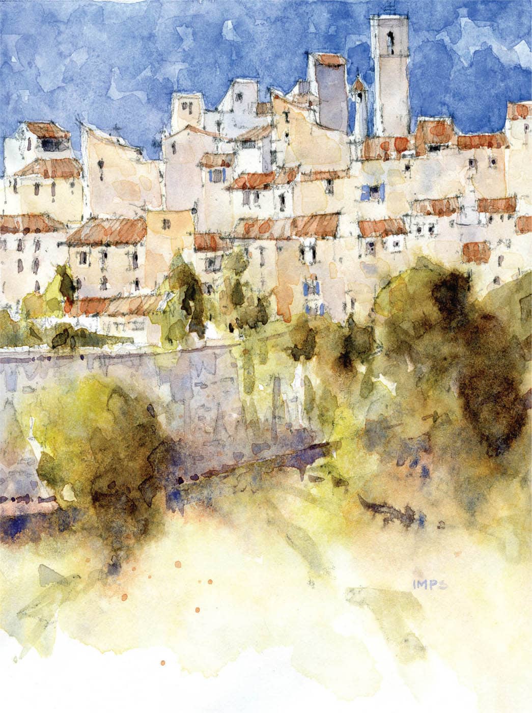
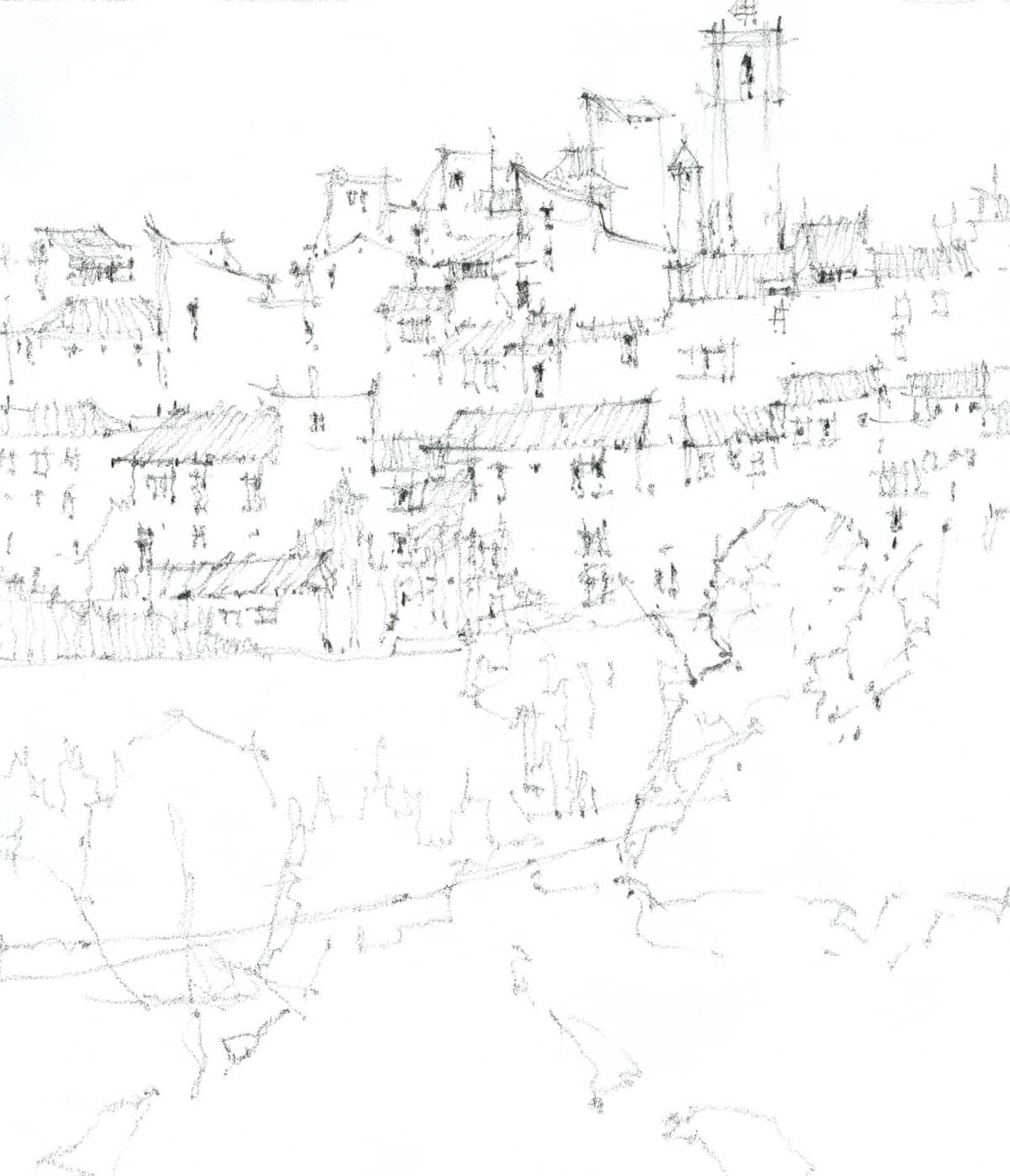
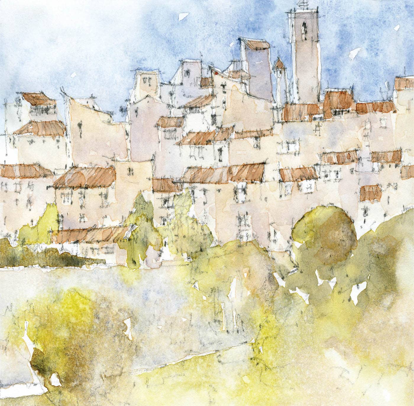
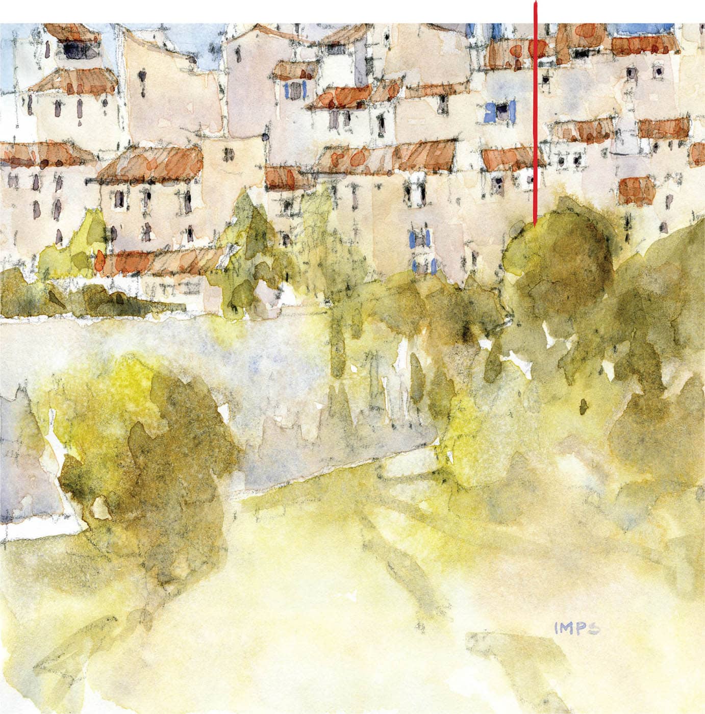
In this exercise, we will look at color and how we can use it to amplify the expression of light within a painting. When planning a painting, it is of utmost importance that you select your palette using harmonious or complementary colors. Using the color wheel, you can easily find suitable complements to describe buildings, city walls, and vegetation. Temperature—another element of color— will play an important role, as well. It’s enjoyable to play cool colors off warmer ones. Light, or luminescence, in watercolor is achieved by directing the eye throughout the painting by focusing on areas of high- contrasting value. Allowing areas of high contrast to be balanced by areas where the value steps are subtler can achieve this effectively and lessen the chance that you will have competing elements within the painting. One of my favorite ways to do this is to “fade out” the area in the foreground where dense trees and shrubs take over; this way they do not garner too much attention. In the initial stages of a piece, I always plan how I am going to portray the light. You should ask yourself: Where is the light source? How can I use that to my advantage? What is the most effective way to emphasize it to the painting’s benefit? Before attempting your painting, try mixing some swatches to create a collection of colors similar to mine shown below. Each sample has two passes of the same color to show that I can add value by simply painting the same color mix over a dried wash. These are subtle value shifts, but they are essential as they add texture to your wash. Remember to mix more color than you think you will use. Remember, too, that watercolor will dry considerably lighter than the color in your palette. Test these swatches as they dry and not while they are wet. (Also referenced is the “variegated wash technique” explained on page 68). Note: See page 68 for how to create a variegated wash. Step 1. I begin each drawing with a very light sketch of the most obvious shapes—these are called construction lines. I rarely erase my initial line work because I know the paint will cover most of it. When it doesn’t, it allows the viewer a deeper understanding of how I construct my drawings. I loosen up before starting the final drawing by doing little sketches and studies of the composition. Note the differing thickness of my line work. I use darker lines to draw the eye throughout the piece and solidify some areas of the buildings, including the deepest shadows. These marks will be covered by the final drawing and if they aren’t, I am not worried if they show. Your goal here is not to paint with too much value. We need the light. This is why I have separated Steps 2 and 3. Step 2. Isolate the buildings using paint mixes 1 + 2 + 3 (see here). We are putting in our lightest lights. Paint around the areas of the buildings receiving direct sunlight. This is what makes watercolor so unique: The paper is our lightest light—not something from a tube. When painting, it is very important to keep this in mind and use it whenever possible. As areas dry, go back and layer color mixes again, but leave some brush strokes visible. For the buildings facing away from the light source, begin using mix 3 to suggest that lack of light. Don’t forget to use clear water as you paint. This dilutes certain areas and allows others to have more strength. It also helps you avoid “flat” washes. Texture is key. Use a few sprays from the water bottle; then let it set. Step 3. Add in roofs using mix 5. As it dries, glaze on another layer of mix 5 leaving more than the previous glaze visible. Step 4. Paint in the sky as the roofs dry. Remember, do not paint over the sun side of the buildings. I started with a light version of mix 9 and allowed it to gain strength as it moves away from the light source. As the sky is drying, begin using mix 6 and mix 7, paying close attention to lost and found edges, strength of color, and the materials being painted. Begin dropping in Burnt Sienna here and there to balance your greens and add warmth to your foreground. As you pass the trees, begin to use your mixing water to create a graded wash that runs to almost nothing. Use the spray bottle again for texture. Step 5. Repeat Step 4 and begin suggesting form by darkening the shade side of the foliage. Repeat the sky wash, as well. Using mix 6, start to give depth to your windows. It’s very important to note the way I overlap brush strokes, which allows the first wash to shine through—now we see color begin to work as a value indicator. Note the red/orange of the roofs complementing both the sky and the greens of the trees. Let color “pop” in certain areas, but allow other areas to remain somewhat neutral. This allows the color you do use to have more potency. Step 6. I try to allow the painting to speak to me at pivotal points along the way. We are clearly in the mid-values here. A black-and-white photo of the painting shows that it looks flat. Changing color does not mean changing value! This painting needs more power. It’s at this stage that many painters will start to protect the image by not putting in the necessary darks to complement the light. Suffice it to say, by protecting a painting you are actively ruining it. Using the dark mix 8 with some Neutral Tint, I brush clear water over the areas I am going to darken and then drop in the dark mixture, allowing it to mingle and draw as they will on the paper. I try not to interfere with what the paint is doing at this point—let the watercolor do what it will. I will mist the painting again and then add another layer to the sky. We are approaching the end. In my head there is a little buzzer along the lines of a metal detector. When I start hearing that blip, blip, blip, I know I need a real reason to continue painting. When working outside you can either pack up and finish in your studio or if the weather is nice, take in your surroundings or do a little sketch. Get your mind out of the painting for a while. Step 7 (opposite page). After some reflection, I decided that one more pass of the sky and hitting the larger connecting shadows in the foreground again would be a wise idea. The painting needed that little bit of brightness and we can only do that by keeping our light saved and punching up the color and value in areas that help set that off. These are the moves that make or break a painting. I added some detail to the city wall and road leading up the hill. It gives the base of the painting some strength and the continued layer of color in the sky allows the light on the stone to shine through. As soon as you think you are done, you are. Stop—the painting will be there tomorrow if you see that it needs something else. Detail studies done prior to the larger composition. This helps with warming up, seeing your subject at a different scale, and choosing a color palette.St. Paul de Vence Step-by-Step
Color Swatches
Paint mixtures


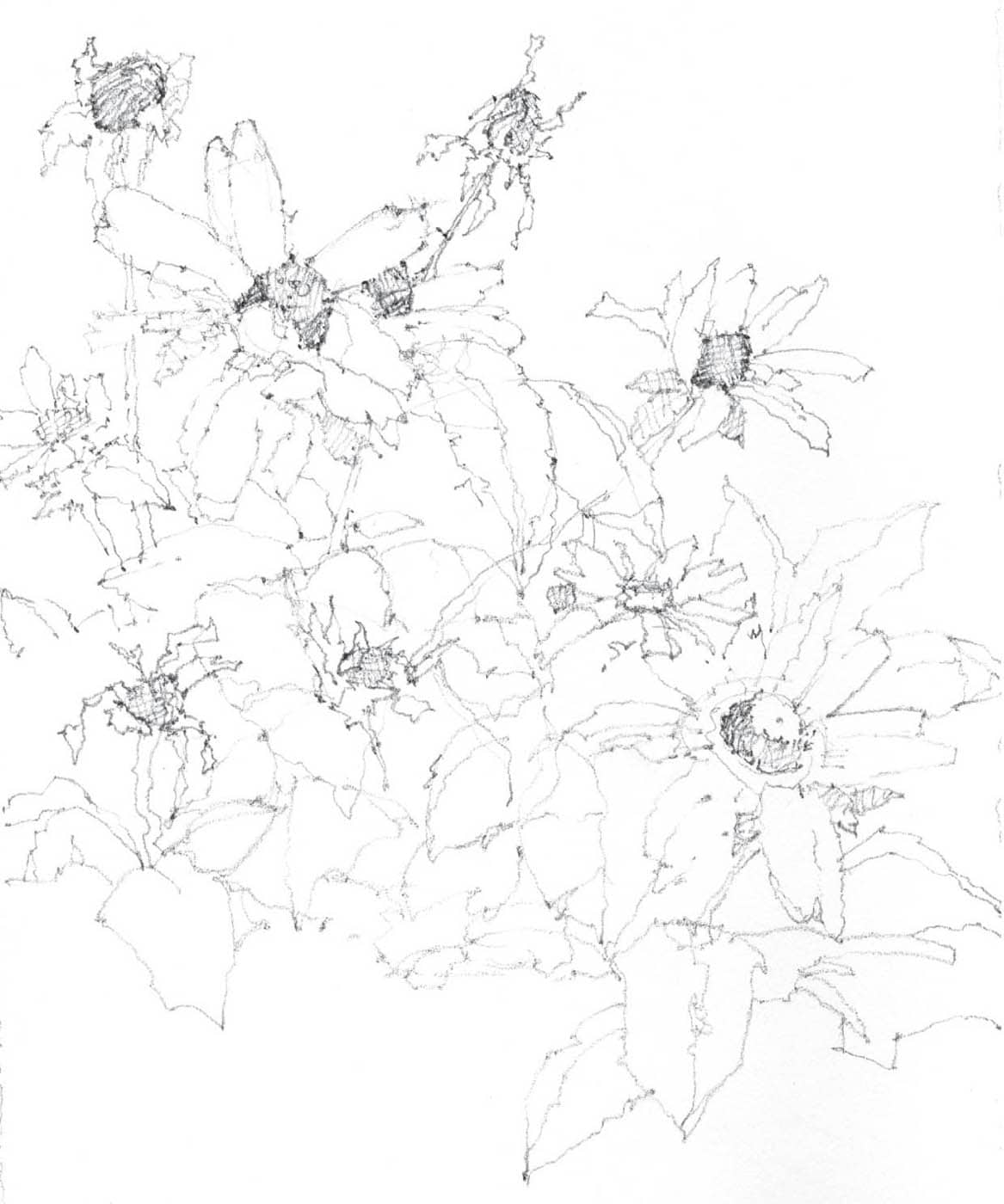
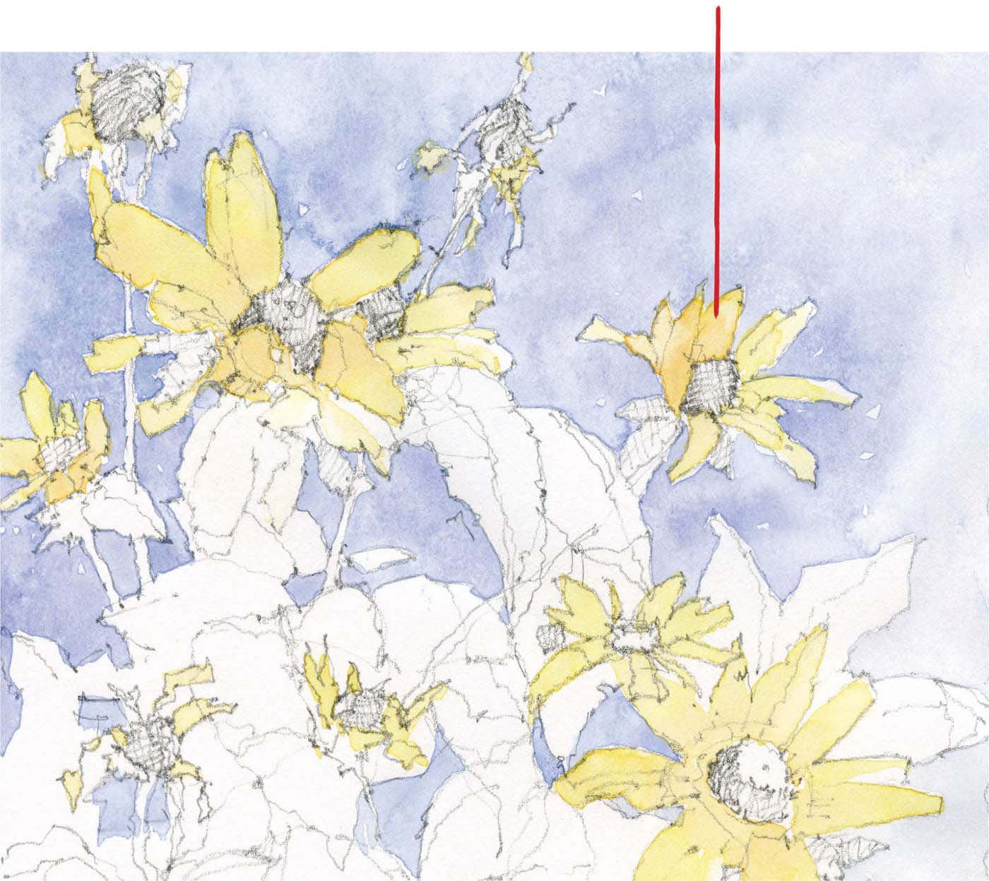
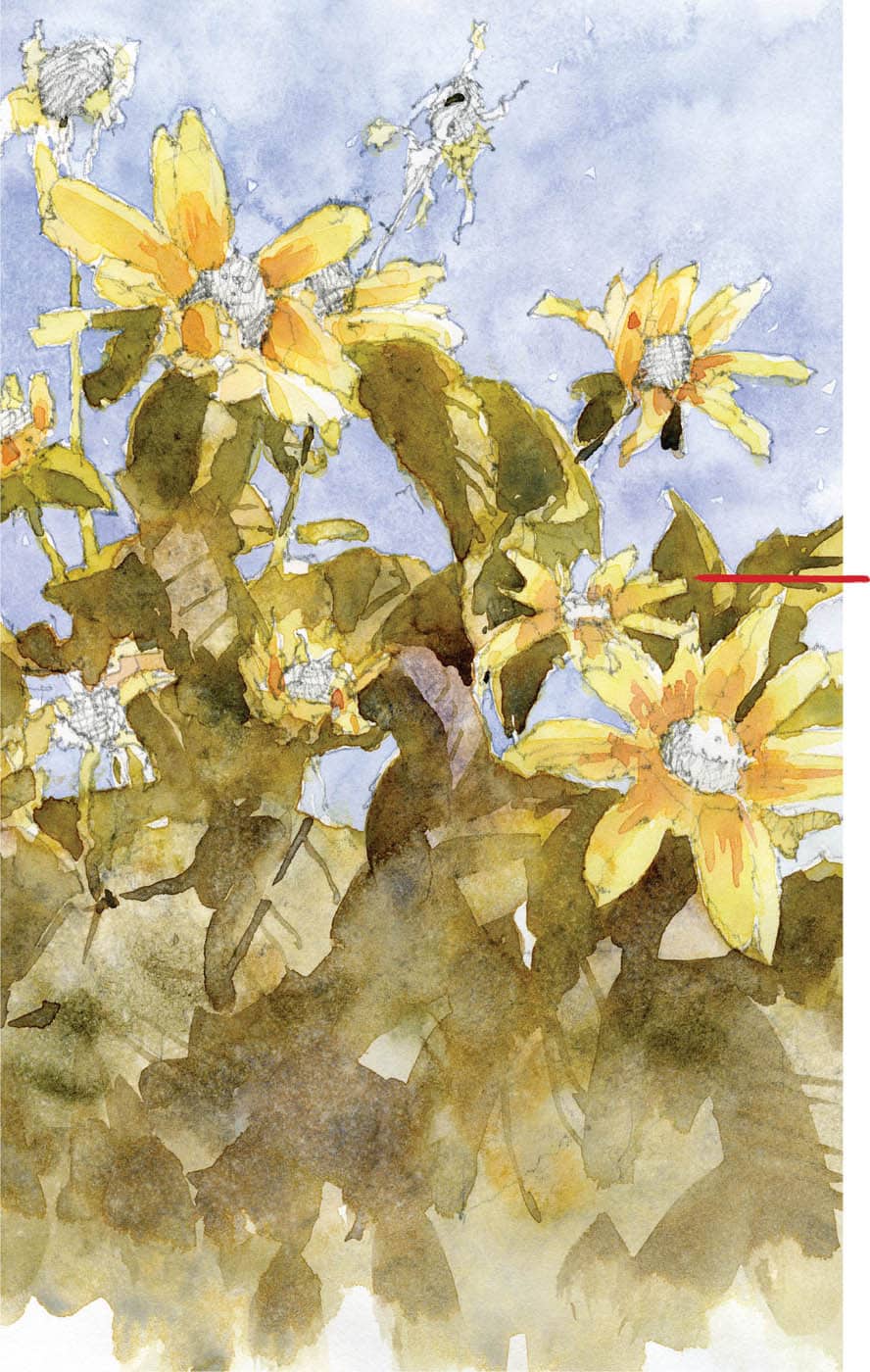
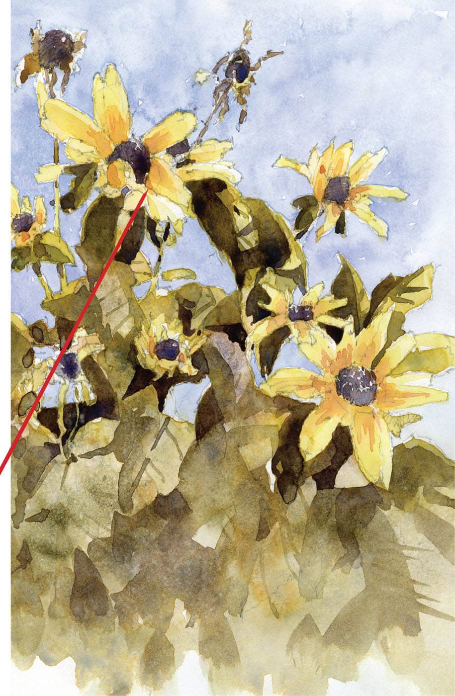
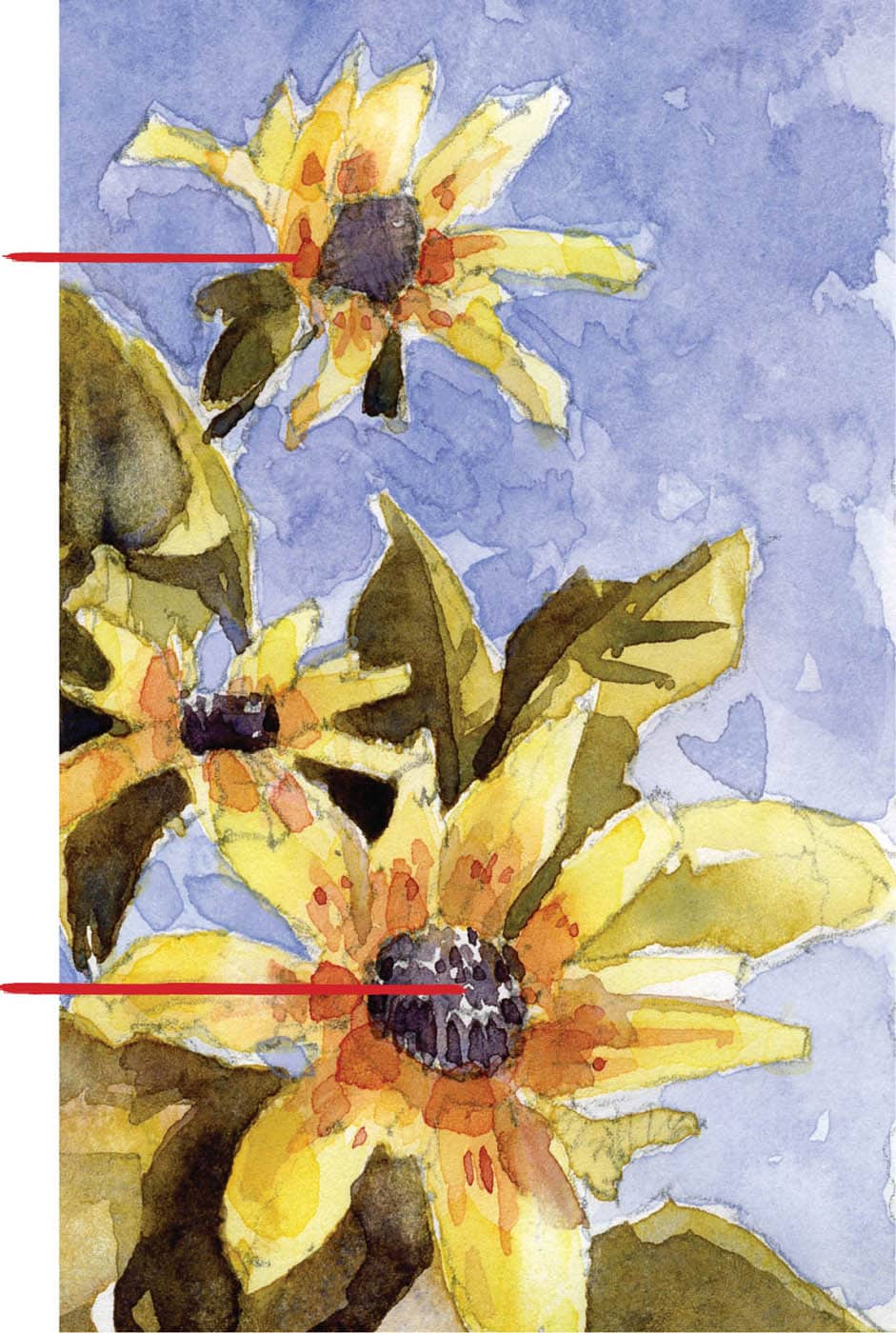
One of the easiest ways to become comfortable with your plein air setup is to begin by working from home, be it from your porch, your garden, or just setting up a still life in your studio and working at your easel. I encourage this practice. As you work, take notes on what materials are not in your bag and more importantly what tools you do not use. You could easily set up looking out of a window, as well. While this is not what a purist might call painting en plein air, it is a useful tool in determining what you need to have in your bag and what you don’t. I painted my studio (shown on here) in this exact way. If you are unable to get away from your house, you can still practice and enjoy it. Just make sure you are painting from life. Step 1. I start this drawing by looking for the big shapes and how the leaves and flowers connect. One of the best ways to practice working en plein air is to use what is readily available to you. In this instance, I sat on my back porch and drew from some potted flowers. Step 2. The underpainting sets the mood of your work. In watercolor you must “save” the light from the start and build upon that, leaving those light areas alone. I tend not to use masking fluid, as I prefer the line of a brush and the possibilities that go with it. I used Lemon Yellow with a bit of New Gamboge for the petals, while dropping in some diluted Winsor Orange to add more pure color to the mix. I left this mixture at the value of the lightest color noticeable in the petals, to ensure that I didn’t push too far into the darks too early. As you paint the petals, they will dry enough to work on once you have moved through all of them. If a little blue from the sky comes through, I just allow that to run. Those blues can suggest shadow and form. The mixture for the sky is an almost pure lavender with a touch of Alizarin Crimson. I also keep this light, as I do not want my sky to dictate too early how much color I need on my subject—the flowers. Step 3. In this wash, I use a mix of Green Gold and Alizarin Crimson, and another mix of Undersea Green, plus a good bit of Imperial Purple. As I reach the bottom of the paper, I begin adding touches of pure lavender to help the foreground harmonize with the background. As the paper dries, watch for the sheen to go off. As this happens, use spray bottle to gently spritz the paper with water for a nice textural effect. For as long as the paper remains workable, add touches of the same mixtures here and there, being careful not to cover the entire area of foliage. A few mid-darks go a long way so don’t overdo it. Let your brush move freely once you have passed the area of careful painting at the tips of the leaves. A combination of carefully painted areas and looser ones will give your image a more painterly feel. Step 4. Watercolors get a bit flat in the middle stages, so keeping that in mind, move forward using darks as a tool to bring some light into the painting. This may seem counterintuitive, but it’s not as long as you are careful. Carefully paint the pistil or bud with a mixture of French Ultramarine, Alizarin Crimson, and a touch of Burnt Sienna to tone the color down. The goal here is not to compete with the light of the petals, but to complement them. This mixture can have more Ultramarine or more Crimson, but the color scheme should dictate where you go here. Since we have yellow petals I let the mixture go more to the violet shade. Try to avoid layering greens in heavy mixtures, as they turn muddy fast. Once I made two light passes of greens, I used the French Ultramarine, Alizarin Crimson, and Burnt Sienna mixture over that. Alternatively, I could have simply used a clean blue-gray so that the darks remain fresh and transparent. Your darks should breathe—that is to say, do not apply them in the same fashion as screen printing. You want to add water to your paper to allow them to lose strength and then drop in more dark to bring them back with some punch. At this stage, I usually have a pure mixture of Burnt Sienna and Cobalt Blue to allow color temperature to play a role in how my darks are portrayed. Step 5. I realize that I need to boost the color of the petals and take the sky up in strength to allow all of those lights to pop. So I make a stronger mix of the original flower color and apply that sparingly around the bud, with some Alizarin Crimson dropped in as it dries. I also begin developing the small pattern of reds on the petals—themselves in varying stages of drying—leaving some edges soft and some hard. Again this allows me to avoid a feeling of “sameness” among the varying flowers. I add more Alizarin Crimson and use a bit of Neutral Tint to define the dying flowers; then I step back again. This time I realize that the sky needs one more pass of the original blue mix. I add it allowing the value to shift and use water instead of pigment in some areas. I also allow my brushwork to get a little looser and more gestural, which left some areas of sky with a textural effect that I find quite pleasing. Lastly, I use Neutral Tint in a fairly strong fashion to define the shape of the buds and add dried-up petals to the withered blooms. As soon as you begin looking for things to do, you should walk away from the work—you are done. You can refine it later, if you like, but you don’t want to ruin it by overworking the piece.Yellow Gerbera Step-by-Step