Capturing the details

First Avenue Light Opelika, AL
Previously, I’ve talked about breaking complex scenes down into manageable parts. Let’s look at a few common objects and how to incorporate them into your paintings.
Everything is a shape with structure and volume, but how do we convey the geometry that defines it? A boat is a series of rectangles organized and drawn to proportion. The same could be said of a complex structure. Organization, editing, and learning the shapes and proportions that define certain objects are essential for your visual vocabulary.
Do you know what a tree line from a distance looks like at its base? Can you observe a tree standing alone and pick out the limbs that define it? While we’re talking about trees, do you know they have the same basic shape in both summer and winter? Just because you can’t see the tree’s structure for the leaves (or snow) doesn’t mean it isn’t there.
Do you know that shadows do not cast on glass windows unless the windows are exceedingly dirty? What you see as shadow is actually a reflection on the surface. Look at the windows on the shaded side of a building and then again on the side against the light. The ones on the dark side will seem lighter, while those facing the sun will appear darker. In other words, it’s all about understanding “how” we see. An artist views the world in a completely different and wonderful way!
Working outside is the only way these little gems will reveal themselves and become part of your visual vocabulary. The more you observe and work from life, the more clearly you can communicate your ideas. Use shape to your advantage. Rather than focus on how many trees you see, look at how you can connect them to simplify a grouping of trees. Is it necessary to paint them all individually?
Before you start a drawing, take a moment to “see” your subject as clearly as possible. Think about its weight and volume, its material, what is close to your subject, and how you can link it with its surroundings.
We all have memories that drive our passion for a subject—for me, it’s boats. I have done countless paintings and sketches standing on a harbor wall: the smells, the sounds of engines and gulls, the joy of being in the moment. It’s a place I love, and recording it is what makes me whole.
Luckily, I am a short drive from some of the most interesting shipyards in the country. There I can see ships repaired and made ready to sail the world. I strongly believe you should understand and search for those things that speak to you personally, as they will show through in your art.
When starting a drawing, it is essential that you think about the steps involved. In the following demonstrations, I break down how to draw and paint boats, cars, people, trees; then I incorporate them within a simple composition. Don’t think to yourself, “I am drawing a car.” Nonsense, you are simply observing and recording shapes and volumes!

Boats
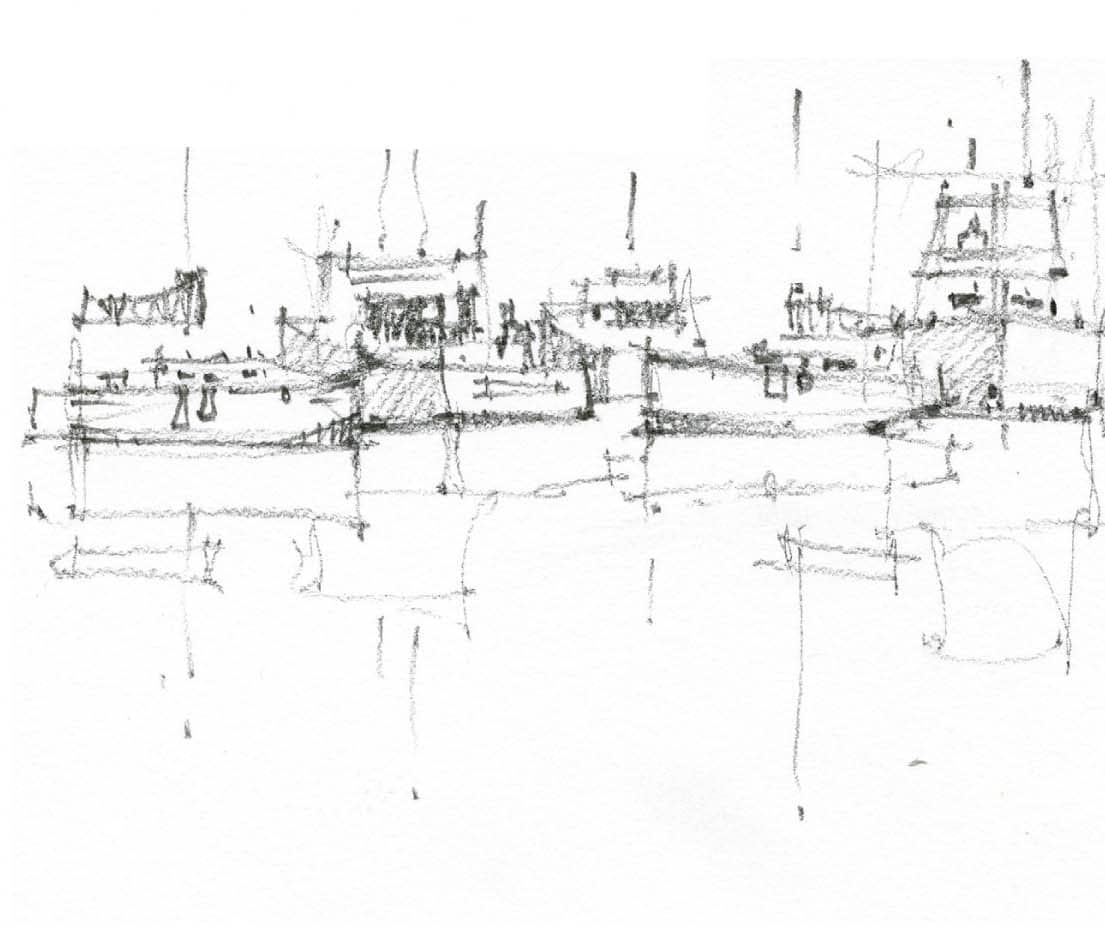
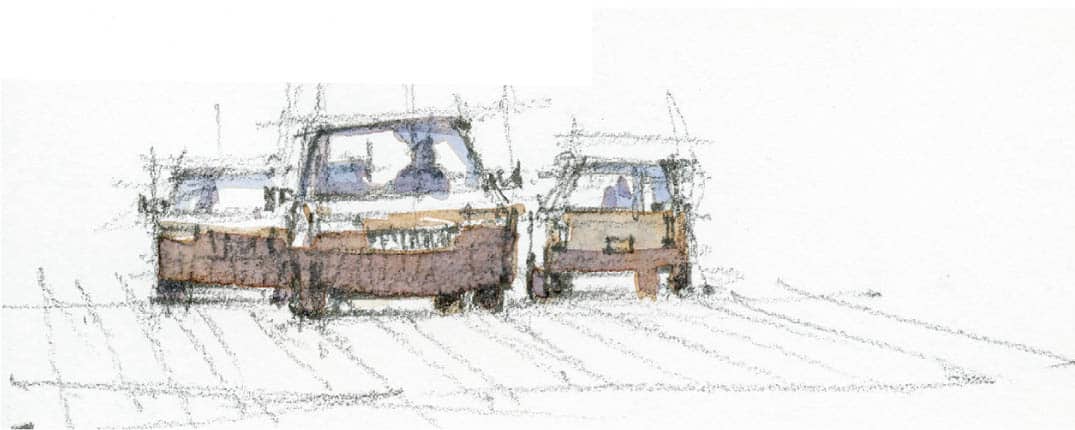
Take a look at the step-by-step construction drawing of a forward-facing boat (above right). Note that I start with simple shapes that become more refined with each step. I’ve placed the bowline off-center so we can see the boat from a three-quarter view, which suggests volume.
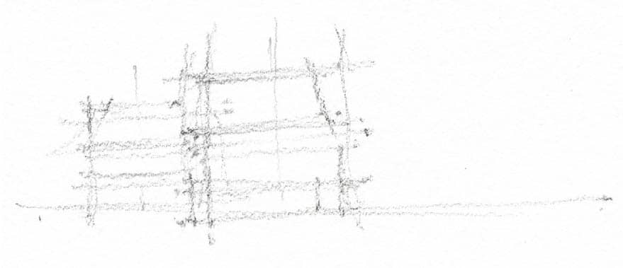
Use your pencil to create the line weight of your construction drawing, which is the lightest stage for placing objects. Once completed, begin to add more robust lines to define the shape. The final line work— the darkest darks—give that last pop. If all of your lines are the same weight, the drawing will appear flat and lifeless. Look at how the darks and lights work together to create interest.
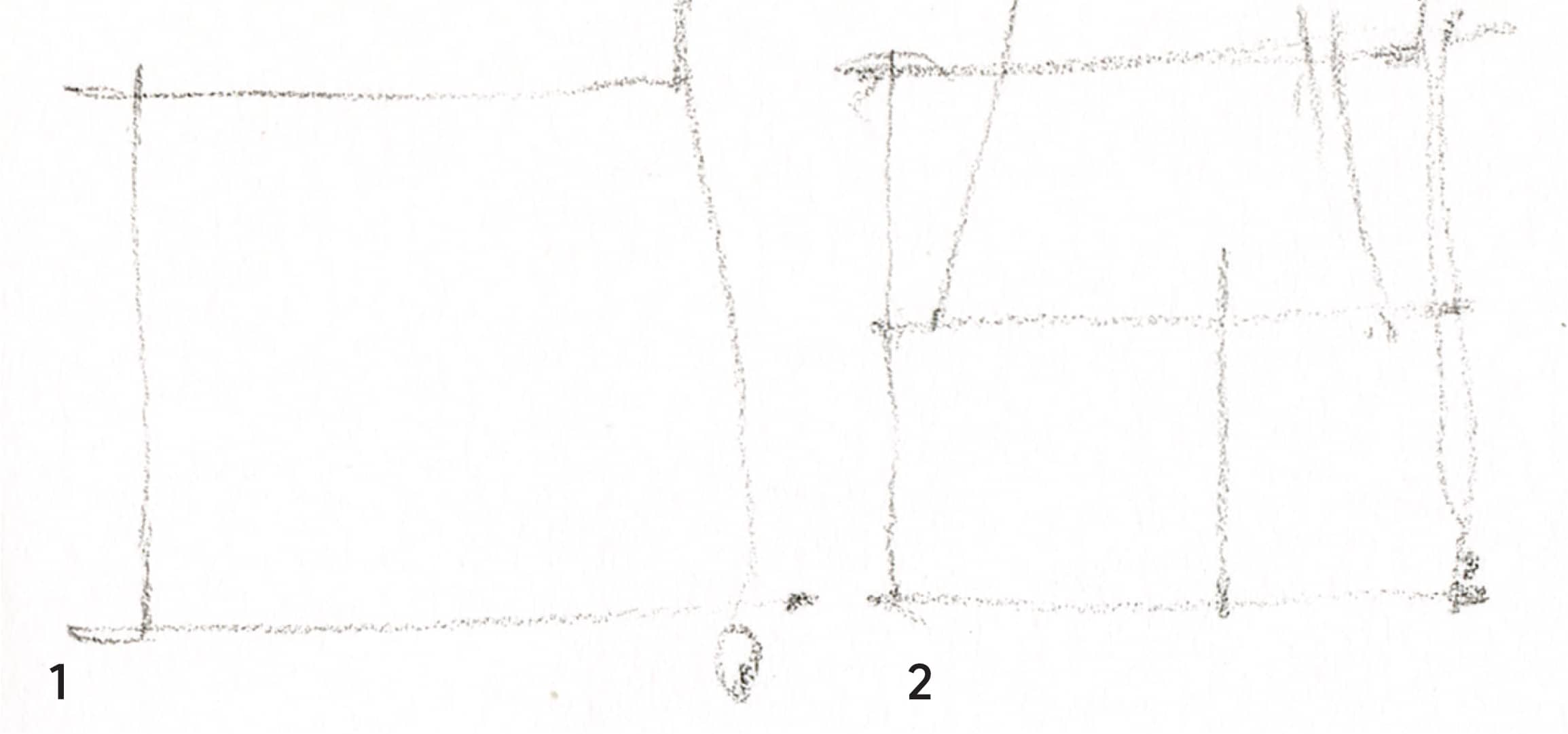
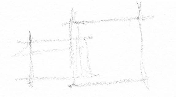
In the sketch above, I approximated a group of boats by drawing rectangles. This is an important step so that I know I have enough room and whether the arrangement pleases me. I used a light F lead, which allows me to make changes without erasing. Notice how the pencil lines rarely leave the surface as they move across the paper. Drawing this way leads to more organic and pleasing shapes.
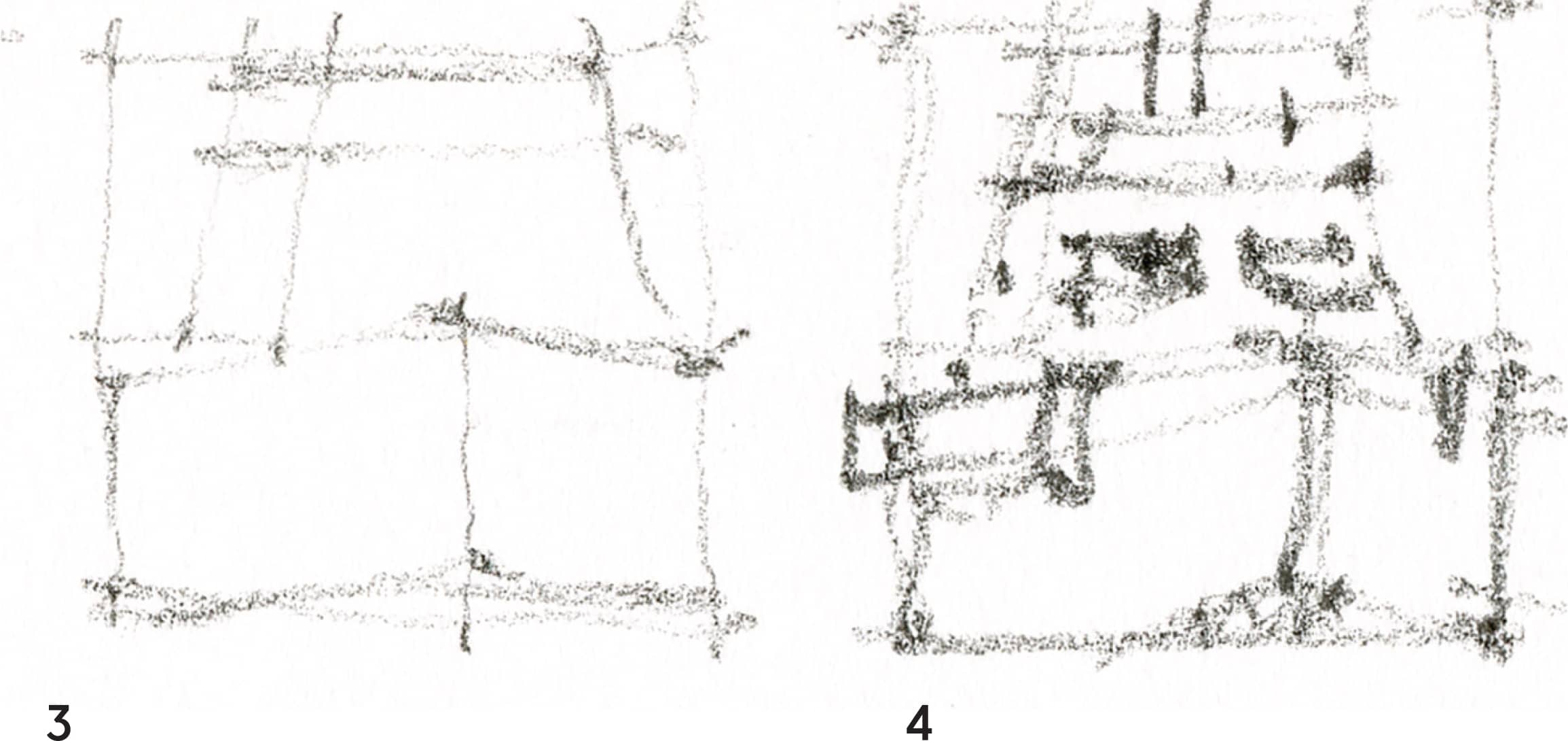
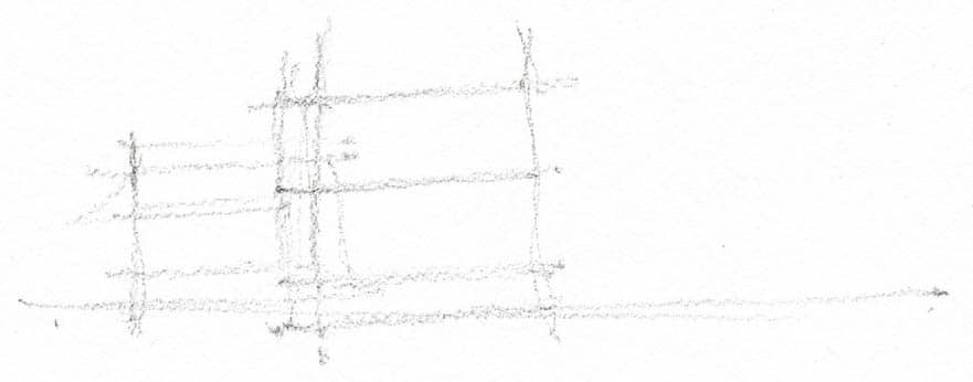
In this step (at right, top), notice how the rectangles are still visible and the boats fit within them. I used a 2B lead here, varying the line weight.
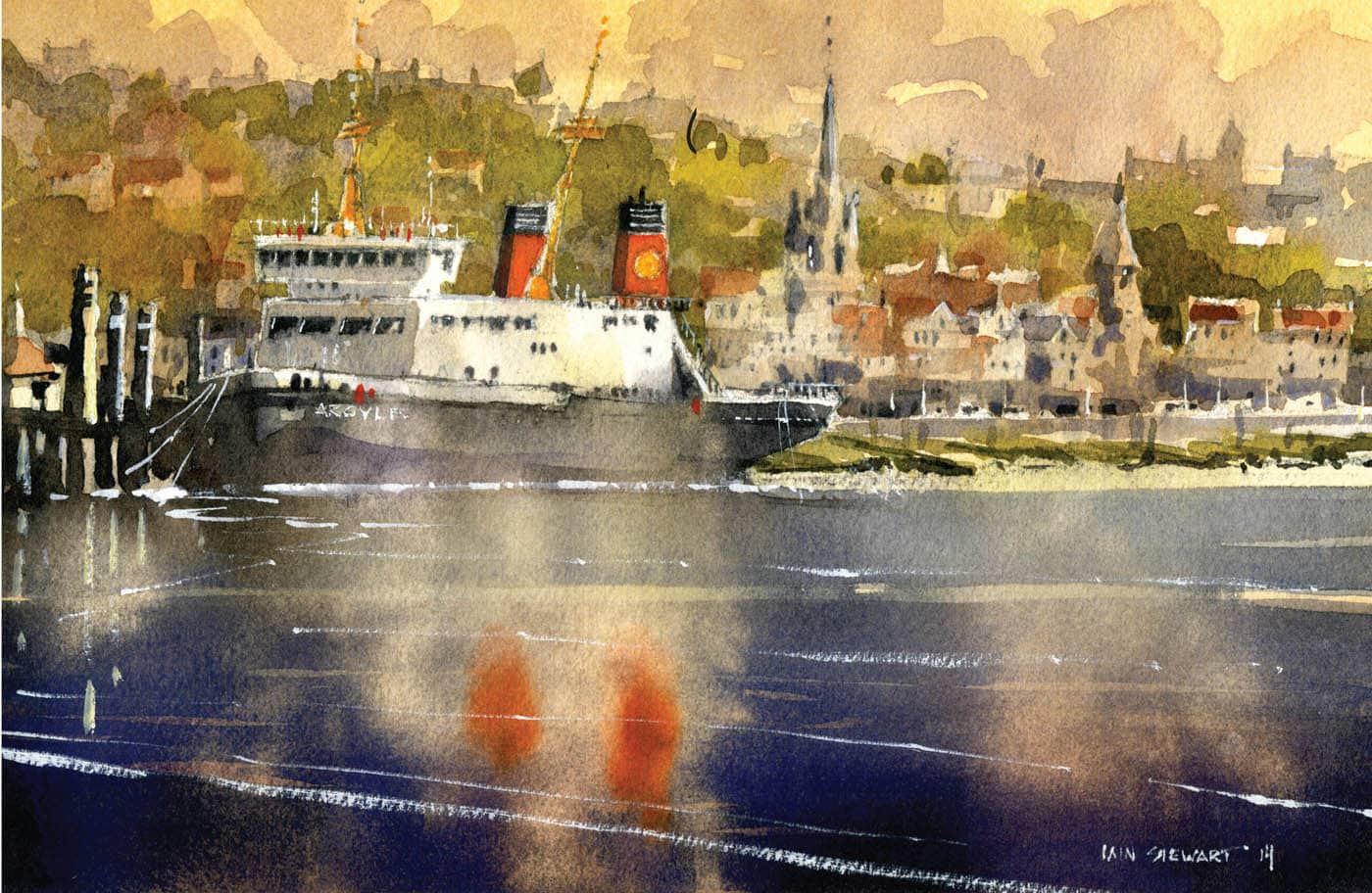
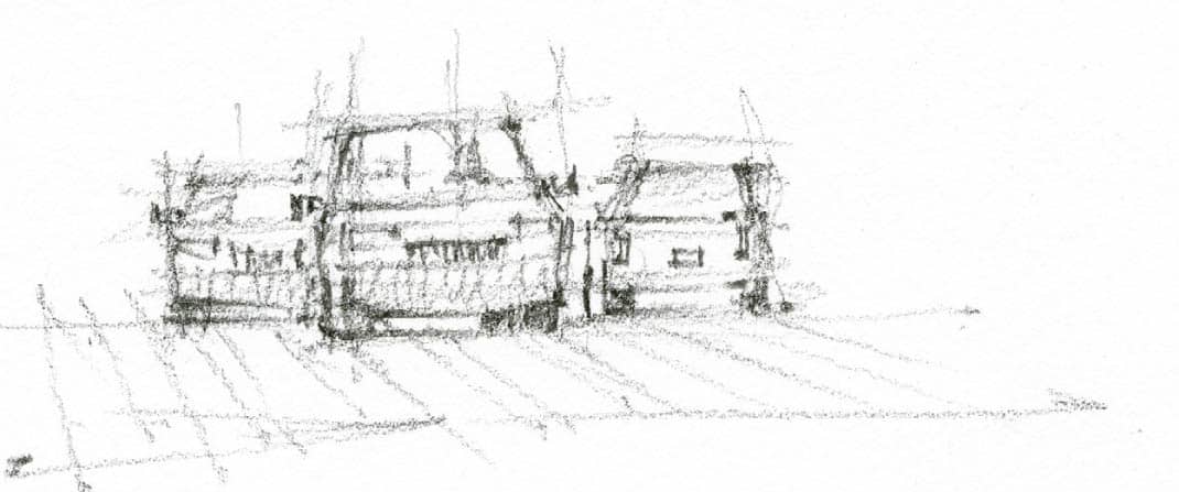
Now I’ve added a light wash of Cobalt Blue and Burnt Sienna to suggest the direction of light. The cool side is away from the sun and the warm side faces the sun. Remember, colors are extremely useful in suggesting temperature and light direction.
To give this exercise a little something extra, I turn it into a vignette or small sketch. The strengthening of the shadows is crucial—with pops of almost pure color and strong windows and masts with Neutral Tint. In most cases, reflections will appear slightly darker than whatever they are reflecting, so I washed from Naples Yellow to Phthalo Turquoise, deepening the gradient as I moved down the wash. Lastly, I added a few directional brushstrokes, done once the wash was dry, to suggest slight movement in the water.
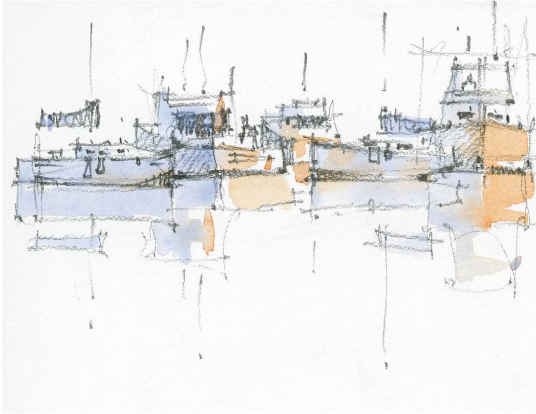
Notice that I used Neutral Tint at the waterline of each boat, connecting them to one another with a dark tone. This suggests they are a grouping of objects rather than just one boat in front of another. It is also extremely important to point out that objects floating on still water will have an almost perfectly horizontal reflection where they hit the waterline. If your lines move out of horizontal, it will create the effect of undulating water. Never forget there is a large portion of the boat beneath the water that we do not see. If the water is moving, the hull will become visible as it crests a wave.

Cars
Approach cars in the same manner as boats: they are simply a different object with different proportions.
Cars are defined by simple shapes. Start with simple rectangles to begin seeing the whole (step 1).
1
These horizontal lines indicate the windshield, body of the car, and space between the underside of the car and the road surface (step 2).
2
Note the diagonals introduced to delineate the form of the windshield and body of the cars (step 3).
3
Using progressively stronger line work, I complete the cars. I chose to add one more for balance and suggested a road surface (step 4).
4
Introducing a mix of Cobalt Blue and Burnt Sienna, I begin to flesh out the car (step 5). A note on materials and reflections: the windshield faces upward in most cars, so the sky tends to reflect on them. The same can be said about the hood of the car, which catches more sun than the sides and front.
5
I add a few darks around the windshields to suggest reflected light, a few pops of red for taillights, and a road surface with a crosswalk (step 6).

6
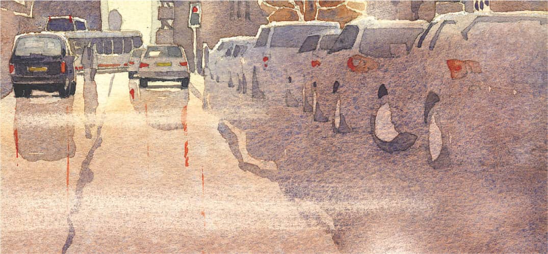
Editing a painting—if done well—will save a lot of time. One of my previous struggles was painting cars parked in a line on a busy street. The solution was simple, but it took some time to realize it: Just paint the things that “say” car.
Take a look at the image at left (top). Notice how by just drawing the outline of the cars and adding a few windshields and a few tires, I have created the illusion of a row of parked cars.
Teaching yourself how to edit in this manner will change your work. It’s a classic example of using preconceived forms to suggest a series of objects as one mass. They are all connected as one shape that doesn’t compete for attention. After all, the painting is not about the cars; they simply provide a context that says “city.”

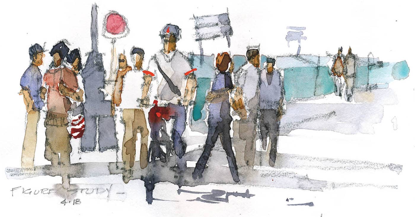
People
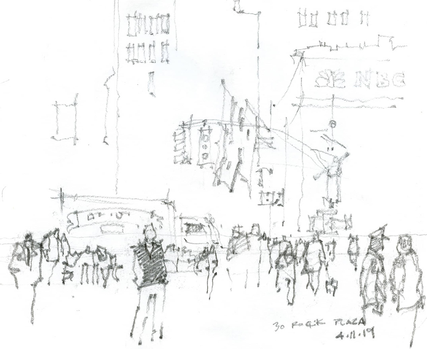
Sometime over the last decade, I lost interest in painting just the city, or more particularly, just buildings. What excites me now is the action on the street. I think of the trees, buildings, and streetlights as the backdrop and furnishings on a theater set. The cast, interest, and action is on the street where everything is moving. I like my paintings to have a balance with areas of rest or calm juxtaposed with areas of interest or movement.
One of the most important lessons I can share with you about populating your paintings is based on my understanding of perspective. Find a flat, level street or park, and watch people mingling. Look for the gestures they make and then attempt to draw what you remember in a simplified way.
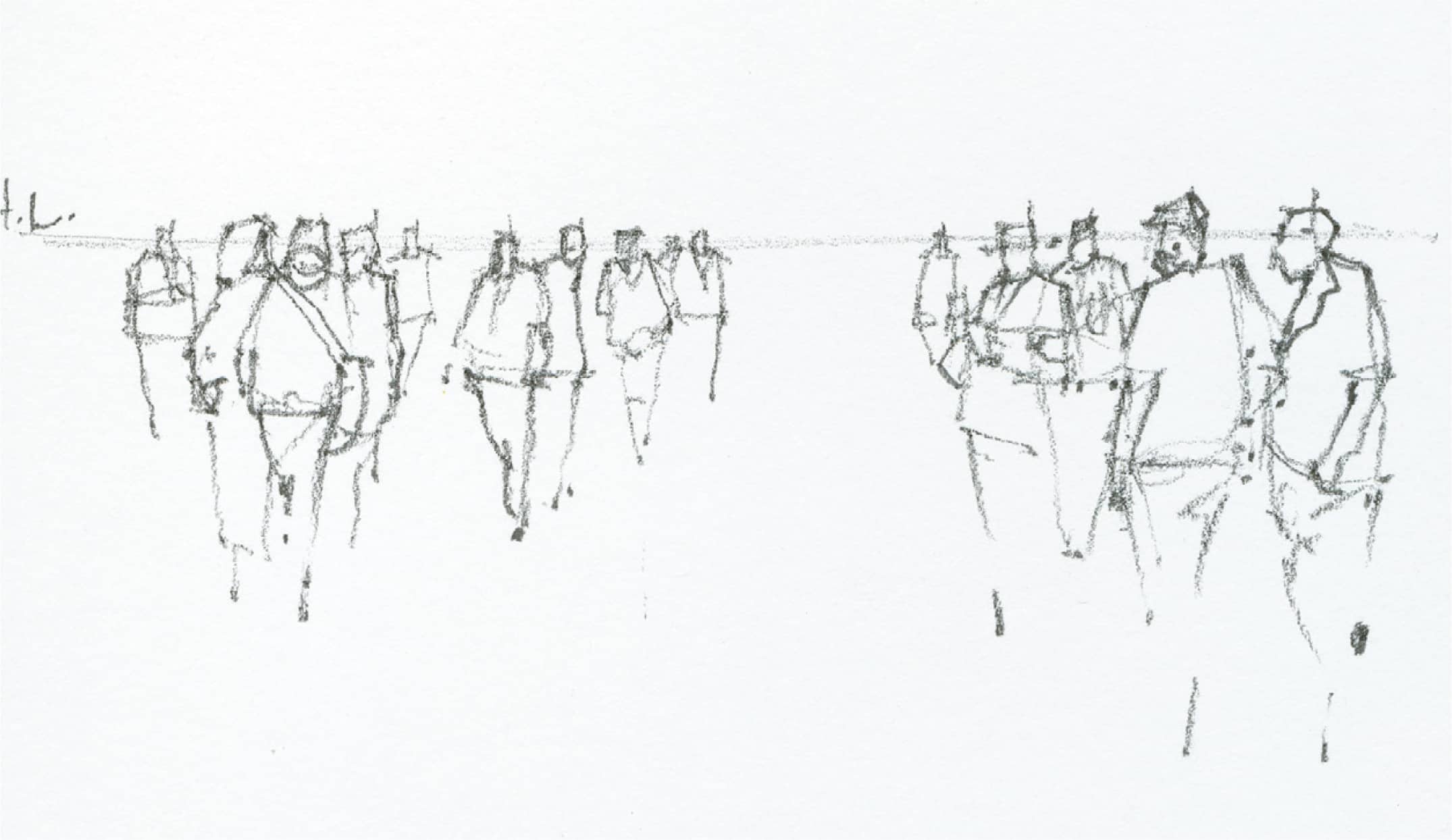
Stand and look directly forward; your eye level is the horizon line. If you are standing on a beach, the horizon is immediately visible. But in a city or landscape setting, you may have to locate the horizon, which is an imaginary line that divides the paper horizontally at eye level. All the work you do is referenced by this line. If you want to have more foreground, place the horizon line higher on the paper. If you want to show more buildings or sky, place the horizon line lower. To locate the horizon line, look ahead while keeping your head level.
People come in all shapes and sizes, but unless your drawing includes someone extremely tall or short, you should keep the heads at or near the horizon line. Imagine standing across a tennis court from someone your exact height. If your heads are both level, they will be the same height off the ground as yours. With this in mind, let’s look at the following examples.
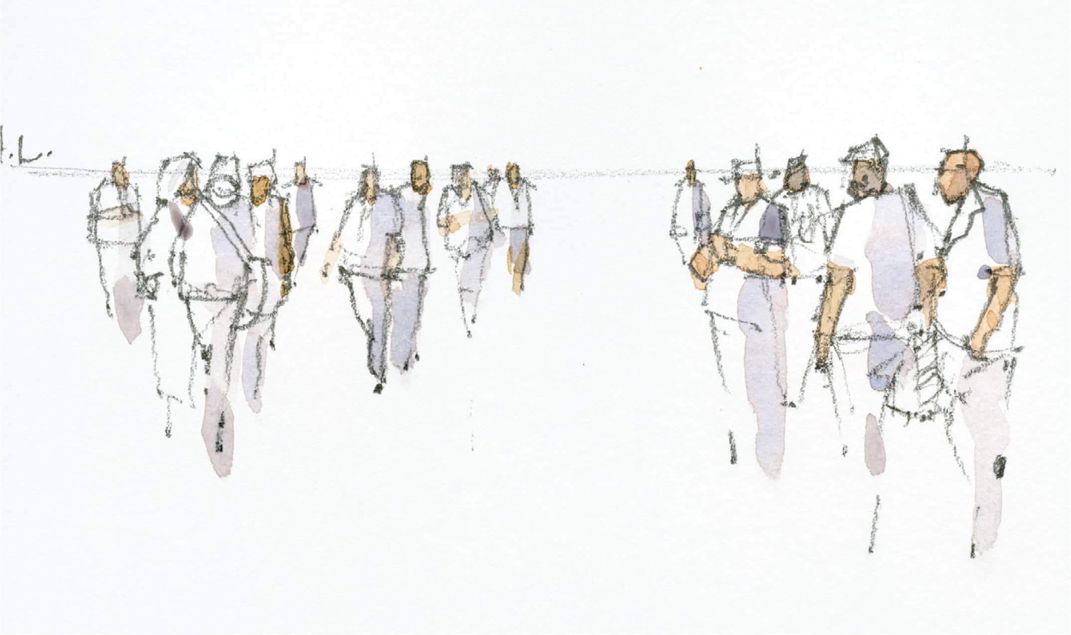
In the sketch above, note how everyone’s head passes through the horizon line (HL) or “eye level” at roughly the same height. In essence, people are the same height in this view.

As people move into the distance, the placement of their head stays at the horizon. The only thing that changes is that their bodies get smaller. Take a moment to notice this. If people are seated in the view, note that their heads all pass through a line lower than the horizon.
Once you start dealing with hills and such, this can be utilized for areas where the ground is flat; and then, as the land slopes up, the people will become smaller and their heads will move above the horizon. If this is the case, avoid “stacking people.” Try not to place a person directly above the head of someone closer to you.
In the sketch at right (top), I add more robust lines and areas of shading to give a sense of depth within the drawing. Details are important: someone clutching a messenger bag or a cell phone; anything that gives them their own style and personality.
Now I begin to add skin tones before moving on to clothing. As the painting progresses, I’ll refine the skin tones and the direction of light. Using a dirty Cobalt Blue mix, I paint the shade side of the people.
I continue to add different colored clothing and details. Lastly, I add shadows to emphasize light direction and give a bit of solidity to the base of the study.

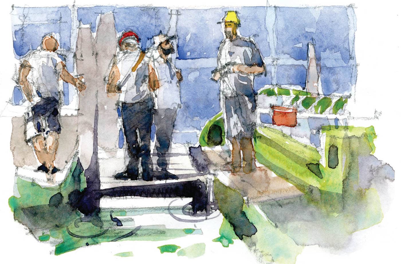
Practice these techniques. Go out, take pictures, and work from them. Below, you can see how I take studies and turn them into something with more interesting details.