18. CLARITY, VIBRANCE, AND SATURATION
![]()
ONCE YOU’VE DIALED in the tonality of your picture, you can move on to making some of the final adjustments. The Clarity, Vibrance, and Saturation sliders can be used to round out the basic editing of a picture.
Clarity
The general exposure of a picture adds contrast in the shadows and highlights, and treats the whites and blacks of the image. The one part that doesn’t get a lot of attention is the midtone portion of the image. There are times when adding a little punch to the mid-tone area could be very helpful. The Clarity slider controls the midtone contrast.
Midtone contrast is great for adding a bit of grit to your pictures (Figures 18.1 and 18.2). Metals, textures, brick walls, and hair are all things that could benefit from a little bit of a clarity boost. The only thing to keep in mind when you’re using the Clarity slider is that, in general, out of focus areas will not look good with Clarity applied to them.
Saturation and Vibrance
The Saturation and Vibrance sliders deal with the application of color in the picture, but they work a little differently. Dragging the Saturation slider to the right will increase all of the colors in the image (Figure 18.4). The only problem with this slider is that it doesn’t take into account whether or not a color is already overused in a picture. That’s where Vibrance comes in.
As you increase the Vibrance slider, you’ll notice that any underrepresented colors will be increased a lot more (Figure 18.5). Any colors that are overrepresented will not be adjusted as much. If there are any skin tones in the picture, Vibrance will not affect them as much either.
I tend to add a more generous Vibrance boost to a picture and see how it does before I try making any adjustments with the Saturation slider. That said, if there is an individual color you wish to adjust, I wouldn’t focus on it by trying to increase Vibrance or Saturation here. You can either adjust that color individually in the HSL panel, or paint in a color change later with an adjustment brush.


Figures 18.1–18.2 A before and after comparison showing the effects of the Clarity slider. Notice how it improves the look of the background elements in the second picture. However, I’d prefer it to have a little less of an effect on the subject.
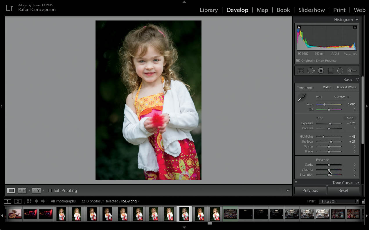
Figure 18.3 This is the image before I adjusted the Saturation or Vibrance sliders.

Figure 18.4 I used the Saturation slider to adjust the image, and you can see that the skin tones and reds in the image are overdone.

Figure 18.5 When I used the Vibrance slider, only the greens were affected.