
5The Color Tool Tab
Capture One Pro has long had a reputation for producing pleasing, natural-looking colors. Unlike Adobe products, which are designed to produce measurably precise colors, Phase One creates its camera profiles using a combination of measured values, perceived quality, and experience. Experience is especially important when it comes to creating and fine-tuning ICC profiles that can be applied in a wide range of situations. This approach addresses questions such as “How do we deal with deviations from a neutral white point?” or “To what degree should colors shift when a user adjusts the color wheel or the tone curve?”
Capture One’s many options are designed to produce pleasing rather than precise colors.
An ICC camera profile has to be carefully fine-tuned to ensure that it reacts robustly to different approaches to image development and processing. This is a lengthy process, and some profiles go through several iterations until they are deemed sufficiently robust for universal use by Phase One.
And this is where the Color tool tab comes in. It can be used to creatively adjust image colors but also to tweak the basic camera settings to suit your own personal preferences. This chapter discusses the Color tools in the twin contexts of creative processing and the creation of your own default “look.”

5.1 The Base Characteristics are the jumping-off point for the Capture One Pro workflow.
5.1Base Characteristics: Rendering Engines, ICC Profiles, and Curves
The Base Characteristics tool determines how Capture One approaches raw data processing. If we compare our work with that of an interpreter at an international conference, the chairperson (Capture One) has to be told which language the speaker (the camera) will use to hold the lecture (the image) so that an interpreter with the right capabilities (the Base Characteristics) is given the job. If the speaker uses English, the chairperson will recognize this automatically, but different dialects require different interpreters.![]() 5.2
5.2
As discussed in section 1.4, the choice of “interpreter” takes place via ICC/ICM profiles. Capture One doesn’t provide multiple “dialects” for all the cameras it supports and gives priority to studio-based devices. Whatever camera you use, Capture One can only deal satisfactorily with its images if it has access to a corresponding ICC camera profile (the interpreter).

5.2 Here, Capture One has automatically detected that an image file was captured using an IQ3 back, but it has left it up to you to select what “dialect” it should assume for interpreting the raw data into a color image.
QUICK TIP
Color rendition is a matter of taste, so feel free to experiment with various ICC profiles for each of your cameras—perhaps you’ll find that you prefer the results produced by the profile designed for your model’s predecessor better than its dedicated version, or perhaps even one from a different camera manufacturer altogether. To stick to our analogy, maybe you prefer the way a French interpreter pronounces English to that of a German or Spanish colleague.
Once you’ve found a profile you like, use the action menu in the Base Characteristics tool to save it as the default for your camera.
The next step is to determine how your raw image data should be modulated. Digital image sensors capture data linearly, but human perception isn’t linear at all. Images developed using linear techniques often appear dull and lifeless, which can have its uses in reproduction or forensic imaging situations, but is less useful in everyday photographic situations in which we want to reproduce colors the way we remember seeing them. We modulate the image data using tone curves.
In our conference analogy, if an ICC camera profile represents the interpreter, the tone curve represents the PA system that amplifies the speaker’s voice.
5.3 Linearly developed raw files often appear “flat” and lifeless. The tone curve you use has a significant effect on the look of your images.
Capture One provides four default tone curves: Film Extra Shadow, Film High Contrast, Film Standard, and Linear Response. Film Standard is the default curve and provides a basic look that appears natural to the human eye.

5.4 The raw data (left) is processed using the selected tone curve (center). The result is an image with tones that are closer to those that humans instinctively perceive.
Returning once again to our meeting analogy, the Film Standard curve increases bass and treble (like the loudness dial on an amplifier). Film High Contrast has the same effect but also increases the overall volume to make the content easier to perceive. Film Extra Shadow raises the midtones, whereas Linear Response switches everything to zero.
As when you are using an audio amplifier, the settings you use depend on the source material and the effect you wish to achieve. How much loudness (contrast) do you need to play a finely honed piece of chamber music (equivalent to a portrait photo)? At which point do the effects outweigh the look of the original, and which settings underscore its intended effect?
QUICK TIP
Film Standard is a good choice in most situations. Use it as default for all of your cameras and use other curves only for individual images that demand you “pump up the volume.”
5.2Histograms: Evaluate and Understand
Histograms display the range of tonal values in an image graphically. They tell you how dark the shadows are, how bright the green midtones are, and how the entire range of tonal values in the image is distributed. If, as I recommended in the previous section, you’ve already experimented with different tone curves and camera profiles, you’ll have noticed that the histogram display in the Color tool tab changes, too. ![]() 5.5
5.5
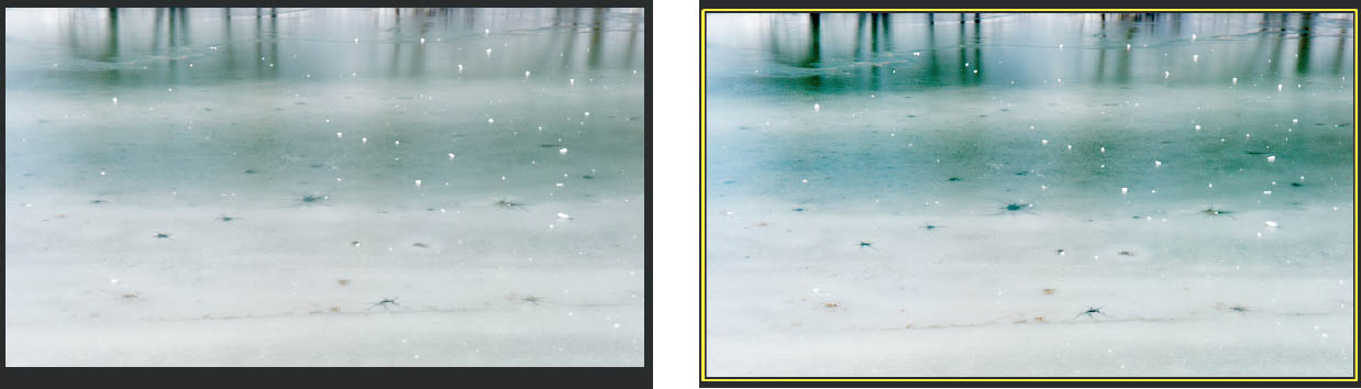
Capture One displays histograms at various points in the workflow. They are all based on the same source material but refer to different stages of the pipeline.

5.5 Two histograms for the same file—with the Linear Response tone curve applied (top) and with Film High Contrast (bottom).

5.6 An image and its histograms at various stages in the pipeline
The Histogram tool is located by default in both the Color and Exposure tool tabs and shows the current state of the active image. This includes all the adjustments you have made, whether to the tone curve, the camera profile, white balance, or exposure. This is a display-only tool and provides no means of making further adjustments. In other words, it shows the current “internal” distribution of tonal values in your image.
Further histograms can also be found in the Levels tool, the Exposure tool tab, the Exposure Evaluation section of the Capture tool tab, and the Curve tool. This might be a little confusing for beginners, so the following sections take a closer look at each to enable you to better evaluate the effects of the adjustments you make. ![]() 5.6
5.6
The Exposure Evaluation Histogram

5.7 Exposure Evaluation helps you judge under- and overexposure.
This histogram displays the undeveloped, linear raw image data to help you judge whether an image is under- or overexposed. This display never changes. We’ll come back to it later in the context of tethered shooting (see chapter 14), the area where it’s most useful and the reason it’s included in the first place.
The Levels and Curve Histograms
These two histograms work in tandem and are included by default in the Exposure tool tab. Unlike the other two histograms, they are both active tools and not just designed for evaluation purposes. We’ll take a closer look at them in chapter 6.
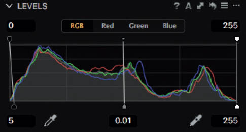
5.8 The Levels histogram enables you to adjust shadows, midtones, and highlights separately for all three color channels or simultaneously.
The Levels histogram displays the current state of the image, including all adjustments to exposure, white balance, the camera profile, High Dynamic Range settings, and so forth. However, it doesn’t react to changes you make using the Curve tool, which works in sequence with the Levels tool. In other words, the Curve tool bases its display and adjustments on all previous adjustments, including Levels. Note that changes you make using the Curve tool don’t influence your previous adjustments and are therefore not reflected in the Levels histogram. To oversimplify a little, the Curve tool is used to fine-tune the look of an image shortly before output.

5.9 The Curve tool enables you to fine-tune the look of an image—if necessary, separately for each RGB color channel. It is used to modulate the tonal values in an image at the end of the development process the same way the Base Characteristics curve does at the beginning.
The Histogram Tool
Like the Exposure Evaluation tool, the Histogram tool offers no adjustment options and instead provides a purely informative display of the current state of your image, including proof profiles. In other words, it displays the tonal values that would end up in your image if you were to output it now. This makes it the most important of all the histogram displays. The levels of shadow and highlight detail also depend on the process recipe you use (see chapter 13), and only the Histogram tool includes the selected output profiles in its display. It pays to keep it open in the Exposure tool tab or float it on your desktop. With a little practice, you’ll be able to judge image quality without having to output a copy—a glance at the histogram is all you need to check whether your image is too dark, too bright, or just right for output to your selected medium.

5.10 The Histogram tool shows the tonal distribution in the finished image that you save to disk.
QUICK TIP
Practice by opening all four histograms in the Exposure tool tab (right-click within the tab to add a tool) or as floating tools (via the Window > Create Floating Tool menu option). Hide all other tools except Exposure Evaluation and the histograms and experiment with various exposure, contrast, and saturation settings. You’ll quickly learn which histogram reflects which adjustments and which histogram is most useful at the various stages of the workflow.
5.3White Balance

5.11 White balance is a central element of all the color adjustments you make in Capture One. Always make setting it the first step in your workflow.
There are two reasons you should always adjust the white point before you make any other adjustments to an image:
- 1. The white point in a freshly captured image is saved only as part of its metadata, whereas the pixels themselves are still “raw.” Every raw developer interprets white points differently.
- 2. A neutral white point isn’t right for every image. For instance, who wants to “normalize” a spectacular sunset to neutral gray?
Point #1 is one of the reasons raw files look different in different programs. Daylight in Lightroom is not the same as it is in Capture One, and is usually different again from the JPEG preview displayed on the camera monitor.

5.12 The same file, displayed using the default settings in Lightroom (left) and Capture One (right). Although both images look very warm, the bell pepper is orange in one version, and yellow in the other.
5.3.1Setting White Balance Using a Gray Card
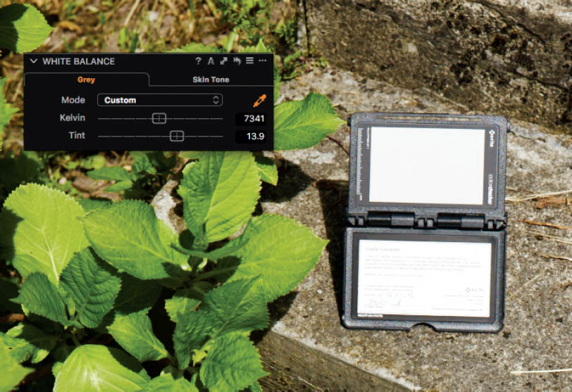
Selecting a neutral white point is a common way of “normalizing” an image for further processing. The easiest way to do this is to photograph a piece of gray card in the same lighting situation as your subject and use the Pick White Balance tool (access using the W shortcut) to select it.
Using a gray card is the best way to ensure that your camera produces neutral colors.
5.13 Setting white balance using the Pick White Balance tool
Alternatively, if you don’t have a gray card or you’re not sure whether yours is still truly neutral gray, you can use the tool to pick an area that appears to have the right neutral tone. Portrait photographers often use the whites of their subjects’ eyes as a reference.
Gray cards are constructed using spectrally flat colors that always reflect the same amount of light. Most gray cards are built to reflect 18 percent of the incident light, and the white balance function built into most raw developers (like the auto white balance setting in your camera) is based on the same metric. However, gray cards lose some of their reflectivity with age, making precise measurements impossible. Make a note of when you purchase a gray card and store it in a lightproof box or bag when it’s not in use.

5.14 The X-Rite ColorChecker Passport is well built and folds away into its own lightproof case when it’s not in use. The built-in date-of-purchase field helps you to estimate its age and degree of reflectivity.
If you need to adjust white balance manually (for example, because the gray card you used was no longer neutral), use the Tint slider in the White Balance tool. If your image has a green cast, move the slider to the right. If it has a magenta cast, move it to the left. If you click the value directly, you can use the up and down arrow keys to fine-tune the value in increments of 0.5. If you do the same with the Shift key pressed, the increment switches to 2.0.
5.3.2Auto White Balance
Capture One has a built-in Auto White Balance function operated by clicking the A icon in the title bar of the White Balance panel. This calculates a (hopefully) neutral white point value based on the RGB values contained in the image. You might have to adjust the auto value a little, but it usually produces usable results for images captured in daylight or full-spectrum studio light.
Auto White Balance often saves a lot of effort but sometimes has to be manually fine-tuned.
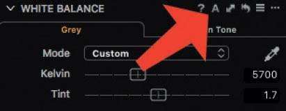
5.15 The White Balance panel with the Auto White Balance button indicated by the arrow
If you find that the Auto White Balance option is good enough for most situations, you can activate it globally using the Adjustments > Auto Adjustments > White Balance command. You can then apply it to all of your freshly imported images using the Auto Adjust (Cmd/Ctrl+L) command or by checking the Auto Adjust option in the Import Images dialog (see section 4.4).

5.16 If you are happy with the results produced by the Auto White Balance function, you can opt to apply it automatically during image import.
5.3.3The Skin Tone Tool
The Skin Tone tool is unique to Capture One. It offers Beige, Honey, and Rose tones, each with Deep, Medium, and Light settings. These presets won’t apply to everyone, but they offer a useful range of starting points when you’re capturing skin tones in artificial light without the help of a gray card. The tool comes into its own if you regularly photograph the same person:
The Skin Tone tool is particularly useful if you often photograph the same people.
- 1.Neutralize the white balance settings in the Grey tab of the White Balance tool, if possible using a gray card held by your model.
- 2.Switch to the Skin Tone tool.
- 3.Check the “Pick to create new” option.
- 4.Use the Pick Skin Tone eyedropper to select a well-exposed and evenly lit area of your model’s face (the forehead, for example) and save your selection under a meaningful name in the dialog that follows.
 5.17
5.17
You have now saved a skin tone preset that perfectly matches your model’s skin. Next time you’re photographing the same person, simply select the appropriate preset in the Skin Tone drop-down list and use it to select the part of your subject’s face you used to create it.

This method is never as precise as using a gray card. Changes in makeup and the your model’s current mood can make a difference in the value you measure, but the tool is still useful for saving a basic look that you can fine-tune during each session.

5.17 Using the Skin Tone tool with a live subject
If your model is looking paler or rosier than usual, you can still fine-tune your preset using the White Balance tool.
As mentioned in section 5.3.1, in most situations you will have to fine-tune white balance using the Tint slider in the White Balance tool’s Grey tab. This is especially true if the real subject is an item of clothing rather than the model. Manual corrections are also necessary when colored reflections occur or some of the ambient light is absorbed—for example, if you’re shooting among trees or with mixed light sources.
Since version 8, white balance can also be adjusted locally, which is often necessary if you’re shooting with mixed light sources. See chapter 10 for more on local adjustments.
5.4Color Balance
The Color Balance tool is one of the most popular in Capture One’s bag of tricks. It uses a color wheel to adjust the overall look of the image. If you want your image to look a little cooler, all you have to do is shift the wheel toward blue. Conversely, if you want to make things look a little warmer, a shift toward yellow/orange usually does the trick. All versions of Capture One ship with presets for such a “Cool Look” and “Warm Look,” with three strengths, numbered 1 through 3.

5.18 The Color Balance tool is central to the workflow pipeline and influences all other tools that are based on tone curve adjustments. Always adjust color balance after you have adjusted the white point but before you make any other color adjustments, or before you convert an image to black and white.
During version 8’s life cycle, Phase One rebuilt the tool from the ground up. Color Balance as seen in Capture One Pro 10 is the final version—for the time being. Phase One might tweak the algorithms in the background for future point-releases, but the tool’s look-and-feel also found its way into the revamped Color Editor (see section 5.6). If you’re coming from an earlier version of Capture One, don’t be intimidated by the new tool; you can still easily make general adjustments that range between cool and warm, but you can also make complex adjustments that previously required a lot of time and effort fiddling with the Levels and Curve tools or third-party software like Google Nik Collection Color Efex Pro and Adobe Photoshop.
In its simplest form, the Color Balance tool works the same way it always did.
You can use the Color Balance tool to alter the tone of the white point separately for shadows, midtones, and highlights.

5.19 The Color Balance tool, as we have come to know and love it
You use the color wheel to select the color you want to use to “tone” the white point. It’s kind of like dyeing your hair—you don’t want to turn your blond hair blue, but perhaps give it a reddish shimmer. The Color Balance tool gives that boring old neutral white point a cooler or warmer touch. Because the white point is the most important metric for the rendition of all the colors (see section 5.3), even slight alterations make a big difference to the overall look of an image.

5.20 From left to right, these images were toned using the Cool Look 3 preset, a neutral white point, and the Warm Look 3 preset. Each screenshot shows the corresponding settings in the Color Balance tool.
In addition to the basic tool, version 8.1 introduced separate shadow, mid-tone, and highlight toning options like the ones in Apple Aperture. Even with its expanded capabilities, the tool remains intuitive to use and has thus seen very little change even with Capture One 10.
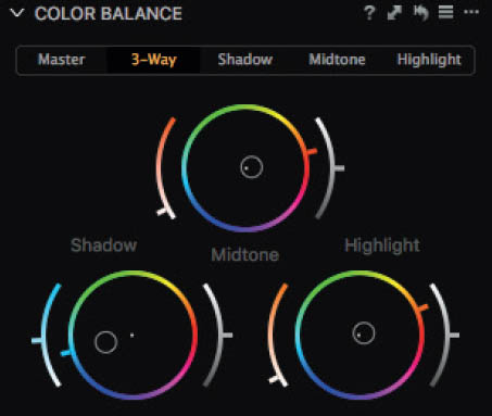
5.21 In the new version of the Color Balance tool, the Master adjustment is equivalent to the white point adjustment you’re probably familiar with.
The tool works in basically the same way as the black, gray, and white Tint dials in Aperture and Lightroom’s Split Toning tool. You select a color and then the strength of the toning effect—Capture One automatically alters the shape of the tone curves to match.
In principle, you can achieve the same effect using the Levels or Curve tool in the Exposure tool tab—all these tools adjust your image at about the same stage of the pipeline, although the Color Balance tool is much easier to understand and use. If you have created your own presets using earlier versions of the tool, you can still use them with the latest iteration.
The tool is controlled using color wheels with built-in sliders. The setting in the wheel determines the hue, whereas the left-hand slider controls saturation and the right-hand one lightness.
QUICK TIP
If you want to give an image a slightly cooler or warmer look, stick to using the Master color wheel and ignore the other options. Used this way, the tool will adjust the entire image to suit your setting and saves you the effort of setting three separate sliders.
Creating a Cross-Processing Filter
The Color Balance tool is designed as a creative tool rather than a means of correcting image errors. It is great for copying effects that you like and creating your own styles. Cross processing is one of the most popular develop effects around, and it’s based on the analog darkroom technique of developing C-41 color negative film in E-6 slide development chemicals, or developing slide film with black-and-white chemicals, or any other combination you can think of.

5.22 This is a look we all know.
One of the most popular cross-processing looks is achieved by developing slide film using color negative chemicals. The resulting images have high levels of contrast, blue-tinted shadows, and yellow-green highlights. The following steps explain how to re-create this effect using the Color Balance tool:
- 1.Select an image with average contrast but highly saturated colors. This will help you to see the effects you apply. Now switch to the Color Balance tool.


- 3.Switch to the Shadow tab. Slide film developed in C-41 chemicals usually has a deep blue cast in the shadows. To reproduce this effect, shift the lightness slider (on the right) and the saturation slider (on the left) all the way to the top and click your desired blue hue in the color wheel.

- 4.Readjust your lightness and saturation settings until you get the effect you are looking for in the shadows. Remember: Less is more! High saturation and lightness values produce dramatic effects, but lower values produce images that look more natural.

- 5.Switch to the Highlight tab and perform the same steps as before, this time using a yellow hue.

- 6.The 3-Way tab gives you simultaneous access to all three color wheels. Adjust their saturation and lightness settings in the shadows and highlights to produce a pleasing overall look.

- 7.If midtone areas such as human skin end up looking unnatural, use the Midtone tab to select a hue on the opposite side of the circle to the one you wish to correct. In our example, the subject’s skin looks a little too orange, which is why we selected a blueish hue.

- 8. Once again, use the lightness and saturation sliders to eliminate the color cast and that’s it—you have now produced an image with a cool cross-processed look.

QUICK TIP
Unless your project has critical colorimetric guidelines (reproduction work, for example), there is no right or wrong approach to working with colors in Capture One. Some people like skewed, “lomographic” colors, whereas others prefer their images to look as natural as possible. Always save color balance settings that you like (use the Save User Preset command in the Manage and Apply menu). You’ll quickly build up a library of “process simulation” presets that you can apply to a wide range of images. If you find after a while that an effect is too heavy-handed, you can tweak it and reapply.
5.5Black & White
For a long time, conventional wisdom upheld the notion that you need dedicated software to produce monochrome results that look like “real” film-based images rather than just desaturated color photos. In view of the endless possible combinations of films, emulsions, and developers, it’s pretty obvious that simply dialing out the colors won’t produce a genuine-looking black-and-white image. For a black-and-white conversion to look convincing, you have to precisely adjust its tonal values and take into account the effects of different colors.

5.23 The Black & White tool bases its adjustments on the current state of your image—including the white point setting, tone curve adjustments, and color balance—so it’s usually a good idea to use the Black & White tool as the final step in your workflow.
Google Nik Collection Silver Efex Pro is one of a number of specialized programs that used to prove just how expensive high-end black-and-white know-how and algorithms can be, but it was nevertheless a popular choice among monochrome enthusiasts. Since Google released the Nik collection for free, its popularity only grew. Such programs are built from the ground up with monochrome conversion in mind, and offer a range of tools that are optimized for this kind of work. Additional tools such as a digital Ansel Adams–style zone system ensure that many photographers stick to using dedicated software and don’t even consider converting their images at the raw development stage.

5.24 Silver Efex Pro is a powerful but simple-to-use program designed explicitly for working in black and white.
The downside of such specialized software is that it only works with TIFF, PSD, or JPEG image files, so you have to develop your raw images before you convert them. In turn, this means that you have to keep the raw version of each image with its associated settings as well as a copy for conversion. Additionally, if you adjust the original, you’ll have to convert it all over again. Even though Silver Efex Pro can be used as an Aperture or Photoshop plug-in that enables you to adjust the black-and-white layer separately from the rest of the image, the plug-in still requires bitmap data to work on.
The Levels, Curve, Black & White, and Film Grain tools give you all the options you need to make perfect monochrome images.
If you discover a major error such as dust on the sensor that only becomes apparent when you apply a film simulation, or a source image that wasn’t sharpened enough at the import stage, you simply have to start over. And this is where black-and-white conversion at the raw development stage comes into its own. Capture One has been a favorite among monochrome enthusiasts for quite a while because the Film Grain tool (see section 9.5) enables you to produce authentic-looking high-end monochrome images for display on a monitor or printing. Because the black-and-white conversion takes place on a raw data level, you can easily make further adjustments to your original images without having to repeat the black-and-white conversion process.
The settings in the Color Sensitivity tab determine how your virtual black and white film reacts to the colors in the visible spectrum and can also be used to simulate the use of filters. Yellow and red filters are often used in black-and-white photos—for example, to darken the sky, brighten grass, or shift skin tones into a more appropriate tonal range (or “zone” as Ansel Adams would have said). The greatest benefit of converting to black and white at the raw development stage is that you don’t have to use filters while you shoot. Because you’re working with raw image data, you can add and fine-tune whichever filters you like during processing.

5.25 The Black & White tool’s default location is in the Color tool tab. Right-clicking the Color tool tab title bar opens a context menu in which you can add a dedicated Black & White tool tab that contains the Black & White, Exposure, Levels, Curve, Clarity, Vignetting, and Film Grain tools.

5.26 The Color Sensitivity tab can be used to simulate the effects of color filters. Capture One provides a wide range of filter presets for you to experiment with.
Try not to overdo your Color Sensitivity settings. Capture One is very good at producing smooth color gradients, but if you aren’t careful, you can easily produce unwanted banding effects, especially in high-contrast images. Regulate your settings until any artifacts are no longer visible.
The Split Tone tab enables you to tone the highlights and shadows in your image separately. Most people are familiar with sepia-toned images, but special analog chemicals and paper types can also be used to produce other colors and combinations of tones in the light and dark areas of an image—and this is the type of effect the Split Tone sliders create.

5.27 The Split Tone sliders can be used to simulate coffee-colored grays on a “cool” paper just as easily as a conventional sepia tone. The Black & White tool offers a range of presets.
QUICK TIP
It is up to you to decide which stage in your workflow is best suited to applying the Black & White tool’s effects. The advantage of performing your monochrome conversion in Capture One is that it enables you to decide whether, when, and how you apply each tool. However, when working in black and white, it’s always a good idea to clone your original color image before you convert it. This way, you can optimize the Curve and Levels settings in your monochrome image without spoiling the work you’ve already done on the color version. To clone an image, right-click it in the Browser and select Clone Variant.
Producing Perfect Black-and-White Images for Printing or Online Publishing
Capture One makes it simple to create and manage multiple versions of your images. This is particularly useful when you’re working on monochrome variants, because you never know when you might want to go back to your original color version. Additionally, images destined for online publishing often have to be prepared differently from those that you wish to have printed at a lab or that you print at home. The following steps explain the most efficient way to produce black-and-white versions of your images for print and online sharing.
- 1.Select an image and develop it; then copy it using the Clone Variant command in the Browser context menu.

- 2. Check the Enable Black & White option in the Black & White tool to display your image with desaturated colors.

- 3.Begin by adding filters. For this example, use the Yellow filter 1 preset to darken the sky.

- 4. The preset works well but still doesn’t produce quite the effect we’re looking for, so use the settings shown here to fine-tune it.

- 5.Adjust the tonal distribution to keep the main foreground subject mid-gray while increasing overall contrast. To do this, select the Curve tool in the Exposure tool tab, switch to the Luma view, and drag the curve into an S shape.

QUICK TIP
Using the Luma curve enables you to work with the luminance levels as they are recorded in the raw file. As we’ve already discussed, raw images are basically black-and-white images; the color values per pixel are only calculated during the development process by interpreting those luminance values with the known pattern of the color filter array in front of your sensor. Different from RGB mode, the Luma curve ignores these color calculations—it stays in black-and-white mode, so to say, and hence is perfectly suited for working with your monochrome images.
- 6. Our image looks better, but the shadows aren’t dark enough. To sort this out, switch to the Levels tool and increase the midtone value while moving the highlight and shadow zones closer together.

- 7.Now let’s adjust the details. To fine-tune overall texture and tweak the contrast between the main subject and the rest of the frame, switch to the Clarity tool and select the Punch method.

- 8. Now adjust the shadow and midtone settings in the Levels tool to achieve the right compromise between a punchy overall look and sufficient shadow detail. Zoom into the 100% view to check your settings and readjust them if necessary.

- 9.Adding a grain effect adds to the analog feel. To do this, switch to the Details tool tab and a 100% view and select the Silver Rich option in the Film Grain tool. Adjust the Impact and Granularity sliders until you achieve the effect you are looking for.

- 10.If you’ve followed the steps so far, you now have an image that is ready for inkjet printing. Create another clone using the Clone Variant option in the Browser context menu.
- 11.If you scale your image down for web viewing, the grain effect and the effects of your Clarity and Structure settings will change accordingly. To compensate, increase the Granularity value by 30–60 points and the Clarity and Structure values by 10–20 points, depending on the size of the web version. In our example, I scaled the image to 50% of its original size and set +30 for Granularity and +10 for Structure and Clarity.

- 12.In the Output tool tab, choose the process recipe you usually use for web output. Double-check whether your Scale settings are as desired, and then activate Recipe Proofing either with the corresponding menu item in the View menu or by clicking on the glasses icon. Capture One’s Viewer will now display the image as if it were already exported—in our example, exported as a JPEG with 960 px on the long edge, including the scaled down Film Grain and Clarity effect. You can now adjust the values for Clarity, Structure, Impact, and Granularity until you are happy with the final result, optimized for web output.

This example doesn’t provide ideal values for each and every black-and-white conversion, but it does indicate the ideal sequence in which to apply the steps involved. See chapter 6 for more on the Levels, Curve, and Clarity tools. The Film Grain tool is discussed in detail in chapter 9, which also includes further details on combining grain, clarity, sharpening and noise reduction in web-based images.
5.6The Color Editor

5.28 In our idealized workflow, the Color Editor follows the Base Characteristics settings (see section 5.1), but nevertheless reacts to all previous and subsequent color adjustments. I recommend using the Color Editor after you have made any adjustments using the Color Balance and White Balance tools.
The Color Editor is one of Capture One’s most popular tools, and some users maintain that it was deactivated in the Express version of the program to get more people to upgrade to the Pro version. Once you’ve spent a while working with the Color Editor, you’re sure to be impressed by the ease and speed with which you can perform high-quality color edits.

5.29 The look and feel of the Capture One Pro Color Editor tool is adapted from that of the Color Balance tool. It may look confusing but is, in fact, just complex!
Among other things, you can use the Color Editor to do the following:
- Correct color casts—for example, if you have to shoot in (poor) artificial light.
- Compensate for the color errors produced by a weak in-camera infrared filter.
- Creatively recolor image details, such as the iris in a subject’s eye or a flower.
- Clean up skin blemishes and irregularities, even if your model used makeup.
- Intensify color effects—for example, to make a sunset more dramatic or give a landscape extra punch.
- Select a range of colors, and then create a new Adjustment Layer from this selection to edit these image areas with tools other than just the Color Editor (see chapter 10).
These are, of course, all tasks you can perform in Photoshop or by using specialized plug-ins like Color Efex. However, as described in section 5.5, performing these types of adjustments at the raw development stage produces higher-quality results and enables you to alter your color settings later without having to trash all your other settings.
QUICK TIPS
Settings you make using the Color Editor can be saved as ICC color profiles using the action menu (the three dots at the top right in the tool panel). This makes the Color Editor a useful tool for making ad hoc adjustments to camera profiles (see section 5.1) and offers a much easier way to desaturate, brighten, darken, and modulate colors than creating a new ICC camera profile from scratch.
Also in the action menu, you will find the option Create Masked Layer from Selection. When you choose this option, the selected color range is used to create a new Adjustment Layer in the Local Adjustments tool. This makes it easy for you to not only fine-tune the tone of blue in the sky (i.e., do color edits), for example, but also to use tools such as Sharpening, Noise Reduction, Clarity, or Exposure correction on the selected range only. Sticking with the sky example, you usually don’t want high levels of sharpness in a uniform sky because it would only accentuate sensor noise or dirt spots. Use a masked layer of the sky, switch to the Local Adjustments tool tab, and turn off Sharpening—done.

5.30 The Basic tab in the Color Editor is clearly laid out and is great for making quick color adjustments or performing on-the-fly creative tweaks.
5.6.1The Basic Tab
The Color Editor offers Basic, Advanced and Skin Tone tabs. The Basic tab is the simplest to use: pick a color using the Color Picker (eyedropper) or one of the color ranges (or “slices”) displayed in the lower part of the tool’s panel and use the Smoothness, Hue Rotation, Saturation, and Lightness sliders to tweak it as you wish. ![]() 5.30
5.30
The Color Editor makes it quick to adjust and retouch colors.
The Saturation and Lightness sliders are self-explanatory. The Hue Rotation slider rotates the selected color slice within the color wheel.

5.31 Here, I selected the green color range and rotated it toward blue (on the left) and toward yellow (on the right).
Imagine you have shot a session under a tree and your subject’s face has turned out looking too green. All you have to do is click on the face using the Color Picker and use the Hue Rotation slider to shift the color wheel toward red. If a photo of a sunset doesn’t turn out as dramatic as your memory of it, select the sky and rotate the blue slice toward violet. The Basic tab isn’t designed with high-precision adjustments in mind, but the Smoothness slider and the “View selected color range” option make it effective for quick adjustments.

5.32 Checking the “View selected color range” option desaturates the image in the Viewer and displays only the selected range in color. Used together with the Smoothness slider, this enables you to precisely fine-tune the range of tones included in the selected range.
The Smoothness setting determines the degree of similarity between the colors that are included in the selected range. The default value 12 includes tones that vary only slightly, whereas a value of 1 affects only the tone you’ve selected, and a value of 29 affects a wide range of tones on both sides of the selected one.
You can use different settings for each color range and the settings you select are shown in the ΔH, ΔS, and ΔL columns in the tool panel. Δ stands for the Greek letter delta and denotes the difference between the displayed and original values. The check boxes next to each color range show which of your adjustments are currently active.

5.33 The blue color range has been shifted toward turquoise, darkened, and its saturation increased. The orange range has been shifted slightly toward red but is otherwise unchanged.
The last entry in the range list applies to all the tones in the image instead of just a selected range. If you select this entry, the Smoothness slider will be grayed out.
This option is useful for performing quick repairs on color casts—for example, if you forgot to use a yellow filter for a black-and-white shot or if the blue spotlights in a theater shot turn out too pink.
5.6.2The Advanced Tab
The Advanced tab enables you to create your own color ranges and make adjustments that are more precise than those you can make in the Basic tab.
In principle, the Advanced tab works just like the Basic tab. You select a color, define a range, and adjust your tones accordingly. The difference between the two tabs lies in how you select colors and the tools available for adjusting them. To understand fully how the Advanced tab works, let’s first take a closer look at the color wheel.
The color wheel is based on the traditional color model that you perhaps encountered in art classes at school. Complementary colors lie on opposite sides of the wheel, and saturation increases toward the edges (that is, the center is white where all colors are completely desaturated and the edges show completely saturated colors). The Advanced tab enables you to precisely define and display the range of tones in a slice.
The color you select in the Viewer using the Color Picker (eyedropper) is indicated by a dot, and you can precisely define the saturation and range in the slice by shifting the surrounding edges.

5.34 The Capture One color wheel

5.35 The tones you’ve selected are the ones that are affected by your adjustments. You can adjust the range and saturation by shifting the edges of the color slice.
The tools in the Advanced tab are the same as those in the Basic tab, with the addition of the Span Full Saturation Range and Invert Slice options.
The former increases the saturation range from the center to the edge of the color wheel as it does in the Basic tab, whereas the latter does exactly what it says and alters the selection to cover the tones you haven’t selected.
5.36 The Advanced tab in the Color Editor includes Invert Slice and Span Full Saturation Range options.

5.37 The original color range selection is shown on the left and its inverse on the right.
The Invert Slice option comes into play when you want to prevent certain colors from being altered. The best-known example of this type of usage is in color key shots, in which all colors but one are shifted to grayscale. To do this in Capture One, follow these steps:

- 1. Use the Color Picker to select the color you wish to retain.
- 2. Check the “View selected color range” option at the bottom left of the panel (circled in red below) and alter Smoothness and the shape of your slice until the Viewer shows your desired range of tones.
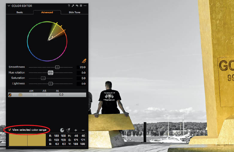
- 3. Uncheck the “View selected color range” option and click the Invert Slice button at the bottom right of the panel (circled in red on next page).

- 4. Shift the Saturation slider all the way to the left.

IMPORTANT
The Color Key technique is an obvious but basic example of how to use the Color Editor—the tool is capable of making extremely finely nuanced adjustments. To get a feel for how powerful it is, experiment with images that show obvious color casts as well as images that don’t necessarily require adjustment. You’ll quickly learn to recognize when you need to use the Color Editor and when the Color Balance tool (see section 5.4) or even just the White Balance tool (see section 5.3) will do. Remember that any adjustments you make to your colors later on will affect the selections you make using the Color Editor. For example, if you want to give an image with a corrected white point a warmer feel using the Color Editor, it will alter tones that tend toward yellow/orange.
5.6.3The Skin Tone Tab
At first glance, the Skin Tone tab appears identical to the Advanced tab. However, on closer inspection you’ll notice a couple of things:
The Skin Tone tab is a specialized version of the Advanced tab.
- It only works for one very specific color range.
- Instead of the Invert Slice option, it includes additional sliders labeled Uniformity.
Because most portrait photos have only one basic skin tone, the Skin Tone tab doesn’t offer a set of alternative color ranges like those in the Basic tab. The Uniformity sliders are the killer feature in this tool. ![]() 5.38
5.38
Studio photographers spend a lot of time and effort ensuring that their models are perfectly made up, often with the emphasis on achieving a balanced look for the skin rather than concentrating on eye-catching lips or striking eye styling. News anchors often sweat under layers of makeup, politicians use face powder for press conferences, and models usually wear plenty of makeup, even if they are hired to promote a “natural” look. They do this to prevent unwanted glossy reflections and produce a clean overall look. The Uniformity sliders help you do the same even after a shoot is over. ![]() 5.39
5.39

5.38 The Skin Tone tab is simple to use and makes life a lot easier for portrait photographers.
It works by shifting similar tones closer to one another and, like the Smoothness slider, includes tones that are similar to (but not the same as) the selected one. With the Hue slider, you combine various slightly different hues into a more uniform appearance—for example, to tone down freckles. The Saturation slider does the same with different levels of saturation (rather than different hues). Think of applying a foundation to the model’s skin. Brightness moves different levels of skin luminosity together—what the cosmetics industry would refer to as a “more transparent look” after using a skin powder on top of the foundation.
The higher the values you select for the three sliders, the farther apart different colors (or rather their hues, brightnesses, and saturations) can be until they are moved closer together. To put it bluntly, with the Uniformity tools you narrow the amount of available colors in an image, without altering the image itself. You won’t lose any fine detail or structures when you use Uniformity. So, going back to the freckles example from above, the freckles won’t disappear completely.
QUICK TIP
If you’re taking group portraits or photos of just two people, you’ll often end up capturing more than one skin color range. Fortunately, the Color Editor is available as a local adjustment in the Skin Tone tab, enabling you to mask individual faces and adjust the skin tone separately for each. See chapter 10 for more on local adjustments.

5.39 We used pretty high settings for the Uniformity sliders for the image on the right. The model’s skin looks smoother but still retains all its detail.