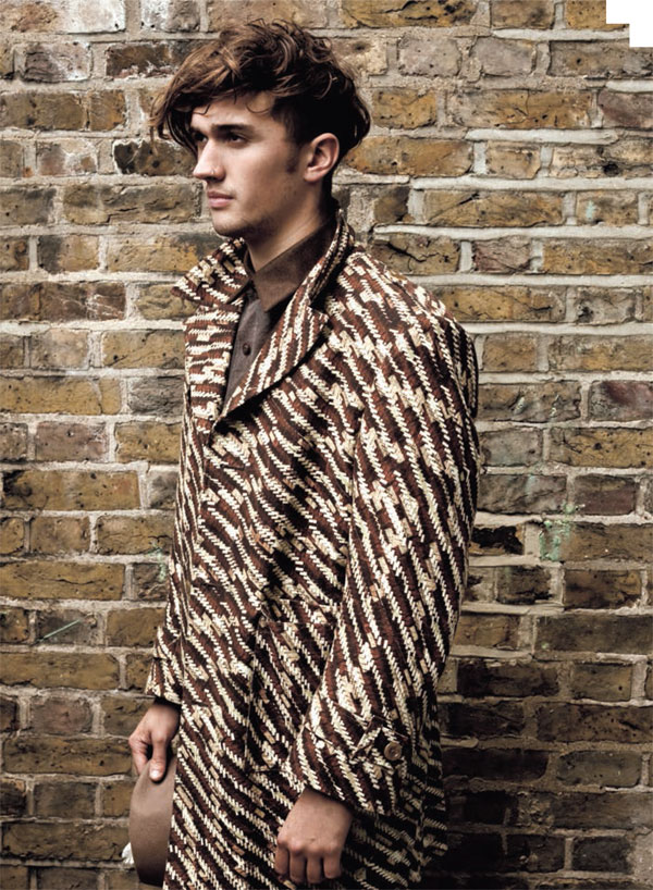
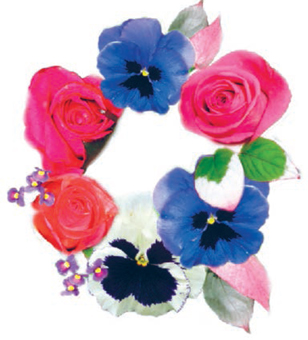
2
DIGITAL DESIGN TUTORIALS
Adobe Photoshop and Illustrator together offer a perfect platform for textile design. While the bitmap-based Photoshop gives you the freedom to edit and manipulate drawings and photographs, the vector-based Illustrator enables the creation of accurate graphic drawings and effects, such as streamlined shapes and sharp geometrics. Photoshop is programmed in such a way that an image is made up of a mosaic of individual colored pixels; the software itself does not automatically recognize shapes unless they have been separated out by the user. Motifs that are significantly enlarged, for example, will eventually lose their integrity and become “pixelated” so that fine lines appear jagged. The total number of pixels over an area is called the resolution, and this determines the quality of the image.
Illustrator creates a graphic image from a series of points, lines, curves, and shapes. Sophisticated and high-quality artwork and graphics can be created with the wide range of drawing tools on offer. Once an image is created it can be scaled indefinitely without degradation. It is possible to design solely using either Photoshop or Illustrator, or to work between the two— either way, they offer a perfect toolkit for textile design. The introduction of the digital stylus pen has also given fluidity to the action of drawing with the computer so that it is now more akin to drawing by hand.
Originally designed for the graphics industry, these tools are now leading textile designers along different avenues of creativity and extending the range of design possibilities available to them. Previously, designers were required to hand render their ideas and designs, which was often a time-consuming process, but working within a digital environment has speeded up this task. This allows more time for experimentation and exploration, thus freeing up the designer’s imagination. Because these programs are now recognized as standard tools for textile designers, it is essential to acquire the skills to use them with confidence. With perseverance, designers will learn to use them intuitively, making them just as important as paint and brushes have always been. This chapter offers inspiration by demonstrating the wealth of possibilities that these programs give to the textile designer. With a series of step-by-step tutorials focusing on particular techniques that are relevant to textile design, amply illustrated with work by both students and established designers, this chapter is aimed at students who have already acquired a basic knowledge of Photoshop and Illustrator. It begins by looking at the skills and tools that underlie all good digital textile design, including research and drawing, the use of the scanner, the digital stylus pen, and the incorporation of photography.
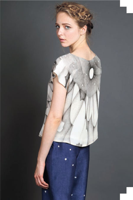
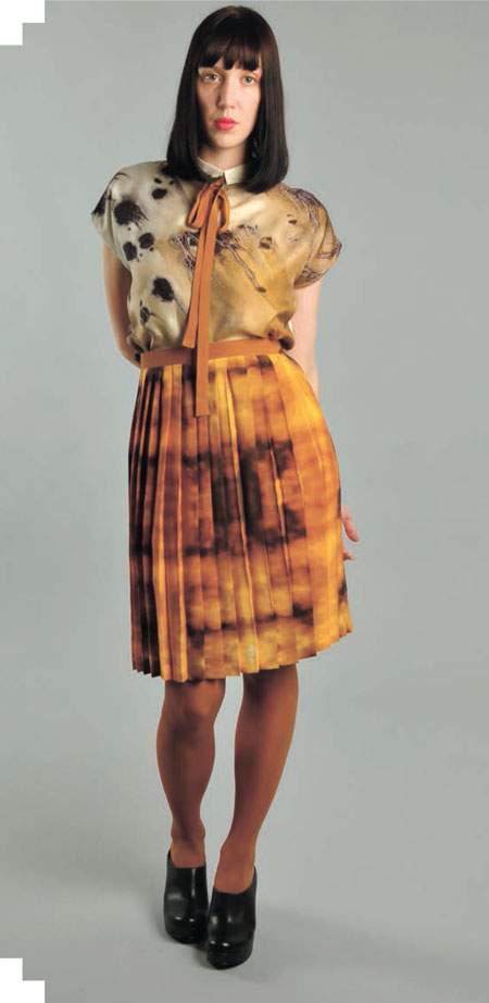
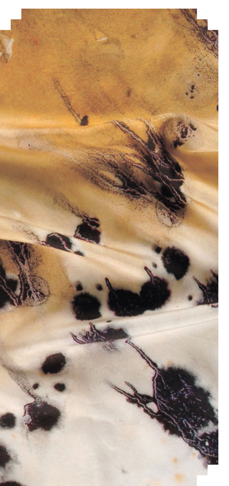
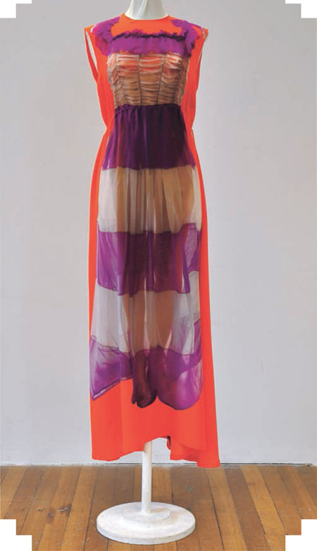
Jemima Gregson’s design “New York, New York” was created in Photoshop and digitally printed onto cotton canvas.
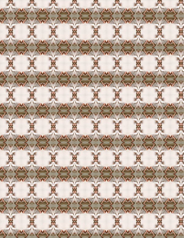
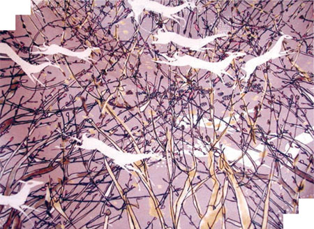
Marie O’Connor achieves a moiré effect through digital manipulation.
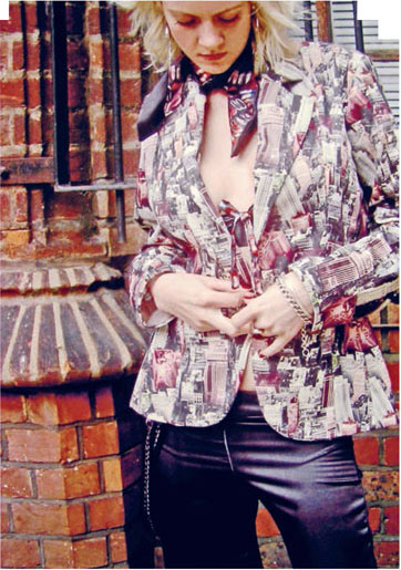
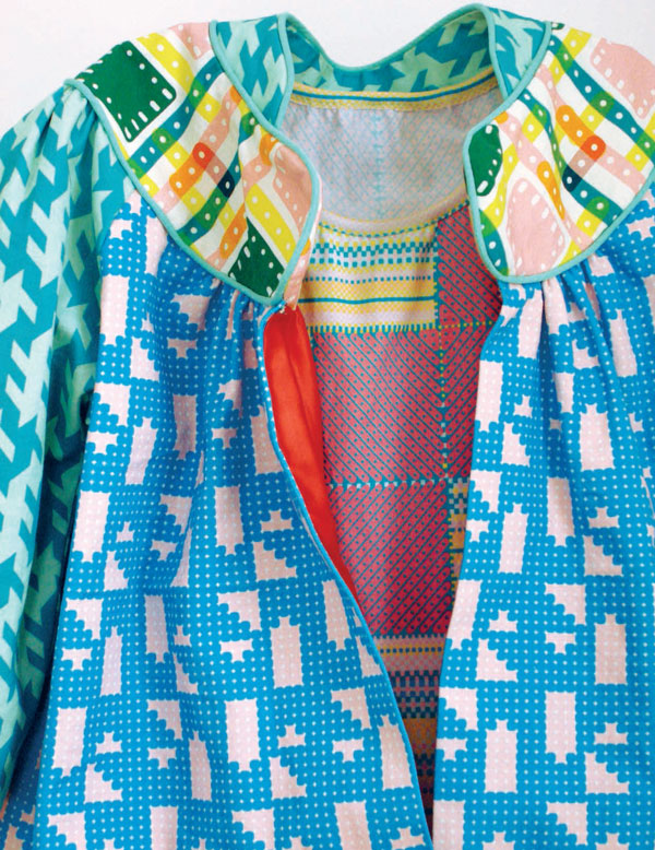
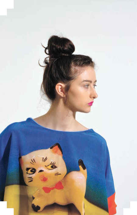
Rowenna Wilcox has fun with this paper-chain shirt from her collection “Lilian.”
Claire Thorpe designed her fashion collection “Ballet Mécanique” entirely in Illustrator. Her inspiration came from the mechanical patterns found in Meccano toys and also in the work of Eduardo Paolozzi, which she then translated into graphic patterns. Thorpe’s designs illustrate the crisp, clean lines that can be achieved using this vector-based program.
GETTING STARTED
When working digitally, the designer is faced with a vast array of options and it is all too easy to get carried away choosing between the technical effects and filters that are available at the click of a button. Consequently, it is vitally important to develop and explore ideas thoroughly before starting to work on the computer.
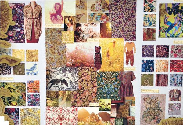
The starting point for a design can come from one of many sources. It might be a highly personal thought or experience that you want to express visually, or it might come from a commercial brief. Wherever it comes from, thorough research of the subject is essential, and the process can take you on an exciting and stimulating journey; one that may lead you to explore historical periods, other cultures from around the world, or contemporary design trends. You may even find inspiration in other creative disciplines such as fine art, literature, science, and music. Once a theme is established, the next stage is to gather material to help get the design underway. This can be anything from photographs, sketches, and drawings to found objects. It is important not to underestimate the amount of material needed; design work has now become a very sophisticated mix of graphic imagery, drawing, photography, pattern, texture, and motif. The more research, the greater the wealth of material you will have to work with, allowing your ideas and concept to develop fully. Explore ideas around the theme and collect anything that relates to it, gathering the material in a sketchbook to track the development of ideas and primary research. This sketchbook can then be referenced throughout the design process, and it can also act as a basis for discussion with your peers.
While you are researching your theme, you also need to keep the context for your design in mind and research the market. Historically, textile design has always had a very close relationship with fashion, whether for clothing or interiors, and so an awareness of contemporary trends is crucial. In our consumer society, buyers are constantly seeking the next new look. As a textile designer you need market awareness to stay on top of the game in this competitive field.
Kitty Joseph’s collection “Color Immersion” was inspired by the play of light on the Thames River in London.
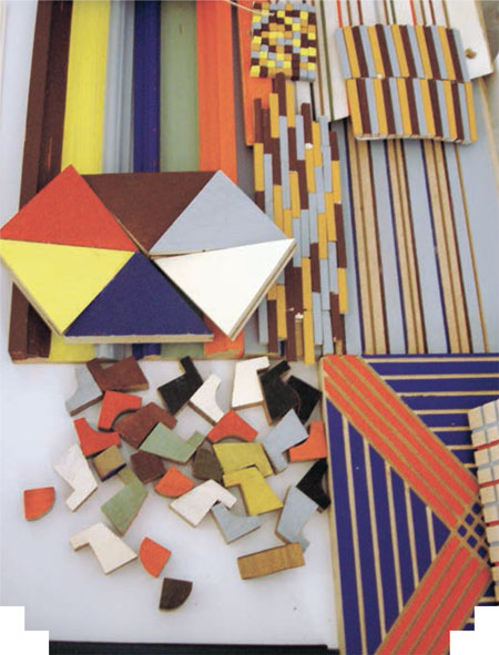
Beatrice Moys created designs for her “Building Blocks” collection by constructing wooden patterns.
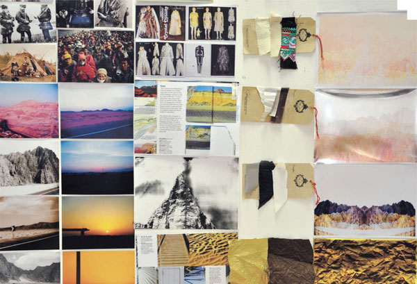
Anjali D’Souza’s travels to Egypt were the inspiration for her “Futuristic Traveller” collection.
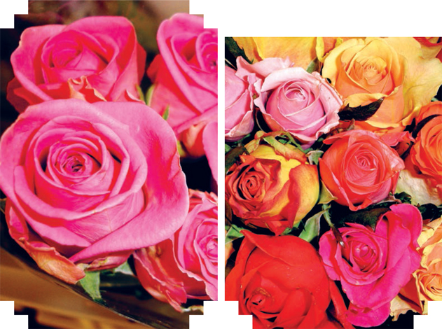
Catherine Frere-Smith is inspired by traditional English garden florals and nature.
SCANNING
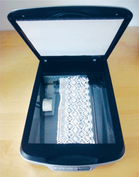
Once you have gathered together all your material, you then need to assemble it into a form that you can work with digitally. Many of your items will be in two-dimensional form—such as drawings and photographs; others may be three-dimensional— such as buttons, textured fabrics, and trimmings. All of these elements can be scanned.
The scanner is an exciting tool for textile designers and has opened up a wide range of options for assembling imagery, allowing nondigital elements into the digital workspace. Designers, who are often magpies by nature, are able to experiment with real objects and imagery that they have collected, collaging them into designs that have a tactile quality and can also be highly personal, humorous, charming, and quirky.
Before you start scanning, it is important to know the final print output in dots per inch (dpi), as this determines the resolution required. Ideally, you should scan at the same dpi as the final output, and at the same dimensions as you wish to use the scan in your design. For a textile designer, the final output will usually be a collection of designs that are printed onto fabric or paper—usually 11 x 17 (tabloid) to 17 x 22 inches in size. To guarantee a high-quality image at this size, it is best to scan your raw materials at 300 dpi.
If you are outputting the design onto a length of fabric, you need to take more care. Textile designers often work on a large scale and may unwittingly create complex documents with file sizes that are too large to manage. One way to overcome this, if you are working in repeat, is to just give the printer the repeat unit. The printer will then use a specialist repeat program to fill the unit across whatever length of fabric that you require. Giving the repeat unit alone to the printer means that the document size is likely to be manageable, especially as the printer will usually request artwork at between 200 and 300 dpi.
When working with a large-scale placement or engineered design for fabric, you need to take extra care to maintain a balance between a high-enough resolution and a manageable document size. If you find your final artwork document becomes too large for your computer to manage, you will have to lower the resolution of the image gradually, while assessing the quality of the output.
File sizes generally become large when you scan in objects that are subsequently enlarged by a significant amount. In order to maintain the best photographic quality, scan objects at high resolution, so that when the object is reproduced at 100 percent in your design it is output at the required dpi. The box opposite provides the general rules that will allow you to reproduce good-quality imagery for print.
If your artwork is too large for the scanner, you may need to take it to a specialist bureau. A more complicated, but less expensive, alternative is to scan the work in sections and piece them together in Photoshop.
SCANNING QUALITY
From 8.5 x 11 to 17 x 22 inches:
Scan your work at 850 dpi;
your 17 x 22 inch artwork will be 300 dpi.
From 8.5 x 11 to 22 x 34 inches:
Scan your work at 600 dpi;
your 22 x 34 inch artwork will be 300 dpi.
From 8.5 x 11 to 34 x 44 inches:
Scan your work at 1300 dpi;
your 34 x 44 inch artwork will be 300 dpi.
NOTE ON COPYRIGHT
When scanning imagery for use in your designs, it is essential to be aware of copyright issues. Copyright is a form of intellectual property protection. It applies to artists’ original work such as paintings, illustrations, photographs, maps, and any other work of craftsmanship. Scanning opens up a wide range of design opportunities and can sometimes be used as a quick design tool for copying and editing your work, but you must be aware that you should not scan other people’s artwork as it may be copyright protected. Either use your own material to avoid infringing on copyright or be sure to use copyright-free imagery.
Kitty Joseph needs time and patience to create her intricate and complex collages from hand-colored paper. Once she has scanned her collages, however, she uses the speed of the computer to manipulate, compose, color, and edit her artwork further. The ability to preserve her images, once saved, gives her the freedom to experiment with color and layout without destroying her original artwork.
DRAWING
Drawing, sketching, and mark-making have always been solid starting points for design work. They are even more important in the digital age, in ensuring that work is original and that the designer’s unique “handwriting” is not lost, but instead is enhanced, by the computer.
By starting with a beautiful set of drawings, you can scale, compose, and arrange them into a design collection using the basic transform tools in Photoshop. There is still skill involved in editing and assembling the drawings and merging them sensitively so that they do not simply look pasted together. Having a thorough understanding of the tools in Photoshop will allow you to choose the best method of selecting a drawing or motif and thereby retaining the feeling of fluid and sensitive artwork. Tools range from the Magic Wand tool (used to select flat colors) to more advanced tools, such as the Mask tool (used to select photography) or the Pen tool (used to draw accurately around an area and cut it out).
The detail and tone of Hana Kitazaki’s beautifully fine hand-rendered drawings are captured perfectly by digital printing in her collection “The Magic Flute.”
To replicate the softness and sensuality of the originals, Rosie MacCurrach uses the Quick Mask tool to select her drawings; she also feathers the edges so that the images blend softly together. Finally, she prints her designs onto silk, a fabric that allows her to maintain the delicate marks and blends present in her original drawings.
The computer allows Victoria Purver the freedom to translate her paintings onto fabric without losing any of the beautiful qualities achieved with her brush marks and drawing. She does not have to make color separations to screen-print them; instead she translates them directly onto fabric through digital printing. Her aim is to keep the sensual feel of the paintings when they are transferred onto cloth.
Deborah Vesey combines hand painting with a conceptual approach to maintain a spontaneous look for her digital collection.
Rowenna Wilcox’s collection “Lillian” is based on her grandmother’s favorite ornaments.
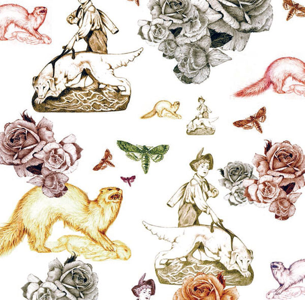
Brian Barrett’s inspiration for his “Classical/Contemporary Romantic” textile collection derives from vintage objects and antiques, including taxidermy. He looks at how collecting objects can harbor memories of the past and create new emotional attachments. Barrett created his own take on a traditional floral repeat that, on first viewing, is timeless and familiar. But by subtly weaving unconventional imagery into a traditional layout, the design took on a new meaning and narrative. The result is an intriguing mix of the bizarre and the familiar that creates a new look for textiles by mixing old and new methods in the design and print process.
Henry Muller created a woven effect for his menswear collection “The Outer Face,” digitally printed onto heavy canvas.
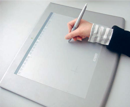
THE DIGITAL STYLUS PEN
The introduction of the digital stylus pen has given artists the freedom to draw, paint, and sketch with a computer, in much the same way as if using traditional materials. You can draw directly onto a graphics tablet with the pen, or trace over an image, or even draw on the screen. Once mastered, the pen becomes an intuitive drawing tool, allowing the same freedom of movement and sensitivity as a traditional pen or brush. For the textile designer, the pen allows a sensitive and sensual approach to design and is a worthwhile investment. A pressuresensitive stylus pen can also give depth to your lines, for a more natural way of drawing and rendering. In Photoshop you can even “harness” the numerous paintbrushes to it, allowing you to create effects ranging from subtle watercolors to bold line drawings. In Illustrator, the pen allows a high degree of dexterity and control when drawing.
Melanie Bowles finds that using the stylus pen gives her the precision she needs to design in Illustrator. Her background in embroidered textiles influences not only her design aesthetic, but also how she uses the computer as a design tool. Bowles finds she can achieve the same dexterity with the stylus pen as with the embroiderer’s needle, replicating the intricacies of fine stitchwork found in historical embroideries. Bowles uses the pen to draw streamlined shapes, build up motifs, and create subtle blends. She is able to create elegant, graphic designs by directly tracing from found or drawn imagery onto the screen with the pen. When printed onto silks, these designs become fluid and sensual.
PHOTOGRAPHY
Textile designers often make good photographers, having an eye for detail, texture, and color. It is no surprise, therefore, that with the ability to print high-quality photographic detail digitally, many students are now integrating photography into design.
Photography is an immensely useful medium for the textile designer, whether used directly in the design work or as a means of researching and collecting reference material. It can also be useful to draw and trace over photographs in Photoshop or Illustrator as a quick way of achieving an image outline.
The compact size of digital cameras means that many artists and designers use their cameras like sketchbooks or diaries, and are able to build up archives of imagery that they can access when needed. This approach is preferable to downloading images from the Internet because it avoids running into any copyright issues and, of course, the work is unique and personal.
Once you have imported your images into Photoshop you will find a huge number of options to help you adapt your photographs.
Melanie Bowles and Kathryn Round gave a vintage dress a second life by photographing it and digitally printing it on silk crêpe de Chine.
Alexa Ball’s womenswear collection “Holiday Memories” incorporates childhood vacation photographs in complex pattern formations to achieve a quirky, nostalgic design.
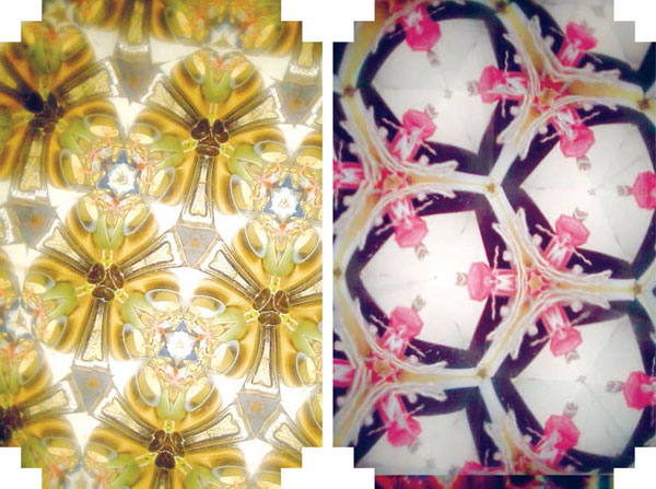
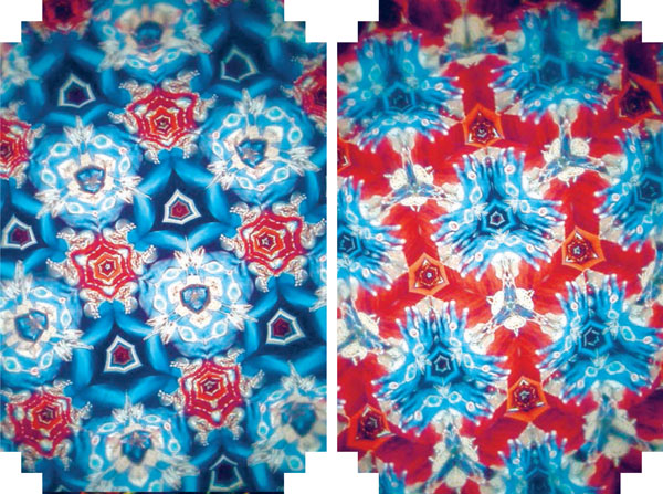
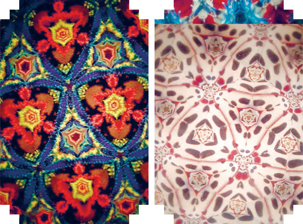
Croatian-born Nada Herceg demonstrates the creative use of photography in her textile collection “Kaleidoscope.” Here, she arranged everyday objects and then photographed them through a kaleidoscope, creating these amazing pattern formations. She edited them further by putting them into repeat and printing them digitally onto silk, allowing her to maintain their rich, photographic qualities.
Emma Stone uses a complex combination of photography, scanning, drawing, and collage techniques to create elaborate and personal textiles.
Working digitally opened up a whole new world for illustrator and designer Emma Stone. It has allowed her to engage with a world of fantasy and surrealism. Her textile collection “Recollection” is based on sentimental objects, memories, and collections from her family history and aims to reinvent forgotten pieces.
Temitope Tijani plays with caricatures of family members in Photoshop, demonstrating how much fun it can be to integrate photography into design.
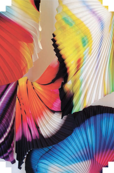
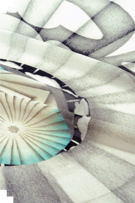
Inspired by the Aurora Borealis, designer Deja Abati digitally creates stunning light effects. He adds pleating to give more movement to the fabric.
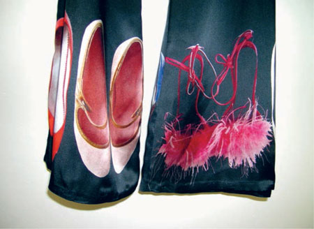
Jemima Gregson exploits her love of fashion, photographing treasured pieces and placing them back onto a garment. She enhances her photographs digitally and places them carefully onto specific areas of clothing. The result is witty, glamorous, and sexy.
USING FILTERS IN PHOTOSHOP
There are numerous filters in Photoshop and the choice can seem overwhelming. Filters come in and out of fashion and can make your work look obviously “Photoshopped” and too familiar. But, if they are carefully integrated into your design work, they can add some amazing and subtle effects. Overuse of filters can confuse a design, so be clear from the start about what you want to achieve. You can apply a filter to the whole image or to a selected area. On these pages are just a few examples of favorite filters. Use RGB images, as some filters do not work with CMYK.
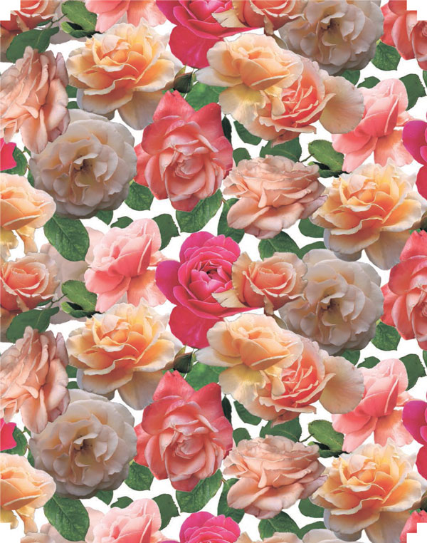
Melanie Bowles’s design “The Brockwell Rose” is created from photographs of the rose garden in her local park; the design is put into a half-drop repeat. You can apply filters to a repeat unit to break up the traditional look of a design.
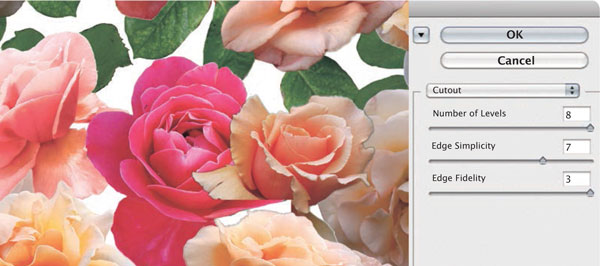
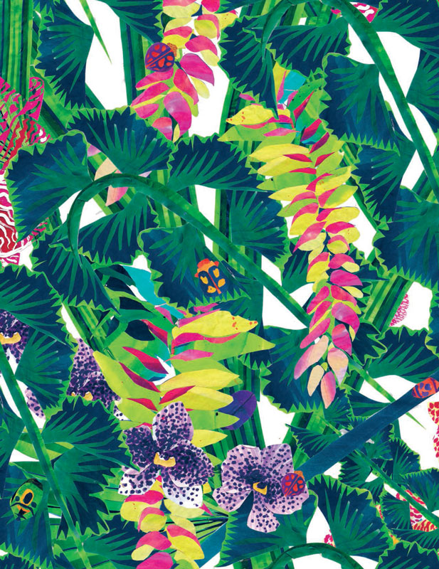
COLLAGE
Here the Cutout filter is used to add a collage effect to the original photographs. When you choose a filter, a dialog box will open, giving you several options. Experiment by moving the sliders to get your desired effect. In the bottom left corner of the image window, you can zoom in and out of the design.
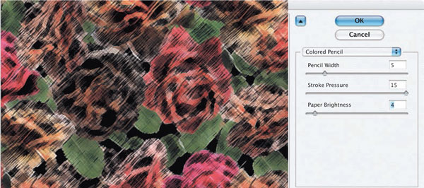
COLORED PENCIL
The Colored Pencil filter in Artistic filters was applied to give a bold, vibrant drawn effect. Altering Pencil Width, Stroke Pressure, and Paper Brightness gives a batik effect.
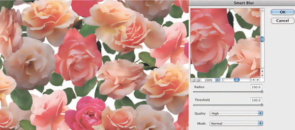
SOFT
With the Blur filter, you can soften the edges of a design.
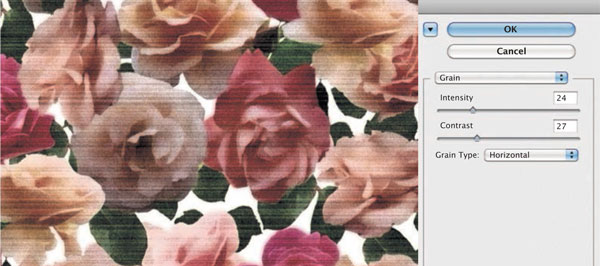
VINTAGE
To create a vintage effect, try adding a Grain texture (Filter > Texture > Grain). Select Grain Type: Horizontal.
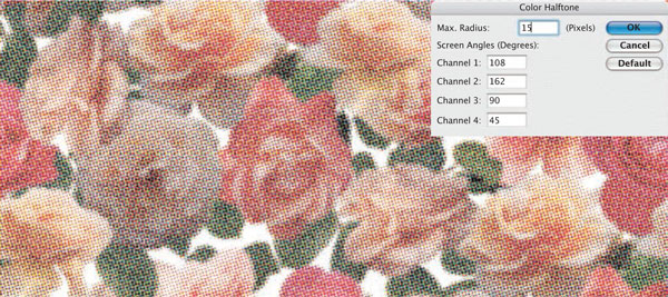
POP ART
The Color Halftone filter is found in Pixelate filters and simulates the effect of using a halftone screen on each channel of the image. For each channel, the filter divides the image into rectangles and replaces each rectangle with a dot.
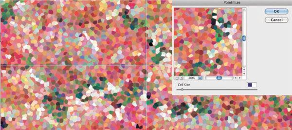
PIXELATE
To pixelate the image and break it up further, go to the Pixelate filter and select Pointillize.
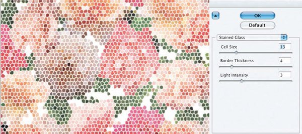
EMBROIDERED EFFECTS
The Stained Glass filter is in Texture filters and will transform an image into cells to give a stitched effect.
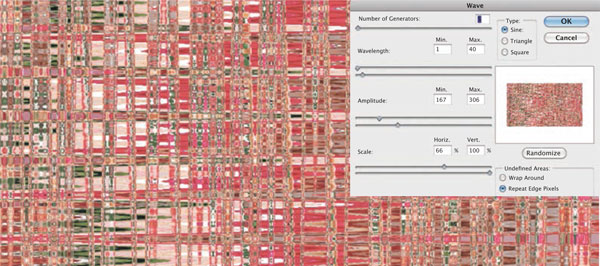
ABSTRACT DISTORTION
The Wave filter is found in Distort filters. This, along with other Distort filters, will give you numerous options with which to abstract and distort a photograph or image into an instant textile design that has fluidity and movement.
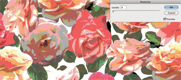
SILK-SCREEN EFFECT
Using the Posterize command (Image > Adjustments > Posterize) will give a photograph an instant silk-screen effect.
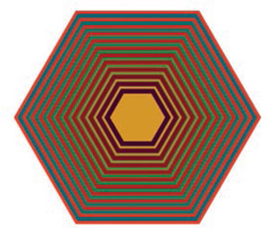
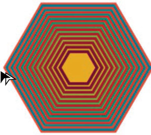
CREATING COMPLEX COLOR BLENDS
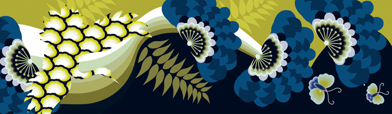
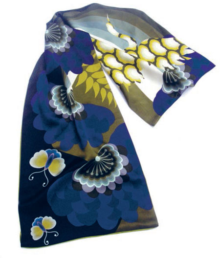
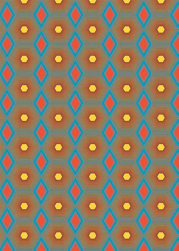
Emamoke Ukeleghe’s collection “My Family Album” captures the essence of her ethnic background. Her inspiration comes from the journey her family made from Nigeria to England in the mid-1980s. Based on this childhood experience, she has created a collection of digital prints for scarfs and panels that showcases a new contemporary ethnicity.
Ukeleghe replaces the traditional techniques of handdyed batik used in African textiles with digital media. Working in Illustrator, she recreates simple geometrics and blends them to give them a rich and exotic feel. Her designs are dynamic, exciting, and reminiscent of ethnic textiles, retaining the luminosity of batik printing but with a contemporary twist.
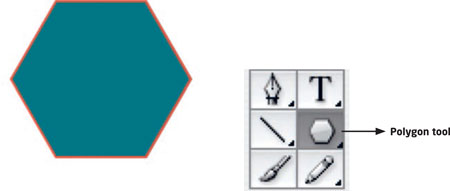
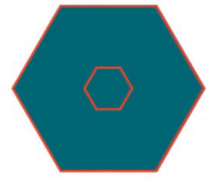
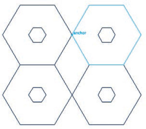
STEP 1
In Illustrator, select the Polygon tool from the Tool panel. Holding down the Shift key, click and drag to create a polygon.
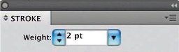
STEP 2
Window > Stroke.
Apply a stroke (Weight: 2 pt) in a contrasting color.
STEP 3
Copy and paste the polygon, and change the scale of the copied polygon to 25 percent.
Object > Transform > Scale.
Select both polygons.

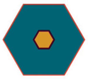
STEP 4
Window > Align.
The Align panel will appear.
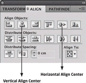
STEP 5
Select Vertical Align Center and Horizontal Align Center to centralize the polygons.
STEP 6
Apply a new Fill and Stroke color to the central polygon.
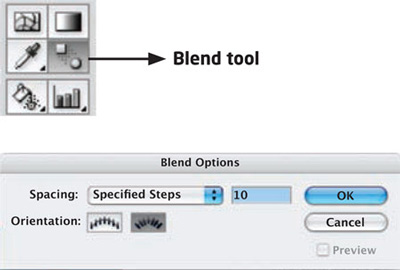
STEP 7
Select the Blend tool in the toolbar. Double-click it to reveal the Blend Options dialog box. Choose Specified Steps and enter “10.”
STEP 8
Place the Blend tool in the middle of the polygon; drag it to the outer edge and your blend will appear. It’s worth experimenting with the options the Blend tool offers to get different effects.
STEP 9
Now create a tile with the polygon. To position it accurately, go to the View menu and select Snap to Point and Smart Guides. Position the pointer on the left-hand anchor point and drag it to the right.
STEP 10
Holding down the Shift and Option/Alt keys, drag the tile across until it snaps into place and leaves a copy. The cursor will turn white when it has snapped to point.
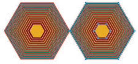
STEP 11
Repeat this action to tile four polygons.
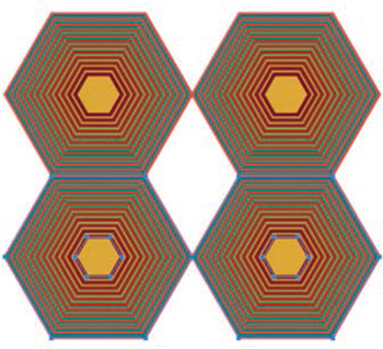
STEP 12
View > Outline.
With the Pen tool, draw a central diamond, clicking on the anchor points as a guide.
STEP 13
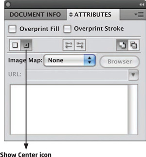
Window > Attributes.
A dialog box will appear. With your diamond selected, select the Show Center icon. This will show the center of the diamond.
STEP 14
View > Outline.
Make a copy of your diamond, change its scale, and place it in the center of the first diamond.
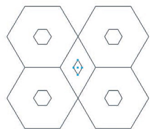
Fill and Stroke both diamonds with contrast colors.
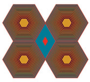
STEP 16
Now apply a blend to the diamond.
STEP 17
Now to put the design unit into repeat in Photoshop:
Select the design unit in Illustrator.
Edit > Copy.
Create a new document in Photoshop.
Edit > Paste.
STEP 18
A dialog box will appear. Select the Paste As Pixels option, and click OK.
STEP 19
Another dialog box will appear.
Click Place.
STEP 20
View > Rulers > Show Rulers.
View > Guides > Show Guides.
STEP 21
Bring down horizontal and vertical guides to the center points of all four polygons.
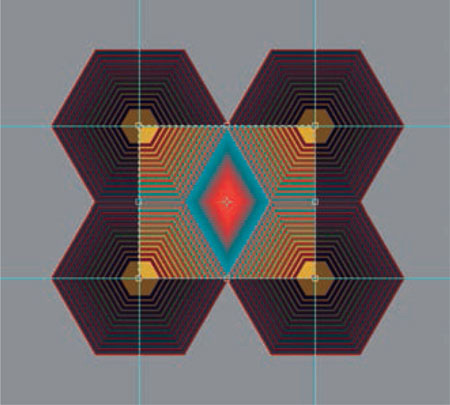
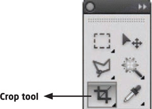
STEP 22
Select the Crop tool from the Tool panel and, using the guides, crop the unit.
STEP 23
Select > All.
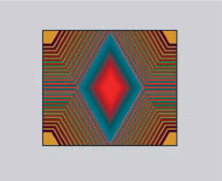
STEP 24
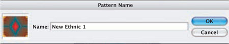
Edit > Define Pattern.
Name the pattern and press OK.
STEP 25
Create a new document.
Edit > Fill > Pattern.
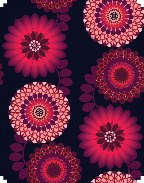
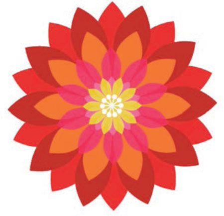
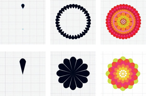
BUILDING FLORAL MOTIFS
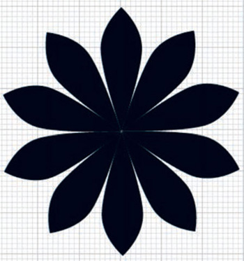
“Making Flowers” is a collection of digital prints created by Melanie Bowles. With Illustrator she creates clean, graphic florals that give her work a striking, contemporary look.
This tutorial shows you the principles of creating flowers in Illustrator by making a basic petal, and then duplicating and rotating it to build up a complex flower. You can build up ornate patterns from the basic design. The possibilities are endless for the textile designer who wishes create a fresh, bold floral look.
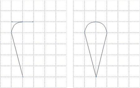
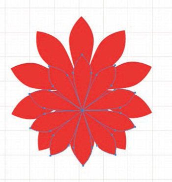
Reveal a grid on your Illustrator document page to help you create the basic petal shapes.
View > Show Grid.
Work in the Outline mode to create petals.
View > Outline.
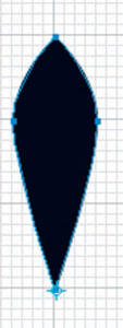
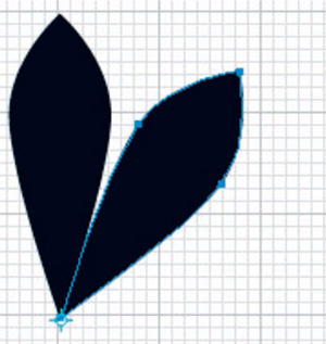
Now use the Pen tool to create your petal shapes.
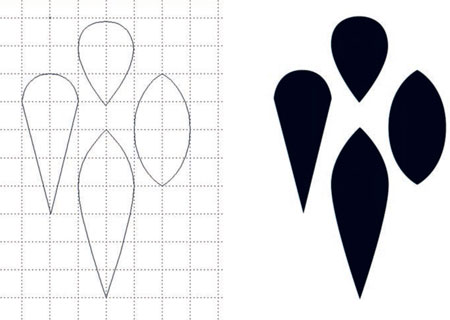
STEP 2
View > Preview.
Fill your shapes with black.
Select one petal.
Edit > Copy.
STEP 3
Open up a new document, and again reveal the grid.
Edit > Paste.
STEP 4
Now build the flower up.
Window > Info.
With the petal selected, select the Rotate tool from the Tool panel, and place it at the bottom of the petal.
Hold down the Option/Alt key and rotate the petal (this will make a copy of your petal as you rotate it).
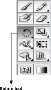
STEP 5
To enter an accurate angle for your petal to rotate, with the Rotate tool still selected, place the reference point at the bottom of the petal. Now press Option/Alt and click, and the Rotate dialog box will appear. Enter an angle that is a division of 360 degrees. Click on the Copy button, and a second petal will appear.
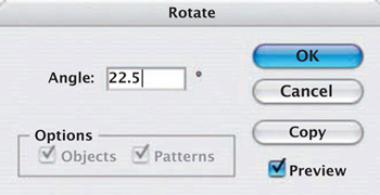
STEP 6
Once you have placed the second petal correctly, you can build up the other petals to complete the flower. Press Command + D; this keyboard shortcut will repeat the last command.
Once you have a complete flower, group the petals together.
Object > Group.
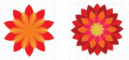
STEP 7
Now apply a color fill. Copy and paste several times to build the flower up, changing the scale and color of each copy.
STEP 8
Window > Align.
Select Vertical Align Center and Horizontal Align Center.
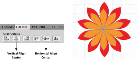
STEP 9
With the Rotate tool, rotate the flowers.
Alter the transparency of the petals to give an impression of depth.
Finally, group the completed flower.
Object > Group.
Draw a line and a circle for the stamen.
Object > Group.
Now copy and rotate the stamen, using the same method as for the petals.
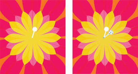
STEP 11
The flower is complete.
Object > Group.
STEP 12
Create more flowers using the same techniques, selecting different colors and sizes of petals.
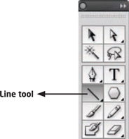
CROSS-STITCH EFFECTS
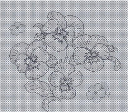
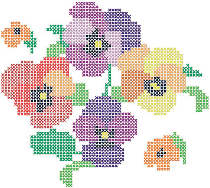
Claire Thorpe devised this effective technique in Illustrator to fill motifs with cross-stitch without even touching a needle.
This tutorial demonstrates how to create a cross-stitch from a motif of your choice.
STEP 1
In Illustrator, select the Line tool from the Tool panel.
Draw a 45-degree line by holding down the Shift key while clicking and dragging.
![]()
STEP 2
Go to the option bar at the top of the screen. Click on the Link icon between the Width and the Height. Enter 0.08 in (0.2 cm).
![]()
STEP 3
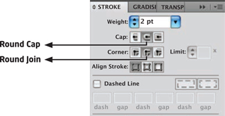
Go to the Stroke panel and enter Weight: 2 pt.
Select Cap: Round Cap and Corner: Round Join.
STEP 4
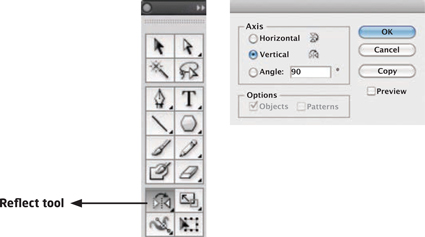
Select the cross. Double-click on the Refl the Tool panel to open the Refl Select Vertical and enter an Angle of 90 degrees. Click Copy.
Select both lines.
Object > Group.

STEP 5
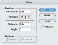
Press the Return key to open the Move dialog box. Enter -0.11 in (-0.27 cm) in the Vertical field. This is the measurement from the center of the cross to the center of the repeated cross. (In this case it is -0.11 in. If your cross is bigger, the measurement to your repeated cross will be larger, depending on the gap you want between them.)
Click on Copy, and the second cross will appear. Press Command + D repeatedly to build up a vertical line of crosses.

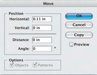
Select the vertical line of crosses. Press the Return key to bring up the Move dialog box. Enter 0.11 in (0.27 cm) in the Horizontal field and click on Copy.
Press Command + D repeatedly to build up horizontal rows of crosses. Your cross-stitch grid is now complete.

STEP 7
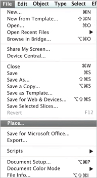
Create a new layer and place it underneath your stitch grid. Choose a motif you wish to work from.
File > Place.
Go back to the stitch grid layer.
Select > All.
Color the stroke gray.
Lower the Opacity to reveal the motif template.
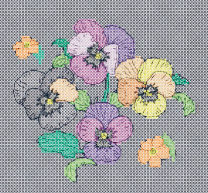
STEP 8
Now carefully color individual stitches and build up the motif (select groups of stitches by holding down the Shift key). Once colored, select all the stitches and raise the Opacity back to normal.
STEP 9
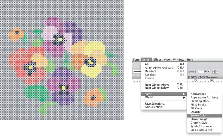
Select one of the grid stitches.
Select > Same > Stroke Color.
All the stitches of that color will be selected. With this method you can recolor your design or delete any stitches you wish to.
ENGINEERED PRINTS
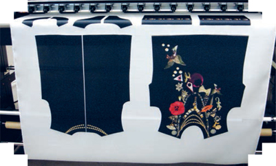
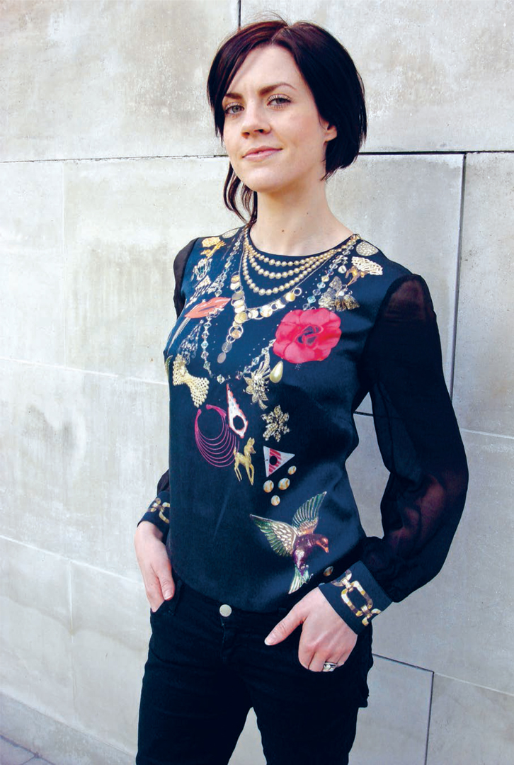
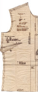
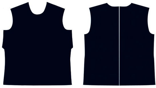
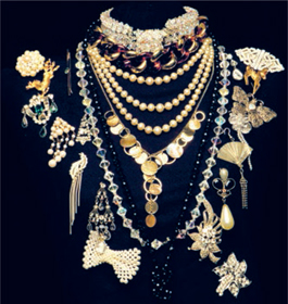
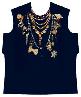
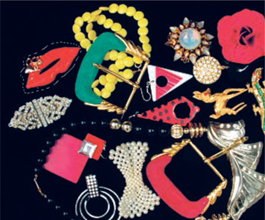
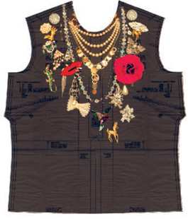
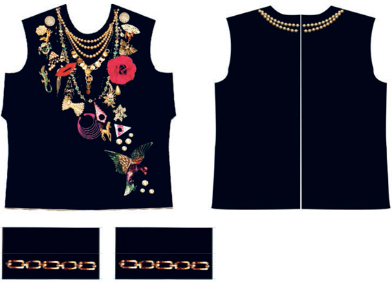
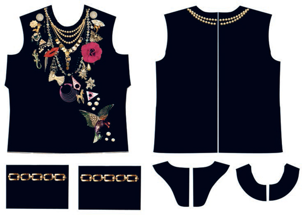
“Jemima’s World” is an inspirational fashion collection by Jemima Gregson, based on her love of vintage costume jewelry. Jemima places photographs of her jewelry onto the garment shapes in Photoshop to create a stunning trompe l’oeil effect, which also shows the exceptional photographic qualities that can be achieved with digital printing. The garment shapes are digitally printed onto silk satin using a Mimaki TX2, and then made into a garment.
This tutorial demonstrates the process of engineering a print onto a garment shape using Photoshop.
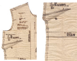
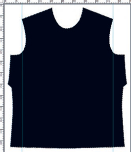
Scan your pattern pieces at 300 dpi, starting with the front. You will have to do this in several sections. Once they are scanned, paste the sections together in Photoshop.
STEP 2
Reposition the top front section of the garment on the canvas by moving it to the top.
STEP 3
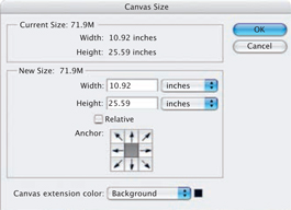
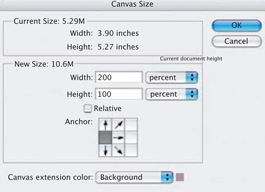
Image > Canvas Size.
In the Canvas Size dialog box, alter the Width and Height measurements sufficiently to allow you to paste in the bottom section of the garment. Once this is done, flatten the image.
Layer > Flatten Image.
STEP 4
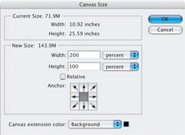
Now increase the canvas size to fit the complete garment shape.
Image > Canvas Size.
Change the Width to 200 percent.
Click OK.
STEP 5
Select the garment piece with the Marquee tool. Copy and Paste.
Edit > Transform > Flip Horizontally.
Piece the two shapes together so that they match up. Flatten the image.
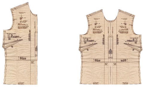
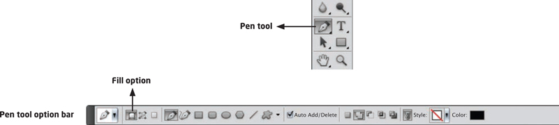
Select the Pen tool, and the Pen tool option bar will appear. Select the Fill option with black as the foreground color in the toolbar.
STEP 7
Carefully trace around the garment using the Pen tool, to create a series of anchor points around the garment shape. Use the Convert Point tool (in the Pen tool menu) to create the curves around the neck and armholes. It may take some time and practice until you are happy with the results.
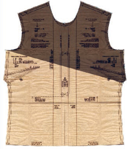
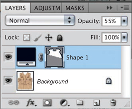
STEP 8
When you use the Pen tool, a shape layer will appear in the Layers panel. Change the Opacity of this layer to reveal the pattern shape so you can trace over it.
STEP 9
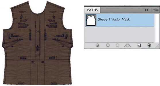
Continue to draw around the garment shape with the Pen tool until it is complete. When you use the Pen tool, you create a new path. Go to the Paths panel to see your new path. Click on the menu button at top right to reveal the drop-down menu. Save your new path so you can edit or select it at any time.
Repeat the entire process with the back sections of the garment.
STEP 11
Arrange a selection of costume jewelry onto a mannequin covered in black material. Using a digital SLR camera and studio lighting, photograph the mannequin at the highest possible resolution. This will allow the image to be reproduced at the maximum size with no compromise in quality.
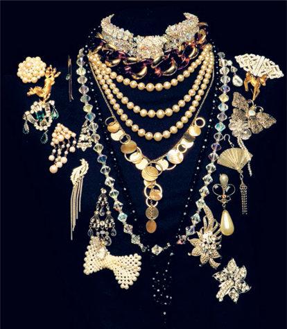
STEP 12
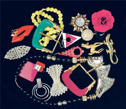
You could also photograph some extra jewelry against a black background to add to the mannequin jewelry.
STEP 13
Open up the front garment shape. Your path is drawn but you need to make it into a selection so you can start to paste your jewelry into the pattern piece.
STEP 14
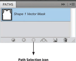
On the Paths panel, highlight your path and click the Path Selection icon at the bottom of the panel. This will create a selection for you to paste your jewelry into.
STEP 15
Open up the mannequin photograph.
You may wish to brighten the jewelry.
Image > Adjustments > Brightness/Contrast.
Alter the sliders to adjust the tonal range until you are happy with the effect.
Select > All.
Edit > Copy.
STEP 16
Now open up the front garment image.
Select the garment shape.
Edit > Paste Special > Paste Into.
With the new pasted-in layer selected, select the Move tool and position your jewelry to fit into the garment shape.
Scale it to fit.
Edit > Transform > Scale.
STEP 17
Merge the shape layer and the jewelry layer using the Merge Visible command in the Layers panel drop-down menu.

STEP 18
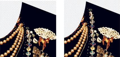
With the Clone tool, carefully clone the necklace to make it continue around the neckline.
STEP 19
Open the extra photographs, and select items with the Lasso tool. Edit > Copy.
Now go back to the garment shape and paste on new jewelry.
Edit > Paste.
Merge the new layers as you go.
Lower the Opacity of the jewelry layer so that it reveals the pattern piece beneath.
Continue to add more images to build up the design.
STEP 21
Once you have completed the front, use the same techniques to complete the back and cuffs. When they are all finished, flatten the layers.
Now open a document with a Width of 55 in (140 cm)— the width of fabric on the digital printer—and a Height of 59 in (150 cm). Set the Resolution to 200 dpi.
Open each garment piece.
Select > All.
Edit > Copy.
Go to your new fabric length document and paste the garment piece on.
Edit > Paste.
Paste all the garment shapes and arrange them across the final document.
STEP 22
Once the shapes are placed, flatten the layers. Now you are ready to prepare the document for printing.
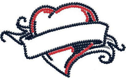
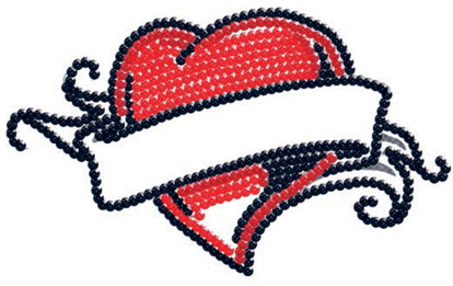
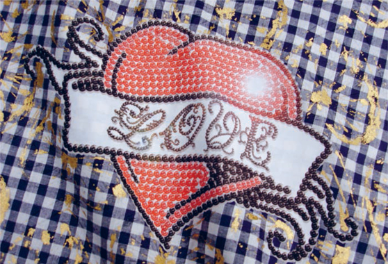
SEQUIN EFFECTS
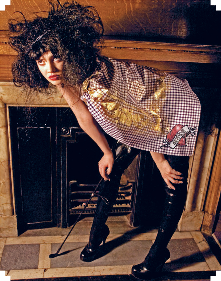
“You Can’t Hurry Love” is a fashion collection created by Tennessee-born Katie Irving Jones. The collection is intended to elicit a sentimental attachment, and draws inspiration from nostalgic heirlooms that Katie incorporates into her designs. She recreates vintage embellishments using digital techniques in Photoshop.
This tutorial demonstrates how to create a sequin motif. Once the technique is mastered, it can be applied to any design.
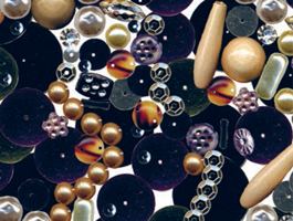
STEP 1
Scan a sequin at 300 dpi and open the image in Photoshop.
Select > Image > Adjustments > Levels.
Adjust the shadow and highlights by moving the sliders in the dialog box.

STEP 2
Add a lens flare on the corner of the sequin to give it an extra twinkle.
Filter > Render > Lens Flare.

STEP 3
Select the sequin with the Magic Wand tool. Set the Tolerance in the option bar to 30 and select an area around the sequin.
Edit > Cut.
Cut away the background. Select the sequin with the Marquee tool.
Edit > Define Brush.
Name the sequin and press OK.

STEP 4
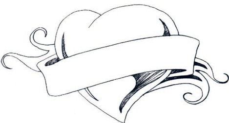
Make a drawing of a heart and banner and scan it into Photoshop. Create a new layer.
Select the new sequin brush.
In the Brush Options panel, change the Opacity to 93 percent and the Size to 70 pixels.
STEP 5
Select black as the brush color and “stamp” around the outline of the heart in black sequins, by clicking once to apply each.
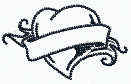
STEP 6
Now add a slight shadow to this layer to give it a three-dimensional effect.
Click the Layer Style icon at the bottom of the Layers panel.
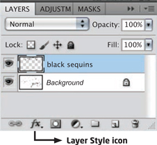
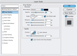
In the Layer Style menu, select Drop Shadow.
A dialog box will appear.
Change the Opacity and the Distance values to create a soft shadow.
STEP 8
Create a new layer.
Select the sequin brush and choose a dark red color.
Stamp inside the heart as shown.
STEP 9
Create a new layer.
Fill the rest of the heart with the sequin brush colored bright red.
You should now have four layers.
Turn the Background layer offand merge the visible layers.

STEP 10
Next, create the stitches that appear to fasten each sequin to give the hand-sewn effect. This is a fairly time-consuming process, but is still a lot quicker than actually sewing them!
Select the Line tool from the Tool panel.
Make sure the Fill option is selected in the Line tool option bar.
STEP 11
The Line tool option bar will appear at the top of your screen. For Weight, enter 3 px. Select a color for the stitch. Now draw in every stitch, working on each separate layer. Make them slightly irregular to achieve a truly hand-sewn effect.
Your sequins are now complete. Fill in the background layer with white and flatten the image.
Layer> Flatten Image.
STEP 12
Next you need to create the “LOVE” lettering. Scan your chosen lettering into Photoshop.

STEP 13
Use the same technique as before to stamp around the lettering with the sequin brush, varying the scale of the brush.

STEP 14
Once the lettering is complete, flatten the layers and cut it out with the Marquee tool.
Edit > Copy.
Open the heart motif.
Edit > Paste.
Position and adjust the lettering with the Transform tools to fit inside the banner.
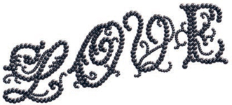
STEP 15
Finally, add an extra glow to the finished heart motif.
Filter > Render > Lens Flare.
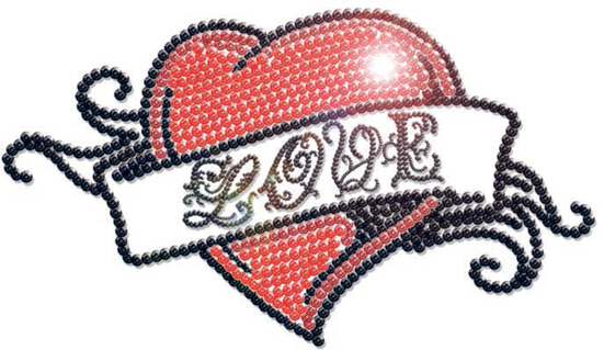
STEP 16
Print the design onto opaque transfer T-shirt paper through a desktop inkjet printer. Carefully cut the motif out and press it onto your fabric with an iron or heat press.
PHOTOMONTAGE
Photomontage is the technique of combining photographic elements together to create new compositions. The introduction of Photoshop has made achieving a photomontage effect faster and easier. There is now a trend toward combining illustration, graphics, and photography to create complex designs.
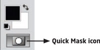
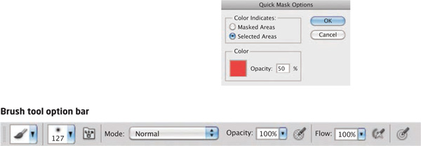
Creating a photomontage in Photoshop depends on developing a theme and having a collection of visually strong photographs to work with. Once you have these, you need to select elements from them and start to build new configurations. You will need to work with the more advanced selection tools to achieve the best edge quality. The most effective tool for selecting areas of photographs is the Quick Mask tool. By using the Airbrush to make selections, you can also achieve soft edges; this tool is easiest to control with a stylus pen.
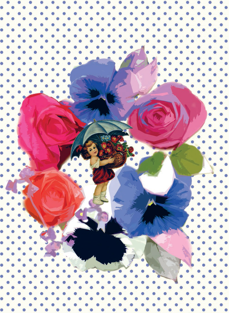
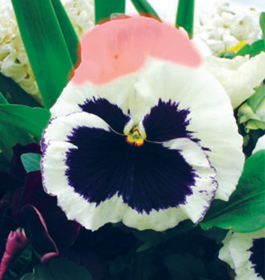
STEP 1
Open your source image in Photoshop (make sure it is in RGB, as you will apply a filter later). Click on the Quick Mask icon located at the bottom of the Tool panel.
STEP 2
Choose a soft airbrush (using the Brush tool option bar) and paint over the image you want to mask. To change the color of the mask and transparency, double-click the Quick Mask icon to open Quick Mask Options.
STEP 3
Switch the foreground color to white to use the Mask Eraser tool. Select a small, soft brush and start to clean up the edges of the mask.
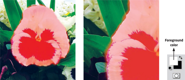
STEP 4
Click on the Quick Mask icon to exit Quick Mask. The area outside of the mask will now be selected.
STEP 5
Now select the pansy. Select > Inverse.
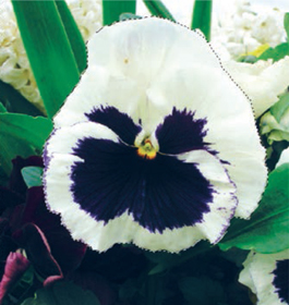
STEP 6
Open a new document. Edit > Copy.
Edit > Paste.
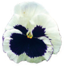
STEP 7
Continue to build a posy from the photographs you have, using the same Quick Mask process to select a flower from your photograph. Copy and paste the flowers and arrange them into a posy with the Move tool.
STEP 8
Turn the background layer offand merge the visible layers.
STEP 9
To achieve a collage effect, apply the Cutout filter.
Filter > Artist > Cutout.
Experiment with the levels until you are happy with the result.
STEP 10
Open a new document sized 0.4 x 0.4 in and create a spot.
STEP 11
Define > Pattern.
Name the spot pattern and press OK.
STEP 12
Select the background layer.
Edit > Fill > Pattern.
Find your spot.
STEP 13
Finally, scan in another image and copy and paste it into the center of the design.
Good photography and careful selection of areas is the basis of creating successful photomontage designs. This group of photographs by Daisy Butler formed the basic elements of her design. The photographs are all 300 dpi to maintain a high-resolution image.
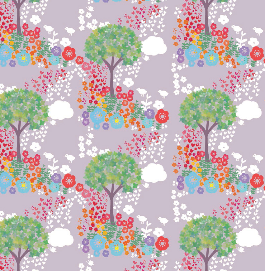
BUILDING A BRUSH PALETTE
The Brush panel is one of the most versatile tools for textile design in Photoshop. It allows you to create your own custom brush from almost any mark or motif, and then paint freely with it. Designs can be created instantly using your custom brush, or the brush may just be a useful tool to add your own elements to a design.
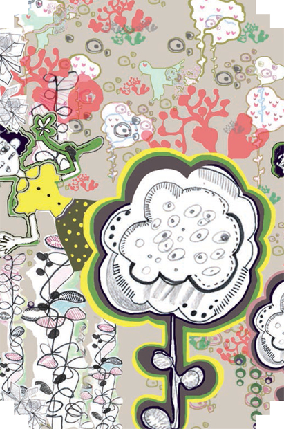
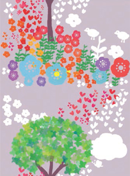
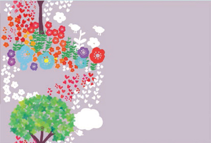
The inspiration behind this whimsical textile collection, by Korean-born Hong Yeon Yun, came from childhood memories of her garden. Her designs are mainly produced using brushes created in Photoshop from her drawings.
The Brush panel in Photoshop affords the same fluidity and spontaneity that painting does. This, combined with Hong’s quirky drawings, adds a magical element to her work. The design shown here is made up from 23 brushes produced in Photoshop; by layering the brushes and changing their scale, rotation, and scattering, she has created a rich and complex collection of designs that maintain the lyrical feeling of her drawings.
This tutorial demonstrates how to use brushes and also shows how to create a basic half-drop with the design.
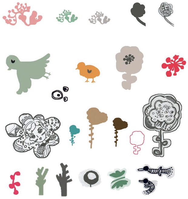
STEP 1
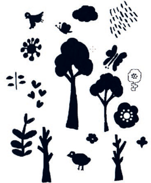
First, create the series of brushes that you will use to produce your design. You may choose a motif for each brush from a shape you have drawn in Illustrator or from a drawing scanned into Photoshop. Either way, it is best if the initial motif is black to allow maximum definition when you come to customize it. If you are following the tutorial exactly, you may wish to scan in the motifs shown here.
STEP 2
In Photoshop, use the Magic Wand tool to select a motif. (In this case, the butterfly.)

STEP 3
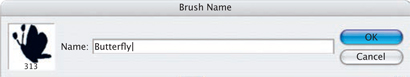
Edit > Define Brush Preset.
Name the brush and press OK.
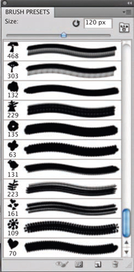
Your new brush will be saved in the Brush panel. Create a whole series of brushes in the same way.
STEP 4
Open the Brush panel.
Windows > Brush.
Within this panel you have endless choices for editing your brushes. Do this by adjusting the various sliders; it is worth experimenting with these options to see the effects that can be achieved.
STEP 5
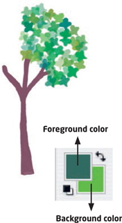
Open a new document and a new layer. With the tree-trunk brush (or one of your own brushes), choose a color and size and paint a tree trunk by clicking once.
Open another new layer. This will give you the chance to try a few effects, deleting and remaking layers until you are satisfied.

Choose the leaf brush from the Brush panel and select Shape Dynamics. Change the Size Jitter and Angle Jitter.
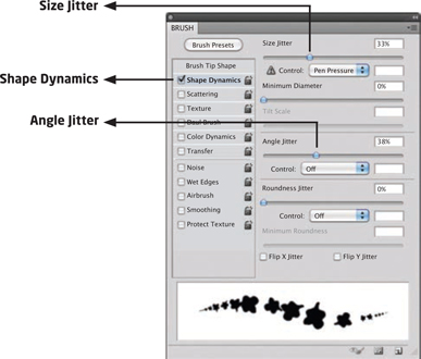
STEP 7
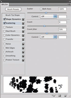
Select the Scattering option. Adjust the Scatter, Count, and Count Jitter.
STEP 8
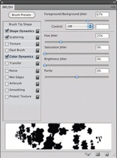
Select Color Dynamics. Select a foreground and background color in the Tool panel. Adjust the sliders in the Color Dynamics dialog box.
Finally, determine the Opacity by clicking on Color Dynamics and moving the Opacity slider. Your leaf brush is ready; start scattering the leaves.
STEP 9
Continue to scatter the leaves until the tree is complete.
Fill the background layer with a color.

STEP 10
Create a new layer and select the flower stem brush. Select the Shape Dynamics option and slightly change the Angle Jitter. Paint the flower stems, changing the scale as you go if you wish.

STEP 11
Create a new layer for the flowers. Again, change the foreground and background colors to change the color effects in the Color Dynamics option.


STEP 12
Build up the flowers to surround the tree.

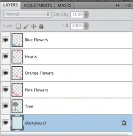
STEP 13
Create a new layer and scatter some hearts around the tree.

STEP 14
Now that your design is nearly complete you will have several layers. Turn the background layer off and flatten the visible layers. You should now have two layers: the background layer and the design layer. Save a copy of the image with a new name.
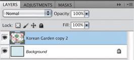
STEP 15
Create another new layer and place it under the design layer. Add other motifs to fill in the spaces. Do not let any of the motifs go over the edges of the design.
STEP 16
Now go to the background layer and change the color if you wish.
Finally, flatten the image.
Layer > Flatten Image.

STEP 17
The next stage is to put the design into a simple half-drop repeat.
Select > All.
Edit > Copy.
STEP 18
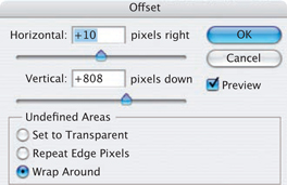
Filter > Other > Offset.
Move the Vertical slider to cut the image in half. (Ensure Wrap Around is selected.)
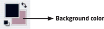
STEP 19
Go to the Tool panel and make sure the background color is the same as your design background color.
STEP 20
Image > Canvas size.
Highlight the middle box on the left-hand side of the Anchor grid.
Change the Width to 200 percent.
STEP 21
View > Snap To > All.
STEP 22
Edit > Paste.
Snap your design into position. Flatten the layers.
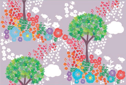
Your half-drop repeat is now complete. If you wish to change the unit size, go to Image > Image Size.
STEP 24
Select > All.
Edit > Define Pattern.
Name the pattern and press OK.
TEXTURED EFFECTS
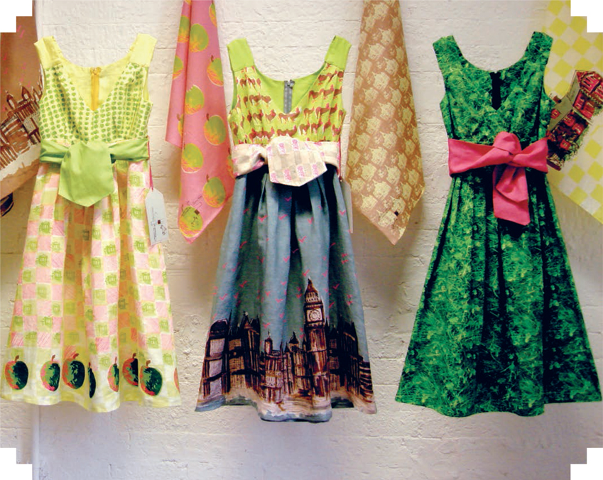
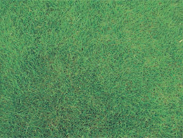
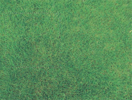
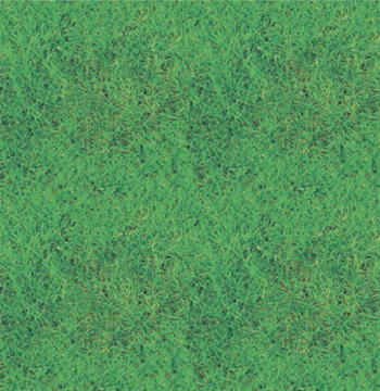
Claire Turner’s collection is a quirky mixture of screenprinted fabrics and digital prints. She combines digital photography with her lovely freehand drawings. Her grassprinted dress (above right) is an example of an allover texture print, and shows how effective a photographic print can be. This technique can also be useful for creating a background onto which you can apply images or motifs.
To create a textured grass repeat, take a good-quality photo of a patch of grass and open it in Photoshop.
STEP 2
With the Marquee tool, select a section of the image.
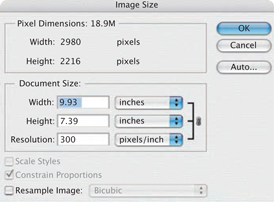
Image > Crop.
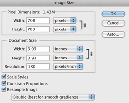
Image > Image Size.
Jot down the pixel size of your image.
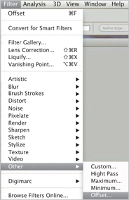
STEP 3
Filter > Other > Offset.
In the Offset dialog box, divide the Horizontal and the Vertical pixel image sizes by two and enter the new values.
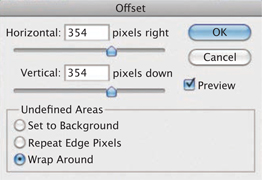
STEP 4
Your image will be cut into four and flipped round so the outside of the image is in repeat. You will see a seam appear.
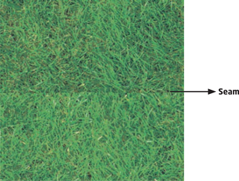
STEP 5
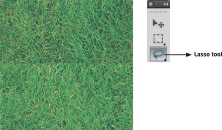
To mend the seam between the repeat sections, you can use Content-Aware Fill. This will copy and color-match data from another part of the image to fill in a selected area.
Select the Lasso tool from the toolbar and select an area of the seam.
Edit > Fill > Content Aware. Click OK.
Repeat this process until the seam has been completely mended.
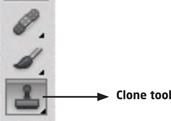
STEP 6
Content-Aware Fill is a quick and easy method to mend seams between sections of a repeat. You can also use the Clone tool to mend any individual areas. The Clone tool will copy one area to another using the Brush tool.
Select the Clone tool and choose a brush, size, and opacity—the airbrush will give a softer and more forgiving effect. Choose an area you want to clone and press the Alt/Option key to set the copy target point. Move the Clone tool onto the seam and start mending the seam.
STEP 7
One you are happy with your mended seam you can put the unit into repeat. At this point you can change the unit size.
Image > Image Size.
Change the unit of measurement to percent and adjust as required.
STEP 8
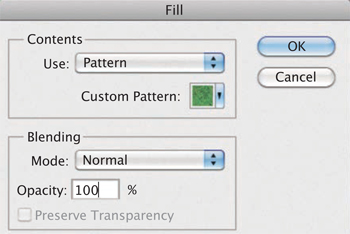
Edit > Define Pattern.
Name your design unit and press OK.

STEP 9
Open a new document.
Edit > Fill.
Select Pattern and find your design unit under Custom Pattern.
Check your repeat for any obvious seams or lines of patches. If you see any you can go back to the original unit and amend, then remake your pattern until you are satisfied.
When putting a textural design into repeat, the aim is to create a continuous pattern. There should be no clumsy interruptions that stand out and make a design look awkward. After a few attempts it should be perfectly possible to create repeats where the repetition of the unit is not apparent unless the viewer really searches for it. Rhythm and balance are the key to a good repeat.
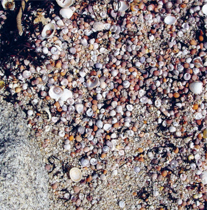
The photograph on the right was the starting point for this example. The largest possible area, containing only the shells, was cropped and put into a half-drop repeat (see page 96). A half-drop is the best method for disguising the joins of textural repeat. In this process the seams are blended using the Clone tool.
The best method for checking your repeat is successful is to reduce the file size and tile-out as large an area as possible (at least two units across and down), then stand back and see if any unintentional patterns emerge.
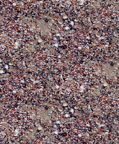
BAD REPEAT
This example is not as successfully crafted as it could be. This is because certain elements, such as the emptier patches of sand and the diagonal line of larger white shells, stand out too obviously. One way of avoiding this is to scatter any eye-catching elements so they do not line up and so that the eye moves around the design rather than focusing on an isolated element.
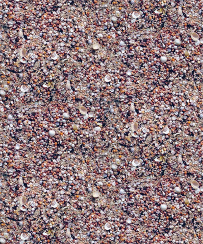
GOOD REPEAT
In this example of a successful repeat, some of these same shells were carefully selected, copied, and repositioned around the unit and finally blended into the background so that they were more evenly distributed. Some were also rotated so they look like slightly different motifs.
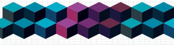
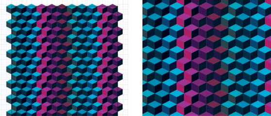
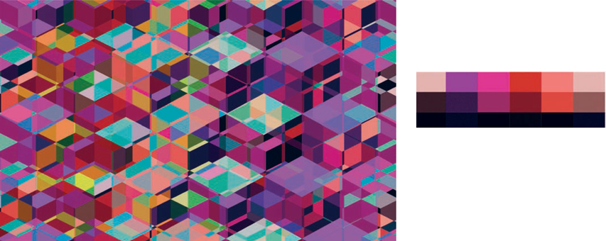
CREATING A COLOR PALETTE
Color is one of the most important elements in creating a successful textile design, and it is essential that the designer is a confident colorist. Textile designers often have to design with a season in mind and follow color forecasts, but there are plenty of sources of inspiration for building color palettes.
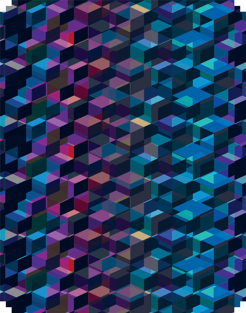
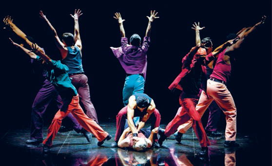
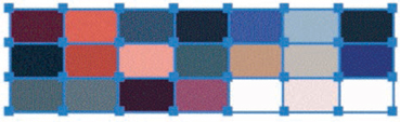
A movie of the Broadway musical West Side Story was designer Andrea Patterson’s starting point for her winter womenswear collection. Set in New York, the musical centers around rival teenage gangs of different ethnic and cultural backgrounds. The urban tones of gritty city life mixed with flashes of jewel brights gave the designer a rich palette to work with, but it was also the mood, atmosphere, tension, and passion of the movie that she wanted her designs to evoke.
This tutorial shows how to extract a color palette from a photograph, create a geometric pattern, and apply coloring effects and filters to create a sense of mood and atmosphere.
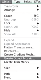
Open your photograph in Illustrator.
Select > All.
Object > Create Object Mosaic.
STEP 2
A dialog box will appear. Choose how many tiles you want vertically and horizontally. In this example 25 have been selected.
The tiles will be grouped; you will need to ungroup them.
Object > Ungroup.
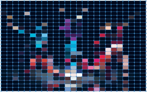
STEP 3
Select a series of tiles from the mosaic that represent a color grouping you like.
Edit > Copy.
Edit > Paste.
Select individual tiles and, with the Eyedropper tool, move across the mosaic and select and drop colors to create a palette. Alternatively, you could use a combination already together in the mosaic.

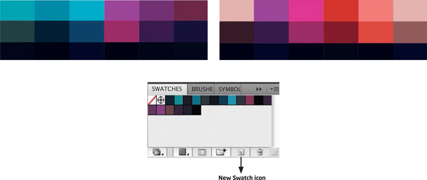
STEP 4
Here the designer has created two separate palettes from the mosaic that capture the mood she wants to evoke. To create a new palette, open up the Swatches panel if it is not already visible.
Window > Swatches.
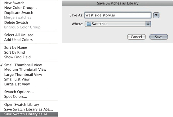
Delete colors from the Swatches panel. Now highlight the individual tiles from your selected colors and click on the New Swatch icon at the bottom of the panel to create new swatches.
STEP 5
Click on the menu button in the top right-hand corner of the Swatches panel to reveal the drop-down menu. Scroll down to Save Swatch Library as AI. Name your new swatch palette. This will now be saved and you can access it at any time from the Swatch Library.
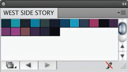
STEP 6
Open the Swatches panel and find your saved color palette in the Swatch Library.
STEP 7
Open up a new document.
View > Show Grid.
View > Snap to Grid.
View > Smart Guides.
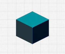
With the grid as a guide, begin to draw a cube.
Your points will snap to the grid.
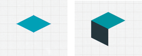
STEP 8
Once your cube is complete, select the whole cube.
Object > Group.
In the View menu, deselect Snap to Grid and select Snap to Point.
STEP 9
Select the cube, with the Selection tool placed directly on the far left anchor point. Hold down the Shift key and the Option/Alt key and drag and copy the first cube until it snaps into place on the right-hand anchor point of the cube and leaves a copy. When the double arrow goes white it has snapped to point.
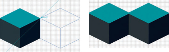
STEP 10
Press Command + D to repeat the last command and duplicate your cube.
Build up a row.

STEP 11
Once you have a row, ungroup the cubes so you can color individual sides with your color palette. Object > Ungroup.
When your row is colored, regroup the cubes. Select > All.
Object > Group.
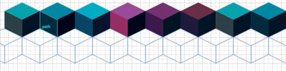
STEP 12
Select the row and, holding down the Shift and Option/Alt keys as before, duplicate the entire row this time. Continue until you have built up a unit of cubes.
STEP 13
Use a Clipping Mask to tidy up the edges of your design. Using the Rectangle tool, draw a rectangle (with no Stroke or Fill) over the design.
Select > All.
Object > Clipping Mask > Make.
Save your design. Export it as a TIFF file.
File > Export.
ADDING FILTERS AND EFFECTS
There are many effects and filters that can be used in Photoshop, but Andrea wanted to maintain the color and energy of the musical that initially inspired her. Her aim was to give the design a sense of movement and rhythm that the dance scene evokes.
TRANSPARENT OVERLAYS
STEP 1
Open the design in Photoshop and duplicate the layer twice.
Layer > Duplicate Layer.
Select the second layer.
Edit > Transform > Scale.
Enlarge the layer. Alter the Opacity in the Layers panel to reveal the underneath layer. With the Move tool, slightly shift the layer across to reveal the layer beneath.
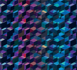
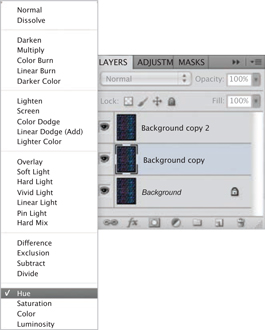
STEP 2
With this layer still selected, click on the drop-down menu at the top left of the Layers panel to reveal the Blend Modes.
On Layer 3, apply the Hue blend to heighten the color. Experiment with the Opacity in the Layers panel to enhance the effects of transparency and movement.
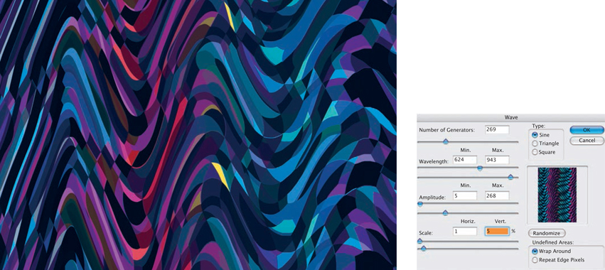
Flatten all the layers.
Filter > Distort > Wave.
Alter the sliders in the Wave dialog box until you are happy with the effect.
COLOR BLENDS
Here, a different color palette has been used to create the cube design.
After exporting your design to Photoshop, again duplicate the layers, changing the Scale and Opacity in the Layers panel, and add the Blend Modes settings Difference and Lighten to create the effect shown on the left.
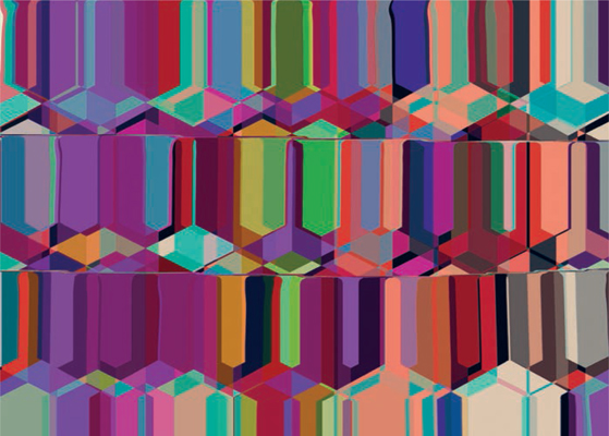
Finally, flatten the image and apply the Liquify filter to create fluidity and color blending.
Filter > Liquify.