
Chapter 4 : Inside the publication

Having a proper understanding of editorial design is just the first ingredient in a complex mix. Another essential element is a real understanding of the publication and the ability to apply this to the constituent parts of the magazine or newspaper. It’s not simply about design decisions, but a deep knowledge and fascination with what underpins and motivates these design decisions.
A publication is broken down into areas that largely follow an established format for its particular type. Thus, a magazine breaks down into three areas: the news-led first third (called the front of the book), a middle third housing the features (called the feature well), and a back third (called the back of the book), which is usually where information-based content – reviews, listings, directories and so on – is located. A newspaper can be similarly broken down into areas of content: hard news (the unpredictable, including international news and business); analysis and opinion of the news; expected content (television, stock-market information, reviews, weather, sport reports, etc.); and irregular features.
A flick through any newspaper or magazine will reveal that the different areas are often signposted by varying layouts or grids: column widths, headlines, fonts and their weights, images and so on are all likely to differ subtly from each other, identifying departments and making navigation easier for the reader. There is, of course, no reason why designers should not deviate from these formats, but, if they do, they should use consistency in flow and navigation to compensate for the reader’s lack of familiarity with the structure. This is particularly true for popular and predictable content – TV listings, weather forecasts, letters, crosswords, horoscopes and so on.
Contents page
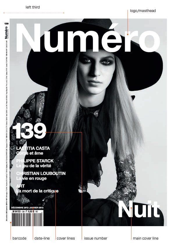
What does the contents page of a magazine do? Contemporary readers use the contents page in a number of different ways: to find the cover story, browse the entire content of the publication, find favourite sections or find a story they vaguely remember reading years earlier. Some people don’t use the contents page at all; others read or flip from back to front, making the contents page at the front fairly redundant. But the contents page remains very important because, after the cover, it is the only device that can literally guide the reader deeper into the publication and signpost a way through and around its content. Because of this status, contents pages are often located on the right-hand side, since this is the page most easily read. However, precisely because of this, right-hand pages – and particularly those near the front of a magazine – are more appealing to advertisers and therefore may be sold, forcing contents pages onto the left-hand side of a spread.

Contents pages have to list everything in the publication, but there is no reason why their design cannot be handled inventively, as these examples from Zembla (below) and The New York Times Magazine (below right) demonstrate. For the latter’s November 2003 annual issue on ‘Inspiration’, former art director Janet Froelich found inspiration at the Cooper-Hewitt Design Museum’s biennial. ‘I saw the wonderful “Alphabits”, which designer and writer Paul Elliman constructs from scrap materials, found objects and bits of industrial waste, including bottle tops, computer components, engine parts and so on. As such, they are a perfect embodiment of the question of where inspiration comes from. His letterforms are powerful graphic objects and they made our pages look fresh and inspirational. They were so much fun to work with,’ says Froelich.
Designing the contents page
First and foremost, the contents page – and particularly the essential information it contains – should be clear to read, simple to follow and easy to find. While traditionally it is placed as close to the cover as possible, its position isn’t as important as consistency of positioning. Every issue of the same magazine will put the contents page in the same place. Regularity leads to familiarity. This, in turn, fosters the sense of a publication being a friend. The arrangement and organization of a contents page should be attractive, lucid and quick to absorb and navigate – to find the cover story, for example, or a favourite regular section. It should highlight individual features and important section stories through the use of type, imagery and graphic devices such as rules and icons, and it should summarize main stories to tempt the reader to them. After all, someone reading the contents page may not have bought the magazine as yet. Finally, it should echo the arrangement of the contents that come after it; so, if there’s a news section followed by a feature well (see p.83) and a directory, this should be reflected in the contents page.
Some publications don’t bother with a contents page at all. Chris Dixon, former art editor at Adbusters, did away with the contents page because he and the editor, Kalle Lasn, agreed that it segmented the magazine too much and dictated the approach. Instead, navigational tools, including colour bars and colour stock, were used, the former signifying the length and variety of the section’s contents by their width, colour selection and length. This is an extreme solution to a design problem and one that, in any case, can only be applied to certain types and sizes of publications; a news weekly or listings magazine with no contents page would quickly annoy its readers, while a publication with 300-plus pages simply has to be navigable in a practical way.


Contents pages can be designed well as lists, as illustrated by these examples from Twen, Sleazenation and About Town , which use strict underlying grids and a Swiss formalism to make the text matter-of-fact and informative while retaining a graphic elegance. But there are many different ways of representing the navigation of the magazine. In Metropolis, ‘The map on the table of contents is a graphic device that was created by Paula Scher when she redesigned the magazine in 1999. It provides a framework to show the reader where the stories appear in relation to each other. Although the table of contents has gone through many design variants over the last five years, the map has remained, and has actually become a more significant element in the design of the page,’ says former Metropolis art director Criswell Lappin.
The front sections
Magazine editorial-department pages – pages into which all the editorial departments on the publication will feed, whether culture, fashion, sport, music, travel or interiors and so on – will generally have well-structured style sheets and templates that are based on a selected range of fonts (size and weights), colours and page furniture (including graphic icons, rules and keylines), all laid out across a well-defined grid. Design has a part to play in the masthead and editorial comment, too, where the way in which information is laid out sends strong clues as to the style and tone of the publication. This is particularly true of the editorial comment, which should deliver the editorial tone of the publication very clearly.
Contemporary news pages (and the writing for them) have learnt much from web design, which uses boxes, colours and a variety of font weights and sizes to make pages lively and energetic. Wired and Business 2.0, in particular, pioneered this approach, which was picked up by Gary Cook at FT The Business. In an effort to make the Wired news pages busy and energetic, designers use an abundance of overlapping boxes, shades, tints and colours, fonts, photos and shapes. White space, which would add an unwelcome sense of calm to the layout, is completely obliterated.
A newspaper’s front section shares certain aspects with magazines in that it contains the most up-to-theminute content laid out across flexible templates on a well-structured grid. The bulk of unpredictable content – breaking news stories, developments in current news stories and so on –is contained here.
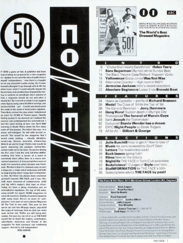
On alternative style magazine The Face, editor Nick Logan and designer and typographer Neville Brody recorded a post-punk era by taking typography, layout and design in new directions, which drew on the politics and visual aesthetic of Russian Constructivism. However, the layout of the contents page was still clear, and remained fairly traditional in its design.
In becoming the first ‘lad mag’, Loaded in the 1990s identified a new market, but it remained successful because the features and how they were written both tuned in perfectly to that market. Here were great writers expressing all the things their readers wanted to be doing, thinking, seeing, having and being. Its design also brilliantly conveyed and illustrated the energy, mayhem and anarchy expressed in the writing. Art director Steve Read achieved this by developing an ‘undesigned’ style that suggested features had been thrown together. The combination of vibrant colour, big, full-bleed action shots, huge headlines that were manipulated to convey movement and depth, and body copy printed out of the image created an effect of sheer joie de vivre.
The feature well
Features are the most important textual element of a magazine’s branding. Whether it be the handling of a celebrity interview that every other publication is running that month, an in-depth analysis of an event, situation or topic that is currently hot, or a scoop that no one else has, the style, content and tone of the writing and layout are what will make it stand out from competitors.
Many publications use a standardized house style or ‘look’ for features, and employ design to distinguish them from other editorial content through elements such as wider columns, more white space, different typefaces, larger headlines and longer stand-firsts or ‘sells’ beneath them. If the feature begins on a spread, it will often open with a full-bleed image – a head shot, figure or illustration – facing the feature opener, which will usually consist of the text (a headline, stand-first or sell, body copy and pull quotes) and perhaps further images that will tie the full-bleed image to the feature (if no such imagery is used, the headline usually does this instead). If the feature begins on a single page facing a full-colour ad, a bleed image in black-and-white to contrast with the ad next to it, or judicious use of white space, can create a distinction between the two pages and draw the eye away from the ad towards the editorial. Using white space formed part of a move away from the excessive over-design of the 1990s towards a clean simplicity, a move whose popularity has, unsurprisingly, continued well into the new century. One way of ensuring consistent use of white space is by incorporating it into the grid or templates: for example, in top or bottom margins or in the relationship between headline and stand-first, in ‘blank’ columns and in space around pull quotes.

On Vogue Paris, former art director Fabien Baron used both black and white space to construct spreads that reference, the underlying grid and accentuated display text. Willy Fleckhaus’s bold use of white space in this issue of Twen (opposite top) from 1968 is an unexpected treatment for the subject matter, and is therefore an elegant surprise, both visually and conceptually.
Back sections: reviews, listings, commentary
As with the front of the publication, elements that come after the feature well (for instance, reviews, listings, letters and horoscopes) are often laid out by junior designers and have a fairly well-determined structure and grid. A colour palette is usually in place, as are font selections, weights and styles. Imagery is all-important in these pages: good use of illustration and photography will determine whether the pages are lively, and, indeed, which individual story on the page is read. Equally, layout is crucial: using cut-outs on white backgrounds will make an image stand out and allow the page breathing space, something that can be difficult to achieve on editorial department pages, which are often crammed with stories and imagery. Very few people will read all the stories, but they may be tempted to do so if faced with a page that surprises and excites them, a fact that is true for all editorial design, even listings pages, where the intelligent use of typefaces and rules is crucial if the page is not to look an overall grey. Of the back section, the most valuable page is that facing the inside back cover; readers flicking from back to front will see this page first, which is why some titles use it for high-volume or popular content such as horoscopes, letters or the masthead.


This section opener for The New York Times ‘T:Travel’ Magazine reinforces the brand through the use of the hand-drawn Fraktur font of The New York Times, and the concept of the content through lettering in sand, while also presenting an image that is both original and inviting.
Section openers
Section openers are often an indulgence in a periodical publication, but a welcome one for the reader. In content terms, they are generally unnecessary spreads with an eye-catching image and a minimal amount of text, but they do allow breathing space and, if used as a spread, offer a rare opportunity for a landscape, image-led layout, which can be used to create a much greater design impact than a portrait (though ensuring that you have an image of good-enough quality and impact to repeat this regularly can be tricky). Because they generally stand out in a memorable way, such openers can act as a useful ‘marker’ for the reader looking for an article in a particular section. If this is their primary use, it can be helpful to create a distinct format that the regular reader can recognize and use to navigate the publication.
The role of typography
Type design is the backbone of editorial design and every designer has to know the basics. In digital formats the same typographic principles still apply as in print, but with a few additional adjustments. Any designer with a keen knowledge of type and an ability to handle complex typographic material will find they can work on any number of different publishing systems.
The terminology for copy can be confusing to a designer unused to the array of terms used in editorial design. It doesn’t help that many of them have different names for the same thing (see illustration p.88), but it is important for the designer to know four things when it comes to copy:
•the different terms for copy;
•what these different forms of copy are;
•how writing for editorial generally, and these types of copy specifically, differs from other types of writing;
•how this affects the designer.
Tag-lines
Tag-lines or slogans under a logo can add enormous value to a publication. A well-worded tag-line not only tells the reader what a title is, but also indicates tone and target audience. For regular readers, it reinforces the feeling that they are ‘the men who should know better’ (Loaded), the people who care about ‘the stuff that surrounds you’ (Wallpaper*) and the fashionistas that form part of the unusually styled ‘we’ar different’ cognoscenti (WAD). For newcomers, it’s a handy instant clue to content that they may not otherwise get.
Headlines
A sub-editor will argue that the headline is just as important in persuading a reader to read a story as the layout. A headline creates a strong bond between the publication and the reader; it says, ‘We know you, we’re like you, we share the same sense of humour/interests/ cultural references and we know you’re intelligent enough to understand this headline and story’. Therefore, appropriate size, positioning and treatment are vital. This is particularly true on a text-driven newspaper, which may not have the luxury of images with which to entice the reader into a purchase.
Stand-first
The content of the stand-first (aka sell, deck or intro text) is textually more important than the headline, for it sets the tone, after the headline, in informing the reader of the story’s intention, and acts as the bridge or link, both textually and visually, between the headline and the body copy. As such, it must contextualize the headline, but also summarize and sell the story to the reader in a pithy, arresting way.
Pull quotes
Pull quotes are another very useful tool at the designer’s disposal when it comes to orientating the reader and breaking up copy to make readability easier and the feature more enticing. The content for pull quotes is pulled directly out of the copy, or is a summarized excerpt.
Subheads (aka cross-heads)
Subheads can break up dense columns of copy and are most usefully employed in lengthy news items, where continuous copy can be off-putting or a reader may be looking for a particular aspect of a story. Subheads are also useful for denoting a new section, chapter subdivision or a subject change, and they will help readers find their place if not reading the article in one sitting.
Bylines and credits
The treatment and positioning of bylines and credits should be determined largely by the publication and the importance of these elements to it: a magazine will generally want to flag contributors and staff, particularly if they are using a well-known writer, photographer or illustrator; newspapers (which used not to have bylines at all) focus on the news, not who is reporting it, so bylines will be smaller on news pages than on feature pages.

‘A designer should have a willingness to read the material, to discuss it thoughtfully and passionately, and to develop visual components that expand the read while still working within the publication’s architecture.’
Martin Venezky, art director, Speak

On many titles, a publication’s design will draw a readership in, but if the textual content or body copy does not match expectations, sales will fall, advertisers will stop advertising and the publication could fold. Of course, a publication’s content will change to meet trends and remain relevant to its readership, but key to such change is the ability to remain true to the brand and the brand’s message, and essential to this is the strength of content, its writers and its entire staff. The designer’s involvement in body copy is, therefore, twofold: he or she must deal with its main requirements and characteristics, using column and font selection to reflect and deliver the brand and the individual content of the story to the reader; but they should also contribute ideas and knowledge of cultural trends to the editorial mix, as this can lead to dynamic content.
Panels, box copy, sidebars and infographics
Panels function as short news items or adjuncts to lengthy articles, where they are used to impart data such as facts and statistics, a case study or another element that is separate from but still relevant to the main article. Because of this, panel and box copy is usually snappier than the more discursive or in-depth approach of feature writing. This is reflected in shorter sentences, a more factual tone, lots of snippets of information and elements that break down continuous text into lists, points and the like. The design should, of course, visualize this snappiness.

The Flaunt headline (above) is more traditional, but is still strong, clever and insightful, suggesting as it does a selfeffacing attitude to (and on the part of?) superstar actor Brad Pitt, but also promising real insight rather than half a story.

More and more newspapers are using pull quotes, a device borrowed from consumer magazines, to catch the reader’s eye and also to break up dense columns of body copy, as seen here in Spanish newspaper El País (left).

Two differing approaches to body copy from two very different publications: The New York Times Magazine fills the page with body copy yet retains a sense of space, light and accessibility through its selection of fonts (Cheltenham redesigned by Jonathan Hoefler, Stymie redesigned by Cyrus Highsmith and Matthew Carter, Garamond and Helvetica). In Speak, Martin Venezky shapes the body copy to create space, but also to create a sense of cohesion across the spread, unifying the various elements.
Captions
Just as stand-firsts act as the bridge between headline and body copy, captions bridge the image and the text, and are therefore an important design element that requires a well-thought-out design solution. There are different approaches to designing captions and their placement (as outlined in Chapter 5), but their design will be dependent on the designer knowing what the role and tone of the caption is in the publication.
Folios
Consisting of a page number, the publication’s title and, in some cases, a section or chapter title, folios are an indispensable part of the page furniture, helping to orientate the reader in the publication and strengthening the structure of the format and therefore the brand. On a title where the content is straightforward and direct, folios will not usually be made into a design feature, but a publication whose readers are visually literate will use fonts, weights and positioning to make folios stand out as design elements in their own right. David Carson, Martin Venezky and Rudy VanderLans often did this on RayGun, Speak and Emigre magazines. Many magazines will drop folios on pages featuring full-bleed images. There is nothing intrinsically wrong with this, but too many folio-free pages together might make production difficult for the design team and printer, and make navigation difficult and irritating for the reader. If choosing a left- or right-hand page for a folio, the right is the more visible page.
Screen fonts versus print fonts
There is one big difference between the way the human eye reads text printed on paper and text on a screen: the human eye is actually reading backlit letterforms on a screen. Depending on the brightness and calibration of the screen, letterforms can appear slightly bleached out if the contrast is too high. Compare this to paper where the eye is seeing black letters printed on a natural white background. The quality of the reading experience depends on the light reflecting off the paper stock. The traditional ‘dot gain’ effect is also a factor when text is printed on newsprint or recycled paper, where letters appear slightly softer or blurry under a magnifying glass.
These factors mean that the designer must choose fonts carefully and know the difference between a font designed for screen and a font designed for print. Digital fonts are design products in their own right and commercially available from manufacturer companies, which are aptly named foundries. There is a bewildering array of digital fonts available to download from the internet and a little background knowledge of type history will certainly help the beginner. There exists a thriving community of typography fans who are only too willing to engage via blogging, type societies and lectures. For the more experienced designer, learning about typography is a life-long special interest. Learning new software and staying informed about technological advances is an essential part of continuing professional development as a designer.
News organizations, such as The Times newspaper, are able to draw on their vast archive of material, and use this content in both print and digital formats to make reference to a current story. In this way publications can bring forward some of their heritage into the present. Readers of The Times still want a reliable and trusted journalistic product. If they now have to pay to read content on the website, then they want a polished product, not the aggregated content they could get from free news sites. The digital product needs, therefore, to be of a high standard.
Jon Hill is Design Editor at The Times in London and oversaw redesigns of the paper, The Times website and the iPad edition. He also oversaw the launch of the Eureka supplement. In the interview which follows he explains his views on typography and the impact of the digital environment on design.
How do you take the The Times brand and keep it looking fresh?
It is a bit like setting up a kit or palette: not so much setting up templates as setting up a toolbox that all the designers can use. That goes all the way down to the font. We use Times Modern, which was created as part of the Neville Brody redesign in 2006/7.
We worked very hard to make sure that the font worked across all the platforms from print to digital. Times Modern is our DNA; it is our brand if you like, because, of course, a big part of The Times is its headline font. It appears on everything we do.
You are known as a strict typographic designer who knows the deep structure of editorial pages and the visual language of page architecture. Do you still use these typography skills when working on the screen versions of The Times?
The biggest challenge for me is working with developers and the people that work with and build our content management systems. When you work with these people, you realize that their idea of a successful publication is one that is published automatically: it takes the journalism then automatically flows it into the web or the tablet edition. Meanwhile, art directors want to retain control and craft every page of the edition and this can be an area of conflict. The editing team want to have the last word on the way it looks, for example to make the headline better or adjust the picture crop for the iPad edition. The truth is somewhere in the middle. Where possible, the systems will automate much of our digital editions, but we have a level of control that allows for typographic and editorial adjustments.
Who has the last word when setting up these digital editions?
One of the things that we have learned is that, because of the paywall at The Times, we aim to give our readers an elegant and considered product if they are paying for it. Therefore it is important to get specifics like drop caps right and paragraph spacing. Polishing these details also shows that we care and makes the product stand out from all the free news sites. We discussed this with the developers and made sure they knew this was important to the integrity of The Times when they were prioritizing their work.
Do you feel like the quality of digital fonts has improved to match the print version?
We are happier. We are still working with Monotype to try and improve the website fonts because there are still different browsers to consider and each browser displays the type differently. On the tablets you are in control because you know the resolution and quality of the device. Now in 2012 on some of the retina screens it is as good as it is in print. I am confident that we are now in control of our brand and the colour palettes across our digital editions in a way that we weren’t, say, five years ago.
Can you explain how the new digital environment has had an impact on your work?
No publisher has really cracked what it means to publish editorial on the iPad and how you make that a rich experience. It hasn’t quite happened yet but I am sure it will. It is important that our designers know about interactive graphics, motion graphics and are able to handle large amounts of data. They need storytelling skills in a digital context. It is no longer a case of moving around text and images on a page layout. Designing for digital newspapers demands a whole new approach.


Tell us about the iPad. Is making the tablet version very different to making the website?
A bit of history: Rupert Murdoch made a promise to Steve Jobs, so the story goes, that we would be the first newspaper to publish on the iPad, within three months of its UK launch. From a standing start we created the app within three months. It is a daily edition as opposed to a constantly updated website, with the editorial mantra that it is ‘like the newspaper but better’.
The idea behind the app is that it shouldn’t be a ‘live’ product, like the website, but a daily edition with all the journalism you’d get in the paper plus interactive graphics, video and extra archive material to give background content to bigger articles.
The reader can have an edition-based linear experience. We think readers prefer this, they don’t want an infinite, overwhelming product, which is sometimes what navigating a news website can be like.
Jon Hill’s advice for getting into news design
Do you think that young designers still need to know typographic rules and basics or can they survive without this knowledge?
Yes, they need to have a passion for design and typography and show some evidence of working with complex information and large amounts of text.
Graduates need to have a basic knowledge of typography and information design, but now they must also have the ability to teach themselves new software. Designers in the workplace update their knowledge all the time by using online tutorials. They need some knowledge of coding, so that they can appreciate what website developers do and be able to speak their language.
In terms of specialist publishing software, that is learned on the job. Many large publishers have custom-built systems that are not publicly available and so training is done in-house. This means that an aptitude for learning quickly is the most important attribute. If an applicant can demonstrate an ability to learn, this would be a good thing.
Once they are at work, can students pick up typographic rules as they go along?
The temptation is to bring people in who have a technical set of skills, but you can spend longer explaining rules of typography. We take students with technical skills, but we spend time training them to work with type. We can train them on our own system, called Methode. I like to see portfolios that show the person has a real interest in typography so you can have a deep conversation with them about that.
We look for people who have done some heavyweight typography before, or who show some sort of passion, even if it’s for wooden type, so you know you can have a conversation with them about details. After all, crafting type is common to everything we do at The Times, from print to digital, information design to animation.
What specialist skills would you look for?
An understanding or appreciation of how websites and basic coding works is an advantage. Currently that includes HTML5 and CSS. We wouldn’t expect a designer to code everything by hand, but they have to appreciate how it is done. Knowledge of how to handle stories with a lot of data, visuals and graphics is important. The rising popularity of storytelling using infographics has come about because of the trend towards organizations and governments sharing more of their data and this is good for designers. Designers need to interrogate the journalism, and be able to tell complex stories simply, especially when designing for the tablet, perhaps by using maps or moving graphics. It is not just about pure typography now; we need to tell stories in a number of different formats. Moving image, handling data and coding is all part of a designer’s skill set now, on top of the more traditional skills of page layout, typography and how to crop an image. I want designers who can do all those things.
True or false? All mastheads need to appear at the top of the cover.
This principle came from the days when magazines were only sold in shops or kiosks and covers were stacked for display purposes, so the masthead had to appear at the top of the cover. Now, with many customers subscribing, this is no longer the case. However for hierarchy and a sense of authority the top is an ideal place.
True or false? Never run small x-height body copy across long line lengths to create wide columns.
This is a question of legibility and there are many books you can read about legibility. See Better Type by Betty Binns (Roundtable Press, Watson-Guptill Publications, 1989). Once the eye reads too far down a line it can’t find its way back again. As a general rule, keep lines of moderate lengths. (The x-height is the height of a lowercase ‘x’ of a given typeface measured from the baseline to the mean-line. Different fonts can be the same point size but have a different x-height.)
True or false? Headlines should never be placed over a beautiful/reportage picture or any image if it can be avoided.
When reportage pictures were as precious as pieces of art, then this was the maxim. Any fine artist will be irritated by a headline placed over his or her work reproduced in a magazine. However, there is nothing wrong with text on pictures. The ‘pop’ of a headline on an image can be amazing and the design can make brilliant combinations. See George Lois’s book Covering the Sixties (The Monacelli Press, Inc, 1996).
True or false? Don’t reverse white text out of a black background. People won’t read it.
In a printed glossy magazine, the ‘black’ of an image is made up from at least black plus blue; sometimes magenta and yellow as well. This is part of the four-colour printing process: the colours are known as CMYK. Once on the press the registration can vary. Tiny reversed-out type will not hold its shape and the reader will be unable to read pieces of the letters. (In colour printing, registration is the system that print machines use to ensure colours are lined up and print clearly and crisply.)
True or false? Headlines should run across the top of the page but never across the gutter.
This statement came from the days when type hierarchy existed to help the reader digest the content step-by-step. In our multi-channel world there is no reason why a more unconventional publication should adhere to this. When tablets can flip a page from portrait to landscape, a headline might move or even appear as a navigational link. Headlines along the bottom of a page can use scale to dominate. Because of the way magazines are bound, the gutter in thick glossy magazines is a 12mm (half-inch) no-go area. Most magazines use a binding technique known as perfect binding, which uses hot-melt adhesive to glue folded sections together. For those thick publications, headlines should be kept out of the gutter to avoid losing a letter. In a digital or saddle-stitched magazine, you can place headlines across the gutter. Think about your reader.

Website references:
For a description of fonts for print and fonts for screen:
Opinionated Font Facts, Research and writing, Alissa Faden with Ellen Lupton. This site is linked to Ellen’s book and Princeton Architectural Press. http://www.thinkingwithtype.com
To find out more on the psychology of reading:
The Science of Word Recognition, Kevin Larson, Advanced Reading Technology, Microsoft Corporation
July 2004, http://www.microsoft.com/typography
Book references:
While You Are Reading, Gerard Unger, Mark Batty Publisher, 2007
Detail in Typography, Jost Hochuli, Hyphen Press, 2008
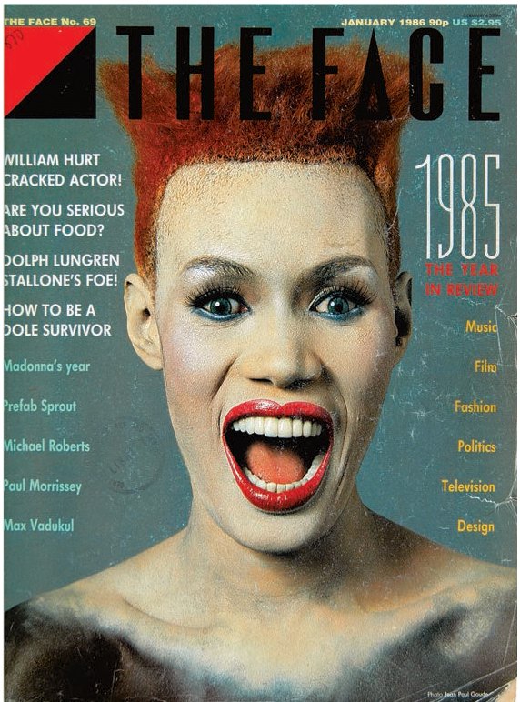
In his work for The Face from 1981 to 1986, Neville Brody made radical experiments with typography and layout. Influenced by Constructivism and Dada he broke many of the conventions of typography, highlighting individual words and phrases and changing the size of letters within the same word. The cover above from January 1986 features a portrait of the singer Grace Jones by Jean-Paul Goude.
Image treatment
Imagery and what the designer does with it have an enormous impact on a publication’s feel. Newspapers are increasingly relying on pictures as storytelling. As more newspapers move from text-driven to image-driven content, their use of all kinds of images – graphs, illustrations and graphic devices – is growing. But there is a key difference between the use of pictures in newspapers and magazines. As Mario Garcia puts it, ‘The nature of the content is different; newspapers need imagery that imparts immediacy in contrast to the more relaxing environment for the images that you’d find in a magazine.’ Production and budget issues are also factors, as time and money spent on images for a newspaper will be minute compared to that of magazines.

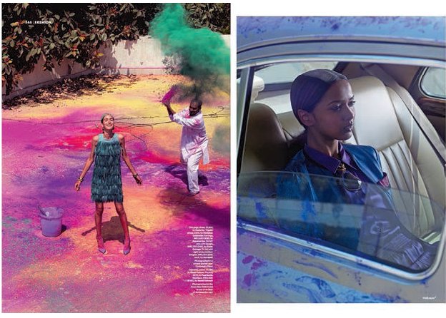
These fashion photographs from Wallpaper* for a story in their ‘Reborn In India’ edition explode with colour and movement. The fashion shoot was created during the Hindu festival of Holi and can be seen on the Wallpaper* website as a video clip. The use of full-bleed colour shows how photographs can underpin the identity of a magazine – in this case a curiosity for different cultures and locations.
Myths about art direction
True or false? The cover is the most important page in any magazine.
Increasingly true. If the cover doesn’t attract the reader’s attention then all the work inside is wasted. For digital magazines, the cover is an entry point and a home page that reinforces the brand. On the web, magazines are represented as thumbnail icons and covers have to work hard, therefore, to be memorable even at tiny size.
True or false? Designers only exist to do what editors say.
Designers are partners and equals in the creative process. They add spark to the fire and can make dull editorial content look good. The best editor/designer team is one of mutual respect and partnership.
True or false? Every picture needs a caption.
If you want readers to follow the meaning of a picture story then every picture does need a caption. If pictures are used as decorative elements then it is not necessary. Pictures always need to be credited to the photographer or to the stock agency that supplied them. Copyright infringement is not good design practice and must be avoided.
True or false? Money spent on original photography or illustration is worth every penny.
Creating something original is what designers get out of bed for. If the budget allows for new material then it is worth creating something unique to the magazine. In addition, the rights to use that image again can be included in the original fee. A publisher can, therefore, start to build a library of images that can be reused. Fashion and lifestyle magazines have profited by syndicating images in this way.
True or false? Using images for free from the internet is the way of the future.
Aiming for a unique product should be the top priority. Producing original images cannot be beaten but this can be expensive. Remember that images available for free on the internet can turn up anywhere. If using images from the web, credit must be given to sources and care taken to check permission for usage.
True or false? White space does not sell magazines.
If white space adds to the atmosphere and visual storytelling (tension/absence) then it has value. If it exists simply to stretch out copy and fill up pages then it has no editorial value. See Emigre magazine (see p.179) and RayGun as examples of magazines that use white space to create dynamic and graphic visual elements.

When shooting for the iPad, still-life photos can make good use of the single-page format. In this Port fashion shoot, the bench provides a strong diagonal emphasis within the composition. Instead of a cut-out garment shot, this lovely photographic set-up helps to define the thick texture of the coat, and in so doing tells the story of the garment.
Using photography
Photography functions as visual reporting or storytelling, and the huge range of contemporary photographic techniques and styles available offers the editorial designer a vast choice of reporters and storytellers. Even if photography cannot be commissioned for financial reasons, the photos that are supplied by a PR agency, or by the subject of the story, can be edited just as text is. Commissioning a visual story or style is just the beginning (see p.190 for successful commissioning), for although photographs are taken in a rectangular format, the designer then has the option to crop the image or change the shape, as well as alter tonal values and employ other photo-manipulation techniques. All of this is visual editing; just as the editor makes selections and decisions about the copy, so art directors work with the image content of a publication.
But they can go further than that: if an art editor wants a different perspective on a story, he or she has the luxury of not giving the photographer any information about it, possibly resulting in two very different interpretations (image and text), which can add up to much more than the sum of their parts. Just as editing can shape a viewpoint, so can editorial design. The selection, juxtaposition, combination and positioning of images and text with captions that ‘tell’ viewers what they are seeing can strongly suggest a ‘truth’ that may not be there at all. Added to this is the growing sophistication in photo manipulation (both in and out of camera), which literally changes truth to lies. Hence the intervention of art editor, editor, picture editor and photographer can result in myriad representations of a story. Michael Watts, editor of many newspaper supplements, recalls experiences on the FT The Business magazine for the Financial Times:

‘The December 2001 issue was our first after 9/11. Because of our two- to three-month lead time, the world had been saturated with images of the Twin Towers being destroyed by the time this issue was printed. We decided not to show any images of destruction but use the space to celebrate the past and look towards the future,’ says Criswell Lappin, former art director of Metropolis. This photograph by Sean Hemmerle did just that.

A great photo is the basic requirement for a great image, but equally important are sympathetic and appropriate cropping, scaling, positioning, format and stock. This image from Twen (left) is a brilliant image, brilliantly cropped.
‘Sometimes there were difficulties between myself and Julia Cuthbertson, who ran the weekend paper. She wanted conventional magazine items like food and restaurant reviews, while we wanted something that was visually dynamic and new, reflecting the dot-com boom and the new, cool status of business. The trick was to subvert the genre. On the food pages we photographed food in its raw state, when everyone else was showing cooked dishes. Our picture editor, Caroline Metcalfe, came up with some great food photographers, notably Rob White. Then we illustrated the restaurant reviews – by the very witty Marion McGilvary – with a mixture of maps showing where the restaurant was located, and bills that we reproduced. The combination of all these elements made the mag highly idiosyncratic, which irritated some but pleased many more. It gave it character. And sales of the weekend Financial Times rose to over the 250,000 mark in my time there – a 20 per cent leap. People who never read the Financial Times in the week would get it at the weekend.’

Whereas photography in magazines is as much about image as text, in newspapers imagery is very much used to support text. But aspects of magazine design are creeping in, so that a front page will ofen use one striking image to attract the eye immediately and communicate something that no words could do, as in this powerful Guardian cover of 12 September 2001.


In this July 1967 issue of Harper’s Bazaar (left), a piece on poetry is illustrated with a picture of the score for Karlheinz Stockhausen’s ‘Refrain for the Players, no.11’. Art directors Ruth Ansel and Bea Feitler were making the conceptual link between the elegant intricacy and visual lyricism of the score (and the music it represents) and the nature and concept of poetry. It is a brilliant visual metaphor for the article. Newspapers are also increasingly using illustration to give readers a less literal interpretation of a story, as illustrations will offer a different dynamic to a page. Below, Marion Deuchars’ illustration for The Guardian gives breath and life to the page. Its composition and colour contrast well with the blocks of text beneath it, while its obvious hand-craftedness gives the story something a photo would struggle to do. Below left, in this page for iPad, the brushstrokes of the illustration by Dan Williams contrast with the crisp typography.

By choosing to use illustration in place of photography, which is only used for high-gloss, full-colour ads confined to two or three spreads in the centre of the magazine, first-class Virgin Atlantic fanzine Carlos (right) ‘set out to avoid the clichéd world of celebrity-led magazine content, both editorially and visually. Or, in the words of the then art director, Carlos is “post-photography”!’ – Jeremy Leslie.
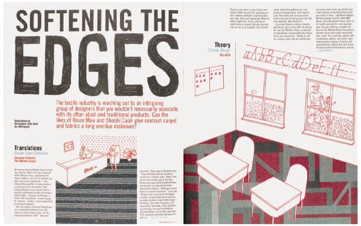
‘If we didn’t incorporate the textiles into an illustration [right], then we would be left showing carpet swatches, which would be pretty dull. By having Christopher Neal incorporate the textiles into his one-colour line drawings, we accomplished two things. First, we made carpet samples interesting to look at without taking away from the product. Second, the illustrations give the viewer information about the product. The environments, while somewhat tongue-incheek, indicate the locations that the different textiles are designed for – schools, offices, airports and so on. I gave Christopher a rough page layout, the approximate size for each illustration and told him which environment went with each textile. Christopher came up with the content of each illustration with little direction. Once he sent me the finished illustrations, I decided to hand-letter the word ‘edges’ in the headline to reflect what he did.’ – Criswell Lappin, former art director, Metropolis.
Using illustration
When at The Guardian newspaper, Mark Porter used illustration because ‘it has always been an important part of The Guardian visual mix, and, by introducing more contemporary illustrators, we have ensured that the paper feels fresh and modern’. Other art editors use illustration when a story demands a conceptual or oblique interpretation, or there are no good photographic images to be used, or simply to create an interesting and constantly varying dialogue between visuals and text. Illustration can express a concept or feeling more than photography can, because readers often cannot help but attach a narrative to a photograph, particularly if it’s figurative. This is because they ‘read’ the photograph literally: ‘This image is made up of this figure wearing these clothes in this setting doing this thing, therefore I am being told this.’ But illustration is not read in this way, allowing the story, art editor and reader to create other, often more expressive and abstract associations. Illustration can also illustrate the zeitgeist in a more obvious way than photography can, and it can be used to support a brand. The Illustrated Ape magazine in the UK is famed for only using illustration, as is Carlos, which retains colour photography solely for the ads.

Many editorial publications incorporate illustrations into their design, but none besides The Illustrated Ape (above), edited by Christian Patterson and Michael Sims, designed by Darren Ellis at See Studio and illustrated by top illustrators such as Paul Davis, builds its whole raison d’être around it. Created by using open submissions from writers, artists and illustrators, this cultural quarterly of poetry and fiction uses only illustration as its imagery – and more often than not its text, too. The resulting large-scale spreads are rich and textural, and form an intelligent, cohesive whole that always looks fresh.
Cropping an image
Cropping, magnifying, repeating or shooting an image from unusual approaches can have a huge impact on a layout and create original and unexpected perspectives. Techniques such as cropping and magnifying can also concentrate the eye on the portion of an image that contains its essence, or create a meaningful dialogue with the text, and, ultimately, a dynamic rapport with the text and layout. If more than one image is used, this rapport becomes more complex, with the need to create a narrative interaction both between the images and between the images and text. American industrial design magazine I.D. uses these tools to great effect: by blowing up a product to massive proportions on a page, an everyday item such as a toothbrush becomes a surreal object of beauty whose sculptural qualities are revealed, making for a visually arresting page. Tight close-ups can be equally effective, as can using images to create abstract patterns and focusing on or bringing out an unusual curve, shape or aspect in an object.

On the spread from Japanese magazine Eat (top), the close-up photograph of the scales of an upside-down artichoke turn what could have been a mundane image into a sculptural, striking graphic. In I.D. magazine, the image of a bicycle (left) works hard to pull two spreads literally and boldly together while also suggesting movement and continuity; in another issue, toothbrushes become abstract translucent objects (above).
Brief Three
Typographic style sheets
AIM
To create typographic worksheets for your magazine.
THE BRIEF
Work on a visual typographic identity for your magazine and think about how the fonts will relate to the philosophy of your magazine’s content. Start with two or three fonts that relate to each other and work together visually as a headline font, subhead font and text font. Other design elements tend to be sisters and brothers of these main three fonts. As you progress, you might cut this number down to one font or two, but be open to ideas at the start. Remember that if your magazine is bold and powerful then use fonts that have a dynamic page presence. If your magazine is contemplative, however, choose fonts that reflect a softer visual sensibility.
•Write some headlines and stand-firsts. Explore scale by looking at what would work for drop caps. Which font reads smoothly for pull quotes? Print them out and pin them to a wall to view them from a different perspective. Collage your elements together in your sketchbook for reference later on.
•Consider the letter kerning. Almost all digital fonts will need adjusting. Don’t accept the output from the computer. It does not have your human eye and cannot ‘see’ type. You are learning to feel type and really see it in use. Look at the letters off screen and absorb the shapes they make.
•Be confident in your ability. You are aiming for a typographic style sheet that reflects and enhances the idea of your magazine.
This magazine is an example of a student project that utilizes and explores a largely typographic format. It uses graphic language to reflect the opinionated content of the editorial, which is a slightly cynical take on the art-school experience and a critique of the lifestyle. The creator Jordan Harrison-Twist has chosen sharp Futura Italic as his headline font and made provocative covers that challenge the reader.


Much of the content was written by Harrison-Twist, who is talented in that area, but the visual looks raw in its lack of respect for convention. The magazine evokes a fanzine feel in its use of two colours and line drawings, all of which serve to reinforce the concept of the editorial.