
Chapter 6 : Essential design skills

As we have seen, in order to create an effective and successful publication, designers need a broad range of practical technical and conceptual design skills, as well as knowledge of the field. The preceding chapters have dealt with many of these individual skills, such as understanding the component parts of a publication and everyone’s role within it. In this chapter, we continue our focus on the design skills and knowledge required not only to be an editorial designer but an art director too, specifically:
•the ability to master objective visualization;
•skilful page preparation;
•an understanding of and skill in working with typography;
•an ability to keep up with changing production skills and to keep learning new software;
•the ability to create consistency without monotony;
•project-managing time and cost.
Mastering objective visualization
This is a complex skill that involves the ability to select, reject, emphasize, arrange and combine essential elements in order not only to design a layout but also to develop a vision for a whole publication that is completely attuned to its subject matter or raison d’être and the readership. The designer must be able to:
•understand and make a good and accurate interpretation of editorial material – do this by reading the copy and, where appropriate, talking to the features editor, writer and/or photographer;
•synchronize thinking with an editor to produce the layouts he or she has in mind – meetings and mock-ups are the keys to achieving clear communication here;
•clearly identify the requirements and purpose of a particular publication, or know the brand, the reader and the relationship between the two;
•produce more than one version of a layout (if, for example, the pagination alters). Always develop more than one idea – this has the dual purpose of testing the strength of your original idea against other solutions, and offering back-ups for discussion and development if the first idea is unacceptable;
•stay inspired and, as far as possible, free from constraints – once they have been learnt, all the elements and structures of editorial design can be examined, questioned, played with, revisited and broken. Don’t get so stuck in one route and direction that you can’t approach a graphic solution laterally;
•visualize and produce layouts from material that may have been created or selected before the start of a layout. Always have a sketchbook on you. Work out ideas and rough layouts on paper; create sketches, diagrams and other material before going near the computer.

Jeremy Leslie’s guide to the editorial designer’s must-have attributes
•The ability to engage with, understand and make sense of the content you’re working with, however obscure or distant from your own interests.
•Strong visualization skills allied with the ability to communicate your ideas to colleagues.
•A developed sense of what’s possible with illustration and photography.
•An understanding of the market context and competitor magazines.
•Being able to spot a good idea regardless of whose it is (and give credit for it).
•Able to balance your desire to be creative with the reality of deadlines.
•An enjoyment of the process – lack of enjoyment will show in the pages.
•Utter self belief but also the ability to choose the right battle.
Building successful foundations for layout construction consists of choosing the format and stock, creating appropriate grids, knowing how to use design to signal priorities, and working with a flatplan to ensure that sections and pagination keep the flow and pace of the publication while working through constant changes.

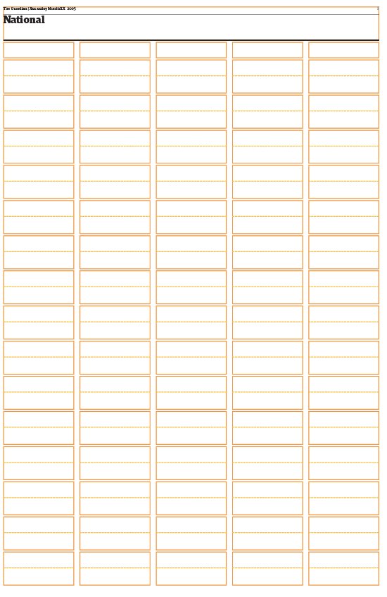
Chunky blocks of text in formal grid structures can look very effective ‘floated’ in space, as seen here in the redesigned Guardian newspaper.
Grids
Rather like blueprints in architecture, grids are invisible sets of guidelines, or systems of order, which help the designer determine the placement and use of text, images and other design elements, such as white space, margins and folios, helping to maintain continuity while still allowing for variety in a layout. Good grid systems anchor, but do not necessarily constrain items on a page. Where a publication has a particularly fluid design, the grid acts as an anchor or point of reference, a departure point that roots the whole structure. Sizes and shapes of type, images and areas of white space can be pre-planned, greatly facilitating the process of creating a layout. They can vary from rigid three-column grids to more complex ones of nine or 12 units that enable greater flexibility and almost endless permutations. In either case, the grid remains defined, but having the confidence and knowledge to manipulate and personalize the layout around it is what will make it into something special.
It is useful to be aware of grid conventions that underpin different forms of publishing, if only in order to deviate from them if desired. A weekly or daily, for example, usually has a formal grid structure because its production process has to be simple and fast. Quarterlies, by contrast, have the luxury of time, enabling experimentation and fluidity in the grid and columns system. In Fernando Gutiérrez’s annual Matador, each issue is designed using a strict but different grid and one typeface. Some publications don’t bother with a grid at all, choosing to use just the limits of the page as a grid. In this way they can build up the structure of a layout around an image or headline. Handled well, the result can be a fluid, flexible page and publication, but caution should be used with such an approach – it must be right for the publication, its brand attributes and its readership.

Roger Black’s ten rules of design
(But remember, rules, once learnt, are there to be broken!)
1Put content on every page. Design shouldn’t be mere decoration; it must convey information. Or entertainment. Content should come to the surface on every level. Corollary: nobody reads anything – at least not everything. The only person who will read every word of what you’ve written is your mother. All other people skim and surf. So make sure there’s content on every page.
2, 3, 4 The first colour is white. The second colour is black. The third colour is red. Calligraphers and early printers grasped this over 500 years ago, and experience has proved them exactly right. White for background, black for text, red for accent and excitement. These three colours are the best. Be very careful with all other colours.
5Don’t be blown around by fashion like a hot-dog wrapper in the wind.
6Never set a lot of text type in all caps. After a while, it’s just too hard to read.
7A cover should be a poster. A single image of a human will sell more copies than multiple images or all type. Always has, always will. Think about why.
8Use only one or two typefaces. Italian design is the model: a strong sense of a few things that work together. Avoid a free-for-all of multiple fonts/colours.
9Make everything as big as possible. Type looks great in big font sizes. A bad picture always looks better bigger.
10Get lumpy! The trouble with most design is it has no surprise. If you want normal people to pay attention, you have to change pace in your presentation. Monotonous rhythms of picture, headline, picture, text, ad, headline, picture, ad, etc., is like a pudding without raisins – a stew without lumps.
Roger Black has designed Rolling Stone, The New York Times Magazine , Newsweek , McCall’s, Reader’s Digest , Esquire and National Enquirer , among others.
Legibility issues play a part in the construction of the grid, so Fassett’s theorem of legible line length should always be considered. This states that line lengths containing 45 to 65 characters are legible (characters include letters, numerals, punctuation and spaces). Line lengths exceeding these limits challenge legibility. This does not mean that 40 characters or 75 characters should never be used, but anything that challenges established legibility theory should be examined closely – including a designer’s reasons for doing so. If clear, easy reading is important, grids must take this into account. In newspapers, five columns are viewed as the optimum number for tabloid or Berliner formats, and a story deeper than 7.5 centimetres (3 inches) under a multi-column headline is traditionally broken up with subheads and/or images. There are stylistic conventions, too, that might be considered: in a magazine feature, for reasons of legibility, the grid traditionally has three columns, but literary magazines often use two wide columns instead to form a classical symmetry and deliver long lengths or squares of text that shout ‘we’re intellectual’; many newspaper supplements take this as their basic structure but lighten the page using white space and other design elements.

Many periodicals or serial publications, which are published just once or twice a year, don’t bother with a grid system, relying instead on their conceptual approach to content and treatment to create continuity from issue to issue. Annual publication soDA takes this approach. The theme dictates the format, design and underlying grid (if any) of each issue. Metropolis uses a two-, three- and four-column grid throughout the magazine. ‘On editorial pages the text never comes above a certain point on the page, leaving plenty of white space at the top. The Metropolis logo moves cinematically back and forth across the top of the page as you progress through the magazine. This is a convention that still exists from Paula Scher’s redesign in 1999. Features are printed on an uncoated sheet, which lets readers know – visually and tactilely – that they are in a specific section of the magazine. This allows us to be more experimental in the layout and structure of this section, because it only contains editorial content. Each feature is designed individually, based on the content of the story and the quality and quantity of art that supports it. Most stories are loosely based on the same two- and three-column grids that appear in the rest of the magazine, but we are not afraid of dropping the grid altogether if another approach works better for a particular piece.’ – Criswell Lappin, former creative director, Metropolis.
On Inside magazine the underlying grid is restrained, but its simplicity doesn’t hamper design and layouts of other department pages. ‘A simple grid can still carry many possible combinations. You have to look at the bigger picture. Readers like to feel as if they have an understanding, almost a relationship, with the magazine. The consistency of the grid nurtures this need. If it’s kept consistent, the avid reader of a magazine can pick up any issue and feel comfortable navigating through “new” material,’ says former art director Jeffrey Docherty.

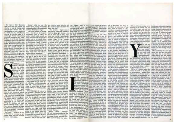
In a magazine feature, for reasons of legibility, the grid traditionally has three columns, but literary magazines often use two wide columns instead to form a classical symmetry and deliver big, dense blocks of text. The New York Times Magazine pages shown here take this further, boldly using one wide column that defies Fassett’s theory of legibility (see p.156), while remaining accessible and with a formal beauty provided by their classical structure.
The grid is also an important part of the editorial designer’s toolkit for digital formats. At The Times newspaper, the column structure of the printed version is used to give an ordered, legible system for designers and subeditors to work with, using the classic rules on the hierarchy of text to lead the reader in. When applying this philosophy to The Times for mobile media, the same sensibility is used, but the grid is smaller for the screen. Some users think there is no need for traditional columns, but design director Jon Hill explains the grid structure for the iPad as follows:
‘Navigation is linear, meaning it literally has a front cover, so you can swipe through a bunch of pages from page one onwards. We found we were quite gentle about how we introduced the tablet to the reader, and we kept the familiar column-based style of the newspaper. We did get lots of stick for that. Ultimately, it felt like the columns were a visual aid for readers of the website and they were comfortable with it. The columns made it easier to program and easier to design too. Going from print to digital format was a big leap for our readers, but they are iPad literate and the columns of text were a reassuring feature for them.’
In contrast, Mark Porter has a different attitude to digital grids. He redesigned the grid for The Guardian when it moved to the Berliner format in 2005, and consulted on the iPad version in 2010. Porter has extended the visual identity of The Guardian newspaper, adapting the design to fit The Guardian Online (a digital news website) and The Guardian app by making design decisions that stem from the design philosophy originated during the massive typographic overhaul in 2005. As he explains, ‘It is about adapting what you do to the medium. So the kind of grid on a newspaper is not the kind of grid on a web or app. Basically you can have an approach and a philosophy about how to use them and apply that to the different medium. You can’t just take the grids over.’

The Times decided to retain the use of a grid structure for their iPad version to give the traditional newspaper reader a familiar reading experience in terms of navigating through the page. The mobile version has the same attitude to clarity and order that the brand has had for many years. ‘It is all about typographic structure. Once we have our fonts established, the structure of columns and page design is just as important on the tablet versions as it is in the print version. We are looking for a polished typographic product.’ – Jon Hill, design director, The Times.


At The Guardian, the underlying grid on the newspaper is a 20-column grid that divides into 5. The grid for the website is a 12-column grid that breaks into 3 or 4. On the iPad the grid is 6 squares by 8 squares. The hierarchy of typography signals the importance of the story. Crisp headlines underpin the design and bring a spark through the juxtaposition of words and images. Every opportunity for graphic impact is used so that the website is a rich experience of simple navigational tools that help the reader get straight down to the exact content he or she is looking for.
Like many news sites, The Guardian iPad edition uses horizontal section heading bars and vertical lists of subjects to enable the reader to get to content quickly in the way he or she would use a referencing system.
Templates
Once a grid has been established, page templates should be made up for the different sections of the magazine – news pages, feature pages, back sections and so on. These templates will be based on the master grid but each should be simplified to deal with the specific demands of the section. All the major elements of the design – boxes for display fonts in alternative sizes, columns, picture boxes, caption boxes and so on – should be included (for more on templates, including an example, see p.110).
Pagination
The running order of pages has to be planned to ensure everything fits into an issue. Such planning is important in design terms because the flow created by a publication’s pagination will determine the pace and balance, and ensure that spreads of similar contents are spaced apart. Determining pagination is usually a collaboration between the editor, art editor, production editor and advertising-sales head. The only real restrictions are those of the print process – the way sections need to be made up for the presses – and the needs of advertising. Special attention should be paid to the details: a feature ending on a left-hand page with a new feature facing it is rarely desirable, and neither is a feature that is interrupted by four consecutive pages of advertising, or by an unexpected advertising insert. The best way to test the pacing and flow of your publication is to produce miniature spreads, ‘minis’, that can be pinned up in the studio. These can easily be shifted around as the flatplan changes, enabling you to monitor constantly the effects the inevitable changes are having.

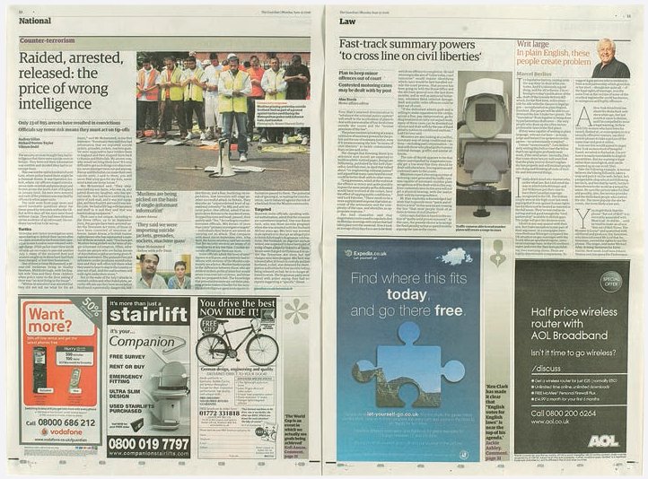
The day after the 7 July 2005 London bombings, national tabloid the Daily Mirror portrayed the capital as bloody but unbowed. Newspapers will usually treat such huge events pictorially.
Signalling
In printed periodicals an integral part of pagination and page preparation is the ability to signal the importance, priority and style of articles to the reader. All the design elements act as signals, from an article’s position in the publication and on the page to the width of columns (wider columns usually indicate features or the opinion and editorial – op-ed – section of a newspaper), type size, length and position of a headline, length of text, style of text setting, use and size of images and use of colour. A newspaper illustrates this very clearly. On the front page the lead story will be near the top of the page (so that it’s visible to the reader at the news-stand) and have the biggest headline and most space allocated to it, with less important stories radiating from it. The op-ed pages distinguish themselves from news pages by using a lot more negative space, picture bylines, pull quotes, wider columns and different type weights and sizes. But this signalling is also visible in magazines. In the news and reviews pages, signalling is similar to that of a newspaper, but in the feature well it may be more subtly employed. If the headline is very prominent and the article spans eight pages in wide columns with full-bleed, commissioned photographs, it’s clear that the publication wants you to read it. A designer should adopt a coherent and consistent use of such signals appropriate to his or her publication.
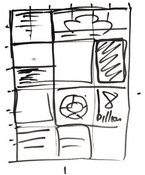
A sketch from The Guardian’s iPad development, showing blocks that indicate a modular grid, some with images, some with text. This was later developed into a slick grid with roll–over features. Designers still use felt-tip pens at all stages of design.
Digital page design
Designing for digital publications employs similar typographic and layout principles as for print. However, designers must understand that it is not just the output which varies, but what the reader wants from each different digital publication. Reading from an app on a touch screen is different to the experience of reading on a website; the editorial team must understand who their reader is, what his or her interests are, why, how and where he or she is engaging with the media. It is then that the skill of the art director and the editorial team comes into play; the team must be able to respond with the right content and design for their reader.
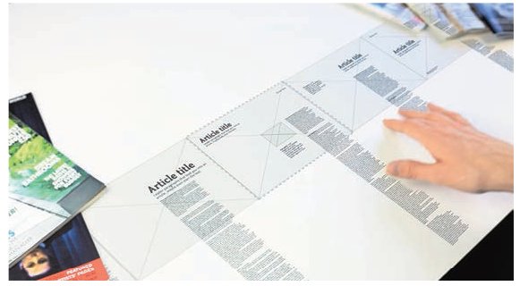
In this shot taken from a video Jack Schulze explains the thinking behind the new geography of digital editorial (search for Mag+Berg Bonnier video). Articles are designed as vertical columns comprising text, image and usual page furniture, which can be scrolled up and down, but are then assembled on a ‘clothes line’ that can be swiped horizontally.
Here the layouts are being swiped left to right, and pages moved sideways. The reader can go up and down to read, and left to right to see different articles. There is still a grid and typographic style sheets, but this style of navigation puts the viewer in control of how they access articles.
Navigation
The same principles of clarity in planning used in printed publications also apply to digital ones, but are extended to include navigation design skills for tablet and mobile devices. Online magazines designed to be read on an iPad or mobile device have become highly interactive; the way the user navigates the screen has to be carefully planned to make him or her want to interact and delve deeper into the publication. Navigation headings are designed to take the reader quickly to what he or she wants to read about, and on-screen tags and tabs are designed to help him or her quickly find out more information on a story or subject. The language and copy has to be easily digestible and attention grabbing in order to engage and intrigue the reader.
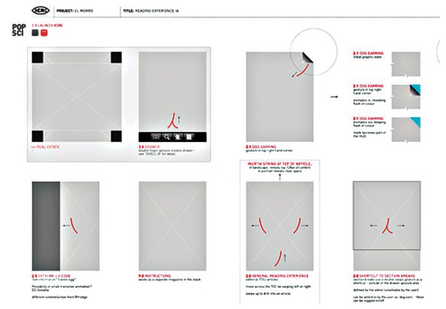
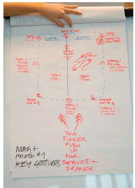
The sketch on the flipchart shows the thinking behind the development of Mag+ software, developed by Berg London with Bonnier. This chart shows the ‘key gestures’ the team considered at the early stages of building the software. A gestural language develops (top), like ‘drag and flick’ (a swipe action) and ‘drag to dog-ear’ (the little turneddown corner at the top of the page that invites the reader to move on to the next page).

The sketches on the wall show the pages planned out both as horizontal layouts and overlaid with their corresponding portrait layouts. Designers must think in terms of both formats for mobile use and put aside the double-page-spread thinking of print.
A cell system is used for a double navigational purpose. Firstly, it signifies the importance of a story, so a major story will get more cells than a minor story. Second it acts as a touch entry point so that the reader can dive into the content. As Mark Porter explains, ‘With the lead picture [on a page], we see that cell navigation allows the user to plunge right in and open up any story they want. Whereas in print a major story would have a large headline, the major story occupies two or three cells. The user slides down or right to left.’

In this lively and colourful still-life set-up, messy and lengthy captions are a thing of the past. The photograph stays intact and captions are latent content, only revealed when the reader requires them and swipes over one of the featured watches. In the feature on Marilyn’s shoes, hovering over a different shoe reveals a different story.
Websites
Magazine websites can use the familiar navigation language of the web – menu bars and drop-down tab menus. The designer then directs the reader to sections and pages using a hierarchy of text and section names. The major difference is that this form of presentation doesn’t encourage the longer reads expected of a printed magazine. Designing a magazine for a website also requires different design considerations to those of designing for a touch-screen tablet. Websites offer the designer opportunities to showcase a brand and design incentives that encourage the reader to make purchases.
Tablets
For the tablet version of magazines, however, the navigation options become more exciting because of the use of a touch screen. The designer must be aware, however, that the reader will still want to access the content quickly and without any complicated hurdles being put in the way. Not all tablets devices are as fast as others and viewers may quickly lose patience. As Mark Porter explains, ‘That’s why there are some successful newspaper websites where people know what they are looking for and they can drill down to, for example, the sports results. You go in and there is a list of new headlines since you last viewed the website. It is a fairly straightforward transaction. It is very hard to find a satisfying magazine website because the way that you want to interact with a magazine is very different.’

On a tablet, enhanced features can appear by using different touch functions. Slight pressure from a finger brings up a submenu, seen here as radiating icons that link to other dynamic media. You can send an image or other content from the magazine straight to social media. In the example here, if you press and hold the screen you can send a recipe by email, or share it on Twitter or Facebook.
Apps
Their very nature means newspaper apps need to continually be updated, so they tend to be more templated and website-like than magazine apps, which have a broader selection of options to work from. These range from a simple PDF page-turner taken from the printed layouts (perhaps with embedded web and social media links) to a bespoke designed and coded app with full interactivity.
A middle route between these two extremes is provided by the many app-creation tools, in the form of software plug ins, that allow the designer to adapt their print designs for tablets. Theoretically a simple step, such a move from print to app brings many complications. The various sizes and formats of the different tablet screens mean that distinct apps need to be built for each tablet, and as all tablet screens are smaller than most print magazine pages, the entire magazine has to be repurposed page by page. Even with the high resolution of recent screens, text generally needs to be larger than in print to maintain legibility.
For reasons of cost and resource, smaller publishers have relied on the PDF option to start with, but others have seized the opportunity to create something more appropriate to their readership. Sarah Douglas from Wallpaper* magazine comments on planning a design for her magazine’s app:
‘It is just about re-appropriating your thoughts. How things work differently how they are read differently. You have to think differently. You have to think through the reader’s eyes. Think how people use it. You can do some crossover things on an iPad. With design for a tablet you can get a sense of scale, while on a smartphone you are much more limited by the screen width. Theoretically on a website you have quite a lot of space, but once you bear in mind the way the website is made and also the screen you, the user, are looking at, then it is not as much space as it looks. Most of the navigation is done by lists and menus, which is fine if you are looking at lists or reading a book, but it doesn’t sit very happily in an editorial environment.’

Jeremy Leslie’s tips for digital design
1The basic basic principle is to understand what you are trying to say and who you are saying it to, and then figure out how you are going to say it.
2People are connected by shared ideas and common interests. The communal desire to be part of something bigger will always be there, and is easier than ever to achieve today, thanks to digital technology.
3Don’t use a channel for the sake of using it. Ask yourself which ones add to your story, which ones might diminish it.
4Interactive elements can be exciting to create and use, but don’t let them become a distraction. Keep them useful and relevant.
5From an editorial standpoint there is not a huge difference between working for print and digital – unless you make it that way.
6Remember that magazines create a world of their own. Readers do still get absolutely lost in those worlds.
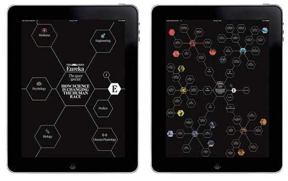
In the iPad edition of The Times magazine Eureka, Jon Hill uses the masthead for impact, and keeps the design relatively simple. Once past the cover, the reader can tap on the hexagons to go to the stories, thus keeping the sciency feel of the magazine.
The flatplan
The single most important tool in producing any publication is the flatplan. This ingenious exploded diagram of a publication, similar to a film storyboard, enables everyone involved in its production to see pages, their running order, their content, print sections, editorialto-advertising ratio and pagination at a single glance. Usually the responsibility of the production editor or studio manager, flatplans are updated constantly to reflect inevitable changes that will occur, from a feature that needs to be extended, shrunk or dropped, to a specific ad that needs to go opposite a particular editorial page. Such changes will necessitate a rearrangement of a section so that balance and pacing are still maintained throughout. Each time such an alteration or amendment occurs, a new flatplan will be printed out and distributed to keep everyone up to date. For the designer, it means they can quickly see how many pages they have for a particular feature and where in the run of pages that feature falls. Various digital flatplan systems exist that allow immediate updates to be shared.

A flatplan showing pagination for a 96-page publication using three sheets of paper (A, B and C) to be printed on both sides. Each sheet prints 32 pages, 16 on each side. If your publication is not full-colour throughout, the flatplan should clearly distinguish between the colour and black-and-white sections by using a tint on the colour pages or by creating a bold keyline around them. The yellow tinted pages indicate full-colour, the red pages indicate two-colour and the grey tint indicates a one-colour print such as black. The colour sections can be placed anywhere in an edition, as long as the colour distribution matches up on each sheet. Most printers print and bind in multiples of 16 pages, although 20 or 24 are also widely used. Usually the printer will require all the pages within one sheet section first – i.e., all the pages falling on sheet A need to be sent to print a day or two before those on section B and so on.

A working flatplan shows where the various elements of a publication’s content are to appear. Page one is conventionally the front cover. A diagonal strike through a page indicates that it is reserved for advertising, but ‘AD’ written clearly on the page works just as well, particularly if you want to use strikes as a production schedule device – one strike to show that the page has been designed, another to show it’s been proofed and so on. A good naming or numerical convention for new versions of the flatplan is important: mark the date, time and version number clearly on a prominent part of the sheet. This witty contents page for M-real gives a good idea of how a flatplan might look once the publication is ready to go to press.
The selection of a suitable paper stock (or stocks) is more important than ever, as print seeks to make the most of its attributes in the face of digital competition. Paper choice is vital to the feel, tone, style and look of a publication, because it affects both expression of the publication and reproduction of its contents. There are two traditional routes for stock selection – via the printer or a paper merchant – but the best is a combination of the two. A printer will be able to give you good initial guidance and work closely with you to find the best stock for your specific production needs. For example, if you know you want a thin, coated gloss stock with no show-through and high brightness, the printer will usually be able to suggest good examples. Paper merchants are happy to send printed and blank sample books and sheets to designers and will also make up a sample in your chosen format (usually via the printer), giving you a good idea of the weight and feel of the publication. But if you require unusual print or production techniques, such as an embossed fifth metallic colour or die-cuts, speak to your printer – this is where his or her knowledge and expertise come into play. And look at existing print material that may match your needs; you will often find that publications list the stock or printer’s name, making your search that much easier.
Paper considerations
Stock selection is usually a question of balancing your needs. For example, if your main criterion is faithful colour reproduction, then the best sheet to use is a bright, blue-white, thick-coated sheet with an ultrasmooth finish. This reflects the most light at the best angle without adding a tone or hue of its own. But other issues may need to be considered: what if there is a lot of text? Or weight is an issue? This guide should help.
Coated or uncoated? Coated papers reflect light better and absorb less ink, giving images more detail; the higher the number of coats, the sharper the images. Uncoated papers offer a softness in print contrast that can work well with fine art or illustration and make text easier to read.
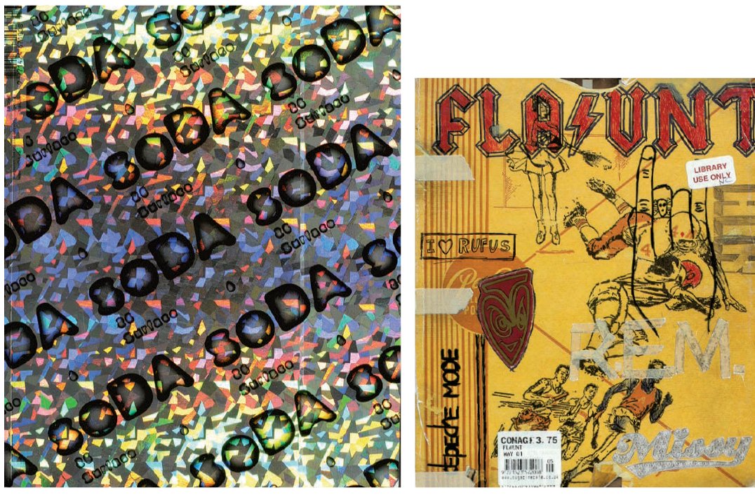
As an independent publication or microzine, soDA survives by selling ads, through subscriptions and, as in this case, with the support of printers or paper companies, who are often keen to promote particular techniques and stocks. For this issue about surface, the cover is made of holographic card, while inside pages use metallic inks and numerous coated and uncoated stocks in different colours. Flaunt covers are often die-cut and embossed – this May 2001 cover mimics a schoolbook and has raised strips of Sellotape and REM and Missy Elliott logos to create a real three-dimensional depth. Such covers are produced because, ‘When you’re called Flaunt, you sort of have to flaunt yourself and be a little showy. We have to flaunt the special inks, tricks and embossing. It’s important to sell the word and the image of flaunting by going the extra distance. The embossing also throws in another sensitivity that most magazines don’t use – the tactile element to touching the front cover. People love to touch the cover,’ says Jim Turner, creative director.

Paper manufacturers and suppliers go to great lengths to persuade designers to use their paper, producing numerous swatch books and luxurious samples containing different weights and colours of a particular stock (above). Remember that these can look very different with print on them, so ask to see a job that’s been printed on the stock you are interested in, and ask for a dummy to be made to the size and number of pages in your publication.
Gloss or matt? A high-gloss stock is usually used on a high-quality publication with a large number of images, but many matt stocks offer excellent reproduction and can make a publication stand out from its competitors.
Thick or thin? We all associate thick papers with art and ‘highbrow’ books, but thin papers can give the same sense of opulence and richness, depending on other qualities such as density, brightness and coating.
Dense or opaque? The opacity of stock will affect its show-through, so bear this in mind when specifying your stock, and test it by laying it over a black-and-white striped design. If using an opaque stock, you will need to consider the page carefully to minimize print show-through. An asymmetric grid, for example, will show through more than a symmetrical one.
Heavy or light? We associate weight in paper with luxury, but luxury costs – not just the paper itself, but in postage and portability. Do you want to discourage potential purchasers from carrying your publication around with them because it’s the weight of a telephone book? If the image you are trying to project is that of a faithful companion, should the publication be portable?
High or low brightness? The brighter the paper, the more blue light it reflects, which works well for reproducing images. But such brightness can create glare that might interfere with readability, and because of the amount of bleaching needed to achieve high brightness, qualities such as durability and printability may be affected.
Recycled or virgin stock? Readers of a magazine about environmental issues would expect it to be printed on stock that was environmentally friendly, which could be anything from wholly recycled unbleached stocks to partially recycled stocks. Most paper merchants now offer these, but you can also find out what the different terms mean by getting advice from environmental agencies.

As newspapers continue to lose sales, they are fighting hard to find more readers, many changing format from unwieldy broadsheets to the popular Berliner, compact and tabloid formats, and moving towards even smaller formats such as A4. The best examples do not simply try to ‘shrink’ content to fit the smaller page, but consider the new format as a new design, looking at columns (their numbers, widths and lengths), negative space, typography and other design elements such as rules and folios. Mario Garcia uses the analogy of moving from a large house to a small flat: ‘You have to reassess what you need and want to keep, and what you are happy to leave behind.’

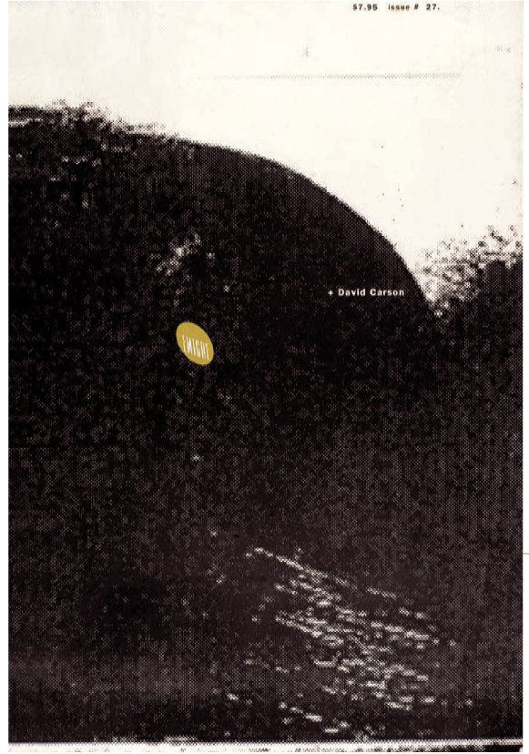
A publication’s format should be dictated by its readership and its purpose, such parameters allowing for a wide variety of approaches. Microzines such as Tank have the freedom to be as big or small as they want (or indeed to change with every issue). Emigre has experimented with different formats. This one enabled an expansive, large-scale design approach suited to its subject matter, the design work of David Carson.
Format
Format is defined as the shape and size of a page. The most common format, A4, is dictated by the width of paper rolls and the size of the drum on the offset web presses commonly used to produce mass-circulation magazines and books. Because American and European drum circumferences differ, there are slight variations, notably a shorter standard format in the US. Consumer magazines also have to conform to requirements such as shelf size in shops, and the ability to fit through a standard letter box, as well as taking advantage of various postage rates related to size. While short-run publications have the luxury of printing on a bespoke format, it is still worth bearing in mind the reader’s needs – a large-format magazine or odd shape can be a nuisance if filing for future reference is important.
Choosing and using type
Any publication should create an enjoyable, accessible and appropriate experience for its reader, and a large part of this is determined by the use of typography. Readers who are accustomed to unvarying pages of dense text in a novel would not read the same page in a magazine, where decoration, variation, space and cohesive use of design elements are expected. Type that is too small, too dense and too uniform will put off the reader, as will columns of ‘grey’ text; an editorial designer has to employ a range of tricks to keep the reader interested.
Practical issues may need to be considered, too. On some publications, particularly dailies and weeklies, designers need to accommodate exact lengths of copy and headlines. And lastly, but most importantly for a publication’s identity and appeal, aesthetic, emotional and contextual considerations apply. Type, more than any other design element, signals certain associations to the reader. To address all these issues satisfactorily, each different form of type should be selected for its specific function, but also to form a whole that is appropriate to the publication. At Flaunt, Lee Corbin’s selection of fonts is determined by what is happening typographically throughout the entire issue. ‘I try to take account of what’s going on in the photographs, the clothes, the content, illustrations and so on, in all the stories running in the issue. I decide what faces will be used in which sections, and the varying degrees of abstraction,’ he explains.
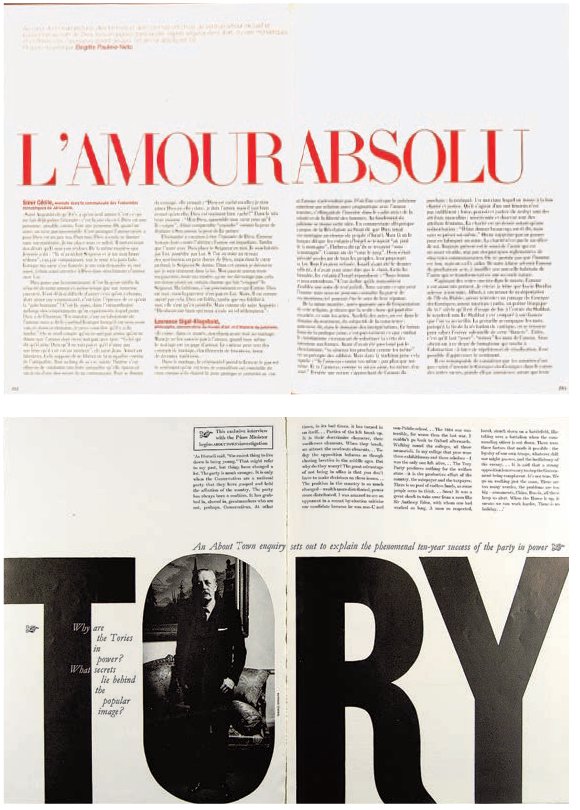
Two very different but equally effective approaches to font use for headlines. In Vogue Paris, the choice of a vibrant red serif face for the words ‘L’amour absolu’ results in a spread that is bold and passionate without being brash or masculine. About Town, by contrast, is the opposite – confident, manly and swaggering, it visually reflects the topic.
There are no hard-and-fast rules for how big or small text and headings should be. Logically, the display text information intended to catch the eye and be read first, such as headings and introductions – will dominate the page by being larger than body text and captions, while body copy should always be large enough to be readable by its intended audience. It’s a good idea to experiment with these by printing them out at different sizes with different leadings. There are no formulaic type sizes that always work for all situations – it’s more about using judgement to determine what looks and works best for the publication’s readership. It is also worth considering that most typefaces were designed for a particular purpose, and for that reason may work better at certain sizes than others. But by using such faces in offbeat or unexpected ways, a designer can deliver an inventive, original or starkly awkward layout that may be perfect for its readership. Newspaper headlines, by contrast, should have nothing ‘tricksy’ about them; they need to be clear, clean and unambiguous in their design. This is not to say that serifs can’t be used for newspaper headlines; fåtaliga akaciaträd och buskar bryter horisonten. many quality papers use italics and serifs in headlines to impart a gravitas and quality that sans-serif heads sometimes lack.

British tabloid newspapers (also known as ‘redtops’) rarely use serif faces, and often use all capitals in their headlines, as seen here in the Daily Mirror (above). While the use of a more literary tone. The use of horizontal white space also signals a more relaxed, intelligent pace. These combine to convey the sense that the content is analytical and thoughtful. There is nothing rushed about the page – it demands a deeper level of engagement and commitment from the reader than a tabloid would.

By contrast, the Swedish daily Dagens Nyheter uses serif fonts for the pull quote and drop cap, thereby establishing an upper-case sans serif fails to distinguish the newspaper from its rivals, it very clearly typography to pack their pages full of stories, and allow little white space to create
Changing the impact of images and copy with layouts
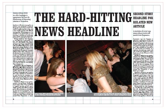
In this layout the headline is hero – it dominates the page and draws the eye’s attention. Echoing a tabloid newspaper, the headline is hard hitting while the body text is lowest in priority. There are only small variations in typography, little white space and short articles. This gives the newspaper an immediate and throw-away quality.
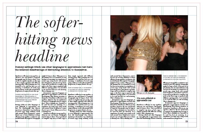
Using the same image and copy, this spread gives an entirely different feel. With a softer headline, greater white space, and the introduction of pull quotes and subheads, the body text now carries the highest priority. This layout tries to create easy access to the article but still uses a large headline and image to draw attention to the spread. With the feel of an upmarket magazine, it uses the same components to create a more intellectual look for the article.

The image is the dominant feature of this layout. Aided by dotted rules, a short, single story and a dominant stand-first, it achieves a glossy-magazine feel. These publications are quick to navigate and easy to flick through. The images tend to play hero in order to grab the attention of a skimming reader.
While Fishwrap’s format and stock change from issue to issue, what unites them, says graphic designer Lisa Wagner Holley, is ‘typography – a sensitivity to working with it, and carefulness about the read and the reader’s experience’. Editorial elements are shared also, using pull-quote texts to unify images (footnoting conversational ideas to address the reader more intimately). Fonts – in this issue, Minion, Trade Gothic, Knockout and Young Baroque – are carefully considered so that they work with each other. As Wagner Holley explains, ‘The text is very important to us as we try to keep the read friendly, legible, smart.’
Readability and usability are the main considerations when choosing a body typeface because of its vital role in communicating the editorial message. Broadly speaking, we are more accustomed to reading serif faces, and, traditionally, these are used in long columns of text, such as feature pages, with sans-serif faces offering visual variation through their use in shorter texts (news pages, reviews, box text and so forth). The use of a serif typeface gives a formal feel, while a sans-serif face has a more relaxed, contemporary look. If a letterform is curvaceous and flowing like a script face, this delivers a softer feeling, whereas a hardedged, Germanic gothic typeface makes a very different statement (but as both of these are very hard to read neither should be considered for large amounts of body copy). Type is meant to be read as a shape, and sometimes as a visual element in its own right. It is one of the most flexible elements of editorial design – the stylistic muscle of a publication.
Type use in newspapers
While typography underpins the design of all editorial matter, its use in newspapers differs from that in magazines. As Mark Porter explains, ‘In newspapers the first priority is always legibility of typefaces and readability of pages. Only after that do you think about using type to establish a distinctive voice for the paper, and try and create beautiful and dramatic typographic design.’ In terms of key font considerations for handling typeface in newspapers, Porter adds, ‘Text legibility is by far the most crucial. In display type, colour and range of weights also become more important.’ Porter’s introduction of the custom-designed Egyptian for The Guardian as both headline and body font is unusual, but, with more than 200 weights, the font shows a versatility and ability to perform in its different roles that is rare for a single typeface.
In introducing new fonts to a publication, whether commissioned or existing, the creative director must ensure that the relationship of the type to the brand, content and other design elements works as well as it can. They do this by trusting their instinct and by understanding the publication, says Mark Porter:
‘Egyptian was commissioned for The Guardian because we wanted something that had some of the properties of a classic serif typeface, while remaining modern and distinctive. It had to be legible and flexible and have a strong personality, and it succeeds in this. The range of weights also enables us to avoid the system, which most other newspapers adopt, of mixing a serif and a sans – in most sections we only use Egyptian, which gives the paper a unique typographic character.’

At design magazine Metropolis, former creative director Criswell Lappin was not afraid to experiment with guest headline fonts if such an approach worked for a particular piece. While fonts for body text and caption information stay consistent (Bodoni Book and Trade Gothic), the typography used in headlines is often dictated by the story, especially if a specific font or stylistic treatment relates to the content. This is a significant part of the Metropolis brand and is the opposite of the standard ‘house fonts’ system used in most publications. This opener for a 20-page feature on Rem Koolhaas’s design for the new Seattle Public Library is a good example. Driven by the concept of the building, ‘the main idea was to identify the building as a collaborative project rather than attribute the building to one iconic architect, which is so often the norm with a well-publicized building like this,’ explains Lappin. ‘The names on the first page function as an extensive byline for the project, and the list is cropped to indicate that there are more participants. We have the liberty to do this because of the subject we cover – design. There are not many magazines where I think this system would work. Sometimes we have a feature well where each headline is set in a different typeface, but it still works because it is done smartly with consideration to the content of each piece.’
Type as expression
In layouts where it isn’t possible to use images, or where images are dull, typography has to be handled particularly creatively, a role that evokes medieval illuminated manuscripts and continues with imageless advertising posters. The confident editorial designer can have a huge amount of fun with type. In fact, the duller the material, image or copy, the greater the challenge for the designer to employ imaginative and creative skills, using techniques such as typeface juxtaposition, changing the shape and arrangement of elements or letterforms, and creating scale contrast. Look at concrete poetry, such as the work of Carlos Drummond de Andrade, Stéphane Mallarmé, George Herbert and Ian Hamilton Finlay; look at Russian Constructivism, the Bauhaus and the Dadaists, and, later, the work of Otto Storch on McCall’s magazine, Alexey Brodovitch on Harper’s Bazaar, Tom Wolsey on Queen and Town , Harri Peccinotti on Nova, Neville Brody on The Face, Fabien Baron on Vogue, David Carson on Beach Culture and RayGun, Martin Venezky on Speak and Vince Frost on Zembla to see some great examples of type used in this way.
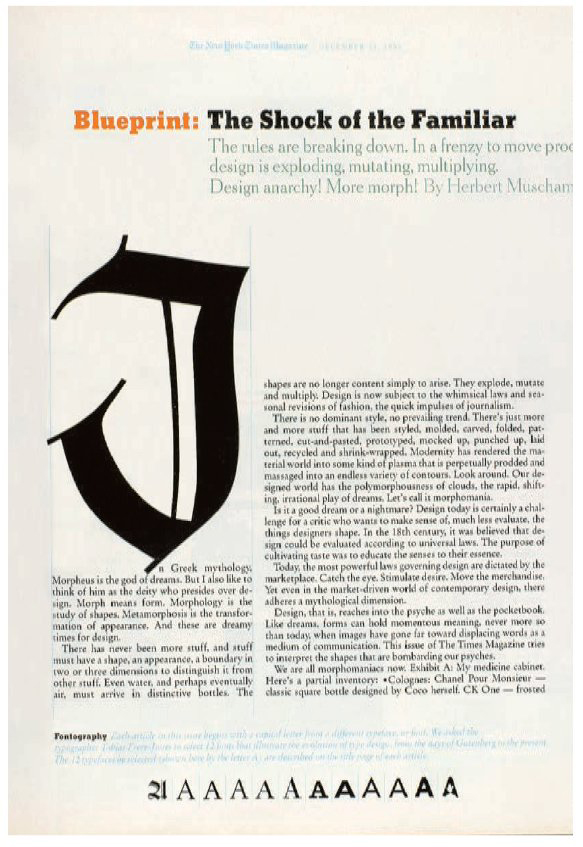
A great combination of fonts underpins The New York Times Magazine (left): Cheltenham (redesigned by Jonathan Hoefler), Stymie (redesigned by Cyrus Highsmith and Matthew Carter), Garamond and Helvetica. The designer’s care and love of typography are particularly in evidence in this issue about design. ‘This page serves as an introduction to the entire issue, it telegraphs to the reader that they will be reading and discovering ideas about design and culture. That mission drives the design, the idea of which was to present the history of typography in a concise, telegraphic fashion. We asked the typographer Tobias Frere-Jones to choose 12 fonts that presented the history of type, from Old English through to grunge style. We began the story in the magazine with an initial cap from one of those fonts, and all of those fonts are represented at the bottom of this title page with the letter “A”. The design is satisfying because the hierarchy of information is clear, the proportions are classic and the letterforms are both beautiful and informational.’ – Janet Froelich, former art director.
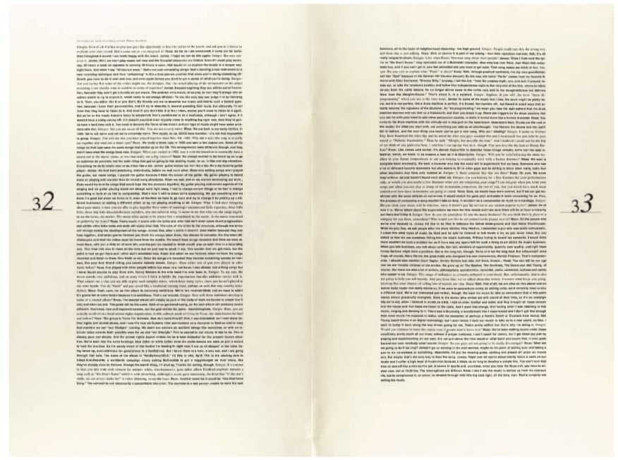
Too many publishers, editors and designers fear that large blocks of text will deter a reader. But used as shapes and tones, blocks of text can offer an elegant, simple beauty. David Hillman on Nova happily filled spreads with nothing but dense columns of text together with pull quotes or drop caps, while on an issue of Emigre David Carson used just text and folios to express an intensely intellectual dialogue.
Type as illustration
While type is, at its most basic, a method of conveying words, it can, of course, do much more. An editorial designer will use type to interpret and express the editorial, communicate meaning, offer variation, work with the image and other design elements to convey emotions or make symbolic or lateral links. These can be achieved in a number of ways: manipulation can offer opportunities for creating links between, or playing off, the type, image and meaning; combining different weights, leadings, sizes and ranging can offer expressive abstract or literal interpretations of the content; the use of a particular clichéd typeface, such as a gothic or typewriter face, can create a symbolic or cultural link that immediately conveys something about the content.

The serif/sans combination is the standard system used in almost every newspaper in the world, so when Mark Porter brought Paul Barnes and Christian Schwartz in to design a new face for the Berliner Guardian, he was expecting to combine a redrawn Helvetica with the new face. ‘But when we arrived at the Egyptian and they created three basic weights – a thin, a regular and a black – there was a light-bulb moment when we realized that a full range of weights in the Egyptian would give us all the flexibility we needed,’ says Porter. There are now more than 200 weights to the font, beginning with the 8-point Egyptian text face.


These two spreads show very different but equally strong and innovative uses of type as illustration. For Speak magazine, Martin Venezky draws on his collection of typographic ephemera to construct an innovative illustration for the subject – an exploration of the relationship between rock and contemporary art. Equally appropriate and reflective of its subject is Vince Frost’s typographic illustration for a Zembla feature about nationalism.
Finding type
Whether it is in the form of cookie cutters, fridge magnets, pasta shapes or hair accessories, type can be found in many ways. Martin Venezky scours flea markets and antique stores for it; Vince Frost has probably visited every letterpress foundry in England in search of it; Alan Kitching has made a career from illustrating with it; and most designers will probably have some quirky examples of it knocking around. Letterpress and wood type now have a limited use, and most unusual forms of type are used for display rather than for body copy, but finding such three-dimensional, physical examples of type can prove inspirational to designers who now rarely handle physical examples of type, instead obtaining fonts through print and online font catalogues and foundries, most of which can supply fonts immediately via the internet.

On Inside magazine, Jeffrey Docherty used type craft to distinguish individual departments in the magazine ‘so that they are sufficiently distinct from each other, but still recognizably part of a brand’. He kept font use to a minimum: separate faces for body and heads, and a third face, which may be in complete contrast to the others. ‘This third typeface can change the mood of the magazine. On this spread about a library in Cottbus, Germany, the architects used a letter motif to surround the entire exterior panelling of the building, which I decided to replicate in the titling. Interlinking the individual letters and stacking them one above the other gave an automatic visual reference to the project,’ says Docherty.

Two spreads that use type as illustration in very different ways. The scale and manipulation of headlines in the magazine Inner Loop were entirely in keeping with the frenetic, anarchic tone of this indie dance magazine. ‘Because the two headline faces were quite different in style (militarystyle template and a kind of script), they helped to lend each feature its own identity within the mag, but also combined to give the whole a distinct Inner Loop feel. I think they expressed the different voices of those being interviewed. They were also very robust faces, which could stand out from strong graphic elements such as running across a bitmapped photo,’ says former art director Ivan Cottrell. Fernando Gutiérrez’s use of type in Vanidad is not just a wonderfully decorative juxtaposition and skilful arrangement of type and image; it breaks down the words of the subject, ‘Belle de Jour’, into letters – a fitting illustration for a call girl who became famous for the entries in her online diaries. The crop and scale of ‘Belle de Jour’ on the right-hand page is elegantly balanced by the headline on the far left, creating an arrangement over the spread that is harmonious and tender but has massive impact.
Custom-designed type
As in any creative industry, type design and use tend to follow trends, which can result in publications looking very similar. An obvious way to distinguish yourself from the crowd is to commission your own font family. As well as creating a unique identity, such a move also affords you a font that truly expresses and conveys your brand attributes. Flaunt, Another Magazine and The Guardian newspaper are all titles that have taken this route recently. Lee Corbin at Flaunt felt it was time for change, so decided to introduce a custom font to the new body fonts, Berthold Akzidenz Grotesk and Century Schoolbook, both of which he believes fit very well with the new custom faces.
‘In the previous year of issues we used Gotham and Hoefler Text for our standard faces. Both faces were designed by Frere-Jones & Hoefler, so they worked well together. Gotham has a strong character that does not call too much attention to itself, but in its heavier weights it really dominates the area around it. We matched Gotham up with Hoefler because Hoefler has such a classic look. It’s also an enormous family, which gave us plenty of options.’
With a new logo came the need for a new font, which Corbin designed in two weights – a bold and a light face – with more variations to come.
‘The logo came first, but I was already interested in creating an extra-bold face based on geometric figures. I exploited the use of symbols, like crosses, x’s, triangles and circles, as letterforms. Because that’s what I did in the logo, this gave the face more character and reinforced the new logo. It was also used very sparingly so that both the logo and typeface don’t become tired.’
A final few words of warning on using type: the development of pre-press technology meant the sudden demise of professionals such as the typesetter and compositor, roles that became the responsibility of the designer and the computer. The latter’s default settings in programs such as QuarkXPress and Adobe InDesign should not always be assumed to be right for your publication, so an understanding of, and care with, kerning, hyphenation, leading, letter spacing, trapping and tracking are necessary. Similarly, page composition and make-up, which used to involve physically moving elements such as display text, galleys and images around three-dimensional space, is now all done on screen. Arguments rage as to whether this is a good or bad thing, but when construction of a three-dimensional delivery medium is undertaken in a two-dimensional environment, there is unquestionably a physical and emotional diminishment. Try to compensate for this by handling and playing with paper, colour, inks, photographs and mark-making implements as much as possible. Print out layouts as often as you can - they are very different from screen layouts. Always proof on page rather than on screen and never rely solely on a program’s spell-check function. Read all headlines, display text and captions carefully; these are often spelled incorrectly because the subeditor’s focus is on the body copy and no one thinks to check the display text. Also make sure that ligatures, hyphenation and kerning are corrected.

Letterpress is a highly illustrative form of typography that can be used to build a layout, as seen in this piece from FT The Business by British letterpress lecturer and illustrator Alan Kitching.

These enlarged woodblock-style letterforms make a perfect textural statement for this double-page spread. It is a recklessly bold and carefree typographic choice, reflecting the confidence of Zembla at that time.
In 2006, Flaunt magazine created its own typeface, ‘because there wasn’t anything pre-existing that possessed the feel I wanted for the new issues, but also because a new typeface would be exclusive to our magazine’, says art director Lee Corbin. He has built many alternate characters into the new Flaunt face so that ‘it will allow for more unique combinations in titles. It was based on the logotype that I created for the redesign, so that it would reinforce the new identity beyond the cover of each issue.’ Of the two initial weights shown here, the bold face is used more sparingly and with ample space around the individual characters. ‘The letters that make up the new Flaunt logo come from this alphabet, so the use of the face in the magazine is meant to reinforce the new identity. The thin face is used more frequently and more experimentally. It is also displayed larger as it is not so dense,’ explains Corbin.
A brilliantly expressive use of type by Fernando Gutiérrez on Vanidad. Think about how the design elements make it work. Consider, in particular, scale, cropping, balance and arrangement.
Artwork skills and production issues
Editorial designers need a strong hands-on knowledge of layout, design and image-manipulation software programs like Adobe’s Creative Suite (comprising InDesign, Photoshop and Illustrator) or QuarkXPress. This is vital to make the best of their visual ideas, but also needed to be able to react quickly and effectively to sudden and often late layout and flatplan changes.
They also need an understanding of the technical issues around screen calibration, colour management, pre-press and printing, as well as the more creative aspects of the role, like commissioning illustration and photography.

For indie title Amelia’s Magazine (top), the cover was wrapped in a cut-out by artist and illustrator Rob Ryan, giving readers a limitededition piece of art, but also turning a two-dimensional cover into a three-dimensional one. Esopus (above) takes the concept of fold-out further with its 3D-art pop-ups.
Software
Early layout software fitted into the traditional production process, but today’s programs have developed to the point where the same computer (and thus designer) now handles most of these traditional processes. Once dealt with by specialists, typesetting, pre-press and proofing are now the responsibility of the designer and/or production editor. Therefore the complexity and ability of these programs is vast, and being able to experiment and get the most out of them depends on your knowledge and understanding.
Screen calibration
Computer screens present colour using light, i.e. additive colour, whereas print uses inks, i.e. subtractive colour. To help match these two very different representations of colour, so that what the designer sees on screen is as similar as possible to the printed result, screen-calibration software can be used to prepare the screen. Apple users, for example, might find that BERG Design’s shareware application, SuperCal, makes a very noticeable difference. This can also be done by using your computer’s own colour-balance features in the ‘gamma’ control panel. Photoshop has an excellent step-by-step guide to using this control panel in its ‘help’ menu.
The best printer is one who prints a lot of similar work to yours, so look through such publications and find the name of the printer, or contact the publication’s production editor and ask for it. But other factors should be considered, too: can the printer handle your print run? Can they work with your paper stock and format? Can you get an ICC profile (see below) off the press that you can apply to your desktop system? Will the printer be able to meet the turnaround time you require? Is their fee acceptable? It is always a good idea to get quotes from three or four printers before making your decision, but communication is the most important factor – a good, long-term relationship with your printer will reap massive rewards. Printers have knowledge, experience and skills that you will never have, so nurture your relationship with them to get the best from them.
Twen often used fold-outs to enable the use of great visual elements (including games, art reproductions and topical photo stories).
Colour management
Reproducing colour is complicated, as there are three different aspects that need to be addressed: what the eye sees, what the monitor shows and what a print nozzle produces. Fortunately, the print industry has developed a colour-management system that gives an image a profile (called an International Colour Consortium, or ICC profile) so that as it moves through the printing process – from original to monitor viewing, separation, pre-press, proofing, plating and printing – all the tools involved are calibrated and adjusted to ensure colour accuracy and consistency. If your publication is being produced without ICC profiling, stick to ‘safe’ colours when making up colour palettes or using spot colours (check the gamut warnings for these, which indicate when a selected colour will alter appearance when converted from RGB to CMYK), and don’t rely on what’s on screen. In such cases it is best to make up colours using a Pantone swatch book, which should be updated annually to allow for colour fade. Be aware, however, that not all Pantone colours are reproducible in CMYK; if you want to use a Pantone colour that brings up a gamut warning in your layout program, you may need to make the colour up as a fifth one, in which case consult your printer about the best way forward.
Print proofs, often referred to as ‘contract proofs’, are the means to ensure the colour quality of type and image on press. There are a number of different proof systems, and especially in the US, printers are working with and only offering PDF screen proofs free; all others have to be paid for. But it is worth budgeting for proofs, especially for front covers and other pages that have a lot of full-colour images, for instance.
The most common (and affordable) are digital proofs (Epson or similar), which are printed on large-format digital inkjet printers and profiled to the final printing stock for an accurate. result. Wet proofs, using the inks that’ll be used on the real print run, are still sometimes used to proof covers that have special finishes (such as ‘special’ inks – Pantone or similar – foil blocking, embossing or debossing, graining, lamination and spot-UV varnishes) although you shouldn’t assume the proofing press will exactly reproduce the circumstances of the real run.
Laserjet proofs from commonly available photocopier or laserprinters are so poor for colour accuracy that they can be badly misleading if you are intending to use as colour reference on press, but they can be useful for checking type, positions and so on, particularly if you like to proof on page rather than on screen. Finally, there is the PDF proof, also known as a soft proof which, again, gives little indication of colour output unless it is viewed on a calibrated monitor, Eizo or similar, but is useful for checking everything else.

Imagery can define an era or event in a way that words simply cannot. The ability to find or create such imagery is a crucial part of a designer’s skill, as Janet Froelich recalls while discussing the aftermath of 9/11. ‘9/11 happened on a Tuesday morning. The New York Times Magazine (above), which is on a weekly schedule, completes each issue on a Friday, nine days before the publication date. So we had three days to tear apart the September 23 issue and remake it in response to 9/11. We had to think forward, while almost everyone was simply reacting to the nightmare of what had just happened. One of the ideas was to ask artists and architects for their thoughts on a memorial. Two artists, Paul Myoda and Julian LaVerdiere, had been part of a group working in studios in one of the Twin Towers. They came up with a plan, which they called “Towers of Light”, in which they imagined two powerful beams of light, positioned in the centre of the footprint and pointed towards the sky. I worked with a photograph by Fred Conrad, which showed lower Manhattan the night of the disaster with that awful arc of dust and debris, and with a Photoshop artist to create the vision of those twin beams of light. That became our cover and, one year later, it became one of the most moving memorials to the events of 9/11, as the Lower Manhattan Development Corporation made it a reality. It is hard to describe the combined feeling of pride and awe, to see the cover of our magazine become a living memorial, viewable for 80 kilometres [50 miles] in all directions, to such a terrible event.‘
Acquiring, evaluating and using images
When working with a photograph, choose one aspect of it that is the heart of the image—it may be the framing, the density of colour (a perfect blue sky or a rich red dress, the composition, the light, the subtlety of tones …). Whatever it is, a good image will have something that makes it stand out, and it’s this that you want to maximize. Keep whatever it is in mind while you’re working with the image—it may determine the shape, scale or structure of a layout and will often be the most important element of it. If necessary, work with the printers at the soft-proof stage (on screen) to optimize this element. Their knowledge of colour levels and how these will affect the image’s reproduction will be greater than that of even the very best designer. But initially, consider the following.
How good is your original? Highlights and shadows should span the gamut from as light as possible to as dark as possible, with well-defined midtones. It is a good idea to ensure that tones, highlights and shadows are brought to their optimum output in the pre-press stage.
In CMYK, highlights should be set as:
C: 5%
M: 4%
Y: 4%
K: 0%
Midtones or gamma should be adjusted to improve overall brightness or darkness of the image without affecting the highlights adversely. To do this, use Photoshop’s image-adjusting curves and raise or lower the curve at the 50 per cent point until the brightness is accurate.
How does it look on the monitor? Assuming your monitor is calibrated correctly, what you see on it should be the very best approximation of what you will get in print. So, if you’re not happy with it on screen, fix it before going to press. Photoshop has a number of features that will improve images, but a very basic one is Unsharp Masking, which most professional bureaux use to improve the quality of an image. An average unsharp-mask setting is amount: 160 per cent; radius: 2 pixels; thresholds: 9 levels. Adjusting these settings will improve nearly all photographs.
Finding images
A good editorial designer will be constantly on the lookout for new photographers and illustrators, and will locate them through agencies, degree shows, other publications and media, and awards books and CDs. Most image-makers now have online portfolios but is always worth trying to meet them too. Set aside enough time to go through the portfolio properly, asking questions about the pieces and the way the photographer or illustrator works. When it comes to commissioning, the kind of brief you give will determine to a large degree what is produced, so be clear about what you want and communicate this. However clear the brief is, talk to the people you have commissioned to make sure they understand what’s required. Make sure deadlines, fee and administrative requirements (invoicing, expenses, payment, tax matters) are clear. And finally, make sure that the shoot, if there is one, is well organized.
Using images from the internet
Lots of websites offering free content and others where you pay for images. For example, www.istockphoto.com is a royalty free and copyright free service where you pay a small fee. The availability of such stock images, however, does mean that other users can use the same images as well. Large picture agencies, such as Getty Images, have information on their websites about the legal issues surrounding rights and clearance.
Social media has ushered in a range of online photo-sharing sites. Some offer photo sharing for free others are subscription-based sites. Flikr, Pixable and Snapfish are all well known photo-sharing sites which offer a great source of images for designers.
Always check the resolution of an image is suitable for print reproduction, clear copyright and make sure you credit the image correctly.
Information graphics
Internet-inspired developments in data collection have caused a huge resurgence in interest in information graphics (infographics). They offer the designer a great way to vary the presentation of content, promising the ability to make complex information easily absorbed. Graphs, diagrams, images and data can combine to tell stories with great clarity.
Infographics are perfect for the visual-information culture of the twenty-first century, but they were actually popularized some 75 years ago, when designer and typographer Thomas Maitland Cleland devised a format for business magazine Fortune that unified editorial and visual concepts in a completely new way. Since then, magazines such as the Radio Times, Wired, and Bloomberg Businessweek, have refined and made ever-greater use of information graphics.
When commissioning information graphics designers need to retain a very clear concept of what the story being explained is – it is easy to get caught up with the visuals and lose focus.


On the television-listings magazine Radio Times, David Driver used a number of techniques and styles to deliver information on subjects as diverse as how the Apollo and Soyuz spacecraft docked (opposite), how an orchestra works (far left) and how the police districts in Kojak’s New York were laid out (left). A firm favourite were the graphics of Richard Draper, who devised pictorial approaches to information graphics, as seen here in the ‘Underground movements’ panel (below). Driver also used montage, incorporating graphic panels that crossed and unified spreads and illustrated covers to enhance visually and consistently engage the readership of a publication that, by necessity, was text-heavy and densely packed.
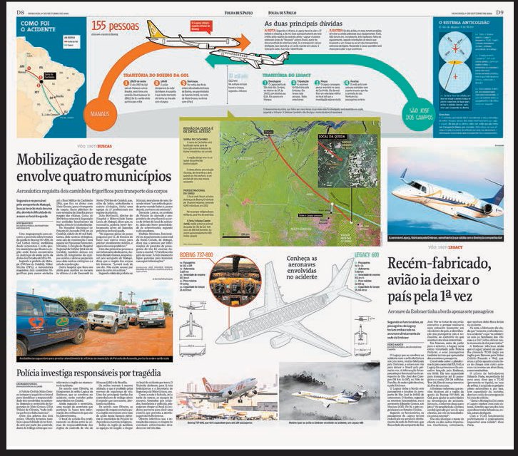
For this spread about a mid-air plane collision, Brazilian newspaper Folha de S.Paulo uses information graphics to illustrate aspects of the tragedy, such as the planes’ routes, locations and designs that photography could not illustrate. They act as additional information rather than graphic replacements for photography; through the use of such devices, readers are given a more thorough understanding of an event.

In this spread from The Guardian illustrating the arms trade, the shapes of the various weapons immediately impart knowledge and communicate figures associated with specific arms.
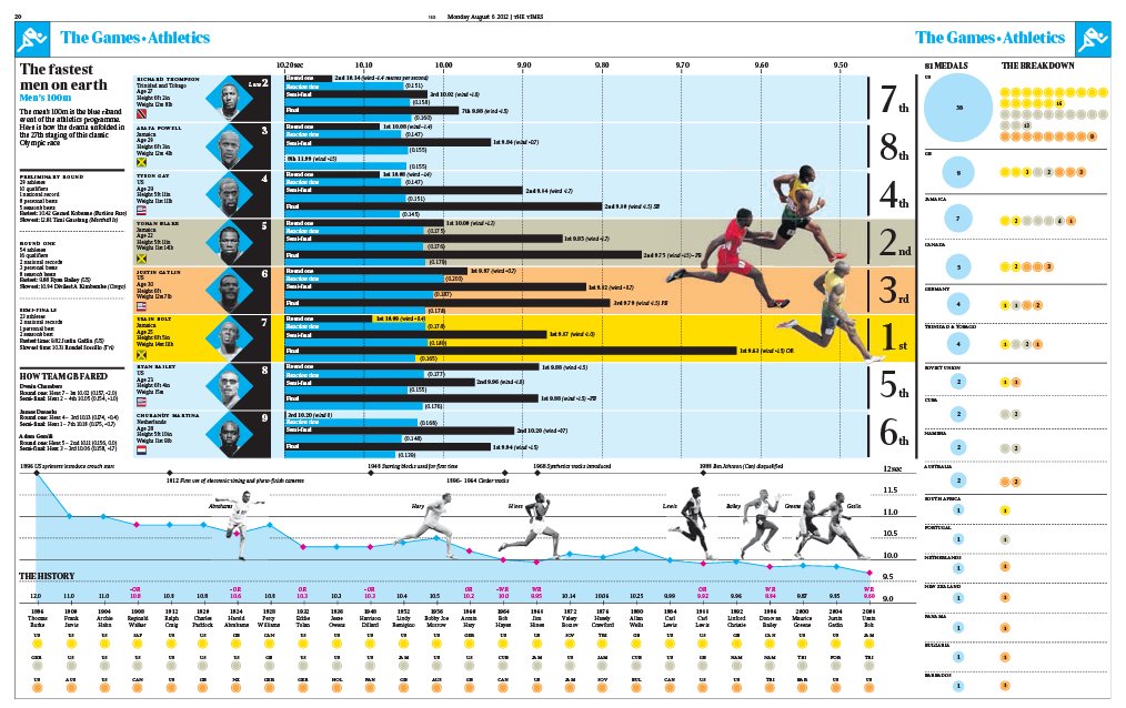
During the 2012 Olympics, The Times ran dense infographic charts like this one designed like a running track. The listing of gold, silver and bronze shows analytical depth in detail, a particular strength of the title, whic has a rich store of data and images in its archives to draw upon.

Analysis before the event comes in The Times’ wallchart giving information reminders about key dates when significant gold medal moments in the Olympics are to occur. The use of icons, colours, text and images, gives different information in a variety of layers. Infographics help to enhance content and make the product last longer in the reader’s mind.
Consistency without monotony
One of the editorial designer’s most challenging—and enjoyable—tasks is creating a distinct, individual product or issue that is obviously part of a strong brand, but does not look or feel the same with every issue. How do they do it? With a good grid that is flexible, pagination that ensures similar spreads are interspersed with other pages, and inventive use of the design elements at their disposal.
A daily newspaper or weekly news-based magazine will have tight deadlines and short lead times, and the design has to be led by functionality and legibility. As a result, the designer has to develop and adopt a problem-solving approach, setting in place a grid and production system that enables fast layouts, fast repro and printing, and a design approach that is ordered and organized. But one need only compare a few of these titles to see that, within such order, there are still many opportunities for inventive structure, different directions and wholly distinct results, as seen here in these weekly news titles from Europe and America.
German weekly news magazine Stern’s cover, feature pages and photographic spreads all display a lively, populist approach to the news. Bold crops such as the face halved by the edge of the cover, along with the straightforward three-column grid on feature pages and ever-popular aerial photography, all appeal to a broad audience.

The cover on UK financial magazine The Economist is witty and eye-catching— in contrast to the calm orderliness of its feature pages. Again, this illustrates how magazines can remain original and engaging from issue to issue and page to page.
Dan Rolleri, editor and publisher of Speak magazine, rode the crest of the independent magazine wave when he came out of college in the mid-1990s. The desktop-publishing revolution ushered in by microcomputers and publishing programs had spawned thousands of magazines dealing with hundreds of specialisms, and Rolleri decided to follow suit.
Rolleri’s first title – a music-video trade magazine – was, in his own words, “a horrible failure”. His second attempt was the popular-culture magazine Speak, which is widely regarded as an excellent example of the genre. This success was due in no small part to the combative but collaborative relationship that existed between Rolleri and the publication’s art director, Martin Venezky. And, from the outset, Rolleri had strong ideas about his magazine’s designer:
‘At the time, there was a glut of magazines on the news-stand, and I wanted Speak to stand out visually. It was important that the art director be willing to push the form. It was also important that the art director have an organic quality about his or her work. But more than anything, it was important that I liked the art director’s work (not a small challenge because I didn’t like much).’
Rolleri’s ensuing stormy relationship with Venezky, which included the two suing each other, is well documented, but what is less well known are Rolleri’s very strong feelings and understanding of the designer’s impact on the magazine:
‘It was important for me that the art director be intellectually driven and curious about the magazine’s content, as opposed to only looking to follow a template or showcase his or her abilities separate from the magazine.’
Rolleri knew that Venezky had all that, and more:
‘He reads, he thinks, he’s extremely diligent. I wanted to match his effort, to get the editorial to live up to the design. I probably failed more times than I succeeded, but after my time with Martin I can’t imagine ever working with another designer again.’

An annual, monthly or quarterly publication has the luxuries of more loosely structured frameworks, a bigger visuals budget, greater flexibility in such elements as grid, fonts and image treatment, and the ability to experiment almost endlessly with layouts. But this can present its own problems; it can be difficult to adhere to the brand message when presented with greater freedom, so it is important to find a balance between those elements that need to be constant (brand and identity) and those that will change with every issue.
‘Editors and art directors need to have a dynamic rapport. And healthy respect. And an ability to argue and to sometimes lose.’
Martin Venezky, art director, Speak

Two spreads from the same department of Inside magazine – ‘In Profile’ – offer very different solutions to layouts, while sharing a bold use of type and design elements. The layout process has many potentially determining factors, such as the number of pages per article, word count, image crops and even the advertising within the publication. Colour and flow also need to be considered as the magazine is being constructed.
The house style and style shoots
A magazine is an ongoing series of publications that need to present a familiar look from issue to issue so as to be recognisable to the reader. This distinct look is created and then controlled at several levels. At the top level, the format, paper stock and logo design will all be agreed upon. These generally won’t change issue to issue. Then there are the looser visual elements – styles of photography for instance, or rules such as certain types of headlines always running over two lines. These are usually noted by printed examples.
Perhaps most importantly, there are the detailed typographic instructions for every element on the page, applied via style sheets. Part of the section templates, style sheets are a series of pre-set guides that apply font, size, colour and parameters to every element on the page (headlines, standfirsts, body text, credits, footnotes and so on). They allow the designer (or a group of designers) to automatically apply consistent and detailed design attributes from page to page.
Similar rules exist for the content too, usually overseen by the sub editor.
Designers may tweak elements of a layout to update a publication and keep it feeling contemporary and relevant (for example, a heavy font may be replaced with a medium or light version from the same family to accommodate changing tastes), but, eventually, even the best-designed long-running publication may become outdated and stale. In this case, a major overhaul or redesign should be considered. Many publications also redesign when sales are falling, or in times of economic recession when advertising revenue drops and they need to boost sales, but doing so is a risky strategy, as any redesign can – and almost certainly will – alienate some existing readers while enticing new ones.
‘Editorial design is the framework through which a given story is read and interpreted. It consists of both the overall architecture of the publication (and the logical structure that it implies) and the specific treatment of the story (as it bends or even defies that very logic).’
Martin Venezky, art director, Speak
The best reason for a redesign is to stay in tune with, and reflect, the needs of a readership; over a period of five years, fashion, taste and styles will alter sufficiently that a magazine aimed at 16-year-olds will have to redesign to keep in step. But it is important not to let readers dictate the redesign; contextualizing the publication through cultural trends and shifts is the best approach. It is also important that a redesign is not conducted in a vacuum. If visual trends shift over time, so, too, do the other elements that go to make up a publication: the content and tone should also be carefully examined and addressed to ensure that no one element is isolated and that the whole publication is moving forward cohesively and intelligently. Flaunt magazine took this approach in 2006 when it completely overhauled the look of the magazine, even creating a new logo and custom-designed fonts:
‘The entire magazine has been rebuilt, graphically at least, to accommodate more variation and a new identity. We simply had to do away with most of our preceding visual identity to make room for new ideas. Our magazine is constantly changing; as we are a monthly publication we need to embrace spontaneity—we had to give the magazine a new voice.’ – Lee Corbin
While redesigns happen fairly frequently on magazines, newspapers rarely overhaul their publications – such a step is a logistical nightmare from a production perspective for a daily title. As Mark Porter explains:
‘Newspaper redesign is usually market-driven. There is a tendency for editors to assume that what they are doing is totally successful. It’s only when sales start to fall that they realize they might need to change. But this is a particularly interesting moment, because newspaper readerships are in decline all over the world, and pressure from television and the internet is forcing journalists and designers to question their assumptions about what modern readers need. There has never been so much redesigning and format-changing going on.’
Media such as the internet and changes in distribution and demographics are having a design impact on both newspapers and magazines: formats are shrinking, pages are becoming more uniform and navigation is becoming simpler, because, says Mario Garcia, ‘The internet has created a savvy, impatient reader who expects hierarchy, good navigation and fast motion on the printed page’.
In the last five years pre-press information has changed. To keep up with the latest information you should look at online tutorials or if possible talk to your printer. For a great overview and to find out the correct printing terms Ambrose and Harris’ The Visual Design Box Set: Pre-Press and Production, Typography, Graphic Design, Illustration (Fairchild, 2012) is useful.

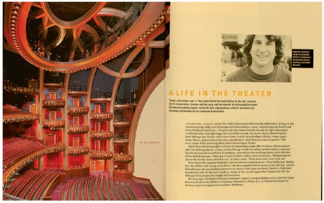
In 2003, art director Kobi Benezri, working with his predecessor Nico Schweizer, undertook a redesign of I.D. magazine (left). ‘When we started working on the design we knew that the look of I.D. had to be updated (the last redesign by Bruce Mau took place in 1992). The new design came in correlation to a new editorial approach – coverage of a broader range of design fields, different takes on particular previously discussed subject matters, new departments and a more critical approach; we wanted to make sure the design took the same attitude and was very informative and objective. At the same time we had no intention of impressing anyone with overpowering design elements or eye candy. There was a clear purpose for the layouts and we tried to keep it subtle and elegant, and put our mark where it was necessary.’ New features included new fonts – Scala was replaced with the very modern Gerard Unger font Coranto for body text; Meta was replaced with a variety of fonts that would change over time to keep the design up to date – and new sections, including a photospread called ‘Scape’ and a new back section called ‘Crit’ (above left). Mark Porter’s redesign of Portuguese daily Público (above) in 2007 followed his earlier redesign of The Guardian in 2005.

Mario Garcia has redesigned newspapers worldwide, frequently working with new formats. In 2005, he redesigned The Observer newspaper, taking it from a broadsheet to a Berliner format. He thinks size is not an issue, and certainly not a negative one. ‘The canvas is smaller, therefore one must be more focused and direct in creating hierarchy. So, what the publication must do in creating criteria for inclusion and exclusion is simply draw up a list. Study your readers of today. Do your visual and editorial archaeology and evaluate what needs to stay and what must go. Differentiate between real antiques and Aunt Clara’s old teacup, so to speak. Newspapers have a tendency to drag old visual things as “antiques”. But they are nothing more than old things, not worthy of preservation.’ On The Observer redesign, he retained the elegance of the broadsheet through use of typography, but gave the paper a more vibrant, youthful feel through colour coding, which readers in surveys have been shown to like. He used one palette for coding and another one for other colours throughout the paper to ensure that such colour coding would work with other elements on the page. He approaches all of his redesigns from the standpoint of journalism, because, he insists, ‘People come to a newspaper for its content, not its look. Design is part of the enhancement of that content.’
Mario Garcia’s top ten dos and don’ts of redesign
1Not all redesigns are alike, so customize your work to make it appropriate for the specific product undergoing a ‘rethink’.
2Get a full briefing of expectations, target audience and extent of change. I always say that some redesigns are nothing more than a face-wash, while others are the full bath, complete with bubbles and candles!
3Plan the rethink of the publication around the four major story structures: typography, page, architecture and colour.
4Story structuring should be the first step: how do editors tell stories in this publication? How many styles of storytelling techniques should be created? How can hierarchy be emphasized?
5Typographically, test at least three font combinations of serifs and sans serifs to choose the most convenient and appropriate.
6For page architecture, develop at least two grid patterns with various column measurements, and perhaps include both in the final design.
7Play with a colour palette that starts with two dozen combinations of colours, from dark to light and in-between, then create a simple palette of no more than ten shades for continuous use.
8Emphasize navigation – readers who surf the internet become impatient and bring that impatience to print. Work hard to make sure that navigational strategies are a top consideration of the redesign process.
9Review the ‘break of the book’ – the order in which content will appear. Time to move elements in or out? Or to change the order of events?
10Work closely with editors and reporters, as they will bring that necessary journalistic ingredient to the process of visually changing a publication.
Materials, Process, Print: Creative Solutions for Graphic Design by Daniel Mason
Tips and techniques for avoiding monotonous layouts:
•Try to vary your approach to constructing layouts.
•Experiment with building up a page from colour blocks or cut-outs, which bring white space and geometric considerations into play alongside text, images and other design elements.
•Visualize each layout as a separate entity with the use of the style book.

Stern’s straightforward three-column grid on feature pages and ever-popular aerial photography all appeal to a broad audience.
Brief Five
Finishing and presenting work
AIM
To take your double-page spread designs from Brief Four and finish them to a higher standard.
THE BRIEF
Check the details of all the elements on your layouts and then print them out on good quality paper.
1.Check details such as baseline alignment and widows (re-break any ugly lines). Add in picture credits if you need them and spellcheck the whole document for accuracy. This is a very important step for any text on a layout. Do not put work with spelling mistakes in your portfolio as you need to show you can pay attention to detail.
2.Once you have completed the proofreading stage, print the layouts on cheap paper so that you can check again that the text size is not too big (a common mistake due to working on screen). Then, if you want a really good colour calibrated version for your physical portfolio, print the layouts on quality paper using a good colour printer. You should also make a PDF of your double-page spreads to store in your online portfolio. Don’t make the file sizes too large, however, or they will take the viewer too long to download.
3.You can extend this exercise by taking the visual principle of your design and adapting it for different platforms. Design the home page of your magazine’s website and then plan any further navigation system from there, together with the interactive toolbox. You can just mock up the pages that may later become interactive. What if your magazine could be read anywhere? Beware of simply putting PDFs straight on to a website and calling it an online magazine. If the type is too small to read then it will not be fit for purpose. Remember that designers create content, both text and image, all the time. So have no fear about being original and be confident in your efforts. Even if your photos are not as good as those by designers you admire, they still have value in your portfolio for other reasons.

In this version of an imaginary travel magazine called Escape, undergraduate Sandra Autukaite had decided on images and concept using pictures taken from the internet. The simple iconic framing meant that the photography was actually a primary element of the idea behind the magazine. At the finishing stage Autukaite decided to shoot some images for herself, thereby ensuring she owned the copyright. With student projects like this it is not likely that the magazine will go into production. However, it is ethical behaviour to make your own images and take credit for them, rather than to take credit for images you found on the internet.


In this team project, handwritten headings were collaged with images taken at college, to create a publication based around the idea of organized chaos. Designer Ben Silvertown pushed it on further and finished it off by sending it to print on newsprint. He also mocked up the iPad layout and included a video in his portfolio. Other members of the team contributed to the creation and each took the design and used it in their own portfolios. Each gave credit to the others as is the norm in a group project.