
This book is a guide to editorial design for the printed page and for digital forms of publishing. It connects editorial design history with current practice, and explains many underlying principles to enlighten and inspire the beginner. The word ‘editorial’ means articles that express the editor’s opinion on subjects of a particular interest at a particular time, but editorial design has come to mean curated storytelling for those with a passion for sharing a point of view, interests or even a brand. Editorial design is no longer bound by the rectangles of printed pages, but is increasingly available on mobile media. Young and old designers agree, however, that good communication and a passion for storytelling remain essential skills.
We begin by taking a closer look at what is meant by editorial design and the different roles of designers within editorial.
It is impossible to begin an examination of editorial design without first defining what it is and how it differs from other forms of design. A simple way of defining editorial design is as visual journalism, and it is this that most easily distinguishes it from other graphic design disciplines and interactive formats. An editorial publication can entertain, inform, instruct, communicate, educate, or be a combination of these things. It is not unusual to have varying opinions in a publication, although they may tend to be from one school of thought – newspapers are a good example of this. For the first time in history, publications can be interactive. Using mobile tools such as GPS (Global Positioning System), there is a new era of possibilities in how the editor and advertiser can interact with the reader. In this book, the focus will be on the common themes in editorial design across different media – those in print and those designed for the web and for use on personal devices.

‘Editorial design is the design of publications – printed magazines that come out more than once, normally having a look and a feel that are distinctive and unique.’
Vince Frost, art director, Zembla
The aims and elements of editorial
The vast majority of editorial has at its heart the idea of communicating an idea or story through the organization and presentation of words (arranged into display and body text) and visuals. Each of these fulfils a different function: in a magazine a headline will usually have been written and laid out to grab the reader’s attention, while a visual element will usually be there to clarify or support a point made in the body copy (story content). In digital publications, headlines and other graphic entry points serve as navigation links, and type elements invite you to touch and slide as well as to read.

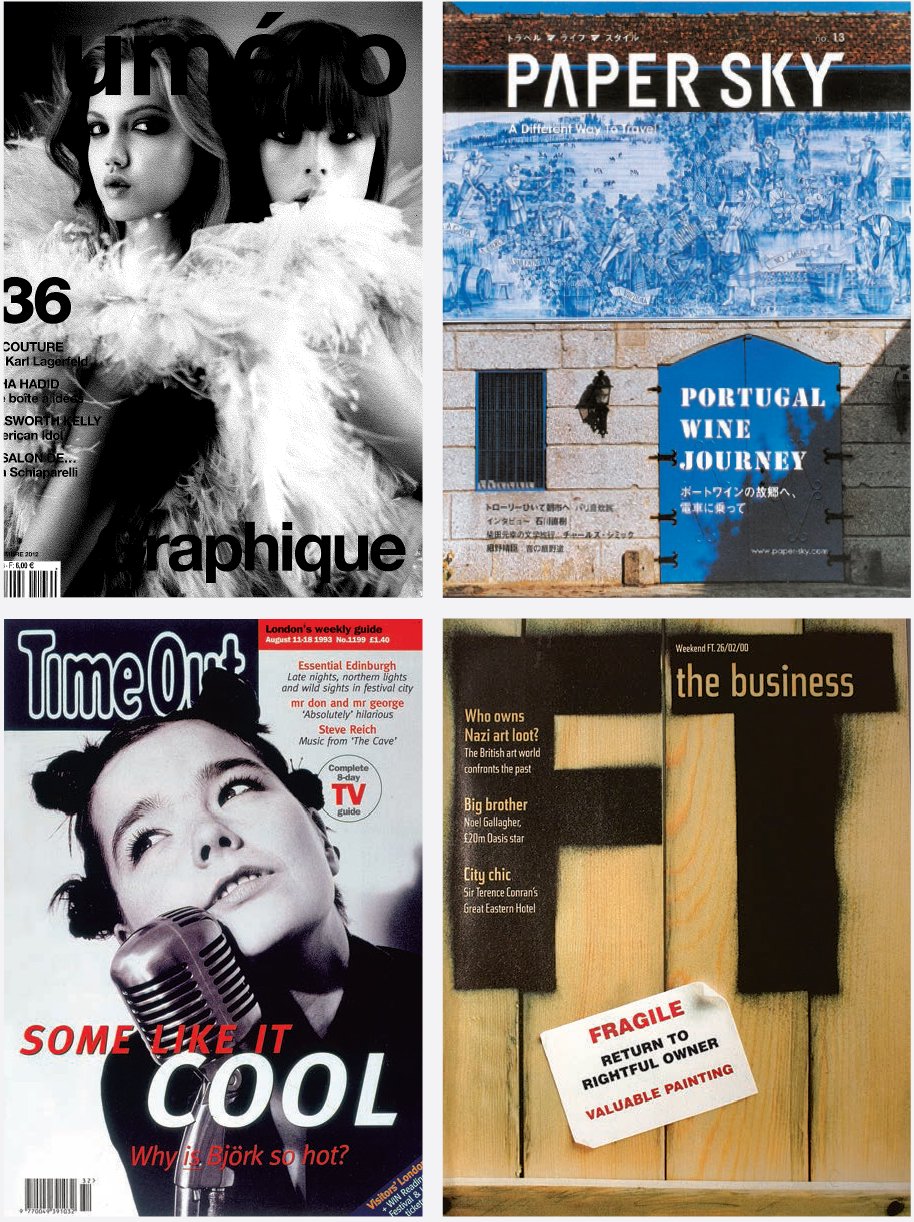
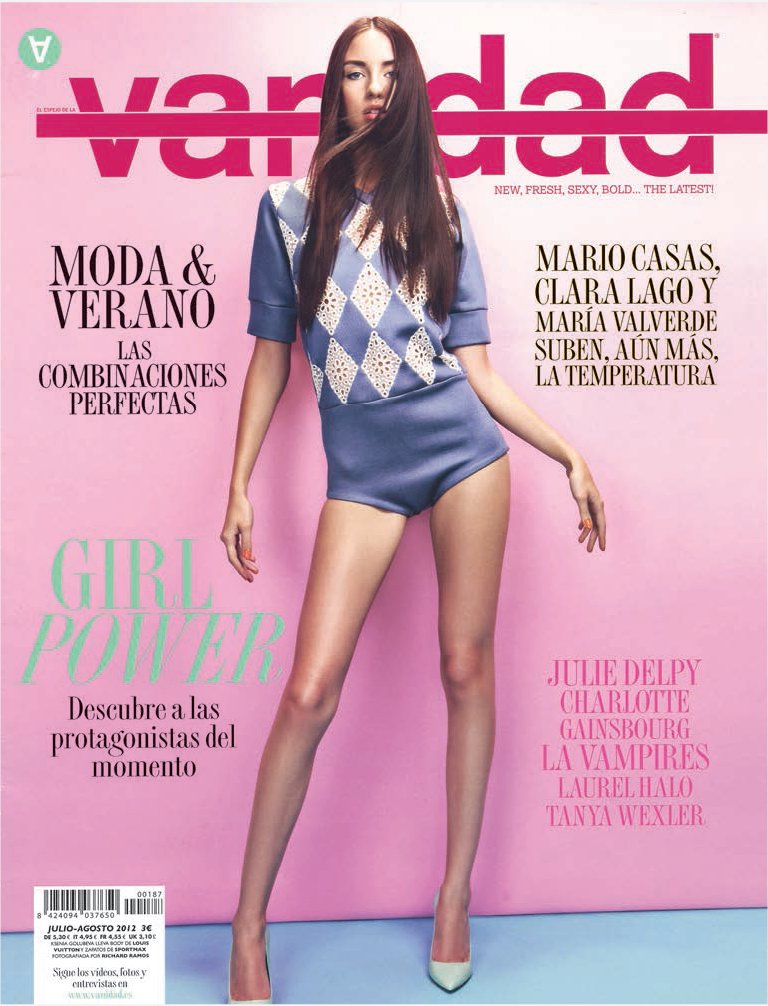
These images demonstrate how the same content can reach the reader in a variety of ways. Strong, iconic photography appears throughout and is cropped in a very simple way, using full bleed where the photographer intended.
‘What’s fascinating about magazines generally is their organic nature; unlike books or other print media they are a constantly evolving thing that changes slightly with each issue.’
Jeremy Leslie, creative director, magCulture
The function of editorial design
The design of editorial matter serves different functions, such as giving expression and personality to the content, attracting and retaining readers, and structuring the material clearly. These functions have to coexist and work cohesively together to deliver something that is enjoyable, useful or informative – usually a combination of all three if it is to succeed. At its very best, design for editorial for both print and screen is an exciting and constantly evolving research lab and launch pad for stylistic innovations that are often then enthusiastically taken up in many other areas of visual communication.
‘Editorial design is the framework through which a given story is read and interpreted. It consists of both the overall architecture of the publication (and the logical structure that it implies) and the specific treatment of the story (as it bends or even defies that very logic).’
Martin Venezky, art director, Speak
But editorial design does something else, too: it acts as a vivid cultural snapshot of the era in which it is produced. For example, 1960s magazines Nova and Oz not only brilliantly evoked the visual vibrancy of the decade, but also captured the spirit of an age that celebrated experimentation, innovation and new directions.
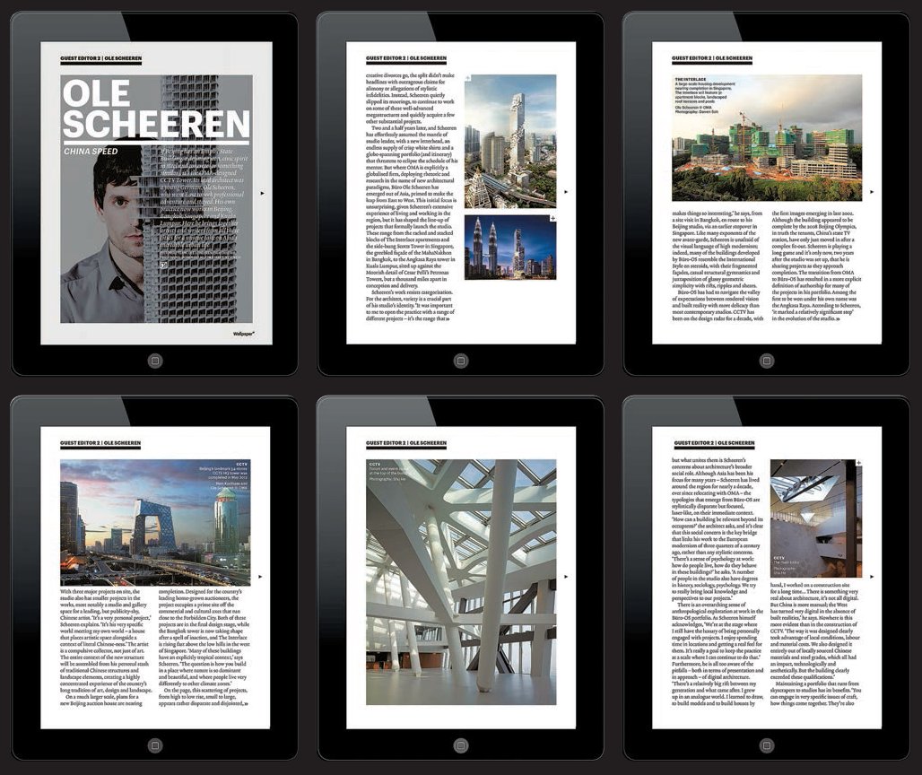
The making of Wallpaper*
How a global brand explores print and digital formats
‘When it has pushed us to commission things in a different way when we are at the shoot stage. We are thinking what happens with the magazine, what happens on the iPad, what is going to happen on the website? We don’t want exactly the same things on the website, the iPad and the printed edition but they need to complement each other.’
Sarah Douglas, Design Director, Wallpaper*
Wallpaper* magazine produced its first iPad edition in 2010 and continues to produce a monthly edition. The printed magazine version was originally launched in 1996 by editor Tyler Brûlé, with the website appearing in 2004 and attracting half a million unique users a month. Wallpaper* covers design, interiors, arts, architecture, travel, fashion and technology. The company added an asterisk to its logo in 2007 on its 100th edition, signalling the use of the cursor and alluding to its digital future.
There are many examples of how the brand of Wallpaper* has expanded to partner up with collaborators in fashion, architecture and design. The editorial team is now headed by Tony Chambers, who made the unusual transition from art director to editor. Chambers’ team works closely with the publishers and operates an open approach to publishing, working with advertisers on creative projects.
In the following interview Sarah Douglas (design director) and Meirion Pritchard (former art director) explain how Wallpaper* has extended its brand into digital outputs, design events, curating exhibitions and even property.
How do you keep control of the design elements across all three outputs?
MP: The consensus is that with the introduction to the web, designers and editors lost control for a while – we were told you can’t do this and you can’t do that. With tablets and iPhones, the ball is back in our court. Now it is a controlled environment. The screens are better now for viewing type online.
What digital tools do you have?
SD: We are making everything relevant to content and not animating just for the sake of it. We can only get a certain number of pictures in the magazine for a feature on architecture for example, but then on the iPad we have started including floor plans and showing much more. We can say: ‘this photograph was taken from this viewpoint’. It is a great thing to show readers and the idea was to help them to understand buildings. Using the website everyone can navigate through a building.
Where do you get your inspiration from?
MP: Even if it is cycling or walking, travelling around you see things from a different perspective, not from sitting at a desk.
SD: We really rely on cultural immersion. For inspiration, I would say that I like The Ride magazine from designer Andrew Diprose with editor Philip [Diprose]. The fact that Andy works for Wired is great, but he absolutely loves magazines and produces this fantastic publication as well.

What’s the main aspect that you as a designer have had to rethink working for the tablet format?
SD: It is just about re-appropriating your thoughts. You have to think differently about how things work differently, how they are read differently. You have to think through the reader’s eyes. Think how people use it.
Do you get feedback in the form of data?
MP: We get massive statistics about which pages are successful. The Twitter following is something that never existed before. We have half a million Twitter followers, which is pretty good for a magazine. The website has gone so well we have just been asked to make a Chinese version. We printed a Made in China issue as part of a series and making those contacts was really important. Although we are based in London, Wallpaper* goes much further now with the web – 150,000 circulation.

Chunky headlines are underlined in both print and digital. Designers take care to use topright-hand ‘slugs’ or headers to signify which section the reader is currently reading.
How do you work with advertisers?
SD: We meet with them with the Wallpaper* bespoke team and the editor to talk through what will work for them and for us. The output is tailored to that conversation. It might be a website, an event or a shoot.
What is going to happen next? Are there any more platforms to extend into?
SD: I think the way it is going we could do more. The annual Wallpaper* handmade August issue is a showcase for contemporary design and craftsmanship. Artists contribute by making items to display. This has taken the brand into a curatorial activity. Wallpaper* Composed applies to this. The Apartment is also another opportunity to extend the Wallpaper* brand. We hold events in it, use it for photo shoots, and can show it to clients. It is set up as a venture. Developers see that and start to think creatively about how they could work with us. It is also useful for photographers to come and stay in if they are shooting for us!
You commission a lot of photography. Have the different digital platforms, such as the website and iPad, affected how you commission photographers?
SD: It is a mixture at the moment; photographers are slowly getting into it as they did during the switch from film to digital. We are still in the transition.
Will every still shoot have an element of moving image content in it in the future?
SD: Maybe about 80 per cent.
What are the other Wallpaper* brand extensions?
The Wallpaper* travel guides have been turned into apps. That franchise is run by a separate publisher. Wallpaper* Selects is another franchise which works with contemporary photography with art retailer Eyestorm. The Wallpaper* Design Awards feature new and emerging talent and keep the brand positioned at the top of the international contemporary design scene.
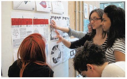
Designing magazines is a collaborative experience. Students here learn to stand back and look at their images and text from the reader’s point of view, taking in feedback from other contributors. This image shows design students at Central Saint Martins in London discussing work created from the briefs in this book.
The different roles of designers in editorial
Key to successful editorial design is the working relationship between the designer and the editor, but equally important is the designer’s relationship with the rest of the publication’s staff. The designer will often be second only to the editor in the number of staff he or she interacts with on a daily basis.
Key staff in editorial
Depending on the type of publication, the size of the team and how it has been organized, the individual roles of the team may vary. But, while a magazine editor will probably have commissioned the bulk of the material to appear in the publication, it is the art director, design director or lead designer who will be responsible for the way this is organized and presented to represent the magazine’s identity.
It would take a whole book to explain the various roles and relationships of every designer working in digital and print formats for newspapers and magazines, and these will differ vastly depending on the media format, size and circulation of a publication – an independent magazine that is produced biannually will have staffing needs that are very different from those of a daily magazine blog. Here is a guide to the staff that an editorial designer will work most closely with.
Editor: ultimately responsible for the publication’s content. Works most closely with the art director and the tier of editorial staff immediately below him or her, including features editor, picture editor and production editor.
Art director/art editor: responsible for the organization and ordering of all the content, including commissioned and in-house articles and all imagery, to a timescale set by the production manager or production editor. He or she commissions images and information graphics (infographics), including from illustrators and, sometimes, photographers (see also picture editor, below). Works closely with creative and production staff across print editions and to some extent on digital formats.
Production manager/web editor: oversees the physical compilation of all the material by setting a production schedule. This works backwards from the publication date to determine receipt of copy and imagery, editing, subbing and design schedules, and dates on which the sections need to go to the printer. The production manager is also responsible for producing, updating and circulating the flatplan. Works most closely with the art department and the printer, particularly in overseeing all special print requirements.
Chief subeditor, subeditors: responsible for proofing and ‘subbing’ (subediting) the copy to ensure stylistic coherence, correct spelling, grammar, punctuation, etc., writing all display copy, rewriting badly written copy, cutting copy and sometimes laying out pages. Works closely with the editor, art team, features editor and, depending on the structure of the editorial team, the writing staff.
Picture editor: usually responsible for sourcing images and copyright clearing on imagery, but also, in conjunction with the art director and editor, for ensuring the quality of photographic material used throughout the publication. Works closely with these individuals, but also with picture agencies, photo libraries and repro houses.
Designers: responsible for laying out the publication according to the art director’s directions or instructions. The way designers work with their art director and how much autonomy they have in laying out the material is determined by a number of factors, including levels of seniority, the working practice of the art director (some like to be very hands-on and oversee every detail of the publication; others are happy to delegate and sign off pages once they’ve been laid out), the ratio of staff to the number of pages, and the lead time to publication – often, the shorter a lead time, the more responsibility will be given to designers.
Studio manager: not all publications have a studio manager, as the project-management aspects of the job mirror that of the production manager to some degree. But a studio manager is a great facilitator for a design studio, acting as a co-ordinator and handling the everyday interaction between design studio, picture desk and production. He or she ensures that everything is going to plan and is on schedule, and that all the differing elements that go to make up the page layout are in place and as they should be.
The Guardian newspaper
Tackling a brand-new format in print
In 2005, the UK’s The Guardian newspaper became the first large-circulation British daily to have front-to-back colour, something that its creative director at the time, Mark Porter, says was necessary because ‘real life is in colour, and in an age when we are in competition with TV and the internet as news providers, it’s crazy to attempt to do it without full colour. That is a twentieth-century approach which readers found very frustrating.’
Unlike many of the UK broadsheets, which have adopted a tabloid format to respond to modern users’ changing needs and relationship with their daily paper, The Guardian’s redesign incorporated a move to a brand-new format – the Berliner format used by Le Monde newspaper. It’s not surprising that the newspaper is forging its own path with a format that Porter says ‘has a unique ability to combine convenience for the reader with serious journalism, a contemporary approach to design, and the demands of advertisers’. Its approach to design has always been intelligent and forward-thinking; in 1988 a radical redesign by Pentagram’s David Hillman split the newspaper into two sections, unveiled a new masthead and, most importantly, introduced the idea of ‘white space’ to newspaper design, a concept previously restricted to magazines.
‘Everything changed with the Hillman redesign. It wasn’t just a new look; it was a whole design philosophy, probably the first time any newspaper really had one,’ says Porter. ‘The designers who followed (Mike McNay, Simon Esterson and myself) have had a very strong set of principles to work with,’ he adds. These principles were adapted in the 2005 redesign by following Hillman’s own clear vision of how a newspaper should work – a vision ‘that was based not on journalistic habits and traditions, but on sound design principles’.
The Guardian newspaper is now published alongside The Guardian live website and the app, which updates stories as they happen. Mark Porter left the newspaper in 2010, but his influence remains due to the continued impact of his team’s massive typographic overhaul of the publication in 2005. Since then the visual identity of The Guardian has been extended to fit The Guardian online website and The Guardian app. Porter is still connected to the paper as an editorial consultant and says, ‘Nowadays, when you do a newspaper redesign you are also designing a website, pages for mobile devices and for apps. It is getting to be unusual just to do a job for print. Conceptually it all has to fit together and it’s about having a visual identity for a brand that works in print and also works in other channels.’
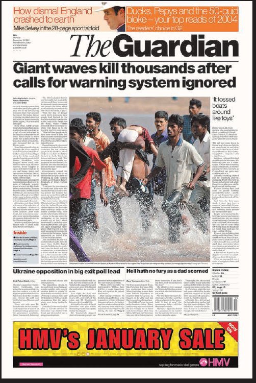

The Guardian website is staffed by a team that follow the core design values outlined by Porter, supported by the belief that in any format good balanced typography and strong reportage photography create an intelligent product. When Porter moved on to The Guardian iPad, he ensured that these principles were still there, but enhanced by the interactive nature of the device. The smooth slide navigation is an important feature, but it is the mobile nature of the iPad that opens up new possibilities for editors and advertisers to interact with the reader through sophisticated data-collection software and GPS. Porter comments that, ‘Tablets have opened up lots of other opportunities. This is the first time in the digital sphere that we have been able to use a lot of what we know about doing things in print. It is exciting that the tablet market is going to grow. In the future we will have more opportunities to do good editorial design in digital media than we have had up until now. The amazing thing is that it changes every day. We are seeing the last days of desktop-based browsing. Most people will be consuming media on mobile devices. Tablets and phones will be much more important than desktop. Print will always be a part of what we do but it will not be the biggest part.’
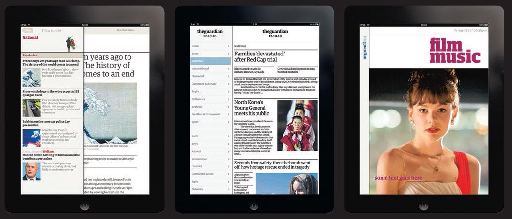
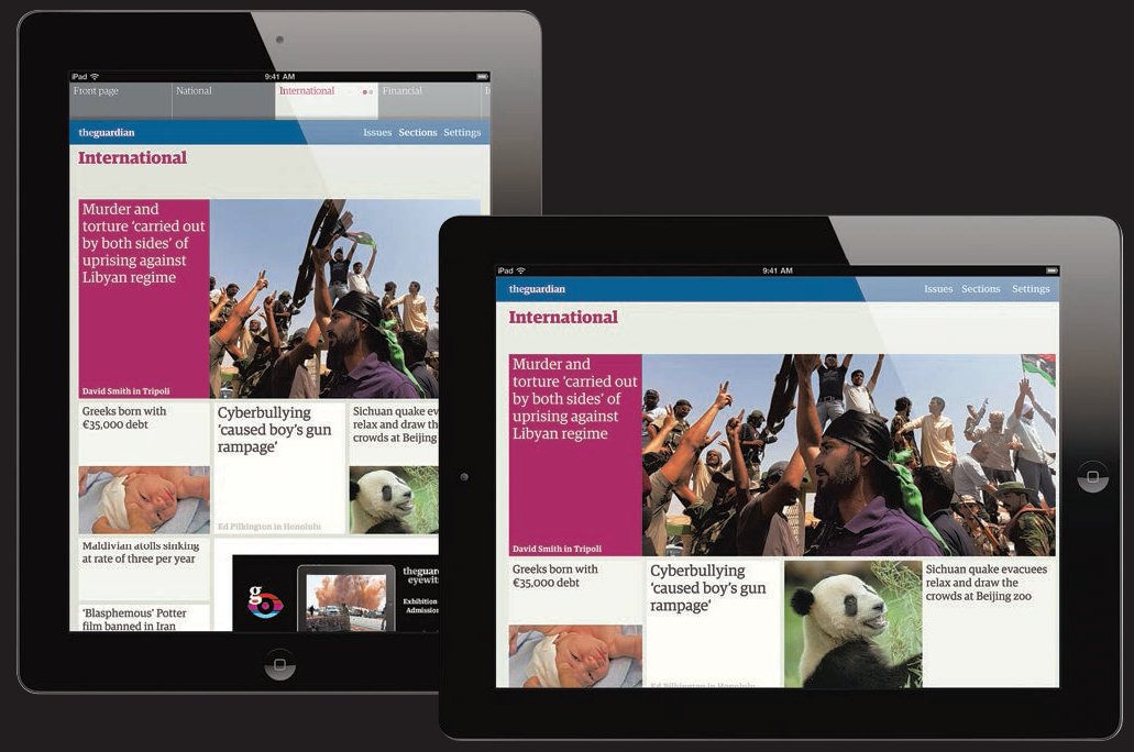
The hierarchy of typography signals the importance of the story. Crisp headlines underpin the design and bring a spark through the juxtaposition of words and images. Every opportunity for graphic impact is used so that the website provides a rich experience of simple navigational tools that help the reader get straight to the content he or she is looking for. Gimmicky tools and whizzing pictures have no place here and are shunned in favour of a plain and straightforward approach.
‘Magazine content is basically built around the idea that editorial breaks up the advertising, which, for a lot of magazines, is what it’s all about: selling ads.’
Vince Frost, art director, Zembla
What attributes should an editorial designer have?
Tibor Kalman once famously said that it is the job of the art editor to get the editor fired if he or she believes the job is not being done properly. By this he meant that an editorial designer should take as much interest in the content of a publication as the editor, because designing a magazine is unquestionably an extension of editing it. Both roles are creative ones that are rooted in and play part of a creative process, and how they function together will nearly always determine the success or failure of an editorial publication.
So, if editorial designers should ‘become’ editors, the converse is equally true and editors should ‘become’ editorial designers – or at the very least they should understand each other’s attitudes, roles and areas of expertise in order to build the necessary trust to create a first-rate publication. All the great editorial designers and editors have expressed this, some of them even bringing other skills and backgrounds to the mix. Mark Porter, who designed Colors and WIRED before becoming creative director of The Guardian newspaper, read languages at Oxford University instead of formally studying design. As he explains, this fact lies at the heart of his approach to design:
‘I approach editorial from the reader’s point of view. Good editorial design is, firstly, about making people want to read, and then about telling stories; most readers aren’t interested in design, and when they look at a page they should see ideas, people and places, not graphic design. It may also be that having been to university makes it easier for me to communicate with editors, as they tend to share the same background. Newspapers are full of very smart journalists, which is a constant intellectual challenge for me; if I can’t make a clear, convincing case for my design, then I will just get shot down. Languages themselves haven’t been that useful in my work (apart from doing projects overseas), but I believe that design is a language too, and, like any language, of no real value in itself; it only becomes useful when you have something worthwhile to say.’
Dylan Jones, editor of GQ magazine, but also past editor of i-D magazine, The Face, Arena and Arena Homme Plus, trained as a graphic designer. Willy Fleckhaus, art director of the seminal 1960s German magazine Twen, was a journalist. And David Hillman, Pentagram partner and designer of New Statesman and Society and The Guardian newspaper, was both art director and deputy editor on Nova. He has said, ‘Art direction isn’t about establishing a grid or styling a masthead, or even about a good-looking juxtaposition of image and text. In its best form, it involves the art director having a full and in-depth understanding of what the magazine says, and, through design, influencing how it is said.’
You may well have heard and read about the design greats and wondered how they got where they are. Opposite and overleaf are three interviews with some real-life designers at different levels who explain the work they do and how they got started.
Esa Martinesva, Port digital magazine
What does a junior designer/intern on a digital magazine actually do?
Since the tablet format (iPad) is so new, there really aren’t any senior designers who know everything about designing for them. It’s just one big discovery for everybody. In my role as a junior/intern I was responsible for thinking about how the reader interacts with, and navigates through, the magazine, plus helping to make layouts, and thinking about typography on screen.
How is this day-to-day activity different from a designer working in print?
The medium might be new, but the communication and interaction basics are the same. You need to have an overall understanding of how type and image (moving or still) and audio all work together and also when not to use them.
Do you have to learn to deal with different platforms?
Many applications have tried to do too much at the same time. Obviously the tablets are really good with video and audio, but the users seem to appreciate simplicity and subtlety in the design.
I don’t think all designers need to technically know every medium, but it is essential to understand how these different mediums work. Design-wise, working with Adobe Creative Suite you don’t really need to touch the coding side, but you will be dealing with interactive elements like buttons and hyperlinks. Again, the biggest challenge is to understand how type and image work differently on the screen than on the printed page.
How do you stay up to date with technology?
You really can’t do it any other way than just taking the bull by the horns and trying to experiment with the new tools and mediums as they are released.
How did you get started in magazines?
My portfolio had a reasonable number of editorial and print projects in it. A tutor of mine remembered my interest in editorial design and recommended me for the job. I got the position and was assisting in designing the magazine’s iPad edition. After the project the team wanted me to continue working with them. Now I’m mainly working with the printed edition, but I’m still working a bit with the digital side as well.
Did you work for free as an intern?
Yes, at the start. The magazine was a start-up and made mainly through voluntary work. That seems to be pretty standard with freshly started independent magazines before the budget is stabilized. Since then I have been paid and nowadays our interns get paid a small fee.

As an intern, it is rare that you can say ‘I did this’, as it is often group work, directed by an art director. However, your experience working on even simple layouts really counts.
Gemma Stark, Net-a-Porter digital magazine
What does a senior designer on a digital magazine actually do?
In some ways the role is fairly similar to the role on a ‘traditional’ magazine. I art direct fashion shoots, design features for the magazine and attend planning meetings. I am normally designing several stories at once, along with finding photographers and developing shoot concepts. One thing that is different is having an awareness of the digital aspect of the finished product, so I work closely with the tech team to discuss how the pages will work on screen.
How is this day-to-day activity different from a designer working in print? Is it a faster process?
Well I work on a weekly magazine so it is most definitely fast-paced! We start to design the majority of the stories on the Tuesday and by Thursday lunchtime the editor reviews the whole magazine. Our layouts are then passed over to the tech team on a Monday and are live on the website by Wednesday. The proofing process is quite different. We will check the quality of the images and type on our internal website instead of cromalins [high-quality colour proofs] and make changes where necessary, which are then updated by the tech team.
Do you have to deal with different platforms?
Our magazine is built in Flash, but the designs are also used to create our iPad app in HTML 5 too. We also design a mini PDF version of one magazine story a week for the iPhone, and we still do print projects from time to time. We work in InDesign, but also use Photoshop for site pages and emails. So yes, there is a lot of variety. At Net-a-Porter we approach everything from an editorial angle – even the banners and promos have an editorial message. Working on a digital magazine means we tend to put much less on a page. This, of course, has its advantages. We can use animation to expose more information and images. We have to consider things like animation and usability the second we start designing each layout. Even the simplest of animation can completely alter the page.
How do you stay up to date with technology?
I am constantly looking at other websites for inspiration and reading about new ideas on blogs. As a team we get together and discuss what new things we could be doing. If someone sees something brilliant we send a link to the whole team. Although it may not be relevant to each person, or the project he or she may be working on, it could be useful for someone else. Our tech department are also really great and constantly highlight any new tools available to us.
How did you get started in magazines?
I started doing work experience during the summer holiday while I was at Central Saint Martins. My tutor recommended me for a summer placement at Elle magazine. I was there for a couple of months and loved it; for me it perfectly blended two things I enjoy most – graphics and fashion! I kept in touch with people and did more work experience whenever I could. While at Elle I met my now boss. When she approached me about a job at Net-a-Porter I was so excited. The fact it was a luxury e-tailer with a strong focus on editorial made it all the more appealing. By the time I graduated I already had my job lined up. I started as a junior designer the following September.

Gemma’s work shows an understanding of how the fashion reader loves a clear image but also can scroll over to read a caption.
John Belknap, The Jewish Chronicle newspaper
What does a design director on a newspaper actually do?
As a design director there are two levels of design you engage with. The first is creating and maintaining the signature look of the paper. Everything from the masthead to the classifieds has a unique look, and you create it, keep an eye on it, and keep improving it. The editor might want to create a new section and you design that, or supervise its design.
The second level is actually producing daily or weekly editions. That involves working closely with the editors to prepare photographs, illustrations and infographics for the pages, and also laying out pages. Designers on big newspapers are usually only involved with complex layouts, and the subeditors (or copy editors in the US) lay out most of the news pages according to strict guidelines given to them previously by the design director. As a design director you employ other art directors to deal with the specific pages for various feature sections such as business, sport and arts reviews. You work closely with the editor to lend drama to stories on the page, and you work with picture editors, section editors, graphic artists and, at the end of the process, the production manager who is anxious to send your work to press.
How do you design in order to allow the content to then go into the online version?
Most papers have a ‘plug-in’ system attached to Quark or InDesign or other page-makeup software. This means that the articles are put into a database and then pulled on to the page from the database. There are many ways for that copy to be connected to the web, but basically the copy for the web is pulled from that database as well. On top of that, the same database is used to create the paper’s archive of past articles. In the old days (i.e. a couple of years ago), stories went into the paper and then onto the web. Now they often go to the web first. This is mostly a production/IT systems task, but it can affect design details. For instance, headlines, bylines and text have to always be in separate boxes – or have separate style sheets – so the web software can distinguish between them and arrange them in the right order.
How do you stay up to date with technology?
My IT manager tells me we have to install new this and new that and I try and stay up to date with it.
How did you get started in newspapers?
I worked on my high school paper and loved its rhythmic progression from sloth to adrenalin. I got hooked. My first job was part-time at a newspaper during university. I eventually left university, but stayed at the paper for ten years.
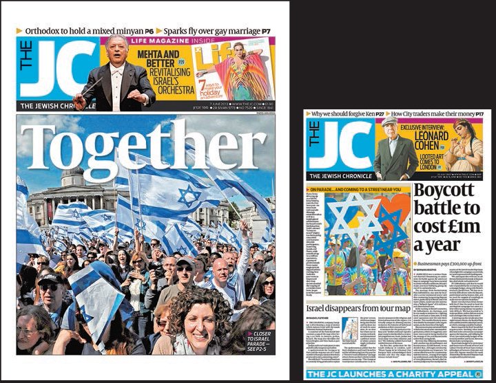
John works closely with the editor to create bold front covers, and to ensure many entry points for the target reader. Photo on left-hand image by John Rifkin.