
Chapter 2 : Editorial formats

Until the introduction of the tablet in 2010, national newspapers, consumer and lifestyle magazines, and glossy supplements represented the highest status of editorial design. However, digital publications are now developing fast and providing new opportunities for editorial designers, publishers and advertisers. The new digital family consists of websites, mobiles, Android tablets and the iPad. ‘Apps’ are enabling designers to add moving images and interactivity to digital newspapers and magazines. Many people now carry mobile devices which enable publications to have larger followings via their digital interfaces than they do in print format.
Our focus in this chapter is on editorial design for both print and digital formats, looking at regularly published editions of newspapers and magazines that set and dictate the trends for the rest to follow.
A concise history of digital publications
Early digital publications were mainly websites featuring PDF (portable document format) pages that could be flicked through as if turning the pages of a conventional newspaper or magazine. The files were, however, large and were limited by the fonts available. American publisher Condé Nast built their own custom software in-house and produced Wired, GQ and Vanity Fair without relying on external software systems. The arrival of HTML in the 1990s as a computer coding language enabled designers to embed moving content into the web. The web browser reads the tags and renders this code as pictures and text.
As interactive design technology improved, so apps appealed to advertisers who could then add moving images and interactive content to advertisements. With the arrival of the iPad in 2010, digital publishing became an even better portable experience. The iPad brought an element of play to the tools available. It also put editorial in the same portable device as all the other great things in life – email, photos, shopping, internet and reading. At the close of 2011, however, many iPad apps went back to a more stripped-down delivery: the full ‘bells and whistles’ approach was rejected and a reliance on good graphic design and smart editing returned to digital publishing. After the initial flurry of moving image and complicated interactive promises, a sense of normality returned to the digital publishing industry in 2012.
The pitfalls of sharing
However, access to another company’s content causes friction with those who invest in news gathering. Those who create journalistic content, such as The New York Times and the BBC, are bearing the cost of serious reportage. The WikiLeaks scandal in 2011 highlighted the moral debate about accessibility of news in the digital age and raised the question of who content ‘belongs’ to. The law around news gathering clearly needed to be redefined. In 2012, the British phone hacking scandal exposed the inability of the authorities to control the media and the Leveson Inquiry was called to investigate the culture, practices and ethics of the press. The report of the inquiry called for a new regulatory body to enforce set principles involving the legality, privacy and honesty in copyright.

‘When we are designing the magazine we are thinking about how it is going to work on the iPad.
The iPad has pushed us to think about how to build on the content for the printed issue and from the website. It contains all the interactive elements. It is similar content to the magazine but borrows interactive elements from the website.’
Meirion Pritchard, former Art Director, Wallpaper*

Real Simple art director Janet Froelich uses this eye-catching feature opener to grab the attention of the reader. On the iPad the sharpness of the bold photo by Craig Culter is enhanced, giving great clarity. Many publications use a simple PDF of a printed page, but Real Simple uses the iPad format at its best, to enhance the content for the way the reader uses the magazine – often in the kitchen.


The Times newspaper uses simple headlines and iconic imagery to great effect. Special historic occasions like the presidential inauguration are an opportunity to play to its strengths as one of the world’s papers of record. Here we see the combination of foreign correspondent reporting, thorough attention to detail and dense graphical information to give the reader a substantial product.
Harold Evans, editor of The Sunday Times from 1967 to 1981, wrote a series of seminal books on newspaper editing, layout and typography that are still used in journalism schools. In Book Five: Newspaper Design, he said:
‘A newspaper is a vehicle for transmitting news and ideas. The design is an integral part of that process. We begin with a blank sheet of newsprint and a mosaic of ideas we want to communicate, and it is the function of newspaper design to present that mosaic in an organized and comprehensible way. To do this, the newspaper designer uses text type, display type, photographs, line work, white space and a sequence of pages in the most fitting combinations.’
This is probably as succinct and accurate a description of newspapers as you will find anywhere. But Harold Evans didn’t have the internet and mobile media to contend with. The immediacy of these delivery media has now forced newspapers to provide a different service to their readers, and required designers to respond accordingly. As Mark Porter, former creative director at The Guardian, explains:
‘Many papers are now less concerned with simply reporting and more with providing background, perspective and interpretation. Rather than just telling readers what happened, these papers now have to help them understand the significance of events, and encourage them to think. Design has to respond to this in a number of ways. As stories get longer and more complex, rational and readable page layouts and typography become increasingly important. And visual journalism – intelligent use of photography, infographics and layout – has also become an essential tool for editors.
The best thing about working on a newspaper is the opportunity to work with such a wide range of incredibly intelligent and knowledgeable people. The worst is the lack of control over the detail. Most newspaper pages are not laid out by trained designers. This is very difficult for magazine-trained art directors to adjust to!’
Mark Porter, Design Director, Mark Porter Associates
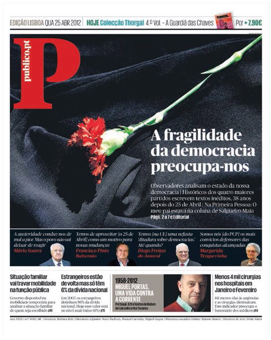
The logo on the front page of the Portuguese colour daily Publico is iconic; the use of a flower image is bold and symbolic, balanced by the gravitas of the small headshots below. This tabloid front page uses scale dramatically and combines it with a thoroughly modern typographic look.
Publico’s inside pages have a magazine feel, with dense, structured content packing in four stories. A common byline treatment helps the reader to navigate entry points to the stories. The coloured panel indicates a different kind of content and the vertical columns balance the horizontal axis, intro and headline, while the cut-out image on the pull quote adds a little air.
Newspaper sizes
Although there are many other sizes for newspapers (in particular, a number of European newspapers publish in sizes between a Berliner and a broadsheet), the majority of papers worldwide use one of three formats: tabloid, Berliner or broadsheet. Dimensions are as follows:

Broadsheet (or Nordic/Nordisch) approximately 56 x 43.2cm (22 x 17in)
Berliner (or Midi) approximately 47 x 31.5cm (18½x 12½in)
Tabloid (also known as Half Nordic or Compact) approximately 35.5 x 25.5–30.5cm (14 x 10–12in)
Digital newspapers
In the early days of digital format, newspapers published the same pages online as in print by using PDFs on their websites. Since then a more interactive approach has been developed and is now enhanced by the use of GPS tracking. With more people buying mobile devices, news organizations have begun exploring GPS as an advertising tool. News services can link in to advertisers, based either on the reader’s interests or his or her location. This enables news organizations to retain important advertising revenue that was once generated by print advertising.
Today, editorial news designers need to be able to work with the developers of digital platforms and require a basic knowledge of coding. They must understand the verbal language that developers use so that they can work with them on keeping the visual identity of the publication intact once the pages are processed by content management systems. These systems distribute page designs onto the different platforms for mobile and tablet. They enable the change of scale required for each device, which makes a huge difference to the reader’s perception of the storytelling.
The arrival of the tablet marks the death of print
False The introduction of the iPad in 2010 has not changed everything; magazine titles and editorial brands are the same as they were before its launch. Tablets are fantastic devices that offer more interactive possibilities.
Readers don’t read long text on digital devices
False The idea that people use mobile devices for an instant hit when they are on the go is a myth. Since the improvement of on-screen legibility, there is evidence that readers read long-form text on digital devices. There are new ways to view information quickly and to store text for reading later, such with in apps like Instapaper. Reading habits have changed, however, and in 2012 statistics show that the average length of an online session has lengthened from a quick update to between 17 and 31 minutes.
Readers prefer to read editorial on desktop screens
False By the time this book is published, the amount of data being downloaded through desktop browsers on PCs will have been overtaken by the amount downloaded by mobile devices. It appears that the best computer is the one that you take with you. Mobile devices are used even when people are not on the move, with 84 per cent usage being from the home in 2012. This is changing our behaviour, and reading magazines and newspapers is increasingly becoming something we can do while watching television or consuming some other kind of media. Editors are realizing that they no longer have the undivided attention of their audience.
Small-run print publications will survive
True Independent publishers fiercely champion print and there will always be print publications as long as we can afford the paper to print them on. The design community continues to play with print formats and readers seem to like this. Cheaper digital printing makes it easier than ever to print a short run publication. A good example is the Newspaper Club, one of the websites where you can go to upload your editorial material and have it printed or published online.
Large print publications will not survive
False The giant media companies are less sentimental than independent publishers about print because the overheads for the traditional model of print and distribution are so expensive. Familiar titles have ceased to print and have moved to a paywall website, using responsive design across mobile and desktop. The publication has survived and in 2012 won the Society of Newspaper Designers (SND) best-designed news website. News weeklies, such as Newsweek, also closed their print operation in 2012. Such large publications, however, may be resurrected in another form in the future.
Digital terminology
Frictionless experience
A website or app’s user experience (referred to as UX) that is smooth and describes the ideal journey between different sections of a site without frustrating layers of navigation, e.g. having to go to the home page or log in again.
Geo-targeting
A marketing term for enabling content to be directed straight to a reader depending on their physical location. Publishers can use this to tailor both editorial and advertising content, e.g. restaurant listings. Mobile devices need to be GPS-enabled.
Global Positioning System (GPS)
A satellite-based navigation system that provides location and time information to devices such as those in cars, smartphones and tablets.
Liquid layout
Design software can adjust rectangular page layouts slightly between different device screen sizes. Liquid layouts are cost effective, but typographers and photographers often dislike their work being stretched.
Paywall
A system where internet users pay to access content. Some newspapers use paywalls on their websites to generate revenue following the general decline in print subscriptions and advertising revenue.
Phablet
A tablet with the added functionality of a phone.
Mainstream consumer magazines and news-stand titles in print
In a bookshop in New York or London, a news-stand in Barcelona or a magazine outlet in China, you will find hundreds of consumer magazines all screaming for the customer’s attention through a combination of their choice of cover image, cover mounts, cover lines, brand recognition and appeals to reader loyalty. For a medium whose imminent death was widely predicted with the growth of the internet, the magazine market remains both international and vibrant in its appeal. Now, however, the printed magazine is only one member of a family of outputs. In fashion and lifestyle, the glossy printed pages remain a tactile pleasure, but this is no longer true of news and special-interest magazines, where the printed publication might be the secondary product.
The majority of consumer titles – including women’s, men’s, business, leisure, news, style and special interest – can be broken down further into different areas, interests and genres, each with its own target audience and often appearing in different country editions.
Independent publications (selfpublished magazines and zines)
The worldwide appetite for not only consuming magazines but also creating them seems to be insatiable, and nowhere is this more apparent than in the rise of independently published zines (a small circulation ‘fanzine’ with minority interest) and special-interest publications, which cater to niche audiences worldwide. These publications all hope to offer readers something that the mainstream titles, with their pursuit of huge circulation numbers, don’t. They are not afraid to indulge in long-form writing online and are seen as a powerful force in emerging graphic trends, crossing over into other areas such as art, architecture, photography, fashion and music.

Adbusters is the ultimate example of an independent magazine, founded in Canada in 1989 as an anti-consumerist, proenvironmental organization. It continues to challenge the establishment with its international campaigns such as Buy Nothing Day and Digital Detox Week.

Using elements from parent titles for supplements may seem the only way to ensure a brand is consistent, but international design consultant Mario Garcia believes that ’beyond placing the logo somewhere, supplements should have a life and identity of their own; readers are smart and will know the parent publication. Supplement design should be adventurous, and the typography more relaxed and not that of the newspaper. Photos should be bigger, more colour, better quality paper.’ The San Francisco Chronicle Magazine (left) takes this on board, with great use of full-page illustrations and wide columns to differentiate its tone and style.

The Economist exists in print format and has a successful free app. Subscribers get straightforward news, designed with clarity. There is no overreliance on interactive content, instead links to relevant articles and websites prevail, staying true to the mother brand.
Richard Turley, Bloomberg Businessweek
Richard Turley originally worked with Mark Porter at The Guardian on various projects, including specials, books and the redesign of the newspaper. Turley is now creative director of Bloomberg Businessweek in New York. The success of this magazine began when he arrived in 2009 and with his team began to breathe new life into the financial publication. His style is to integrate bold graphics and sharp words to produce sparkling and memorable poster-like covers. This contemporary visual style really stands out within the context of financial magazines. It punches hard and to the point, coolly reminiscent of 1960s activist graphics. The variety of imagery used on the covers changes to keep the reader guessing. However, the real success is due to the combination of sharp ideas (using words as images and clever infographics) with dense analytical content in a weekly magazine format.
Design awards from the Design and Art Direction association (D&AD) and Society of Publication Designers (SPD) recognize Turley’s redesign of Bloomberg Businessweek. One accolade from the SPD says:
‘It’s a look that fuses the formatting brilliance of New York and the smart visual approach of The New York Times Magazine, with a hierarchy and architecture lifted from the best British and European publications (The Guardian chief among them). Most impressively, Businessweek has a high level of visual intelligence, challenging its readers, pushing the boundaries of traditional newsweekly and business magazine design.’- Bob Newman, Grids magazine. Source www.spd.org
In the following interview, Richard Turley discusses digital design.
What inspires you about magazines for the future?
Small-circulation independent magazines inspire me for the future. Apart from the odd issue of Vanity Fair I rarely even look at, let alone buy, big commercial magazines. Equally I have zero interest in iPad mags. Just can’t be bothered with them. I’m a dinosaur – I know that – but for me a magazine should be printed on paper. Actually that’s a lie. I look at one mag, and that magazine is, somewhat shamefully, the London Evening Standard’s ES Magazine. Fridays just aren’t Fridays without the ES Magazine. And that’s a PDF reader. Which is more than fine for me. I like websites. I especially like websites on my iPad.
Can designing for digital editions be as satisfying as designing for print when you are dealing with dense content?
I haven’t done much digital design. I quite enjoy what I have done. But for me the exciting thing about digital design is the ‘design’ is often the least important part. It’s all about strong, simple editorial ideas. Once you have the framework, there is far less messing around with fonts and all the (quite often) dumb bells and whistles that magazine design has become. (I say that being a practitioner of dumb bells and whistles magazine design.)
You love Twitter. Is it your favourite way of sharing information?
I like Twitter and Tumblr. Twitter more than Tumblr. I share using both, but my default would be Twitter. I don’t think I share that much. I use Twitter far more to learn than to share.
Editorial designers need skills. Which digital crafts do you think are needed alongside the traditional print crafts?
I’m not really a digital designer so not sure I can answer that. I think the most important trait an editorial designer needs is endless inquisitiveness and a desire to communicate and share.

Bloomberg Businessweek delivers different covers for iPad and print, but they are all related to the popular website, full of business data. The graphic images are created by art director Richard Turley and then repeated throughout all the different deliveries of the publication and all its constituent parts.
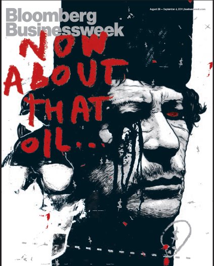
Turley’s irreverent oil cover from 29 August, 2011 (left), shows that mobile media is a powerful addition to print and is a vibrant and exciting medium to work in. The rock and roll treatment of both the image and the type here shows Bloomberg Businessweek is up there in the realms of Rolling Stone for visual treatment. Arresting covers like this proved that the redesign demonstrated the title’s confidence in itself and in its readers as intelligent viewers.

This bold, minimal graphic treatment of the Japanese flag on Bloomberg Businessweek (right) stands out in the weekly market among some other fussy covers.

The gothic ‘T’ logo signals the style magazine section of The New York Times, but it is the striking headshot that invites the reader in to this fall fashion issue. Photographers capture the moment with striking lighting and styling.

The pure graphic impact of The New York Times Magazine is clear. Janet Froelich, the art director, commissioned strong, conceptual photographs to fit within an editorial brief in close collaboration with photographers. Such great photographic details can be enhanced by typography: here the extreme exaggerated drop cap draws the eye to the curve of the jacket.
Supplements
When The Sunday Times launched a full-colour glossy magazine with its newspaper in 1962, a whole new form of publishing was born. Supplements had been around in the US since the end of the nineteenth century, but the sheer pizzazz, gloss and production values of this new form of magazine made them an instant success. They quickly came to have a cachet and regard in design circles that matched those for the highest-quality magazines, and in their 50-year history they have attracted some of the world’s best designers, delivering some of the world’s best editorial design. The need to brand and express the title as part of a much bigger family – the newspaper it comes with, which has a particular tone, stance and readership – yet give it a distinct identity of its own, is a particularly exciting challenge for designers, who can experiment with elements such as fonts, layouts and formats with greater freedom than the designer of news-stand titles. Add to this good budgets (because newspaper proprietors know that readers will buy their paper if they particularly like the magazine or supplement), and designing newspaper supplements becomes one of the best editorial-design jobs there is.
‘Design is at the forefront of establishing a relationship with the reader. It telegraphs the content, spirit and forward-thinking qualities of the publication and gives the reader an instant relationship with the spirit of the magazine.’
Janet Froelich, Creative Director, Real Simple

Inside front cover and contents page from M-real for paper specifiers. Every issue of the magazine changes completely, with the exception of the page size, the grid system and a diagonal corner pattern at the start of each feature, while the majority of the design elements provide newness.
Customer magazines and business-to-business
Customer magazines have developed the art of branding into an integrated part of the business world, merging visual branding with product placement and marketing. The magazines began by being exclusively available to users of a particular consumer product or service, but are now inventive and cross-platform, creating communities of people who like the same brand of product or service and who like to talk about it on social media. Unlike consumer magazines, they are financed by businesses and seen as an essential way of promoting the ‘good news’ about their brands. Brand marketers understand that for a customer magazine to work well, the content has to be informative and entertaining, and the brand promotion element should remain subtle and understated. These dual needs mean that much more is expected of a designer in customer publishing, maintains Jeremy Leslie, creative consultant at magCulture:
‘There is little difference in terms of design skills, but much in terms of strategy, thinking and broader creativity. Consumer magazines need to stand out on the shelf, but cannot risk alienating their existing audience as they seek to attract new readers. Customer magazines are interested in standing out in every and any way they can. They have to demand the attention of the reader in an appropriate way for the brand or service they are promoting. So there is far more emphasis on ideas and conceptual thinking – what can a magazine be?’
Business-to-business (B2B) magazines are a vast area of activity, often overlooked in the consumer world. This area of publishing includes the branding of editorial communications within the public and private sectors. Often design is not a priority in these journals, newsletters and blogs as they are member-based and not sold to the public. However, there are some exceptions – The Lawyer magazine and the website designed by Esterson Associates are good examples. Organizations such as the Periodical Publishers Association Services (PDAS) promote good practice in the B2B sector and run awards.
The marketplace: what’s out there?
•Each month, over 30 million copies of magazines are bought through subscription or news-stands in the US.
•In 2004 American magazines numbered 18,821 titles.
•The average American supermarket carries 700 titles, and may have 300 to 400 of those titles on the shelf at any given time.
•There are over 120 Asian–American magazine titles published in the US.
•In 2002 Germany saw 224 news-stand launches and more than 200 customer magazine launches.
•The UK has around 3,000 magazines, with about 200 of these accounting for more than 90 per cent of the total sales.
•Each year in the US around 1,000 titles are proposed, of which around a third make it to a launch issue.
US STATISTICS from the Magazine Publishers of America and Audit Bureau of Circulations (ABC), based on 2002 sales/circulation. UK STATISTICS from Nielsen BookData.
Digital magazine publishing
In magazine publishing, the type of market dictates the content and mode of delivery. In fashion publishing, print editions still host glossy advertisements and uphold high production values, but the sister websites offer enhanced moving-image content and exclusive reader offers. In lifestyle publishing, such as Real Simple in the US, the magazine content feeds into the website, and in turn the website introduces readers to the print version and draws in subscribers.


Cover and pages from Carlos, a publication for first-class passengers of Virgin Atlantic. The visual identity is very strong, but its strength is also its weakness; it is defined as much by what it does not do (no photography, no full colour) as what it does.
The most innovative companies started to gather together content that the user defined in their history or indicated that they ‘liked’. These magazines were named ‘social magazines’ in the US and were pioneered by apps such as Flipboard and Editions from AOL, and build-on social media tools such as Twitter and Facebook. The Editions app brings in content from feeds supplied by other AOL news providers and combines this with local content, enabled by the use of GPS. These kinds of magazines are a hybrid blend of a tightly edited branded product and an aggregated content feed and encourage the user to ‘share’, in a similar way that friends used to tear out printed pages to show each other.
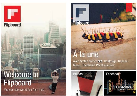
The success of Flipboard combines the power of social networking sites with content drawn in from other sites according to the reader’s data profile. The editorial content is automatically generated. It is designed to be a one-stop shop of the user’s interests.

The slick and clean look of Real Simple underlines the aspirational values of the brand. Using a selected colour palette, it looks beautiful in print but also works well on the tablet. The interactive videos present the how-to approach and are an example of enhanced content.
The simplicity of complex editorial content on an iPad is a joy for both the reader and the designer. Here, you just tap a finger on the little pies and the recipe pops into the central area. Lots of information is held as latent content within this simple page.
Tutors, use this as a basis for your own brief, and build on and add references that you think are relevant to your part of the world. This is aimed at first-year BA or BFA students and can be adapted for higher levels.
Students or those teaching themselves, use these briefs to give you a structure for your personal learning. Generate your own photography. Get your friends to critique your work and take in their feedback.
AIM
To capture the feeling of the moment by inventing a concept for a magazine on a contemporary subject.
THE BRIEF
Use your imagination to think of a contemporary subject and then follow this up with research into the kind of stories you would like to feature in your magazine.
To get started, brainstorm and create ideas for at least five different magazines. Draw up each idea with a felt pen on a separate sheet of paper. A masthead (also referred to as a logo) and an outline sketch are sufficient. Play with combining your ideas.
Choose one of the concepts and collect visual material that suits the content of the magazine. Research other magazines that have related content, and clubs or communities that share a similar interest. What is their approach? Visit libraries or independent bookshops and also seek out online magazines. Start by taking clippings from magazines or photocopies of photographs you think will suit the content. Make a note of any fonts or illustrations that could enhance the storytelling. Keep adding to your collection of material. Refine the idea of your magazine into a cohesive ten-word manifesto, e.g. My magazine is called…. It is about….
Create a moodboard which demonstrates the concept of your magazine. Edit down all your created and researched images and stick them on a piece of A3 or A2 card. The aim here is to create a visual style linked to the content. Write some cover lines and think of a name for your magazine. This will become the masthead.
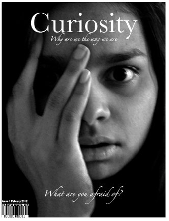

This idea for a magazine from student Salomi Desai is all about superstitions in everyday life. The idea gave Salomi a chance to play with photos and images that she could create herself by shooting everyday things and making them look extraordinary.


At first Desai sketched out ideas with a pencil and then worked them up to actual size. The simplicity of these images meant that she could get started and create stories and headlines quite easily. She named her magazine Curiosity – a reference to the collections of oddities in Victorian curiosity shops.