Designing a Prezi for online delivery needs a very different approach than designing for a face-to-face presentation. As viewers will be viewing your Prezi online, and in their own time, you should assume that their attention span will be very limited. Most people viewing content online only have about eight seconds before they become uninterested and move on to something else.
You should also assume that people might not know what Prezi is or how it works. This could send the technophobes in your office running straightaway.
In the rest of this chapter, we'll look at how to design your online Prezi with these things in mind.
The three design steps you learned in Chapter 1, Understanding the Prezi Frame of Mind still apply:
- Plan your Prezi.
- Get the flavor right.
- Build in layers.
In step 1, you need to ensure that you don't get too carried away with your ideas and stick to a very simple approach. No one is going to click through a Prezi that takes an hour to complete online, so try and make your content as simple as it can be. A no-frills approach is a good idea for online Prezis. You can still use step 2 to get a nice flavor and design.
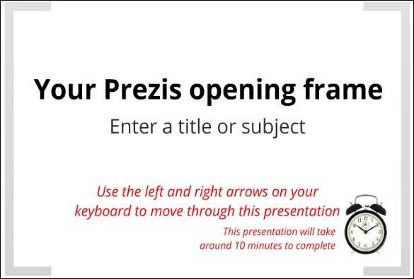
Throughout your Prezi design, you should always give the user instructions on how to navigate through the canvas. If people can't quickly grasp what they need to do, then they might give up after only a few seconds. Instruct the users on exactly how to use it, and help guide them along the way.
A simple example of a Prezi using good instructions in the opening frame is shown in the following screenshot:
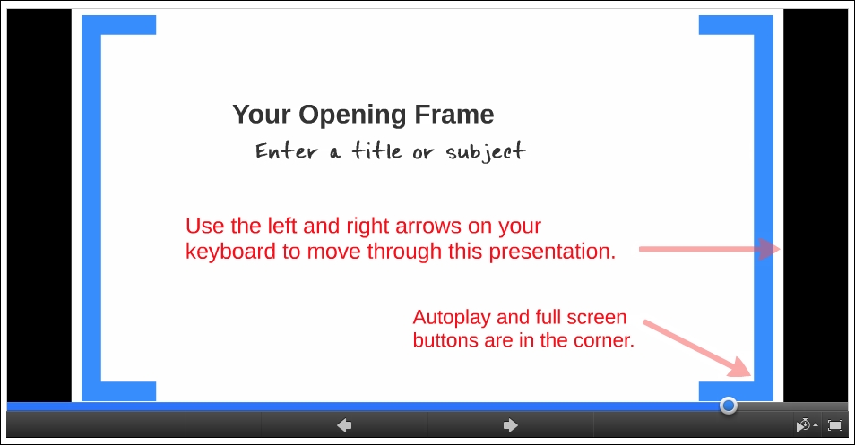
Even if the user hasn't used Prezi before, they should instantly know how to move through the Prezi.
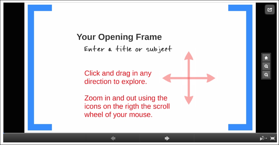
If your Prezi has been designed for the user to explore, then you will need to explain how they can move through the canvas. An example of this is shown in the following screenshot:
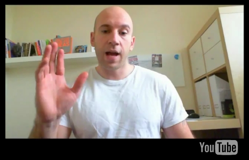
An even more powerful way of giving instructions while also engaging your audience would be to use a video in your very first frame. Using the knowledge you gained in Chapter 7, Inserting a Video, you can create a video that nicely introduces your subject, and also tells the user how to use the Prezi at the same time.
You can create a video and upload it to YouTube. In order to do this:
Adding instructions can really help improve the success of your Prezi. Remember that you don't have the advantage of being there with the person viewing it.
In Chapter 6, Using Audio, you learned how to insert audio into your Prezi. Mastering this skill can be extremely useful when designing for online use. The beauty is that your user will feel as though they are being presented to, and therefore, will be engaged from the start.
In your opening frame, add some narration to introduce the subject and also explain how the Prezi works.
If you designed a Prezi that's completely nonlinear and that users can explore on their own, then good for you. Ensure that your users don't get completely lost in the canvas though; otherwise, they will switch off very quickly.
Aim to strike a balance between allowing them total freedom, and gently directing them to certain areas. You can do this using simple markers to highlight important information.
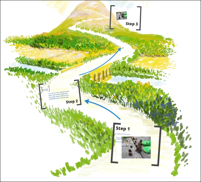
The simplest way of doing this is using bracket frames to clearly highlight where a user can zoom in to view the content. The following image shows a full Prezi canvas that a user can explore. Although the user can zoom anywhere they want to, you can clearly see where content is on the canvas:
You can also add further details within frames as shown in the following image. There is no limit on how many levels of information you can add, but using bracket frames is a clear indicator that there is something here that needs to be viewed.
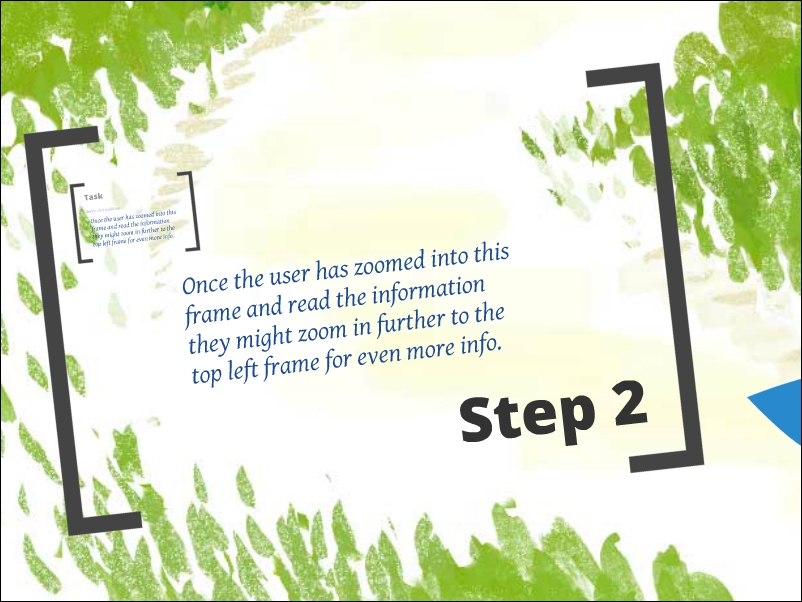
Add levels of content hidden within frames
If you're creating your own imagery, then you might want to be clever with your design and use color to highlight key areas. A good example of this is available at http://prezi.com/jukqtsincrom/the-destruction-of-linear-learning. In this Prezi, the users are encouraged to explore. Some clear instructions are given explaining how to do this, and the areas of important content are in a much brighter color than the rest of the imagery being used. There are no visible frames on the canvas at all.
The following screenshot shows clear instruction and good use of color to highlight key areas:
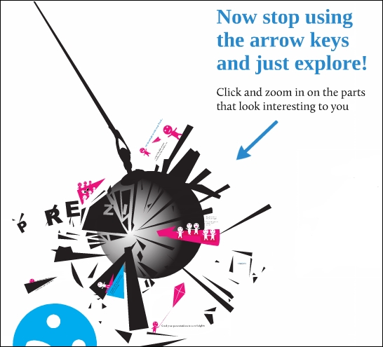
Invisible frames have been inserted around the highlighted areas to make it easier for the user to zoom in with just one click. You can see from this example that it also has another level of content within the frame. If the user spots it and wants to zoom in, they can do so with just one click.
The good thing about using invisible frames is that they won't distract the viewer from any nice imagery you have. On the flip side, it can mean that the viewer misses important information. Using color, arrows, or even icons to highlight key areas is a must for any online Prezi design.
How is your attention span when viewing content online? Like the rest of us, it's probably very low, and only a fraction of your real world attention span. If you use the techniques explained in this chapter so far, you'll be on track to create a very engaging online presentation. What we don't want to do is ruin any initial engagement by creating a Prezi that takes 30 minutes to view from start to finish.
If your Prezi is nonlinear and asks the user to explore on their own, then they'll probably complete it fairly quickly and leave it once they have the content they need.
If your Prezi follows a path, we strongly recommend that you try and design it to be no more than ten minutes long at the absolute maximum. Also, if you do build it to be delivered in over ten minutes, we suggest that you divulge the time it will take in your very first frame.