In this chapter, we will start off by learning about column charts and their plotting options. Then, we will apply more advanced options for stacking and grouping columns together. After that, we will move on to bar charts by following the same example. Then, we will learn how to polish up a bar chart and apply tricks to turn a bar chart into mirror and gauge charts. Finally, a web page of multiple charts will be put together as a concluding exercise. In this chapter, we will cover the following:
- Introducing column charts
- Stacking and grouping a column chart
- Adjusting column colors and data labels
- Introducing bar charts
- Constructing a mirror chart
- Converting a single bar chart into a horizontal gauge chart
- Sticking the charts together
The difference between column and bar charts is trivial. The data in column charts is aligned vertically, whereas it is aligned horizontally in bar charts. Column and bar charts are generally used for plotting data with categories along the x axis. In this section, we are going to demonstrate plotting column charts. The dataset we are going to use is from the U.S. Patent and Trademark Office.
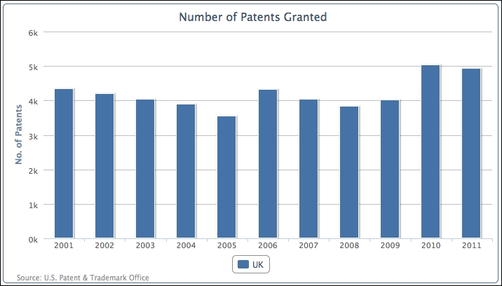
The graph just after the following code snippet shows a column chart for the number of patents granted in the United Kingdom over the last 10 years. The following is the chart configuration code:
            chart: {
                renderTo: 'container',
                type: 'column',
                borderWidth: 1
            },
            title: {
                text: 'Number of Patents Granted',
            },
            credits: {
                position: {
                   align: 'left',
                   x: 20
                },
                href: 'http://www.uspto.gov',
                text: 'Source: U.S. Patent & Trademark Office'
            },
            xAxis: {
                categories: [
                    '2001', '2002', '2003', '2004', '2005',
                    '2006', '2007', '2008', '2009', '2010',
                    '2011' ]
            },
            yAxis: {
                title: {
                    text: 'No. of Patents'
                }
            },
            series: [{
                name: 'UK',
                data: [ 4351, 4190, 4028, 3895, 3553,
                        4323, 4029, 3834, 4009, 5038, 4924 ]
            }]
The following is the result that we get from the preceding code snippet:
Note
This data can be found in the online report All Patents, All Types Report by the Patent Technology Monitoring Team at http://www.uspto.gov/web/offices/ac/ido/oeip/taf/apat.htm.
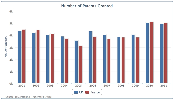
Let's add another series, France:
            series: [{
                name: 'UK',
                data: [ 4351, 4190, 4028, .... ]
            }, {
                name: 'France',
                data: [ 4456, 4421, 4126, 3686, 3106,
                        3856, 3720, 3813, 3805, 5100, 5022 ]
            }]
The following chart shows both series aligned with each other side by side:
Another way to present multi-series columns is to overlap the columns. The main reason for this type of presentation is to avoid columns becoming too thin and over-packed if there are too many categories in the chart. As a result, it becomes difficult to observe the values and compare them. Overlapping the columns provides more space between each category, so each column can still retain its width.
We can make both series partially overlap each other with the padding options, as follows:
            plotOptions: {
                series: {
                    pointPadding: -0.2,
                    groupPadding: 0.3
                }
            },
The default setting for padding between columns (also for bars) is 0.2, which is a fraction value of the width of each category. In this example, we are going to set pointPadding to a negative value, which means that, instead of having padding distance between neighboring columns, we bring the columns together to overlap each other. groupPadding is the distance of group values relative to each category width, so the distance between the pair of UK and France columns in 2005 and 2006. In this example, we have set it to 0.3 to make sure the columns don't automatically become wider, because overlapping produces more space between each group. The following is the screenshot of the overlapping columns:
Instead of aligning columns side by side, we can stack the columns on top of each other. Although this will make it slightly harder to visualize each column's values, we can instantly observe the total values of each category and the change of ratios between the series. Another powerful feature with stacked columns is to group them selectively when we have more than a couple of series. This can give a sense of proportion between multiple groups of stacked series.
Let's start a new column chart with the UK, Germany, Japan, and South Korea.
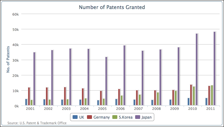
The number of patents granted for Japan is off-the-scale compared to the other countries. Let's group and stack the multiple series into Europe and Asia with the following series configuration:
         plotOptions: {
                column: {
                    stacking: 'normal'
                }
          },
         series: [{
                name: 'UK',
                data: [ 4351, 4190, 4028, .... ],
                stack: 'Europe'
            }, {
                name: 'Germany',
                data: [ 11894, 11957, 12140, ... ],
                stack: 'Europe'
            }, {
                name: 'S.Korea',
                data: [ 3763, 4009, 4132, ... ],
                stack: 'Asia'
            }, {
                name: 'Japan',
                data: [ 34890, 36339, 37248, ... ],
                stack: 'Asia'
            }]
We declare column stacking in plotOptions as 'normal' and then for each column series assign a stack group name, 'Europe' and 'Asia', which produces the following graph:
As we can see, the chart reduces four vertical bars into two and each column comprises two series. The first vertical bar is the 'Europe' group and the second one is 'Asia'.
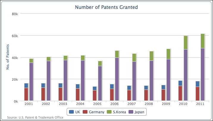
In the previous section, we acknowledged the benefit of grouping and stacking multiple series. There are also occasions when multiple series can belong to a group but there are also individual series in their own groups. Highcharts offers the flexibility to mix stacked and grouped series with single series.
Let's look at an example of mixing a stacked column and a single column together. First, we remove the stack group assignment in each series, as the default action for all the column series is to remain stacked together. Then, we introduce a new column series, US, and manually declare the stacking option as null in the series configuration to override the default plotOptions setting:
          plotOptions: {
                column: {
                    stacking: 'normal'
                }
          },
          series: [{
                name: 'UK',
                data: [ 4351, 4190, 4028, .... ]
            }, {
                name: 'Germany',
                data: [ 11894, 11957, 12140, ... ]
            }, {
                name: 'S.Korea',
                data: [ 3763, 4009, 4132, ... ]
            }, {
                name: 'Japan',
                data: [ 34890, 36339, 37248, ... ]
            }, {
                name: 'US',
                data: [ 98655, 97125, 98590, ... ],
                stacking: null
            }
          }]
The new series array produces the following graph:
The first four series, UK, Germany, S. Korea, and Japan, are stacked together as a single column and US is displayed as a separate column. We can easily observe by stacking the series together that the number of patents from the other four countries put together is less than two-thirds of the number of patents from the US (the US is nearly 25 times that of the UK).
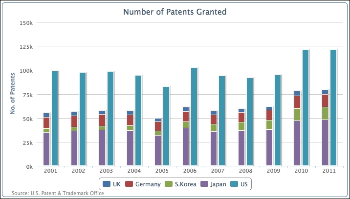
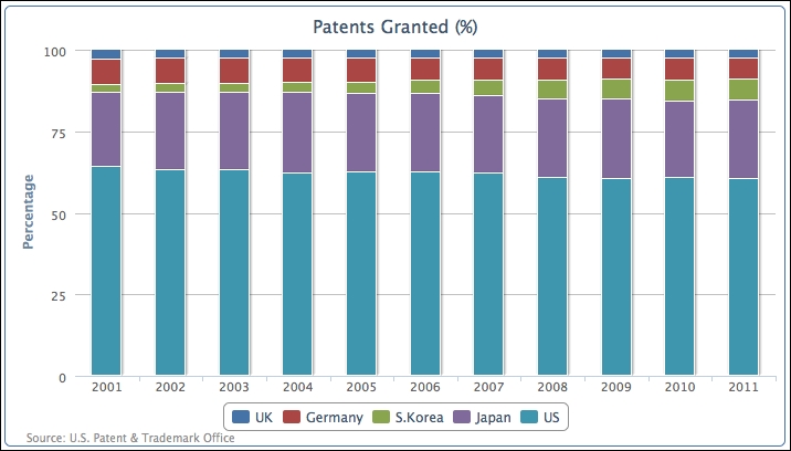
Alternatively, we can see how each country compares in columns by normalizing the values into percentages and stacking them together. This can be achieved by removing the manual stacking setting in the US series and setting the global column stacking as 'percent':
            plotOptions: {
                column: {
                    stacking: 'percent'
                }
            }
All the series are put into a single column and their values are normalized into percentages, as shown in the following screenshot:
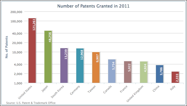
Let's make another chart; this time we will plot the top ten countries with patents granted. The following is the code to produce the chart:
            chart: {
                renderTo: 'container',
                type: 'column',
                borderWidth: 1
            },
            title: {
                text: 'Number of Patents Granted in 2011'
            },
            credits: { ... },
            xAxis: {
                categories: [
                    'United States', 'Japan',
                    'South Korea', 'Germany', 'Taiwan',
                    'Canada', 'France', 'United Kingdom',
                    'China', 'Italy' ]
            },
            yAxis: {
                title: {
                    text: 'No. of Patents'
                }
            },
            series: [{
                showInLegend: false,
                data: [ 121261, 48256, 13239, 12968, 9907,
                        5754, 5022, 4924, 3786, 2333 ]
            }]
The preceding code snippet generates the following graph:
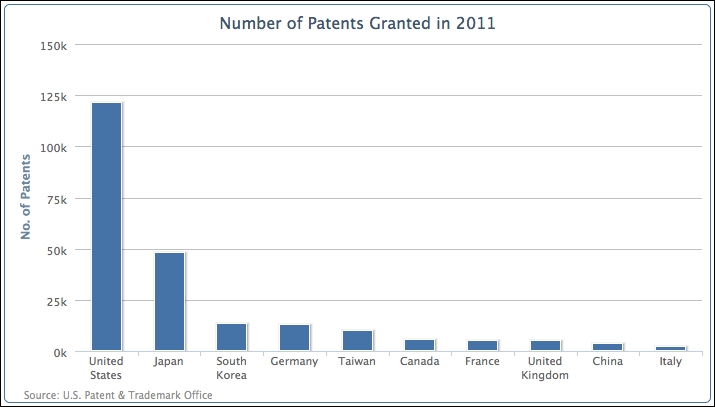
There are several areas that we would like to change in the preceding graph. First, there are word wraps in the country names. In order to avoid that, we can apply rotation to the x-axis labels, as follows:
            xAxis: {
                categories: [
                    'United States', 'Japan',
                    'South Korea',  ... ],
                labels: {
                    rotation: -45,
                    align: 'right'
                }
            },
Secondly, the large value from 'United States' has gone off the scale compared to values from other countries, so we cannot easily identify their values. To resolve this issue we can apply a logarithmic scale onto the y axis, as follows:
            yAxis: {
                title: ... ,
                type: 'logarithmic'
            },
Finally, we would like to print the value labels along the columns and decorate the chart with different colors for each column, as follows:
     plotOptions: {
         column: {
             colorByPoint: true,
             dataLabels: {
                 enabled: true,
                 rotation: -90,
                 y: 25,
                 color: '#F4F4F4',
                     formatter: function() {
                         return
                          Highcharts.numberFormat(this.y, 0);
                     },
                     x: 10,
                     style: {
                         fontWeight: 'bold'
                     }
                 }
             }
         },
The following is the graph showing all the improvements: