
Let's begin our exploration with the dynamic topology approach, using the following as our guidelines. We'll begin with an example instance before moving on to creating our own working examples using a few simple steps:
- We'll start by exploring the concept of DNA using the graph generators familiarized in Chapter 4, Network Patterns. We'll begin with the dynamic graph example, which will be used to illustrate a very simple example of a dynamic network.
- Next, we'll start preparing the data for use in a DNA project, which will allow us to leverage Gephi's built-in capabilities to create time intervals that facilitate dynamic networks.
- Then we'll move on to the process of implementing, and ultimately working with, a dynamic network analysis example in Gephi.
- Finally, we'll end the section with a discussion on what we learned from our example and how we might apply this process to other network datasets.
So without further delay, let's look at a very basic example of DNA as provided using the dynamic graph example from the generators menu.
To begin this process, navigate to File | Generate | Dynamic Graph Example from the Gephi menu system. Selecting this option will create a network with 50 nodes and somewhere upwards of 50 edges (this will vary somewhat randomly). In your workspace, you should see something simple along these lines:
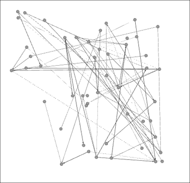
Generated dynamic network graph
This particular graph has 50 nodes and 64 edges, a small, sparse network that will nonetheless illustrate a simple instance of DNA quite effectively. At first glance, this looks like any other network we might see in Gephi, but there is something hidden in the data that is not present in the static graphs. For a quick illustration of how the data differs, take a look at the Nodes tab in the Data Laboratory window:
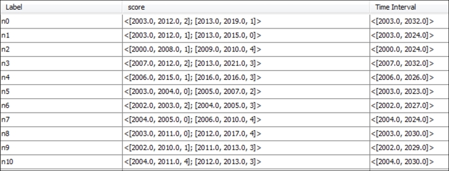
Time intervals for dynamic networks in the Nodes tab
Take a look at the score and Time Interval attributes, where each node has more complex information sets. If you are familiar with XML, or have become acquainted with GEXF (a graph-based variant of XML), you will recognize the data layouts for these attributes. If not, don't worry, as it will be quite easy to understand. What we see here is quite basic—starting with a time interval value that shows when each individual node enters or exits the network, say [2004.0, 2024.0]. In this example, node n7 will appear in the graph in 2004 and remain visible through 2024.
The score attribute will also change in this case, giving us a preview of dynamic attributes, which will be covered in greater detail later in the chapter. For node n7, we see the values [2004.0, 2005.0, 0]; [2006.0, 2010.0, 4], which translates to a score of 0 in the period between 2004 and 2005, followed by a score of 4 for 2006 through 2010. No information is provided for the years through 2024 in this case, although that could also be added.
Now take a look at the Edges tab, specifically the Weight attribute in the following screenshot. Notice the higher level of complexity here, as the relationships between nodes change over time, alternately strengthening or weakening of their respective connections.
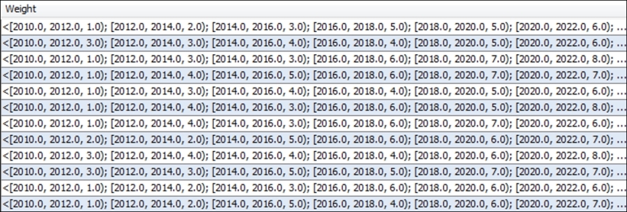
Time intervals across edge weights
Note that the time intervals use both brackets and parentheses for parsing the data. Each interval begins with a bracket, and all end with a closing parenthesis—except for the final interval, which uses a closing bracket to signify the end of the data for a given row.
Now that the data is at least somewhat familiar, it's time to see how this extends to the network graph visualization, using a timeline. This is the key Gephi option for viewing dynamic networks, one which we'll spend more time on in a moment. For now, recognize that the timeline will use our time interval data to build a dynamic network.
Open the timeline by selecting it in your Overview window (it's found at the bottom of the window). You'll see a timeline extending from the start point of 2000 all the way out to about 2037. In its default mode, the entire graph will be displayed. To see how this works, grab the right edge of the timeline and drag it to 2005, and see how the results reflect only those nodes present in the network at that time:
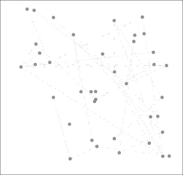
Viewing a network at a point in time with the timeline feature
Now drag the right edge as far to the left as possible, so your entire network is reduced to just those nodes present at the start of the network period. This should leave you with just 6 nodes out of the original 50. Next, click on the large arrow to the left of the timeline to see how the network evolves over the nearly 40-year period. What do we see? Nodes enter the network, connections are formed, nodes leave, connections are broken, and we wind up with just a handful of surviving members in the final years.
If you find the graph changing too rapidly (or too slowly), click on the icon at the bottom-left corner of the timeline, pick the Set play settings option, and change the values using the ensuing dialog screen.
While you might find the dynamic graph example to be less than realistic in its depiction of the way most networks behave, it nevertheless provides a useful foundation for our own explorations. To create our own more sophisticated examples, we can follow a series of steps that result in a final graph that can tell a compelling story.
One essential ingredient for a dynamic network analysis is to have some sort of attribute or attributes that describe one or more units of time. These fields can be in the form of integers, dates, or timestamps, and should correspond with the events in the network at a node level. Here are just a few ideas for what could be represented by one or more of these fields:
- A birth date
- A deceased date
- Date of entry into a network
- Date of removal from a network
- Timestamp of a Twitter tweet
You probably get the idea—virtually any sort of time-related event can be included in a network dataset to help describe specific events, relationships, network entry or exit, network growth, and so on. In cases where networks are fluid, it is very helpful to have attributes representing both start and end points of key behaviors. In the case of dynamic attributes, we will also perhaps want to include some information that reflects changes in stature at a node or edge level.
You needn't worry about merging the data beforehand (although you could use a GEFX format prior to importing to Gephi; more on GEFX later in the chapter), as Gephi makes it very simple to merge individual fields into a time range (start date and end date for example) that can be used to view changes in the network over a span of time. It would be a good idea to populate your network with as many time elements as possible, giving yourself the opportunity to view multiple scenarios in Gephi before deciding which one tells the most compelling story.
Think carefully about what you would like to see in your network graph, as this can save considerable time spent iterating through multiple data pulls. Once you have settled on your general goal for the visualization, there are a few simple guidelines that can make the process as straightforward as possible, especially if the data source is a .csv or other generic file format:
- Make sure your node's file is recognizable when you import it into Gephi. This applies to static as well as dynamic network projects. A critical part of this process is to correctly identify the data type for each attribute. In many instances, Gephi might assume that your data is a string type, even when it actually represents numerical values. Rectifying field types after the import is possible, but it is much more easily done at the outset.
- Your edges table must have source and target values, even when importing an undirected network. Most networks will also benefit with the edge weight values in the data source file.
- If you have multiple node attributes beyond the standard label and ID fields, be sure to import the nodes table before you load an edges table. Otherwise, Gephi will automatically create a nodes table based on the edges data, which will make it very difficult to update your nodes table. Nodes first, edges second.
- Assuming you plan to create time intervals for a DNA (you should be if you are reading this chapter!), be sure to have start and stop points that can be used to build these intervals. Depending on the network you are working with, it is possible to have an open-ended graph, in which case only a start date is required. However, for most networks you will want to have nodes appear and disappear as the graph evolves, so multiple dates are a general requirement.
- Dates can be provided in both a date format that resides in one or more fields in your source data, or they can be manually entered as a calendar date or timestamp when you import timeframes.
We'll see how this all works in a moment as we begin importing files to create our own dynamic networks. Let's begin by taking a look at how to create time intervals using existing attributes, putting into practice some powerful Gephi capabilities.
We're going to use the Red Sox player network familiar to you from Chapter 7, Segmenting and Partitioning a Graph, to illustrate some basic yet powerful capabilities within Gephi. The data can be found at https://app.box.com/s/177yit0fdovz1czgcecp.
Our first section will work with Gephi timelines to display changes in a network.
We'll look at two different ways to make our network dynamic:
- First, from an existing project within Gephi. In other words, we don't need to alert Gephi to the fact that our network has dynamic fields when we initially import the data. All it takes is a few simple steps to convert either date or integer values to time intervals that communicate when nodes are added or removed from the network.
- Second, when we are creating a new project, Gephi provides an option to identify time interval values. If we know from the start that certain attributes will be used for dynamic graphs, this option allows a single process to get the job done.
In either case, our dataset has two fields that will serve as both a starting point and an end point in the following examples. The first, birthYear, represents the calendar year in which an individual was born. Our second field is titled deathYear, and tells us the year a player died, with a null value for those individuals still living.
We'll begin with the existing project approach, followed by a walk through the new project steps.
Adding time intervals to an existing Gephi project is quite simple, provided your dataset already has some date or integer values (months or years, for example) you wish to utilize. We're going to walk through a simple case where we use the birthYear and deathYear attributes to create a time interval attribute.
Here are the simple steps to create an interval from the two existing data fields:
- Navigate to the Data Laboratory window.
- Select the Merge Columns icon at the bottom of the window. This will open a dialog box similar to this:
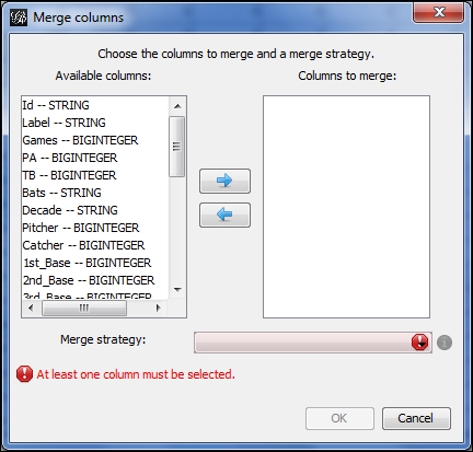
Creating a time interval by merging columns
- Choose the appropriate fields to merge—in this case birthYear and deathYear are the two attributes we wish to combine.
- Next, select the Create time interval option from the drop-down menu and click on OK.
- Now you should see a window similar to this one:
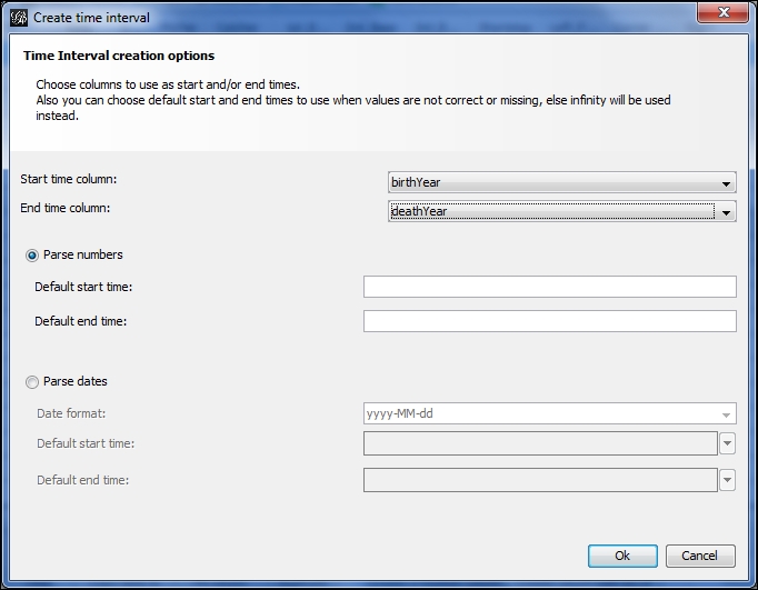
Specifying start and end times for time intervals
- Specify your start and ending time fields—in this case birthYear and then deathYear, and allow Gephi to use the Parse numbers option. Alternatively, you could specify your start and end times, assuming you are familiar with the dataset. This will allow you to set start and end times that could extend beyond the actual time values, which will act as a bit of a fade-in and fade-out for the timeline; Or the interval could be set to start at a midpoint relative to the time values, enabling you to manipulate the number of nodes shown at the start of the timeline process. That's it—you now have a time interval attribute to perform temporal analysis on your network.
This process has put us in position to begin using timelines that power all dynamic networks in Gephi. So at this stage, you are poised to create and view a dynamic network. We'll resume from this point in a few moments, after we have examined some other approaches to move dynamic network data into Gephi. For our next case, we'll assume that you're working with a new project, and would like to specify some time-based attributes from the start.
There are a couple of ways to incorporate time intervals in a new project. The first approach is to have a GEXF file that already has the presence of time intervals—we'll take a look at how to create simple GEXF files later in the chapter. For now, our approach will be to use an already existing one created in Gephi. The second option is to import a series of static network files that can be identified as timeframes, enabling Gephi to recognize time intervals and act accordingly. We'll look at that process as well.
We'll begin with the GEXF option, which involves the import of a single file that is already designed with time intervals. For this example, we'll take the previously used Red Sox player file and save it as a GEXF file, using the Graph file menu located at File | Export, and then select the .gexf option from the list. We now have a file titled redsox_timeline.gexf that can be loaded into Gephi to illustrate the process.
We're going to start a new project with the GEXF file. Proceed to the Open menu under File, and filter on GEXF files if needed until the correct file is located. We'll open the file, which loads the following dialog screen:
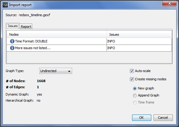
Importing a dynamic network
Notice that Gephi has already identified the presence of a time format while recognizing this is a dynamic network. This will be the case for any GEXF files that include time intervals. We can now begin working with the file using all of the available Gephi tools such as partitioning, clustering, filtering, and so on, and we will also have an immediately available timeline. All we have to do is enable the timeline, just as we did in the dynamic graph example shared earlier in this chapter.
Now that we have seen how easy it is to add time intervals in Gephi, it's time to begin working with them to tell a story. We'll pick up with the existing open project and our already created time interval.
The second option is to layer a series of static networks as timeframes for Gephi to create a dynamic network. Suppose in our case that we have various snapshots of the baseball player file we have been using, taken at specific points in time. In this instance, we'll work with a series of three files, titled redsox1.gexf, redsox2.gexf, and redsox3.gexf. We could also follow this process using .csv or other file formats.
Let's start the process by opening the first of these three files. By navigating to the File | Open menu, we'll locate the redsox1.gexf file and begin the process. Notice how Gephi handles this static file differently than our prior dynamic file:
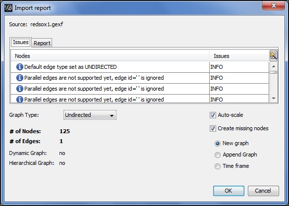
Loading a file as a timeframe
The file is correctly recognized as not dynamic since there is not yet a time interval attribute. Notice also that we have three options at the lower-right of the screen—New graph, Append Graph, and Time frame. In a nondynamic situation, we would typically proceed with the New graph selection, but for dynamic networks we choose the Time frame radio button. This selection gives us the ability to convert static files to a file with time intervals that can subsequently be viewed using the timeline feature. After completing this process, a second dialog is presented, which looks like this:
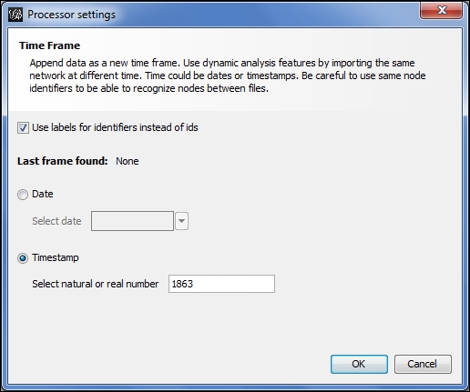
Manually specifying a timestamp for a timeframe
This will help Gephi to orient the timeline based on the underlying time intervals. In this case, I have selected the Timestamp option (the screen defaults to the Date option) and specified the year 1863 to represent the starting point for this layer of the network. After completing this screen, Gephi loads the data as with any other new project, with the exception of the application of time intervals to each of the data fields. A quick examination of the Nodes tab in the Data Laboratory window confirms this process.
The process is then repeated for the second and third files, identifying each as a timeframe, and adjusting the timestamp accordingly. Each subsequent timestamp must be higher than the existing values; for this example, I simply entered 1873 and 1883 for the second and third files, although we could certainly be more precise depending on our underlying data. You might have noticed after importing the second timeframe that the timeline became available, as Gephi now recognizes the presence of time intervals across multiple timeframes. After the final layer is loaded, we can enable the timeline and proceed as in our previous examples.
What we've done here is to build a timeline that starts at 1863 and ends at 1883, and displays the network members relative to those time parameters. In this example, the first file had only players who began their Red Sox career from 1900 to 1909, the second has those from 1910 to 1919, and the third file covers 1920 through 1929. So we are layering their birth year with the start of their individual playing careers, which tells Gephi how to visualize each node throughout the timeline. Some nodes will be present at the start of the graph before disappearing, while others enter the network at later intervals. Here is a glimpse of our data in the Data Laboratory window:
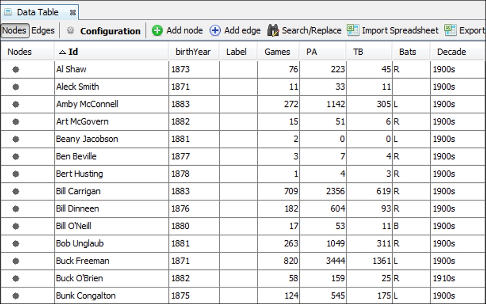
Data Laboratory view with timeline set to 1863 through 1883
Now that we have seen a couple of examples that incorporated timelines, let's have a more focused discussion for how and why we should use them. Timelines are an ideal way to view changes in the structure of a network, based on the time-based entry or exit of members from a network. There are multiple potential uses of timelines, including the following:
- Timelines help to understand the rate at which nodes enter or exit a network. We can thus address questions about how a network evolved, and whether it continues to grow or is deteriorating. Note that you can also run force-directed layouts while the animated graph is playing.
- A timeline can also help us to identify larger patterns, especially when used in conjunction with a layout algorithm or clustering method applied to the network. This gives us the ability to see if new entrants into the network are linked based on their entry time, or whether they disperse across the graph.
- We can also make judgments about how nodes eventually leave a network, and whether this happens in individual or group fashion—do we see entire clusters defecting from the network at a given point in time?
- Finally, timelines can be used as a filter that allows us to quickly investigate portions of the network using time as a driver of network growth or contraction. As we'll see in a moment, timelines cleverly use Gephi's capable filtering and query windows to restrict the graph display to the selected interval.
Consider some of the types of data that might be abetted by the use of timelines—disease contagion networks, Twitter tweet dispersion, retail shopping patterns, and transportation networks, to name but a few. The list of potential applications is virtually unlimited, as you can undoubtedly come up with many more instances where timelines add to the richness of the network analysis.
Another critical factor for the adoption of timelines lies in their intuitive nature. Just as maps make it much easier to understand geographic patterns, timelines convey a similar sense through the simple left to right time flow. For most cultures, this is consistent with the general concept of time movement and facilitates an easy understanding of the evolution of the network.
Now that we have established some of the potential uses and strengths of timelines, let's create one of our own using the previously created time interval. We'll examine some further uses for the timeline as we proceed through the next section.
Working with timelines in Gephi is very straightforward, as we'll demonstrate in this section. To launch the timeline (if it isn't already visible), simply click on the Timeline menu offering under Window. This will load a timeline bar at the bottom of the screen, viewable in all of the primary work areas. You will see text that states Enable Timeline, accompanied by a plus sign. Click on the underlying button, and your previously created timeline will appear, showing the full range of values from 1863 through 2013.
By default, the timeline opens with all values populated, which means you should see a full graph if you are in the Preview window. We'll now work through some quick examples for how to use the timeline to scroll through the graph programmatically and then see how it can be used for some quick filtering.
For our first example, grab the right edge of the timeline using your mouse and drag it as far to the left as possible. This will bring your entire timeline back to the earliest starting values and will leave you with a virtually empty graph. This also sets us up to watch how the network evolves, which we'll do by clicking on the arrow button to the left of the timeline. Click on the arrow and watch our graph change through time, growing as players are born across the years, while also losing members as they die. You can see the entire evolution of the network in a few short seconds.
As you might have anticipated, the network was at its peak somewhere in the mid to late ranges between 1863 and 2013, as the growth in the number of new players being born far exceeded the death rate of those leaving the network. As we near the end of the time range, the size of the network diminishes, due to many of the earlier players dying. You can in fact determine the peak period by stopping the timeline at various intervals (click on the arrow key to pause, then again to resume) and viewing the status of the network in the Context tab.
Let's look at a few stopping points along the way to see how the timeline can help us assess our network at various intervals, noting that the narrowest interval Gephi allows appears to be in the two-year range for this graph (we'll see how to adjust this manually in the section Timelines as filters later in the chapter):
|
Starting Interval |
Nodes |
Edges |
|---|---|---|
|
1875 |
44 |
444 |
|
1900 |
412 |
8,917 |
|
1925 |
735 |
18,337 |
|
1950 |
909 |
23,495 |
|
1975 |
1,119 |
31,210 |
|
2000 |
996 |
30,763 |
A quick glance at the table tells us that the network might have peaked in size somewhere near 1975, with more than 1,100 of the total 1,668 nodes present, and over 31,000 of 51,000 edges active. We can become more precise by examining periods on either side of 1975, but this at least provides a general understanding that the network has in fact shrunk and that it likely peaked in or around the 1970s.
Looking at sheer numbers is far from the only pattern we might wish to examine in any network. Viewing the network at specific intervals could also allow us to see critical junctures in either the growth or dissolution of a network. For instance, what happens to the network if a centrally located member (perhaps a hub) leaves the network? Do others follow en masse, or do they reorient themselves to seek out a replacement for the departed member?
In the case of a contagion, viewing the spread of a pathogen might help to inform researchers about the likely path of future diseases, and how changes in a network structure might alter the path, for better or worse. Nodes that are likely to be key transmitters of the disease could potentially be quarantined for a brief period until the threat of contagion passes.
Timelines can also allow us to see the impact of geography or language on the spread of an idea, an invention, a Twitter hashtag, and many more possibilities. For the moment, let's take a look at how timelines double as filters in Gephi, and learn how to take advantage of that functionality.
As we noted earlier, timelines invoke the Gephi filtering and querying logic, which then allow us to become more precise with setting filter values. In theory, we could get down to a single date in the evolution of a network, perhaps a single hour if our date format permits. In an instance where the timeline is built on a single Twitter hashtag, the ability to view the growth of a network might need to be viewed in hours or even minutes to be useful.
Using our aforementioned baseball player network, let's examine a few of these cases, and see the potential for creatively using timelines together with additional filtering possibilities. To begin, we're going to view the network for players who were alive between 1925 and 1930 to start understanding other attributes within the dataset. Drag both edges (one at a time) of the timeline to define this period, and notice that the Dynamic Range filter is active in the queries window. Here's a view of those members:
Viewing the player network from 1925-1930
We have 777 members remaining of the 1,668 in our total network. We can now treat our timeline filter just as we would any other filter by adding additional conditions from the filter tab. Now let's assume that we wish to see only those players who started their Red Sox career in the 1950s. To do this, drag an Equal filter for the Decade attribute down to the Queries window (as we learned in Chapter 5, Working with Filters) and make it a subfilter of the dynamic range filter already in place. We are now left with just 101 of the 777 nodes.
At this point, we could add further conditions to our filters or even change our timeline settings to view the same conditions for a different time interval, or we could leave things as they are. In either case we should recognize that timelines used as filters provide one more powerful tool for our Gephi toolkit.