
We have explored in detail how to prepare and implement dynamic networks that are topology-based. Now it's time to learn more about implementing attribute-based dynamic networks. We'll begin with a brief review of the fundamental differences between the two, and why we would go to the extra effort of creating dynamic attributes.
As you can recall, in our earlier discussion on topologies we were primarily focused on the changes taking place across and within a network. This included viewing network growth, emerging patterns, changes to the network structure, and perhaps, eventual dissolution of the network. At the risk of oversimplifying, our goal was to understand the collective network, rather than focusing on changes to its individual members.
In contrast, the dynamic attribute approach is heavily oriented toward seeing changes within individual nodes and their relationships to others in the network. To be sure, we can also see some more wholesale changes to the entire network, but the goal is to understand changes at the individual node level. A few of the questions we might ask include:
- When did the node enter the network?
- Did it grow over time, and if so at what rate?
- Was the node a hub through which other nodes connected?
- Did it maintain a relationship with other nodes over a long period, or did it become associated with an entirely different peer group at some point in the network evolution?
With these somewhat different facets to focus on, our approach to create and prepare the network dataset will differ slightly. The general concept is identical, but we need be certain about what we are seeking to understand, with respect to the node behavior.
We previously walked through how to prepare the data for a dynamic network based on topological changes. Let's follow a similar process for dynamic attribute analysis, making adjustments where needed.
Rather than merely focusing on specific dates where changes occur, we are now highly interested in the level of change; in other words, when Node A changed status at Time B, how significant was the change? To do this, our dataset will require measurable fields such as scores, weights, degrees, or some other quantifiable value that can be shown through color or size changes in Gephi.
These changes will still need to be associated with time intervals in order to create the dynamic network, but our focus has clearly shifted toward viewing individual changes versus network-wide shifts. Consistent with this shift, there are a few considerations to bear in mind when preparing data for an attribute-based dynamic network.
As you might have guessed, if we are to view changes in the structure of network attributes such as nodes and edges, we will need to be certain that our source data has the necessary elements. Now, in addition to the still critical time values, we will want to add other values that are essential to reflect the changing nature of the network. A few possible time-based values to think about include:
- Values that reflect changes in the stature of individual nodes. These could be in the form of weights, sizes, dollar values, populations, or any of hundreds of other measurable values that could be found in a network. These values are most often displayed through changes in the size of nodes, but could also be used to show color changes.
- Values that affect the status (as opposed to stature) of a node can be effectively used in a dynamic network analysis. These might reflect shifts from one category to another, or could also be used to reflect the relative level of some measurable value, perhaps on a 0-100 scale. These types of values will frequently be seen through changes in color.
- Dynamic edge weights can also be used effectively to show structural changes within a network over time. Changes to the relationships between individual nodes or node neighborhoods can be more easily detected if edge weights are calibrated to reflect these shifts.
Exactly what these nodes and edges measure is up to you, but you will likely want to use variables that show enough relative change that can be viewed within the graph.
Given the higher degree of focus on the behavior of individual nodes within a network, we're going to spend some time on a variety of techniques that will highlight changes at the node and edge levels. Much of this will involve using color and size as measures of change, both positive and negative.
So let's begin with nodes, as they will often show changes that are easier to detect when first viewing a dynamic network. We'll walk through a couple of examples—one dealing with changes in size, as dictated by a measurable attribute of the node, followed by another that uses changes in color intensity to display changes in a second attribute.
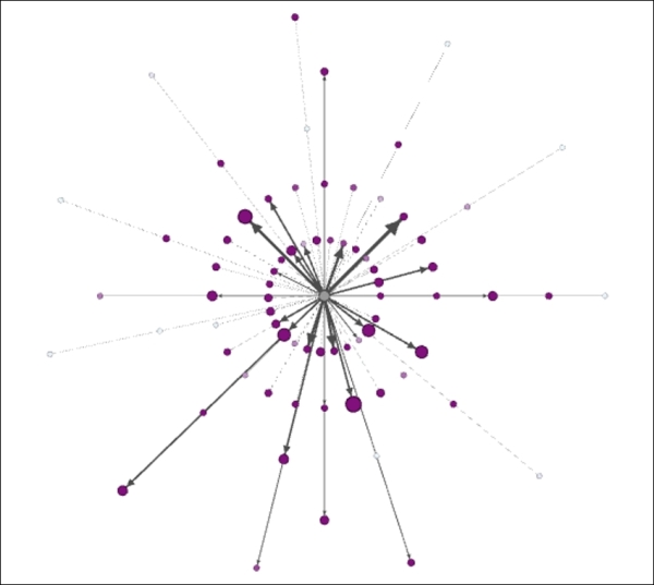
Let's return to our Red Sox player network and illustrate how to use dynamic sizes in a simple case where an individual player has a single size value that is combined with the time intervals we saw previously. We'll then move to a more complex example where values change for many of the individual nodes.
For our initial instance, we're going to look at the number of seasons played by each individual who ever suited up for the team. Remember that we still have the time intervals that govern when each node appears and disappears (or not), based on each individual's birth and death years. We are now simply adding a size-based variable based on the number of seasons played. So let's begin.
Make sure you have the Red Sox detail timeline file loaded if you wish to follow along. Once the project is loaded, we're going to follow these steps:
- Move to the Ranking window, and select the Nodes tab.
- Find the SeasonsInteger field in the drop-down list. We're going to focus on size rather than color, so make sure you're in the size window.
- You will notice that the data values range from 1 to 23, based on the number of seasons played. Set the Min size value to
2and the Max size value to50. - Now click on the very small icon to the left of the Apply button. This will enable the Auto Apply option, which will ensure that time-based values change at the appropriate time interval. For this example, this will be less critical, but for future cases where a single node might have many values, this is a critical step.
- Click on the Auto Apply button.
- Drag the timeline to the far left of the window, and make it as small as possible by dragging the right edge until it stops. This will give you a small window of about two years duration.
- Start the timeline animation by clicking on the large arrow. Here's how your settings should look:
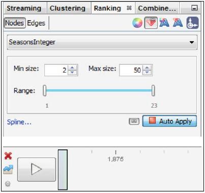
Settings for dynamic network graph example
Now you can watch the dynamic network evolve, seeing both the evolution of the network, as we saw previously, as well as the players who logged many seasons appearing as outsized nodes in the graph. If the network is moving too rapidly for your taste, select the small icon to the left of the timeline arrow and adjust the time settings accordingly.
As we saw earlier, we also have the ability to stop the network animation at any point by clicking a second time on the timeline arrow. We can also take snapshots of the network by manipulating the timeline to include the time interval we desire. Let's have a look at how this works, by dragging the left and right edges to show us the graph from 1920 to 1930. Here's the result:
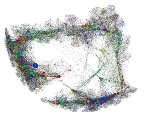
Viewing the player network from 1920-1930
This shows us all the players who were alive in the 1920 to 1930 window, regardless of whether they were retired, active, or future players. We can also see a few prominent nodes who will or already did play many seasons for the team.
If we shift the timeline from 1940 to 1950, the graph grows accordingly, as many of the older players are still alive, and many additional younger players have now been born:
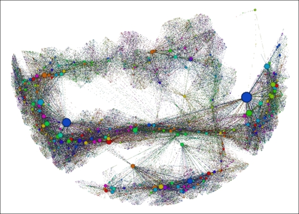
Viewing the player network from 1940-1950
Most of the prior network is still visible, and a sizable section has grown to the right of the earlier graph. In particular, there is a highly visible large hub node present in the new area of the graph. Let's view one more, encompassing from 1970 to 1980, and see the results:
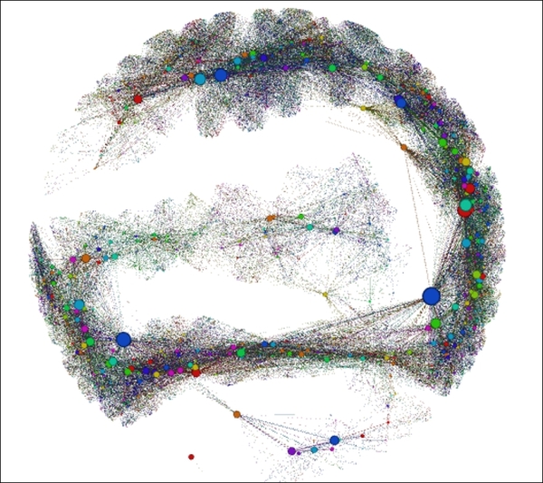
Viewing the player network from 1970-1980
Now the graph has grown to show many more nodes, although a portion of the earlier ones have departed the network. These snapshots show some of the power of using time intervals and the timeline itself, but the real power comes in interacting with the graph in Gephi, exploring, animating, and learning more about your network the entire time.
Once you have this sort of dynamic template set up you can always substitute another variable in place of seasons, as long as it is in the correct numeric format. Then just repeat the above process to see how the new variable changes relative to time.
This was a simple example, in that each node had a static value from the time it entered the network until it is either removed or the timeline simply comes to an end. So we're not completely dynamic yet; for that to happen we need to change the values that correspond with time intervals at the node level. So let's move on to a more complex network, at least from the perspective of changing node values.
Let's look at another example that incorporates changing attribute values across multiple time periods. For this illustration, we're going to use some airline data made available through the US Department of Transportation website at http://www.rita.dot.gov/bts/sites/rita.dot.gov.bts/files/subject_areas/airline_information/index.html.
This site plays host to a variety of transportation statistics. What we'll be working with is the data that tabulates travel patterns between US airports by both domestic and international carriers. These files can be very large depending on the data variables you choose to download. For this example, we're going to reduce the data to examine travel patterns originating at a single airport over the course of three calendar months. This will provide us with enough data to make for an interesting graph, but not so much as to lose focus on our goal of showing dynamic attributes. The files are available at https://app.box.com/s/177yit0fdovz1czgcecp for you to download if you wish to follow along.
Our goals for the network graph can be summarized as follows:
- We want to be able to understand the general passenger volume patterns flying from our base airport to dozens of destinations
- We would like to see changes by time period in the number of passengers flying to specific destinations
- We would also like to understand how many carriers are flying from the host airport to each destination
- Finally, it would be nice to detect changes in the number of carriers from one time period to the next
The data I've selected for this example is designed to accommodate each of these goals. It is comprised of a single host airport (Baltimore Washington International (BWI) in this case) that flies passenger flights to more than 70 domestic locations. This should enable us to fulfill our goal.
The dataset includes three time periods—January, February, and March 2014 calendar months. Thus, we should be able to detect any significant changes in passenger volume by calibrating node sizes to these volumes. This will address our second goal.
If we use the number of carriers to set edge weights (that is, how many airlines fly from BWI to Atlanta) then we should be able to address the third goal as well as the fourth, assuming there are any changes in the number of carriers within this limited timeframe.
The process we will follow is to manipulate the data files to create node and edge files for each of the three time periods, using an identical format in each case. These files can then be processed using Gephi to create three individual timeframes for our eventual dynamic network. So let's begin with the process, starting with the January file. I happened to use Excel for this process, but feel free to use whichever tool you feel comfortable with to create the .csv files.
We'll follow the familiar process for loading these files using the Gephi's capabilities of Import spreadsheet found in Data laboratory:
- Import the node file first. This includes fields for
Label,ID,Passengers,Distance, andDistance Group, a categorization used to classify flights by relative distance. - Now import the edges table. This will include just three fields—
Source,Target, andWeight, which is based on the number of carriers flying a route, as discussed a moment ago. - Go to the Overview window and select a layout. For this example, the Layered layout seems appropriate, using the Distance Category (1-5) to construct an easy-to-understand network structure. Apply this layout.
- Size your nodes in the Ranking tab, using Passengers as the attribute value. Adjust the scaling accordingly—I reduced the upper bound so the overall volume associated with the host airport doesn't affect the sizes of the destination airport nodes.
When you've completed each of these steps, your graph should resemble this:
First look at an airline destination network
We can see BWI in the center, surrounded by concentric rings based on the relative distances from the host airport—those with a distance category of 1 are in close proximity, while airports with a 5 are at the far edges of the graph. We can also see by the edge thickness which airports have the most carriers arriving from BWI. The node sizes also tell us where customers are flying. All in all, this is a fairly informative graph. However, our job is not complete—we need to repeat this process for the following two months to answer the remaining questions posed earlier.
Before moving to the February data, be sure to export your current work as a .gexf file, so it can be loaded as one of our three timeframes. Then repeat the exact process using the February and March files. After each of these is exported to a .gexf format, we'll have the three time-based components for our dynamic network.
Now we move on to the fun part, where we layer the three .gexf files into a single Gephi project. Following these steps will result in a useful dynamic graph that shows month over month changes in the flight patterns emanating from BWI.
- Open a new project in Gephi.
- Use Open under File and locate your respective
.gexffiles. - Import the January file by following the screen prompts. Set Date to
January 1, 2014using the built-in calendar. - Repeat the process for the February and March files, setting Date to
February 1, 2014andMarch 1, 2014respectively. This will give the Gephi timeline the parameters for applying time intervals.
When all of the steps have been completed, enable your timeline. Remember to apply Passengers as the node size attribute in the Ranking tab, and make certain that this will be applied across all time intervals using the Enable auto transformation icon to the left of the Apply button. As you can recall from earlier in this chapter, this will activate the Auto Apply button that enables attribute changes across time intervals.
At this point you can elect to change your layout, apply colors using a partition, and so on. In certain cases, you will even be able to check dynamic graph statistics, although that capability is especially geared to more granular time elements, as opposed to the simple monthly categories used here. Nonetheless, four useful measures can be found in the Statistics | Dynamic tab:
- The # Nodes statistic will track the growth (or decline) in the number of nodes at various intervals within the timeline
- Similarly, the # Edges statistic will do the same for edge counts
- The Degree calculation will look at the number of degrees at a given interval and can be set to simply provide the average degree level
- Finally, the Clustering Coefficient measure can provide insight into how the network is evolving over time, based on clustering levels
Each of these will provide time series views over the specified time window set using the timeline.
In this instance, I opted to change the layout to a Dual Circle layout, using BWI as the only member of the inner circle, resulting in the following graph:
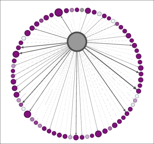
Dynamic airline network snapshot using dual circle layout
One further tweak was to partition the graph using the aforementioned distance group field, resulting in six distinct colors—one for BWI, and a total of five for all the destination airports. The result is similar to the preceding snapshot:
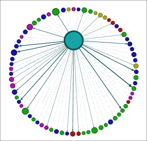
Dynamic airline network partitioned by distance group
You can verify dynamic changes in the graph by running the timeline and observing small changes in node and edge sizes as January changes to February and February to March. While the changes here are slow and somewhat subtle, I hope this provides a bit of insight into what can be done using smaller units of time, such as weeks, days, hours, minutes, and even seconds. The possibilities are almost infinite, depending only on the detail in your data and the processing power of your computer.
We've now seen a few examples of how to visualize networks with dynamic attributes, using files that were previously imported to and enhanced in Gephi. Next, we'll take a brief look at how to create your own GEXF files that will support the creation of dynamic networks.