
Any component can be enhanced with the droppable behavior. Droppable components are targets for draggable ones. To enable the droppable functionality on any PrimeFaces component, we always need a component called droppable.
In this recipe, we will see how to define droppable targets and will learn a client-side callback onDrop.
A component can be made droppable by using p:droppable. The component ID must match the for attribute of p:droppable. If the for attribute is omitted, the parent component will be selected as a droppable target. We will take two h:panelGroup components and make them droppable and draggable, respectively. In addition, we will define a client-side callback that gets invoked when a draggable component is dropped. This can be accomplished by the onDrop attribute, which points to a JavaScript function.
<h:panelGroup id="drop" layout="block" styleClass="ui-widget-content"
style="height:150px; width:300px;">
<p class="ui-widget-header" style="margin:0; padding:5px;">
Drop here
</p>
<p:droppable onDrop="handleDrop"/>
</h:panelGroup>
<br/>
<h:panelGroup id="drag" layout="block"
styleClass="dragDiv ui-widget-content">
<p>Drag me to my target</p>
</h:panelGroup>
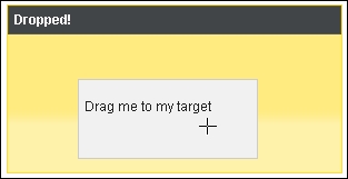
<p:draggable for="drag"/>The client-side callback highlights the droppable h:panelGroup component and adds the text Dropped! to the paragraph tag p, when invoked.
function handleDrop(event, ui) {
  $(event.target).addClass("ui-state-highlight").
    find("p").html("Dropped!");
}
The following screenshot shows the result after dropping the draggable h:panelGroup component onto the droppable one:
The onDrop callback gets two parameters: event and ui, which are objects holding information about the drag and drop event. The droppable target is accessible by event.target. We use this fact to add the style class ui-state-highlight to the target. This class is defined by jQuery ThemeRoller.
Note
The event parameter is the original browser event, and ui is a prepared object with the following properties:
ui.draggable: This is the current draggable element, a jQuery objectui.helper: This is the current draggable helper, a jQuery objectui.position: This is the current position of the draggable helper as the{top, left}objectui.offset: This is the current absolute position of the draggable helper as the{top, left}object
- The most important style classes defined by jQuery ThemeRoller are described in the Understanding structural and skinning CSS recipe in Chapter 2, Theming Concepts
- Advanced configuration and use cases of
droppablewill be discussed in the remaining three recipes of this chapter, that is, Restricting dropping by tolerance and acceptance, AJAX-enhanced drag and drop, and Integrating drag and drop with data iteration components
This recipe is available in the demo web application on GitHub (https://github.com/ova2/primefaces-cookbook/tree/second-edition). Clone the project if you have not done it yet, explore the project structure, and build and deploy the WAR file on every Servlet 3.x compatible application server, such as JBoss WildFly or Apache TomEE.
The showcase for the recipe is available at http://localhost:8080/pf-cookbook/views/chapter8/droppable.jsf.