
The blockUI component allows us to block any piece(s) of a page during AJAX calls. Blocking is initiated by one or more trigger components. The blockUI component adds a layer and any custom content over the target elements to be blocked and gives the appearance and behavior of blocking user interaction. It is very handy if you have, for example, a large dataTable component, and sorting, filtering, and pagination takes much time. You can block almost everything—even the entire page.
In this recipe, we will implement p:panel and p:dataTable that are blockable in order to learn all the features of p:blockUI.
The panel component in the following code snippet gets blocked when the command button is clicked on and gets unblocked when the AJAX response is received. We will see a semitransparent layer over the panel, which blocks user interactions within it. The action listener on the command button simulates a long-running task. The following code encapsulates this discussion:
<p:panel id="panel" header="Blockable Panel"
style="height:90px;">
Click on Save to block me.
<p:commandButton id="saveBtn" value="Save"
actionListener="#{blockUIBean.doSomething}"
style="margin:10px;"/>
</p:panel>
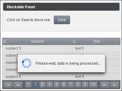
<p:blockUI block="panel" trigger="saveBtn"/>The following example demonstrates a dataTable component that gets blocked on pagination and sorting. The blockUI component displays custom content with an animated image and the text Please wait, data is being processed...:
<p:dataTable id="dataTable" var="message"
  value="#{blockUIBean.messages}"
  paginator="true" rows="5" ...>
  <p:ajax event="page" listener="#{blockUIBean.doSomething}"/>
  <p:ajax event="sort" listener="#{blockUIBean.doSomething}"/>
  <p:column sortBy="#{message.subject}">
    <f:facet name="header">
      <h:outputText value="Subject"/>
    </f:facet>
    <h:outputText value="#{message.subject}"/>
  </p:column>
  <p:column sortBy="#{message.text}">
    <f:facet name="header">
      <h:outputText value="Text"/>
    </f:facet>
    <h:outputText value="#{message.text}"/>
  </p:column>
</p:dataTable>

<p:blockUI block="dataTable" trigger="dataTable">
  <h:panelGrid id="blockContent" columns="2"
    style="table-layout:auto;">
    <h:graphicImage library="images" name="ajax-loader.gif"
      style="margin-right:12px; vertical-align:middle;"/>
    <h:outputText value="Please wait, data is being processed..."
      style="white-space:nowrap;"/>
  </h:panelGrid>
</p:blockUI>
The following screenshot shows the blocked dataTable component when the user has clicked on page 2:
BlockUI requires the trigger and block attributes to be defined. The trigger attribute defines a search expression for the component that sends an AJAX request and blocks triggers. The block attribute defines a search expression for the component to be blocked.
Tip
Chapter 1, Getting Started with PrimeFaces, provides more details on search expressions.
In the first code snippet, we pointed the trigger attribute to the button's ID, saveBtn, and in the second one to the table's ID, dataTable. The block attribute points to the panel's ID, panel and to the table's ID, dataTable, respectively. In the case of dataTable blocking, we placed custom content inside the p:blockUI tag. In this way, we can display any content we want.
There are two widget methods to be used on the client side. The show() method blocks the specified component and the hide() method unblocks it. They can be used in the onstart and oncomplete callbacks respectively.
This recipe is available in the demo web application on GitHub (https://github.com/ova2/primefaces-cookbook/tree/second-edition). Clone the project if you have not done it yet, explore the project structure, and build and deploy the WAR file on application servers compatible with Servlet 3.x, such as JBoss WildFly and Apache TomEE.
The showcase for the recipe is available at http://localhost:8080/pf-cookbook/views/chapter11/blockUI.jsf.