
How to customize theme styles is one of the most asked questions by the PrimeFaces users. There are simple rules to be followed to overwrite bundled theme styles with custom CSS. There is no need to edit bundled themes and repackage theme JAR files.
In this recipe, we will present two examples for theme customization—one for selectOneMenu and another for the tree component. We will see how to change styles for a particular component or for all components of the same type. The reason to do that could be a company style guide with the need to maintain corporate identity throughout all applications. Furthermore, we will learn tips for customizing default styles on input components.
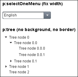
Let's set a fixed width for p:selectOneMenu and remove the background and border for p:tree. The default width of p:selectOneMenu is calculated at runtime. That means, the width of p:selectOneMenu is dynamic and depends on its content (select items). Large select items cause large p:selectOneMenu. A fixed width would sometimes show a better p:selectOneMenu for items with a short text. p:tree without background and border could better fit a custom design in certain circumstances. This is demonstrated in the following screenshot:
The corresponding XHTML part looks as follows:
<h:panelGrid styleClass="customStyles">
  <h3>p:selectOneMenu (fix width)</h3>

  <p:selectOneMenu value="dummy">
    <f:selectItem itemLabel="English" itemValue="en"/>
    <f:selectItem itemLabel="German" itemValue="de"/>
    <f:selectItem itemLabel="Russian" itemValue="ru"/>
  </p:selectOneMenu>

  <h3 style="margin:20px 0 0 0;">
    p:tree (no background, no border)
  </h3>

  <p:tree value="#{treeController.root}" var="node">
    <p:treeNode>
      <h:outputText value="#{node}"/>
    </p:treeNode>
  </p:tree>
</h:panelGrid>
The most interesting part is CSS. Our aim is to customize styles for only two particular components which are placed below a h:panelGrid with style class customStyles. Use namespacing to do this. Simply prepend the .customStyles style class to the PrimeFaces styles:
.customStyles .ui-selectonemenu {
  width: 157px !important;
}

.customStyles .ui-selectonemenu .ui-selectonemenu-label {
  width: 130px !important;
}

.customStyles .ui-tree {
  border: none;
  background: none;
}Any other CSS selector can be used for namespacing too, but the use of ID is not recommended. ID in CSS is a component's client ID—an ID in the generated HTML. This is normally not the ID used in facelets (XHTML files). JSF prepends IDs of parent components that extend NamingContainer (for example, h:form or p:dataTable) while generating client IDs. It has disadvantages such as:
- The default separator for
NamingContaineris a colon which should always be escaped in CSS by a backslash - A style class can be used several times, while an ID can only be used once
- IDs can be changed accidentally while refactoring and developers have to change the client IDs in CSS too
Namespacing is not needed if you want to change styles for all components of the same type. In this case, .customStyles should be omitted.
Use h:outputStylesheet to add custom CSS files to your JSF application. An example:
<h:outputStylesheet library="css" name="customStyles.css"/>
Custom styles will be rendered after the PrimeFaces theme (skinning) and component (structural) styles. The correct output is ensured by the PrimeFaces resource ordering. Therefore, custom styles, being rendered after PrimeFaces ones, overwrite the default settings.
We used the !important keyword to set a fixed width for the container and the label of selectOneMenu. This was necessary because selectOneMenu renders the width as an inline style in HTML markup, for example, style="width:76px". Inline styles always have the highest specificity and win against IDs and other CSS selectors. The different weight of selectors is usually the reason why your CSS rules are not applied to some elements, although you think they should have.
Note
You can learn about CSS specificity (weight of selectors) at World Wide Web Consortium (W3C) http://w3.org/TR/CSS21/cascade.html#specificity.
To remove the default border and background settings for Tree, we applied the none keyword on the border and background properties.
Generally, to distinguish between input and non-input elements, there is a style class ui-inputfield assigned to every input element. Examples of components with ui-inputfield are p:inputText, p:inputTextarea, p:calendar and p:spinner. There are also additional CSS selectors on those elements such as ui-state-disabled. They affect the look and feel for various states. To modify default styles on input components, we should overwrite the style classes ui-inputfield, ui-state-disabled, ui-state-error, ui-state-default, ui-state-focus, and so on. In the following code snippet, we have removed the border, background and shadow on input components. Furthermore, we have changed the styling of disabled inputs and assigned a custom background to the ui-state-error style class, which is applied to inputs when the validation fails:
.ui-inputfield {
  background: #ffffff;
  -moz-box-shadow: none;
  -webkit-box-shadow: none;
  box-shadow: none;
  color: #000000;
}

.ui-inputfield.ui-state-focus {
  -moz-box-shadow: none;
  -webkit-box-shadow: none;
  box-shadow: none;
}

.ui-inputfield.ui-state-default {
  background: none;
  border: 1px inset;
}

.ui-inputfield.ui-state-disabled,
.ui-state-disabled .ui-inputfield {
  background-color: #8F8F8F;
  border: solid 1px gray;
}

.ui-inputfield.ui-state-error,
.ui-state-error .ui-inputfield {
  background-color: #F43939;
}
We write .ui-inputfield concatenated with .ui-state-default, .ui-state-disabled, .ui-state-error, .ui-state-focus, and so on. because these style classes are defined on the same HTML elements.
The order of resource rendering may be broken when you use dynamic includes (the ui:include tag with the dynamic src attribute bound to a bean). CSS resources for dynamic included component tags, which were not presented on the page before including, are being added to the head as the last elements. That means that the existing custom styles will be rendered before, and not after, the newly added PrimeFaces styles.
This recipe is available in the demo web application on GitHub (https://github.com/ova2/primefaces-cookbook/tree/second-edition). Clone the project if you have not done it yet, explore the project structure, build, and deploy the WAR file on every Servlet 3.x compatible application server such as JBoss WildFly or Apache TomEE.
The showcase for the recipe is available at http://localhost:8080/pf-cookbook/views/chapter2/customThemeStyles.jsf.
- Refer to the Improved resource ordering recipe from Chapter 1, Getting Started with PrimeFaces, for better understanding of PrimeFaces resource ordering