
To provide skinning, selectBooleanCheckbox and selectManyCheckbox extend the default JSF components <h:selectBooleanCheckbox> and <h:selectManyCheckbox>, respectively.
Basic definitions for selectBooleanCheckbox and selectManyCheckbox would be as follows:
<p:selectBooleanCheckbox
  value="#{selectCheckboxBean.selectedValue}" />

<p:selectManyCheckbox
  value="#{selectCheckboxBean.selectedCountries}">
  <f:selectItem itemLabel="Turkey" itemValue="Turkey" />
  <f:selectItem itemLabel="Germany" itemValue="Germany" />
  <f:selectItem itemLabel="Switzerland" itemValue="Switzerland" />
</p:selectManyCheckbox>
Adding labels to the checkbox is easy with the itemLabel attribute. The itemLabel attribute displays a label next to the checkbox:
<p:selectBooleanCheckbox
  value="#{selectCheckboxBean.selectedValue}"
  itemLabel="#{msg['selectBooleanCheckbox.label']}" />
The text that will be rendered right next to the checkbox component with the itemLabel attribute can also be clicked to select/deselect the checkbox. The msg resource bundle variable given in the example is defined in faces-config.xml.
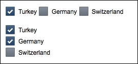
The direction of contents of the selectManyCheckbox component can be changed from the default horizontal rendering to vertical by setting the layout attribute with the pageDirection value. The output for both horizontal and vertical rendering of the example given in the basic definition is shown in the following screenshot:
The layout of selectManyCheckbox can be customized with its columns attribute, which would specify the maximum number of allowed columns. When it's exceeded the number of SelectItem elements given, a new row will be created automatically.
It's also possible to get the state of the checkbox at the client-side via JavaScript. To achieve this, the widgetVar attribute needs to be specified to the component. The widgetVar attribute defines the client-side variable, which has various responsibilities, such as progressive enhancement of the markup and communication with the server-side via AJAX. It can also be used directly from the JavaScript code as follows:
<p:selectBooleanCheckbox
  value="#{selectCheckboxBean.selectedValue}"
  widgetVar="mySelection" />

<p:commandLink value="Alert Selection"
  onclick="alert(PF('mySelection').isChecked());" />
Within the alert method of the onclick event of commandLink (a client-side JavaScript call), the state will be retrieved by the mySelection.isChecked() code section. The checkbox component is being accessed by mySelection, which is the name of the client-side widget variable of the checkbox.
We can also invoke server-side code when the checkbox is checked/unchecked. The definition will update the growl message component when it's clicked:
<p:selectBooleanCheckbox
  value="#{selectCheckboxBean.selectedValue}">
  <p:ajax update="growl"
    listener="#{selectCheckboxBean.addMessage}" />
</p:selectBooleanCheckbox>
The server-side addMessage method that is called for adding the actual message is as follows:
public void addMessage() {
  String summaryKey =
    selectedValue ? "checkbox.checked" : "checkbox.unchecked";
  MessageUtil.addInfoMessage(summaryKey);
}
This will add a Faces message that corresponds to the given key from the defined resource bundle.
This recipe is available in the demo web application on GitHub (https://github.com/ova2/primefaces-cookbook/tree/second-edition). Clone the project if you have not done it yet, explore the project structure, and build and deploy the WAR file on every Servlet 3.x compatible application server, such as JBoss WildFly or Apache TomEE.
The showcase for the recipe is available under http://localhost:8080/pf-cookbook/views/chapter3/selectBooleanCheckboxSelectManyCheckbox.jsf.
For details about the MessageUtil class, see the Internationalization (i18n) and Localization (L10n) recipe in Chapter 1, Getting Started with PrimeFaces.