
The calendar component is used to provide date input with customizable features, such as localization, paging of months, and restriction mechanisms on the date selection.
The simplest component declaration for a basic date selection would be as follows:
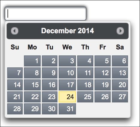
<p:calendar value="#{calendarBean.date}" />This renders an input text that opens a pop-up date selection dialog when clicked, as shown in the following screenshot:
The pop-up visual of the calendar can also be configured to render as an inline visual on the page with the mode attribute, as follows:
<p:calendar value="#{calendarBean.date}" mode="inline" />The default value of mode is popup. It is also possible to render multiple months side by side on the page with the pages attribute:
<p:calendar value="#{calendarBean.date}" pages="3"
  mode="inline" />
Paging will start with the month that the given date exists in, and will continue with the number of months specified by the pages attribute. The inline attribute can also be used along with the paging to display, for instance, three months in a row, as in the preceding example.
The attribute showOn defines a client-side event that displays the pop-up calendar. The value button can be specified with the showOn attribute to render a button right next to the input text field to show the pop-up calendar when clicked. The default value for the showOn attribute is focus, which will render the popup when the input field gets the focus.
The mindate and maxdate attributes set the calendar's minimum visible and maximum visible dates. With the following example, the calendar will be rendered with three days available for selection, which are yesterday, today, and tomorrow.
<p:calendar id="restrictedDates" value="#{calendarBean.date}"
  mode="inline"
  mindate="#{calendarBean.yesterday}"
  maxdate="#{calendarBean.tomorrow}" />
It's also possible to disable the manual input on the input text of a pop-up calendar by setting the readonlyInput attribute to true.
The pattern attribute defines the date format that will be applied for localization. A pattern given as dd.MM.yyyy will result in a value like 07.01.2015. A pattern given as EEE, dd MM, yyyy will result in the value Wed, 07 Jan, 2015 for the same date.
It's also possible to invoke a server-side method instantly when a date is selected. The calendar component provides the dateSelect AJAX behavior event that will be fired instantly when a date is selected:
<p:calendar value="#{calendarBean.date}" mode="inline">
  <p:ajax event="dateSelect"
    listener="#{calendarBean.onDateSelect}" update="growl" />
</p:calendar>
The onDateSelect method will be invoked with org.primefaces.event.DateSelectEvent. The current value of the calendar can be retrieved with event.getDate(), and a Faces message could be added with the current date, as in the following code snippet:
public void onDateSelect(DateSelectEvent event) {
  Date date = event.getDate();
  MessageUtil.addInfoMessage("selected.date", date);
}Defining the locale value to the locale attribute provides the localization of the calendar. Definition of a calendar in a Turkish locale would be as follows:
<p:calendar locale="tr" mode="inline" id="trCal"/>
The calendar component uses a shared PrimeFaces.locales property to display the labels. PrimeFaces only provides English translations, so in order to localize the calendar, we need to put the corresponding locales into a JavaScript file and include the scripting file to the page, as follows:
<h:outputScript library="js" name="turkishLocale.js" />
For the usage of the outputScript tag, refer to http://www.mkyong.com/jsf2/how-to-include-javascript-file-in-jsf. For already translated locales of the calendar, visit http://code.google.com/p/primefaces/wiki/PrimeFacesLocales.
When the calendar component is in the popup mode, effects can be applied for the hide/unhide mechanism of the pop-up dialog box:
<p:calendar value="#{calendarBean.date}" effect="bounce"
  effectDuration="slow" />
The effectDuration attribute can also be set with values slow, normal, and fast to define the duration of the effect. The default value for the duration is normal. The list of all the effects that could be used is as follows:
blindbounceclipdropfadeInfoldshowslideslideDown
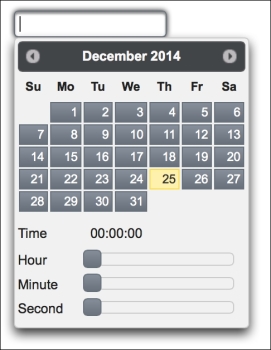
By providing a time format to the pattern attribute, the timePicker functionality can be enabled:
<p:calendar value="#{calendarBean.date}"
  pattern="dd/MM/yyyy HH:mm:ss" />
The appearance of the calendar with the time-picking ability would appear as shown in the following screenshot:
To select only time with the calendar component, the timeOnly attribute should be set to true, along with the pattern value as "dd/MM/yyyy HH:mm". Sliders of the time input section of the calendar should have the step value 1. In order to change this, the calendar component provides three attributes: stepHour, stepMinute, and stepSecond. We can also define ranges for the hour, minute, and second inputs, so as to enable the user to input hours between 3 and 5, minutes between 0 and 30, and seconds between 45 and 55. This is shown in the following code snippet:
<p:calendar value="#{calendarBean.date}"
  pattern="dd/MM/yyyy HH:mm:ss"
  minHour="3" maxHour="5"
  minMinute="0" maxMinute="30"
  minSecond="45" maxSecond="55" />
Note
To disable entering the date with keyboard input or with pasting, use pass through attributes of JSF 2.2 within the definition of the calendar component, as given here:
<f:passThroughAttribute name="onkeypress"
  value="return false;" />
<f:passThroughAttribute name="onpaste"
  value="return false;" />
This recipe is available in the demo web application on GitHub (https://github.com/ova2/primefaces-cookbook/tree/second-edition). Clone the project if you have not done it yet, explore the project structure, and build and deploy the WAR file on every Servlet 3.x compatible application server, such as JBoss WildFly or Apache TomEE.
The showcase for the recipe is available under http://localhost:8080/pf-cookbook/views/chapter3/calendar.jsf.
For details about the localization of the calendar component, see the Internationalization (i18n) and Localization (L10n) recipe in Chapter 1, Getting Started with PrimeFaces.