
The slider component provides the user with the ability to input a value by using a slider bar. This component requires an input component to work properly.
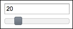
As mentioned earlier, we first need to define an input component that will be used by the slider component. The for attribute is used to set the ID of the input component whose input will be provided by the slider component. The basic definition of a slider would be as follows:
<h:inputText id="basicSlider" value="#{sliderBean.intValue}" />
<p:slider for="basicSlider" />
This will render an input text along with a horizontal slider bar as follows:
By default, the slider renders a horizontal bar for sliding. With the type attribute, the slider can also be set to render a vertical bar with the value set as vertical. The minValue attribute defines the minimum value of the slider with the default value as 0. The maxValue attribute defines the maximum value of the slider with the default value as 100.
By default, the slider provides animation when the background of the slider is clicked. This animation can be enabled/disabled with the animation attribute by setting its value as true or false.
The step attribute defines the amount of fixed pixels which increment the movement of the slider with the default value of 1. The step attribute only supports integer values:
<h:inputText id="steppingSlider" value="#{sliderBean.intValue}" />
<p:slider for="steppingSlider" step="10" />With the display attribute, we can display the output of the slider while getting input from the user by using an inputHidden component. The display attribute should refer the output component while the for attribute refers the hidden input field:
<h:outputText id="output" value="#{sliderBean.intValue}" />
<h:inputHidden id="displaySlider"
  value="#{sliderBean.intValue}" />
<p:slider for="displaySlider" display="output" />
The slider component also provides a displayTemplate attribute where we can provide a template while updating the display. A sample usage for the template could be as follows:
<h:outputText id="output"
  value="The value is: #{sliderBean.intValue}" />
<h:inputHidden id="displaySlider"
  value="#{sliderBean.intValue}" />
<p:slider for="displaySlider" display="output"
  displayTemplate="The value is: {value}" />
Here, {value} is a placeholder definition that is being set by the number value selected in the spinner.
By default, the slider component does not disable the manual input. To get input only with the slider bar, without keyboard input, we need to define the onfocus attribute as follows:
<h:inputText id="minMaxSlider" value="#{sliderBean.intValue}"
  onfocus="this.readOnly=true;" />
<p:slider for="minMaxSlider" step="10"
  minValue="0" maxValue="100" />
This will render an input field and a slider bar for which the user can enter values from 0 to 100 with an increment of 10 only by using the slider bar.
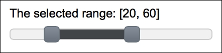
Range selection is also offered with the slider where we can select a minimum and a maximum value. The range attribute should be set to true in order to achieve this and a comma-separated ID pair should be declared with the for attribute, whose IDs are defined by the inputHidden components.
The code snippet definition for the range selection is given here:
<h:outputText id="outputRange" value="The selected range:
  [#{sliderBean.rangeStart}, #{sliderBean.rangeEnd}]" />
<p:slider for="rangeStart,rangeEnd" style="width:200px"
  range="true" display="outputRange"
  displayTemplate="The selected range: [{min}, {max}]" />
<h:inputHidden id="rangeStart" value="#{sliderBean.rangeStart}" />
<h:inputHidden id="rangeEnd" value="#{sliderBean.rangeEnd}" />
The displayTemplate attribute can be used with {min} and {max} placeholders when range selection is enabled. These placeholders will be updated by spinner when the user selects his own range. The visual of the range selection is given in the following screenshot:
The slider provides the slideEnd AJAX behavior event that will be fired when the slide gets completed:
<h:inputText id="ajaxSliderInput"
  value="#{sliderBean.intValue}" />
<p:slider id="ajaxSlider" for="ajaxSliderInput">
  <p:ajax event="slideEnd" listener="#{sliderBean.onSlideEnd}"
    update="growl" />
</p:slider>
The onSlideEnd method will be invoked with org.primefaces.event.SlideEndEvent. The current value of the slider can be retrieved with event.getValue(), and a Faces message could be added with the current value, as in the following code snippet:
public void onSlideEnd(SlideEndEvent event) {
  int value = event.getValue();
  MessageUtil.addInfoMessage("selected.value", value);
}This recipe is available in the demo web application on GitHub (https://github.com/ova2/primefaces-cookbook/tree/second-edition). Clone the project if you have not done it yet, explore the project structure, and build and deploy the WAR file on every Servlet 3.x compatible application server, such as JBoss WildFly or Apache TomEE.
The showcase for the recipe is available under http://localhost:8080/pf-cookbook/views/chapter3/slider.jsf.
For details about the MessageUtil class, see the Internationalization (i18n) and Localization (L10n) recipe in Chapter 1, Getting Started with PrimeFaces.