
The inplace component provides easy in-place editing and inline content display. It consists of two members:
The basic declaration of the component would be as follows:
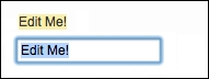
<p:inplace>
  <h:inputText value="Edit Me!" />
</p:inplace>
This would render an input text field that could be clicked by the user to go into the edit mode. To go out of the edit mode, the user needs to click on the Enter button after typing.
By default, the inplace component displays its first child's value as the label; this can also be customized with the label attribute. This attribute defines the label that will be shown in the display mode regardless of the text input by the user:
<p:inplace label="My Input Field">
  <h:inputText value="Edit Me!" />
</p:inplace>
The emptyLabel attribute defines the label that will be shown to the user when the value of the input field is empty. The value displayed will change to the one provided if the user, for instance, enters any text into the input field:
<p:inplace emptyLabel="My Empty Input Field">
  <h:inputText value="" />
</p:inplace>
Besides the input text field, other components such as the drop-down list could also be used with the in-place editor, as seen in the following example:
<p:inplace label="Countries">
  <h:selectOneMenu>
    <f:selectItem itemLabel="Turkey" itemValue="Turkey" />
    <f:selectItem itemLabel="Germany" itemValue="Germany" />
  </h:selectOneMenu>
</p:inplace>The editor attribute specifies the confirmation mode of the editor with the default value false. When set to true, approve and cancel buttons will be rendered right next to the editor, as shown in the following screenshot:
There are two attributes available for introducing i18n to the in-place input when the editor mode is set to true. The saveLabel attribute sets the tool-tip text of the save button with the default value Save. The cancelLabel attribute sets the tool-tip text of the cancel button with the default value Cancel.
The inplace component also provides ways to customize the effects of editing with the attributes effect and effectSpeed. The effect attribute sets the effect to be used when toggling, with the default value as fade. The other option is slide. When set to slide, the component will slide its content upside down when it's toggled. The effectSpeed attribute sets the speed of the effect with the default value normal. The other options for the attribute are slow and fast.
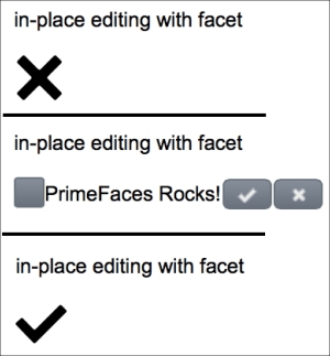
Since version 4.0, the inplace component offers input and output faces, where you can customize what to show as the input and output states of the component. The next example given shows a checkbox for the input and a cross or a thick icon as the output. The names of the icons are set as false.png and true.png for simplicity:
<p:inplace editor="true">
  <f:facet name="output">
    <p:graphicImage
      value="/resources/images/inplace/#{inplaceBean.value}.png"
      width="30" height="30" />
  </f:facet>
  <f:facet name="input">
    <p:selectBooleanCheckbox value="#{inplaceBean.value}" />
    <h:outputLabel value="PrimeFaces Rocks!" />
  </f:facet>
</p:inplace>
The editing process will be as given in the following screenshot:
The inplace component provides the save AJAX behavior event that will be fired when the save button gets clicked:
<p:inplace editor="true">
  <p:ajax event="save"
    listener="#{inplaceBean.handleSave}" update="growl" />
  <h:inputText value="Edit Me!" />
</p:inplace>
The handleSave method will be invoked with javax.faces.event.AjaxBehaviorEvent:
public void handleSave(AjaxBehaviorEvent event) {
  MessageUtil.addInfoMessageWithoutKey("Input Saved!", null);
}This recipe is available in the demo web application on GitHub (https://github.com/ova2/primefaces-cookbook/tree/second-edition). Clone the project if you have not done it yet, explore the project structure, and build and deploy the WAR file on every Servlet 3.x compatible application server, such as JBoss WildFly or Apache TomEE.
The showcase for the recipe is available under http://localhost:8080/pf-cookbook/views/chapter3/inPlaceEditor.jsf.