
A container component, accordionPanel provides the ability to group multiple tabs. In this recipe, we will create accordion panels generated with dynamic content and AJAX behaviors added.
A basic definition of the accordion panel with two panels would be as follows:
<p:accordionPanel>
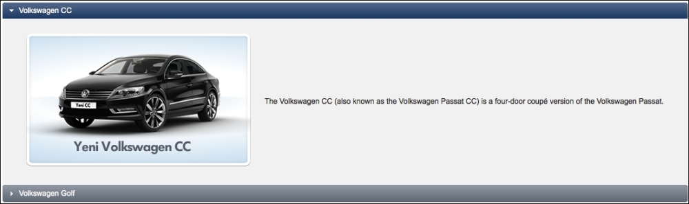
<p:tab title="Volkswagen CC">
<h:panelGrid columns="2" cellpadding="10">
<h:graphicImage library="images"
name="autocomplete/CC.png" />
<h:outputText value="The Volkswagen CC (also known as the
Volkswagen Passat CC) is a four-door coupé version of
the Volkswagen Passat." />
</h:panelGrid>
</p:tab>
<p:tab title="Volkswagen Golf">
<h:panelGrid columns="2" cellpadding="10">
<h:graphicImage library="images"
name="autocomplete/Golf.png" />
<h:outputText value="The Volkswagen Golf is a small
family car manufactured by Volkswagen since 1974 and
marketed worldwide across six generations, in various
body configurations and under various nameplates" />
</h:panelGrid>
</p:tab>
</p:accordionPanel>The visual output for the panel will be as follows:
The multiple attribute enables the activation of multiple tabs. With the value set as enabled, the active tab will not collapse when another tab gets activated. The default value of the attribute is false. To disable a tab, just set the disabled attribute to true.
The activeIndex attribute defines the index of the tab that will be expanded by default. Its default value is 0. If 2 is specified as the value, the third tab will be expanded. When the multiple attribute is set to true, we can specify the index of the multiple tabs as being separated by commas.
By setting the dynamic attribute to true, it's also possible to lazily load the content of the tabs with an AJAX request when they get activated in order to save the bandwidth and reduce the size of the page. Also, by setting the cache attribute to true, consecutive invokes on the same tab will not invoke an AJAX request.
Dynamic tab loading allows us to load the content of the accordion panel dynamically by providing a data model. We can access the iterator defined by the var attribute. The definition of the component for providing a data list on cars to accordionPanel would be as follows:
<p:accordionPanel value="#{accordionPanelBean.cars}" var="car">
  <p:tab title="#{car.name}">
    <h:panelGrid columns="2" cellpadding="5">
      <p:graphicImage
        value="/resources/images/autocomplete/#{car.name}.png" />
      <h:outputText value="#{car.name}" />
    </h:panelGrid>
  </p:tab>
</p:accordionPanel>
The data model here is the list of car objects that will be iterated over, for rendering each panel, along with the image and the name of the car.
The accordionPanel component supports the tabChange and tabClose AJAX behavior events that will be fired when a tab is changed by clicking on another one or when a tab is closed by clicking on it. The definition of the AJAX behavior events and their method declarations would be as follows:
<p:accordionPanel>
  <p:ajax event="tabChange"
    listener="#{accordionPanelBean.onTabChange}"
    update=":mainForm:growl" />
  <p:ajax event="tabClose"
    listener="#{accordionPanelBean.onTabClose}"
    update=":mainForm:growl" />
  ...
</p:accordionPanel>
The listener methods, onTabChange and onTabClose, receive an instance of org.primefaces.event.TabChangeEvent and org.primefaces.event.TabCloseEvent respectively, as parameters:
public void onTabChange(TabChangeEvent event) {
  MessageUtil.addInfoMessage("tab.changed", "Title: " +
    event.getTab().getTitle());
}

public void onTabClose(TabCloseEvent event) {
  MessageUtil.addInfoMessage("tab.closed", "Closed Tab: " +
    event.getTab().getTitle());
}This recipe is available in the demo web application on GitHub (https://github.com/ova2/primefaces-cookbook/tree/second-edition). Clone the project if you have not done it yet, explore the project structure, and build and deploy the WAR file on application servers compatible with Servlet 3.x, such as JBoss WildFly and Apache TomEE.
The showcase for the recipe is available at http://localhost:8080/pf-cookbook/views/chapter4/accordionPanel.jsf.
For details about the MessageUtil class, see the Internationalization (i18n) and Localization (L10n) recipe in Chapter 1, Getting Started with PrimeFaces.