
A layout component, dashboard has the drag-and-drop ability to support reordering of the panels. In this recipe, we will create a dashboard with predefined panels and then add new ones.
A basic definition for a dashboard with six panels would be as follows:
<p:dashboard id="board" model="#{dashboardBean.model}">
<p:ajax event="reorder" listener=
"#{dashboardBean.handleReorder}" update="growl" />
<p:panel id="calculator" header="Calculator">
<h:outputText value="Content for Calculator" />
</p:panel>
<p:panel id="calendar" header="Calendar">
<h:outputText value="Content for Calendar" />
</p:panel>
<p:panel id="contact" header="Contacts">
<h:outputText value="Content for Contacts" />
</p:panel>
<p:panel id="dictionary" header="Dictionary">
<h:outputText value="Weather Content for Dictionary" />
</p:panel>
<p:panel id="weather" header="Weather">
<h:outputText value="Content for Weather" />
</p:panel>
<p:panel id="translation" header="Translation">
<h:outputText value="Content for Translation" />
</p:panel>
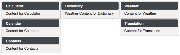
</p:dashboard>A data model needs to be provided in order to preserve the panel order. The data model depends on org.primefaces.model.DefaultDashboardModel. The model for the given sample would be as follows:
DashboardColumn column1 = new DefaultDashboardColumn();
DashboardColumn column2 = new DefaultDashboardColumn();
DashboardColumn column3 = new DefaultDashboardColumn();

column1.addWidget("calculator");
column1.addWidget("calendar");
column1.addWidget("contact");
column2.addWidget("dictionary");
column3.addWidget("weather");
column3.addWidget("translation");

model.addColumn(column1);
model.addColumn(column2);
model.addColumn(column3);
The preceding definition of the dashboard contains three columns and six panels and will look like the following image:
The dashboard component supports the reordering of the AJAX behavior event that will be fired when a panel is dragged and dropped. The reorder event definition is given in the previous sample. The handleReorder listener method defined next receives org.primefaces.event.DashboardReorderEvent as its parameter:
public void handleReorder(DashboardReorderEvent event) {
  MessageUtil.addInfoMessageWithoutKey("Reordered: " +
    event.getWidgetId(),
    "Item index: " + event.getItemIndex() +
    ", Column index: " + event.getColumnIndex() +
    ", Sender column index: " +
    event.getSenderColumnIndex());
}
As seen in the method, the information about the drag-and-drop action is communicated to the user by adding it as a PrimeFaces message. The order number of the panel can be retrieved from the event.getItemIndex() method. The number of the column from which the panel has been dragged can be retrieved by event.getColumnIndex(), and the number of the column that the panel will be dragged onto can be retrieved from event.getSenderColumnIndex().
To add new panels that reside outside of the dashboard, you can use the draggable component. The following definition creates a new panel component and attaches a draggable component that knows the panel and the dashboard, which the panel could be dragged to:
<p:panel id="newWidget" style="width: 200px">
  <h:outputText value="Drag me and create a new widget" />
</p:panel>
<p:draggable for="newWidget" helper="clone" dashboard="board" />
By default, if the user moves panels from one column to another and gets one column empty, it cannot be filled again by dragging panels back. To have columns of a fixed size, the ui-dashboard-column style should be defined with the preferred width, as shown in the following code snippet:
.ui-dashboard-column {
  width:200px;
}This recipe is available in the demo web application on GitHub (https://github.com/ova2/primefaces-cookbook/tree/second-edition). Clone the project if you have not done it yet, explore the project structure, and build and deploy the WAR file on application servers compatible with Servlet 3.x, such as JBoss WildFly and Apache TomEE.
The showcase for the recipe is available at http://localhost:8080/pf-cookbook/views/chapter4/dashboard.jsf.
For details about the MessageUtil class, see the Internationalization (i18n) and Localization (L10n) recipe in Chapter 1, Getting Started with PrimeFaces.