
Grid CSS is a lightweight stylesheet bundled with PrimeFaces that offers responsive layout utilities for mobile devices and desktops. In this recipe, we will create a responsive user interface with custom styling and also demonstrate them in a nested version.
A simple definition of a responsive grid is created with the help of HTML div components and CSS classes as follows:
<div class="ui-grid ui-grid-responsive">
<div class="ui-grid-row">
<div class="ui-grid-col-1">1</div>
<div class="ui-grid-col-1">1</div>
<div class="ui-grid-col-1">1</div>
<div class="ui-grid-col-1">1</div>
<div class="ui-grid-col-1">1</div>
<div class="ui-grid-col-1">1</div>
<div class="ui-grid-col-1">1</div>
<div class="ui-grid-col-1">1</div>
<div class="ui-grid-col-1">1</div>
<div class="ui-grid-col-1">1</div>
<div class="ui-grid-col-1">1</div>
<div class="ui-grid-col-1">1</div>
</div>
<div class="ui-grid-row">
<div class="ui-grid-col-6">6</div>
<div class="ui-grid-col-6">6</div>
</div>
<div class="ui-grid-row">
<div class="ui-grid-col-4">4</div>
<div class="ui-grid-col-8">8</div>
</div>
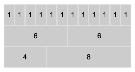
</div>Grid CSS contains a built-in stylesheet definition for up to 12 columns, matching with ui-grid-col-1 and onward up to ui-grid-col-12. If we have a sum of columns at a fixed number, we can create combinations easily, as seen in the previous sample. But the sum should not exceed 12. The ui-grid-row style class, which defines the style that will be applied per row.
The visual of the sample will be as follows:
For demonstration purposes, we applied the following style to make the cells more distinct:
<style type="text/css">
  .ui-grid .ui-grid-row div {
    background-color: #cccccc;
    border: 1px solid #dddddd;
    padding: 10px 0;
    text-align: center;
  }
</style>The ui-grid-responsive style class makes the div element respond to the screen resizing as seen here:
It's possible to nest div elements that have the ui-grid-responsive style. A sample definition is as follows:
<div class="ui-grid ui-grid-responsive">
<div class="ui-grid-row">
<div class="ui-grid-col-3">3</div>
<div class="ui-grid-col-9">9
<div class="ui-grid ui-grid-responsive">
<div class="ui-grid-row">
<div class="ui-grid-col-4">4</div>
<div class="ui-grid-col-4">4</div>
<div class="ui-grid-col-4">4</div>
</div>
<div class="ui-grid-row">
<div class="ui-grid-col-6">6</div>
<div class="ui-grid-col-6">6</div>
</div>
</div>
</div>
</div>
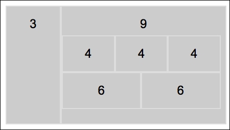
</div>We defined 12 columns separated by 3 to 9, and then within the second section, which consists of 9 columns, we split it into 12, that is, by 4-4-4 and then by 6-6. The visual of the nested definition will be as follows:
For demonstration purposes, we applied the style as we did in the first example, but here we define it with an immediate children declaration (>) as follows:
<style type="text/css">
  .ui-grid > .ui-grid-row > div {
    background-color: #cccccc;
    border: 1px solid #dddddd;
    padding: 10px 0;
    text-align: center;
  }
</style>This recipe is available in the demo web application on GitHub (https://github.com/ova2/primefaces-cookbook/tree/second-edition). Clone the project if you have not done it yet, explore the project structure, and build and deploy the WAR file on application servers compatible with Servlet 3.x, such as JBoss WildFly and Apache TomEE.
When the server is running, the showcase for the recipe is available at the following URLs:
http://localhost:8080/pf-cookbook/views/chapter4/gridCSS.jsfhttp://localhost:8080/pf-cookbook/views/chapter4/gridCSSNested.jsf