
A menu can be positioned on a page in two ways: statically and dynamically. A menu is static by default. This means that the menu is in the normal page flow. A dynamic menu, in contrast, is not in the normal page flow and overlays other elements. In terms of CSS, it is absolutely positioned.
In this recipe, we will see how we can develop these two kinds of positioned menus. But first, we will meet submenus and menu items.
A menu is composed of submenus and menu items. Submenus group single menu items. Grouped menu items can be presented in the same page flow or in an overlay over other elements. This behavior depends on the type of menu. The simple p:menu menu shows grouped menu items in the same page flow. Let's define an example structure of a static menu:
<p:growl id="growl"/>
<p:menu>
<p:submenu label="JavaScript Libraries">
<p:menuitem value="jQuery" url="http://jquery.com"/>
<p:menuitem value="Yahoo UI" url="http://yuilibrary.com"/>
<p:menuitem value="Prototype"
url="http://prototypejs.org"/>
</p:submenu>
<p:submenu label="Operations">
<p:menuitem value="Save"
actionListener="#{positionedMenuBean.save}"
update="growl"/>
<p:menuitem value="Update"
actionListener="#{positionedMenuBean.update}"
update="growl"/>
<p:menuitem value="Delete"
actionListener="#{positionedMenuBean.delete}"
update="growl"/>
</p:submenu>
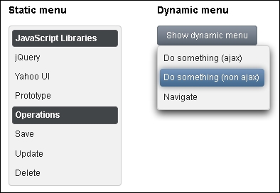
</p:menu>A dynamic menu is created by setting the overlay option to true and defining a trigger to show the menu. For example, a command button from the following code snippet acts as such a trigger. It will display a menu, the top-left corner of which is aligned with the bottom-left corner of the button when the user clicks on it. The following code snippet shows this:
<p:growl id="growl"/>

<p:menu overlay="true" trigger="btn" my="left top" at="bottom left">
  <p:menuitem value="Do something (ajax)"
    action="#{positionedMenuBean.doSomething}"
    update="growl"/>
  <p:menuitem value="Do something (non ajax)"
    action="#{positionedMenuBean.doSomething}"
    ajax="false"/>
  <p:menuitem value="Navigate" url="http://primefaces.org"/>
</p:menu>

<p:commandButton id="btn" value="Show dynamic menu" type="button"/>
The following screenshot shows both these types of menus. The dynamic menu is opened after the user has clicked on the Show dynamic menu button:
Tip
Place the most frequently used items at the top of the menu. The top of the menu tends to be the most visible part of the menu because users often see it first. Avoid combining semantically different actions/navigations in the same group. Avoid displaying an icon for every menu item. Include them only for menu items for which they add significant value. A menu that includes too many icons can appear cluttered and be hard to read.
We saw that p:menuitem can be placed either under p:submenu or directly under p:menu. As the menu uses menu items, it is easy to invoke actions or action listeners with or without AJAX (ajax="false") as well as navigate. Navigation means a GET request that causes a switch to another page. This is always a full page refresh and only works when the url attribute on p:menuitem is set. In this case, the menu item is rendered as a normal HTML link element. If the url attribute is missing, only POST requests (with AJAX or without) can be sent.
The location of the dynamic menu on a page is relative to the trigger and is defined by the my and at attributes, which take a combination of two values from the following:
leftrightbottomtop
We can also specify an icon for the menu item and design attractive menus. There are two ways to specify an icon—either using any predefined jQuery ThemeRoller style class (http://jqueryui.com/themeroller) that is a part of PrimeFaces themes or by providing our own style class for the <p:menuitem icon="home" .../> icon attribute. The following code shows this:
.home {
  background: url("#{resource['images:home.png']}") no-repeat;
  height:16px;
  width:16px;
}
You may want to expand and collapse submenus on click. This feature can be achieved by setting toggleable="true" on p:menu.
See the MenuItem section in PrimeFaces User's Guide (http://primefaces.org/documentation.html) to learn more about menu item capabilities.
This recipe is available in the demo web application on GitHub (https://github.com/ova2/primefaces-cookbook/tree/second-edition). Clone the project if you have not done it yet, explore the project structure, and build and deploy the WAR file on application servers compatible with Servlet 3.x, such as JBoss WildFly and Apache TomEE.
The showcase for the recipe is available at http://localhost:8080/pf-cookbook/views/chapter6/positionedMenus.jsf.