
Any component can be enhanced with the draggable behavior. To enable the draggable functionality on any PrimeFaces component, we always need a component called draggable.
In this recipe, we will see how to make a component draggable and learn some basic features of draggable. To demonstrate these features, we will make several p:panel components draggable.
A component can be made draggable by using p:draggable. The value of the for attribute specifies a search expression for the draggable target. In our case, it matches the ID of p:panel.
Tip
Chapter 1, Getting Started with PrimeFaces, provides more details on search expressions.
If the for attribute is omitted, the parent component will be selected as a draggable target. Let us make some panel components draggable and apply some basic features:
<p:panel id="pnl" header="Draggable panel with default settings">
  Drag me around
</p:panel>
<p:draggable for="pnl"/>

<p:panel id="hpnl" header="Draggable panel by handle">
  I can be only dragged by my header
</p:panel>
<p:draggable for="hpnl" handle=".ui-panel-titlebar"/>

<p:panel id="cpnl" header="Draggable panel with clone">
  I display a clone as helper while being dragged
</p:panel>
<p:draggable for="cpnl" helper="clone"/>

<p:panel id="rpnl" header="Draggable panel with revert">
  I will be returned to my start position when dragging stops
</p:panel>
<p:draggable for="rpnl" revert="true"/>

<p:panel id="opnl" header="Draggable panel with opacity">
  I use opacity for helper while being dragged
</p:panel>
<p:draggable for="opnl" opacity="0.5"/>
The following screenshot shows the five panels. The last panel is being dragged. Its opacity has been changed to 0.5 after the dragging starts.
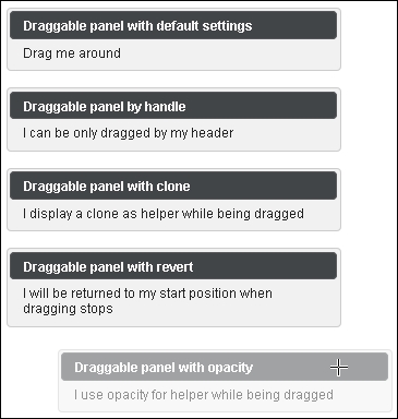
By default, any point in a dragged component can be used as a handle. To restrict the drag-start click to a specified element(s), we can use the handle option, which is a jQuery selector. The second panel is dragged by using its header only.
By default, the actual component is used as a drag indicator. The helper option allows keeping the component at its original location during dragging. This can be achieved with helper set to clone for the third panel.
If the revert option is set to true, the component will return to its starting position when the dragging stops, and the draggable component is not dropped onto a matching droppable component. The fourth panel features this behavior.
Opacity for helper, while it is being dragged, is another useful option to give the user a visual feedback. The opacity of the fifth panel is reduced when dragging.
Other basic features are related to the attributes cursor and stack. cursor is a CSS cursor that is to be displayed when dragging. It is handy to set its value to move. stack is a jQuery selector. It controls the z-index of the set of draggable elements that match the selector and always brings them to the front. That means the draggable component always overlays the other draggables.
Refer to the Restricting dragging by axis, grid, and containment and Snapping to the edges of nearest elements recipes discussed later in this chapter to learn the advanced features of Draggable.
This recipe is available in the demo web application on GitHub (https://github.com/ova2/primefaces-cookbook/tree/second-edition). Clone the project if you have not done it yet, explore the project structure, and build and deploy the WAR file on every Servlet 3.x compatible application server, such as JBoss WildFly or Apache TomEE.
The showcase for the recipe is available at http://localhost:8080/pf-cookbook/views/chapter8/draggable.jsf.