We are starting by making a partial Sass file, let's call it _variables.scss and start by writing simple variables that will define the number of columns and their max-width, as well as the breakpoints:
$grid-columns: 12;
$grid-max-width: 65em;

$breakpoint-small: "only screen and (min-width: 20em)";
$breakpoint-medium: "only screen and (min-width: 30em)";
Time to write some mixins, for example for a border-box property which we assume still isn't unified by the various vendors.
And for the sake of this tutorial, we are going to save the mixins in a different file, called _mixins.scss.
@mixin border-box {
    -webkit-box-sizing: border-box;
    -moz-box-sizing: border-box;
    box-sizing: border-box;
    }
Time to really write up the Sass for the Grid, so we create a grid.scss.
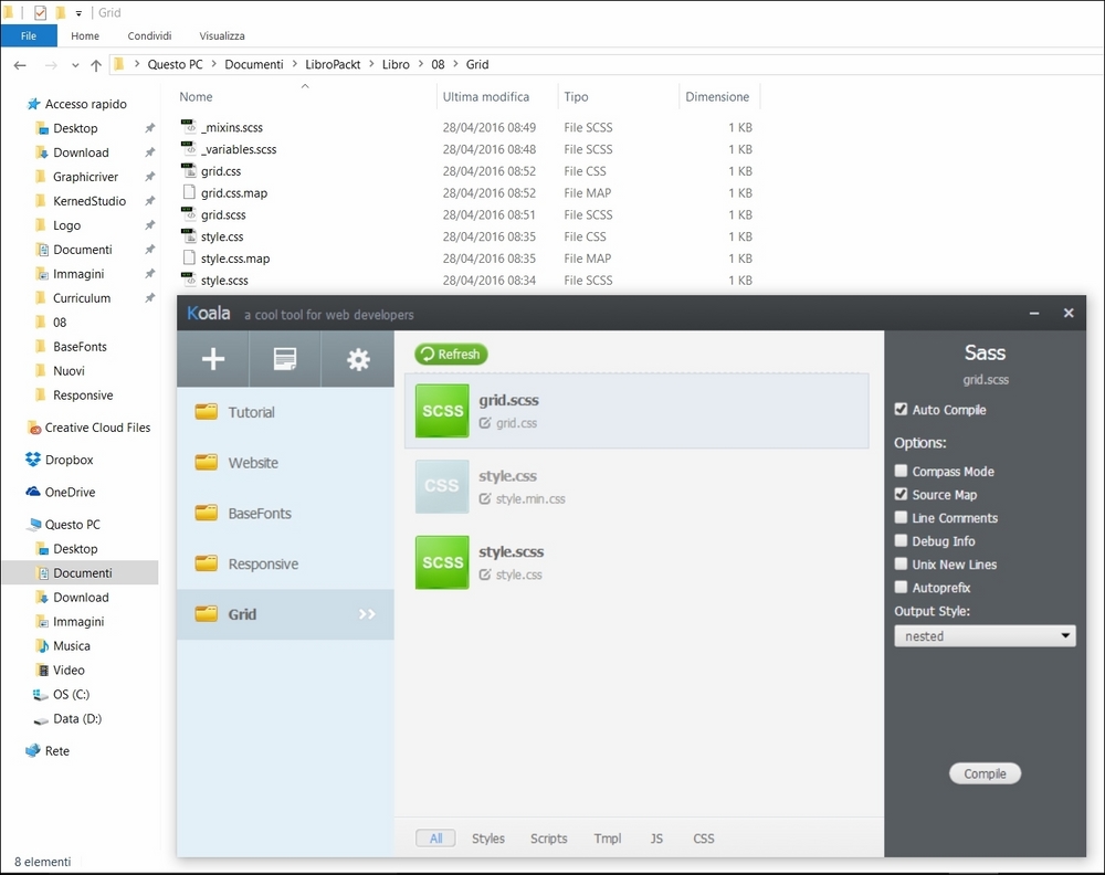
Our document structure will look like this:
We now import our variables and mixins in the document through the following simple code:
@import "variables";
@import "mixins";
We start writing by resetting every property:
*,
*:after,
*:before {
    margin: 0;
    padding: 0;

    @include border-box;

    }

%clearfix {
    *zoom: 1;
    &:before,
    &:after {
        content: " ";
        display: table;
    }
    &:after {
        clear: both;
    }
}

.wrapper,
.row {
    @extend %clearfix;
}
Which will easily compile in the following CSS:
*,
*:after,
*:before {
  margin: 0;
  padding: 0;
  -webkit-box-sizing: border-box;
  -moz-box-sizing: border-box;
  box-sizing: border-box; }

.wrapper,
.row {
  *zoom: 1; }
  .wrapper:before,
  .row:before, .wrapper:after,
  .row:after {
    content: " ";
    display: table; }
  .wrapper:after,
  .row:after {
    clear: both; }
We then write a container for our grid:
.wrapper {
    width: 95%;
    max-width: $grid-max-width;
    }
We write a first breakpoint:
@media #{$breakpoint-medium} {
}
To make and use the columns, we'll use the Sass loops.
Since the columns, numbers aside, will be the same but for their width, we define a loop that is triggered by the @for instance and will look like this:
@for $i from 1 through 12 {

    .column-#{$i} {

        }

}
This defines a column class as follows:
[class*='column-'] {
    float: left;
    padding: 1em;
    width: 100%;
    min-height: 1px;
    }
width: 100% / $grid-columns * $i;
            }
        }
    }
This will execute the loop.
Recalling the column appendix will run this CSS when compiled:
.column-1 {

    }

.column-2 {

    }

.column-3 {

    }

.column-4 {

    }

.column-5 {

    }

.column-6 {

    }

.column-7 {

    }

.column-8 {

    }

.column-9 {

    }

.column-10 {

    }

.column-11 {

    }

.column-12 {

    }
We now only need to obtain values for each of them to define our width defying grid
We can obtain the values with simple math.
Taking the whole (100%) into account, we divide it for the number of desired columns and multiply it for each of the single numbers 'till we line up with the total numbers of columns, like this:
100 / 12 * 1, 100 / 12 * 2 and so on.
So we put the simple math into the loop, like so:
@for $i from 1 through 12 {

    .column-#{$i} {
        width: 100% / 12 * $i;
    }

}.column-1 {
width: 8.33333%;
}
.column-2 {
width: 16.66667%;
}
.column-3 {
width: 25%;
}
.column-4 {
width: 33.33333%;
}
.column-5 {
width: 41.66667%;
}
.column-6 {
width: 50%;
}
.column-7 {
width: 58.33333%;
}
.column-8 {
width: 66.66667%;
}
.column-9 {
width: 75%;
}
.column-10 {
width: 83.33333%;
}
.column-11 {
width: 91.66667%;
}
.column-12 {
width: 100%;
}But what if we want to change the total number of columns? Do we have to manually retrieve and substitute that in each operation?
No; since we are using Sass, we simply change, right now, the number 12 in the loop with the variable $grid-columns and that's it!
A magically responsive grid, defined by the number of columns you want each time!
Change just one value and you're good to go!