All we did till now was beautiful text, well paired and calculated. But what if we want to break the old squared development and present our text inside a wide array of shapes?
Luckily, with the newly-introduced CSS3 shape element (which is still much unsupported) we can do it!
I will guide you through this, it will just be a little bit since we'll be able to fully use it in our day-by-day projects. Combined with clipping and masking, CSS filters, compositing, and blending we'll be able to make the web our playground more than ever. But it's time for us to focus on our typography.
You can apply a shape to an element on the page by attaching one of its properties, since the shapes right now are functions:
Element {
Shape-outside: polygon(parameters);
}
The currently existing functions are:
- Circle
- Ellipse
- Inset
- Polygon
Each of them is defined by a set of points. The properties instead are:
Shape-outside(wrap content around a shape)Shape-inside(wrap its content inside the given shape)
You can use the shape-margin property to lay a margin between your shape and your text. The inside shape instead answers to the shape-padding property.
Right now only two rules are needed for shapes to be rendered: the element must be floated, and it must have dimensions, since those will be the starting point to establish a coordinate system.
For example, see the following code:
.element {
    float: left;
    height: 10em;
    width: 15em;
    shape-outside: circle();
}
This will tell our browser to draw a 15em circle around our element.
Each shape is defined and created inside a reference box to define its extents – taking in account not only the given object dimension but also its margins, paddings and borders.
For example:
shape-outside: circle(250px at 50% 50%) padding-box;
This will define a circular space of 250px size in the middle of our element until it touches the padding box, it won't go further than that.
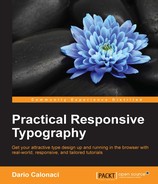
We are going to make a simple bio section for a fictional website.
Right now we simply added a small profile image – and a bio inside a p
This is the current CSS:
img  { width: 150px;
    float: left;
    height: auto;
    border-radius: 50%;
    margin-right: 15px;
}

p {max-width: 30%;
}
This is what we have thus far, with the text outlining the shape as a simple square:
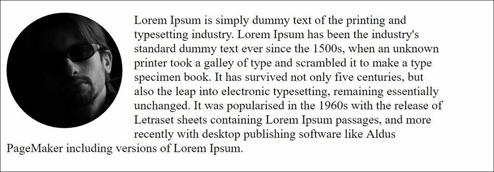
It's now time to integrate the shape into our image to make the text flow, all below inside the img element:
    shape-outside: circle();
    shape-margin: 15px;
}
With this code, the browser will render a 15px circle around our image element and the text will change its flow accordingly:
Isn't it extraordinary?!?
Other parameters to know about shapes right now are:
- The parameters inside the function for the circle are its radius and the starting position.
- Closest-side and furthest-side are two valid variables, with closest being the browser base, meaning the radius will be taken as the length from the center to the closer side. For example:
- shape-outside: circle(farthest-side at 25% 25%); defines a circle whose radius is half the length of the longest side, positioned at the point of coordinates 25% 25% on the element's coordinate system
- shape-inside: circle(250px at 500px 300px); /* defines a circle whose center is positioned at 500px horizontally and 300px vertically, with a radius of 250px */
- The ellipse function works the same way but it takes two variables: one for the x-radius and one for the y-radius.
- Inset is created to make rectangular shapes inside our initial rectangle, but since the web is already rectangular, we can use it for another thing: making rounded angles rectangular with content flowing around those shapes, since it takes two options: a parameter for the inner injection of the object and a second value for the roundness of its corners.
- Polygon is the last element available, in which you can create which shape you want with coordinates given by pairs, each one specifying the position of one point.
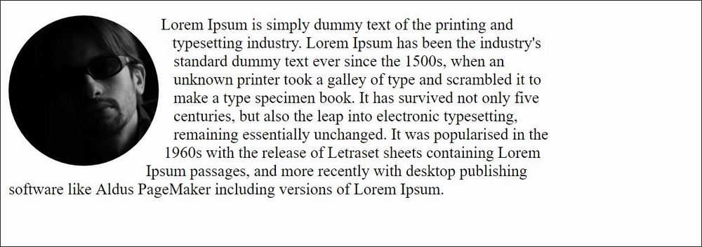
To let our text flow automatically around a given image, the image itself should have an alpha channel.
Calling an object as a path is easy:
.leaf-shaped-element {
    float: left;
    width: 400px;
    height: 400px;
    shape-outside: url(leaf.png);
    shape-margin: 15px;
}
You just pinpoint the URL to the image and you're done! (I left my leaf image in the tutorial files for you to experiment with)
Also you can use the shape-image-threshold property for images with an alpha channel: Setting it to 0.6 value for example will mean that the shape will take into account pixels that are more than 60% opaque.
Values range from 0.0 – completely transparent – to 1.0, completely opaque.
How does all the above fit in to our responsive web design?
Everything in shapes-outside can be set using relative or percentage units, even the shapes – so everything can be scaled accordingly to our viewpoint.
Shape-inside instead is still unresponsive – its responsiveness will be pushed by the W3C as soon as possible.
Right now, CSS shapes are cut out from the largest CSS3 spec – in the future, when they are finally standardized, we'll see the rise of CSS exclusions as well, which will allow us to wrap content around non floated elements, allowing the entire shape to be wrapped on every side, for example, on absolutely positioned elements.