A toolbar is ideally suited for actions that'll be used on a regular basis. For example, in our email application Reply will be a popular action, as will New and Delete. Grouping toolbar items together by similarity (for example, Reply and Reply All or Cut, Copy, and Paste) will help users to find your shortcuts quickly. Ordering these groups by likelihood of use will mean that, if the user interface is smaller than expected, then the most useful features will still be visible. To provide access to tools that don't fit onto the screen, you can use an overflow item (where it pops out a list of not-visible items), make the tool bar scrollable, or provide access in a different place, such as a menu or second row.
Toolbars are popular in most form factors of devices, from small phones up to large desktop applications. The main difference is clearly the number of items that can be included. If you're including toolbars in a responsive or adaptive layout, you may consider a more complex strategy than leftmost-visible. For example, in an email application, if only five items can be displayed, then removing Reply All so Delete can be seen might be a good approach; the user could always choose to reply to all in the compose window after pressing Reply.
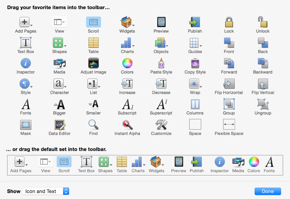
Many applications choose to allow items in the toolbar to be rearranged, a feature that's provided by some graphical toolkits (for example, UIKit for Apple's iOS devices and AppKit for their desktop applications):