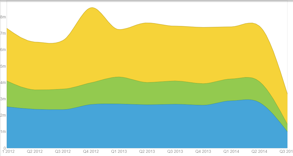
You can always click on the Visualizations Options icon in the lower right of the page (as shown in the following screenshot) to make some additional changes to the current visualization. In this example, I have checked Show labels vertically and also checked Smooth lines.
Smoothing is a process that levels out fluctuations in the actual data to represent the overall trend a bit better. In other words, it makes the line between data points curved. If not selected, straight lines are used to connect data points:

Another view of the same visualization is shown in the following screenshot, with the title, grid lines, and axis turned off. You may want to experiment with these options if you plan to add the visualization to a presentation later and do not need the textual references, and so on:
So, now that we have explored and experimented enough with our data, let's move on to the more formal results review phase of the project.