Let's first get the data set we will need to implement a StatArb trading strategy. For this section, we will use the following major currencies across the world:
- Austrian Dollar versus American Dollar (AUD/USD)
- British Pound versus American Dollar (GBP/USD)
- Canadian Dollar versus American Dollar (CAD/USD)
- Swiss Franc versus American Dollar (CHF/USD)
- Euro versus American Dollar (EUR/USD)
- Japanese Yen versus American Dollar (JPY/USD)
- New Zealand Kiwi versus American Dollar (NZD/USD)
And for this implementation of the StatArb trading strategy, we will try to trade CAD/USD using its relationship with the other currency pairs:
- Let's fetch 4 years' worth of data for these currency pairs and set up our data frames:
import pandas as pd
from pandas_datareader import data

# Fetch daily data for 4 years, for 7 major currency pairs
TRADING_INSTRUMENT = 'CADUSD=X'
SYMBOLS = ['AUDUSD=X', 'GBPUSD=X', 'CADUSD=X', 'CHFUSD=X', 'EURUSD=X', 'JPYUSD=X', 'NZDUSD=X']
START_DATE = '2014-01-01'
END_DATE = '2018-01-01'

# DataSeries for each currency
symbols_data = {}
for symbol in SYMBOLS:
  SRC_DATA_FILENAME = symbol + '_data.pkl'

  try:
    data = pd.read_pickle(SRC_DATA_FILENAME)
  except FileNotFoundError:
    data = data.DataReader(symbol, 'yahoo', START_DATE, END_DATE)
    data.to_pickle(SRC_DATA_FILENAME)

  symbols_data[symbol] = data
- Let's quickly visualize each currency pair's prices over the period of our data set and see what we observe. We scale the JPY/USD pair by 100.0 purely for visualization scaling purposes:
# Visualize prices for currency to inspect relationship between them
import matplotlib.pyplot as plt
import numpy as np
from itertools import cycle

cycol = cycle('bgrcmky')

price_data = pd.DataFrame()
for symbol in SYMBOLS:
  multiplier = 1.0
  if symbol == 'JPYUSD=X':
    multiplier = 100.0

  label = symbol + ' ClosePrice'
  price_data = price_data.assign(label=pd.Series(symbols_data[symbol]['Close'] * multiplier, index=symbols_data[symbol].index))
  ax = price_data['label'].plot(color=next(cycol), lw=2., label=label)
plt.xlabel('Date', fontsize=18)
plt.ylabel('Scaled Price', fontsize=18)
plt.legend(prop={'size': 18})
plt.show()
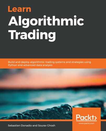
The code will return the following output. Let's have a look at the plot:

As one would expect and can observe, these currency pairs' price moves are all similar to each other in varying degrees. CAD/USD, AUD/USD, and NZD/USD seem to be most correlated, with CHF/USD and JPY/USD being least correlated to CAD/USD. For the purposes of this strategy, we will use all currencies in the trading model because these relationships are obviously not known ahead of time.