
Chapter 13: Tying It All Together
In the last few chapters, we learned about the ways in which our web application can interact with third-party systems. Now, we'll return to our web application and improve the visual aspects of the website to make the user interface modern and more appealing.
First, we'll start by modifying the styles by importing new Cascading Style Sheets (CSS). Then, we'll clean up the index page code and adjust some of the various final elements of the website. By doing this, we're approaching the time to deploy the website.
The main topics that we will cover in this chapter are as follows:
- Gatsby.js layout modifications
- Preparing for deployment
Technical requirements
To deploy the project on Netlify, you must have an account at https://www.netlify.com/. To deploy the project on Azure, you must create an account at https://azure.microsoft.com/en-us/.
Additionally, a terminal program is needed.
Gatsby.js layout modifications
There are many different ways to incorporate styles into a web page to change the default fonts, colors, backgrounds, and layout. While style and classes can also be created one by one, an easier and more efficient approach is to use a framework to leverage pre-built ideas and design patterns. One of the hottest cascading frameworks at the time of writing is Tailwind CSS. Let's introduce Tailwind and learn why it is used within Gatsby.
Introducing Tailwind CSS
Tailwind CSS is a nice CSS framework that is easy to learn and use. It aims to be unopinionated and is driven toward allow the designer to construct styles from smaller pieces. Let's start by installing the framework so that we can use it.
Installing the Tailwind CSS framework
We will install it and use it to improve the visual appearance of the website:
- The first step is to use the Node package manager to install Tailwind CSS. In the terminal, type the following command:
npm install tailwindcss --save-dev
The --save-dev argument will add it to the project's development dependencies. Additionally, since we want to improve the appearance of the form, we will add an additional package built by Tailwind Labs called custom-forms.
- Again, we'll add this to the project's development properties. Type the following command into the terminal as well:
npm install @tailwindcss/custom-forms --save-dev
- Finally, by typing the following command in to the terminal, the configuration file is automatically created:
npx tailwindcss init
The tailwind.config.js file gets created in Gatsby's main folder, in the /web directory. This file contains the Tailwind configuration. The contents of the file are composed as follows:
module.exports = {
purge: [],
theme: {
extend: {}
},
variants: {},
plugins: [require('@tailwindcss/custom-forms')]
}
Most of the options use the default settings, and hence they are empty. The only option used is the list of plugins. Here, the list of plugins only includes the custom-forms plugin, which we installed previously.
Using the Tailwind CSS framework
Next, we'll integrate the Tailwind framework into the project. Starting with the web/src/styles/layout.css file, we need to insert the following lines of code. The following lines of code will bring Tailwind's styles into the project:
@tailwind base;
@tailwind components;
@tailwind utilities;
Formatting the event proposal form
Revisiting the event proposal form of our project's website, it's obvious that there is no style at all. So, let's first review the form's code. The following is an excerpt of the HTML source code for the event title input and label:
<div className='field'>
<label className='label'>Event Title:
<input className='input' type='text' name='eventTitle'/>
</label>
</div>
Using Tailwind CSS, the form has been styled as shown in the following figure:

Figure 13.1 – The event proposal form styled with Tailwind
Note
The full documentation for Tailwind CSS can be found at https://tailwindcss.com.
For the purpose of this book, we'll look at the following example, which is simply one small component of the full capabilities of Tailwind CSS. Here, we have the previous HTML code block now styled with Tailwind:
<div className='mt-10 block'>
<label className='label'>Event Title:
<input className='form-input mt-1 block w-full' type='text' name='eventTitle'/>
</label>
</div>
First, a space was added around each form element. Let's quickly review what types of options exist to add space around an element. Each element in the HTML Document Object Model (DOM) has three surrounding components: the border, the margin, and the padding. In the simplest terms, margin is the spacing around an element and padding is the spacing inside of an element. border, as the name would suggest, is any of several ways to visually delineate an HTML element.
The first of the styles we'll examine is mt-10. This nomenclature is a bit different than in other CSS frameworks since both the m and the t have an atomic meaning.
The m in Tailwind represents margin. Likewise, p is used for padding, t represents top, and so obviously, b represents bottom, r is right, and l is left. Additionally, y represents both the top and bottom, and x represents both the right and left sides. If m and p are used alone (m-10, for example), this usage represents the entire element, so space would be provided on all sides. This makes remembering which attribute to use quite easy, lending to the framework's popularity.
-10 represents 10 pixels. This will provide 10 pixels of needed space at the top of each form element to provide a cleaner appearance.
Additionally, the Tailwind CSS block style is used to set a block-style layout.
For the form input element, a text box, in this case, with the Tailwind form-input style, is used. This applies the following styles:
- background-color: #fff;: White
- border-color: #e2e8f0; border-width: 1px; border-radius: 0.25rem;: A lightly colored, 1-pixel input border with slightly rounded edges
- padding-right: 0.75rem; padding-left: 0.75rem;: More space around the sides of the text
- padding-top: 0.5rem; padding-bottom: 0.5rem;: More space around the top and bottom of the text
- line-height: 1.5;: Sets the vertical text spacing
- font-size: 1rem;: Sets the text size
The w-full form input style instructs the form element to be at the full width of its container. As shown in the form, the Your Full Name and Your Email Address fields are half-width. Since the form should be responsive, the full width is used for these elements when the form is small, for example, when the browser is minimized horizontally, such as when a smartphone is used for viewing it. The following two styles work together to make this happen: sm:w-full and md:w-1/2.
The width of the element will be full when the form container is in small mode and half-width (1/2) when the form is at least medium size, or the browser width is greater than 768 pixels wide.
Improving and formatting the event list
In the previous section, we added Tailwind styles to the event proposal form. Next, we can add styles to the list of events on the website. In the following figure, Figure 13.2, the events list is shown with Tailwind CSS styles also applied to the list of events:
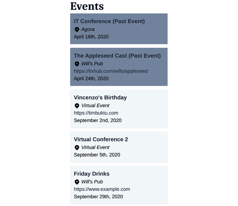
Figure 13.2 – The list of events styled with Tailwind
By adding sorting to the events query, the events are listed in chronological order. The following code demonstrates how this is done. Sorting is added to the dateAndTime field using the ASC (ascending) order:
events: allSanityEvent(
sort: {
fields: [dateAndTime]
order: ASC
},
) {
...
As shown in Figure 13.2, events that happened in the past, prior to September 1, 2020, in this case, are displayed with a darker background than events that will happen in the future. Let's learn how this effect is achieved.
First, node.dateAndTime is converted into a date by passing it as a parameter to the new Date() function. The current time is obtained by instantiating a date object without a parameter. The Boolean (true/false) result of the comparison, if the event date is less than the current date, is assigned to the pastEvent variable:
let pastEvent =
new Date(node.dateAndTime) < new Date() ? true : false;
Next, the background color is set based on whether pastEvent's value is set to True:
(${pastEvent ? 'bg-gray-600' : 'bg-gray-100'}):
return (
<div className={`max-w-full shadow-sm mt-3 p-3 ${pastEvent ? 'bg-gray-600' : 'bg-gray-100'}`}>
...
Now that we've dealt with the styles, next, we will look at how to improve the code quality. We'll begin to prepare for deployment by first cleaning up the source code.
Preparing for deployment
In this section, we will make several improvements to the code, making it cleaner. Additionally, we will improve the functionality of the form.
Cleaning up the code
Since the list of events and the event form source code could eventually be reused in multiple places on the website, we can refactor the code by creating separate components for each.
In the web/src/components folder, create two files: event-list.js and event-form.js. Both files are similar in format.
The basic format of the event list module is as shown in the following code block:
import {Link} from "gatsby";
import React from "react";
const {format} = require('date-fns')
function EventList(props) {
return (
...
)
}
EventList.defaultProps = {
title: '',
eventNodes: [],
}
export default EventList
The basic format of the event form module is as shown:
import React from "react";
function EventForm(props) {
return (
...
)
}
EventForm.defaultProps = {
title: '',
venueNodes: [],
}
export default EventForm
The source code of the event form and event list will be inserted into return. Opening and closing <div> tags are added since JSX requires a root node:
return (
<div>
<h2 className='font-serif text-4xl font-bold text-gray-800 bb-10'>{props.title}</h2>
<div className='max-w-full'>
...
</div>
)
To use the two newly created components, they need to be imported:
import EventList from '../components/event-list'
import EventForm from '../components/event-form'
Now, the event list and event form may be replaced with these components. The nodes and title will be passed into these components as properties:
<EventList
eventNodes={eventNodes}
title='Events'
/>
<EventForm
venueNodes={venueNodes}
title='Add an Event'
/>
Remember, now the nodes and the titles are passed in as props. Previously, the events and venues were able to be used directly from the GraphQL result as follows:
{eventNodes && eventNodes.map((node) => (
Now, the nodes will be accessed through props:
{props.eventNodes && props.eventNodes.map((venue) => (
Similarly, title is now passed in as a property, so the code should be refactored as follows:
<h2 className='font-serif text-4xl font-bold text-gray-800 bb-10'>{props.title}</h2>
Now that the code has been improved, we can improve the form by leveraging one of React's features to improve the user experience.
Toggling the venue visibility
When the event is virtual, it would be nice to hide the venue selector, since it isn't relevant.
To do this, we'll need to utilize React Hooks by adding it to import React in event-form.js as shown:
import React, {useState} from "react";
The new feature that we'll use in this section is useState(), so let's look at its definition.
From the documentation, useState() returns a stateful value, and a function to update it.
In our case, isVisible is the Boolean stateful value and toggleVisible is the function to update it, as shown:
function EventForm(props) {
const [isVisible, toggleVisible] = useState(true)
The two <div> elements should be modified as follows:
<div className='mt-10 block'>
<label className=''>Is Event Virtual?
<input onClick={() => toggleVisible(!isVisible)} className='form-checkbox ml-3 h-6 w-6'
type='checkbox' name='virtual'/>
</label>
</div>
<div className='mt-10 block'>
{isVisible && <label className=''>Event Venue:
<select className='form-select block w-full mt-1' name='venue' id={`venue`}>
{props.venueNodes &&
props.venueNodes.map((venue) => (
<option value={venue._id}>{venue.name}</option>
))}
</select>
</label>
}
</div>
The HTML onClick event attribute is added to the toggle input, passing the opposite value (!) of the isVisible Boolean variable:
onClick={() => toggleVisible(!isVisible)}
If isVisible evaluates as true, then the event venue selection and label are shown; otherwise, they're hidden.
Summary
In this chapter, we learned how to style a website for modern design and responsiveness using the Tailwind CSS framework, saving time and effort when compared to starting with traditional CSS. Next, we learned how to extract fragments of the page into separate components. Finally, we added dynamic functionality to the form itself.
Styling and polishing the user experience is a deep subject, and therefore beyond the scope of this book. Feel free to read the Tailwind CSS documentation for more ways to improve the appearance. Also, even using other elements of React, which Gatsby can fully take advantage of, could help build out this prototype into a full website—you have all the tools needed.
In the next chapter, Netlify will be used to deploy the website and we will see its usefulness in automating many tasks that previously needed to be performed manually.