Chapter 6: Implementing Additional Tools and Plugins for Testing
In the previous chapters, we learned the basics of React Testing Library and how to test from simple to complex components using the tool. In this chapter, we will learn how to increase our productivity by using additional tools. We will install and use a few plugins to help our ability to write tests by avoiding common mistakes and following React Testing Library's best practices.
We will add a library to audit and increase application accessibility. We'll ensure we select the best React Testing Library query method with Testing Playground. Finally, we will increase our productivity by using Wallaby.js to receive rapid feedback on our tests' status from our code editor.
In this chapter, we're going to cover the following main topics:
- Using eslint-plugin-testing-library to follow best practices and avoid common mistakes when using React Testing Library
- Using eslint-plugin-jest-dom to follow best practices and avoid common mistakes when using jest-dom
- Using jest-axe to increase application accessibility
- Selecting the Testing Library-recommended queries with Testing Playground
- Increasing our testing productivity with Wallaby.js
The skills in this chapter will increase your productivity and enhance your ability to test React applications using Testing Library's best practices.
Technical requirements
For the examples in this chapter, you will need to have Node.js installed on your machine. We will be using the create-react-app CLI tool for all code examples. Please familiarize yourself with the tool before starting this chapter, if required. Code snippets will be provided throughout the chapter to understand the code under test, but the objective is to understand how to test the code.
You can find code examples for this chapter at https://github.com/PacktPublishing/Simplify-Testing-with-React-Testing-Library/tree/master/Chapter06.
Implementing best practices with Testing Library ESLint plugins
In this section, you will learn how to install and use eslint-plugin-testing-library and eslint-plugin-jest-dom. The purpose of these plugins is to audit your test code and help you to write tests that follow the best practices of Document Object Model (DOM) Testing Library and jest-dom. The plugins work by highlighting areas that can be improved and providing recommendations to refactor your code.
Before installing the plugins, we need to have ESLint installed in our project. ESLint is a tool that statistically analyzes and informs you of problems in your code. You can think of ESLint as having someone look over your shoulder to point out issues you might otherwise take longer to debug on your own. For example, you could create the following function:
const reverseWord = str => str.split('').reverse().join('')
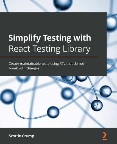
In the preceding code, we have a reverseWord function that reverses a passed-in string. If we invoke the function with the word packt, we get the following result:
reverseWord('packt') // tkcap
In the preceding code, we get a result of tkcap when we pass in packt as a parameter to the function. However, if we mistakenly misspell the function name and run the code, we get the following result:
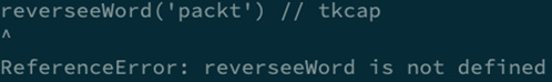
Figure 6.1 – The reverseWord function name typo
In the previous code, the console output indicates ReferenceError. The error refers to the interpreter not locating a defined function, called reverseeWord, in the file. The problem was that the user mistakenly added an extra e in the function name. We could create a better workflow by installing and configuring ESLint in our project to help debug issues.
If you are using create-react-app for your project, then ESLint should automatically be installed for you. For projects that don't already have ESLint installed, use the following command:
npm install eslint --save-dev
The previous command will install ESLint as a development dependency to your project.
Next, we can create a configuration file to tell ESLint how we want it to lint our files:
{
"extends": "eslint:recommended",
"parserOptions": {
"ecmaVersion": 2021,
"sourceType": "module"
}
}
The configuration file that was created in json format, in the previous code, has a few settings that tell ESLint how to lint our files. The "extends" key is set to "eslint:recommended". This means that we want to use ESLint's recommended linting rules. The "parserOptions" key is set to an object with two keys. The "ecmaVersion" key is set to 2021. This means that the code we write will support JavaScript options available in the 2021 version of ECMAScript. The "sourceType" key is set to "module", meaning our code will support ES modules. There are numerous ways ESLint can be configured to lint your project files.
Note
Please refer to Configuring ESLint (https://eslint.org/docs/user-guide/configuring/) for more details.
Use the following command to run ESLint against your project files:
npx eslint .
In the previous command, we use the npx command to run ESLint against all of the project files. Note that npx allows you to quickly execute npm packages regardless of whether the package is installed locally or globally on your machine or not installed at all. We receive the following output in the console after running the command:

Figure 6.2 – ESLint output
In the previous command, ESLint informs us of two errors in our code. The first error says that the reverseWord function was never used on line 1, referencing the no-unused-vars ESLint rule. The second error says that reverseeWord on line 3 is not defined anywhere in the file, referencing the no-undef ESLint rule. We can also enhance our ESLint workflow by displaying the output directly in our code editor to learn about any potential issues before running our code. For example, the VSCode and Atom code editors have third-party tools that we can install to display problems directly in the editor.
Note
Please refer to ESLint (https://marketplace.visualstudio.com/items?itemName=dbaeumer.vscode-eslint) for the VSCode editor extension. Alternatively, you can refer to linter-eslint (https://atom.io/packages/linter-eslint) for the Atom editor plugin for installation and configuration details.
Displaying the linter output directly in the code editor provides faster feedback than manually running ESLint via the command line. Now that you understand how to get ESLint up and running, we will install and configure eslint-plugin-testing-library in the next section.
Installing and configuring eslint-plugin-testing-library
In this section, we will learn how to install and configure eslint-plugin-testing-library inside our application. Install the plugin using the following command:
npm install --save-dev eslint-plugin-testing-library
The preceding command installs eslint-plugin-testing-library as a development dependency in your project. Now that the plugin is installed, we can add it to our ESLint configuration file:
"overrides": [
{
"files": ["*.test.js"],
"extends": [
"plugin:testing-library/react"
]
In the previous code, we created an "overrides" section in our ESLint configuration to target any files ending in .test.js. Then, we added plugin:testing-library/react to the extends array in the configuration file. We added the React version of the plugin to gain React-specific rules and the rules we get from DOM Testing Library's base rules. The plugin applies a particular set of linting rules that are specific to React applications. For example, the no-dom-import rule, which doesn't allow direct imports from DOM Testing Library, is useful because React Testing Library re-exports everything from DOM Testing Library, eliminating the need for direct imports.
Note
Please refer to Supported Rules (https://github.com/testing-library/eslint-plugin-testing-library#supported-rules) for a complete list of React-specific applied rules.
Note that the react-app entry is also included in the array. The react-app entry adds ESLint rules that have been set up by create-react-app. Now that we have the plugin set up in the project, we can write tests. We will test a drop-down component that allows a user to select a programming language:

Figure 6.3 – The drop-down component
In the preceding screenshot, you can see a dropdown that lists four programing languages that a user can click on to choose. When a user selects a language, we get the following:
Figure 6.4 – The selected drop-down option
Here, you can view the text You selected: JavaScript, which appears when a user selects the JavaScript option. We can write a test to verify that the selected language displays on the screen:
test('LanguageDropdown, given selected menu item, displays selection', async () => {
render(<LanguageDropdown />)
user.click(screen.getByRole('button', { name: /programming language/I }))
user.click(screen.getByRole''menuite'', { name: /javascript/i }))
user.click(screen.getByRole''menuite'', { name: /javascript/i }))
In the preceding code, first, we render the LanguageDropdown component in the DOM. Next, we click on the Programming Language button. Then, we select JavaScript from the menu options. Next, we will verify that the selected option is displayed on the screen:
const selection = await waitFor(() =>
screen.getByRole('heading', { name: /you selected: javascript/i })
)
In the preceding code, we use the waitFor method from React Testing Library to get the element with the text that includes the selected option. The waitFor method can be used when you need to wait for an element in the DOM. However, according to eslint-plugin-testing-library, waitFor is not the best way to select an element in this situation:

Figure 6.5 – The findByRole linter suggestion
In the previous screenshot, the code that includes the waitFor method is underlined by ESLint, drawing our attention to the code issue. When we hover over the waitFor method code, we get feedback indicating that the preferred query is findByRole via the prefer-find-by rule of eslint-plugin-testing-library.
In Chapter 5, Refactoring Legacy Applications with React Testing Library, we learned how to use the findByRole query to select elements that need time to appear on the screen. The prefer-find-by rule is a fixable rule; this means that we can select to have the problem code automatically fixed for us.
One easy way to automatically fix issues is by setting up your code editor to automatically resolve any fixable issues when saving a file. Please refer to the documentation of your respective code editor for instructions. If, for some reason, your editor does not have a fix on save feature, you can run eslint --fix in the command line or use pre-commit hooks via git. As a last resort, you always have the option of referring to the eslint-plugin-testing-library documentation, which is related to the prefer-find-by rule and others, for suggestions. Once we refactor the problem code, we get the following output:
const selection = await screen.findByRole('heading', {
name: /you selected: javascript/i
})
expect(selection).toBeInTheDocument()
})
In the preceding code, the waitFor code is replaced with the findByRole query method. The code has a cleaner syntax that behaves similarly to the waitFor code and satisfies the linter rules. Finally, we assert that the selected code is in the document.
Some rules are not automatically enabled with the React version of eslint-plugin-testing-library. For example, in previous versions of React Testing Library, it was common to see selectors written as follows:
const { getByRole } = render(<LanguageDropdown />)
user.click(getByRole('button', { name: /programming language/i }))
user.click(getByRole('menuitem', { name: /javascript/i }))
In the preceding code, we access the query methods by destructuring them off the rendered component. The latest React Testing Library versions suggest using the screen object to access query methods for a better user experience. The screen object allows you to access query methods using your editor's autocomplete feature rather than undergoing explicit destructuring via the rendered component. We can add the prefer-screen-queries rule to our ESLint configuration file to enforce this way of selecting query methods:
"rules": {
"testing-library/prefer-screen-queries": "error"
}
In the preceding code, we added a "rules" key to the configuration file. The "rules" key is used when we want to add specific rules to enforce our code. Inside the "rules" key, we add the "testing-library/prefer-screen-queries" key, which is set to "error". If we had our project set up with a linting script to run ESLint across our files, the error would trigger an exit code to stop file execution, making it clear that the current code is not acceptable for use.
Now, with this rule in place, the previous code using destructuring will be flagged by ESLint:
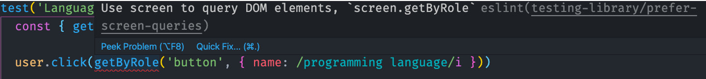
Figure 6.6 – The prefer-screen-queries linter suggestion
In the previous screenshot, getByRole is underlined by ESLint to draw our attention to the query issue. When we hover over the query, we get feedback indicating that the preferred approach uses screen to query DOM elements via the prefer-screen-queries rule of eslint-plugin-testing-library.
Unlike the prefer-find-by rule in the previous example, prefer-screen-queries is not a fixable rule. This means that we will need to fix the code manually. When we refactor the code, we get the following result:
render(<LanguageDropdown />)
user.click(screen.getByRole('button', { name: /programming language/i }))
user.click(screen.getByRole('menuitem', { name: /javascript/i }))
The DOM selectors have been refactored to use the screen object in the preceding code, satisfying the prefer-screen-queries rule. The code also looks cleaner compared to the version using destructured query methods.
In some situations, we might want rules that provide a warning compared to an error when ESLint runs across project files. The warning won't stop code execution; however, instead, it will serve as a reminder to the user to remove the file's highlighted code before committing the code. For example, it is common to use the debug method to view the current state of the DOM as we build tests:
render(<LanguageDropdown />)
screen.debug()
In the previous code, the debug method is used for logging the current DOM output to the console after rendering the LanguageDropdown component. The debug method will be highlighted in the editor, as follows:

Figure 6.7 – The no-debug linter suggestion
In the preceding screenshot, debug is underlined by ESLint to draw our attention to an issue with the query. When we hover over the query, we get feedback indicating the method should be removed via the no-debug rule of eslint-plugin-testing-library. We often forget to remove the console's logging code before committing work, so the no-debug rule serves as a helpful reminder to remove it.
Now you know how to install and configure ESLint with eslint-plugin-testing-library to help avoid issues and follow best practices while writing tests.
In the next section, we will go a step further by installing another plugin that is specific to jest-dom.
Installing and configuring eslint-plugin-jest-dom
In the previous section, we installed and configured ESLint and eslint-plugin-testing-library. In this section, we will teach you how to install and configure eslint-plugin-jest-dom, ensuring we follow the best practices using jest-dom. Use the following command to install the plugin:
npm install --save-dev eslint-plugin-jest-dom
The previous command installs eslint-plugin-jest-dom as a development dependency inside the project. Now that the plugin is installed, we can add it to our ESLint configuration file:
{
"extends": ["react-app", "plugin:jest-dom/recommended"]
}
In the previous code, we added plugin:jest-dom/recommended to the extends array in the configuration file. The recommended configuration for the plugin is used to automatically include a set of standard rules to enforce jest-dom best practices. We will test a checkbox component that allows the user to select their preferred programming languages:
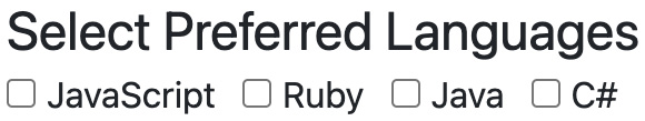
Figure 6.8 – The languages checkbox component
In the preceding screenshot, you can see that there are four checkboxes for programming languages that a user can select from. When a user selects a language, we get the following:
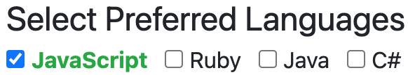
Figure 6.9 – The selected language checkbox
In the preceding screenshot, the user selects JavaScript, which results in the associated checkbox being selected, the text color changing to green, and the font-weight changing to bold. We can write a test to verify that the checkbox for the selected language is selected and has the expected classes associated with the color and font-weight of the text the user sees on the screen:
test('LanguageCheckbox, given selected item, item is checked', () => {
render(<LanguageCheckBox />)
const jsCheckbox = screen.getByRole('checkbox', { name: / javascript/i })
user.click(jsCheckbox)
In the preceding code, we render the LanguageCheckBox component to the DOM. Next, we get the JavaScript checkbox, store it in the jsCheckbox variable, and click on it. Next, we will make assertions on the expected output. First, we try using the toHaveAttribute Jest matcher:
expect(jsCheckbox).toHaveAttribute("checked");
In the preceding code, we use toHaveAttribute to verify that the checkbox has the checked attribute after being clicked. However, our test will fail with this matcher because it only looks for an explicit checked attribute that is added to the elements commonly used in situations where we want a prechecked checkbox. In our case, we're testing the result of a user clicking on the checkbox in the resulting DOM, so we need a different matcher. Next, we try using the toHaveProperty Jest matcher:
expect(jsCheckbox).toHaveProperty("checked", true);
In the preceding code, we use the toHaveProperty Jest matcher to verify that the checkbox has the checked property set to true. This matcher works in a technical sense, but it doesn't read very clearly. Additionally, when we hover over the matcher, we get the following output:

Figure 6.10 – The prefer-checked linter suggestion
In the preceding screenshot, the toHaveProperty matcher is underlined by ESLint to draw our attention to the matcher's issue. When we hover over the matcher, we get feedback indicating it should be replaced with the jest-dom toBeChecked matcher via the prefer-checked rule of eslint-plugin-jest-dom. The rule is automatically fixable and will refactor the matcher for us if we have our code editor set up. When we refactor our matcher, we get the following output:
expect(jsCheckbox).toBeChecked()
In the preceding code, we use the toBeChecked jest-dom matcher to verify that the checkbox is checked. Now we have a matcher that eliminates any issues with previous matcher versions and also reads a lot better. Next, we will assert the expected classes:
expect(screen.getByText(/javascript/i).className). toContain('text-success font-weight-bold')
In the preceding code, we access the className property inside the element with the javascript text to verify that it contains the text-success and font-weight-bold classes. However, when we hover over toContain, we get the following feedback:

Figure 6.11 – The prefer-to-have-class linter suggestion
In the preceding screenshot, the toContain matcher is underlined by ESLint to draw our attention to the matcher's issue. When we hover over the matcher, we get feedback indicating that it should be replaced with the jest-dom toHaveClass matcher via the prefer-to-have-class rule of eslint-plugin-jest-dom. Similar to the previous example, the prefer-to-have-class rule is automatically fixable and will refactor the matcher for us if we have our code editor set up to do so. When we refactor the code, we get the following output:
expect(screen.getByText(/javascript/i)).toHaveClass(
'text-success font-weight-bold'
)
In the preceding code, we refactored our code to use the jest-dom toHaveClass matcher. Now we have a matcher that is easier to implement and read compared to our original example.
Now you understand how to install and use the eslint-plugin-jest-dom plugin to use assertion matchers that follow the jest-dom best practices. In the next section, we will learn how to install and use a package to increase the accessibility of our component's source code.
Testing accessibility with jest-axe
In this section, we will learn how to use a tool that is designed to help improve the accessibility of our features. There are many tools available that can help increase accessibility by automating the process of auditing and reporting issues, such as Wave (https://wave.webaim.org/) and Lighthouse (https://developers.google.com/web/tools/lighthouse). However, there is no single tool that can guarantee accessibility across an entire application. Accessibility auditing tools are helpful, but they do not replace the need for manual accessibility auditing done by a human. For example, when an abbreviation is used for the first time in a line of text, the related expanded version should be included:
Structured Query Language (SQL) is used to manage data in relational databases.
In the preceding sentence, the expanded version, Structured Query Language, is included with its abbreviated form, SQL. The sentence would need to be manually checked to verify accessibility. We will learn how to use jest-axe, which is a tool that adds a custom matcher for Jest and behaves in ways that are similar to ESLint. The tool helps find and report common accessibility issues in your code, such as image buttons with no alternate text or inputs with no associated labels. Use the following command to install the tool:
npm install --save-dev jest-axe
The previous command installs jest-axe as a development dependency inside the project. Now that the tool is installed, we can use it in our tests. First, we will test the accessibility of an image button:
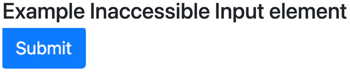
Figure 6.12 – An inaccessible image button
In the preceding screenshot, we have an image that behaves as a Submit button. The following is the source code for the image button:
import loginImg from './image/login.png'
<input src={loginImg} type="image" />
In the preceding code, we will import an image and pass it as source for an input of the image type. Now we will write a test to verify that the element is accessible to users:
import { render } from '@testing-library/react'
import { axe } from 'jest-axe'
import 'jest-axe/extend-expect'
import NoAccessibility from './NoAccessibility'
In the preceding code, first, we import the render method from React Testing Library. Then, we import the axe method from jest-axe. The axe method is what we will use to audit the accessibility of our component. Next, we import jest-axe/extend-expect, which adds a special matcher to Jest to report the audit outcome in a readable format. Finally, we import the NoAccessibility component to test. Next, we will write the main test code:
const { container } = render(<NoAccessibility />)
const results = await axe(container)
expect(results).toHaveNoViolations()
In the preceding code, first, we destructure container off the rendered component. Unlike query methods, we can destructure container off the rendered component without violating DOM Testing Library's best practices because it is not available on the screen object. container is the div element that wraps your React component under test.
Next, we pass container as an argument to the axe method and store it in the results variable. The axe method will run an accessibility audit across our component under test. Finally, we assert that the results have no accessibility issues using the toHaveNoViolations matcher. The test will pass if no violations are found.
However, if violations are found, the test will fail and provide feedback to resolve those issues. When we run the test, we get the following output:
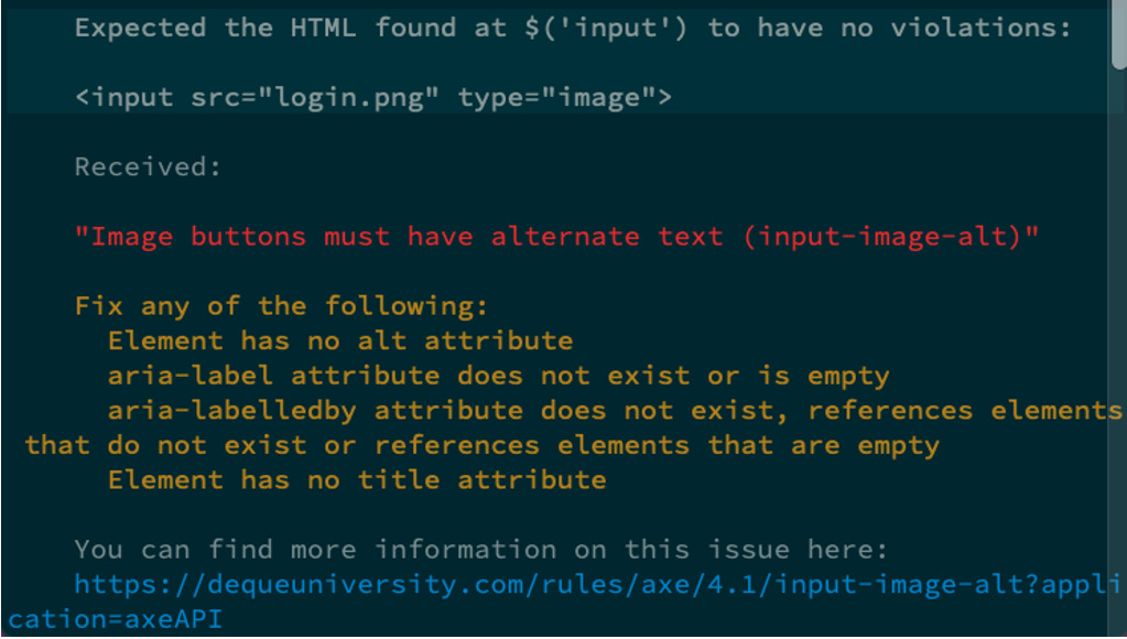
Figure 6.13 – Inaccessible image button test output
The preceding screenshot shows that accessibility violations were found in the NoAccessibility component, which resulted in a test failure with feedback. First, the feedback indicates that an input element is the source of the issue. Next, we see the entire element printed on the screen. Then, we get the "Image buttons must have alternate text (input-image-alt)" message, informing us why the element failed the audit. Next, we get several suggestions that we can implement to resolve the issue. Finally, we get a hyperlink that we can follow to gain a deeper understanding of the issue. We will resolve the issue by providing an alt attribute:
<input src={loginImg} type="image" alt="login" />
In the preceding code, we added an alt attribute with the value of login. Now, when we rerun our test, we get the following result:
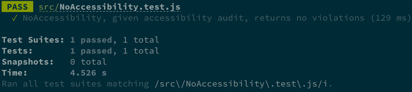
Figure 6.14 – Accessible image button test output
In the preceding screenshot, the test results indicate that NoAccessibility, given accessibility audit, returns no violations passes with no violations. Next, we will test the accessibility of a list that includes an image:
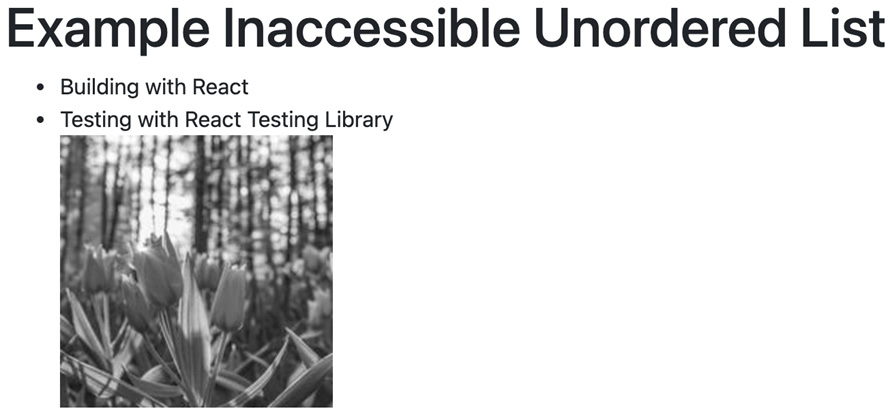
Figure 6.15 – An inaccessible list
In the preceding screenshot, we have an unordered list that includes an image element. The following is the source code for the list:
<ul>
<li>Building with React</li>
<li>Testing with React Testing Library</li>
<img
src="http://unsplash.it/g/200?random&gravity=center"
alt="tulips"
/>
</ul>
In the preceding code, we have an unordered list element with two list item child elements and one image child element. Our test code will be the same as the previous test for the image button. The only difference here is the component that we pass into the render method. So, for this example, we will only focus on the test results:
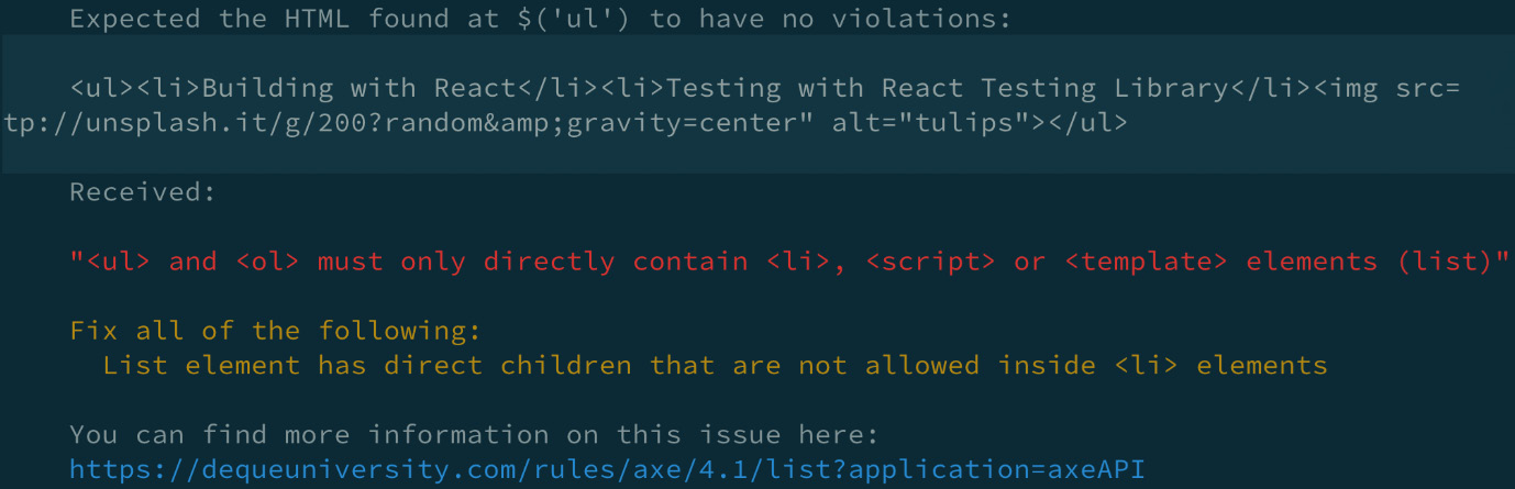
Figure 6.16 – Inaccessible list test results
The preceding screenshot shows that accessibility violations were found in the unordered list component, which resulted in a test failure with feedback. First, the feedback indicates that a ul element is the source of the issue. Next, we see the entire element printed on the screen. Then, we get the "<ul> and <ol> must only directly contain <li>, <script> or <template> elements (list)" message, which helps us to understand why the element failed the audit.
Next, we get a suggestion regarding how to resolve the issue. Finally, we get a hyperlink that we can follow to gain a deeper understanding of the issue. We will resolve the issue by moving the image inside an li element:
<ul>
<li>Building with React</li>
<li>Testing with React Testing Library</li>
<li>
<img
src="http://unsplash.it/ g/200?random& gravity=center"
alt="tulips"
/>
</li>
</ul>
In the previous code, we wrapped the image element inside an li element. When we rerun our test, the test will pass and return results that are similar to what we saw in the image button's previous test. Now you know how to use jest-axe to increase the accessibility of applications using React with Jest. It is important to reiterate that automated accessibility tools help increase our applications' ability to work for various end users. However, they cannot catch all issues and are not a replacement for manual audits.
Next, we will learn how to use a tool to speed up our element selections with React Testing Library.
Selecting the best queries with Testing Playground
In this section, we will learn how to use Testing Playground. This is a tool that makes it easier for you to determine the right DOM Testing Library query selector. Testing Playground allows you to paste HTML into an interactive website, which allows you to click on elements as they appear rendered in the browser. This enables you to learn which DOM Testing Library queries can be used to select a particular element.
The tool always suggests queries in order, based on the DOM Testing Library query recommendations for elements that offer multiple ways of selection. Furthermore, the tool allows you to copy the selector to use in your test code. We will look at two ways of using Testing Playground: first, via the website, and second, via a Chrome extension.
Selecting queries using the Testing Playground website
In this section, we will learn how to use Testing Playground via its website. In previous examples throughout the book, we used the debug method to log the resulting HTML of components to the console while writing tests. One limitation of the debug method is that it has no feature that enables you to log the output to the browser and test out different query methods to select elements.
We can use the logTestingPlaygroundURL method inside a test file to log the resulting HTML to a browser via Testing Playground (https://testing-playground.com/) and utilize the site's query selector features. For example, we could be in the process of selecting elements in a test for the following MoreInfoPopover component:
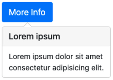
Figure 6.17 – The Popover component
In the preceding screenshot, we have a button element with the text More Info, which displays a popover with dummy text when it is clicked on. We want to select the button element using DOM Testing Library queries, so we start our test as follows:
import { render, screen } from '@testing-library/react'
import MoreInfoPopover from './MoreInfoPopover'
it('logs output to Testing Playground', () => {
render(<MoreInfoPopover />)
screen.logTestingPlaygroundURL()
})
We import the render and screen methods from React Testing Library and the component under test in the preceding code. Inside the main test code, first, we render the component in the DOM. Next, we call the logTestingPlaygroundURL method. When we run the test, we get the following output:
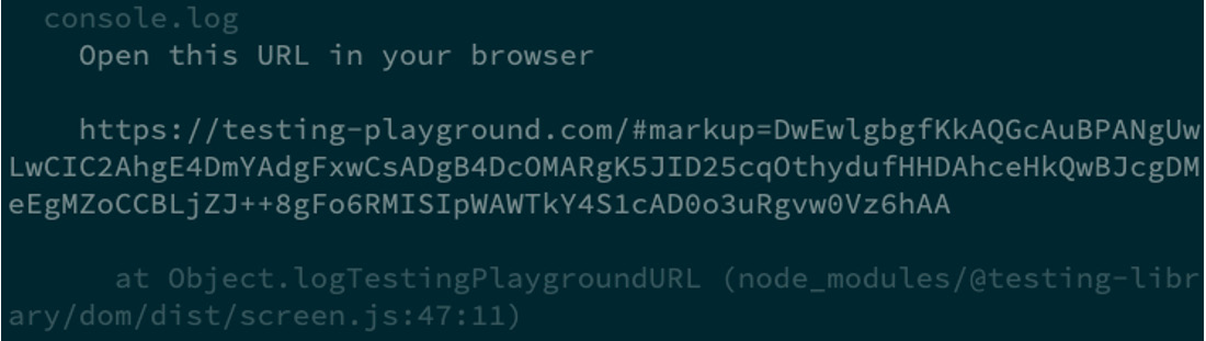
Figure 6.18 – The Testing Playground link
In the preceding screenshot, we have a unique link to the Testing Playground website to follow and view our component's rendered HTML. When we follow the link, we should see something similar to the following:

Figure 6.19 – The Testing Playground HTML structure
In the preceding screenshot, the link navigated us to the Testing Playground website. First, we see a section that includes the HTML structure for our component. Next, we see the rendered browser output, as follows:

Figure 6.20 – The Testing Playground browser output
In the preceding screenshot, we can see a section with the browser output for our component. Notice that we don't see the complete result with associated styles included. The Testing Playground website only displays the HTML content. Next, we see a suggested query section, as follows:
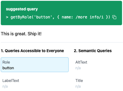
Figure 6.21 – Testing Playground suggested query
In the preceding screenshot, we get a suggested query for the button element we clicked on in the browser output section. The getByRole query is the best way to select the button based on its HTML structure. Additionally, we can see the This is great. Ship it! message, which suggests that we should use this query further.
There are also other options available, as shown in the following screenshot, to select the element:
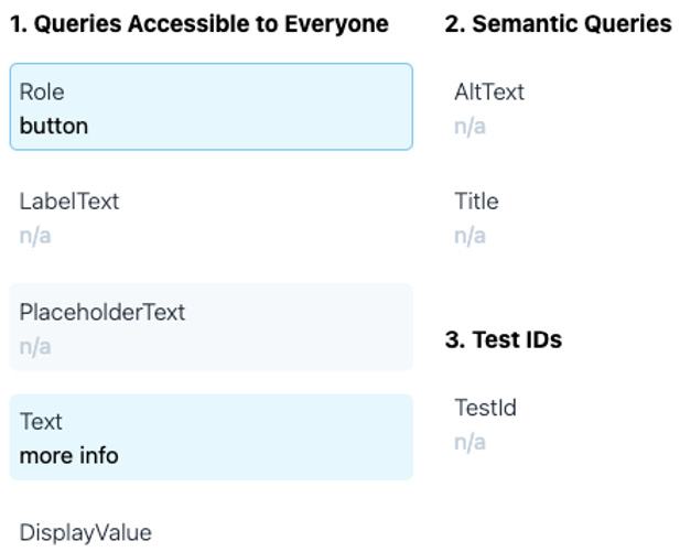
Figure 6.22 – Testing Playground query priority options
In the preceding code, we can see multiple options to select the element in order of priority. Based on the HTML structure of the button element, there are two ways we could choose the element – by its role and by its text value. The other listed queries are not available for the button and, therefore, display n/a. If we decide to select the Text query option, we should see something similar to the following screenshot:
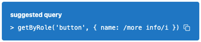
Figure 6.23 – The Testing Playground text query option
In the preceding screenshot, we can see the text Nice! getByText is a great selector! Using getByRole would still be preferable though.. This message informs us that while it is not wrong to use getByText to select the button, it is not the best query for the selected element. Once we decide on the query we want to grab the element, we can click on the icon displayed on the far right of the suggested query box to copy the code needed to select the element within our test.
Now you know how to use the logTestingPlaygroundURL method to select elements using the Testing Playground website. There is one notable limitation to using the Testing Playground website. When we click on the More Info button, we should see a popup appear beneath the button. We cannot use the Testing Playground website to perform this action since it only copies the HTML and not the associated JavaScript to render the result of clicking on the button.
In the next section, we will learn how to use the Testing Playground Chrome extension to overcome this limitation.
Selecting queries using the Testing Playground Chrome extension
In this section, we will install and use the Testing Playground Chrome extension to overcome the limitations of using the Testing Playground website. This extension provides the benefit of allowing you to use Testing Playground features locally, in the same browser that is used to run your application. The extension is currently only available for the Google Chrome browser, so be sure to install it if necessary.
Install the Testing Playground Chrome extension (https://chrome.google.com/webstore/detail/testing-playground/hejbmebodbijjdhflfknehhcgaklhano) via the Chrome Web Store. Once the extension is installed, a new Testing Playground tab is added to your Chrome Developer Tools.
Going back to the MoreInfoPopover component from the previous section, we can write a test to verify that the popover is displayed when a user clicks on the More Info button:
test('MoreInfoPopover, given clicked button, displays popover', () => {
render(<MoreInfoPopover />)
In the preceding code, we render MoreInfoPopover in the DOM. Next, we will use the Testing Playground extension to find the preferred query selector for the button:
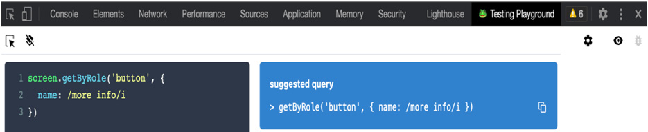
Figure 6.24 – The Testing Playground Chrome extension
In the previous screenshot, we can see a tab added for the Testing Playground extension in the Chrome Developer Tools. The experience of using the Chrome extension is similar to that of the Testing Playground website. However, now, we can interact with our component's HTML output with the associated JavaScript and styles included. As we discussed in the Selecting queries using the Testing Playground website section, when we click on the button, we get the preferred getByRole query selector. When we copy the selector, we get the query code to add to our test:
screen.getByRole('button', { name: /more info/i})
In the preceding code, we copied the getByRole selector to access the More Info button. Next, we will use the extension to help select the popover, which is displayed after clicking on the button:
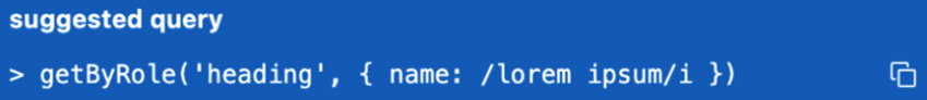
Figure 6.25 – The popover query selector
In the preceding screenshot, getByRole is the suggested query for the popover element after selecting it in the browser. Now we have all the selectors that we need to write the remaining test code:
user.click(screen.getByRole('button', { name: /more info/i }))
const popover = await screen.findByRole('heading', { name: / lorem ipsum/i })
expect(popover).toBeInTheDocument()
In the preceding code, first, we click on the More Info button. Next, we grab the popover element by its heading and store it in a variable. Notice that we used findByRole instead of the getByRole query. Testing Playground only provides getBy* queries, so it might be necessary to modify the copied query based on the situation. Finally, we assert that the popover element is in the DOM. When we run the test, we get the following result:

Figure 6.26 – The popover test results
In the previous screenshot, the results indicate that the MoreInfoPopover, given clicked button, displays popover test passes as expected. Now you know how to install and use the Testing Playground Chrome extension to enhance your workflow when writing tests. The Testing Playground website and extension are great supporting tools to utilize when working with DOM Testing Library.
In the next section, we will learn how to use a tool that will speed up the results feedback from beginning to completion when writing tests.
Increasing our testing productivity with Wallaby.js
In this section, we will learn how to increase our productivity by using the Wallaby.js productivity tool. Wallaby.js works by automatically running your tests behind the scenes via a Headless Chrome browser. There is also the option to run tests in other environments, such as Node.js or Phantom.js, with a custom configuration file. Wallaby.js helps to speed up your workflow by providing immediate test results inside your code editor, so you can type without needing to save and run a test script to view the results.
Wallaby.js provides many features, such as the following:
- Time Travel Debugging: This allows you to navigate through your code to pinpoint bug sources easily.
- Test Story Viewer: This provides the ability to view the code associated with your test on one compact screen.
- Inline Code Coverage: This informs you of the test coverage for each line of code inside the code editor.
Note
Please refer to the Features section (https://wallabyjs.com/#features) on the Wallaby.js documentation website for a complete list of features.
Installing and configuring Wallaby.js
In this section, we will learn how to install and set up Wallaby.js for the Visual Studio Code editor. Please refer to the Install section (https://wallabyjs.com/download/) on the Wallaby.js documentation website for a complete list of installation options. To get started, add the Wallaby.js VSCode extension to your editor via the VSCode Marketplace (https://marketplace.visualstudio.com/items?itemName=WallabyJs.wallaby-vscode). Once the extension has been installed, we can configure it to work in our project.
The quickest and easiest way to configure Wallaby.js is with automatic configuration. Projects using specific versions of tools such as create-react-app version 3 or greater, or Jest version 24 or greater, qualify for automatic configuration.
For projects that do not qualify for automatic configuration, please refer to the Configuration File section (https://wallabyjs.com/docs/intro/config.html?editor=vsc#configuration-file) in the Wallaby.js documentation for specific configurations based on your project setup.
Start Wallaby.js in VSCode with automatic configuration using the command palette:
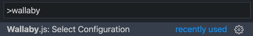
Figure 6.27 – Select Configuration
In the preceding screenshot, wallaby is entered into the command palette to bring up the available Wallaby.js commands. We will click on the Wallaby.js: Select Configuration option:

Figure 6.28 – The Automatic Configuration option
In the preceding screenshot, we have selected the Automatic Configuration <project directory> and Automatic Configuration <custom directory> options. We will select <project directory> to use the directory of our current project. Once we select the configuration, Wallaby.js will start and run our tests to provide feedback directly inside the test files of the code editor, as shown in the following screenshot:
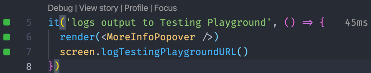
Figure 6.29 – Wallaby.js enhanced test output
In the preceding screenshot, we can see a test that we created earlier, in the Selecting the best queries with Testing Playground section of this chapter, enhanced with Wallaby.js' features. First, we see green-colored square shapes to the left of the line numbers indicating that all the test lines have passed. Next, we see links for the Wallaby.js Debug, View Story, Profile, and Focus features, which we can click on to analyze the test from the perspective of that particular feature.
Finally, we see the test runtime, 45ms, logged next to the test. Now you understand how to install and configure Wallaby.js. You should also understand the basic enhancements that Wallaby.js adds directly inside the test files.
In the next section, we will walk through how to write a test utilizing Wallaby.js's Interactive Test Output feature.
Writing tests with Interactive Test Output
In the Selecting the best queries with Testing Playground section of this chapter, we wrote the MoreInfoPopover, given clicked button, displays popover test for a MoreInfoPopover component. Let's walk through how to create the same test utilizing Wallaby.js.
First, we will render the component under test in the DOM and use the debug method to log the current state of the HTML output:
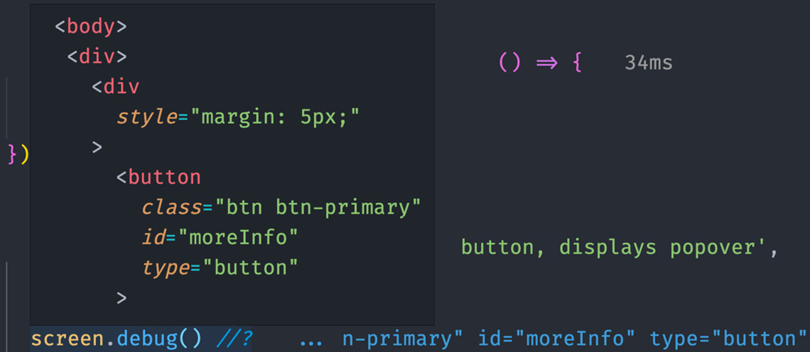
Figure 6.30 – The Wallaby.js inline debug output
In the preceding screenshot, we used the //? command from Wallaby.js to log the results of debug directly inside the code editor. The output is automatically displayed horizontally to the right of debug when we hover over the method. This feature speeds up our workflow because, normally, we would have to execute our test runner from the command line to see the output.
Next, we will add queries to select the DOM elements:
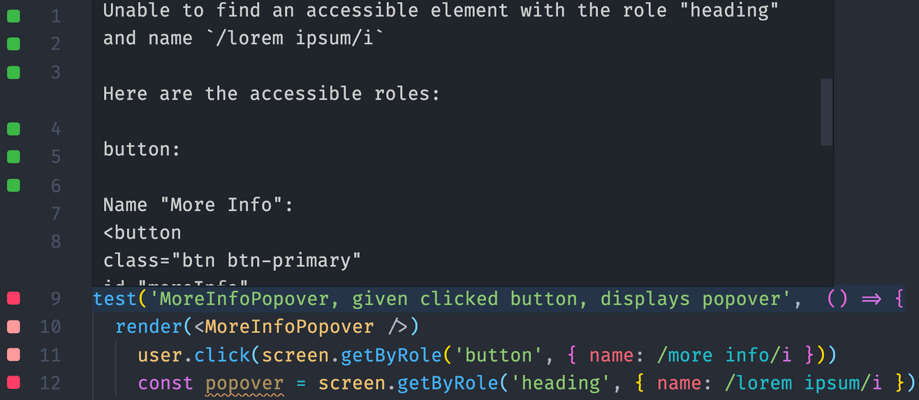
Figure 6.31 – A query error
In the preceding screenshot, we have a test failure resulting from React Testing Library not finding a heading element named lorem ipsum. Wallaby.js increases our ability to discover the error in two ways. First, we see a red-colored square shape to the left of the test name and, specifically, the line number where the error occurred. The inline code notifications help us to quickly identify where we should focus on pinpointing the cause of the error. Second, when we hover over the test method, React Testing Library's test result output is displayed directly in the code editor.
This feature speeds up our workflow because Wallaby.js reruns our test and provides feedback any time we add new code to the test. Furthermore, we don't even have to save our test file to gain feedback. We can also view test feedback in the Wallaby.js Tests console:
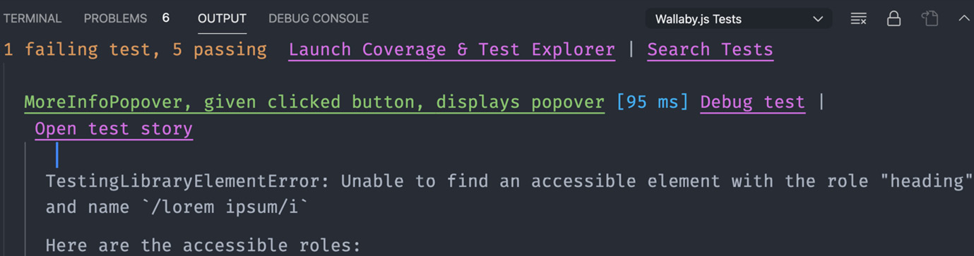
Figure 6.32 – The Wallaby.js Tests console
In the preceding screenshot, we can see similar React Testing Library feedback to what we see directly in the editor anytime code is updated in the test file, but now it is in an expanded view. Additionally, we can see the number of failing tests compared to passing tests, and clickable links for Launch Coverage & Test Explorer, which is a feature that allows you to see visualized test coverage for each file, and Search Test, which is a feature that allows you to quickly search for any test in the project.
After debugging the failure with the help of Wallaby.js' in-editor features, we learned that the heading element with the name of lorem ipsum is not immediately displayed. Using our knowledge of Testing Library queries, we can determine that the element should be selected using an asynchronous findBy* query:
const popover = await screen.findByRole('heading', { name: / lorem ipsum/i })
In the preceding code, we update the selector to findByRole. Immediately after updating the selector, we get feedback within the editor:
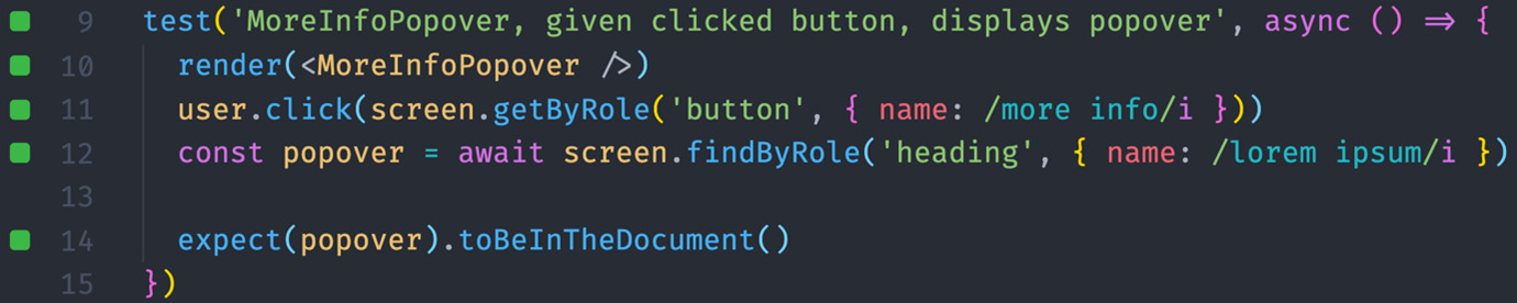
Figure 6.33 – Query refactor
In the preceding screenshot, we see green-colored square shapes to the left of all of the line numbers. This indicates that we have successfully refactored the test code to a working state. We have also written an assertion to verify that the test passes as expected. Now you know how to use Wallaby.js to gain instant editor feedback and test debugging capabilities. Using Wallaby.js is a great tool to have when you need to save time running and debugging tests.
Summary
This chapter has taught you the benefits of using ESLint plugins to follow the DOM Testing Library and jest-dom best practices. You have gained an understanding of accessible code and used jest-axe to increase the accessibility of your applications. You have learned how to speed up the process of determining the best query method with Testing Playground. Finally, you have learned how to increase test writing productivity with Wallaby.js.
In the next chapter, you will learn about end-to-end UI testing using the popular Cypress framework.
Questions
- Install and configure the React-specific version of eslint-plugin-testing-library into a project and add additional rules.
- Create examples of jest assertions using matchers that don't use jest-dom best practices. Then, install and configure eslint-plugin-jest-dom inside a project and use it as a guide to correct highlighted issues.
- Create a few components with accessibility issues, install and run jest-axe against the components and use the feedback to fix them.
- Visit three of your favorite websites and use Testing Playground to see how many elements you can select using DOM Testing Library's preferred byRole* queries.
- Install Wallaby.js and log how quickly you can write a test using its in-editor features.