Chapter 15: Building Actionable Reports and Dashboards (CRM)
The reporting and dashboard capability within Zoho Customer Relationship Management (Zoho CRM) is first class. There is a common saying/cliché in business: Whatever gets measured, gets done. Whether or not you believe this to be completely true, it is difficult to argue against the fact that measuring performance is an essential undertaking for every business that wants to become successful.
Every business at some stage sets goals, followed by targets to help it achieve these goals. Therefore, it follows that we need to measure how we are performing against such targets. Zoho CRM facilitates this by allowing a majority of fields in every module to be used within a report as a measure or as a filter. Also, many numerical and statistical functions (similar to those in Excel) are built into the software. As Zoho users, we have in our hands the tools to create actionable, insightful, intuitive, and visual dashboards with relative ease and speed.
In this chapter, you will learn about the different types of dashboards available in Zoho CRM and how to create a report. You will have guided practical examples to complete and will also gain an insight into some of the best reports and dashboards successful businesses around the world are using.
The following topics are covered in this chapter:
- Creating a report
- Scheduling a report to send automatically
- Creating dashboards
- Example dashboards to accelerate a successful customer relationship management (CRM) experience
By the end of this chapter, you will have learned how to create a basic report. You will have discovered how and why we should automate the distribution of reports, and you will have learned how to create a visual dashboard as well as gaining insight into some of the best dashboards used by Zoho users.
Let's start with report writing!
Creating a report
In this section, you will learn how to create a report using the UI (User Interface) released by Zoho in July 2021. We can create a report as follows:
- Starting from the Home page, click Reports | Create Report.
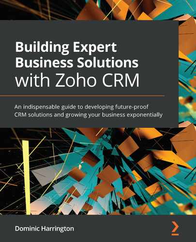
- Select the primary module you wish to base your report upon. In this example, we will select Leads then click Continue as shown:
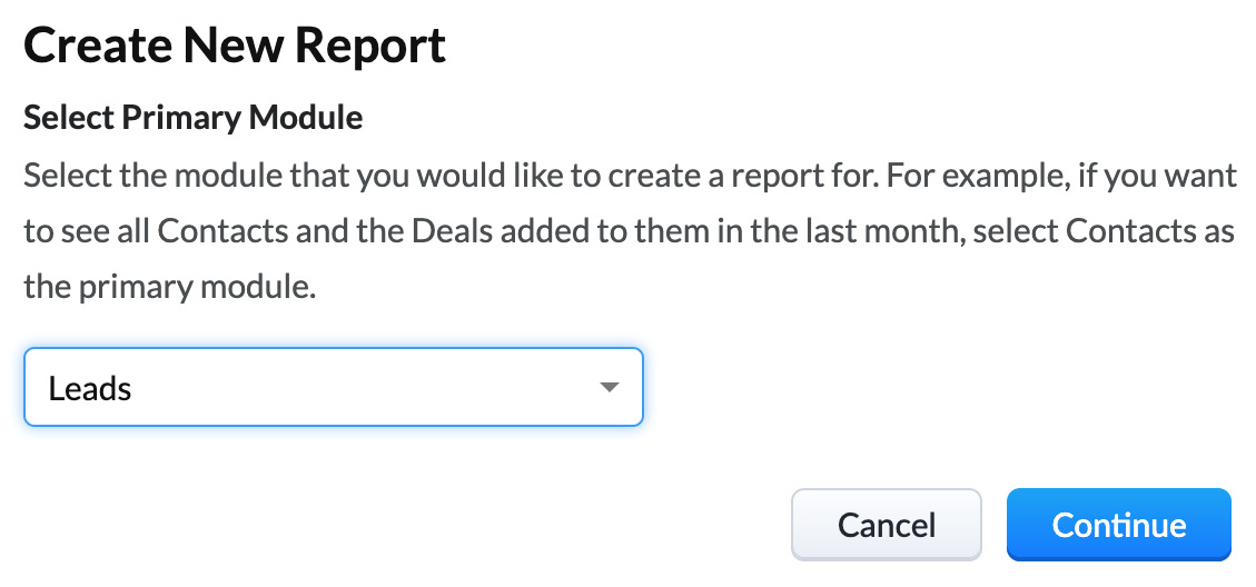
Figure 15.1 – Creating a new report based upon the Leads module
- You will now see the following screen:
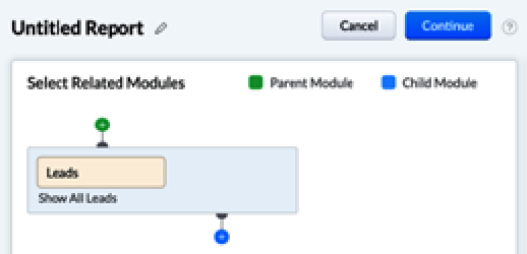
Figure 15.2 – Adding related Child or Parent Modules
You can add additional related child modules by clicking on the blue + and/or parent modules by clicking on the green + button. In this example, we will click Continue without adding any related modules.
Tip
When reporting on Leads you most likely will not need any related modules. When reporting on the Deals module, you may wish to include Contacts and Accounts as child modules. By doing so, you will be able to select any field from the parent and child modules in your report.
- Next, select the columns you wish to add/remove from the report using the + next to Columns as shown in the following image. In this example, select Created Time and then click Done.
Figure 15.3 – Select the columns you wish to include within your report
- Now select the fields you wish to Group By (or summarize by) by clicking on the + next to Row Groups. In this example, select Lead Source and Country (or any other picklist you wish to summarize by) then click Done.
- Once you have added the columns and the rows to group by, you will see a preview appear in the center of the screen showing how your report will look:
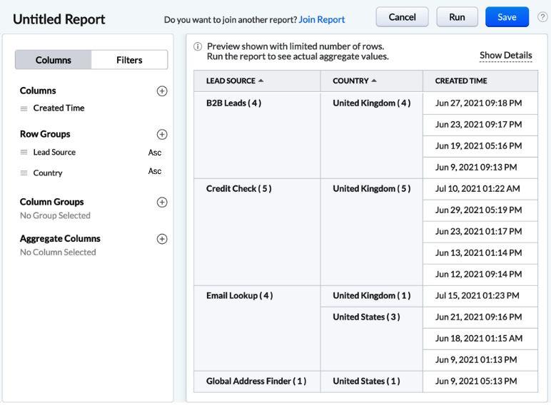
Figure 15.4 – A preview of the report once columns and row groups have been added
Tip
When you start creating reports, you will not be sure whether your fields need to be selected in Columns, Row Groups, Column Groups, or Aggregate Columns. Do not worry about that – just experiment and iterate until you achieve the desired result.
- Using the same menu on the left as shown in Figure 15.4, you may also add columns to Group By or Aggregate By as desired.
- Once you are happy with the preview, click on the Filters tab followed by the + as shown:

Figure 15.5 – Selecting the Filters tab
- Now select the fields you wish to filter your report on.
If your filter is based on a date, use the Date Filter. if you wish to filter using any other field, then use the Advanced Filters. In this first example, we will filter Created Time within the Last 12 Months as shown in the image, then click Save:

Figure 15.6 – Adding filters to your report
- Click the Save button in the top-right corner once more.
- Give your report a Name, Description (optional) and select the Folder you wish to add the report to. Then click Save:
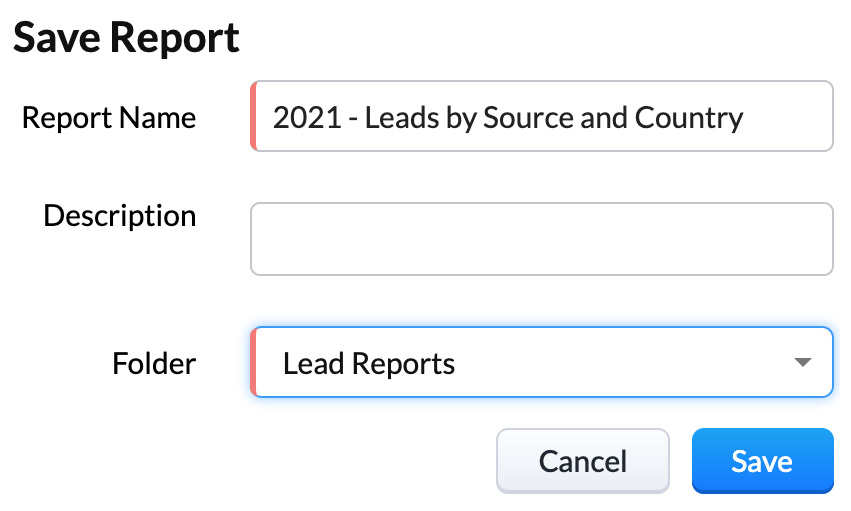
Figure 15.7 – Saving your report
- Once you have saved your report, you will be presented with your report, consisting of the Columns, Groupings, and Filters selected. An example of this can be seen in the following screenshot:
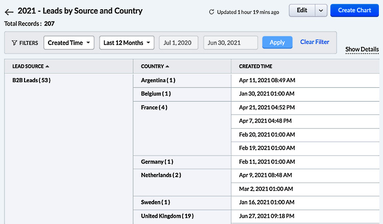
Figure 15.8 – Viewing the report once saved
- Finally, there are a few options remaining to use in the top right:
- Edit: This allows you to amend any of the columns, groupings, and filters.
- Clone: This allows you to clone (copy) your report and then amend any of the columns, groupings, and filters as required. This is a time-saving way for creating multiple, similar reports.
- Export: Export our report into Excel, CSV, or PDF format.
- Send Mail: Email our report to a single or group of recipients.
- Create Chart: Create a visual representation of this filtered data (which we will consider in the next section, Creating Dashboards).
You can see these options by clicking the drop-down menu next to Edit:
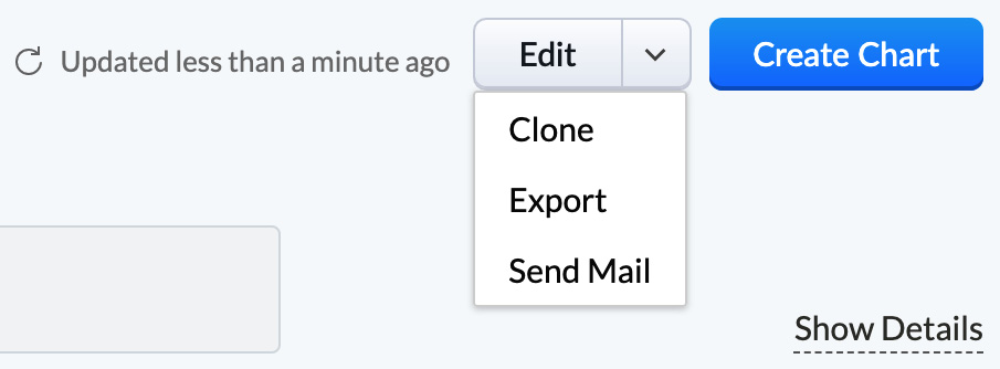
Figure 15.9 – Additional options once you have saved your report
Congratulations! You have created and edited your first report and have taken a key step toward using one of the most powerful and beneficial tools of Zoho CRM. Next, we will look at how we can schedule reports automatically.
Scheduling a report to send automatically
In the previous section, we created a report of all leads generated grouped by Lead Source and Country. In this section, you will learn how we can schedule a version of this report to send automatically. Automating reports, while making you more efficient, is a great way of making sure that you and your team are constantly aware of some of the key performance indicators (KPIs) that are helping to fuel your business growth.
It might be useful to send an amended version of this report to a colleague(s) monthly. That report should only contain leads created the previous month. This can be achieved in the following way:
- With the report open, click on the dropdown next to the Edit option, as shown in Figure 15.9 earlier, and click on Clone.
- Now click on the Filters tab and change the Standard Filter to Leads Created Time to Last Month.
- Click on the pencil next to the report name in the top left then amend the name of the report to Leads Created Last Month.
- Click Done.
- Click Save.
- Click on Reports (module) on the main CRM menu, then locate and select a folder from the list on the left named Scheduled Reports to reveal the following screen:
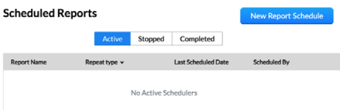
Figure 15.10 – Scheduled Reports folder
- Click on the New Report Schedule button (top right).
- Complete the New Report Schedule screen that appears now, selecting all the options, with a typical example shown in the following screenshot:

Figure 15.11 – Creating a new report schedule
- Finally, click Schedule.
By completing the process of scheduling automated reports, we have achieved another milestone—one that will add a lot of value to your CRM system overall by providing the performance data that management needs. Receiving this information consistently will often serve as a prompt for managers/users to improve accuracy and consistency when updating the system. So, as you now have some experience with how the reporting module in Zoho CRM works, let's take a look at another great performance management module: Analytics.
Creating dashboards
A dashboard in a CRM system is a summarized view of a custom CRM report. It provides real-time analysis of the activities performed by users in addition to analysis of how the business development function of a business is performing.
There are two ways to create a dashboard: from an existing report and/or by using the Quick Chart tool. Let's explore the first method—creating a dashboard from an existing report.
Creating a dashboard from a report
There are two scenarios in which you will need to create a dashboard from a report—firstly, if you want your dashboard to be located within the Dashboard/Analytics module alongside other dashboards, and secondly, if you cannot create a chart using the Quick Chart tool so must first create a report, followed by a chart (for example, a summary of notes).
You can create a dashboard from a report in the following way:
- From the CRM Home page, navigate to the Dashboards or Analytics module on the main menu (Zoho CRM accounts created circa 2019 onward should be named as Analytics).
- Click on the + sign in the top left of the screen, just next to the word Dashboards.
- Input a name for your dashboard—for example, Your Company Name – Dashboard, as shown in the following screenshot:
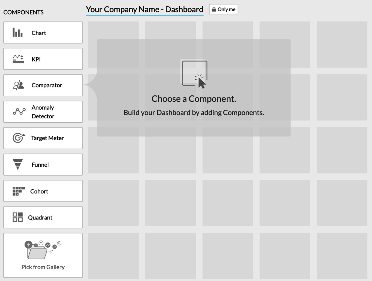
Figure 15.12 – Creating a new dashboard
- Click on the Chart component at the top of the list on the left, then select From Existing.
Now, complete the popup that appears subsequently, as follows:
a) Input a suitable name in the Component Name field (which is often the same as the report you are creating a chart from).
b) Select a report from the Report list that you wish to use to represent the data.
c) Leave the Measure (y-axis) field at the Record Count setting.
d) Select Lead Source as the Grouping option.
e) Select a chart type using the dropdown next to the Column chart (Column chart or Pie chart is recommended for this type of component).
f) Click Done as shown in the following screenshot:
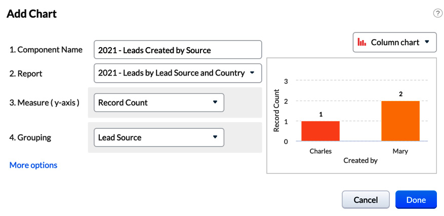
Figure 15.13 – Adding a new chart (component) to the dashboard
You will now be presented with your chart, at which point it is a good time to click Save. Your chart should now resemble the following one:
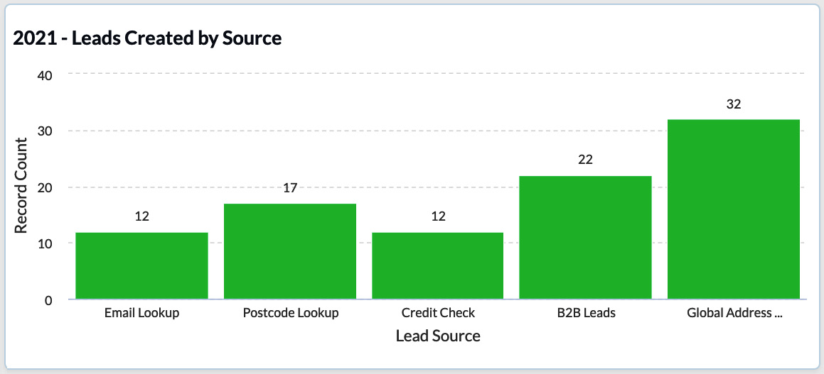
Figure 15.14 – Our report now represented visually on the dashboard
Congratulations – you have now created your first dashboard! Adding dashboards such as this really brings a CRM system to life and helps get users and managers to engage with performance measures. Now, let's look at a second way to create a dashboard: using the dashboard creation tool.
Creating a dashboard using the Quick Chart tool
The dashboard building tool in Zoho CRM is very intuitive and powerful, and dashboards can be created quickly, often without needing to create a report in the first instance. There are several different types of dashboard components we can use, summarized as follows:
- Chart: A chart is a graphical representation of the data. Analysis with this component is easy and quick. Types of charts supported include bar chart, horizontal chart, line chart, stacked chart, pie chart, donut chart, table chart, funnel chart, and area chart.
- KPI: KPIs allow simple measurement of the performance of a team. Types of KPI supported include Standard, Growth Index, Basic, Scorecard, and Rankings KPIs.
- Comparator: Comparator gives users a comparative overview of any data, including user performance, lead source, and more.
- Anomaly Detector: Anomaly Detector detects any type of discrepancy in a user's usual business process. This is most effective when you have been using Zoho for over 12 months or are working with large volumes of data.
- Target Meter: A target meter is an easy way to set and monitor targets.
- Funnel: A funnel provides a visual representation of different stages in a business. Types of funnel supported include Standard, Compact, Segment, Classic, and Path.
- Cohort: Cohort analysis helps us to understand customer behavior across the sales life cycle or buying trends and patterns.
- Quadrant: Quadrant analysis scatters the data you wish to analyze into four quadrants. It is possible to analyze data, such as types of campaigns versus revenue generated to identify the campaign that was the most effective, or leads created versus lead source to identify the source and other information.
So, with that basic understanding of the types of dashboards, let's take a look at a couple of simple examples to get you started.
KPI
We will create a KPI that measures the number of leads in the current month versus the previous month. This can be achieved as follows:
- Open the dashboard you used in the previous section and click Add Component.
- Click on KPI, as shown in the following screenshot:
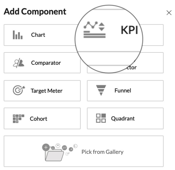
Figure 15.15 – Adding a KPI component to your dashboard
- Select the Standard KPI option, then complete the parameters as displayed in the following screenshot. Note the graphic on the left is illustrative only and does not change when setting the parameters on the right:
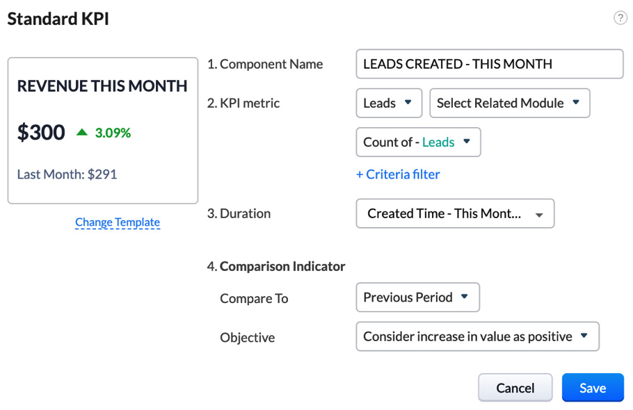
Figure 15.16 – Defining the parameters of a KPI component
- Click Save.
You will now see this KPI component appear on your dashboard, similar to the one shown in the following screenshot:
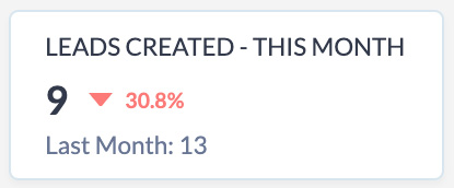
Figure 15.17 – A KPI dashboard component showing the number of leads created this month versus last month
Next, let's have a look at an example of another popular component type—a Target Meter component.
Target Meter
In this example, we will create a component that will show the amount of Closed won revenue against a target over a three-month period. This can be achieved as follows:
- Click on Add Component.
- Select Target Meter.
- Click on the Bar target type, as shown in the following screenshot:
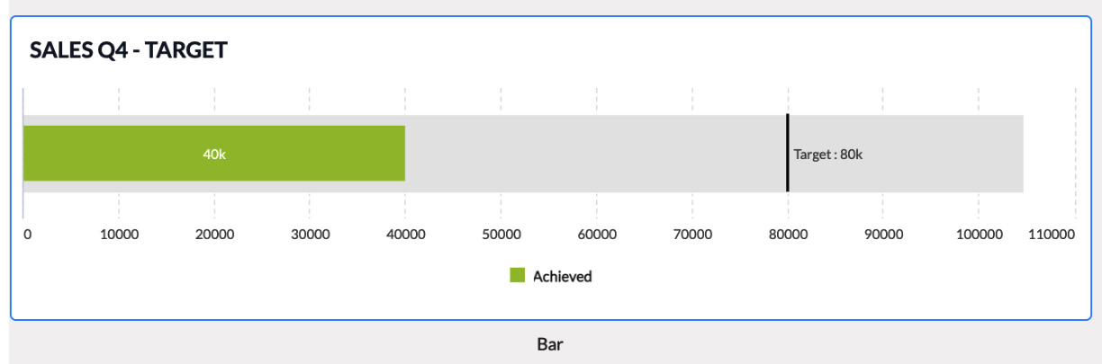
Figure 15.18 – A Bar target
- Complete the subsequent screen that appears with the values shown in the following screenshot (or similar values to these):
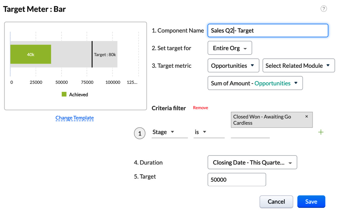
Figure 15.19 – Defining the parameters of a Bar target – Target Meter
You should now see this component appear on your dashboard, similar to the one shown in the following screenshot:
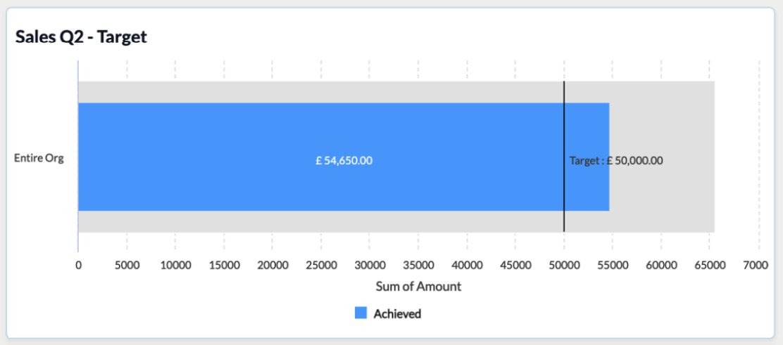
Figure 15.20 – An example target meter once configured
Once you have completed these couple of examples, experiment with a few other component types – you will notice that the process is always similar.
More information on creating dashboards can be found at https://help.zoho.com/portal/en/kb/crm/analytics-and-dashboards/dashboards/articles/analytical-components.
Once you grasp the basic principle of creating dashboards, it's quite common to seek inspiration for others. So, let's now look at some further examples to help you with this.
Example dashboards to accelerate a successful CRM experience
Many Zoho users have common objectives from their CRM system, and thus similar reporting requirements. For this reason, Zoho has provided a gallery of dashboards to select from and tweak slightly to fit your solution. Using this gallery will serve two purposes: it will inspire you and also help you develop the dashboards much more quickly—win-win!
To access the gallery from your own dashboard created earlier, click on Add Component | Pick From Gallery. You will now be presented with the gallery, as shown in the following screenshot:

Figure 15.21 – Analytics Gallery, grouped into five categories displayed on the left
Within the gallery, the reports have been grouped into five types, as follows:
- Org Overview: This set of dashboards contains the type of summaries that would be reviewed during regular management meetings. You will recognize some of the KPI and Target Meter charts discussed in the previous section. However, if you scroll to the bottom, there are a couple of really useful Comparator charts that allow you to measure multiple metrics over a period of time, which is great for identifying trends and better/worse performers in your team.
- Lead Analytics: New leads are often described as the lifeblood of any business. Therefore, it is crucial that you can measure the performance of your marketing and lead-generation activities. Using this will help you identify how many leads become qualified and the status of those yet to qualify, and also gives you a detailed view of which sources of leads convert at a higher rate than others. The standout dashboard in this set is the Sales Funnel dashboard toward the bottom. This is arguably the most valuable dashboard you can ever have—be sure to utilize this one.
- Deal Insights: Once you have qualified a lead, it becomes a deal. The dashboards in this section will provide you with easy-to-interpret insights into overall revenue, performance by salesperson, the value of a pipeline, and many similar related metrics.
- Activity Stats: Do not overlook this section, for it is the activities that are completed by you and your team that will contribute to achieving those revenue and other performance targets. Use these dashboards to help you measure how many tasks, meetings, and calls have been completed.
- Marketing Metrics: If you are using Zoho Campaigns and/or the Campaigns module within Zoho CRM, then these dashboards will provide you with a great way to measure expected and actual revenue generated from each campaign. This will give you and your marketing team insight into which campaigns to continue, which to increase, and which to change or stop altogether.
The dashboards you adapt from these five sections will give you a great head start toward having a suite of dashboards that will help you to report on multiple aspects of your Zoho CRM and ultimately toward your growth and retention goals as a business. Be sure to review the usage and value of these dashboards every 3 to 6 months, especially if your business is experiencing growth or change.
That brings us to the end of this chapter—let's finish with a quick recap.
Summary
In this chapter, you have learned about creating a basic report, as well as discovering how and why we should automate the distribution of reports. In addition to this, you have learned how to create a visual dashboard and gained insight into some of the best dashboards used by Zoho users.
The skills and knowledge gained in this chapter will help you gain insight into which users are working with the CRM system and how it is being used. However, the main benefit of having good reports and dashboards is to enable you to measure, learn, and evolve. Measure current performance, learn from this, and use it to help make decisions on how to evolve not only the CRM system but the marketing, sales, and account management functions within your business.
In the next chapter, we will consider best practices to adopt in order to evolve your CRM system.