Chapter 10: Creating Pimcore Bricks
In the previous chapter, we learned how to use Pimcore to create entities and render custom web pages. Previously, in Chapter 8, Creating Custom CMS Pages, we discovered how to create CMS pages using the web interface or custom Model View Controller (MVC) pages. In both cases, we'd like to have some reusable components that can be defined once and used in every case by changing some settings. Think about a contact form widget that you can drag and drop on any web page. Well, these kinds of reusable components in Pimcore are called Bricks.
In this chapter, we will learn how to build reusable components that can be placed in CMS or MVC pages and, moreover, can be ported from project to project using bundles.
This is our roadmap:
- Creating a bundle
- Understanding how a Brick works
- Implementing a simple Brick
- Implementing a contact form Brick
- Implementing a Slideshow brick
- Using bricks and blocks for a general-purpose template
By the end of this chapter, you will have learned how to create custom interactive widgets to compose pages. This is important to cover all the needs of the users on your website.
Let's start to discover bricks!
Technical requirements
As with the previous chapters, there is a demo that you can find on our GitHub repository here: https://github.com/PacktPublishing/Modernizing-Enterprise-CMS-using-Pimcore/.
All you need to run the demo connected to this chapter is to clone it, then navigate to the Full Demo folder and start the Docker environment.
To do so, just follow these instructions:
- Run Docker with the following command:
docker-compose up
- Then, to restore all the settings from on your local machine, type the following:
docker-compose exec php bash restore.sh
- Navigate to http://localhost/admin and log in with your admin/pimcore credentials.
What you will get with this setup is the following:
- A BlogBundle where you will find all the assets produced in this chapter
- A fully working Pimcore instance, with data and configuration installed
This project is a good reference, but after all the practice we have had with Pimcore, you could also start a project from scratch and try to replicate all the steps on your own.
Creating a bundle
Before starting our journey into bricks, we have to learn how to create a bundle. In Chapter 7, Administrating Pimcore Sites, we learned how to install a bundle released from a vendor, but how do we build our own? In this section, we will learn how a bundle is structured and how you can build it. Bundles are very important for creating a portable set of features that you can reuse or distribute across websites. In our demo project, we will create a blog bundle that is self-contained and that you can pick and place on any of your websites.
What is a bundle?
You have used the main application for many examples in previous chapters. This is good for implementing the specific project but it is not portable. Talking simply, a bundle is a folder that contains both source code and templates. You can get this set of files by adding a composer dependency or by using a local folder. This lets you take your code and reuse it in multiple projects, or simply divide a complex application into modules. For simplicity, in this book, we will use a local folder inside the bundles path. Each subfolder will host a different bundle. In this chapter, we will cover all that is needed to start a blog, so we will create a BlogBundle. This means that we will have the /bundles/BlogBundle folder that will contain all the bundle-related files. This set of files is not discovered automatically; you have to add a specific configuration in your composer.json. In the next piece of code, there is the configuration for the blog bundle:
"autoload": {
"psr-4": {
"App\": "src/",
"BlogBundle\": "bundles/BlogBundle/",
"Pimcore\Model\DataObject\": "var/classes/DataObject",
"Pimcore\Model\Object\": "var/classes/Object",
"Website\": "legacy/website/lib"
}
},
As you can see in the previous snippet, the blog folder is added to the psr-4 definition, just after the standard src that's mapped to the App namespace. In our case, we map the BlogBundle namespace with the bundles/BlogBundle/ folder. Of course, you can play with this configuration and create your own setup to fit your needs. Anyway, we recommend keeping the configuration as close as possible to the Symfony standard.
Here is a list of folders and files inside a bundle:
- /bundles/BlogBundle: This is the bundle folder that contains all the bundle assets. The bundle is self-contained, so it contains all the resources (config, themes, and so on) and the classes.
- DependencyInjection: This contains two important files for configuring the bundle: BlogExtension.php (the convention is the name of the bundle without the Bundle word and then Extension.php) and Configuration.php.
- Document/Areabrick: This folder is used for Brick classes; we will look at it in detail in the next section.
- Controller: This folder contains the controllers.
- Resources: This contains the following subfolders:
a) config: Where your YAML files are built.
b) public: Here you can load all the assets that will be published under /bundles/{bundle name}/, so if you add here a file called script.js, you will have it at http://localhost/bundles/blog/script.js.
c) views: You can create here a subfolder containing templates for each controller. This folder also contains the Areas subfolder, which will have all the Brick templates.
Now it's time to create our first bundle!
Creating a bundle from the command line
You could manually create the files and folders by using the naming convention. This is not hard, but it is easy to make some errors while doing it manually. Fortunately, we have a command from Pimcore that does the job for us.
In Symfony 5, this is no longer a built-in feature, so we have to install a bundle from Pimcore and then we can use the console to create a bundle skeleton.
Creating a bundle is very straightforward and will be explained in the next steps:
- Enter your Docker instance using the following command:
docker-compose exec php bash
- Install the bundle generator using the following command:
composer require pimcore/bundle-generator
The previous command will add the bundle and configure it for use as a regular console command.
- Navigate to config/bundles.php and register the bundle using the following piece of code:
<?php
use PimcoreBundleBundleGeneratorBundle
PimcoreBundleGeneratorBundle;
return [
PimcoreBundleGeneratorBundle::class => ['all' => true],
];
- Run the following command:
bin/console pimcore:generate:bundle BlogBundle
This will create a set of folders and files for your bundle. The result after you run this command is the creation of the bundle with all the basic subfolders.
- Moreover, in order to make the bundle content available for the application, we need to change our composer definition by adding a namespace mapping, as in the next example:
"psr-4": {
"App\": "src/",
"BlogBundle\": "bundles/BlogBundle/",
…
}
After this step, you might need to run chmod -R www-data. for a permission fix. In the Docker example we provided, this is mandatory.
- Now the bundle is available for the system and can be enabled and installed as explained in Chapter 3, Getting Started with Pimcore Admin UI.
In this section, we learned how a bundle is composed and how to create a new one. Now that we have our bundle ready, we can start talking about bricks by using some practical examples.
Understanding how a Brick works
In simple words, a Brick is composed of a class that takes the place of the controller and a view. Building a Brick is not so different from implementing an MVC page. The most important exception is that, in this case, we do not have the routing part, as the Brick is added to an existing page (it cannot be run standalone). In the following diagram, we have a schema that explains how Bricks work:

Figure 10.1: Conceptual schema for a brick
In the previous diagram, we can see that a page (My Page) can host many bricks. Each one is composed of a Class and two templates (edit and view).
In the following sections, we will learn how to implement every single component, including classes and templates.
The class implementation
A brick is an instance of PimcoreExtensionDocumentAreabrickAreabrickInterface, but for convenience, we always extend the AbstractTemplateAreabrick class, which implements the interface and gives us some interesting methods. These classes can be loaded manually or autoloaded using YAML files. Even if adding classes to YAML files is easy, it is always an additional step to do. So, we usually prefer the autoloading scenario, which simply requires us to use a default folder (Document/Areabrick) where we place the classes. The namespace of your class must be namespace BlogBundleDocumentAreabrick.
The following class implements a simple brick:
class MyBrick extends AbstractTemplateAreabrick
{
public function getName()
{
return 'The Brick Name';
}
public function getDescription()
{
return 'The Brick description';
}
public function getTemplateSuffix()
{
return static::TEMPLATE_SUFFIX_TWIG;
}
}
As you can see in the preceding snippet, there are some methods that have to be implemented to provide the information for your components. These methods, highlighted in the code, are as follows:
- getName: This method returns the name of the brick (it should be unique).
- getDescription: This method returns the long description of the brick and it is shown in the web interface to give the user an idea of what the brick does.
- getTemplateSuffix: This method is used for defining the template extension (Twig or PHP). To adopt Twig templates instead of a PHP template, use static::TEMPLATE_SUFFIX_TWIG.
Now that the class part is ready, we can see how to set up the templating in the next section.
Templating
Usually, for brick classes, the template follows a naming convention. The place where they have to be located is the Areas folder inside the view folder (Resources/views). Each brick must have its own folder, but the folder name must be in spinal case (all lowercase with hyphens between words, so MyBrick will need a folder named my-brick). The name of the view template has to be view.html.twig.
Some bricks are fully WYSIWYG, and you can change the component's behavior just by entering data. Others have the configuration separated by the rendering. In these cases, you can configure an edit popup that will prompt for data. We will see that configuration in detail with the next sections' examples.
In the next schema, we summarized the naming convention, adding a path example for each case. The Global scenario is the option where you add the brick to the main project (app folder) and the Bundle scenario is where you will add the brick to specific a bundle:
- View path:
a) Global:
templates/views/Areas/{BrickID}/view.html.(php|twig)
b) Bundle:
{BundleLocation}/Resources/views/Areas/iframe/view.html.(php|twig)
- Class:
a) Global:
src/Document/Areabrick/{BrickID}
b) Bundle:
{BundleLocation}/Document/Areabrick/{BrickID}
In this section, we learn what a brick is composed of. This was important for understanding the naming convention and the principles for using them. Now it's time to go in depth with some examples! In the next section, we will cover the most important use cases, from easy to complex usage.
Implementing a simple brick
In this section, we will implement our first brick. Because the spirit of this book is to learn using real-world examples, we won't limit this to a "hello world" example. In our first example, we will create a widget that could be placed many times on the page and reused. This widget will allow adding text, choosing the header type (h1, h2, and so on), and entering the text.
To complete this goal, we have to follow these steps:
- Create a document and link it to a controller and a template file. We have done this step many times in Chapter 4, Creating Documents in Pimcore, and Chapter 9, Configuring Entities and Rendering Data. This document will be used for testing the brick that we are creating.
- Create a Heading.php file inside /bundles/BlogBundle/Document/Areabrick. The contents of the file should be like this:
class Header extends AbstractTemplateAreabrick
{
public function getName()
{
return 'Header';
}
public function getDescription()
{
return 'A component for rendering a Header';
}
public function getTemplateLocation()
{
return static::TEMPLATE_LOCATION_BUNDLE;
}
}
The code provided declares a brick called Header with a specific description. Now that we have the brick definition, we have to add a template for it. This will be our next step.
- Add a template in /bundles/BlogBundle/Resources/views/Areas called view.html.twig.
- Add the following code to the file:
{% if editmode %}
{{pimcore_select('style', {
"store" : [
['h1', 'H1'],
['h2', 'H2'],
['h3', 'H3']
],
"defaultValue" : "h1"
})}}
{{pimcore_input('text')}}
{% else %}
<{{pimcore_select('style')}}>{{pimcore_input('text')}}<{{pimcore_select('style')}}>
{% endif %}
The code is divided into two branches. The first one is activated in edit mode and displays a select component that lets you choose the heading type (h1, h2, and so on) and the text; the second branch of code displays the data wrapping text in the header. All we need to implement our first brick is done; we just have to test it now.
- Inside the template that was created in Step 1, add the following snippet:
{{ pimcore_areablock("header")}}
This editable will display the following component in edit mode:

Figure 10.2: Editable components
This component is just a placeholder that will let us choose a brick from the brick list and will put it inside the page. We will do this in the next step.
- Click on the plus button. It will display the following menu:

Figure 10.3: The menu for Areablock
As you can see in the preceding screenshot, the data we entered into the class is used to distinguish the component. In fact, we chose Header as the brick name and A component for rendering a Header as the description.
- Click on the Header item. A component will be added to the page. The Pimcore editable component lets us enter the title and pick the right heading type. Choose H1 and enter My H1 text into the box:

Figure 10.4: The heading brick editing
- Now click the Preview button or navigate to the page. The output will be the following:

Figure 10.5: The output of the brick
The page displays the text we chose properly.
This first example shows how simple it is to create a reusable component in Pimcore. In fact, we can use the heading brick on every page, giving the user the power of picking it when needed and configuring it. You can use this in conjunction with blocks to allow the user to choose a sequence of custom elements or hardcode it in a template. Moreover, we can also use an interactive brick. We will discover all these features in the next sections.
Implementing a contact form brick
In this example, we will discover how to create an interactive component where the user can insert data. For this purpose, we will create a contact form. The behavior of this widget will be straightforward: we will have a form with a subject, name, message, and clickable button. An email will be sent to a fixed recipient address once the details are filled in and the button is clicked. This example will also introduce a working example of opening the brick's editor to get parameters not shown in the view. Follow these steps to implement the example:
- First, create a document with a template and place an areabrick in the editable's template. In the next step, we will have to create the brick.
- Create the ContactForm.php file in /bundles/BlogBundle/Document/Areabrick/. The content will be as follows:
class ContactForm extends AbstractTemplateAreabrick
{
public function getName()
{
return 'ContactForm';
}
public function getDescription()
{
return 'ContactForm';
}
public function getTemplateLocation()
{
return static::TEMPLATE_LOCATION_BUNDLE;
}
}
- Now we need to ask the user to add the recipient address for the contact form. In a complex scenario, you may need to add more parameters and organize them. This is possible by implementing a special EditableDialogBoxInterface interface. In the next piece of code, we can see the code that we have to add:
class ContactForm extends AbstractTemplateAreabrick implements EditableDialogBoxInterface
{
public function getEditableDialogBoxConfiguration(DocumentEditable $area, ?Info $info): EditableDialogBoxConfiguration
{
$config = new EditableDialogBoxConfiguration();
$config->setItems([
'type' => 'tabpanel',
'items' => [
[
'type' => 'panel',
'title' => 'Contact Form Settings',
'items' => [
[
'type' => 'input',
'label' => 'Email Recipient',
'name' => 'recipient'
]
]
]
]]);
return $config;
}
}
The configuration is, in fact, an array of items that can be grouped in a container. In our case, we used a tab pane, and we placed the input inside it. This array will be used to automatically generate the user's input form. Entered data will be available to the user as regular editables, as in the following snippet:
$recipient=$this->getDocumentEditable($info->getDocument(), 'input', 'recipient')->getData();
- Create the view.html.twig file. This file will contain all the content that will be displayed to the user. In the next snippet of code, we have a simplified version of the form for brevity (the full bootstrap example is in the source code related to this book):
{% if alert is defined %}
{{ alert }}
{% endif%}
<form id="contact-form" name="contact-form" method="POST">
<input type="hidden" name="sendEmail" value="true"/>
<input type="text" id="name" name="name" >
<input type="text" id="email" name="email" >
<input type="text" id="subject" name="subject" >
<textarea type="text" id="message" name="message" >
</textarea>
<input type="submit" value="submit" />
</form>
The template contains an alert message, which is a message used to confirm sending the email to the user or to display an error. The form contains the input for getting the field from the user and a submit button. The action is not specified, so this form will submit data to the page itself. The input hidden sendEmail is a flag that will activate the sending procedure.
- Now it's time to specify logic in the backend for reading POST data and to send a real email. The next snippet shows the method to add to the brick class:
public function action(Info $info)
{
$request=$info->getRequest();
$id= $info->getEditable()->getName();
$info->setParam('id', $id);
$sendEmail=$request->get("sendEmail");
if($sendEmail==$id)
{
$name=$request->get("name");
$email=$request->get("email");
$subject=$request->get("subject");
$message=$request->get("message");
//send an email here
$sent= $this->sendEmail($name,$email,
$subject,$message, $recipient);
if($sent)
{
$alert="the message is sent!";
}
else
{
$alert="there was an error, try later";
}
$info->setParam('name',$name);
$info->setParam('email',$email);
$info->setParam('subject',$subject);
$info->setParam('message',$message);
$info->setParam('alert',$alert);
}
$recipient=$this->getDocumentEditable($info->
getDocument(), 'input', 'recipient')->getData();
$info->setParam('recipient',$recipient);
}
The preceding code implements the logic for getting parameters and sends an email notifying the user about the result. $request=$info->getRequest(); is used to get the HTTP request that contains the submitted data, and the get method is used to obtain the value of the sendEmail flag, which activates the sending procedure. You can pass variables to the view by using the parameters, as in the following piece of code:
$info->setParam('recipient',$recipient);
Now all the components are in place to test our brick.
- Add the brick to the page by following Steps 5-6 from the Implementing a simple brick section. Now you will have the contact form component on the page and it will be a working one.
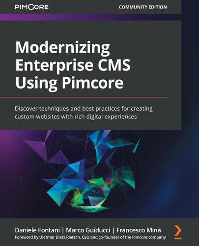
- Open the settings by clicking the pencil icon in the brick's toolbar:

Figure 10.6: Opening the popup
- By clicking the pencil icon, a popup will be shown:
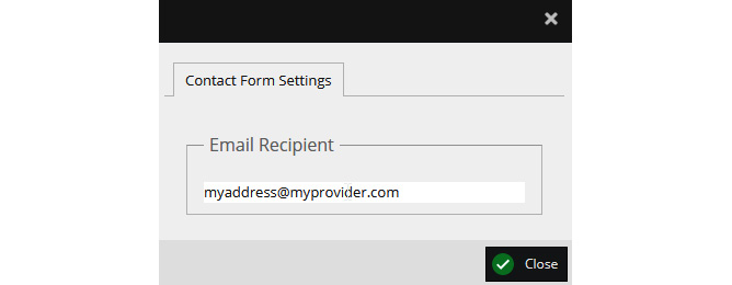
Figure 10.7: The popup for entering the recipient
You can enter an email address to be used as the recipient for the contact form.
- Save the document and open the document's page you created in Step 1 of this section. The contact form will be shown.
- Fill in the form with data (it is a contact form, so the field meanings should be self-explanatory) and click Send. You should see a confirmation alert as in the following screenshot:
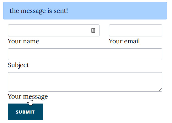
Figure 10.8: The contact form showing the confirmation message after sending
As you have learned from this example, it is quite easy to implement an interactive widget such as a contact form. Anyway, there are some tricks to know to avoid conflicts when you have multiple components on the same page. We will explain this in the next section.
Avoiding conflicts
For the contact form example, we have to raise a point about submitting data on a page with multiple bricks. Using the post approach, we send data to the server and manage the request on the backend. This procedure is very easy but it can lead to some issues. In fact, think about a case where you have many components on the same page.
In our example, if we put two contact form widgets on the same page, clicking send will trigger both actions. The same can happen with different components with similar field names.
To avoid such conflicts, follow these troubleshooting steps:
- Add a unique prefix (per component) to all the field names. In our case, this could be cf for ContactForm, and the name will be cf-name, cf-sendEmail, and so on.
- Add the instance name as the trigger value. This is required to make your post unique. The changes to the action method of the brick class (created in Step 5 of Implementing a contact form brick) are the following:
…
$id= $info->getEditable()->getName();
$sendEmail=$request->get("cf-sendEmail");
if($sendEmail==$id)
{
…
The email sending procedure is now processed only if the name of the component is exactly the same that originates the post. Two different instances of the same brick produce different names, so your action will be triggered only once.
The final step is to make a small change in the view template file (created in Step 3 of Implementing a contact form brick). We will be adding a hidden input with the cf-sendEmail name attribute and the ID computed from the action method as value. Cut and paste the next snippet to your view file:
<input type="hidden" name="cf-sendEmail" value="{{id}}"/>
This value will be sent back to our action method with the post argument and we will be comparing it with the one generated on the server side. If they are not equal, the post is not matched to the current component, and we avoid any action.
In this section, we learned how to implement a contact form. The example we have just finished showed us how simple it is to create an interactive brick that can be reused. You are not only able to reuse this component on any page of your website, but you can also copy the bundle to another website and get this feature for free. In the next example, we will discover how to implement a slideshow, mixing controllers and bricks to reuse the code that we might have written for an MVC page.
Implementing a slideshow brick
In this example, we will build a slideshow widget that can be used to display a carousel of images. This will be very easy, and we will use just bootstrap and the tools learned so far. In fact, we will reuse the code used for displaying the image gallery in Chapter 9, Configuring Entities and Rendering Data, but we will integrate it into a brick. To do that, follow these steps:
- First of all, prepare the environment by creating a folder called Slideshow and upload a list of images to it. We should use wide images (such as 1920x1080).
- Open the image settings for each image and add the title and description of the image as metadata. We will use it in the template.
- Access the properties panel by clicking the Properties tab button on the toolbar. Each Pimcore entity (objects, documents, and assets) has a set of key/pair properties that can be used to expand the information dynamically. We will use them to add metadata to our images. In the next screenshot, we can see a valid configuration:
Figure 10.9: Image properties
The previous screenshot shows the properties table. We added a title and subtitle field with some value inside.
- Create a thumbnail preset. We have to configure the thumbnail engine to resize the uploaded images to match the format that the slideshow component expects. The user could upload images too big or with the wrong proportions (for example, landscape instead of portrait) but we need to make sure that all the images have the same height to show the images properly. We need to crop the uploaded images and make them the same format. In our example, we can use a crop transformation that will produce images that are only 400 px tall. To do that, just enter the Width, Height and X, Y settings as in the following screenshot:
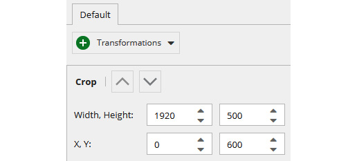
Figure 10.10: The thumbnail configuration
- Create a brick called SlideShow by adding SlideShow.php in the brick class folder (for example, /bundles/BlogBundle/Document/Areabrick/SlideShow.php).
- Create the template file in the view folder (for example, /bundles/BlogBundle/Resources/views/Areas/slide-show). Pay attention to the folder name – it has to match the brick name, but it's lowercase with the words split with a hyphen, so slide-show will be Slideshow.
- Now add the following content to the template:
{{
pimcore_renderlet('myGallery', {
"controller" : "BlogBundle\Controller\
SlideShowController::galleryAction",
"title" : "Drag an asset folder here to get
a gallery",
"height" : 400
})
}}
The preceding code adds a Pimcore renderlet that lets the user drag a folder on it and uses a controller for implementing the rendering logic. In our case, we will use the gallery action from the SlideShow controller. We are using a controller in a bundle, so we must specify the bundle name also.
- Add the SlideShow controller to the controller folder (for example, /bundles/BlogBundle/Document/Controller/SlideShowController.php). The initial content should be the following:
<?php
namespace BlogBundleController;
use PimcoreControllerFrontendController;
use SymfonyComponentHttpFoundationRequest;
use SymfonyComponentHttpFoundationResponse;
use SymfonyComponentRoutingAnnotationRoute;
use SensioBundleFrameworkExtraBundleConfigurationTemplate;
use PimcoreModelAsset;
class SlideShowController extends FrontendController
{
}
- Now we have to implement the action for rendering the view. This action will take the folder added by the user and will load the image list for passing it to the view. In the following snippet, we have the action implementation; take it and add it to your controller:
public function galleryAction(Request $request)
{
$result=array();
if ('asset' === $request->get('type')) {
$asset = Asset::getById($request->
get('id'));
if ('folder' === $asset->getType()) {
$result['assets'] = $asset->
getChildren();
}
}
return $result;
}
The code is the same as what we used in the gallery example of Chapter 9, Configuring Entities and Rendering Data, so there is no need for more explanation.
- The last step for rendering it properly is to create a view called gallery and place it into the folder relative to the controller (for example, /bundles/BlogBundle/Resources/views/slide_show/gallery.twig). The template that we will use is the following:
<div id="carouselExampleControls" ...>
... omitted bootstrap tags
{% if assets %}
{% set active ='active' %}
{% for asset in assets %}
{% if asset is instanceof('\Pimcore\
Model\Asset\Image') %}
<div class="carousel-item {{ active
}}">
<img src="{{ asset.getThumbnail(
'SlideShow') }}" ... />
<div ...>
<h5>{{ asset.getProperty('title')
}}</h5>
<p>{{ asset.getProperty(
'subtitle') }}</p>
</div>
</div>
{% set active=""%}
{% endif %}
{% endfor %}
{% endif %}
... omitted bootstrap tags for navigation
</div>
In the preceding snippet, all the tags that are not relevant to our explanation are omitted for brevity. Focusing on the part that really matters, we have a simple for loop that prints images following the bootstrap carousel standard. The image thumbnail is extracted from the original image using the getThumbnail('SlideShow') function. The title and subtitle fields are read from the asset properties using the asset.getProperty method.
- Add the brick to a page and drag a folder to it:
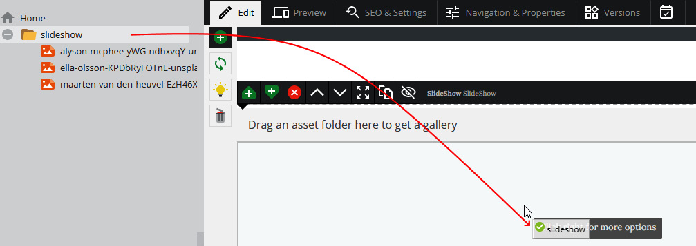
Figure 10.11: Dragging the folder to the component
- Now you will see a sliding carousel as in the next screenshot:
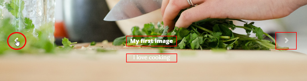
Figure 10.12: The slideshow in action
In the previous screenshot, we highlighted the navigation buttons and the fields printed over the image.
In this section, we discovered how we can integrate controllers and bricks. The same result can be achieved by using the relation editable covered in Chapter 8, Creating Custom CMS Pages, and implementing the template inside the brick itself. Now that we have covered all the topics relating to bricks, it's time to learn how to implement a layout that could let us create any kind of page without writing any additional code.
Using bricks and blocks for a general-purpose template
What we want to do in this section is to find a solution for implementing all kinds of layouts without wasting hours creating custom templates. Theoretically speaking, we could have a set of base objects and then mount them together to create all kinds of websites. In practice, this is what we should do with Pimcore:
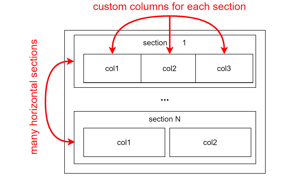
Figure 10.13: General-purpose template
The previous diagram shows how a multipurpose layout is structured. We have many horizontal sections (Section 1, …, Section N) that can be divided into columns (col1, col2, col3). In each place, you will be able to add bricks for composing the page in any layout you want.
Theoretically speaking, we need to add a block iteration that will print rows inside another block iteration that will print columns. This lets us create a matrix of elements where we can add an areablock that lets us choose any brick we want. This layout is quite easy to implement in words, and feasible by putting into practice what we learned in the last chapters.
In this example, we will create a generic layout like the one that is shown in the following figure:
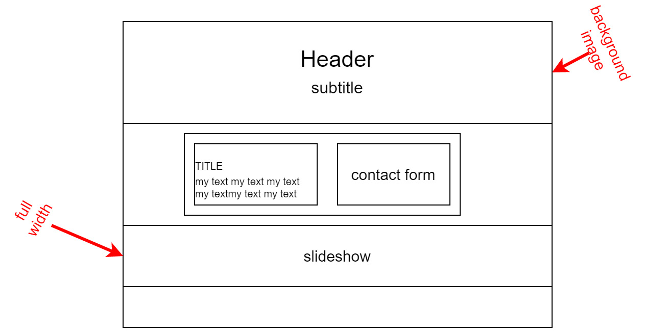
Figure 10.14: Generic website layout
In the preceding figure, we can note the three bands (Header, contact form with a description on the left side, and then a full width slideshow). This is, of course, a very simple use case, but with some imagination, you should understand how you can extend this to any kind of web page. Follow these steps to create a custom layout:
- The first step is to create an area brick that could implement a Bootstrap container. This area brick will let the user choose the column number and sizes. So, we have to create the brick class in Document/AreaBrick/Container.php. The starting code is the following:
<?php
namespace BlogBundleDocumentAreabrick;
class Container extends AbstractTemplateAreabrick implements EditableDialogBoxInterface
{
public function getName()
{
return 'Container';
}
public function getDescription()
{
return 'Container';
}
}
- The second step is to configure the component for exposing the column configuration to the user. In this example, we assume that we can have only three layout options (one column, two columns 30%-70%, and two columns of the same size). In a real-world example, you can prepare any possible combination in terms of the number of columns and sizes to make the user really autonomous in managing any kind of layout. In the next piece of code, there is the configuration for creating a drop-down list with all the layout:
public function getEditableDialogBoxConfiguration(DocumentEditable $area, ?Info $info): EditableDialogBoxConfiguration
{
$config = new EditableDialogBoxConfiguration();
$config->setWidth(600);
$config->setItems([
'type' => 'tabpanel',
'items' => [
[
'type' => 'panel',
'title' => 'Column settings',
'items' => [
[
'type' => 'select',
'label' => 'Layout',
'name' => 'layout',
'config' => [
'store' => [
['one.html.twig', 'One column'],
['two-50-50.html. twig', 'Two column 50-50'],
['two-30-70.html. twig', 'Tre column 30-70'],
]
]
]
]
]
]]);
return $config;
}
Note that, for simplicity, we used the names of a file template as values for the select item, so that the item could be simply related to the content.
- The last step in the class is to read the configuration parameter and pass it to the view. To do this, you can just add the action method implementation that you find in the following piece of code to your class:
public function action(Info $info)
{
$layout=$this->getDocumentEditable($info->
getDocument(), 'select', 'layout')->getData();
$info->setParam('layout',"@Blog/areas/
container/templates/$layout");
}
As you can see from the source code, the relative filename is transformed into a full path and added to the property bag.
- Now we have to implement the main view template. Just add to the view.html.twig file the following code:
<div class="container blog-container">
{% include layout %}
{% if editmode %}
<div class="blog-container-footer">
CONTAINER
<div>
{% endif %}
</div>
The previous piece of code includes the template based on the variable set in the action and simply wraps it in a bootstrap container. Moreover, when you are in edit mode, it adds a bar to the bottom to help the user identify the layout.
- Now we have to implement the brick template. As usual, we need to create a view.html.twig file, but this time we will also create a folder with many other templates that will be loaded dynamically. So, create the one.html.twig, two-50-50.html.twig, and two-30-70.html.twig files. The final result will be the following:
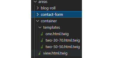
Figure 10.15: Files configuration
- Now we have to implement the three templates. For brevity, we will report here only one case: the others are very similar and can be found in the repository code. The next piece of code shows the two-column implementation:
<div class="row">
<div class="col-6 blog-col">
{{ pimcore_areablock("content_50501")}}
</div>
<div class="col-6 blog-col">
{{ pimcore_areablock("content_50502")}}
</div>
</div>
As you can see in the previous piece of code, there is a bootstrap row and two columns (col-6; col-6 means the same width). Inside each column, the areablock component will allow you to choose the component to add inside it. Now we are ready to use our general-purpose template in a real-world example!
- Create the layout.html.twig file in /bundles/BlogBundle/Layout, and add the following snippet:
{# SETTING THE IMAGE URL#}
{% set imageurl=null %}
{% if not editmode %}
{% set image =pimcore_relation("image")%}
{% if image.getElement() is defined and image. getElement() != null %}
{% set imageurl= image.getElement(). getThumbnail("SlideShow") %}
{% endif %}
{% endif %}
{# PRINT HEADER#}
<header class="masthead" style="background-image: url({{imageurl}})">
<div class="overlay"></div>
<div class="container">
<div class="row">
<div class="col-lg-8 col-md-10 mx-auto">
<div class="site-heading">
<h1> {{ pimcore_input('headline', {'width': 540}) }}</h1>
<span class="subheading"> {{ pimcore_ input('subheading', {'width': 700}) }}</span>
</div>
</div>
</div>
</div>
</header>
{# IMAGE INPUT #}
{% if editmode %}
{{ pimcore_relation("image",{
"types": ["asset"],
"subtypes": {
"asset": [ "image"],
},
"classes": ["person"]
}) }}
{% endif %}
This snippet of code will render a parametric header that is put on all our pages. You don't want to have it on all the pages? Not a problem. You can always transform this code into a brick and place it only where you really need it.
- Now, create a template. Because we want to create a standard layout with horizontal bands, we will allow the use of only the Container brick.
- To do that, just create a file inside the default folder called generic.html.twig, and add it in the following piece of code:
{% extends 'BlogBundle:Layout:layout.html.twig' %}
{% block content %}
{% include 'BlogBundle:Layout:header.html.twig' %}
{{ pimcore_areablock("content", {'allowed':['container']})}}
{% endblock %}
The preceding script defines a page structure with a header and an area block that will host the containers for our page layout.
- Create a web page and use the generic.html.twig template we created during Step 6 of this procedure.
- Open the web page that you have created in edit mode. You should see the following result:

Figure 10.16: Adding the container to the page
- After this step, the component will be ready on the page. Now click on the configuration button, as in the following screenshot:

Figure 10.17: Opening settings
- At this point, the user is able to select a layout using the edit box as in the contact form example that we saw in the previous section. The result of this configuration is the following popup:
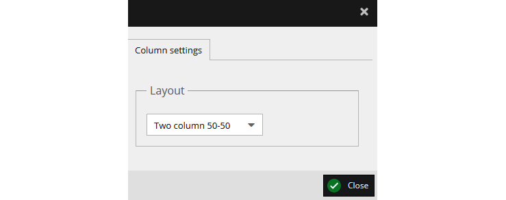
Figure 10.18: Selecting the layout
The following screenshot shows the area brick that lets us create as many bands as we want. After this step, you should get the following result:

Figure 10.19: The container component on the page
- Add the columns content into it by clicking the plus button inside the container area (shown in Figure 10.19) and choosing the column brick.
- Add a contact form on the right by clicking the plus button and choosing the item from the component menu.
- On the left column, add a header component, the one we created earlier in the Implementing a simple brick section. Then add a WYSIWYG editor just above the header. You should get the result shown in the following screenshot:
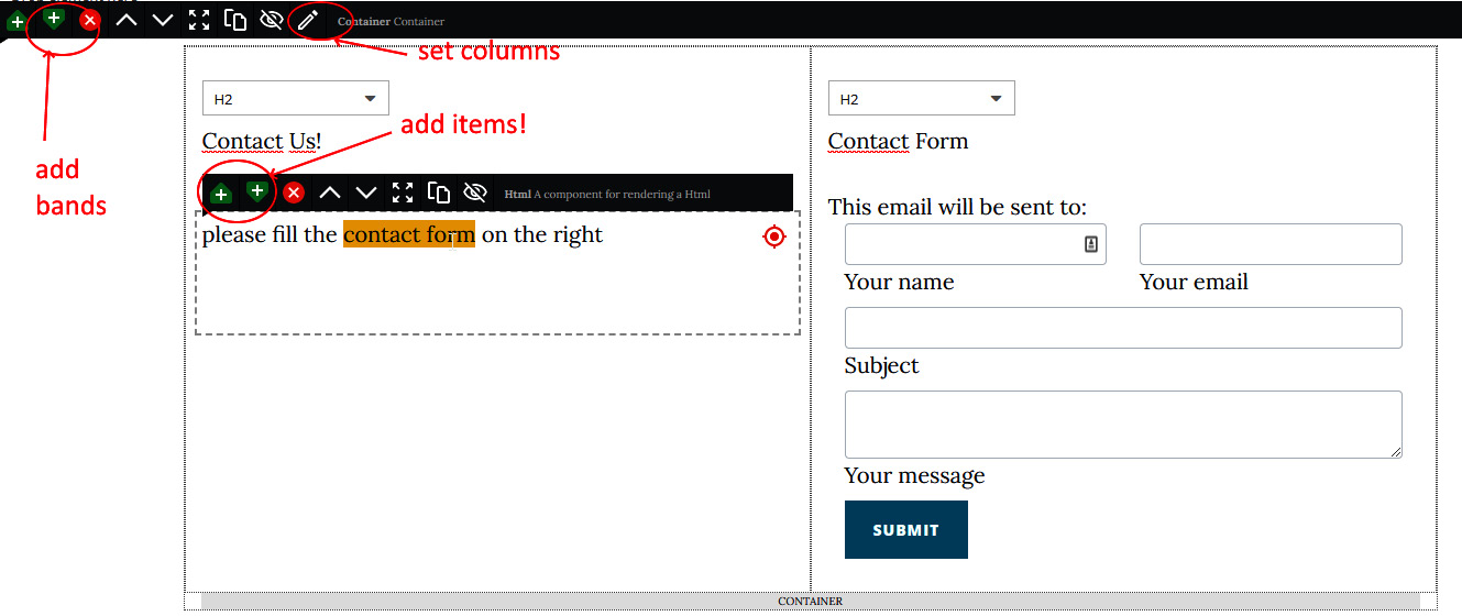
Figure 10.20: The web page with the contact form and data
- Now add another container just after the previous one by clicking on the top down arrow (Figure 10.20). On this component, add a slideshow brick. Configure it by dragging and dropping the images as we have done in the slideshow example in this chapter. The next screenshot summarizes your work in this part of the page:
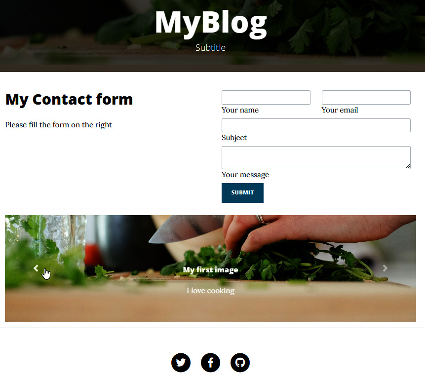
Figure 10.21: The result to obtain in this example
In this section, we learned how to create a template that could suit most situations. The example has been a good opportunity for testing the general-purpose layout in a real-life scenario. This template, in conjunction with all the bricks that you could create, will cover the most common scenarios and will save a lot of time.
Summary
In this chapter, we continued our journey with the Pimcore CMS by discovering the bricks engine, another important tool for creating dynamic websites. By creating bricks, it's easy to prepare reusable components that can be used by web page editors to compose any website without asking the developers for customization. This new way to proceed is very important in reducing the development effort, keeping quality standards high, and increasing the speed of implementing the features that users want.
To be more specific, we discovered how bricks work by implementing real-world examples. The contact form and slideshow are components that you will reuse in your projects for sure. Moreover, we also learned how to create a general-purpose template that enables us to produce any layout of a page without writing a single line of code.
In the next chapter, we will learn how to finalize our website by discovering some important details and solutions for everyday Pimcore usage. To list the most important ones, we will learn how to create a bundle's installers to easily recreate our classes and contents after the setup, and we will learn how to create a multisite instance of Pimcore.