
Chapter 6: Gallery: Building an AR App
In this chapter, we will begin building a full Augmented Reality (AR) app, an AR art gallery that lets you hang virtual framed photos on your real-world walls.
First, we'll define the goals of the project and discuss the importance of project planning and user experience (UX) design. When the user presses the Add button in the main menu, they'll see a Select Image menu. When they pick one, they'll be prompted to place a framed copy of the image on their real-world wall.
To implement the project, we will start with the AR user framework scene template that we created earlier in this book. We'll build a Select Image UI panel and interaction mode, and define the image data used by the app.
In this chapter, we will cover the following topics:
- Specifying a new project and UX design
- Using data structures and arrays, and passing data between objects
- Creating a detailed UI menu panel with a grid of buttons
- Creating prefabs for instantiating in an AR scene
- Implementing a complete scenario based on a given user story
By the end of the chapter, you'll have a working prototype of the app that implements one scenario: placing pictures on the wall. Then we'll continue to build and improve the project in the next chapter.
Technical requirements
To implement the project in this chapter, you need Unity installed on your development computer, connected to a mobile device that supports AR applications (see Chapter 1, Setting Up for AR Development, for instructions). We also assume that you have the ARFramework template and its prerequisites installed; see Chapter 5, Using the AR User Framework. The completed project can be found in this book's GitHub repository, https://github.com/PacktPublishing/Augmented-Reality-with-Unity-AR-Foundation.
Specifying the Art Gallery project UX
An important step before beginning any new project is to do some design and specifications ahead of time. This often entails writing it down in a document. For games, this may be referred to as the Game Design Document (GDD). For applications, it may be a Software Design Document (SDD). Whatever you call it, the purpose is to put into writing a blueprint of the project before development begins. A thorough design document for a Unity AR project might include details such as the following:
- Project overview: Summarize the concept and purpose of the project, identify the primary audience, and perhaps include some background on why the project exists and how and why it will be successful.
- Use cases: Identify the real-life problems the product will solve. It's often effective to define separate user personas (with real or fictitious names) representing types of users of the application, their main goals, and how they'll use the app to achieve these objectives.
- Key features: Identify the discrete areas of functionality that deliver value to your users, perhaps with an emphasis on what distinguishes it from other similar solutions.
- UX design: The user experience (UX) design may include a variety of user scenarios that detail specific workflows, often presented as a storyboard using abstract pencil or wireframe sketches. In lieu of drawing skills, photo captures of a whiteboard session and sticky notes may be sufficient.
Separately, you may also include UI graphic designs that define actual style guides and graphics, for example, color schemes, typography, button graphics, and so on.
- Assets: Collect and categorize the graphic assets you anticipate needing, including concept art, 3D models, effects, and audio.
- Technical plan: This includes software architecture and design patterns that will be used, development tools (such as Unity, Visual Studio, and GitHub), the Unity version, third-party packages (for example, via Package Manager), plus Unity Services and other cloud services (such as advertising, networking, and data storage).
- Project plan: The implementation plan may show the anticipated project phases, production, and release schedules. This could involve the use of tools such as Jira or Trello.
- Business plan: Non-technical planning may include plans for project management, marketing, funding, monetization, user acquisition, and community-building.
For very large projects, these sections could be separate documents. For small projects, the entire thing may only be a few pages long with bullet points. Just keep in mind that the main purpose is to think through your plans before committing to code. That said, don't over-design. Keep in mind one of my favorite quotes from Albert Einstein:
Assume things can and will change as the project progresses. Rapid iteration, frequent feedback from stakeholders, and engaging real users may reaffirm your plans. Or it may expose serious shortcomings with an original design and can take a project in new, better directions. As I tell my clients and students:
In this book, I'll provide an abbreviated design plan at the beginning of each project that tries to capture the most important points without going into a lot of detail. Let's start with this AR Gallery project, and spec out the project objective, use cases, a UX design, and a set of user stories that define the key features of the project.
Project objectives
We are going to build an AR art gallery project that allows users to place their favorite photos on walls of their home or office as virtual framed images using AR.
Use cases
Persona: Jack. Jack works from home and doesn't have time to decorate his drab apartment. Jack wants to spruce up the walls by adding some nice pictures on the wall. But his landlord doesn't allow putting nails in the walls. John also wants to be able to change his hung pictures frequently. Jack spends many hours per day using his mobile phone, so looking at the walls through his phone is satisfying.
Persona: Jill. Jill has a large collection of favorite photos. She would like to hang them on the walls of her office but it's not very appropriate for a work environment. Also, she is a bit obsessive and thus would like to frequently rearrange the photos and swap the pictures.
UX design
The user experience (UX) for this application must include the following requirements and scenarios:
- When the user wants to place a photo on the wall, they select an image from a menu and then tap the screen, indicating where to place the photo.
- When the user wants to modify a photo already placed on the wall, they can tap the photo to enable editing. Then the user can drag to move, pinch to resize, choose a different photo or frame, or swipe to remove the photo.
- When the framed photo is rendered, it matches the current room lighting conditions and casts shadows on real-world surfaces.
- When the user exits and re-opens the app, all the photos they placed in the room will be saved and restored in their locations.
I asked a professional UX designer (and friend of mine) Kirk Membry (https://kirkmembry.com/) to prepare UX wireframe sketches specifically for this book's project. The following image shows a few frames of a full storyboard:
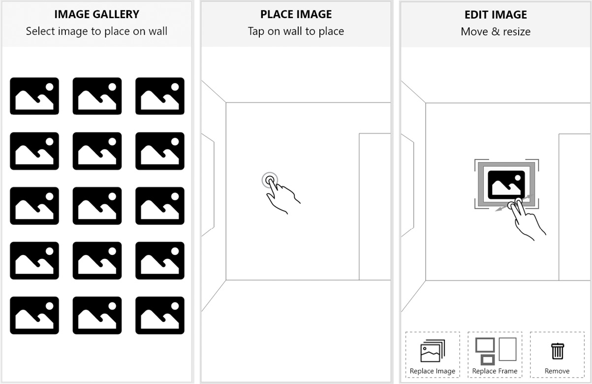
Figure 6.1 – UX design wireframe sketches
The leftmost frame shows the image gallery menu that appears when the user has chosen to add a new photo into the scene. The middle frame depicts the user choosing a location to hang the photo on a wall. And the rightmost frame shows the user editing an existing picture, including finger gestures to move and resize, and a menu of other edit options on the bottom of the screen.
Storyboards like this can be used to communicate the design intent to graphic designers, coders, and stakeholders alike. It can form the basis of discussion for ironing out kinks in the user workflow and inconsistencies in the user interface. It can go a long way to make the project management more efficient by preventing unnecessary rework when it's most costly – after features have been implemented.
With enough of the design drafted, we can now select some of the assets we'll use while building the project.
User stories
It is useful to break up the features into a set of "user stories" or bite-sized features that can be implemented incrementally, building up the project a piece at a time. In an agile-managed project, the team may choose a specific set of stories to accomplish in one- or two-week sprints. And these stories could be managed and tracked on a shared project board such as Trello (https://trello.com/) or Jira (https://www.atlassian.com/software/jira). Here are a set of stories for this project:
- When the app starts, I am prompted to scan the room while the device detects and tracks vertical walls in the environment.
- After tracking is established, I see a main menu with an Add button.
- When I press the Add button, I am presented with a selection of photos.
- When I choose a photo from the selection, I see the tracked vertical planes and I am prompted to tap to hang a framed photo (picture) on a wall.
- When the picture is instantiated, it hangs squarely upright and flush against the wall plane.
- When I tap on an existing virtual picture to begin editing the picture.
- When editing a picture, I see an edit menu with options to change the photo, change the frame, or remove the framed picture.
- When editing a picture, I can drag the picture to a new location.
- When editing a picture, I can pinch (using two fingers) to resize it.
That seems like a good set of features. We'll try to get through the first half of them in this chapter and complete it in the next chapter. Let's get started.
Getting started
To begin, we'll create a new scene named ARGallery using the ARFramework scene template, with the following steps:
- Select File | New Scene.
- In the New Scene dialog box, select the ARFramework template.
- Select Create.
- Select File | Save As. Navigate to the Scenes/ folder in your project's Assets folder, give it the name ARGallery, and select Save.
The new AR scene already has the following objects:
- An AR Session game object.
- An AR Session Origin rig with raycast manager and plane manager components.
- UI Canvas is a screen space canvas with child panels Startup UI, Scan UI, Main UI, and NonAR UI. It has the UI Controller component script that we wrote.
- Interaction Controller is a game object with the Interaction Controller component script we wrote that helps the app switch between interaction modes, including Startup, Scan, Main, and NonAR modes. It also has a Player Input component configured with the AR Input Actions asset we created previously.
- An OnboardingUX prefab from the AR Foundation Demos project that provides AR session status and feature detection status messages, and animated onboarding graphics prompts.
We now have a plan for the AR gallery project, including a statement of objectives, use cases, and a UX design with some user stories to implement. With this scene, we're ready to go. Let's find a collection of photos we can work with and add them to the project.
Collecting image data
In Unity, images can be imported for use in a variety of purposes. Textures are images that can be used for texturing the materials for rendering the surface of 3D objects. The UI uses images as sprites for button and panel graphics. For our framed photos, we're going to use images as… images.
The most basic approach to using images in your application is to import them into your Assets folder and reference them as Unity textures. A more advanced solution would be to dynamically find and load them at runtime. In this chapter, we'll use the former technique and build the list of images into the application. Let's start by importing the photos you want to use.
Importing photos to use
Go ahead and choose some images for your gallery from your favorites. Or you can use the images included with the files in this book's GitHub repository, containing a collection of freely usable nature photos found on Unsplash.com (https://unsplash.com/) that I found, along with a photo of my own named WinterBarn.jpg.
To import images into your project, use the following steps:
- In the Project window, create a folder named Photos by right-clicking, then selecting Create | Folder.
- From your Windows Explorer or OSX Finder, locate an image you want to use. Then drag the image file into Unity, dropping it in your Photos/ folder.
- In the Inspector window, you can check the size of the imported image. Because we're using it in AR and on a relatively low-resolution mobile device, let's limit the max size to 1,024 pixels. Note that Unity requires textures be imported into a size that is a power of 2 for best compression and runtime optimization. In the Inspector, ensure the Default tab is selected and choose Max Size | 1024.
Now we'll add a way to reference your images in the scene.
Adding image data to the scene
To add the image data to the scene, we'll create an empty GameObject with an ImagesData script that contains a list of images. First, create a new C# script in your project's Scripts/ folder, name it ImagesData, and write it as follows:
using UnityEngine;
[System.Serializable]
public struct ImageInfo
{
public Texture texture;
public int width;
public int height;
}
public class ImagesData : MonoBehaviour
{
public ImageInfo[] images;
}
The script starts by defining an ImageInfo data structure containing the image Texture and the pixel dimensions of the image. It is public so it can be referenced from other scripts. Then the ImagesData class declares an array of this data in the images variable. The ImageInfo structure requires a [System.Serializable] directive so it will appear in the Unity Inspector.
Now we can add the image data to the scene, using the following steps:
- From the main menu, select GameObject | Create Empty to add an object to the root of your hierarchy, and rename it Images Data (reset its Transform for tidiness, using the 3-dot context menu and Reset).
- Drag the ImagesData script onto the Images Data object, making it a component.
- To populate the images array, in the Inspector, enter the number of images you plan to use, or simply press the + button in the bottom right to incrementally add elements to the array.
- Add your imported image files one at a time by unfolding an Element from the Images list, then drag an image file from the Project window onto the Texture slot for the element. Please also enter the Width and Height in pixels of each image.
My Images Data looks like this in the Inspector:

Figure 6.2 – Images Data component with a list of images
Using ScriptableObjects
A different, and probably better, approach to providing the list of images is to use ScriptableObjects instead of GameObjects. ScriptableObjects are data container objects that live in your Assets/ folder rather than in the scene hierarchy. You can learn more about ScriptableObjects at https://docs.unity3d.com/Manual/class-ScriptableObject.html and https://learn.unity.com/tutorial/introduction-to-scriptable-objects.
It is a little tedious having to manually enter the pixel dimensions of each image. It would be nice if there were a better way because that's not very easy.
Obtaining the pixel dimensions of an image
Unfortunately, when Unity imports an image as a texture, it resizes it to a power of two to optimize runtime performance and compression, and the original dimension data is not preserved. There are several ways around this, none of which are very pretty:
- Require the developer to specify the pixel dimensions manually for each image. This is the approach we are taking here.
- Tell Unity to not resize the image when it is imported. For this, select an image asset, and in its Inspector window, you'll see its Import Settings. Notice its physical size on disk is listed in the preview panel at the bottom. Then change Advanced | Non-Power of 2 to None and select Apply. Note the new size is probably significantly bigger because Unity will not compress the data. And that will make your final app size much bigger too. But since the texture is now the original unscaled size, you can access it in C# using Texture.width and Texture.height.
- Take the first method but automatically determine the pixel size using an Editor script. Unity allows you to write scripts that only run in the Editor, not runtime. The Editor has access to the original image file in your Assets folder before it has been imported as a texture. So it's possible to read and query this information, either using system I/O functions, or possibly (undocumented) the Unity API (see https://forum.unity.com/threads/getting-original-size-of-texture-asset-in-pixels.165295/).
Given that, we'll stick with the manual approach in this chapter, and you can explore the other options on your own.
Perhaps you're also wondering, what if I don't want to build the images into my project and want to find and load them at runtime?
Loading the pictures list at runtime
Loading assets at runtime from outside your build is an advanced topic and outside the scope of this chapter. There are several different approaches that I will briefly describe, and I will point you to more information:
- Including images in Asset Bundles: In Unity, you have the option of bundling assets into an Asset Bundle that the application can download after the user has installed the app, as downloadable content (DLC). See https://docs.unity3d.com/Manual/AssetBundlesIntro.html.
- Downloading images from a web URL: If you have the web address of an image file, you can download the image at runtime using a web request and use it as a texture in the app. See https://docs.unity3d.com/ScriptReference/Networking.UnityWebRequestTexture.GetTexture.html.
- Getting images from the device's photos app: For an application such as our Gallery, it's natural to want to get photos from the user's own photos app. To access data from other apps on the mobile device you need a library with native access. It may also require your app to obtain additional permissions from the user. Search the Unity Asset Store for packages.
If you want to implement these features, I'll leave that up to you.
We have now imported the photos we plan to use, created a C# ImageInfo data structure including the pixel dimensions of each image, and populated this image data in the scene. Let's create a framed photo prefab containing a default image and a picture frame that we can place on a wall plane.
Creating a framed photo prefab
The user will be placing a framed photo on their walls. So, we need to create a prefab game object that will be instantiated. We want to make it easy to change images and frames, as well as resize them for various orientations (landscape versus portrait) and image aspect ratios. For the default frame, we'll create a simple block from a flattened 3D cube and mount the photo on the face of it. For the default image, you may choose your own or use one that's included with the files for this chapter in the GitHub repository.
Creating the prefab hierarchy
First, create an empty prefab named FramedPhoto in your project's Assets/ folder. Follow these steps:
- In the Project window, navigate to your Prefabs/ folder (create one if needed). Then right-click in the folder and select Create | Prefab.
- Rename the new prefab FramedPhoto.
- Double-click the FramedPhoto asset (or click its Open Prefab button in the Inspector window).
We're now editing the empty prefab.
- Add a child AspectScaler container that we can later use to adjust its aspect ratio for the given image: right-click in the Hierarchy window and select Create Empty (or use the + button in the top-left of the window). Rename it AspectScaler.
- Let's create a modern-looking rectangular black frame using a flattened cube. With the AspectScaler object selected, right-click and select 3D Object | Cube and rename it Frame.
- Give the frame some thickness. In the frame's Inspector window, set its Transform | Scale | Z to 0.05 (that's in meters).
- Likewise, offset it from the wall by setting Transform | Position | Z to -0.025.
- To give this frame a black finish, create and add a new material as follows.
In the Project window, navigate to your Materials/ folder (create one if needed). Then right-click in the folder and select Create | Material. Rename the new material Black Frame Material.
- Set its Base Map color to a charcoal black color.
- Then, in the Hierarchy, select the Default Frame object and drag the Black Frame Material onto it.
The current frame properties are shown in the following screenshot:

Figure 6.3 – The FramedPhoto's frame properties
Next, we'll add a default image to the FramedPhoto rig. I'm using the one named WinterBarn.jpg that is included with the files for this book. Use the following steps to create an image object with a material that uses this photo as its texture image:
- With the FramedPhoto prefab open for editing, in Hierarchy, right-click on the AspectScaler object, select Create | 3D Object | Quad, and rename it Image. A quad is the simplest Unity 3D primitive object, a flat quadrilateral plane with only four edges and facing in a single direction.
- To add your image as a texture on the quad, we need to create a material. In the Project window, navigate to your Materials/ folder, right-click in the folder and select Create | Material. Rename the new material Image Material.
- Drag your image file (WinterBarn.jpg) from the Project window into the Inspector window, dropping it onto the little square "chip" slot on the left side of the Base Map property.
- Drag the Image Material onto the Image game object.
- Offset the image quad so it's slightly in front of the frame cube's plane. Set its Transform | Position | Z to -0.06.
- You should be able to see the image now. But the frame is hidden because the image quad is scaled to the same size as the frame. Shrink the image by setting its Scale X and Y to 0.9.
The prefab hierarchy now looks like the following screenshot, where the image is currently selected and visible in the Inspector:
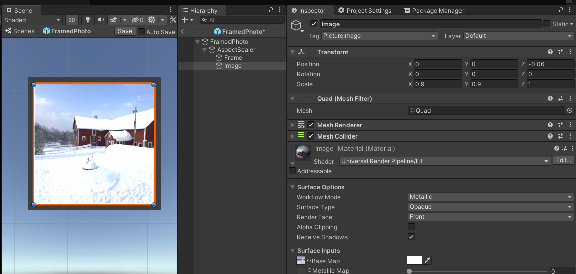
Figure 6.4 – The FramedPhoto prefab
Next, let's add a simple script that will help our other code set the image of a FramedPhoto object.
Writing a FramedPhoto script
We are going to need to set various properties of each instance of the FramedPhoto prefab. Specifically, the user will be able to choose which image belongs in the frame of each picture. So, we can provide a SetImage function for this that gets the image data for this picture.
Create a new C# script named FramedPhoto, open it for editing, and write the script as follows::
using UnityEngine;
public class FramedPhoto : MonoBehaviour
{
[SerializeField] Transform scalerObject;
[SerializeField] GameObject imageObject;
ImageInfo imageInfo;
public void SetImage(ImageInfo image)
{
imageInfo = image;
Renderer renderer = imageObject.GetComponent<Renderer>();
Material material = renderer.material;
material.SetTexture("_BaseMap", imageInfo.texture);
}
}
At the top of the FramedPhoto class, we declare two properties. The imageObject is a reference to the child Image object, for when the script needs to set its image texture. scalerObject is a reference to the AspectScaler for when the script needs to change its aspect ratio (we do this at the end of this chapter).
When a FramedPhoto gets instantiated, we are going to call SetImage to change the Image texture to the one that should be displayed. The code required to do this takes a few steps. If you look at the Image object in the Unity Inspector, you can see it has a Renderer component that references its Material component. Our script gets the Renderer, then gets its Material, and then sets its base texture.
We can now add this script to the prefab as follows:
- With the FramedPhoto prefab opened for editing, drag the FramedPhoto script onto the FramedPhoto root object to make it a component.
- From the Hierarchy, drag the AspectScaler object into the Inspector and drop it onto the Framed Photo | Scaler Object slot.
- From the Hierarchy, drag the Image object onto the Framed Photo | Image Object slot.
Our prefab is now almost ready to be used. Of course, the picture we're using isn't really supposed to be square, so let's scale it.
Scaling the picture's shape
The photo I'm using by default is landscape orientation, but our frame is square, so it looks squished. To fix it, we need to get the original pixel size of the image and calculate its aspect ratio. For example, the WinterBarn.jpg image included on GitHub for this book is 4,032x3,024 (width x height), or 3:4 (height:width landscape ratio). Let's scale it now for the image's aspect ratio (0.75). Follow these steps:
- In the Hierarchy window, select the Scaler object.
- Set its Transform | Scale Y to 0.75 (if your image is portrait, scale the X axis instead, leaving the Y axis at 1.0).
The properly scaled prefab now looks like the following:

Figure 6.5 – FramedPhoto prefab with corrected 3:4 landscape aspect ratio
- Save the prefab by clicking the Save button in the top-right of the Scene window.
- Return to the scene editor using the < button in the top-left of the Hierarchy window.
- Setting up the FramedPhoto rig this way has advantages, including the following:
- The FramedPhoto prefab is normalized to unit scale, that is, scaled (1, 1, 1) regardless of the aspect ratio of the photo within it or the thickness of the frame. This will help with the user interface for placing and scaling the framed photo in the scene.
- The FramedPhoto prefab's anchor point is located at the center of the picture along the back face of the frame, so when it's placed on a wall it'll be positioned flush with the detected wall plane.
- The Frame model and photo Image objects are within an AspectScaler object that can be scaled according to the aspect ratio of the image. By default, we set it to 0.75 height for the 3:4 aspect ratio.
- The Image is scaled evenly (that is, by the same ratio for both X and Y) to fit within the picture area of the frame. In this case, I decided the frame has a 0.05 size border, so the Image is scaled by 0.9.
- The front-back offset of the image will also depend on the frame's model. In this case, I moved it closer, -0.06 versus -0.025 units, so it sits slightly in front of the frame's surface.
When assembling a prefab, thinking through how it can head off gotchas later.
In this section, we created a scalable FramedPhoto prefab made from a cube and an image mounted on the face of the frame block that we can now add to our scene. It is saved in the project Assets folder so copies can be instantiated in the scene when the user places a picture on a wall. The prefab includes a FramedPhoto script that manages some aspects of the behavior of the prefab, including setting its image texture. This script will be expanded later in the chapter. We now have a FramedPhoto prefab with a frame. We're ready to add the user interaction for placing pictures on your walls.
Hanging a virtual photo on your wall
For this project, the app scans the environment for vertical planes. When the user wants to hang a picture on the wall, we'll show a UI panel that instructs the user to tap to place the object, using an animated graphic. Once the user taps the screen, the AddPicture mode instantiates a FramedPhoto prefab, so it appears to hang on the wall, upright and flush against the wall plane. Many of these steps are similar to what we did in Chapter 5, Using the AR User Framework, so I'll offer a little less explanation here. We'll start with a similar script and then enhance it.
Detecting vertical planes
Given the AR Session Origin already has an AR Plane Manager component (provided in the default ARFramework template), use the following steps to set up the scene to scan for vertical planes (instead of horizontal ones):
- In the Hierarchy window, select the AR Session Origin object.
- In its Inspector window, set the AR Plane Manager | Detection Mode to Vertical by first selecting Nothing (clearing all the selections) and then selecting Vertical.
Now let's create the AddPicture UI panel that prompts the user to tap a vertical plane to place a new picture.
Creating the AddPicture UI panel
The AddPicture UI panel is similar to the Scan UI one included with the scene template, so we can duplicate and modify it as follows:
- In the Hierarchy window, unfold the UI Canvas.
- Right-click the Scan UI game object and select Duplicate. Rename the new object AddPicture UI.
- Unfold AddPicture UI and select its child, Animated Prompt.
- In the Inspector, set the Animated Prompt | Instruction to Tap To Place.
- To add the panel to the UI Controller, in the Hierarchy, select the UI Canvas object.
- In the Inspector, at the bottom-right of the UI Controller component, click the + button to add an item to the UI Panels dictionary.
- Enter AddPicture in the Id field.
- Drag the AddPicture UI game object from the Hierarchy onto the Value slot.
We added an instructional user prompt for the AddPicture UI. When the user chooses to add a picture to the scene, we'll go into AddPicture mode, and this panel will be displayed. Let's create the AddPicture mode now.
Writing the initial AddPictureMode script
To add a mode to the framework, we create a child GameObject under the Interaction Controller and write a mode script. The mode script will show the mode's UI, handle any user interactions, and then transition to another mode when it is done. For AddPicture mode, it will display the AddPicture UI panel, wait for the user to tap the screen, instantiate the prefab object, and then return to main mode.
The script starts out like the PlaceObjectMode script we wrote in Chapter 5, Using the AR User Framework. Then we'll enhance it to ensure the framed picture object is aligned with the wall plane, facing into the room, and hanging straight.
Let's write the AddPictureMode script, as follows:
- Begin by creating a new script in your project's Scripts/ folder by right-clicking and selecting Create C# Script. Name the script AddPictureMode.
- Double-click the file to open it for editing. Paste the following code, which is the same as the PlaceObjectMode script you may already have to hand, with differences highlighted. The first half of the script is as follows:
using System.Collections.Generic;
using UnityEngine;
using UnityEngine.InputSystem;
using UnityEngine.XR.ARFoundation;
using UnityEngine.XR.ARSubsystems;
public class AddPictureMode : MonoBehaviour
{
[SerializeField] ARRaycastManager raycaster;
[SerializeField] GameObject placedPrefab;
List<ARRaycastHit> hits = new List<ARRaycastHit>();
void OnEnable()
{
UIController.ShowUI("AddPicture");
}
- The second part of the script is actually unchanged from the PlaceObjectMode script:
public void OnPlaceObject(InputValue value)
{
Vector2 touchPosition = value.Get<Vector2>();
PlaceObject(touchPosition);
}
void PlaceObject(Vector2 touchPosition)
{
if (raycaster.Raycast(touchPosition, hits, TrackableType.PlaneWithinPolygon))
{
Pose hitPose = hits[0].pose;
Instantiate(placedPrefab, hitPose.position, hitPose.rotation);
InteractionController.EnableMode("Main");
}
}
}
At the top of AddPictureMode, we declare a placedPrefab variable that will reference the FramedPhoto Prefab asset we created. We also define and initialize references to the ARRaycastManager and a private list of ARRaycaseHit hits that we'll use in the PlaceObject function.
When the mode is enabled, we show the AddPicture UI panel. Then, when there's an OnPlaceObject user input action event, PlaceObject does a Raycast on the trackable planes. If there's a hit, it instantiates a copy of the FramedPhoto into the scene, and then goes back to main mode.
Let's go with this initial script for now and fix any problems we discover later. The next step is to add the AddPicture mode to the app.
Creating the AddPicture Mode object
We can now add the AddPicture mode to the scene by creating an AddPicture Mode object under the Interaction Controller, as follows:
- In the Hierarchy window, right-click the Interaction Controller game object and select Create Empty. Rename the new object AddPicture Mode.
- Drag the AddPictureMode script from the Project window onto the AddPicture Mode object, adding it as a component.
- Drag the AR Session Origin object from the Hierarchy onto the Add Picture Mode | Raycaster slot.
- Locate your FramedPhoto Prefab asset in the Project window and drag it onto the Add Picture Mode | Placed Prefab slot. The AddPicture Mode component now looks like the following (note that this screenshot also shows two more parameters, Image Data and Default Scale, that we add to the script at the end of this chapter):
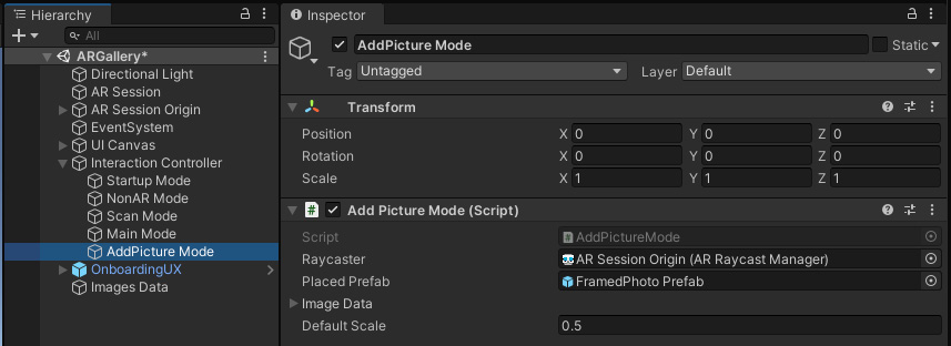
Figure 6.6 – AddPicture Mode added to the scene
- Now we'll add the mode to the Interaction Controller. In the Hierarchy, select the Interaction Controller object.
- In the Inspector, at the bottom-right of the Interaction Controller component, click the + button to add an item to the Interaction Modes dictionary.
- Enter AddPicture in the Id field.
- Drag the AddPicture Mode game object from the Hierarchy onto the Value slot. The Interaction Controller component now looks like the following:
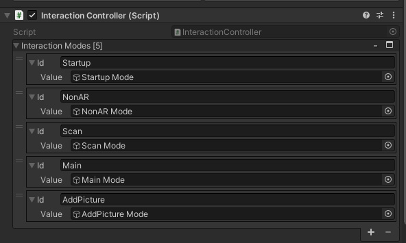
Figure 6.7 – Interaction Controller with AddPicture Mode added to the Interaction Modes dictionary
We now have an AddPicture mode that will be enabled from Main mode when the user clicks an Add button. Let's create this button now.
Creating a main menu Add button
When the app is in Main mode, the Main UI panel is displayed. On this panel, we'll have an Add button for the user to press when they want to place a new picture in the scene. I'll use a large plus sign as its icon, with the following steps:
- In the Hierarchy window, unfold the UI Canvas object, and unfold its child Main UI object.
- The default child text in the panel is a temporary placeholder; we can remove it. Right-click the child Text object and select Delete.
- Now we add a button. Right-click the Main UI game object and select UI | Button – TextMeshPro. Rename it Add Button.
- With the Add Button selected, in its Inspector window use the anchor menu (upper-left) to select a Bottom-Right anchor. Then press Shift + Alt + click Bottom-Right to also set its Pivot and Position in that corner.
- Adjust the button size and position, either using the Rect Tool from the Scene window toolbar (the fifth icon from the left) or numerically in the Inspector, such as Width, Height to (175, 175), and Pos X, Pos Y to (-30, 30), as shown in the following screenshot:

Figure 6.8 – The Add button Rect Transform settings
- In the Hierarchy window, unfold the Add Button by clicking its triangle-icon and select its child object, Text (TMP).
- Set its Text value to + and set its Font Size to 192.
- You can add another text element to label the button. Right-click the Add Button and select UI | Text – TextMeshPro. Set its Text content to Add, Font Size: 24, Color: black, Alignment: center, and Rect Transform | Pos Y to 55.
Our button now looks like the following:

Figure 6.9 – The Add button
- To set up the button to enable PlacePicture Mode, select the Add Button in the Hierarchy. In its Inspector, in the OnClick section of the Button component, press the + button on the bottom-right to add an event action.
- Drag the Interaction Controller from the Hierarchy and drop it onto the Object slot of the OnClick action.
- In the Function select list, choose InteractionController | EnableMode.
- In its string parameter field, enter the text AddPicture.
The On Click property of now looks like this:
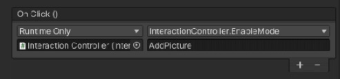
Figure 6.10 – When the Add button is clicked, it calls EnableMode("AddPicture")
We have now added AddPicture Mode to our framework. It will be enabled by the Interaction Controller when the Add button is clicked. When enabled, the script shows the AddPicture instructional UI, then waits for a PlaceObject input action event. Then it uses Raycast to determine where in 3D space the user wants to place the object, instantiates the prefab, and then returns to Main mode. Let's try it out.
Build And Run
Save the scene. If you want to try and see how it looks, you can now Build And Run, as follows:
- Select File | Build Settings.
- Click the Add Open Scenes button if the current scene (ARGallery) is not already in the Scenes In Build list.
- Ensure that the ARGallery scene is the only one checked in the Scenes In Build list.
- Click Build And Run to build the project.
The app will start and prompt you to scan the room. Slowly move your device around to scan the room, concentrating on the general area of the walls where you want to place the photos.
What makes for good plane detection?
When AR plane detection uses the device's built-in white light camera for scanning the 3D environment, it relies on good visual fidelity of the camera image. The room should be well lit. The surfaces being scanned should have distinctive and random textures to assist the detection software. For example, our AR Gallery project may have difficulty detecting vertical planes if your walls are too smooth. (Newer devices may include other sensors, such as laser-based LIDAR depth sensors that don't suffer from these limitations). If your device has trouble detecting vertical wall planes, try strategically adding some sticky notes or other markers on the walls to make the surfaces more distinctive to the software.
When at least one vertical plane is detected, the scan prompt will disappear, and you'll see the Main UI Add button. Tapping the Add button will enable AddPicture Mode, showing the AddPicture UI panel with its tap-to-place instructional graphic. When you tap a tracked plane, the FramedPhoto prefab will be instantiated in the scene. Here's what mine looks like, on the left side:

Figure 6.11 – Placing an object on the wall (left) and correcting for surface normal and upright (right)
Oops! The picture is sticking out of the wall perpendicularly, as shown in the preceding screenshot (on the left side). We want it to hang like a picture on the wall like in the right-hand image. Let's update the script to take care of this.
Completing the AddPictureMode script
There are a number of improvements we need to implement to complete the AddPictureMode script, including the following:
- Rotate the picture so it is upright and flat against the wall plane.
- Tell the picture which image to show in its frame.
- Include a default scale when the picture is first placed on a wall.
The AddPictureMode script contains the following line in the code that sets the rotation to hitPose.rotation:
Instantiate(placedPrefab, hitPose.position, hitPose.rotation);
As you can see in the previous screenshot, the "up" direction of a tracked plane is perpendicular to the surface of the plane, so with this code the picture appears to be sticking out of the wall. It makes sense to instantiate a placed object using this default up direction for horizontal planes, where you want your object standing up on the floor or a table. But in this project, we don't want to do that. We want the picture to be facing in the same direction as the wall. And we want it hanging straight up/down.
Instead of using the hit.pose.rotation, we should calculate the rotation using the plane's normal vector (pose.up). Then we call the Quaternion.LookRotation function to create a rotation with the specified forward and upward directions (see https://docs.unity3d.com/ScriptReference/Quaternion.LookRotation.html).
Quaternions
A quaternion is a mathematical construct that can be used to represent rotations in computer graphics. As a Unity developer, you simply need to know that rotations in Transforms use the Quaternion class. See https://docs.unity3d.com/ScriptReference/Quaternion.html. However, if you'd like an explanation of the underlying math, check out the great videos by 3Blue1Brown such as Quaternions and 3D rotation, explained interactively at https://www.youtube.com/watch?v=zjMuIxRvygQ.
Another thing we need is the ability to tell the FramedPhoto which image to display. We'll add a public variable for the imageInfo that will be set by the Image Select menu (developed in the next section of this chapter).
Also, we will add a defaultScale property that scales the picture when it's instantiated. If you recall, we defined our prefab as normalized to 1 unit max size, which would make it 1 meter wide on the wall unless we scale it. We're only scaling the X and Y axes, leaving the Z at 1.0 so that the frame's depth is not scaled too. I'll set the default scale to 0.5, but you can change it later in the Inspector.
Modify the AddPictureMode script as follows:
- Add the following declarations at the top of the class:
public ImageInfo imageInfo;
[SerializeField] float defaultScale = 0.5f;
- Replace the PlaceObject function with the following:
void PlaceObject(Vector2 touchPosition)
{
if (raycaster.Raycast(touchPosition, hits, TrackableType.PlaneWithinPolygon))
{
ARRaycastHit hit = hits[0];
Vector3 position = hit.pose.position;
Vector3 normal = -hit.pose.up;
Quaternion rotation = Quaternion.LookRotation (normal, Vector3.up);
GameObject spawned = Instantiate(placedPrefab, position, rotation);
FramedPhoto picture = spawned.GetComponent<FramedPhoto>();
picture.SetImage(imageInfo);
spawned.transform.localScale = new Vector3(defaultScale, defaultScale, 1.0f);
InteractionController.EnableMode("Main");
}
}
- Save the script and return to Unity.
Note that I had to negate the wall plane normal vector (-hit.pose.up), because when we created our prefab, by convention, the picture is facing in the minus-Z direction.
When you place a picture, it should now hang properly upright and be flush against the wall, as shown in right-hand panel of the screenshot at the top of this section.
Showing tracked planes in AddPicture mode
Another enhancement might be to hide the tracked planes while in Main mode and show them while in AddPicture mode. This would allow the user to enjoy their image gallery without that distraction. Take a look at how we did that in the Hiding tracked object when not needed topic of Chapter 5, Using the AR User Framework. At that time, we wrote a script, ShowTrackablesOnEnable, that we can use now too. Follow these steps:
- With the AddPicture Mode game object selected in the Hierarchy (under Interaction Controller).
- In the Project window, locate your ShowTrackablesOnEnable script and drag it onto the AddPicture Mode object.
- From the Hierarchy, drag the AR Session Origin object into the Inspector and drop it onto the Show Trackables On Enable | Session Origin slot.
That is all we need to implement this feature.
To recap, we configured the scene to detect and track vertical planes, for the walls of your room. Then we created an AddPicture UI panel that prompts the user with an instructional graphic to tap to place. Next, we created an AddPicture mode, including the interaction AddPicture Mode game object and added a new AddPictureMode script. The script instantiates a copy of the FramedPhoto prefab when the user taps on a vertical plane. Then we improved the script by ensuring the picture is oriented flat on the wall and upright. The script also lets us change the image in the frame and its scale. Lastly, we display the trackable planes when in AddPicture mode and hide them when we return to Main mode.
The next step is to give the user a choice to select an image before hanging a new picture on the wall. We can now go ahead and create an image select menu for the user to pick one to use.
Selecting an image to use
The next thing we want to do is create an image select menu containing image buttons for the user to choose a photo before adding it to the scene. When the Add button is pressed, rather than immediately prompting the user to place a picture on the wall, we'll now present a menu of pictures to select from before hanging the image chosen on the wall. I'll call this SelectImage mode. We'll need to write an ImageButtons script that builds the menu using the Images list you've already added to the project (the Image Data game object). And then we'll insert the SelectImage mode before AddPicture mode, so the selected image is the one placed on the wall. Let's define the SelectImage mode first.
Creating the SelectImage mode
When SelectImage mode is enabled by the user, all we need to do is display the SelectImage UI menu panel with buttons for the user to pick which image to use. Clicking a button will notify the mode script by calling the public function, SetSelectedImage, that in turn tells the AddPictureMode which image to use.
Create a new C# script named SelectImageMode and write it as follows:
using UnityEngine;
public class SelectImageMode : MonoBehaviour
{
void OnEnable()
{
UIController.ShowUI("SelectImage");
}
}
Simple. When SelectImageMode is enabled, we display the SelectImage UI panel (containing the buttons menu).
Now we can add it to the Interaction Controller as follows:
- In the Hierarchy window, right-click the Interaction Controller game object and select Create Empty. Rename the new object SelectImage Mode.
- Drag the SelectImageMode script from the Project window onto the SelectImage Mode object adding it as a component.
- Now we'll add the mode to the Interaction Controller. In the Hierarchy, select the Interaction Controller object.
- In the Inspector, at the bottom-right of the Interaction Controller component, click the + button to add an item to the Interaction Modes dictionary.
- Enter SelectImage in the Id field.
- Drag the SelectImage Mode game object from the Hierarchy onto the Value slot. The Interaction Controller component now looks like the following:
.jpg)
Figure 6.12 – Interaction Controller with SelectImage Mode added
Next, we'll add the UI for this mode.
Creating the Select Image UI panel
To create the SelectImage UI panel, we'll duplicate the existing Main UI and adapt it. The panel will include a Header title and Cancel button. Follow these steps:
- In the Hierarchy, right-click the Main UI (child of UI Canvas) and select Duplicate. Rename the copy SelectImage UI. Delete any child objects, including Add Button, using right-click Delete.
- Make the panel size a little smaller than fullscreen so it looks like a modal popup. In its Inspector window, on the Rect Transform, set the Left, Right, and Bottom values to 50. Set the Top to 150 to leave room for the app title.
- We want this panel to have a solid background so on its Image component, select Component | UI | Image from the main menu.
- Create a menu header sub-panel. In the Hierarchy, right-click the SelectImage UI and select UI | Panel and rename it Header.
- Position and stretch the Header to the top of the panel using the Anchor Presets box (icon in the upper-left of the Rect Transform component), click on Top-Stretch, and then Alt+Shift + click Top-Stretch. We can leave the default Height at 100.
- Right-click the Header, select UI | Text – TextMeshPro, and rename the object Header Text.
- On the Header Text, set its Text value to Select Image, Vertex Color: black, Font Size to 48, Alignment to Center and Middle, and Anchor Presets to Stretch-Stretch. Also, Alt + Shift + click Stretch-Stretch.
- We'll also add a Cancel button to the Header. Right-click the Header object and select UI | Button – TextMeshPro. Rename it Cancel Button.
- Set the Cancel button's Anchor Preset to Middle-Right and use Alt + Shift + click Middle-Right to position it there. Set its Width, Height to 80 and Pos X to -20. Also set its Image | Color to a light gray color.
- For the Cancel Button child text element, set its Text value to X and Font Size to 48.
- With the Cancel Button selected in Hierarchy, in its Inspector click the + button on the bottom-right of the Button | OnClick actions.
- Drag the Interaction Controller game object from the Hierarchy onto the OnClick Object slot.
- From the Function list, choose InteractionController | EnableMode. Enter Main in the text parameter field. The X cancel button will now send you back to Main mode.
The header of the SelectImage UI panel is shown in the following screenshot:
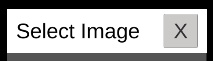
Figure 6.13 – The header panel of the SelectImage UI
Next, we'll add a panel to contain the image buttons that will display photos for the user to pick. These will be laid out in a grid. Use the following steps:
- In the Hierarchy, right-click the SelectImage UI, select UI | Panel, and rename it Image Buttons.
- On the Image Buttons panel, uncheck its Image component or remove it. We don't need a separate background.
- Its Anchor Presets should already be Stretch-Stretch by default. Set the Top to 100.
- Select Add Component, search for layout and add a Grid Layout Group component.
- On the Grid Layout Group, set its Padding to 20, 20, 20, 20, set Cell Size to 200, 200, and set Spacing to 20, 20. Set Child Alignment to Upper Center.
We now have an ImageSelect UI panel with a header and a container for the image buttons. Parts of the current hierarchy are shown in the following screenshot:
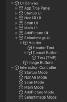
Figure 6.14 –UI Canvas with SelectImage UI, and Interaction Controller with SelectImage Mode
Lastly, we need to add the panel to the UI Controller as follows:
- To add the panel to the UI Controller, in the Hierarchy, select the UI Canvas object.
- In the Inspector, at the bottom-right of the UI Controller component, click the + button to add an item to the UI Panels dictionary.
- Enter SelectImage in the Id field.
- Drag the SelectImage UI game object from the Hierarchy onto the Value slot.
We now have a UI panel with a container for the image buttons. To make the buttons, we'll create a prefab and then write a script to populate the Image Buttons panel.
Creating an Image Button prefab
We will define an Image Button as a prefab so it can be duplicated for each image that we want to provide to the user in the selection menu. Create the button as follows:
- In the Hierarchy, right-click the Image Buttons object, select UI | Button, and rename it Image Button.
- Under the Image Button, delete its child Text element.
- On the Image Button, remove its Image component (using right-click and Remove Component) and then press Add Component. Search and add a Raw Image component instead.
- Its Button component needs a reference to its graphic that we just replaced. In the Inspector, drag the Raw Image component onto Button | Target Graphic slot.
- Now drag your default image texture, such as the WinterBarn asset, from the Project window Photos/ folder into the Inspector and drop it onto the Raw Image | Texture slot.
UI Image versus Raw Image
An Image component takes an image sprite for its graphic. A Raw Image component takes a texture for its graphic. Sprites are small, highly efficient, preprocessed images used for UI and 2D applications. Textures tend to be larger with more pixel depth and fidelity used for 3D rendering and photographic images. You can change an imported image between these and other type using the image file's Inspector properties. To use the same photo asset (PNG files) for both the FramedPhoto prefab and the button, we're using a Raw Image component on the buttons.
- Let's save the Image Button as a prefab. Drag the Image Button object from the Hierarchy into the Project window and drop it into your Assets Prefabs/ folder. This creates a prefab asset and changes its color in the Hierarchy to blue, indicating it's a prefab instance.
- In the Hierarchy window, right-click the Image Button object, select Duplicate (or press Ctrl/Option + D on the keyboard), and make several copies. Because the buttons are parented by the Image Buttons panel that has a Grid Layout Group, they are rendered in a grid, as shown in the following screenshot:

Figure 6.15 – Select image panel with Image Buttons in a grid layout
Next, we'll write a script to populate the buttons with actual images we want to use.
Writing an ImageButtons script
The ImageButtons script will be a component on the Image Buttons panel. Its job is to generate the image buttons with pictures of the corresponding images. Create a new C# script named ImageButtons, open it for editing, and write it as follows:
using UnityEngine;
using UnityEngine.UI;
public class ImageButtons : MonoBehaviour
{
[SerializeField] GameObject imageButtonPrefab;
[SerializeField] ImagesData imagesData;
[SerializeField] AddPictureMode addPicture;
void Start()
{
for (int i = transform.childCount - 1; i >= 0; i--)
{
GameObject.Destroy( transform.GetChild(i).gameObject);
}
foreach (ImageInfo image in imagesData.images)
{
GameObject obj = Instantiate(imageButtonPrefab,transform);
RawImage rawimage = obj.GetComponent<RawImage>();
rawimage.texture = image.texture;
Button button = obj.GetComponent<Button>();
button.onClick.AddListener(() => OnClick(image));
}
}
void OnClick(ImageInfo image)
{
addPicture.imageInfo = image;
InteractionController.EnableMode("AddPicture");
}
}
Let's go through this script. At the top of the class, we declare three variables. imageButtonPrefab will be a reference to the ButtonPrefab that we will instantiated. imagesData is a reference to the object containing our list of images. And addPicture is a reference to AddPictureMode for each button to tell which image has been selected.
The first thing Start() does is clear out any child objects in the buttons panel. For example, we created a number of duplicates of the button to help us develop and visualize the panel, and they'll still be in the scene when it runs unless we remove them first.
Then, Start loops through each of the images, and for each one, creates an Image Button instance and assigns the image to the button's RawImage texture. And it adds a listener to the button's onClick events.
When one of the buttons is clicked, our OnClick function will be called, with that button's image as a parameter. We pass this image data to the AddPictureMode that will be used when AddPictureMode instantiates a new FramedPhoto object.
Add the script to the scene as follows:
- In the Hierarchy, select the Image Buttons object (under UI Canvas/Select Image Panel).
- Drag the ImageButtons script onto the Image Buttons object, making it a component.
- From the Project window, drag the Image Button prefab into the Inspector and drop it onto the Image Buttons | Image Button Prefab slot.
- From the Hierarchy, drag the AddPicture Mode object into the Inspector and drop it onto the Image Buttons | Add Picture slot.
- Also from the Hierarchy, drag the Images Data object and drop it onto the Image Buttons | Images Data slot.
The Image Buttons component now looks like the following screenshot:
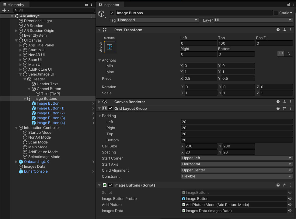
Figure 6.16 – Image buttons panel with the ImageButtons script that builds the menu at runtime
OK. When the app starts up, the Image Buttons menu will be populated from the Images list in Images Data. Then, when the user presses an image button, it'll tell the AddPictureMode which image was selected, and then enabled AddPicture mode.
Reroute the Add button
There is just one last step before we can try it out. Currently, the main menu's Add button enables AddPicture mode directly. We need to change it to call SelectImage instead, as follows:
- In the Hierarchy, select the Add button (located in UI Canvas / Main UI).
- In the Inspector, in the Button | On Click action list, change the EnableMode parameter from AddPicture to SelectImage.
- Save the scene.
If you got all this right, you should be able to Build and Run the scene and run through the complete scenario: pressing the Add button will present a Select Image menu. Tapping an image, the select panel is replaced with a prompt to tap to place the image, with its frame, on a wall. The following screenshots from my phone show, on the left, the Select Image menu. After selecting an image and placing it on the wall, the result is shown on the right. Then the app returns to the main menu:

Figure 6.17 – Pressing the Add button, I see an image menu (left), and the result after placing (right)
To summarize, in this section we added the Select Image menu to the scene by first creating the UI panel and adding it to the UI Controller. Then we created an Image Button prefab and wrote the ImageButtons script that instantiates buttons for each image we want to include in the app. Clicking one of the buttons will pass the selected image data to AddPicture mode. When the user taps to place and a FramedPhoto is instantiated, we set the image to the one the user has selected. We also included a Cancel button in the menu so the user can cancel the add operation.
This is looking good so far. One problem we have is all the pictures are rendered in the same sized landscape frame and thus may look distorted. Let's fix that.
Adjusting for image aspect ratio
Currently, we're ignoring the actual size of the images and making them all fit into a landscape orientation with a 3:4 aspect ratio. Fortunately, we've included the actual (original) pixel dimensions of the image with our ImageInfo. We can use that now to scale the picture accordingly. We can make this change to the FramedPhoto script that's on the FramedPhoto prefab.
The algorithm for calculating the aspect ratio can be separated as a utility function in the ImagesData script. Open the ImagesData script and add the following code:
public static Vector2 AspectRatio(float width, float height)
{
Vector2 scale = Vector2.one;
if (width == 0 || height == 0)
return scale;
if (width > height)
{
scale.x = 1f;
scale.y = height / width;
}
else
{
scale.x = width / height;
scale.y = 1f;
}
return scale;
}
When the width is larger than height, the image is landscape, so we'll keep the X scale at 1.0 and scale down Y. When the height is larger than the width, it is portrait, so we'll keep the Y scale at 1.0 and scale down X. If they're the same or zero, we return (1,1). The function is declared static so it can be called using the ImagesData class name.
Open the FramedPhoto script for editing and make the changes highlighted in the following:
public void SetImage(ImageData image)
{
imageData = image;
Renderer renderer = imageObject.GetComponent<Renderer>();
Material material = renderer.material;
material.SetTexture("_BaseMap", imageData.texture);
AdjustScale();
}
public void AdjustScale()
{
Vector2 scale = ImagesData.AspectRatio(imageInfo.width, imageInfo.height);
scalerObject.localScale = new Vector3(scale.x, scale.y, 1f);
}
If you recall, the SetImage function is called by AddPictureMode immediately after a FramedPhoto object is instantiated. After SetImage sets the texture, it now calls AdjustScale to correct its aspect ratio. AdjustScale uses ImageData.AspectRatio to get the new local scale and updates the scalerObject transform.
You may notice that the frame width is slightly different on the horizontal versus vertical sides when the picture is not square. Fixing this requires an additional adjustment to the Frame object's scale. For example, on a landscape orientation, try setting the child Frame object's Scale X to 1.0 – 0.01/aspectratio. I'll leave that implementation up to you.
When you run the project again and place a picture on your wall, it'll be the correct aspect ratio according to the photo you picked. One improvement you could add is to scale the images on the Select Image Panel buttons so they too are not squished. I'll leave that exercise up to you.
Summary
At the beginning of this chapter, I gave you the requirements and a plan for this AR gallery project, including a statement of the project objectives, use cases, UX design, and user stories. You started the implementation using the ARFramework template created in Chapter 4, Creating an AR User Framework, and built upon it to implement new features for placing a framed photo on your walls.
To implement this feature, you created a SelectImage UI panel, a SelectImage Mode interaction mode, and populated a list of images data. After the app starts up and AR is tracking vertical planes, when the user presses the Add button in the main menu, it opens a Select Image menu showing images to pick from. The image buttons grid was generated from your image data using an ImageButton prefab you created. Clicking an image, you're prompted to tap an AR tracked wall, and a new framed photo of that image is placed on the wall, correctly scaled to the image's aspect ratio.
We now have a fine start to an interesting project. There is a lot more that can be done. For example, presently pictures can be placed on top of one another, which would be a mistake. Also, it would be good to be able to move, resize, and remove pictures. We'll add that functionality in the next chapter.