
The previous chapter explored the Struts 2 generic tags and ventured a bit further into the wild lands of OGNL. In this chapter, we'll take a look at the Struts 2 form tags that handle the usual HTML form input elements. We will also take a look at some combination tags that group two or more form controls together, creating more complex controls.
As we look at the form tags, we'll get our first introduction to Struts 2 themes and templates, which control the HTML emitted by the UI tags. We'll also take a look at how to upload files, and one way to help prevent double submits using Struts 2.
We saw earlier that we could do all our form tags and error reporting manually using JSP, some conditionals, and some OGNL. A chapter later, we saw that there was an easier way to do it, and we cursed the author.
We'll explore the topics of themes and templates later in the book. For now, all we really need to know is that entire applications, single forms, or individual form elements have a theme. Themes determine how the Struts 2 form tags are rendered on our page.
Struts 2 form tags are rendered by FreeMarker templates (Struts 2.1.6 also saw the addition of a few pure Java tags). The templates handle the basic form element HTML. Most of them also include some layout, field error checks, and so on.
Different themes use different templates. The nutshell version of theme functionality is that the simple theme does nothing for us other than render HTML input elements. The "xhtml" theme uses a table layout and includes field error messages (as do the rest), whereas the css_xhtml puts everything inside<div> tags and relies on CSS for layout. Finally, the ajax theme embeds Ajax functionality, but otherwise it is the "xhtml" theme.
A theme can be set at the application level for use in every form element by setting a configuration constant—struts.ui.theme. Here, we'll set the default theme to"xhtml" (already the default) in a Struts 2 configuration file (as usual, we can also use a filter initialization parameter, or the struts.properties file):
<struts>
<constant name="struts.ui.theme" value="xhtml"/>
We can set the theme in several other ways, each overriding a less-specific setting. The theme of a tag is determined by:
Checking the
themeattribute of the Struts 2 form input element itself.Checking the
themeattribute of the Struts 2 form tag that surrounds it.Checking a scoped
themeattribute (as usual, following the page-request-session-application hierarchy).Finally, checking the configuration file value.
The rest of this chapter assumes the "xhtml" theme (handy for prototyping), but will occasionally set the theme to simple when we don't want any of the table markup.
The "xhtml" theme, as mentioned, uses a table layout. The<s:form> tag emits an HTML<form> tag and a<table> tag inside it. Each "xhtml" theme form element tag renders a two-column table row—the first column holding the label and the second column holding the input element.
If a form is validated and has field errors, the input element templates will also render individual field errors above the input element and change the CSS class of the label to indicate the error.
This is handy most of the time, but a bit irritating occasionally (we'll learn how to fix the irritation in Chapter 12). However, during these irritating times, however, we can always look back at the amount of work we did in Chapter 3 to duplicate a small portion of the "xhtml" theme. We can also recognize that for simple use cases, it's an overall win. And when it isn't a win, we can either revert to doing it by hand, using a different theme, modifying an existing theme, or creating our own.
The<s:head> tag is a bit different in that it's not actually a form tag. However, it does include both Struts 2 JavaScript utilities, and a theme-specific style sheet. The<s:head> tag should be in the<head> section of our pages. It loads the default CSS styles and the Struts 2 javascript from the Struts 2 static directory.
The<s:form> tag, of course, renders an HTML<form> element. In the "xhtml" theme, it also renders a<table> tag in preparation for the form element tags to come:
<s:form action="anAction">
</s:form>
<!-- Renders as: -->
<form id="anAction" name="anAction"
action="path/to/action" method="post">
<table class="wwFormTable">
</table>
</form>
We'll look at styling in Chapter 12, but it's convenient to see which classes are used in certain circumstances. The "xhtml" theme renders the form table with the wwFormTable class.
The<s:form> tag takes a slew of parameters, all of which are detailed in the official Struts 2 documentation. We need only a few to get basic functionality.
The action attribute defines which Struts 2 action the form will be submitted to. We don't put the .action extension (or whatever the action extension is) on the attribute value. Leaving out an action attribute indicates that we're submitting the action that rendered the<s:form> tag to the current action (postback).
If the action is in a different namespace, we use the namespace attribute, as with the<s:url> tag.
The method attribute does the same as in an HTML<form> element—setting the form submission type as either GET or POST. It defaults to POST. This attribute does not define the action method to be run, it is the form submission type.
The validate attribute determines if some client-side validation will be performed. However, it defaults to false indicating that only server-side validation will be run (when applicable). We'll discuss client-side validation further when we cover the various validation configuration options.
The form's id attribute will default to the value of the action attribute. We can define our own with the id attribute. We can also set our own CSS styles and classes with the cssStyle and cssClass attributes.
Each input element tag has a slew of possible attributes, but we need only a few for the most basic functionality. The big three are name, value, and label, which can all be set with the key attribute. However, we'll go over what they all mean.
The name attribute determines the name of the submitted value, just like the name attribute of an HTML form input element. As we've already seen, if the action we're submitting to contains a property of the same name, the form value will be set on that property (with the help of XWork's type conversion).
<!-- Value will be initialized to action's "foo" property
value (null values will be blank, *not* "null") -->
<s:textfield name="foo" />
The value attribute, if specified, sets the initial value of the input element. If no value is specified, the value will be initialized from the action property in the name attribute. The value attribute can be an OGNL expression.
<!-- Sets text element's value to "hello" -->
<s:textfield name="foo" value="%{'hello'}" />
<!-- Sets text element's value to "10" -->
<s:textfield name="foo" value="%{5 + 5}" />
The %{} syntax forces Struts 2 to evaluate the expression. The Struts 2 tag documentation lists which attributes are evaluated (in theory), but that may mean by default. The value attribute is listed as not being evaluated. However, when wrapped in the OGNL escape sequence %{}, the attribute will be evaluated. Some people prefer to use the %{} characters around all OGNL expressions to resolve any ambiguity. Suppose that we use the following:
value="hello"
This would actually put the word hello into the text input, without calling getHello() in our action. In this particular case, we must use the %{} characters to force evaluation:
value="%{hello}"
In this case, our action's getHello() method is called.
The label attribute sets the label of the input element. We can set this to a simple string and use our action's getText() methods, if we extended ActionSupport (remember Chapter 3?). We might set an input element's label as we see here:
<s:textfield name="text1" label="%{getText('text1')}" />
This uses the same resource lookup logic we've seen previously.
The key attribute replaces all three attributes, cleaning up our JSP pages quite a bit. It does the label text lookup and sets the name attribute. For the key attribute to work properly, our action must extend ActionSupport, as we're relying on its getText() methods. The key attribute reduces the most common use case to:
<s:textfield key="text1" />
One possible disadvantage of the key attribute is that our label messages must have the exact same name as our field names. Sometimes, we'll see labels named by the field name, and a prefix or suffix, such as text1.label.
If our application is not internationalized with messages stored in resource files, this might seem like an extra, unnecessary step. In some cases, particularly in smaller applications, it can be frustrating and is arguably not worth the extra hassle. However, separating text like this can make both development and documentation easier. It may also provide long-term benefits not originally anticipated.
Most of the standard HTML input element attributes are supported. As with<s:form>, CSS styles and classes are handled with the cssStyle and cssClass attributes. All the event handler attributes are supported. A complete attribute list for each tag is available on the Struts 2 documentation wiki.
The next question is: how does the label and input element get rendered in relationship to the table element that was rendered by the<s:form> tag. To answer this briefly, the label goes in the first table cell and the input element in the second. Given the Struts 2 form defined like this:
<s:form action="anAction">
<s:textfield key="text1" />
</s:form>
We'll get (once it's formatted nicely) something like the following:
<form id="anAction" name="anAction" ...>
<table>
<tr>
<td class="tdLabel">
<label for="anAction_text1" class="label">
Text1 label from resource file
</label>
</td>
<td class="tdLabel">
<input type="text" name="text1" id="anAction_text1"/>
</td>
</tr>
</table>
</form>
We'll see later that the tags also render error messages if there are any errors present.
The default table layout may not work for a particular application. In that case, we can use the simple theme (which may actually be too simple, as error messages are not rendered) or the css_xhtml theme. If neither of these work, we must either create a custom theme (which can be as simple as taking an existing theme and tweaking it slightly, or as complicated as completely redoing every template) or avoid the Struts 2 form tags altogether, which may make sense in some circumstances.
We'll cover the basic form input elements briefly, leaving a more detailed exploration for the official Struts 2 documentation. However, it's helpful to get a quick flavor of what's available. Most of it is obvious. However, when it's not, we'll go a bit more in depth.
We've already seen<s:textfield> in the previous examples. It renders a text input element and accepts the maxlength and size attributes as a normal HTML text input element. It is used to enter strings, numbers, and so on. The<s:password> and<s:hidden> tags render password and hidden fields, respectively. The<s:hidden> tag does not render a label.
<s:textfield key="firstname" />
<s:password key="password" />
<s:hidden key="hiddenField" />
The<s:textarea> tag renders an HTML<textarea> tag, taking similar attributes like cols, rows, and so on.
<s:textarea key="directions" />
The<s:label> tag isn't an input element per se, but can still be useful. It renders a table row, as the other input elements do, and emits two HTML<label> tags. The first label is like the other input elements—the label is either defined explicitly using the label attribute or by lookup using the key attribute.
The second label is the value of the named element. Instead of rendering an input element, the<s:label> tag renders the value in an HTML<label> tag, providing a read-only view of the value. For example, assume that our action property firstname is set to Albert (and we have a message named firstname):
<s:label key="firstname" />
It will be rendered as:
<tr>
<td>
<label for="firstname" class="label">
First Name:
</label>
</td>
<td><label id="firstname">Albert</label></td>
</tr>
Styling the label containing the data can be done using the normal cssClass and/or the cssStyle attributes. Note that this only styles the label containing the data (column two) and not the label for the label (column one). We can use CSS tricks and style label elements, but it is just not as flexible as it could be.
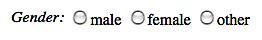
The<s:radio> tag renders a collection of radio buttons. As such, the tag requires a List or Map to be used for the radio button values. There are various ways to control what gets rendered as the radio button value and label. The simplest method is to supply a List of any type. Its toString() representation will be used as both the value and the label. In our action:
public List<String> getGenderOptions() {
return new ArrayList<String>() {{
add("Male"); add("Female"); add("Other");
}};
}
We then use the radio tag, providing a list attribute value. Here, we use the key attribute to retrieve both the form element label and define the action property that will be set.
<s:radio key="gender" list="genderOptions" />
We can also use an immediate list:
<s:radio key="gender" list="{'male', 'female', 'other'"/>
This renders a row of radio buttons like this:
Relying on the toString() representation is fine for simple types, such as strings or integers. However, complex values usually require the specification of listKey and listValue attributes. These attributes specify which bean properties will be used for the radio button value and label. Perhaps confusingly, the listKey property is used as the radio button value, while the listValue property will be used as the label.
For example, our action property coolBeans is a collection of beans, each with id and text fields. We could specify our<s:radio> tag like this:
<s:radio key="stringFromRadio" list="coolBeans"
listKey="id" listValue="text"/>
Radio button collections can also be created from maps. The map keys will be used as the radio button values, the map entry's toString() being used as the label. We cannot use the listKey and listValue with maps. If we use them, we'll get a FreeMarker exception.
This is a bit of a hassle, as that means we can only use a map containing simple objects, or we must provide a toString() method suitable for use on our view side. In other words, we can't have a more complete toString(), which could be used for logging, and so on.
Maps, of course, are generally unordered. If we need the radio buttons to appear in a specific order, we'd need to use a TreeMap or another ordered map.
The<s:checkbox> tag renders a single checkbox. At the time of this writing it only works well with Boolean (or boolean) properties. Attempting to preselect a checkbox with, for example, a string value only works if the string is true or false.
<s:checkbox key="checkbox1" />
We can set the value that will be sent back to the browser with the fieldValue attribute:
<s:checkbox key="checkbox1" value="Y" fieldValue="Y"/>
Browsers do not send a value for unchecked checkboxes to the server on a form submit. This causes some confusion, particularly among those who choose not to learn how browsers work. In the "xhtml" theme, the<s:checkbox> tag also renders a hidden element containing the current value of the checkbox property.
<tr>
<td valign="top" align="right"></td>
<td valign="top" align="left">
<input type="checkbox" name="checkbox1" value="true"
id="forms1_checkbox1"/>
<input type="hidden" id="__checkbox_forms1_checkbox1"
name="__checkbox_checkbox1" value="true" />
<label for="forms1_checkbox1" class="checkboxLabel">
Checkbox 1
</label>
</td>
</tr>
Notice the funky name for the hidden input element. The hidden form value is used by the checkbox interceptor. The checkbox interceptor looks for request parameters with a leading __checkbox_. If anything is found with no corresponding checkbox value, it indicates that the checkbox wasn't checked and the hidden value is set on the checkbox's action property. It's a nice way to work around how browsers handled unchecked checkboxes, neatly encapsulated in a custom tag and an interceptor. Our mainline code doesn't have to worry about any of this anymore (Yes, no more ActionForm.reset())
The<s:checkboxlist> tag, of course, renders a list of checkboxes. It operates similar to the<s:radio> tag, except that the action property being set should be a collection (or array) rather than a single value. Similar to the<s:radio> tag, using a map will result in the map keys being the checkbox value and the map entry's toString() as the label. You may also use the listKey and listValue attributes, as with the radio tag.
<s:checkboxlist key="cblist" list="listOfCbs"/>
At the time of writing this chapter, the hidden fields rendered by the<s:checkbox> tag are not rendered by<s:checkboxlist>. For example, if we needed to do something with the collection of options that were unselected, we'd need to do that on our own.
Moreover, as of this writing,<s:checkboxlist> ignores the cssClass and cssStyle attributes, making styling it a bit more problematic than the other UI tags.
Let's return to our recipe application for a moment, create a user story, and prototype an implementation. This user story, like all user stories, is short and sweet:
Users can check off any number of recipe types (like "appetizer", "dessert", and so on).
First, we'll create a RecipeType class, which seems to consist only of an integer ID and a string name. Mercifully, we won't list the code here (it's as we'd expect).
We'll also create a RecipeTypeService interface and a fake implementation, as we did with the recipes. We give the interface a getAll() method, returning a list of RecipeTypes. The fake implementation just returns a hard-coded list.
For now, our recipe class will get a List<String> recipeTypes to hold its collection of recipe type names, and our FakeRecipeService is modified to add some recipe types to each of our test recipes.
We'll also take this opportunity to modify our new recipe form to use Struts 2 tags, significantly cleaning it up and again making us crabby as we didn't do it that way in the first place. As a brutal reminder, here's what the JSP looked like for just the recipe name:
<tr>
<th>Name</th>
<td>
<s:if test="getFieldErrors().get('recipe.name') != null">
<div class="error">
<s:property
value="getFieldErrors().get('recipe.name')[0]" />
</div>
</s:if>
<input name="recipe.name" type="text" size="20"
value="<s:property value="recipe.name"/>" />
</td>
</tr>
Converting the form to use Struts 2 form tags, putting our labels in a resource file, and adding the new recipe type field, reduces our form JSP to this:
<s:form action="newRecipe">
<s:textfield key="recipe.name" />
<s:textfield key="recipe.description" />
<s:checkboxlist key="recipe.recipeTypes"
list="recipeTypeOptions"
listKey="name" listValue="name" />
<s:textarea key="recipe.ingredients" rows="5" cols="40" />
<s:textarea key="recipe.directions" rows="5" cols="40" />
<s:submit />
</s:form>
It's marginally cleaner (just like I have a marginal penchant for understatement).
In the above JSP fragment, we see that we're providing the list of recipe type options using an action property named recipeTypeOptions. Here's the rub: to get to our form we're requesting /recipes/new-recipe, and relying on Convention Plug-in to create the backing action for us. We need a way to get the recipe types into our action for use on the JSP.
There are several ways to accomplish this. We could just put the recipe types into application scope, so they can be used across the application with no database calls. However, this is not contrived enough for a book example. Therefore, we'll look at two additional options.
One solution would be to create a recipe action subclass—NewRecipeAction. It would implement the Preparable interface and contain a recipeTypeOptions property. We'd put code in its prepare()method to load up the recipe types.
We'll go a second route. We'll create a single class, NewRecipeAction, which implements Preparable, and uses the @Action annotation to create another URL handler. Both the initial form display (handled by ActionSupport's default execute() method) and the form submit (defined using the @Action annotation) are handled in the same class. The action, minus saving new recipes, and without imports, getters, and setters is shown next:
package com.packt.s2wad.ch06.actions.recipes;
public class NewRecipeAction extends ActionSupport
implements Preparable {
private Recipe recipe;
private Collection<RecipeType> recipeTypeOptions;
private static RecipeTypeService recipeTypeService =
new FakeRecipeTypeService();
public void prepare() throws Exception {
recipeTypeOptions = recipeTypeService.getAll();
}
@Action(value = "new-recipe-process")
public String process() {
// Handle saved recipe.
return "thanks";
}
}
We'd also need to make sure that validation errors return us to /recipes/new-recipe. There are several ways we could do this with the Convention Plug-in, including using the @Result annotation to define an "input" result.
The<s:select> tag renders a select box, with the options filled from its list attribute, similar to the radio and checkbox list tags.
As with the other collection-oriented tags, if our collection is contained in a map, the map key will be used as the value, and the map's toString() value will be used as the option text. When using a map, the listKey and listValue attributes are ignored. However, the select tag doesn't give us a FreeMarker exception. The attributes are just ignored, and we get a select box with empty values and text.
The optional headerKey and headerValue attributes specify an<option> rendered first, at the top of the list of options. This can be used to specify instructional text—for example, "-- Select State --" or similar. The headerKey attribute specifies the header option value, while the headerValue specifies the header option's text.
The emptyOption attribute specifies whether or not a blank<option> will be generated at the top of the<option>s, although, if one is specified after the header option. In general, it's likely that only one of the emptyOption and headerKey/headerValue attributes is used—it's not a requirement though (it's fine to use both, at least from a technical standpoint).
The<s:select> tag also accepts a multiple attribute, which does what we expect. Additionally, if the value passed to the tag (through either the key or the value attributes) is a collection, the multiple preselects will be rendered appropriately.
The<s:optgroup> tag provides an HTML<optgroup> element within a<s:select> tag. It takes a label attribute to specify the label of the option group. It can either be an immediate value or a getText() call as we've seen previously.
The<s:optgroup> tag is a bit quirky when using a list as an argument to the list attribute. If we use a map as the list argument, everything is fine (although once again, providing listKey and listValue attributes produce a FreeMarker exception). When we use a List, we must provide both the listKey and listValue attributes, or we'll receive a FreeMarker template exception.
One potential gotcha with<s:optgroup> is that if all our options are contained in optgroups, we must still provide a list to the surrounding select tag because the list attribute is required. We can use OGNL's immediate list syntax to provide this:
<s:select name="optg1" list="{}">
The<s:submit> tag renders a "submit" input element. Either the key or the value attributes may be used to specify the text of the submit button. As usual, the key attribute will perform a property lookup, while the value attribute will use its value as the button text.
The submit button accepts a type attribute, which may be input, button, or image. The input type renders a normal submit input element, while the button and image types render what we'd expect. IE (of course) has certain issues with button input elements. However, if we are targeting other browsers, button inputs are nice because we can use different values for the button text and value.
The<s:submit> tag also accepts the action and method parameters. These require a bit of hackery on the server side to let us specify the action we'll submit to, and/or the action method to execute, when we click to submit.
If we specify an action attribute and examine the emitted HTML (always a good idea), we'll notice that the input element's name attribute has changed to action: plus whatever we specified as the action attribute's value. Similarly, specifying a method attribute sets the name to method: plus the value of the method attribute.
If we specify both, the input element's name attribute is set to action: plus the action and method attributes joined by "!" (an exclamation mark). The action-plus-method attributes require that dynamic method invocation is enabled, and may not always leave the expected URL in the browser's address bar, if such things matter to us.
Struts 2 provides a set of "combination" form tags that combine several HTML input elements together and provides some enhanced functionality (think of them as simple HTML/JavaScript widgets).
Getting these tags to do what we want can sometimes be more trouble than it's worth. While these tags do provide some value for simple use cases, we'll often find that using their functionality within an existing design can be problematic. It may be a better idea to either create our own components or graduate to a real client-side framework.
The<s:combobox> tag renders both a text input element and a select box.
<s:combobox key="combo1" list="hellos" />
The text element can be filled directly, or by changing the select box's value. The text value is updated only when the select box value changes, meaning, we'll almost always want to include either the emptyOption or the headerKey/headerValue attributes.
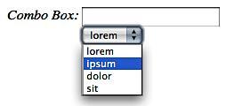
As the text box won't be filled (or cleared) if the select box value is empty, the default behavior of the<s:combobox> tag may not always be what we want. Also, selecting an empty option will not clear the text box—the JavaScript checks for nonempty values.
Using a map for the list attribute will again act in a way that is a bit counter intuitive. The listKey and the listValue attributes are ignored completely, although no exception is thrown. However, if the map uses something like an integer as its key, the text box will be filled with an integer rather than text, opposite of what we probably want.
The<s:updownselect> tag renders a select box along with an optional set of buttons for moving the currently selected list item (or items) up or down in the list, or to select all items in the list. Note that all the items in the list are submitted. This is a control for ordering a list, not for selecting individual list items.
<s:updownselect key="updown1" list="goodbyes"/>
The creation of the buttons is controlled by three attributes—allowMoveUp, allowMoveDown, and allowSelectAll—each of which controls the button we would expect. The label for each may be specified with the moveUpLabel, moveDownLabel, and selectAllLabel attributes. The defaults are "^", "v", and "*".
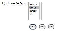
Again, the listKey and listValue attributes are ignored if the list attribute evaluates to a map, but no exception is thrown.
The<s:optiontransferselect> tag renders two select boxes along with a set of buttons for moving selected options between the two selects, moving all elements from one to the other, and ordering selections within each. Button rendering and button labels are controlled by a long list of attributes.
The only required attributes are:
list:Specifies the options for the lefthand select box (the "select from" list)doubleList:For the righthand select box (the "select to" list, allowing for initially selected items)doubleName:Provides a name for the entire component—the action property that will be set on form submission
The simplest use looks like this, and renders as follows:
<s:optiontransferselect label="Transfer" list="options"
doubleList="{}" doubleName="rightList" />
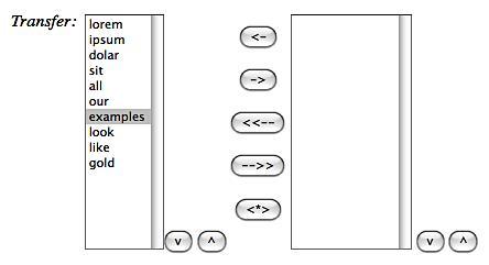
The usual suspects for list-oriented attributes are available for both the rendered select boxes—prefix the attribute name with double to apply to the second (righthand) select box. The same applies for event handler attributes. For example, the onclick attribute is for the lefthand list, whereas the doubleOnclick attribute is for the righthand list.
All entries of the righthand select box are submitted.
Note
Leaving the doubleName element blank, might, at the minimum, cause the tag to be nonfunctional, and might actually lock up some browsers and spike the CPU.
Note that the previous image also used some minimal CSS to get the empty righthand box. If there are no preselected list items, it will collapse on itself, would be narrow, and would look odd.
All of the control buttons are optional and are controlled using tag attributes. For example, the buttons labeled<<-- and -->> (which move the original list of items into the lefthand or righthand boxes) can be removed by setting the allowAddAllToLeft and/or allowAddAllToRight attributes to false.
Perhaps surprisingly, removing the "add all" buttons won't change the height of the combination control. Setting the size attribute doesn't quite work either. We actually need to set both size and doubleSize to reduce the height of the entire control.
There are also attributes for specifying JavaScript to run on the click of any of the buttons, and so on (see the Struts 2 documentation wiki for an exhaustive list).
Finally, the<s:doubleselect> tag renders two select boxes where selecting an item in the first select box (the lefthand select) determines which values are visible in the second select box (the righthand select). The collection for the second select box is chosen using an OGNL expression. The example provided on the Struts 2 documentation wiki looks something like the following, but has only two elements in the lefthand list. Here, we're using a three-element list, making the doubleList attribute's OGNL a bit awkward.
<s:doubleselect
doubleName="dsel2"
list="{'one', 'two', 'three'}"
doubleList="top == 'one' ? {'1a', '1b'}
: top == 'two' ? {'2a', '2b'}
: {'3a', '3b'}"/>
At the time of writing this book, the JavaScript generated for this tag fails under Convention-based actions because of the hyphen in the action names (this will be addressed later). Note also that we must use CSS if we want equally sized select boxes.
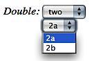
For longer lists (in either select box), the immediate lists aren't really an option. However, we recall that OGNL can call arbitrary methods with parameters. Using this and the idea that the currently-selected item in the first select box is called "top", leads us to the following solution. It's more realistic because in many (most?) applications, both sets of lists will come from the server.
<s:doubleselect doubleName="dsel4"
list="doublelist1"
doubleList="getDoublemap1(top)"/>
Here, we've created a method getDoublemap1(String s) in our action that returns the appropriate collection type for our application. We just use the currently selected value of the first list to determine the contents of the second list.
The<s:file> tag renders a standard file form element. The file upload itself is handled using the upload interceptor, included in the default interceptor stack (we'll cover that part later). For now, it's enough to know that the file upload interceptor puts uploaded files in a temporary directory and (as we'll discover), deletes them after the action executes.
Handling a single file is straightforward. The temporary uploaded file is available to us as a java.io.File in the action, as are the original filename and content type. Let's say we want to upload a single file to an action property named (unimaginatively) file1:
<s:form action="file1" enctype="multipart/form-data">
<s:file key="file1"/>
<s:submit/>
</s:form>
Our action has a File property, as well as string properties, for both the file name and content type (getters and setters not shown).
private File file1;
private String file1ContentType;
private String file1Name;
The upload interceptor sets those action properties for us. The File's filename will be system-generated and will consist of the default temporary directory and a temporary file name. The file name property will be the name of the file on the client's computer and will vary depending on what browser the client is using. Some browsers return the full pathname of the file, while others return only the file name.
We can change the temporary upload directory (it defaults to the container's javax.servlet.context.tempdir property) by setting a parameter on the upload interceptor (which we'll see in Chapter 8).
Note that we must download the Commons File Upload and the IO libraries (unless we want to use and configure a different multipart parser) and include them on our web app's classpath. The standard download doesn't (as of this writing) include these dependencies. Even if we're not uploading files, we must have those libraries on the classpath, or our application will fail on startup.
If we're paying attention (and have our logging set up to show INFO-level messages from the Struts 2 hierarchy) after our action processes the file upload form submission, we'll see a message from the upload interceptor saying that it has deleted the temporary file.
This means that, by default, we must copy uploaded files to a permanent location if we need them after the action executes. This is made trivial with the Commons IO library FileUtils.copyFile(File, File), or a similar method. Expecting the file to be saved in the temporary upload directory is a common file upload gotcha. If we want to keep uploaded files after action execution, we must copy them to their final destination(s).
We all hate being charged twice for a single purchase and double submits are really irritating (and occasionally expensive). Struts 2 provides the<s:token> tag (along with two interceptors, token and tokenSession) to help eliminate double submits. We'll sneak a peek at the token interceptor's configuration to see how to use the<s:token> tag.
The default interceptor stack doesn't include the token interceptor. We must add it to the actions that need it (or our default interceptor stack) in our Struts 2 configuration file, or using the @InterceptorRefs and the @InterceptorRef annotations of our Convention Plug-in.
<action name="dsub"
class="com.packt.s2wad.ch06.examples.DoubleSub">
<interceptor-ref name="token"/>
<interceptor-ref name="defaultStack"/>
<result name="input">/WEB-INF/content/examples/doublesub.jsp
</result>
<result name="invalid.token">
/WEB-INF/content/examples/doublesub.jsp</result>
<result type="redirectAction">thanks</result>
</action>
We then put the<s:token/> tag in our form:
<s:form action="dsub">
<s:token/>
<s:textfield key="text1"/>
<s:submit/>
</s:form>
The<s:token/> tag puts a unique identifier in the form that's checked by the token interceptor. The first time we submit the form, we're redirected to the "thanks" page. If we hit the back button in our browser (taking us back to the form) and submit again (or if we double-click the submit button), we're taken to the same page—courtesy the result named invalid.token, returned by the token interceptor (not our action).
The session token interceptor handles a double submit with a bit more sophistication (we'll cover it briefly in Chapter 8).
This chapter covers the Struts 2 user interface tags and how they can be used to significantly reduce the amount of clutter on our JSP pages. The chapter also takes a quick look at file uploading and double submission prevention. We also get a hint of the power and the utility of the themes and templates used by Struts 2 to generate tag HTML.
In the next chapter, we'll take a look at form validation using both XML and annotations, avoiding manual validation, thereby cleaning up our action code further. We'll also see how to create our own validators. We'll also look at the closely related topic of type conversion, that is, taking form values (always strings, remember) and converting them into useful Java objects. We've already seen some examples of this. However, we'll now cover more, including collection support and how to create our own type converters.
References
A reader can refer to the following:
Struts 2 UI Tags Documentation: