
Aside from the common formatting that we've already seen in the previous chapters, you may notice that our report here has different bar colors (blue, red, and green).
For accomplishing this, select the bar and right-click on it to display its context menu. From the context menu select Series Properties.
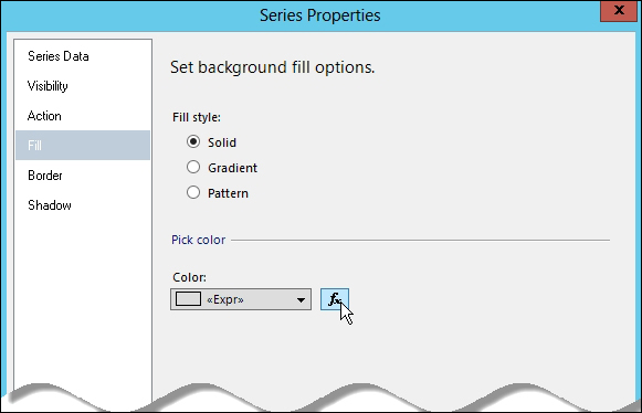
When the Series Properties dialog box is displayed, select the Fill tab. On the Pick Color section of the dialog box, click on the expression button next to the Color drop-down list, and enter the following expression:
=IIF(Fields!TotalSales.Value = Min((Fields!TotalSales.Value), "ds_DataBars"),"Red", IIF(Fields!TotalSales.Value = Max((Fields!TotalSales.Value), "ds_DataBars"),"Green","Blue"))
What we're doing in this expression is testing if the current TotalSales value is the least in the dataset, then if it is, we want to change the color of the bar to red. Green, if it is the highest value. Otherwise, the color bar is blue.
This is a quick way of showing the least and best performing sales territory in a single glance without really digging deeper into the data.