
Take another look at our report above. Something is amiss, right?
Compare the sparkline series between Canada and France. Canada has twelve (12) bars on its categories compared to France's six (6). What this tells us is that France has sales data only on the half of the year (six months). But which half: first or second?
That's hard to tell the way our Sparklines is presented in the previous report.
We want to align each and every bar so we can tell which months have no sales data or which month is missing data, whatever the case is.
Let's fix that.
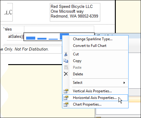
Going back to the report designer, select and right-click on the sparkline, then select the Horizontal Axis Properties option from its context menu, as shown in the following screenshot:
On the Horizontal Axis Properties window, select the Align axes in checkbox under the Axis range and interval section of the axis property, and select the tablix name (our tablix is named Tablix), as shown in the following screenshot:

With that little change, our report now has aligned bars from month-to-month across the whole table. It should look something like this (pay attention to Canada and France, highlighted in red box in the following screenshot, and see what the difference is this time):
