
John Kirkland's chart reports have become a big hit in every department of their company. Their numbers have become alive in vivid colors with the use of charts, bars, sparklines, gauges, and indicators. Now it's easier for the business analysts to visualize (pun intended) their company's financial performance through data visualization.
John is now the most loved IT expert in their company. He has now become the Superfluous go-to guy for anything that has to do with data analytics.
Based on John's SQL Server Reporting Services reports, the company is performing well on all fronts. They were able to pinpoint some data points where they need to make some improvements, and were able to recognize some gaps in their sales strategies that the Sales Director will address in their next quarterly meeting.
John knows for sure he will get busier as the meeting approaches. Requests for reports for so and so will again be the order of his day, and he has heard about the company's plan to expand to more international cities.
One of the finance analysts approached John the next day. The Sales Director wanted some kind of visualization that included overview of their sales territories and the sales numbers associated with each.
John's brain clicked! He has SQL Server Reporting Services spatial visualization features to thank!
Let's us follow John as he learns how to lay down data points over map layers.
In this chapter, you'll learn the following:
- Adding the polygon layer
- Adding the point layer
- Adding the tile layer
- Using a shapefile
- Customizing center point
Let's create a map visualization using the wizard.
- First find the T-SQL script named
uspSalesByTerritory.sql. Execute the script on the AdventureWorks2012 database to create a stored procedure calleduspSalesbyTerritory. - In the report designer, create a shared dataset based on the
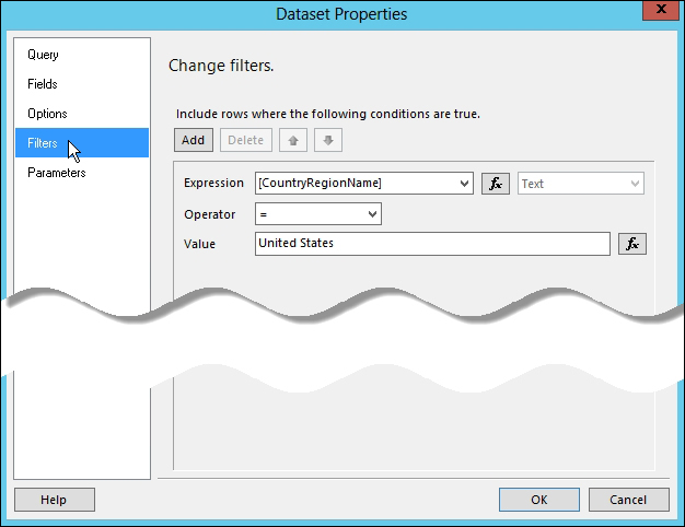
uspSalesByTerritorystored procedure. Let's name itds_SalesByTerritory. - Create a new report using our report template. Name it whatever you want. Create a dataset based on the shared dataset that we just created. In the Dataset Properties window, select the Filters tab, and click on the Add button to add a filter with the following conditions:
- Expression is set to [CountryRegionName]
- Operator is set to = (equals sign)
- Value is set to United States
- Click on the OK button when done.
- Drag a map object from the report designer toolbox into the report body. This displays the New Map Layer dialog box.
- On the first dialog box, select Map gallery as the source of our spatial data. Select USA by State Exploded from Map Gallery.

- Click on the Next button when done.
The second dialog box provides options for spatial data and map views.