
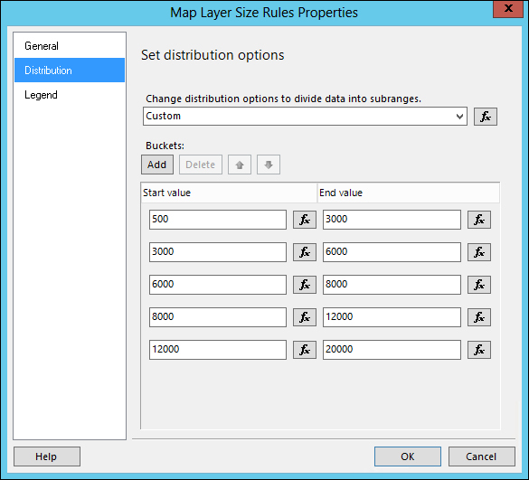
The distribution options enable us to show the variance effect among the ranges defined by the size of our aggregates. We have the option to either use the built-in distributions, or create a customized one.
- From the Map Layer properties pane, select Center Point Size Rule. This displays the Map Layer Size Rules Properties dialog box (you can also do this with the map color rules).
- On the General tab, select Visualize data by using size. Select [Sum(QTY)] from the drop-down textbox of the Data Field option. Set Default size options to zero (0).
- From the Distribution tab, select Custom from the drop-down textbox of the distribution option. Add Buckets as shown in the following screenshot:
- Click on OK when done.
Let's do the same thing with the color rules for our center points.
- Select Center Point Color Rule from the Map Layer properties pane.
- On the General tab, select Visualize data by using color ranges. Select [Count(Qty)] for Data Field. You can actually select any of the fields depending on what data you want to measure.
- You can select whatever color you prefer for the color ranges but, for this demonstration, select the following:
- Start color: Aqua
- Middle color: Khaki
- End color: Hot Pink
- We may also want to make the colors transparent so they won't block our state labels.
Click on the arrow next to the color to show the color selector dialog. Set Transparency to 100 for all three colors.
- On the Distribution tab, select Custom for the distribution option. Let's just copy the same start and end values from our size rule (see previous illustration).
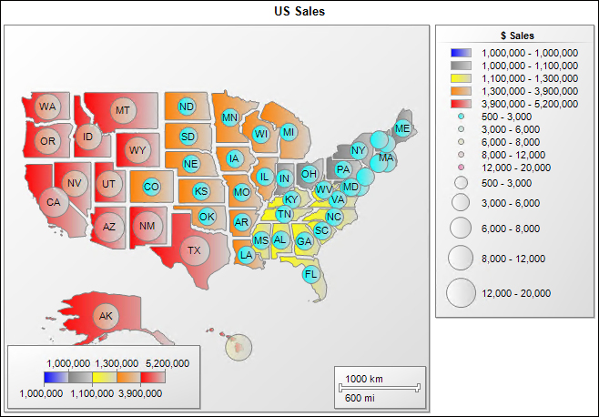
We can now preview our report with the added center point:
..................Content has been hidden....................
You can't read the all page of ebook, please click here login for view all page.