
A drop cap is a large capital letter at the beginning of a body of text. It is as deep as several lines of text and sometimes has additional graphic elements so that it looks more like an illustration than part of the text itself. It is a popular, if somewhat dated, feature, and many design programs and word processors offer the drop cap option as a separate function.
In Pages, the iWork word processing and layout application, drop cap does not feature as a separate option, which has led to much grumbling on user forums. However, there are several easy ways to create drop caps, with both text and graphic elements.
Open a new iWork Pages document with filler text, for example lorem ipsum, to try out the recipe. You can also use any of the letter templates. Under the Format menu, go to Advanced, and uncheck Define as Placeholder text.
The filler text used in this recipe is as follows:
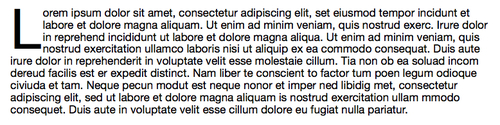
Lorem ipsum dolor sit amet, consectetur adipiscing elit, set eiusmod tempor incidunt et labore et dolore magna aliquam. Ut enim ad minim veniam, quis nostrud exerc. Irure dolor in reprehend incididunt ut labore et dolore magna aliqua. Ut enim ad minim veniam, quis nostrud exercitation ullamco laboris nisi ut aliquip ex ea commodo consequat. Duis aute irure dolor in reprehenderit in voluptate velit esse molestaie cillum. Tia non ob ea soluad incom dereud facilis est er expedit distinct. Nam liber te conscient to factor tum poen legum odioque civiuda et tam. Neque pecun modut est neque nonor et imper ned libidig met, consectetur adipiscing elit, sed ut labore et dolore magna aliquam is nostrud exercitation ullam mmodo consequet. Duis aute in voluptate velit esse cillum dolore eu fugiat nulla pariatur.
The following sections describe how to create a drop cap:
This is probably the easiest way to make a drop cap.
To make a drop cap using Text Bullets, follow the next steps:
- Click in the loremipsum text and open the Text Inspector.
- Click on the List tab and select Text Bullets:
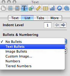
- In the Bullets window, you will see a simple round black bullet. Double-click in the window and type a capital L, for the lorem ipsum, or the first letter of the text that you are using. Hit Return or simply click in your text once again.
- Delete the letter "L" that begins the text.
- Next, increase the size of the drop cap so that it looks much bigger than the rest of the text. To increase the size, click in the Size window and type 500. You can also click on the up and down arrows to change the size gradually.
- Then, adjust the alignment of the drop cap. Click on the down arrow next to the Align window and make the big letter sink inside the body of text. In my example, the indent is at 15 points.
- At this point, the text doesn't flow around the drop cap, but goes over it. To make it flow around the big letter, increase text indent. Click in the indent window and set a size or click on the up and down arrows. If the units are set in inches or centimeters, we may find it difficult to set the desired indent. Go to Preferences | Rulers and choose Points as a unit in the drop-down menu. In my example, the indent is set at 32 points.
- Now, the indent affects the whole paragraph—the text doesn't wrap around the drop cap. To make it roll under the drop cap, insert a paragraph after the last word in the line at the bottom edge of the drop cap. If a paragraph spacing is set, change it to 0. Click on the Text tab and set the After paragraph value to 0.
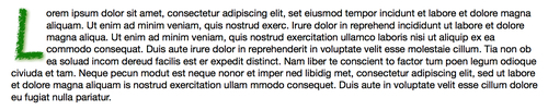
- The next inserted paragraph will repeat the style of the previous one by including the drop cap. Remove it by choosing No Bullets under the List tab. Then, set the text indent back to nil. Here's the result, a perfect drop cap:
If this sounds like too much to do to make a drop cap, remember that this is a feature that we only use occasionally, once for each large section or chapter. Plus, if we want, we can save all the described steps as a paragraph style. Here's how to do it:
Next time you want a drop cap, select a paragraph, open Styles Drawer, and click on Drop Cap Paragraph. Then, type a new drop cap letter in the Text Bullets window.
This method gives more exciting design possibilities than using Text Bullets. All the steps are the same as mentioned in the preceding section, except that instead of Text Bullets we use the Custom Image option.
This option allows us to use any image on our computer as a bullet. We can type the opening letter of the paragraph in a very large font, take a screenshot of it, and use it as a drop cap. We can also draw a letter with the iWork draw tool, make it into an image, and use it as a drop cap.
To draw a letter follow these steps:
- Click on the shapes icon in the toolbar and choose the Draw tool.

- Click three times to make the shape of L and double-click on the last dot.
- In the Graphic Inspector, give the letter an attractive color and outline—see the options available under Stroke.
- Make a screenshot of the letter.
- Then, in the Text Inspector, click on List and choose Custom Image. Click on Choose, find the screenshot of the L, and click on Open. Repeat adjustments described for Text Bullets, and you will have a beautiful graphic drop cap.
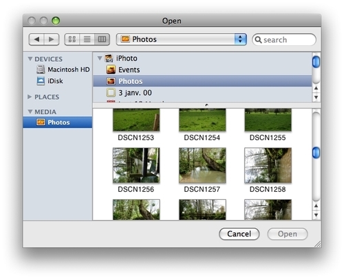
For a big project where drop caps will be used regularly, we can prepare a set of drawn letters following a particular style—even the whole alphabet! Then, we can store them in a dedicated folder. This folder can be added to the Media Browser. Click on the Media icon in the toolbar, click on the Photos tab, and drag your folder to the Media Browser. Then, in the Text Inspector, click on List, and choose the Custom Image option from the Bullets and Numbering drop-down menu. Click on Choose under the Image window. When the dialog window opens, find Media | Photos in the side pane and click on it. Find the letters folder, select a letter, and add as a drop cap.
We should be careful with using drop caps. They are a powerful formatting and design feature, and if used in excess, can spoil the overall effect of the finished document.
Another consideration with modern sans-serif fonts is that drop caps may look out of place because some letters, I for example, are hard to recognize immediately as letters that are part of the text.