
A magazine is different from other types of periodic publications in that it puts high emphasis on graphic presentation. Elements that together form the distinct style of a magazine include its title, fonts, and the graphic headers of the contents page, sections, and columns. The design of the magazine cover, including its title and colors, can be used for headers and footers on each page. Fonts should ideally be consistent throughout a publication.
Of all these elements, the title is arguably the most important. This recipe describes how it is designed.
As an example of a magazine title, we will use the Rendezvous. This design has typical features for such work—a distinct and recognizable style, a compact composition, and elements that can be used separately or built throughout the publication as logos, brand colors, and design elements. The font used in this example is Optima ExtraBlack, which comes pre-installed on Macs.

The following steps describe how to create a magazine title:
- Open a blank iWork Pages document and import a Text Box. In Wrap Inspector, uncheck Object causes wrap.
- Change the font of the highlighted default text—Type to enter text—to Optima ExtraBlack. Type in the word "the".
- Import another Text Box, change the default font to Optima ExtraBlack, and type in "endezvous". Uncheck Object causes wrap in Wrap Inspector.
- Import a third Text Box, change the font to Optima ExtraBlack, and type the capital letter "R". It can also serve as the logo of the magazine. Uncheck Object causes wrap.
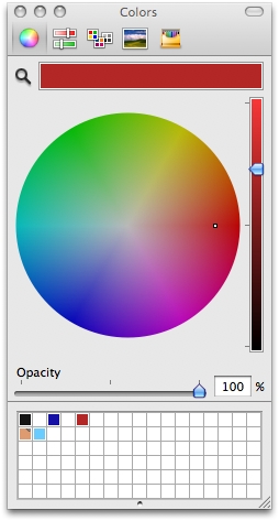
- Change the color of the "R" to a shade of red. Open the Colors Viewer by pressing Command + Shift + C (or by clicking on the color tab in Text Inspector). To change the color, click on the color mixing wheel—the icon at top left of the Colors Viewer. Drag the small white square. Then, drag the darkness slider to achieve the desired shade.
- Enlarge the "R" to a size proportionate to the dimensions of the magazine. Here, it is 134 points. If the letter doesn't fit in the box, make the box bigger.
- Select the box with "endezvous". Move the box with "R" aside while you work on this element of the title.
- Double-click on "endezvous" to highlight it, open Text Inspector, and under Spacing | Character, reduce the character spacing to -7%. The letters now sit much closer together.
- Go to the Text Box containing "the", select the word, and set character spacing to -7%.
- With "the" highlighted, click on the color tab in Text Inspector and set Opacity to 50% by dragging the slider under Opacity in the Colors Viewer. The color of both "endezvous" and "the" should be the same. In our example it is black. But with opacity reduced, "the" will look muted next to the other two elements of the title.
- Move the three boxes to form a tight, visually appealing composition. "R" stands out, "endezvous" fits snugly in front of the middle portion of "R", and "the" is positioned on top in the nest between "R" and "d". This also saves space, allowing you to make the title bigger.
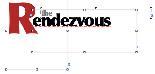
- You can also select all three boxes and group them, using Command + Option + G or choosing Arrange | Group.
In this recipe, we discussed the following properties regarding the title.
When you are satisfied with the red color, save it in the palette at the bottom of the Colors Viewer. Click on the color well displaying the red color and drag it to a cell in the palette. Click on the Sliders icon, choose CMYK from the drop-down menu, and note the CMYK breakdown. It will help when you work with professional printers to ensure quality reproduction. Then, use the color of "R" stored in the palette, for other graphic elements in the magazine—headings, lines, column dividers, box frames or color fills, page numbers, and so on—to give your magazine a distinct and consistent look.
You can leave the title as grouped text boxes, or you can convert it into an image and use it as a logo. For this, export your document to PDF and crop it to the desired dimensions. In Preview, you can remove the white background. It makes sense to have the title stored as an image in a project folder, to use as the company logo on stationery and on the web.
Use just the letter "R" or "the R" as a logo or trademark for your project. For example, like this:
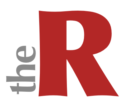
The distinct gray word "the" can be used to graphically accentuate section and column headers in the publication; for example, "the Advice" or "the Classifieds". Repeated use of the graphic elements from the title helps you in creating a company or house style.

If, for design purposes, you want to use the title on a dark background elsewhere in your project, think of inverting the colors. Create a box filled with the red color used for "R" and change the color of the title to white or light gray.
- The Designing repeating elements such as footer and object coordinates, and creating sections recipe in Chapter 10, Designing from Scratch: Beyond Templates
- The Changing font (typeface) using toolbar, menus, or Font Panel—when to use which recipe in Chapter 2, Working with Text