
Even if you include fancy graphics or podcasts on your site, the text is the heart of your Web site and is worthy of your attention. In this section, I cover a grab bag of techniques that all relate to working with text—improving its look, avoiding issues with high-ASCII characters, and creating hyperlinks.
iWeb’s professionally developed templates are nice, but you may want to customize the look of your text, perhaps in order to make your page stand out more. For example, the White template that I’ve used for my example site is quite drab, using gray text everywhere. Although I don’t want to overdo it, I’d like to add pizzazz to my pages by modifying text colors and styles, and applying effects such as opacity and rotation.

If you have a special headline that needs to stand out, consider using a different font. Yes, I know I told you earlier not to use too many different fonts, and that basic rule still applies. However, judicious use of a special font can definitely change the way your Web page looks. As an example, I decided to change the title text “Howdy!” to make it look friendlier and stand out a bit. I selected the text by double-clicking it, and then clicked the Fonts button in the toolbar. Playing with the Font panel for a while, I found a font (Bertram) that gave me the happy feeling I was looking for.
Size matters when it comes to text on Web pages. Headlines and titles should be larger than body text. To change text size without using the Font panel, select the text and press Command-Minus to make the text smaller or Command-Plus to make the text larger. There’s also a slider in the Font panel you can use to resize text on the fly.
Adding color is an easy and usually unobtrusive way to customize the text on your Web site. I recommend using a consistent color theme throughout your site—choose colors that go well together and that make the text easy to read. On my site, I added a dash of color by making most titles and headlines the same color as the browser background—a blue-gray color.
In some circumstances, you can’t change the color of text. For example, links are underlined and remain their original color. And, the text on blog, podcast summary, or entry pages cannot be changed in iWeb. To change the style or color of this text, you must modify an existing iWeb template. See Learn More & Do More for links to several Web sites that provide information on how you can modify iWeb templates and install third-party templates.
To change the color of text, select it and then bring up the Colors panel by clicking the Colors button in the toolbar. You can choose a color in several different ways, and then adjust the brightness and opacity of the color as well.
You have a number of text styles at your disposal as well. When I refer to styles, I’m talking about the usual things you do with text from the Format menu—bold, italicize, underline, or ![]() . iWeb allows you to go beyond those simple styles with additional functions in the Font panel.
. iWeb allows you to go beyond those simple styles with additional functions in the Font panel.
To bring up the Font panel, click the Fonts button in the toolbar. The buttons at the top of the Font panel (Figure 19) are powerful tools. With them, you can double underline, strikethrough, or ![]() text. These styles can’t be coded for in HTML, so iWeb overlays the text with a transparent graphic to create special underline and strikethrough effects.
text. These styles can’t be coded for in HTML, so iWeb overlays the text with a transparent graphic to create special underline and strikethrough effects.
You can also apply a shadow to selected text by clicking the Shadow button. The three sliders to the right of the shadow button control the opacity, blur, and offset of the shadow, while the dial controls the direction of the shadow. Take a minute to play with these controls in order to gain mastery of them; I suggest working on text that is at least 24 points so that you can see the effects more easily.
The alignment and spacing of text can make a remarkable difference in the way that your Web page looks. You control both types of formatting in the Text Inspector (Figure 20).

The Text Inspector provides another location to change the color of text in addition to its alignment and spacing controls.
Typographers reading this ebook will be pleased to know that iWeb provides tools for leading and kerning. If you’re not a typographer, you may be interested to know that leading is the space between lines of text and kerning is the space between characters.
Figure 20.
When I talk about alignment, I’m referring to how the text lines up with the borders of the text box that surrounds it. Text can be:
Left aligned, | ||
center aligned, | ||
or right aligned |
Text can also be justified, which means that it is neatly aligned with both the left and right borders, similar to the way that this paragraph has been formatted. In contrast to the “ragged right” margins in the rest of this ebook (set that way to enhance legibility), this paragraph has a smooth right margin. Notice how some spaces between the words in this paragraph are wider than others—the computer does the spacing automatically in order to make the text justify.
I like the smooth, professional look of justified text, since it aligns both sides of the text and leaves no ragged edges. For an example of the use of justified text in iWeb, see Figure 21.
Spacing of text can make a difference in the look of your pages too:
Character spacing: Known in the typographical world as kerning, character spacing defines how close or far apart individual characters are. Drag the Character slider in the Text Inspector to adjust this distance. I tend to keep this setting at the default value of 0%, although I occasionally increase the percentage to force text to fill a line.
Line spacing: This type of formatting is also called leading (pronounced “ledding”) after the pieces of lead traditional typesetters place between lines of type to adjust the space between lines. To adjust line spacing, click in a paragraph that you want to adjust; then drag the Line slider in the Text Inspector (the space between lines increases as you slide it right). You can also use the tiny pop-up menu associated with the Line slider or enter a value in the field.
Space before/after paragraph: Use the Before Paragraph Spacing and After Paragraph Spacing sliders to define how much space will appear before and after paragraphs. This tool is useful for long Web pages containing a lot of text arranged in paragraphs.
Margin: Finally, you can inset the margin using the Inset Margin slider. Inset refers to the number of points of space between the edges of the text box and the characters.
Background fill is color or an image that fills the space behind text. Background fills, when done right, make the text stand out and work well to draw a reader’s attention to important information. Background fills in iWeb pertain to a specific text object. In other words, you can’t highlight a few words and apply a background fill to them—if you want to do that, you must break those words out into a separate text object.
To apply a background fill, select the text block, click the Inspector button, and click the button (![]() ) to view the Graphic Inspector (Figure 22).
) to view the Graphic Inspector (Figure 22).

Let’s look at the types of fills provided by the Fill pop-up menu in the Graphic Inspector:
A color fill does just what it sounds like—it fills the background of a text object with color. To change the color, click the color well to bring up the Colors panel. If you pick a solid color to fill the background of your text object, the well takes on a solid color. If you change the opacity of your color to make it slightly transparent (look for an Opacity slider on each view of the Colors panel), the color well looks like the one in Figure 22, with two tones.
A gradient fill creates a smooth transition between two colors and places it behind your text. Choosing Gradient Fill from the Fill pop-up menu changes the look of the Fill area of the Graphic Inspector (Figure 23), adding two new color wells, one for the color at the beginning of the color gradient and one for the color at the end.
In the figure above, both colors have some transparency (hence the semaphore-looking rectangles). You can switch which color will be at the top or left of the gradient by clicking the double-ended arrow next to the color wells. Or, you can fiddle with the Angle dial to determine the direction of the gradient, or click one of the two small arrows to quickly set a vertical or horizontal gradient.
An image fill puts a picture behind the text. I recommend using this sparingly. One place where it does work well is in creating buttons where a picture serves as a background image and large, bold text explains the use of the button. After you choose Image Fill from the pop-up menu, the Fill area of the Graphic Inspector changes slightly to reflect the new type of fill (Figure 24): The second pop-up menu lets you set how the image behaves as a background fill and the Choose button lets you select the image.
A tinted image fill is similar to an image fill, but adds a color well so you can choose the tint color and opacity. On my Store page, I used a black-and-white photograph and a brown tint to create a mock sepia-tint picture (Figure 25, next page).


Your text needn’t be horizontal. Using Text Rotation, you can place your text at any angle—even upside down! Although I don’t suggest topsy-turvy text for most Web sites, putting your titles or headlines at a slight angle can add drama to an otherwise dull page.
To rotate a block of text:
Select the text object by clicking it.
Handles will appear around the edge.
Hold down the Command key and move your pointer over a handle. The pointer will take on a double-ended arrow badge to indicate that you can rotate the text.
Continue holding down Command as you drag the handle to rotate the text. A help tip will float nearby, displaying the angle of the text box in degrees.
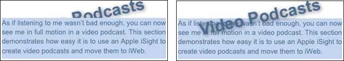
You can apply other text effects to rotated text for extra impact. Figure 26 shows how I used rotated text and a shadow to label my video podcast page.
Note
When is text not text? When it’s a graphic! Whenever you use rotation, shadowing, layering, or any font that isn’t a standard Web font, your text object is converted to a portable network graphics (.png) file. You can still change it in iWeb, but when the page is published to the Web, the text becomes an image.
You have another layout tool at your fingertips with iWeb: layering. Text and graphics can be moved in virtual 3D with some items being higher or lower with respect to the bottom layer. Think of your Web page as a layer cake. The bottom layer can be a picture, while the top layer can be text or another image. The top layer can be opaque, in which case it blocks part of the view of the bottom layer, or it can be transparent and allow an uninterrupted view of the layer below. Figure 26 shows a side-by-side example of layering in action.
After you select a text or graphics object in iWeb, you can use the Forward or Backward button (![]() ) on the toolbar to move that object higher or lower in the virtual layer cake.
) on the toolbar to move that object higher or lower in the virtual layer cake.
Figure 27 shows an interesting effect that I created for my Podcast page. To make it, I started with the large Listen in back, which was in its own text object. I made it slightly transparent using the opacity slider on the Colors panel. The next step was to copy and paste the text object, and in the copy I made the font size slightly smaller, made it slightly less transparent, layered it in front of the previous text. I repeated this three times until I was happy with the headline.

Note
Most current Apple software is Unicode-savvy, meaning that it accepts text in any of the dozens of languages supported by Mac OS X. iWeb is a perfect example of this. It encodes Web pages in such a way that most modern browsers display non-English and non-Latin text properly.
Keyboard input of right-to-left text in languages like Arabic or Hebrew is difficult for practical use in iWeb, although you may get satisfactory results if you copy text from another application and paste it into iWeb.
Say, for instance, that you’re working on your About Me page, and you want to link the Favorite Food item to the Web site for your favorite restaurant. (I linked to an article about how “Big Bill” Ficke, owner of Big Bill’s NY Pizza, helped the University of New Orleans basketball program recover after Hurricane Katrina.)
Here’s what to do:
Figure out the URL to the location that you want to link to. If you don’t want to type it in later in these steps, you can go to that location with your Web browser, and then copy the URL from the address field.
Select a graphic or bit of text that will serve as the source of your link. (I selected Big Bill’s NY Pizza.) If you are selecting text, to make a more professional-looking link, be sure to not select any spaces or punctuation before or after the text.
Choose Insert > Hyperlink > Webpage. (Or, if that option is dimmed, click the Inspector button and open the Link Inspector.)
iWeb opens the Link Inspector (Figure 28), which defaults to the URL entered for your Home page on your card in Address Book. If you didn’t enter a URL there, iWeb defaults to an Apple URL.

The Link Inspector appears, looking like this. I must change a few things in the Link Inspector before this link will work properly:
The first checkbox in the Link Inspector shows that I’m enabling the highlighted text as a hyperlink, and the pop-up menu indicates that I want to link to a page outside of my own Web site.
Figure 28.
Tell iWeb what to link to:
To link to another Web site, enter the URL in the URL field:
Click the URL field to activate it (it will show a blue outline to indicate that you’ve activated it).
You can edit the field in a variety of ways (press the Delete key to get rid of unwanted characters, for instance), but my favorite is to press Command-A to select all the characters in the field and then to press Command-V to paste in the URL that I copied in Step 1.
To link to a page on your own site, choose One of My Pages from the Link To pop-up menu and then choose the page from the Page pop-up menu.
iWeb now establishes the link. If you were linking from text, the text gains an underline, and if you were linking from a graphic, a small icon that looks like the Link Inspector button (
 ) appears in the lower right corner of the picture to indicate that the picture is now a clickable hyperlink. This icon won’t appear on your published Web page, but people reading your site will see whatever cues their browsers offer for graphical links, such as the pointer changing to a hand when it moves over the image or a yellow help tip popping up and showing the linked URL.
Test the link either by publishing your Web site or clicking it in iWeb.
Tip: Faster Link Making
Once you have the basics of link-making down, you can make a link faster by dragging its favicon from your Web browser to iWeb. (A favicon, also known as a Favorites icon or page icon, is a small icon that represents a Web site, typically seen at the left of the address field in a Web browser.) The resulting link text will be the page’s title (Figure 29).

Note: Can I Make a Link Open in Another Browser Window?
In its simplest form, the HTML tag that underlies a hyperlink causes the destination Web page to appear in the same browser window as the source. Although you can’t see it in iWeb, the HTML that iWeb generates looks like: <a href=“linkURL”>
Since iWeb is meant to let you create nice-looking Web pages without a lot of fuss, it doesn’t include options for more sophisticated linking, such as opening the destination Web page in a separate browser window so readers can see the original Web page and the new page at once. If it did include this option, the underlying HTML would look like:
<a href="linkURL" target="_blank">One workaround that you and your Web site visitors may not know about is Control-clicking a link to pop up a menu that will let you open the link in a new tab or window.
Tip: Image Maps
If you’d like to make an image map, where different portions of an image link to different URLs, see Making an Image Map.
Note: Can I Link to a Point On The Same Page?
Anchor or internal links have been around since the early days of HTML. They provide a way of creating links to text or a picture on the same page. A common use of this feature is to create links from a list of alphabetical letters (A to Z) to words listed in an alphabetical glossary on a long Web page. Clicking the letter T, for example, moves you down the page to the start of the glossary entries beginning with T.
Unfortunately for iWeb users, neither version 1.0 nor 1.1 can create anchor links. If you have experience in editing raw HTML, you can add anchor links manually by editing your published iWeb pages. However, the next time you publish the page, the information will be overwritten and you’ll need to add it back in.
If your Web site needs anchor links, you should either prepare to do a lot of HTML editing or use a different Web design tool to create pages that use anchor links.
I’ve only shown you how to link to external Web sites. iWeb provides you with a way to link to an email address (called a mailto link), other pages of your Web site, or to files. Let’s learn more about these types of links:
Mailto links: Links to an email address solve two problems—first, they get your email address off the Web page, making it slightly less vulnerable to spammers harvesting them, though not much less vulnerable—see the warning ahead—and second, they make it easier for visitors to send email to the address in question. Add mailto links by choosing An Email Message from the Link To pop-up menu in the Link Inspector, then adding an email address and a subject (Figure 30).
iWeb also offers the opportunity to add an Email Me button to any page by choosing Insert > Button > Email Me. This automatically sets up a mailto link to your .Mac email address.
Warning!
Mailto links can make you a target for spammers, who use software to automatically glean email addresses from mailto links in Web sites. One way to decrease the chances that you’ll become a spam target is to camouflage your email address. For example, [email protected] can be camouflaged as stevesdotebook@poolitzerprizedotcom. Many senders realize that it’s not a “real” email address and will replace
dotwith . before pressing the send button. iWeb unfortunately won’t let you replace@withat.You can also provide an email addresses without a mailto link. Just writing the email address as something like
stevensande (at)mac (dot) comwill get the point across to your readers while eliminating harvesting by spammers.File links: Do you have files that you want your Web site visitors to download? An example would be a PDF file containing your family’s annual holiday letter—it’s too long to turn it into a Web page, but you want to enable visitors to download it easily. A file link lets a visitor click a link to download a file. Add a file link by choosing A File from the Link To pop-up menu in the Link Inspector, then clicking the Choose button to select the file you want to make available for downloading (Figure 31).

