
Chapter 3. Hello Spark: primitives, components, FXG and MXML graphics, and even video
In this chapter, you’ll start learning Spark, which is the new set of components, containers, and graphics primitives in Flex 4. This will be a “how-to” chapter: we’ll save diving into the Spark component model until the next chapter (which discusses view states, containers, CSS styling, and skinning). This chapter provides enough examples of using Spark that when it comes time to tackle the theory you’ll have plenty of examples in your head.

In four of the five workshop sessions in this chapter, we’ll build a fairly small, self-contained Tester.mxml app that has all the code in the example. In session 14, however, I’ll mix things up a little: we’ll build an “Only Connect” game (that bears strong resemblance to a certain trademarked game). We’ll start with a game board that I drew in Adobe Illustrator and saved as FXG. (I’m providing the FXG file I created, so you don’t need to have Adobe Illustrator.) We’ll then build a fully functioning game based on this FXG, before refactoring it and then adding logic for detecting victory. The victory detection logic is more complex code than you saw in the previous chapter, so if you’re new to ActionScript 3 it will be good to read through it. (And if you’re a “rock star” developer, you can refactor my code to be a lot more efficient.)
Session 14 is pretty long, so after we finish it, we’ll do a toy example in session 15, in which we build the UI (minus logging in and posting to Twitter) of the world’s most narcissistic (fake) Twitter client. This will let us see how to play with the user’s camera and video.
At the end of this chapter, you’ll have a good understanding of the basics of the primitives and components that form the building blocks of a Flex application. Furthermore, you’ll understand both how to create these manually and how to start using FXG generated by tools like Adobe Illustrator.
So, let’s get started!
Session 11. Spark primitives
In this workshop session, we’ll start work with the primitives that are the basic building block classes used by Spark components. (When I say “primitives” in this chapter, I mean Spark primitives, not ActionScript language primitive types like int.) These classes live in the spark.primitives package, except for the Label which lives in the spark.components package. (There used to be a SimpleText component in the spark.primitives package, but Adobe replaced it with the spark.components.Label class in Flex 4 Beta 2. This book went to press very soon after Flex 4 Beta 2 was released, but we updated it to Beta 2.) The classes in the spark.primitives package include BitmapImage, Ellipse, Graphic, Line, Path, Rect, RichEditableText, and RichText. We’ll see Graphic and some of the other classes in session 14, and explore the rest of them now.
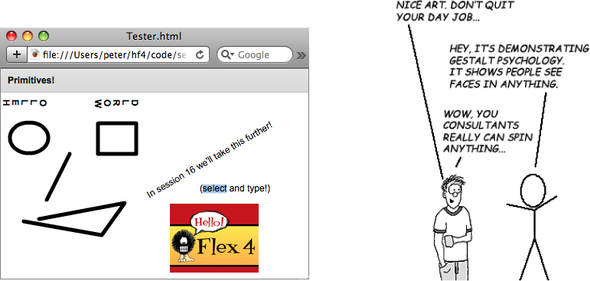
We’ll build an app that looks like this:
So, let’s see the code.
session11/src/Tester.mxml
|
|
We create a SolidColorStroke that we assign to the various shapes. This stroke defines how the lines will appear for components that use it. |
|
|
The left eye is an Ellipse, which is a FilledElement (see inheritance hierarchy in a moment). |
|
|
The right eye is a Rect. |
|
|
The nose is a Line. |
|
|
The mouth is a Path. Note the nice short syntax, where M means “Move the pen,” L means “Line from,” and the rest are space-separated x and y values. |
|
|
The Label is not selectable with the cursor. |
|
|
The eyebrows are RichText. RichText is not selectable either, but it uses FXG so you can do stuff like rotate the text with the textRotation property. |
|
|
The RichEditableText is selectable and editable (try selecting it and typing). |
|
|
The BitmapImage class shows part of the book cover. |
The following inheritance hierarchy shows how this all fits together. (The classes we are discussing in this chapter have shadows.)
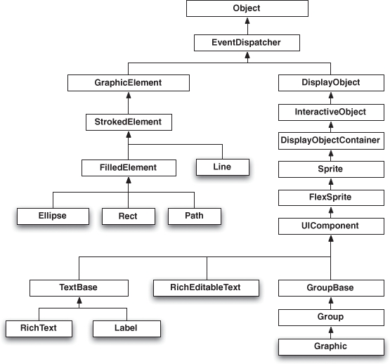
Note that Ellipse, Rect, and Path are all FilledElement subclasses, so they can have fills. Fills are the colors or patterns inside a shape. (You’ll see this in session14 when we build the Only Connect game.) Since FilledElement and Line both extend StrokedElement, the Ellipse, Rect, Path, and Line can all have a stroke (the style of the line), as shown when we assigned the SolidColorStroke to each of them via data binding. Also note how the RichEditableText (which is selectable and editable) extends UIComponent directly, whereas RichText and Label extend TextBase. The TextBase and RichEditableText classes both extend UIComponent, which (eventually) extends InteractiveObject. The InteractiveObject class is an abstract base class for all the display object classes that the user can interact with using the keyboard and mouse.
In sum, the Spark primitives are organized into GraphicElements like Ellipse and UIComponents like RichEditableText and Graphic. As we’ll see in session 14, since Graphic is a UIComponent it’s easy to handle mouse events like clicks.
Key points
- Spark primitives are the building blocks on which Spark components are built.
- Classes that can have a stroke extend StrokedElement; classes that can have a fill extend FilledElement.
- Classes that are interactive extend InteractiveObject.
Session 12. Simple Spark components
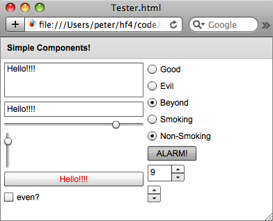
In this workshop session, we’ll move up the food chain from the Spark primitives we discussed in the previous workshop session to the Spark components. We’ll look at many of the most commonly used components in the spark.components package as we build a toy app that looks like this. These components are the building blocks of your application: without things like Buttons and TextInputs you wouldn’t be able to build very many Flex apps! While the primitives are nice, you certainly don’t want to reinvent the wheel.
Again, we’ll start by examining the code, then provide the explanation and an inheritance hierarchy to show how it all fits together.
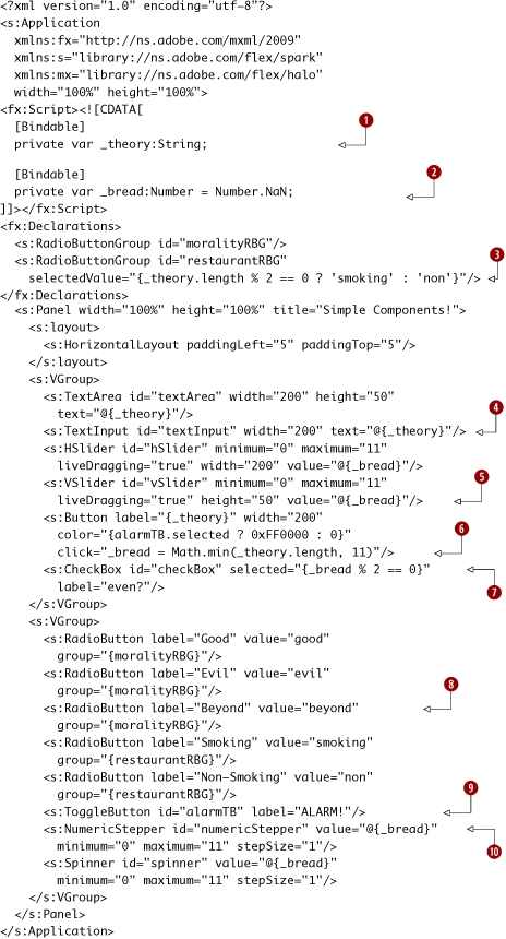
session12/src/Tester.mxml
|
|
The String “_theory” is a variable that many of the components bind to. |
|
|
We create a _bread Number variable, and many of the components bind to it as well. Why did we call it _bread? Well, we’re initializing it to NaN (Not a Number)... (Yes, creating code examples at 3 a.m. makes my puns reach an all-time low!) |
|
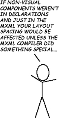
The moralityRBG and restaurantRBG RadioButtonGroups are used to create two sets of mutually exclusive choices, which the various RadioButtons are part of. Since the RadioButtonGroups aren’t visual objects, they go in an fx:Declarations block. |
|
|
|
The TextArea and TextInput are multiline and single-line text components that have two-way bindings (with the @) to the _theory String. |
|
|
The HSlider and VSlider are both bound with two-way bindings to _bread. |
|
|
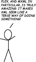
The Button has its label bound to the _theory String, and when clicked it assigns the length of the _theory String to the _bread variable (or 11 if the _theory String is longer). The Math class is a “core class,” so we don’t need to import it. Also note that the color property (which sets the text color) is bound to whether the alarmTB ToggleButton is selected (red if it is, black if it isn’t). |
|
|
The CheckBox has its selected property bound to whether the _bread Number is even (selected) or odd (unselected). The % operator is for modulo, just like it is in virtually every other programming language worth knowing. |
|
|
The first three RadioButtons have their group set to the moralityRBG, so only one can be selected at once. |
|
|
This is the alarmTB ToggleButton, which has its selected boolean valued state determine the text color of the Button earlier. |
|
|
NumericStepper and Spinner are also two-way bound to _bread. |
To understand where all this behavior comes, let’s look at the inheritance hierarchy again. (To save space I’m drawing part of this hierarchy vertically and part of it horizontally.)
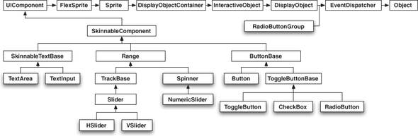
The first thing to note is that all the components we’ve created are SkinnableComponents. You’ll see what this means in more depth in the next chapter; for now, just know that it means we can customize their look easily.
Next, note that the ToggleButton, CheckBox, and RadioButton all extend ToggleButtonBase, so that’s how they get their notion of whether they’re selected. Also, see how the NumericStepper is just a subclass of Spinner; it adds the ability to type in a value yourself via its built-in TextInput. The TextArea and TextInput classes both extend SkinnableTextBase for some of their common functionality.
Finally, the RadioButtonGroup doesn’t extend a visual component like UIComponent, but instead extends EventDispatcher directly, way up the inheritance hierarchy. This means the RadioButtonGroup isn’t a visual component, which is why it’s added to the fx:Declarations block (new to Flex 4)—where nonvisual components in MXML must go. (Note that UIComponent also happens to descend from EventDispatcher, but it and its ancestors add the behavior of being a visual component.)
Key points
- The commonly used Spark components in the spark.components package all extend SkinnableComponent and can have their look customized.
- Use a RadioButtonGroup to ensure that only one RadioButton in the group can be selected.
Session 13. Data-driven Spark components (Lists)
In this workshop session, we’ll continue our tour of Spark components by moving from the simple Spark components we saw in the previous session to a brief look at three data-driven components: List, DropDownList, and ButtonBar. After we’ve done this, we’ll build our Only Connect game in the next workshop session.
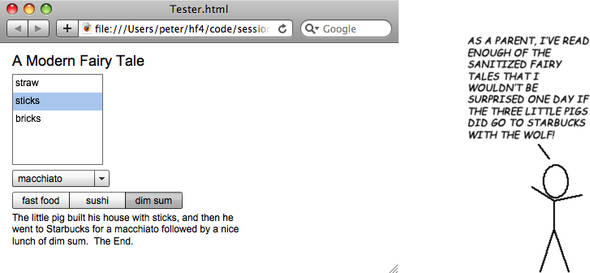
In this session we’ll build the following application, which is a modern-day sanitized fairy tale creator.
So, let’s take a look at the code.
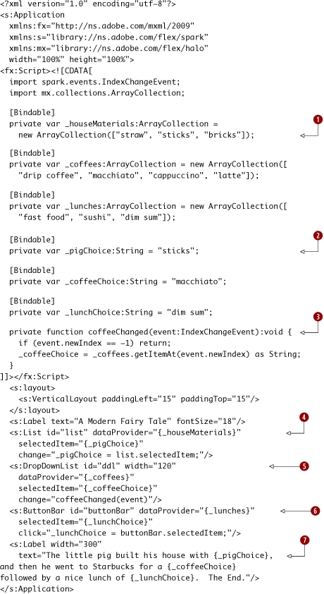
session13/src/Tester.mxml
|
|
We create ArrayCollections for the _houseMaterials, _coffees, and _lunches. |
|
We create String variables for the choices. |
|
|
|
The coffeeChanged function handles the selectionChanged event (of type IndexChangeEvent) broadcast when the user clicks the DropDownList of coffee choices. |
|
|
The List shows the choices of _houseMaterials for the pig to use; its selectedItem is bound to the _pigChoice. |
|
|
The DropDownList shows the _coffees the pig can choose from, and its selectedItem is bound to the _coffeeChoice. |
|
|
The ButtonBar shows the _lunches the pig could choose from, and its selectedItem is bound to the _lunchChoice. |
|
|
The Label shows our sanitized fairy tale. Note how the text attribute in MXML can span multiple lines and contain multiple data bindings. |
The following inheritance hierarchy diagram shows how related the List, ButtonBar, and DropDownList classes are.
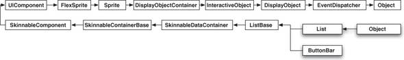
Note that the DropDownList is actually a subclass of List, which is a bit surprising. (For those of you who know Flex 3, the DropDownList replaces the Halo ComboBox class. The only thing the Halo ComboBox can do that DropDownList can’t do is have its text be editable. However, I’ve always found the editable ComboBox text a bit flaky when trying to subclass it, so good riddance to ComboBox as far as I’m concerned.)
Finally, keep in mind that the ButtonBar can be used for navigation in conjunction with view states (which we’ll see in the next chapter), to create the functionality of the Halo TabNavigator or Halo ViewStack plus LinkBar combination, in which only one container component is shown based on which button the user selects.
Key points
- List, DropDownList, and ButtonBar all are descendants of ListBase, and the user can select one element (or in the case of List, multiple elements if the allowMultipleSelection property is set to true).
- DropDownList subclasses List.
- ButtonBar and view states can be used for navigation.
Session 14. FXG and MXML graphics—building a game
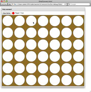
In the previous three workshop sessions, you learned how to code simple graphics manually and build small examples using Spark components. In this workshop session, we’ll take a gigantic leap toward reality and build a real application: an Only Connect game. (We’re going to call it Only Connect, since typically game names are trademarked.) You’ll learn how the full workflow—from design to working Flex application—functions.
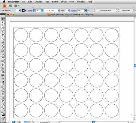
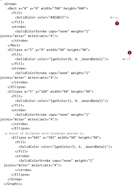
First, I drew the game board in Adobe Illustrator, since it can export FXG. After saving the Adobe Illustrator document (in an src/assets folder which I created in the session14 directory), I then also saved it as an FXG (Flash XML Graphics) document. We’ll look at the source of that document momentarily.
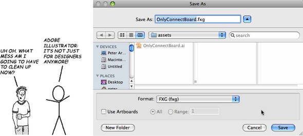
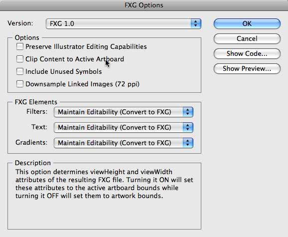
If you have Adobe Illustrator and want to follow along (which is entirely optional, and I’m assuming you won’t), be sure to deselect the Preserve Illustrator Editing Capabilities and Clip Content to Active Artboard check boxes, and then click OK. Also, don’t create any extra groups for your circles.
When I saved the document as an FXG document, this is what it looked like:
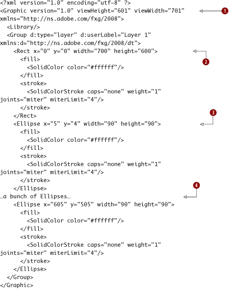
session14/session14a/src/assets/OnlyConnectBoard.fxg
|
|
The root tag is a Graphic. |
|
The Graphic contains a Group tag, which contains a Rect for the outer rectangle. |
|
|
|
Each circle is an Ellipse. |
|
|
I’m skipping showing most of the Ellipses in order to save a tree; please see the code in the zip file on this book’s website if you’re interested. |
If you were paying attention in session 11, these Rect and Ellipse elements should look familiar. In fact, the whole document looks similar to MXML. That’s because MXML graphics are just FXG plus support for data binding!
So, you can save the FXG file from Illustrator and then load it in Flex Builder. Then just copy it and paste it into an MXML file, and with a couple minor tweaks you’ll have a running app!
That’s just awesome.
You Sound like a Fanboy
I say this not as some kind of Adobe sychophant or “fanboy,” but as someone who sees the value in rapid prototyping of UIs and putting this prototype in front of customers as early as possible. The fact that Adobe is pushing the FXG standard across their entire product line—Photoshop, Illustrator, Flash Catalyst, Flex—is very exciting.
So, in this session we’ll go from that document to the following game in as few changes as possible. Then we’ll refactor the code (since the FXG is repetitive), and then build game victory condition logic. In the process, you’ll learn how to build visually complex Flex user interfaces using tools to do things that would be painful to do manually. (Yes, in this specific example, we could—and we will—also draw the game board using code. However, imagine if the game was Risk instead, and we wanted to use vector graphics instead of a bitmap image—I’d certainly rather draw the world in FXG than by writing ActionScript 3 code!)
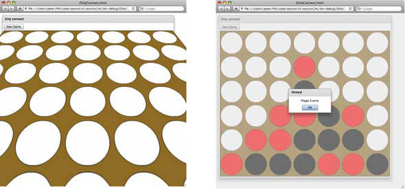
The game that we’re going to build looks like the following screens. Clicking on a column adds the chip of the player whose turn it is, as shown. The players take turns (no, there’s no multiplayer—this is a workshop session!) until someone wins.
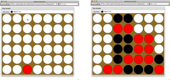
Note that we’ll be adding victory detection later in this workshop session.
We’ll create a main application called OnlyConnect and a BoardDisplay component based on the FXG. Let’s start by creating the main application.
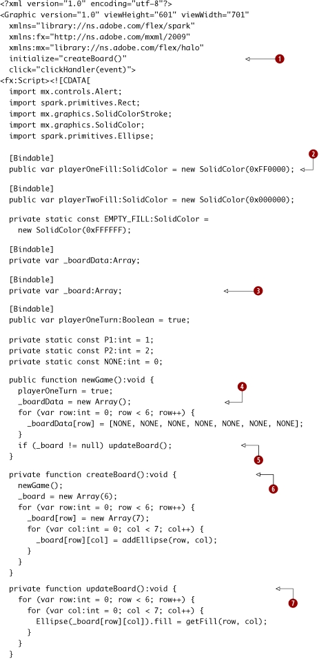
session14/session14a/src/OnlyConnect.mxml
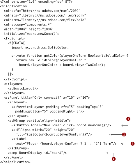
|
The New Game button calls the newGame function of our BoardDisplay. |
|
|
|
We show a little Ellipse filled with the color of the player (player 1 is red; player 2 is black). |
|
|
We indicate whose turn it is with a Label whose text contains a binding to the playerOneTurn flag. Once again, we see how data binding makes creating UIs simple—and how it makes XML seem even terse. |
|
|
We create our BoardDisplay component. |
Next, we create the BoardDisplay component. We start by doing a copy-paste-modify of the OnlyConnectBoard.fxg document that was saved from Illustrator, and then we add the ActionScript code for the game logic. We also add data bindings into the FXG code. There’s a lot of code, so we’ll split the explanation into two parts.
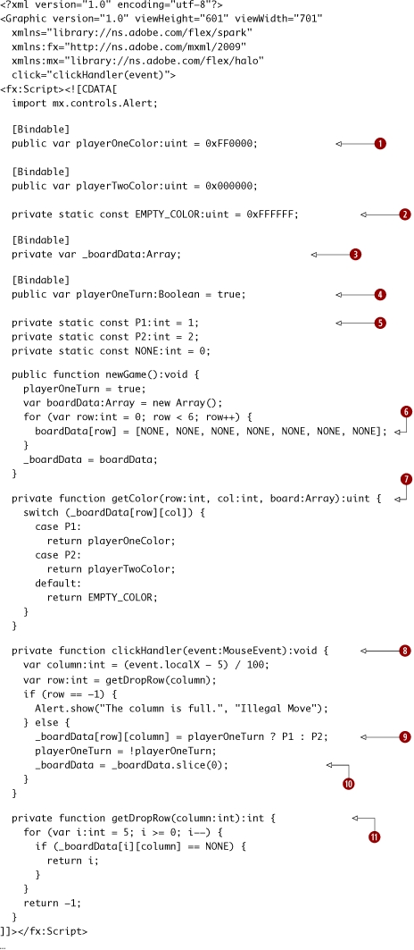
session14/session14a/src/components/BoardDisplay.mxml
|
|
The playerOneColor (red) and playerTwoColor (black) are variables, in case you want to make them settable by the user later. |
|
|
The EMPTY_COLOR (white) is used to fill spots where there’s no game piece. |
|
|
The _boardData is a simple, two-dimensional Array, which is an Array of Arrays. (I’m trying to keep this example small, so I’m not building a full object model.) |
|
|
This contains a Boolean flag for whose turn it is: player 1 or player 2. |
|
|
These are the constants for whether a board position has a player 1 piece (P1), a player 2 piece (P2), or no piece (NONE). |
|
|
We initialize each row to an Array of NONE ints for the columns. Note that the outer Arrays are the rows and the inner Arrays are the columns. |
|
|
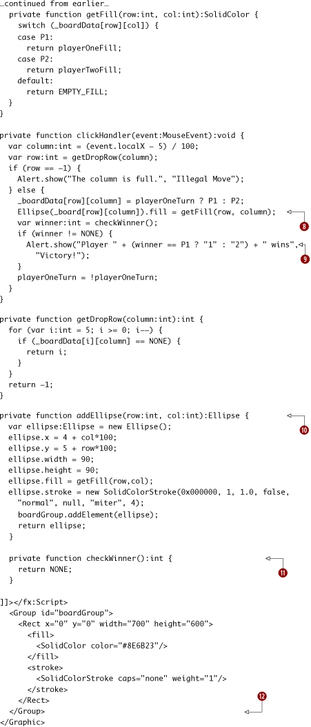
This function returns the color of a given board position based on the _boardData for that row and column. |
|
|
We handle clicks on the board. The columns go from 5 to 105, 106 to 205, and so on. Therefore, subtracting 5 and then using an integer division gets the column. We then call getDropRow() to determine the row to insert the player’s piece in, and display an alert message if every row is full. |
|
|
We assign either P1 or P2 to the given location in the _boardData[row][column] based on whose turn it is. |
|
|
To refresh the bindings in the game board, we assign the _boardData to a copy of itself. This is a very inefficient hack, which will get refactored away later in this workshop session. |
|
|
The getDropRow function finds the lowest row (i.e., with the highest index, based on how we constructed the 2D Array) with a NONE value in that column. |
Continuing along, let’s see the game board.
session14/session14a/src/components/BoardDisplay.mxml (continued)
|
The Rect of the game board has a fill we set ourselves, instead of in Illustrator. |
|
|
|
The Ellipse elements all have their fill set by data bindings. |
This is essentially identical to the FXG produced by Illustrator, except that I’ve set a fill on the Rect to give it a nice background color and set the fill of the Ellipses based on data bindings. Note how each of the data bindings passes in the row and column that the Ellipse corresponds to in the _boardData, and it passes the _boardData in as well. Since we include the _boardData itself in the binding, then the binding will be triggered when we assign the _boardData variable.

This is a “big hammer” approach, which clobbers the entire Array by assigning a temporary variable. Yes, this means that every time a move happens, every square on the whole game board is redrawn! Obviously, this isn’t very efficient and is coupled with a hackish way of using data binding.
But the point here isn’t that our code is going to win an efficiency contest: it’s that we drew all the MXML in Illustrator. If you’ve ever worked with designers, you know that staying true to the visual design is crucial—and that what may seem unimportant to a programmer is essential to a designer. So, FXG helps us bridge that gap, which is awesome.
Running the app, we see the screens we showed earlier.
Next, we’re going to do two refactorings. First, we’ll refactor the app to create the board programmatically, instead of using the FXG that we got from Illustrator. Since an Only Connect board is a simple pattern, this will be easy to do. We’ll also fix the code so that redrawing every Ellipse when a move is made won’t be required. Then, we’ll factor out the board data into its own class and add victory condition checking logic.
So, let’s start with the first refactoring. We begin by making a small change to the main app.
session14/session14b/src/OnlyConnect.mxml
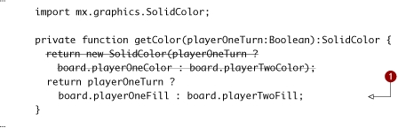
|
|
Instead of having the board return the colors of player 1 and 2, it’s returning the fills they now use. This is better since we don’t need to create a new SolidColor here every time. |
Now, let’s move on to the BoardDisplay. It has changed enough that it’s easiest to show it as a new file rather than showing the differences. So, here’s the refactored code:
session14/session14b/src/BoardDisplay.mxml
Continuing along, here’s the rest of the file:
|
|
When a move is made, we only set the fill of the Ellipse at the _board[row][column]. |
|
|
We call a checkWinner() function, and if the winner isn’t NONE we show an alert message. |
|
|
The addEllipse function creates the board the same way that it was done in the FXG produced by Illustrator. (If you run this app, you’ll be hard-pressed to tell the difference.) |
|
|
This function is stubbed out. If you want to practice your ActionScript 3 skills, implement it before reading the next file. |
|
|
Note how there is nothing more inside the Group than just the Rect now. All the Ellipses are created by addEllipse. |
That’s it!
Running the app, we see no real change from before, which is always the goal when refactoring.
Before moving on to the next workshop session, let’s think about what we’ve done. We’ve created a BoardDisplay that has a bunch of game logic muddled together with display logic. So, let’s refactor it again and create a Board model class to handle the game logic. Also, while we’re at it, let’s implement the checkWinner function. Note that the way that I’m going to implement checkWinner will be pretty inefficient; I’m trying to keep the code somewhat readable. I’m not even going to use the recent move to limit what the function is checking; instead, I’m just going to search the entire board for a winner. (Exercise for the reader: refactor my code!)
Let’s start by creating the Board class, and then refactor the BoardDisplay class to use it.
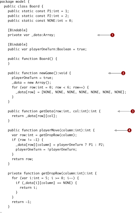
session14/session14c/src/Board.as
|
|
The board data is encapsulated in the private _data Array. |
|
|
The public newGame function just creates the _data. Also, note that the empty Board() constructor is redundant, since it’s what would have been generated by the compiler. However, I have a habit of writing constructors... |
|
|
The public getData function returns the data at the row and column without exposing implementation details. |
|
|
The playerMove function takes the column the player is placing in and returns the row that the player’s piece ended up on (or –1 if illegal). If there was a proper object model I wouldn’t use –1, but there isn’t. |
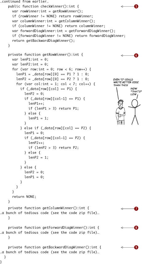
Continuing along, here’s the rest of the file. Note that I’m omitting the implementations of some of the victory checking functions, since there’s nothing particularly exciting in them. However, if you are new to ActionScript 3 you may enjoy writing your own victory checking algorithm and/or downloading the code zip file from the book’s website and reading through mine to see how you can improve it. The row and column victory checking is easy, but the diagonal victory checking is a bit more annoying to get right. Furthermore, if you care about efficiency you could take the last move into account to reduce the number of tests that the code does.
|
The checkWinner function checks whether there are four of the same player’s pieces in a row in any row, column, or diagonal by calling functions that do the messy work. |
|
|
|
The getRowWinner function checks a row for four in a row. |
|
|
The getColumnWinner function checks a column for four in a row. |
|
|
The getForwardDiagWinner function checks a forward-leaning diagonal for four in a row. |
|
|
The getBackwardDiagWinner function checks a backward-leaning diagonal for four in a row. |
Now that we have created the Board class, we can refactor the BoardDisplay to use it. Again, the BoardDisplay will change enough that it’s easiest to show it as a new file. Also, as a bonus for reading this far, I’m going to throw in a gratuitous 3D effect as a preview of some of the fun we’ll have in the next chapter.
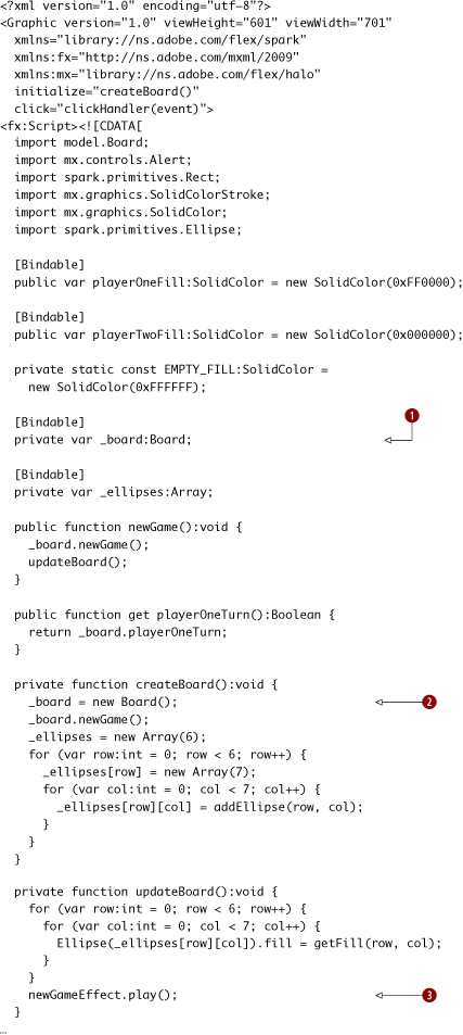
session14/session14c/src/BoardDisplay.mxml
|
|
The _board variable is the new Board type. |
|
|
We create a new Board in createBoard, and we don’t need any cheesy null checking anymore. |
|
|
When the board is updated (on a new game or the hypothetical load game), we play our new effect. |
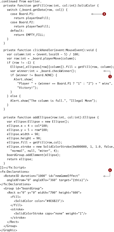
Continuing along, here’s the rest of the file.
|
The getData function of the Board is now called, and the P1 and P2 constants now belong to the Board. |
|
|
|
The Board’s checkWinner function is called. |
|
|
Inside the declarations, we create a new Rotate3D effect. Effects will be explained in the next chapter. Note how the fill child element of the Rect is assigning the SolidColor to the fill property of the Rect. It’s not magic, it’s property assignment. This is why the same namespace (in this case, the default namespace) is used. |
That’s it! Run the application; you’ll see the same app as before but with the new Rotate3D effect, shown here. Also, you can play a game and test the victory condition checking.
Not only has this been your first taste of a larger Flex 4 application, but you’ve also seen how refactoring Flex code works. We started with generated FXG code, added some business logic, replaced the repetitive FXG with programmatically generated graphics, and then factored out the business logic into its own class. In the real world, you’d build a proper object model, not just a Board class and ints. Furthermore, in chapter 7 we’ll see how an even larger Flex application is structured using the Cairngorm framework.
The impressive thing is that all this started with a drawing in Illustrator that could have been done by your designer, and he or she would probably feel that you stayed close enough to the design in the finished output. Note that Flash Catalyst makes this designer-developer workflow even better, but that topic is beyond the scope of this book.
Key points
- FXG produced by tools such as Illustrator or Photoshop can be a good starting point for Flex code.
- As a developer, you probably want to look at places you can refactor once you have confidence in the design. You can also generate graphics using the Spark primitives we saw in session 11.
- Business logic belongs in model classes, not mixed in with view code.
Session 15. Camera and video—a fake Twitter client
Well, this chapter started innocently enough, but that last workshop session sure had a lot of code in it, didn’t it? In this workshop session, the last in the chapter, we’ll have a little bit of fun building a toy example that fits on just over half a page of code. And what’s more fun than playing with a video camera? In the process, you’ll learn how to use the Flash Camera and Video classes with Flex applications, since the API docs for these classes are focused on doing this using just plain ActionScript 3, not a Flex app. Since I had to scratch my head a bit to figure this out, I hope I’ll save you from having to do the same.
So, hopefully your computer has a camera built in (thanks, Apple!) or attached to it. What we’re going to build is an app that looks like this:
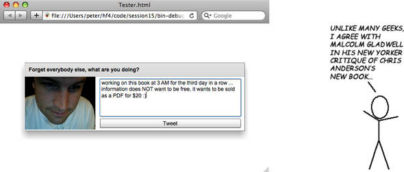
This is a totally fake Twitter client, and that’s me, really tired, captured by my laptop camera. Why a fake Twitter client? Well, this book, like the rest of the tech community, is obsessed with Twitter—so why not? More seriously, the idea is that the Twitter client would take a picture of you when you tweeted, and then post that picture to Flickr. It would then create a shortened URL of that picture (using bit.ly presumably) and insert that URL in your tweet (if there was room). So then, your countless followers could see what you were doing (or how tired you were looking) at the time you were tweeting. (And then they could reply to you telling you to stop tweeting and go to bed.)
We’ll build a real Twitter client in chapter 7. Taking that code and adapting it to do the what I just described is an exercise for the reader.
Without further ado, let’s see the code.
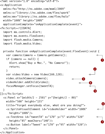
Session15/src/Tester.mxml
|
Get the Camera. |
|
|
|
Create a new Video object to show video. |
|
|
Attach the Camera to the Video object. |
|
|
Add the Video object to the SpriteVisualElement, which can have Sprites added to it. |
|
|
Automatically focus the TextArea, since you are supposed to be tweeting and not just looking at yourself. |
|
|
Create a new SpriteVisualElement. |
|
|
Create a new TextArea for your tweet. |
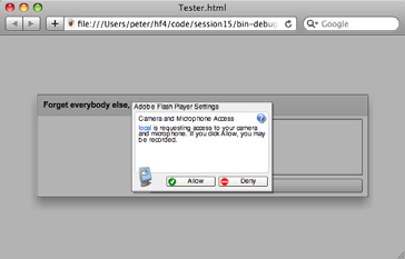
Save the application and run it; you’ll probably see an Adobe Flash Player Settings security dialog first (shown here). Click Allow to allow camera access.
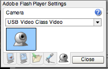
If you still see no video, what you may need to do is change the camera type to USB class video.
Switch to the camera icon tab, choose USB Video Class Video, and click Close.
That’s it!
Key points
- Flex lets you do cool things like play with the user’s camera with very little code.
- The SpriteVisualElement class can have children added to it with addChild.
What’s next?
Well, this has been both a whirlwind tour of the Spark components and a deep dive into building and refactoring a real Flex app—starting with an FXG drawing exported from Adobe Illustrator.
In the next chapter you’ll learn about Spark containers and layouts, as well as view states, effects, styling and skinning. View states are much improved in Flex 4, so they can be effectively used for navigation and state changes in your apps. This is also fortunate, since there’s currently (as of Flex 4 Beta 2; this may change!) no Spark equivalent for the Halo navigator containers you’ll learn about in chapter 5. So if you want to stay Spark-only in your apps, you need to become a view states master.
Finally, by the end of the next chapter, you’ll have a deeper understanding of the Spark component model.