
Chapter 4. Spark containers, view states, effects, and styling
In this chapter, we’ll dive deeper into Spark and into Flex 4 in general. You’ll learn how to use Spark containers and layouts—we’ve already seen them throughout the book, but it will be good to spend a bit of time discussing them. Then, we’ll talk about view states, which are much improved in Flex 4—and which are much more necessary, since there’s no Spark equivalent of the Halo navigator containers, as you’ll see in the next chapter. Next we’ll explore basic effects and CSS styling, and conclude the chapter by peeking behind the MXML curtain to view the code Flex generates for us and some of the events dispatched in the Spark component lifecycle.

Note that in a longer book, each of these topics would have its own 20–30-page chapter. We’re going to see what you can absorb in about 30 pages. Because of this, there won’t be an example of adding to a Button a custom skin that looks like a pizza, for example. And I’m even not going to show you the now seemingly obligatory “custom ScrollBar with something cheesy (like, say, a pizza) as a thumbIcon” example.
So, let’s get started.
Session 16. Spark containers and layouts
In this workshop session, you’ll learn about the Spark containers and layouts. We’ve already seen many of these in the book so far (how could we avoid them?), but now we’ll cover them properly. Briefly, containers are where we add our UI controls (both Spark and Halo controls and Spark primitives) in our Flex application—essentially, a Flex app is just a bunch of components that live in a variety of containers and that respond to events. We’ve already discussed events and components; now it’s time to focus on containers.
Containers such as Group and its subclasses HGroup and VGroup take as children any components that implement the IUIComponent or IGraphicElement interfaces, so they can contain both Spark components and primitives. Containers that extend SkinnableContainerBase can have children and custom skins.
Let’s start by showing the class hierarchy, since we’ll be building four examples that use it:
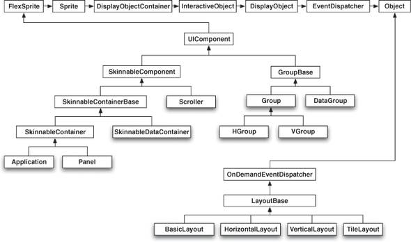
The classes that we’ll use in this session have shadows. Briefly, you’ll see that Application, Panel, SkinnableDataContainer, and Scroller all extend SkinnableComponent, so they can be skinned. And the BasicLayout, HorizontalLayout, VerticalLayout, and TileLayout all extend LayoutBase for common functionality.
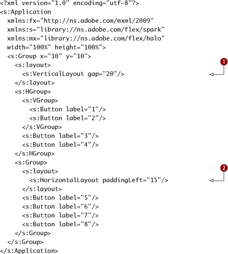
We’ll begin by building an app that looks like this, in order to demonstrate the basic use of Group and Layout classes:

session16/session16a/src/Tester.mxml
|
The outer Group has a VerticalLayout and contains an HGroup (with Buttons 1–4) and a Group with a HorizontalLayout that contains Buttons 5–8. |
|
|
|
The Layout classes can have more attributes set on them than are exposed by the HGroup and VGroup classes. |
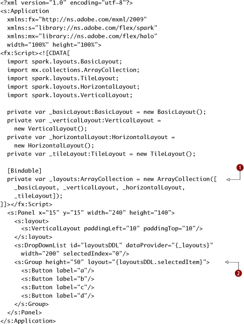
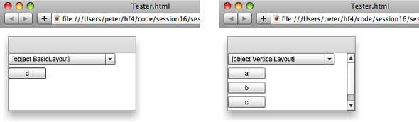
Next, we’ll look at the Panel container, as well as see how to swap layouts at runtime. The app we’re going to build looks like the following when launched:
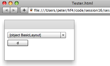
It has a DropDownList that lets us choose between BasicLayout, VerticalLayout, HorizontalLayout, and TileLayout. As shown by the following screenshots, the Spark Panel container doesn’t clip its children, unlike the Halo Panel container. (This is a performance optimization, since some Panels don’t need to scroll; as we’ll see later this workshop session, adding scrolling is easy.)

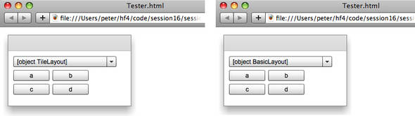
Note that switching back to BasicLayout leaves the x and y locations unchanged (because it’s a no-op layout), so they keep whatever the previous layout did to them. In this case, switching back from a TileLayout produces the following result (the way you tell the difference is by looking at the content of the DropDownList):
Without further ado, let’s see the code that does this. Note that this code is in a new project in the session16 folder.
session16/session16b/src/Tester.mxml
|
We create a new ArrayCollection of the various layout objects we want to explore, and store it in _layouts, which is assigned to the dataProvider of the layoutsDDL DropDownList. Briefly, layout objects such as VerticalLayout and HorizontalLayout define how the children of their container are arranged—by specifying one, you are essentially providing an algorithm, neatly packaged as an object. |
|
|
|
We bind the selectedItem of the layoutsDDL to the layout property of the Group that contains the four buttons. That way, when the user picks another layout from the drop-down list, the binding will trigger, and the chosen layout object will be set as the layout for the group. |
Unlike in Halo, where the layout was fairly tightly coupled to the code for the container, in Spark the layout is completely decoupled from the container. (Extremely advanced developers could subvert the layout done by Halo containers, but this remained beyond the reach of us mere mortals, for whom a VBox lays out its children vertically, period.) This means you can write your own layout classes, which you can use instead of the built-in ones. (If you think that frameworks like Flex are all about inheritance and huge class hierarchies, this fact shows how composition plays an important role in more flexible ones.) These layouts can be used statically or they can be dynamically swapped in, as in the previous example. Andrew Trice wrote a good article at InsideRIA (www.insideria.com/2009/05/flex-4-custom-layouts.html) that explains how to build a custom layout class, so take a look if you’re interested.
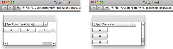
Next, let’s see what happens when we add a Scroller to the mix. A Scroller shows a scrollable component and horizontal and vertical scrollbars. The scrollable component is called a viewport, and it must implement the IViewport interface. We’ll also change the height to not be fixed at 50, since we want the content to be able to grow to trigger the vertical scrolling. Of course, this will change the behavior of our TileLayout.
These screenshots show the behavior of the app we are about to build. It’s similar to the app we just built, but I’m showing all the code so you can follow along without reading “diff”-style code listings. Note how the TileLayout uses only one column when its height isn’t constrained.
Let’s see the code; note that this is in a new project in the session16 folder.
session16/session16c/src/Tester.mxml

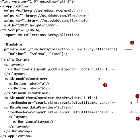
Finally, let’s switch gears and look at DataGroup and SkinnableDataContainer, which are Spark containers with an interesting twist: they can have dataProvider properties that can take primitives and/or components. (Yes, you can even include both at the same time; I’m not sure that you’ll ever need to do this, but there’s an example in the API docs[1] that shows how to define a DataGroup with a mixture of data and graphical items as its dataProvider.) We’ll build an app that shows how to use this dataProvider. While we’re at it, we’ll also show an example of using SkinnableContainer directly. You won’t need to do this unless you’re building your own highly customized container (with custom skins from, say, Flash Catalyst), but I want to show it so you know it’s there.
1http://livedocs.adobe.com/flex/gumbo/langref/spark/components/DataGroup.html#includeExamplesSummary
The app we’re building looks like this:
Let’s see the code.

session16/session16d/src/Tester.mxml
|
We create an ArrayCollection of fish for testing. |
|
|
|
This SkinnableContainer by default has a vertical layout. Also, by default it doesn’t look any different than a Group—but you could change that. |
|
|
The SkinnableDataContainer has a VerticalLayout by default. |
|
|
The DataGroup has a BasicLayout by default, so we give it a HorizontalLayout instead. |
So, what’s the difference between SkinnableDataContainer and DataGroup? After all, in this example both the SkinnableDataContainer and the DataGroup took a DefaultItemRenderer as their itemRenderer. Sure, we gave the DataGroup a HorizontalLayout, but we could have done that with the SkinnableDataContainer as well.
This is actually one of the points: the default behavior of the SkinnableDataContainer and DataGroup is very similar. However, the difference is that the SkinnableDataContainer is a descendant of SkinnableComponent (via SkinnableContainerBase) and thus is skinnable (hence the name), whereas DataGroup is not. What this means is that the SkinnableDataContainer can have a custom skinClass associated with it to customize its look. (To see how to do this, see the documentation for SkinnableComponent. Also, note that this is a job best done in Flash Catalyst, so I don’t want to show it here.) You may recall from the previous chapter that List is a descendant of SkinnableDataContainer (via ListBase). So, now you see where it gets some of its behavior.
We’ve seen how layouts and containers are separate from each other, so the layouts can be swapped in to the different types of containers with predictable effects. Hooray for composition!
Key points
- Layouts and containers are decoupled in Spark, meaning you can write your own layouts to be used with any Spark container.
- DataGroup and SkinnableDataContainer have a dataProvider property you can set.
Session 17. View states
Now that you know how to use containers to store the components that we’re using to build our Flex applications, let’s see how to make our Flex applications more dynamic by using view states. In Halo, there are “navigator containers” (which we’ll discuss in the next chapter) that let you accomplish this, but if you want to use the Spark approach as much as possible, you’ll use view states to build navigation into your Flex apps. View states allow you to change what your application or components look like in response to what state they’re in.

Note for the CS Geeks
If you’re a computer science geek like myself, you’ll appreciate that they’re called states, since the different view states of a component can be thought of as a finite state machine, with the component being in only one at a time.
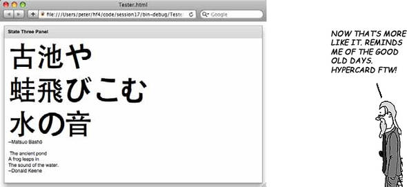
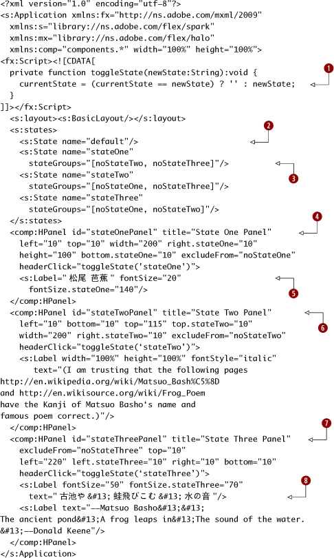
In this workshop session, we’ll build an app that shows the power of view states, which have a highly improved syntax in Flex 4. In its default state, the app looks like this:

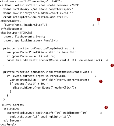
We’ll create a custom subclass of Panel called HPanel (H is for Header, not Horizontal—yes, this is a somewhat awkward name) that adds easy detection of whether its header has been clicked. When any of the HPanel headers are clicked, they dispatch an event named headerClick. The app then changes state to show just that HPanel, as shown in the following three figures. (Note also that we’re using Japanese Kanji and resizing the fonts accordingly—primarily to show off how awesome the font support is in Flash 10!)

Let’s see the code, first for the HPanel.
session17/src/components/HPanel.mxml
|
We create metadata that declares that the HPanel class dispatches an Event named headerClick. By doing this, we can use this in MXML saying headerClick="doSomething(event)" in code which uses this component. |
|
|
|
We add an EventListener to the PanelSkin class that listens for mouse click events. Note that there’s nothing magical about the name onCreationComplete—I could’ve called it handleCreationComplete or peterIsVerbose just as easily. |
|
|
When a mouse click happens, we check that the event currentTarget is a PanelSkin and that the y value of the mouse is within the header’s height. (Exercise for the reader: this isn’t very robust! Come up with an example of where this simple check won’t work.) |
|
|
We add a VerticalLayout with 10-pixel padding for its border, to save ourselves effort in the Tester app. |
Next, we create the Tester app that listens to the HPanel headerClick events and reacts accordingly.
session17/src/Tester.mxml
View states, which are vastly improved in Flex 4, are an easy way of making your app dynamic. They also show the importance of properly componentized design—although in this app we define the HPanel content all in one file, in real applications you want to build encapsulated components so that the application state logic and the component logic is separate. Also, note that view states aren’t just limited to the application—components can have their own view states that you can switch between.
In the next workshop session we’ll explore the basics of effects. Besides what we’ll see in the next session, effects can be used to transition between view states in a more exciting way.
Key points
- View states are an easy way of making a Flex 4 application dynamic.
- Components can be resized, included, and excluded based on which view state they’re in.
- To simplify the logic of including and excluding view states, states can be grouped into stateGroups.
- If you want to see some more examples of view states (both more basic and more advanced than this), see the view states chapter of the Using Flex 4 PDF at http://livedocs.adobe.com/flex/gumbo/flex_4_usingsdk.pdf.
Session 18. Effects and animation
In this workshop session, you’ll learn the basics of effects. While Flex applications already look very nice out of the box, another benefit they offer is that they can leverage the capabilities of the Flash Player. (When writing a marketing sentence like that, I guess it’s appropriate to say “leverage”—ick.) One of these is its strong support for animation—when Macromedia coined the term rich Internet application they wanted to emphasize applications that went beyond the fairly static web apps people have grown accustomed to. Effects, when used extremely sparingly, are a good way of doing this.
This workshop session is a high-level overview whose goal is simple: I want to impress you with how easy it is to use effects, and I want to motivate you to pause at the end of this session to go read the following two excellent articles by Adobe’s Chet Haase:
- Effects in Adobe Flex 4 beta—Part 1: Basic effects (www.adobe.com/devnet/flex/articles/flex4_effects_pt1_print.html)
- Effects in Adobe Flex 4 beta—Part 2: Advanced graphical effects (www.adobe.com/devnet/flex/articles/flex4_effects_pt2_print.html)
Seriously, as soon as you’re done with this session, go read those articles. I’ll wait.
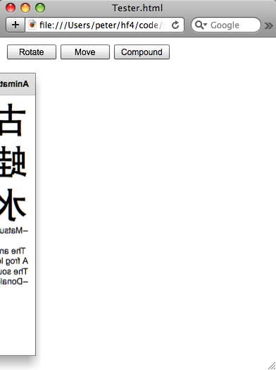
Anyway, here’s what we’re going to build in this session:
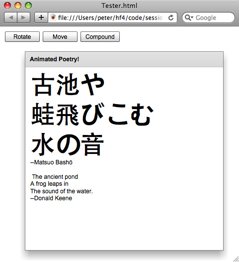
Hmm, haven’t we seen most of this before in the previous session?
Well, yes, we have seen the Panel contents—but we need to rotate something, after all. In this session we’re including the ability to rotate and/or move this Panel together.
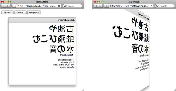
When you load the app and click Rotate, it looks like this:
Well, the rotation was nice, but the end location wasn’t so good. You can also reload the app and click the Move button to move the poetry smoothly to the right, as shown in the following screenshot:

However, combining these effects makes the poetry get rotated around. We create a Parallel effect to do this for us in one smooth transition. These screenshots show the end result and also what it looks like in one of the frames of the transition:
Let’s look at the code. Note that we got rid of the HPanel and we’re using just a Panel.
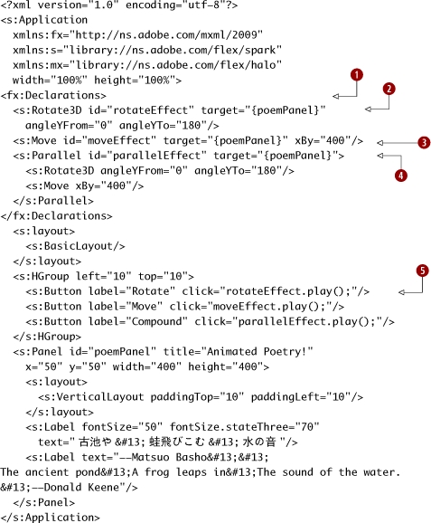
session18/src/Tester.mxml
|
|
The effects are nonvisual children, so they go in an fx:Declarations block. |
|
The Rotate3D effect flips the panel on the y-axis. |
|
|
|
The Move effect moves the panel on the x-axis. |
|
|
The Parallel effect runs a Rotate3D and Move effect in parallel. |
|
|
The buttons trigger the effects. |
That was easy! Note that in addition to running effects in parallel with the Parallel effect, you can also sequence events using a Sequence effect; see the API docs[2] for details.
2http://livedocs.adobe.com/flex/gumbo/langref/mx/effects/Sequence.html#includeExamplesSummary
Now, remember those articles by Chet Haase that I mentioned? Go read them. Now. No, don’t check your email or Twitter—just do it.
Key points
- Effects are nonvisual elements so they’re added to an fx:Declarations element.

- Effects can be run in parallel using Parallel or sequenced using Sequence.
- Don’t overdo it! Remember when being able to use multiple fonts in a word processor first came out, and certain people used, say, 10 of them on one page of a company newsletter? Don’t be that person.
Session 19. CSS styling
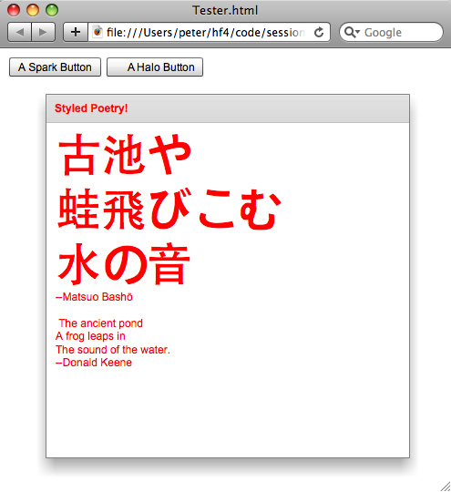
In this workshop session, you’ll learn how to use CSS to style a Flex 4 application. We’ll see how to use CSS both inline in an MXML file and in a separate CSS file. Here’s what we’re going to build:

Let’s see the code, starting with the Tester app.
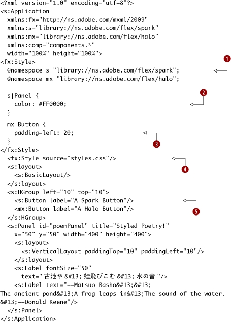
session19/src/Tester.mxml
|
We need to refer to the namespaces of the Spark and Halo components when styling, so that we can style a Spark button differently than a Halo button. This makes for somewhat odd CSS, but it’s much better than having Spark buttons called “FxButton.” |
|
|
|
We set a Spark Panel to have a color of red. |
|
|
We set a Halo Button to have a paddingLeft of 20 pixels. Note that innerCap attributes have hyphenated names in CSS. |
|
|
We also include an external CSS file (which we’ll define next). |
|
|
We create the two buttons that we want to style. |
Next, let’s look at the styles.css file.
session19/src/styles.css
@namespace s "library://ns.adobe.com/flex/spark";
@namespace mx "library://ns.adobe.com/flex/halo";

s|Button {
  font-weight: bold;
}

mx|Button {
  font-style: italic;
  font-size: 18;
}
This code listing specifies that Spark buttons have bold text and Halo buttons have 18 point italic text. Otherwise, the syntax is identical to the syntax inside an fx:Style block. This is true in general—the CSS files have the same content as Style elements.
Note that if we just had the Tester app and we commented out the reference to this external styles.css file, the app would look like this:
That’s it! Besides making a subtle and calm haiku look flashy and garish, we’ve also used CSS—both inline in MXML files and in separate CSS files—to style Flex 4 apps!
In the last two workshop sessions, we’re going to take a break from the eye candy (or, given my skills, the eye poison) and look at some more obscure topics: how to view the generated ActionScript 3 code, and the events dispatched during the component lifecycle.
Key points
- Styles can be specified inline inside an fx:Style block or in external CSS files referenced by an fx:Style block. The effects of these style blocks are cumulative.
- Namespaces are used to differentiate Spark and Halo components.
Session 20. Peeking behind the MXML curtain
We’ve spent the first part of this chapter having fun and building shiny effects and styles, using the easy-to-use Spark containers. In these last two workshop sessions, the “ooh, shiny” train is going to come to a screeching halt as we take an extremely brief look at some of the internals of what’s really going on in both MXML and in the component lifecycle.
These are both deep topics, which could justifiably be completely omitted from a Hello! book. Certainly, a full, gory-details explanation of them doesn’t belong here. However, I don’t feel comfortable just skipping them. So, I’m going to show you a preview if you will, and leave the more complete explanation to the internet.
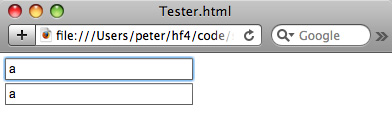
In this workshop session, we’ll take a brief peek behind the curtain of magic that is MXML. We’re going to write a trivially simple app, shown here.
session20/src/Tester.mxml
<?xml version="1.0" encoding="utf-8"?>
<s:Application
  xmlns:fx="http://ns.adobe.com/mxml/2009"
  xmlns:s="library://ns.adobe.com/flex/spark"
  xmlns:mx="library://ns.adobe.com/flex/halo"
  width="100%" height="100%">
  <s:TextInput x="5" y="5" id="sourceTI"/>
  <s:TextInput x="5" y="30" id="destTI" text="{sourceTI.text}"/>
</s:Application>
All this app does is bind the text of the destTI to the text of the sourceTI, as shown in the following screenshot.
A lot of code is generated for us to make this happen. How does this all work? Well, a full explanation is beyond the scope of this book, but I want to point you in the right direction.
First, you can set a compiler flag to keep the ActionScript 3 code that’s generated by the MXML compiler—recall that MXML is first converted to ActionScript 3 by the MXML compiler, and then this ActionScript 3 code is compiled into a SWF. So, let’s set the flag to keep this code around and take a look at it. (Thanks to Peter DeHaan’s blog[3] for this knowledge, which works the same in Flex 4 as it does in his Flex 3 example.)
3http://blog.flexexamples.com/2008/08/02/viewing-a-flex-applications-generated-source-code/
Right-click on the session20 project and choose Properties. Then, choose the Flex Compiler option, and add -keep to the additonal compiler arguments, as shown in the following screenshot:

The next time the project is compiled, there will be a generated folder created under your src folder. Take a look at src/generated/Tester-generated.as, _Tester_FlexInit-generated.as, _Tester-binding-generated.as, and _TesterWatcherSetupUtil.as if you want to see what your Tester app turned into.
Another thing to do is to set a breakpoint (by double-clicking in the margin) on the line with the binding, and then run the app in the debugger by choosing Run > Debug > Tester (or by clicking the icon of the bug in the toolbar). You can then spelunk through all the data binding code in the Flex SDK to your heart’s content. This will give you some appreciation of how much code is involved in the implementation of the Binding mechanism, and why it’s worth keeping that overhead in mind for large, complicated user interfaces as a potential source of performance problems.
Finally, I’ll remind you of the one-hour “Diving in the Flex Data Binding Waters”[4] presentation by Michael Labriola. Go watch it now if you haven’t already done so.
4http://www.slideshare.net/michael.labriola/diving-in-the-flex-data-binding-waters-presentation?src=embed
Key points
- Flex, and especially data binding, isn’t magic—a lot of code is involved.
- One of the best ways to learn how to code Flex after you’ve graduated beyond the introductory books is to read the SDK source.
- An easy way to read the SDK source is to debug into the files, or to just open them. You can Command-click on any of the framework classes that you’re using in your source code (or right-click and choose Goto Definition, or [on Windows] type F3 when the cursor is on a class name).
Session 21. The Spark component lifecycle
Having just spent the previous session digging around in generated code, in this workshop session—the last of this chapter—we’ll take a brief look at the Flex 4 component lifecycle.
First, one of the reasons that this session can be brief is that there are some really good resources online. First, there is the whitepaper[5] on the new component lifecycle. Second, Brad Umbaugh and R.J. Owen of EffectiveUI posted some great slides[6] about the Flex lifecycle, which is essential reading. (I first saw a version of this talk delivered by Doug Schmidt, also of EffectiveUI, at the Vancouver Flash Platform Meetup Group.) Also, Mrinal Wadhwa posted slides from a presentation[7] about the Flex 4 component lifecycle. Both presentation references Ted Patrick’s famous “Elastic Racetrack” post[8] about the workings of the Flash Player from four years ago, which is still conceptually useful today (even though the internals of the Flash Player have changed since then).
5http://opensource.adobe.com/wiki/display/flexsdk/Gumbo+Component+Architecture#GumboComponentArchitecture-NewComponentLifecycle
6www.slideshare.net/rjowen/adobe-flex-component-lifecycle-presentation
7http://weblog.mrinalwadhwa.com/2009/06/21/flex-4-component-lifecycle
8www.onflex.org/ted/2005/07/flash-player-mental-model-elastic.php

I recommend you put this book down and go follow those links (and follow your nose from there), either right now or at the end of this session.
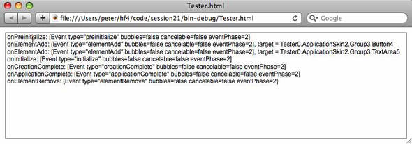
In this session we’ll build a tiny app that shows a number of different events that happen when a component is created and destroyed. This way, you know that they’re there and that you can handle them. This is a complex topic that could be the subject of several book chapters if covered thoroughly; we’ll stick with the basics here. (This isn’t “Rome in a Day,” it’s “Rome in an Hour, on a Vespa.”)
In this session we’re going to build the following application:

Clicking the button removes it and triggers the elementRemove event, as shown in the following screenshot (note the last line in the TextArea).
So, let’s see the code.
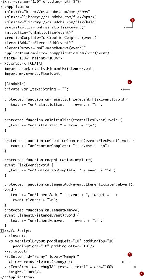
session21/src/Tester.mxml
|
We add handlers for the different events dispatched by the application. The applicationComplete event is defined by the Application class; the rest are inherited from the UIComponent class. Again, there’s nothing special about the onPreinitialize function name; onFooBar is just a naming convention for functions that handle foo-Bar events. |
|
|
|
We create a bindable _text variable to store debugging information in. We don’t just set the debugTA text directly, since the preinitialize Event happens before the debugTA even exists! (Try it and see your app explode. I’m serious: do this. You can learn a lot about Flex by trying to deliberately break your applications and see what happens in the traces when you succeed—and in learning what happens when something you think will break a Flex app doesn’t.) |
|
|
Clicking the kenny button calls the removeElement method of the application (inherited from SkinnableContainer) to remove the kenny button. |
|
|
The debugTA TextArea has its text property bound to the _text variable. |
That’s it!
Running the app, we see the events printed in the order in which they occur. We see that preinitialize happens before the Button and the TextArea are added to the app, and that the initialize, creationComplete, and applicationComplete events then take place.
Key points
- A number of events are broadcast when Flex components are created and removed. These events can bubble up the component containment hierarchy when their bubbles property is set to true. Events can also contain custom data, as you’ll see in chapter 7 when we build a full Flex application using the Cairngorm application framework for Flex.
- To understand the component lifecycle in depth, go to www.slideshare.net/rjowen/adobe-flex-component-lifecycle-presentation.
What’s next?
This chapter has been a whirlwind tour of Spark containers, layouts, view states, and CSS styling, as well as a brief glance at some complex topics that need chapters longer than this one all to themselves to be fully understood.
In the next chapter we’re going to switch gears from Spark and look at Halo. Recall that in Session 5 we looked briefly at Halo? You probably got the sense that there was this whole other way of writing Flex 4 apps, but that it was somewhat quaint and that we didn’t want to talk about it. Well, in Flex 4 it turns out that Halo is still relevant after all. In the next chapter we’ll take a tour of some of the Halo components that are still relevant to you as a Flex 4 developer—either they don’t have Spark equivalents or they’re more functional in some important way than their current Spark equivalents.
Chances are you’ll be using this subset of Halo components every day—OK, well, maybe every other day—as a Flex 4 developer, so the next chapter is essential information.